


Dr. Don J. Easterbrook, Western Washington University, Bellingham, WA
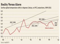
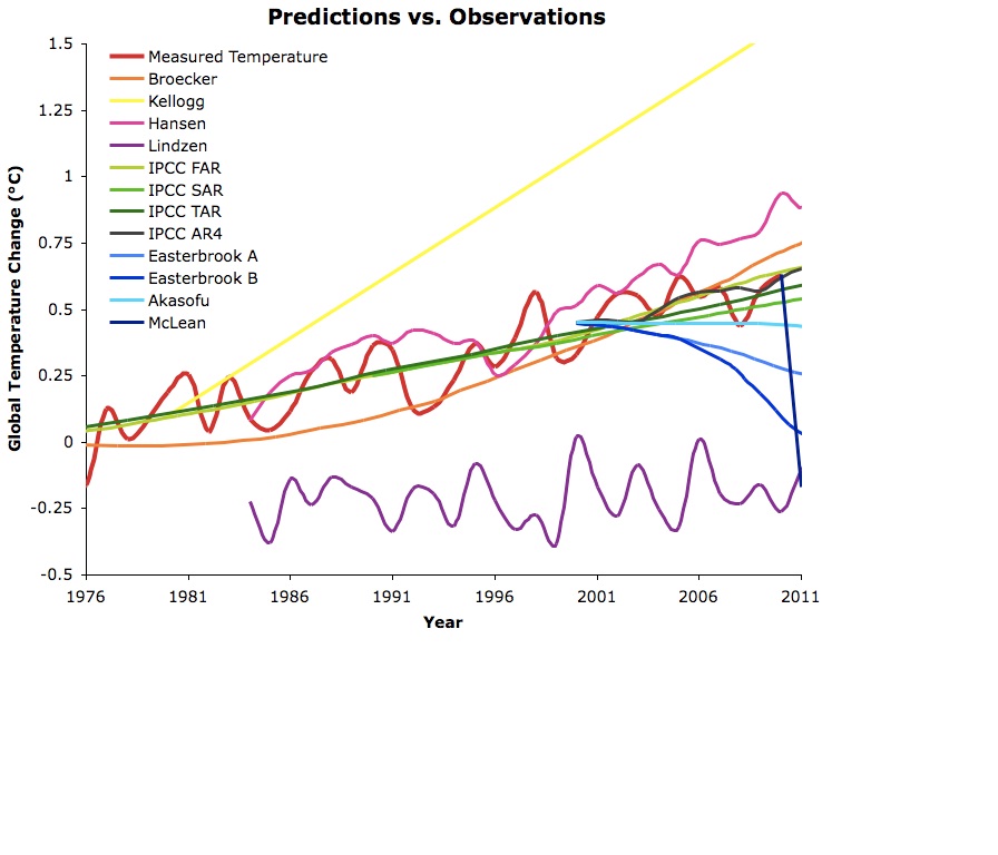
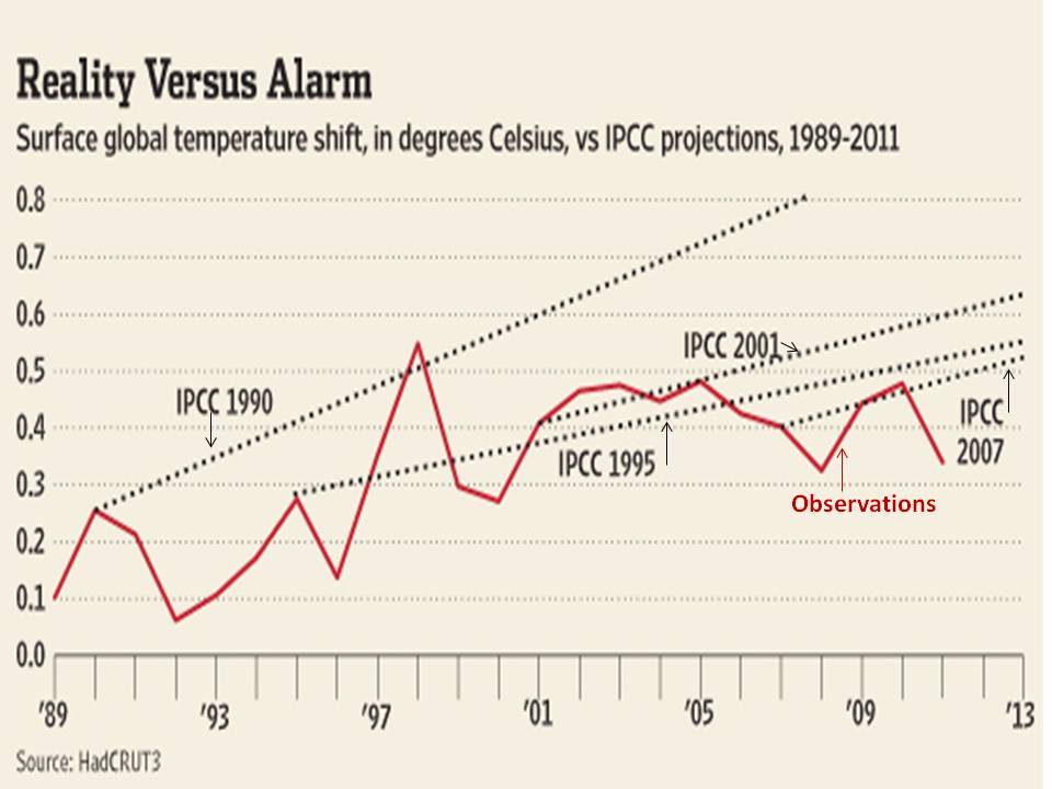
The October 18, 2011 post on Skeptical Science entitled How Global Temperatures Predictions Compare to What Happened (Skeptics Off Target)”by ‘Dana 1981’ claimed that “the IPCC projections have thus far been the most accurate” and “mainstream climate science predictions… have mostly done well.... and the “skeptics” have generally done rather poorly.” “"several skeptics basically failed, while leading scientists such as Dr. James Hansen (a regular climate activist, as well as the top climatologist at NASA) and those at the IPCC did pretty darn well.” Figure 1 shows a graphical comparison of predictions vs. observations as portrayed by Dana1981.
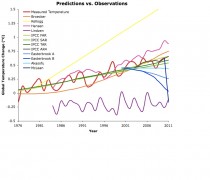
Figure 1. Temperature predictions vs. observations as portrayed by Dana1981. Enlarged.
However, the graph and these statements seemed to fly in the face of data, which show just the opposite - that computer models have failed badly in predicting temperatures over the past decade. So how could anyone make these claims? Figure 2 shows the IPCC temperature predictions from 2000 to 2011, taken from the IPCC website in 2000. Note that their projection is for warming of 0.6C (1.1F) between 2003 and now.

Figure 2. IPCC global warming prediction from the IPCC website in 2000. Enlarged.
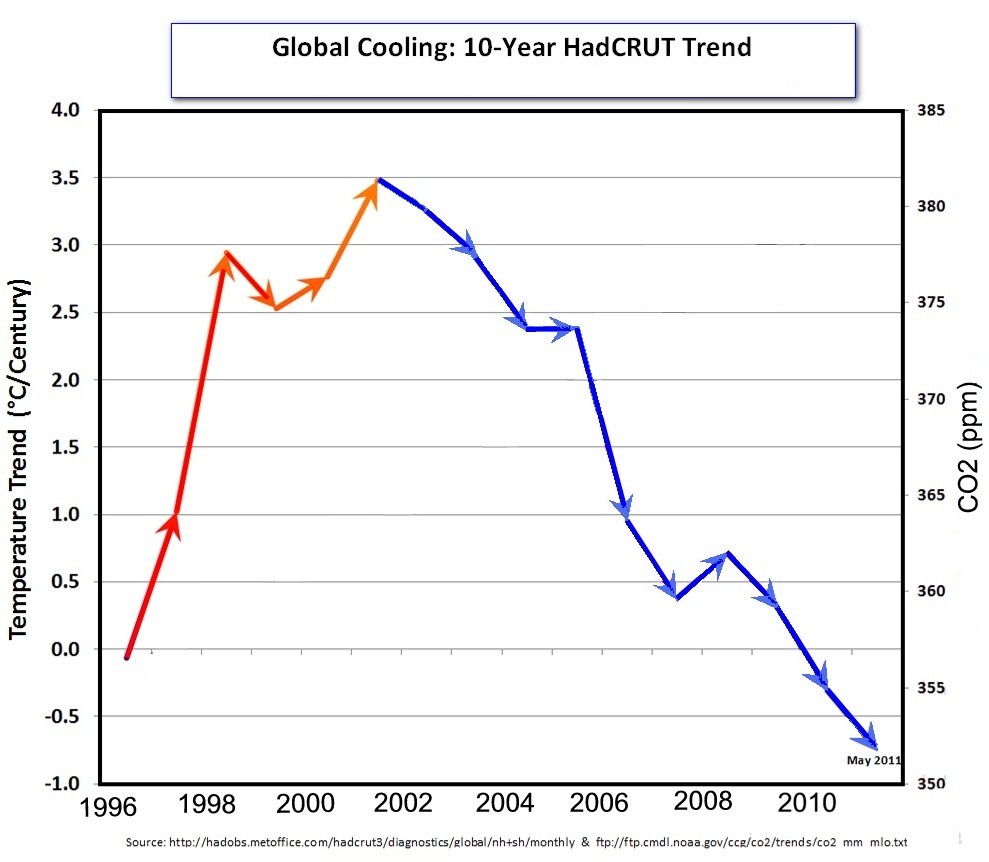
How close is the IPCC projected warming to the measured temperatures? Figure 3 shows a 10-year cooling trend, so how can the computer-model projected warming, (0.6C, 1.1 F) warming be considered accurate?
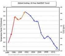
Figure 3. Ten-year cooling trend from 2001 to 2011. Enlarged.
Whats wrong with Figure 1?
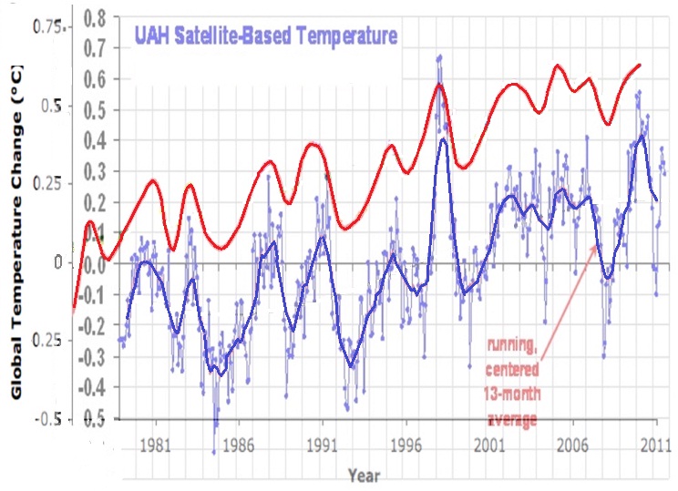
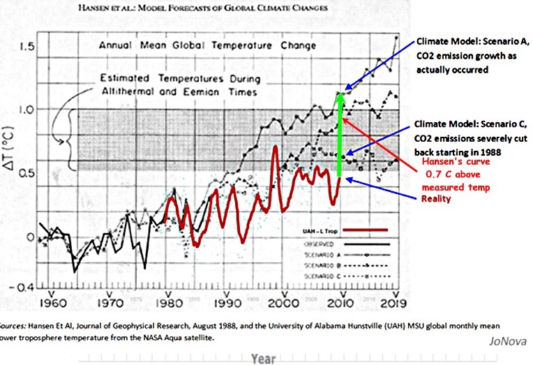
The comparison of various predicted temperature curves and what is labeled “Measured temperature” in Figure 1 is definitely at odds with Figures 2 and 3. How can the IPCC computer model predictions of a full degree of warming (F) (0.6 C) in the past decade and temperature predictions of Hansen and Broecker be consistent with no global warming in the past decade (in fact, slight cooling)? Something is badly off base here. One possibility is that the ‘Measured temperature curve in Figure 1 is too high, taking it into the temperatures of model predictions, so I took the UAH satellite temperature curve from 1979 to Sept. 2011 (available at http://www.drroyspencer.com/latest-global-temperatures/) and dropped it onto Figure 1. The result (Figure 4) was rather startling. What is immediately apparent is that the temperatures plotted in Figure 1 are nearly half a degree C higher than the UAH temperatures! No source is given for the red temperature curve in Figure 1, but it seems to generally mimic the UAH temperatures, rather than ground-measured temperatures.
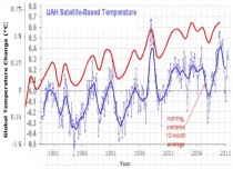
Figure 4. Comparison of UAH satellite global temperatures (blue curve) with temperatures plotted in Figure 1 (red curve). Enlarged.
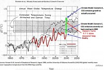
Figure 5 corroborates that Hansen’s 1988 temperature curve is 0.7C higher than the UAH measured temperature curve. By no stretch of the imagination can his prediction be considered ‘accurate!’Enlarged.
As for the skeptics predictions, mine were based on recurring climate cycles that can be traced back at least 400 years, long before CO2 could have been a factor. Using the concept that’the past is the key to the future,’ I simply continued the past, well-documented temperature patterns into the future and offered several possible scenarios beginning about 2000: (1) moderate, 25-30-year cooling similar to the 1945 to 1977 cooling, (2) more intense, 25-30-year cooling, similar to the more severe cooling from 1880 to 1915, (3) more severe, 25-30-year cooling similar to the Dalton Minimum cooling from 1790 to 1820; or very severe cooling (the Little Ice Age) similar to the Maunder Minimum cooling from 1650 to 1700. So far, my cooling prediction, made in 1998, appears to be happening and is certainly far more accurate than any of the model predictions, which called for warming of a full degree F. So far cooling this past decade has been moderate, more like the 1945-1977 cooling, but as we get deeper into the present Grand Solar Minimum, the cooling trend may become more intense.
Professor Muller of Berkeley with funding from many diffferent groups undertook a reevaluation of global temperature trends.The results predictably since he appears to have worked with much of the same raw data all three global data centers used or started with, found little had changed. Even before the peer review process on four papers in progress was complete, the project jumped the gun on releasing the results. The media equally predictably proclaimed it the deathknell for skepticism. There were a number of responses you should read before you prematurely jump to the same conclusion.
Roger Pielke Sr. on Climate Science:
On Climate Etc, Judy Curry posted
Berkeley Surface Temperatures: Released
which refers the Economist article “new analysis of the temperature record leaves little room for the doubters. The world is warming”
The Economist article includes the text
There are three compilations of mean global temperatures, each one based on readings from thousands of thermometers, kept in weather stations and aboard ships, going back over 150 years. Two are American, provided by NASA and the National Oceanic and Atmospheric Administration (NOAA), one is a collaboration between Britains Met Office and the University of East Anglias Climate Research Unit (known as Hadley CRU). And all suggest a similar pattern of warming: amounting to about 0.9C over land in the past half century.
The raw surface temperature data from which all of the different global surface temperature trend analyses are derived are essentially the same...it is no surprise that his trends are the same for GISS, CRU and NCDC but we do not know if it is true or not for Muller et al. His claim is that they draw from a much larger set of data. Here is what I wrote on several weblogs.
rpielke says:
October 21, 2011 at 6:22 am
Zeke Hausfather I realize that he has a much larger set of locations, but many of them are very short term in duration (as I read from his write up). Moreover, if they are in nearly the same geographic location as the GHCN sites, they are not providing much independent new information.
What I would like to see is a map with the GHCN sites and with the added sites from Muller et al. The years of record for his added sites should be given. Also, were the GHCN sites excluded when they did their trend assessment? If not, and the results are weighted by the years of record, this would bias the results towards the GHCN trends.
The evaluation of the degree of indepenence of the Muller et al sites from the GHCN needs to be quantified.
I discussed this most recently in my post: “Erroneous Information In The Report “Procedural Review of EPA’s Greenhouse Gases Endangerment Finding Data Quality Processes”
The new Muller et al study, therefore, has a very major unanswered question. I have asked it on Judys weblog since she is a co-author of these studies [and Muller never replied to my request to answer this question].
Hi Judy I encourage you to document how much overlap there is in Mullers analysis with the locations used by GISS, NCDC and CRU. In our paper
Pielke Sr., R.A., C. Davey, D. Niyogi, S. Fall, J. Steinweg-Woods, K. Hubbard, X. Lin, M. Cai, Y.-K. Lim, H. Li, J. Nielsen-Gammon, K. Gallo, R. Hale, R. Mahmood, S. Foster, R.T. McNider, and P. Blanken, 2007: Unresolved issues with the assessment of multi-decadal global land surface temperature trends. J. Geophys. Res., 112, D24S08, doi:10.1029/2006JD008229.
we reported that
“The raw surface temperature data from which all of the different global surface temperature trend analyses are derived are essentially the same. The best estimate that has been reported is that 9095% of the raw data in each of the analyses is the same (P. Jones, personal communication, 2003).”
Unless, Muller pulls from a significanty different set of raw data, it is no surprise that his trends are the same.
Anthony Watts in post The Berkeley Earth Surface Temperature project puts PR before peer review.
Readers may recall this post last week where I complained about being put in a uncomfortable quandary by an author of a new paper. Despite that, I chose to honor the confidentiality request of the author Dr. Richard Muller, even though I knew that behind the scenes, they were planning a media blitz to MSM outlets. In the past few days I have been contacted by James Astill of the Economist, Ian Sample of the Guardian, and Leslie Kaufman of the New York Times. They have all contacted me regarding the release of papers from BEST today.
Theres only one problem: Not one of the BEST papers have completed peer review.
Nor has one has been published in a journal to my knowledge, nor is the one paper I’ve been asked to comment on in press at JGR, (where I was told it was submitted) yet BEST is making a “pre-peer review” media blitz.
One willing participant to this blitz, that I spent the last week corresponding with, is James Astill of The Economist, who presumably wrote the article below, but we cant be sure since the Economist has not the integrity to put author names to articles.
In an earlier post, Anthony reported:
Thorne said scientists who contributed to the three main studies -by NOAA, NASA and Britains Met Office -welcome new peer-reviewed research. But he said the Berkeley team had been “seriously compromised” by publicizing its work before publishing any vetted papers. - Peter Thorne, National Climatic Data Center in Asheville, N.C.
He went on to report even IPCC Lead Author and alarmist Kevin Trenberth had his doubts:
Even Trenberth isnt too sure about it:
Kevin Trenberth, who heads the Climate Analysis Section of the National Center for Atmospheric Research, a university consortium, said he was “highly skeptical of the hype and claims” surrounding the Berkeley effort. “The team has some good people,” he said, “but not the expertise required in certain areas, and purely statistical approaches are naive.”
Lubos Motl The Reference Frame Berkeley Earth recalculates global mean temperature, gets misinterpreted:
Berkeley Earth Surface Temperature led by Richard Muller a top Berkeley physics teacher and the PhD adviser of the fresh physics Nobel prize winner Saul Perlmutter, among others - has recalculated the evolution of the global mean temperature in the most recent two centuries or so, qualitatively confirmed the previous graphs, and got dishonestly reported in the media.
Some people including Marc Morano of Climate Depot were predicting that this outcome was the very point of the project. They were worried about the positive treatment that Richard Muller received at various places including this blog and they were proved right. Today, it really does look like all the people in the “BEST” project were just puppets used in a bigger, pre-planned propaganda game.
Marc Morano of Climate Depot in Befuddled Warmist Richard Muller Declares Skeptics Should Convert to Believers Because His Study Shows the Earth Has Warmed Since the 1950s!
See editorial and summary.‘Warming now equals human causation?! Muller should be ashamed of himself for promoting media spin like this’—‘Muller’s study is already being met with massive scientific blowback from his colleagues’.
Nigel Calder in Calder’s Updates reacts this way:
Nice research, curious rhetoric. Just dis-embargoed at noon PST (8 pm BST) on 20 October are a press release and associated papers from the Berkeley Earth Surface Temperatures (BEST) project. A team led by Richard A. Muller has been asking whether the histories of land surface temperatures from the likes of NOAA, NASA and the Hadley Centre are to be trusted. Clever statistics glean and process raw data from 39,000 weather stations world wide - more than five times as many as used by other analysts.
...The BEST study, based on a random selection of weather stations, youll see that the average temperatures of the land correspond quite well with the other series.
What’s very odd is the rhetoric of the press release. It begins:
Global warming is real, according to a major study released today. Despite issues raised by climate change skeptics, the Berkeley Earth Surface Temperature study finds reliable evidence of a rise in the average world land temperature of approximately 1C since the mid-1950s.
Global warming real? Not recently, folks. The black curve in the graph confirms what experts have known for years, that warming stopped in the mid-1990s, when the Sun was switching from a manic to a depressive phase.
Elsewhere the press release first begs the question by calling the past 50 years “the period during which the human effect on temperatures is discernible” and then contradicts this by saying, “What Berkeley Earth has not done is make an independent assessment of how much of the observed warming is due to human actions, Richard Muller acknowledged.”
Let me say there is interesting stuff in the material released today, particularly in the paper on Decadal Variations, tracing links with El Nino and other regional temperature oscillations - a subject I may return to when I have more time.
It hasn’t escaped my attention that BEST is today gunning mainly for Anthony Watts and his Surface Stations project in the USA, but hes well capable of answering for himself.
See also James Delingpole on the Muller releases.
By Joseph D’Aleo, Weatherbell.com
The ozone hole above the Antarctic has reached its maximum extent for the year, revealing a gouge in the protective atmospheric layer that rivals the size of North America, scientists have announced.
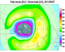
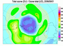
Spanning about 9.7 million square miles (25 million square kilometers), the ozone hole over the South Pole reached its maximum annual size on Sept. 14, 2011, coming in as the fifth largest on record. The largest Antarctic ozone hole ever recorded occurred in 2006, at a size of 10.6 million square miles (27.5 million square km), a size documented by NASA’s Earth-observing Aura satellite.
The Antarctic ozone hole was first discovered in the late 1970s by the first satellite mission that could measure ozone, a spacecraft called POES and run by the National Oceanic and Atmospheric Administration (NOAA). The hole has continued to grow steadily during the 1980s and 90s, though since early 2000 the growth reportedly leveled off. Even so scientists have seen large variability in its size from year to year.
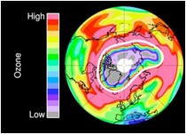
On the Earth’s surface, ozone is a pollutant, but in the stratosphere it forms a protective layer that reflects ultraviolet radiation back out into space, protecting us from the damaging UV rays. Years with large ozone holes are now more associated with very cold winters over Antarctica and high polar winds that prevent the mixing of ozone-rich air outside of the polar circulation with the ozone-depleted air inside, the scientists say.
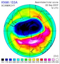
There is a lot of year to year variability, in 2007, the ozone hole shrunk 30% from the record setting 2006 winter.
The record setting ozone hole in 2006 (animating here).
In 2007, it was said: “Although the hole is somewhat smaller than usual, we cannot conclude from this that the ozone layer is recovering already,” said Ronald van der A, a senior project scientist at the Royal Dutch Meteorological Institute in the Netherlands.
This year, the ozone region over Antarctica dropped 30.5 million tons, compared to the record-setting 2006 loss of 44.1 million tons. Van der A said natural variations in temperature and atmospheric changes are responsible for the decrease in ozone loss, and is not indicative of a long-term healing.
“This year’s (2007) ozone hole was less centered on the South Pole as in other years, which allowed it to mix with warmer air,” van der A said. Because ozone depletes at temperatures colder than -108 degrees Fahrenheit (-78 degrees Celsius), the warm air helped protect the thin layer about 16 miles (25 kilometers) above our heads. As winter arrives, a vortex of winds develops around the pole and isolates the polar stratosphere. When temperatures drop below -78C (-109F), thin clouds form of ice, nitric acid, and sulphuric acid mixtures. Chemical reactions on the surfaces of ice crystals in the clouds release active forms of CFCs. Ozone depletion begins, and the ozone “hole” appears.
Over the course of two to three months, approximately 50% of the total column amount of ozone in the atmosphere disappears. At some levels, the losses approach 90%. This has come to be called the Antarctic ozone hole. In spring, temperatures begin to rise, the ice evaporates, and the ozone layer starts to recover.
Intense cold in the upper atmosphere of the Arctic last winter activated ozone-depleting chemicals and produced the first significant ozone hole ever recorded over the high northern regions, scientists reported in the journal Nature.
This year, for the first time scientists also found a depletion of ozone above the Arctic that resembled its South Pole counterpart. “For the first time, sufficient loss occurred to reasonably be described as an Arctic ozone hole,” the researchers wrote.
It was related to a rebound cooling of the polar stratosphere and upper troposphere. Notice the December and early January warmth and VERY NEGATIVE AO and the pop of the AO and rapid cooling starting in January.
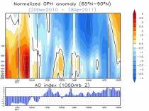
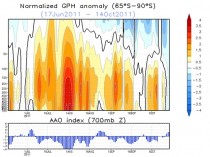
The Antarctic after a record negative polar warming, turned colder in mid to late winter (starting in late August).
Also note the scientists mentioning the sulfuric acid mixtures role in the ozone destruction. Sulfate aerosols are associated with volcanism and the recent high latitude volcanoes in Alaska, Iceland and Chile may have contributed to the blocking (warming). Like a pendulum, a swing to one state, can result in a rebound to the opposite extreme very obvious in the arctic.
The data shows a lot of variability and no real trends after the Montreal protocol banned CFCs. The models had predicted a partial recovery by now. Later scientists adjusted their models and pronounced the recovery would take decades. It may be just another failed alarmist prediction.
Remember we first found the ozone hole when satellites that measure ozone were first available and processed (1985). It is very likely to have been there forever, varying year to year and decade to decade as solar cycles and volcanic events affected high latitude winter vortex strength. PDF.
by Anthony Watts
I had to laugh after reading the reviews on Amazon.com for Donna Laframboise’s book: The Delinquent Teenager Who Was Mistaken for the World’s Top Climate Expert.
There’s some double fun here, because the title reminds me of the language used in the 1 star review given by Dr. Peter Gleick of the Pacific Institute.
The first fun part: Gleick apparently never read the book before posting a negative review, because if he had, he wouldn’t be intellectually slaughtered by some commenters who challenge his claims by pointing out page and paragraph in the book showing exactly how Gleick is the one posting false claims. You can read the reviews here at Amazon, and if youve bought the book and have read it, add your own. If you haven’t bought it yet, heres the link for the Kindle edition. Best $4.99 youll ever spend. If you dont own a Kindle you can read this book on your iPad or Mac via Amazon’s free Kindle Cloud Reader - or on your desktop or laptop via Kindle for PC software.
The other fun part? Gleick apparently doesn’t realize he’s up against a seasoned journalist, he thinks Donna is just another “denier”. Another inconvenient truth for Gleick is that she was a member of the board of directors of the Canadian Civil Liberties Association - serving as a Vice-President from 1998-2001.
Read Gleick’s critique and rebuttal comments by those who actually read the book here.
By Matt Ridley, The Rational Optimist
Which would you rather have in the view from your house? A thing about the size of a domestic garage, or eight towers twice the height of Nelson’s column with blades noisily thrumming the air. The energy they can produce over ten years is similar: eight wind turbines of 2.5-megawatts (working at roughly 25% capacity) roughly equal the output of an average Pennsylvania shale gas well (converted to electricity at 50% efficiency) in its first ten years.
Difficult choice? Let’s make it easier. The gas well can be hidden in a hollow, behind a hedge. The eight wind turbines must be on top of hills, because that is where the wind blows, visible for up to 40 miles. And they require the construction of new pylons marching to the towns; the gas well is connected by an underground pipe.
Unpersuaded? Wind turbines slice thousands of birds of prey in half every year, including white-tailed eagles in Norway, golden eagles in California, wedge-tailed eagles in Tasmania. Theres a video on Youtube of one winging a griffon vulture in Crete. According to a study in Pennsylvania, a wind farm with eight turbines would kill about a 200 bats a year. The pressure wave from the passing blade just implodes the little creatures lungs. You and I can go to jail for harming bats or eagles; wind companies are immune.
Still can’t make up your mind? The wind farm requires eight tonnes of an element called neodymium, which is produced only in Inner Mongolia, by boiling ores in acid leaving lakes of radioactive tailings so toxic no creature goes near them.
Not convinced? The gas well requires no subsidy - in fact it pays a hefty tax to the government - whereas the wind turbines each cost you a substantial add-on to your electricity bill, part of which goes to the rich landowner whose land they stand on. Wind power costs three times as much as gas-fired power. Make that nine times if the wind farm is offshore. And thats assuming the cost of decommissioning the wind farm is left to your children - few will last 25 years.
Decided yet? I forgot to mention something. If you choose the gas well, thats it, you can have it. If you choose the wind farm, you are going to need the gas well too. That’s because when the wind does not blow you will need a back-up power station running on something more reliable. But the bloke who builds gas turbines is not happy to build one that only operates when the wind drops, so he’s now demanding a subsidy, too.
Whats that you say? Gas is running out? Have you not heard the news? Its not. Till five years ago gas was the fuel everybody thought would run out first, before oil and coal. America was getting so worried even Alan Greenspan told it to start building gas import terminals, which it did. They are now being mothballed, or turned into export terminals.
A chap called George Mitchell turned the gas industry on its head. Using just the right combination of horizontal drilling and hydraulic fracturing (fracking) - both well established technologies - he worked out how to get gas out of shale where most of it is, rather than just out of (conventional) porous rocks, where it sometimes pools. The Barnett shale in Texas, where Mitchell worked, turned into one of the biggest gas reserves in America. Then the Haynesville shale in Louisiana dwarfed it. The Marcellus shale mainly in Pennsylvania then trumped that with a barely believable 500 trillion cubic feet of gas, as big as any oil field ever found, on the doorstep of the biggest market in the world.
The impact of shale gas in America is already huge. Gas prices have decoupled from oil prices and are half what they are in Europe. Chemical companies, which use gas as a feedstock, are rushing back from the Persian Gulf to the Gulf of Mexico. Cities are converting their bus fleets to gas. Coal projects are being shelved; nuclear ones abandoned.
Rural Pennsylvania is being transformed by the royalties that shale gas pays (Lancashire take note). Drive around the hills near Pittsburgh and you see new fences, repainted barns and - in the local towns - thriving car dealerships and upmarket shops. The one thing you barely see is gas rigs. The one I visited was hidden in a hollow in the woods, invisible till I came round the last corner where a flock of wild turkeys was crossing the road. Drilling rigs are on site for about five weeks, fracking trucks a few weeks after that, and when they are gone all that is left is a “Christmas tree” wellhead and a few small storage tanks.
The International Energy Agency reckons there is quarter of a millennium’s worth of cheap shale gas in the world. A company called Cuadrilla drilled a hole in Blackpool, hoping to find a few trillion cubic feet of gas. Last month it announced 200 trillion cubic feet, nearly half the size of the giant Marcellus field. That’s enough to keep the entire British economy going for many decades. And it’s just the first field to have been drilled.
Jesse Ausubel is a soft-spoken academic ecologist at Rockefeller University in New York, not given to hyperbole. So when I asked him about the future of gas, I was surprised by the strength of his reply. “It’s unstoppable,” he says simply. Gas, he says, will be the worlds dominant fuel for most of the next century. Coal and renewables will have to give way, while oil is used mainly for transport. Even nuclear may have to wait in the wings.
And he is not even talking mainly about shale gas. He reckons a still bigger story is waiting to be told about offshore gas from the so-called cold seeps around the continental margins. Israel has made a huge find and is planning a pipeline to Greece, to the irritation of the Turks. The Brazilians are striking rich. The Gulf of Guinea is hot. Even our own Rockall Bank looks promising. Ausubel thinks that much of this gas is not even fossil fuel, but ancient methane from the universe that was trapped deep in the earth’s rocks - like the methane that forms lakes on Titan, one of Saturn’s moons.
The best thing about cheap gas is whom it annoys. The Russians and the Iranians hate it because they thought they were going to corner the gas market in the coming decades. The greens hate it because it destroys their argument that fossil fuels are going to get more and more costly till even wind and solar power are competitive. The nuclear industry ditto. The coal industry will be a big loser (incidentally, as somebody who gets some income from coal, I declare that writing this article is against my vested interest).
Little wonder a furious attempt to blacken shale gass reputation is under way, driven by an unlikely alliance of big green, big coal, big nuclear and conventional gas producers. The environmental objections to shale gas are almost comically fabricated or exaggerated. Hydraulic fracturing or fracking uses 99.86% water and sand, the rest being a dilute solution of a few chemicals of the kind you find beneath your kitchen sink.
State regulators in Alaska, Colorado, Indiana, Louisiana, Michigan, Oklahoma, Pennsylvania, South Dakota, Texas and Wyoming have all asserted in writing that there have been no verified or documented cases of groundwater contamination as a result of hydraulic fracking. Those flaming taps in the film “Gasland” were literally nothing to do with shale gas drilling and the film maker knew it before he wrote the script. The claim that gas production generates more greenhouse gases than coal is based on mistaken assumptions about gas leakage rates and cherry-picked time horizons for computing greenhouse impact.
Like Japanese soldiers hiding in the jungle decades after the war was over, our political masters have apparently not heard the news. David Cameron and Chris Huhne are still insisting that the future belongs to renewables. They are still signing contracts on your behalf guaranteeing huge incomes to landowners and power companies, and guaranteeing thereby the destruction of landscapes and jobs. The governments “green” subsidies are costing the average small business 250,000 pounds a year. That’s ten jobs per firm. Making energy cheap is - as the industrial revolution proved - the quickest way to create jobs; making it expensive is the quickest way to lose them.
Not only are renewables far more expensive, intermittent and resource-depleting (their demand for steel and concrete is gigantic) than gas; they are also hugely more damaging to the environment, because they are so land-hungry. Wind kills birds and spoils landscapes; solar paves deserts; tidal wipes out the ecosystems of migratory birds; biofuel starves the poor and devastates the rain forest; hydro interrupts fish migration. Next time you hear somebody call these “clean” energy, dont let him get away with it.
Wind cannot even help cut carbon emissions, because it needs carbon back-up, which is wastefully inefficient when powering up or down (nuclear cannot be turned on and off so fast). Even Germany and Denmark have failed to cut their carbon emissions by installing vast quantities of wind.
Yet switching to gas would hasten decarbonisation. In a combined cycle turbine gas converts to electricity with higher efficiency than other fossil fuels. And when you burn gas, you oxidise four hydrogen atoms for every carbon atom. That’s a better ratio than oil, much better than coal and much, much better than wood. Ausubel calculates that, thanks to gas, we will accelerate a relentless shift from carbon to hydrogen as the source of our energy without touching renewables.
To persist with a policy of pursuing subsidized renewable energy in the midst of a terrible recession, at a time when vast reserves of cheap low-carbon gas have suddenly become available is so perverse it borders on the insane. Nothing but bureaucratic inertia and vested interest can explain it.
By Laura Caroe, Daily Express
BRITAIN is set to suffer a mini ice age that could last for decades and bring with it a series of bitterly cold winters.
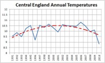
Central England Annual temperatures since 1991
And it could all begin within weeks as experts said last night that the mercury may soon plunge below the record -20C endured last year. Scientists say the anticipated cold blast will be due to the return of a disruptive weather pattern called La Nina. Latest evidence shows La Nina, linked to extreme winter weather in America and with a knock-on effect on Britain, is in force and will gradually strengthen as the year end.
The climate phenomenon, characterised by unusually cold ocean temperatures in the Pacific, was linked to our icy winter last year - one of the coldest on record. And it coincides with research from the Met Office indicating the nation could be facing a repeat of the “little ice age” that gripped the country 300 years ago, causing decades of harsh winters. Britain is set to suffer a mini ice age that could last for decades. (see this PDF that describes the UV as an important ‘amplifying’ factor in the solar impact on climate.
The prediction, to be published in Nature magazine, is based on observations of a slight fall in the sun’s emissions of ultraviolet radiation, which may, over a long period, trigger Arctic conditions for many years.
Although a connection between La Nina and conditions in Europe is scientifically uncertain, ministers have warned transport organisations and emergency services not to take any chances. Forecasts suggest the country could be shivering in a big freeze as severe and sustained as last winter from as early as the end of this month.
La Nina, which occurs every three to five years, has a powerful effect on weather thousands of miles away by influencing an intense upper air current that helps create low pressure fronts.
Another factor that can affect Europe is the amount of ice in the Arctic and sea temperatures closer to home.
Ian Currie, of the Meterological Society, said: “All the world’s weather systems are connected. What is going on now in the Pacific can have repercussions later around the world.”
Parts of the country already saw the first snowfalls of the winter last week, dumping two inches on the Cairngorms in Scotland. And forecaster James Madden, from Exacta Weather, warned we are facing a “severely cold and snowy winter”.
Councils say they are fully prepared having stockpiled thousands of tons of extra grit. And the Local Government Association says it had more salt available at the beginning of this month than the total used last winter.
But the mountain of salt could be dug into very soon amid widespread heavy snow as early as the start of next month. Last winter, the Met Office was heavily criticised after predicting a mild winter, only to see the country grind to a halt amid hazardous driving conditions in temperatures as low as -20C.
Peter Box, the Local Government Association’s economy and transport spokesman, said: “Local authorities have been hard at work making preparations for this winter and keeping the roads open will be our number one priority.”
The National Grid will this week release its forecast for winter energy use based on long-range weather forecasts.
Such forecasting is, however, notoriously difficult, especially for the UK, which is subject to a wide range of competing climatic forces. A Met Office spokesman said that although La Nina was recurring, the temperatures in the equatorial Pacific were so far only 1C below normal, compared with a drop of 2C at the same time last year.
Research by America’s National Oceanic and Atmospheric Administration showed that in 2010-11 La Nina contributed to record winter snowfalls, spring flooding and drought across the world. Jonathan Powell, of Positive Weather Solutions, said: “The end of the month and November are looking colder than average with severe frosts and the chance of snow.” However, some balmy autumnal sunshine was forecast for this week.
By Paul Chesser, Daily Caller
Last week, the Center for Responsive Politics (CRP) released a report on the amount of money that has been spent in the fight over Transcanada Corp.’s proposed Keystone XL pipeline. The pipeline, which would run 1,700 miles from the Canadian tar sands to the Gulf of Mexico, is opposed by environmentalists.
Unfortunately, CRP’s report portrays the fight as a battle between “Big Oil” and poor little environmental activist groups. That couldn’t be further from the truth.
The report quotes Eddie Scher, the senior communications strategist for the Sierra Club. Scher complains that environmental groups can’t compete with the “literally unlimited resources” of energy companies.
“There’s no question we’re up against big numbers of campaign dollars,” he said. “We’re up against the cream of the crop when it comes to K Street lobbyists. But we believe even well-financed insanity is trumped by democracy.”
But the Sierra Club - like other major environmental groups - is by no means poor. At the end of 2009, it had more than $170 million in assets between its activist wing and its education foundation. The Nature Conservancy ended last year with $5.65 billion in assets, after taking in $210.5 million in revenue. The World Wildlife Fund had $377.5 million in assets as of June 2010, after scraping together $177.7 million for the fiscal year. And the National Audubon Society had $305.9 million stashed away at the end of last year. The Environmental Defense Fund, Earthjustice, the Natural Resources Defense Council, and almost every other national “green” group you’ve ever heard of are similarly “impoverished.”
And then there are the foundations - dozens if not hundreds of them - that finance environmental activism. Among their benefactors: the Energy Foundation ($68.6 million in assets), the Joyce Foundation ($773.6 million), the Rockefeller Brothers Fund ($729 million), the William and Flora Hewlett Foundation ($6.8 billion), the David and Lucile Packard Foundation ($5.7 billion), and Heinz Endowments ($1.2 billion).
Scher’s Sierra Club might not spend as much money on lobbying as energy companies do, but that’s by choice. The part of the Sierra Club that is organized under the 501(c)(4) section of the tax code - in other words, the part of the organization that isn’t limited by lobbying restrictions - had nearly $49 million in assets at its disposal at the end of 2009. According to its 2009 tax return, the group spent about $4.9 million on “lobbying and political expenditures.” Only $480,000 of that money was spent at the federal level. The other $4.4 million was spent lobbying at the state level or on political activities like advertisements.
But that’s because the Sierra Club has made a strategic decision to focus more on litigation than on lobbying. The group files, on average, one lawsuit per week.
Other groups with as much financial might, such as the Environmental Defense Fund and the Natural Resources Defense Council, make similar tactical decisions about litigation, lobbying, and other activities. In fact, litigation involves more bullying than lobbying does. There are few things worse in life than dealing with lawsuits.
It’s time for the people at these well-heeled environmental groups to stop whining about how they “can’t compete” with energy companies.
Paul Chesser is executive director of American Tradition Institute.
By Anthony Watts
Senator Inhofe’s EPW office issued a press release today on the subject of USHCN Climate Monitoring stations along with links to this report from the General Accounting Office (GAO)
...the report notes, “NOAA does not centrally track whether USHCN stations adhere to siting standards...nor does it have an agency-wide policy regarding stations that don’t meet standards.” The report continues, “Many of the USHCN stations have incomplete temperature records; very few have complete records. 24 of the 1,218 stations (about 2 percent) have complete data from the time they were established.” GAO goes on to state that most stations with long temperature records are likely to have undergone multiple changes in measurement conditions.
The report shows by their methodology that 42% of the network in 2010 failed to meet siting standards and they have recommendations to NOAA for solving this problem. This number is of course much lower than what we have found in the surfacestations.org survey, but bear in mind that NOAA has been slowly and systematically following my lead and reports and closing the worst stations or removing them from USHCN duty. For example I pointed out that the famous Marysville station (see An old friend put out to pasture: Marysville is no longer a USHCN climate station of record) that started all this was closed just a few months after I reported issues with its atrocious siting. Recent discoveries of closures include Armore (shown below) and Durant OK. This may account for a portion the lower 42% figure for “active stations” the GAO found. Another reason might be that they tended towards using a less exacting rating system than we did.
Recently, while resurveying stations that I previously surveyed in Oklahoma, I discovered that NOAA has been quietly removing the temperature sensors from some of the USHCN stations we cited as the worst (CRN4, 5) offenders of siting quality. For example, here are before and after photographs of the USHCN temperature station in Ardmore, OK, within a few feet of the traffic intersection at City Hall:

Ardmore USHCN station , MMTS temperature sensor, January 2009

Ardmore USHCN station , MMTS temperature sensor removed, March 2011
While NCDC has gone to great lengths to defend the quality of the USHCN network, their actions of closing them speak far louder than written words and peer reviewed publications.
I don’t have time today to go into detail, but will follow up at another time. Here is the GAO summary:
Climate Monitoring: NOAA Can Improve Management of the U.S. Historical Climatology Network
GAO-11-800 August 31, 2011
Highlights Page (PDF) Full Report (PDF, 47 pages) Accessible Text Recommendations (HTML)
Summary
The National Oceanic and Atmospheric Administration (NOAA) maintains a network of weather-monitoring stations known as the U.S. Historical Climatology Network (USHCN), which monitors the nations climate and analyzes long-term surface temperature trends. Recent reports have shown that some stations in the USHCN are not sited in accordance with NOAAs standards, which state that temperature instruments should be located away from extensive paved surfaces or obstructions such as buildings and trees. GAO was asked to examine (1) how NOAA chose stations for the USHCN, (2) the extent to which these stations meet siting standards and other requirements, and (3) the extent to which NOAA tracks USHCN stations’ adherence to siting standards and other requirements and has established a policy for addressing nonadherence to siting standards. GAO reviewed data and documents, interviewed key NOAA officials, surveyed the 116 NOAA weather forecast offices responsible for managing stations in the USHCN, and visited 8 forecast offices.
In choosing USHCN stations from a larger set of existing weather-monitoring stations, NOAA placed a high priority on achieving a relatively uniform geographic distribution of stations across the contiguous 48 states. NOAA balanced geographic distribution with other factors, including a desire for a long history of temperature records, limited periods of missing data, and stability of a stations location and other measurement conditions, since changes in such conditions can cause temperature shifts unrelated to climate trends. NOAA had to make certain exceptions, such as including many stations that had incomplete temperature records. In general, the extent to which the stations met NOAA’s siting standards played a limited role in the designation process, in part because NOAA officials considered other factors, such as geographic distribution and a long history of records, to be more important. USHCN stations meet NOAAs siting standards and management requirements to varying degrees. According to GAOs survey of weather forecast offices, about 42 percent of the active stations in 2010 did not meet one or more of the siting standards.
With regard to management requirements, GAO found that the weather forecast offices had generally but not always met the requirements to conduct annual station inspections and to update station records. NOAA officials told GAO that it is important to annually visit stations and keep records up to date, including siting conditions, so that NOAA and other users of the data know the conditions under which they were recorded. NOAA officials identified a variety of challenges that contribute to some stations not adhering to siting standards and management requirements, including the use of temperature - measuring equipment that is connected by a cable to an indoor readout device - which can require installing equipment closer to buildings than specified in the siting standards. NOAA does not centrally track whether USHCN stations adhere to siting standards and the requirement to update station records, and it does not have an agencywide policy regarding stations that do not meet its siting standards. Performance management guidelines call for using performance information to assess program results. NOAA’s information systems, however, are not designed to centrally track whether stations in the USHCN meet its siting standards or the requirement to update station records. Without centrally available information, NOAA cannot easily measure the performance of the USHCN in meeting siting standards and management requirements.
Furthermore, federal internal control standards call for agencies to document their policies and procedures to help managers achieve desired results. NOAA has not developed an agencywide policy, however, that clarifies for agency staff whether stations that do not adhere to siting standards should remain open because the continuity of the data is important, or should be moved or closed. As a result, weather forecast offices do not have a basis for making consistent decisions to address stations that do not meet the siting standards. GAO recommends that NOAA enhance its information systems to centrally capture information useful in managing the USHCN and develop a policy on how to address stations that do not meet its siting standards. NOAA agreed with GAO’s recommendations.
Recommendations
Our recommendations from this work are listed below with a Contact for more information. Status will change from “In process” to “Open,” “Closed - implemented,” or “Closed - not implemented” based on our follow up work.
Director: Anu K. Mittal
Team: Government Accountability Office: Natural Resources and Environment
Phone: (202) 512-9846
Recommendations for Executive Action
Recommendation: To improve the National Weather Services (NWS) ability to manage the USHCN in accordance with performance management guidelines and federal internal control standards, as well as to strengthen congressional and public confidence in the data the network provides, the Acting Secretary of Commerce should direct the Administrator of NOAA to enhance NWS’s information system to centrally capture information that would be useful in managing stations in the USHCN, including (1) more complete data on siting conditions (including when siting conditions change), which would allow the agency to assess the extent to which the stations meet its siting standards, and (2) existing data on when station records were last updated to monitor whether the records are being updated at least once every 5 years as NWS requires.
Agency Affected: Department of Commerce
Status: In process
Comments: When we confirm what actions the agency has taken in response to this recommendation, we will provide updated information.
---------------
Recommendation: To improve the National Weather Service’s (NWS) ability to manage the USHCN in accordance with performance management guidelines and federal internal control standards, as well as to strengthen congressional and public confidence in the data the network provides, the Acting Secretary of Commerce should direct the Administrator of NOAA to develop an NWS agencywide policy, in consultation with the National Climatic Data Center, on the actions weather forecast offices should take to address stations that do not meet siting standards.
Agency Affected: Department of Commerce
Status: In process
Comments: When we confirm what actions the agency has taken in response to this recommendation, we will provide updated information.
--------------------
Vindication for Alan Carlin
Anthony Watts
While the GAO issues a report today saying that the US Historical Climatological Monitoring Network has real tangible problems (as I have been saying for years) the Inspector General just released a report this week saying that EPA rushed their CO2 endangerment finding, skipping annoying steps like doing proper review. The lone man holding up his hand at the EPA saying “wait a minute” was Alan Carlin, who was excoriated for doing so. Read more here.
Icecap comment: Kudos to Anthony and the surfacestation.org team for raising this issue and forcing changes and now more transparency and to Alan Carlin for the courage to speak out from inside an agency on a mission.
By P Gosselin on 26. September 2011
I think I’ve found the root of Joe Romm’s problem. He needs to go back to school and learn more math and natural sciences! At least that’s what a recent Yale University study shows.

Somehow this paper got by me. Maybe this is old news, and so forgive me if this is already known. It’s nothing you’d hear about from the “enlightened” media, after all.
Recall how climate alarmists always try to portray skeptics as ignorant, close-minded flat-earthers who lack sufficient education to understand even the basics of the science, and if it wasn’t for them, the world could start taking the necessary steps to rescue itself.
Unfortunately for the warmists, the opposite is true. The warmists are the ones who are less educated scientifically. This is what a recent Yale University study shows. Hat tip: http://www.politik.ch.
Professor Dan M. Kahan and his team surveyed 1540 US adults and determined that people with more education in natural sciences and mathematics tend to be more skeptical of AGW climate science. Of course this means that people will less education are more apt to be duped by it.
Surprised? Here’s an excerpt of the study’s abstract (emphasis added):
The conventional explanation for controversy over climate change emphasizes impediments to public understanding: Limited popular knowledge of science, the inability of ordinary citizens to assess technical information, and the resulting widespread use of unreliable cognitive heuristics to assess risk. A large survey of U.S. adults (N = 1540) found little support for this account. On the whole, the most scientifically literate and numerate subjects were slightly less likely, not more, to see climate change as a serious threat than the least scientifically literate and numerate ones.
Time for you warmists to go back to school (though I seriously doubt many of you are capable of learning much of anything, on account of extreme cultural cognition disability).
To learn more, here’s a video on Cultural Cognition and the Challenge of Science Communication which looks at risk perception w.r.t. the issues of climate change, and here’s a video on Cultural Cognition Hypothesis.
By Verity Jones, Digging in the Clay
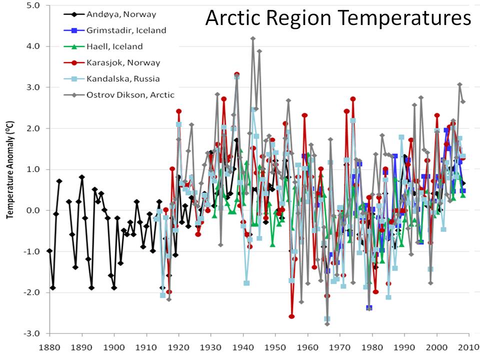
A Tamino rant aimed at Joe D’Aleo’s Arctic ice refreezing after falling short of 2007 record (also at ICECAP) has had me smiling. Tamino’s accusation against Joe of cherry picking are centred on one of the graphs originally posted here at DITC.
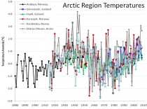
“D’Aleo tries so hard to blame Arctic climate change on ocean oscillations. Part of his dissertation includes a plot of “Arctic Region Temperatures”
“Do you suspect that these six stations were “hand-picked” to give the impression he wanted to give? Do you think maybe they were cherry-picked? If so, you’d be right.”
Well excuse me but of course they were cherry-picked, but not for the reasons Tamino suggests. If you really want to spit cherry stones, Tamino, chew on them first.
The graph was originally posted here and here’s what I said about it then:
“Tony had found many climate stations all over the world with a cooling trend in temperatures over at least the last thirty years…
We were concerned that this could be seen as ‘cherrypicking’...In many cases it was not just cherrypicking the stations, but also the start dates of each cooling trend.”
However, the story the post revealed wasn’t the one Tony wanted to tell from the original reason why the stations were chosen - the story that came out of the work was the unexpected (to us) cyclical pattern exhibited by so many of the stations across the world. The pattern matched more closely in regional stations - hence the closely grouped Arctic set in the graph above. So no, the stations in the graph weren’t meant to represent the whole of the Arctic (the original presentation of the graph is here).
But while we’re at it let’s look at a few more stations.
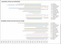
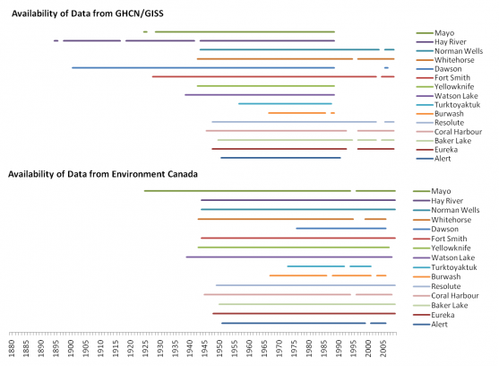
One of the reasons for choosing the stations we did in the graph above was the longevity of the record. This was something I had a look at in the Canadian Arctic too when comparing GHCN/GISS data and that of Environment Canada.
Tamino also berates Joe for not averaging/spatially weighting the data:
“He wants you to think that Arctic regional temperature was just as hot in the 1930s-1940s as it is today.”
If we want a simple comparison of the 1930s with the present we need stations that cover both time periods. In GHCN v2 for Canada, only one station (Fort Smith) has data in 2009 and also has data prior to 1943. Now Fort Smith is more than 1C warmer on average in the five years 1998-2002 than in 1938-1942, but if we look at Mayo in the Environment Canada data set, it is only 0.275C warmer in recent times when comparing averages of the two periods.
These are just two stations but such differences intrigue me. If you don’t compare like with like, how can you be sure there is no inadvertent bias? Are we comparing apples in the 1930s/40s with oranges in the 1990s and 2000s?
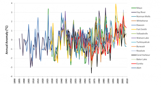
If we plot all the (GHCN/GISS) data (yes it’s another one of those ‘awful’ spaghetti graphs ;-0) - look at that big white gap under the plots from 1937-1946.
Those years look pretty warm compared to 2000-2010, but unfortunately the data for Hay River, Mayo and Dawson does not extend to recent times. To do a comparison, you need to plot GISS and Environment Canada data together, and (as I showed here) there is a bit of a mismatch that needs to be overcome. In Dawson the 1940s are warmer; Hay River shows a slow continuous upward trend.
If you want to compare the two periods in Canada, unfortunately you mostly have to rely on combining stations, and methods for this are well documented (I’ll not go into detail here). What is still debated though is the magnitude of correction (if any) for urban warming.
Much as scientists are required to be objective, there is a need for subjectivity in looking at the surface temperature records. What has changed around this station? Why is one station producing a cyclical signal while another gives a near linear trend? Like I’ve said before, I’m a fan of a parallax view.
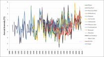
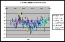
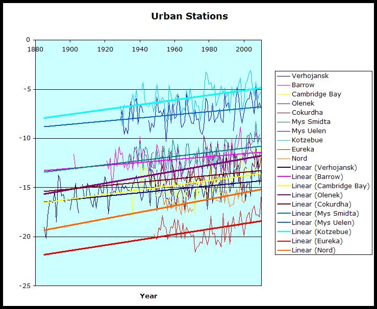
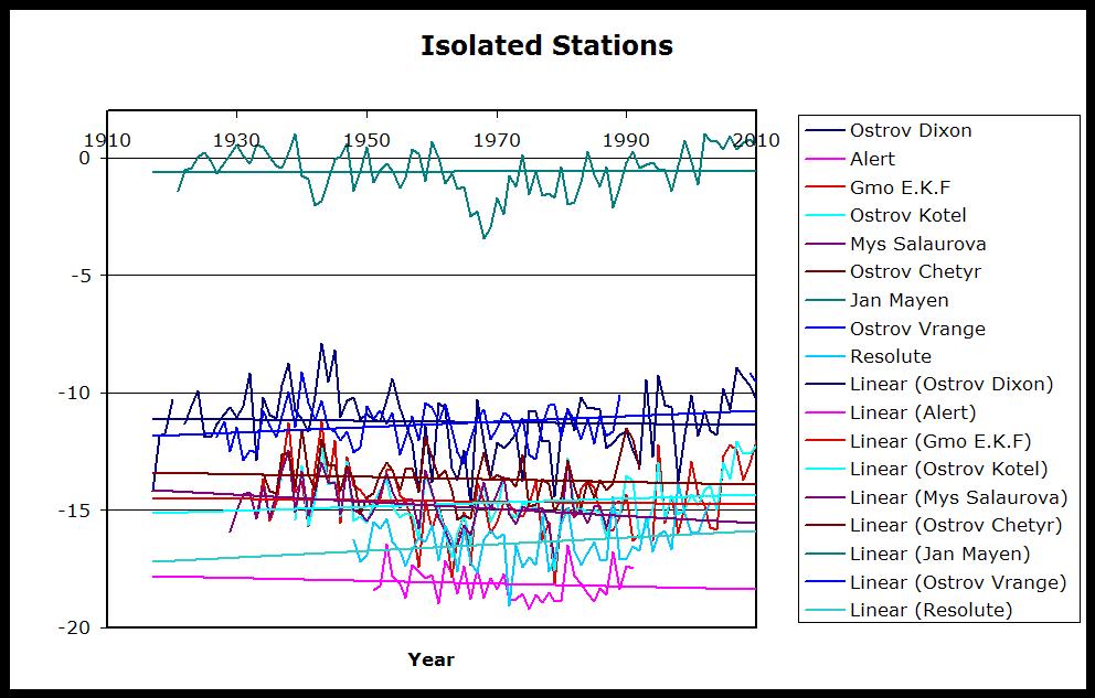
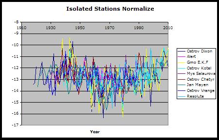
Canadian Arctic stations are mostly rural and very small settlements; they’re labelled as <10,000 population by GISS. Analysis by Roy Spencer showed the greatest warming bias associated with population density increases at low population density. Ed Caryl in A Light in Siberia compared “isolated stations” with “urban” where there was a possible influence from human activity. He found a distinct warming trend in temperatures of “urban" stations where there was increasing evidence of manmade structures or heat sources. In contrast, he found little or no trend in ”isolated stations’. Normalising the data for the isolated stations, he too produced a ‘spaghetti’ graph, which, lo and behold, also shows up that cyclical variation. Not only that, but for a lot of these stations (go ahead - call them cherry picked if you wish), the 1940s are clearly warmer than recent times.
Enlarged
Graph from No Tricks Zone.
So it is very clear to me that, in comparing station data, we’re dealing with cherries, apples, oranges, and probably a whole fruit bowl. Banana anyone? The problem is that Tamino and others insist on mixing it all up to make a smoothie. Now that’s OK as long as you like bananas. See post here.
Icecap Note: I want to thank Verity for taking time to respond to Tamino. I am preparing my response (preliminary notes here) back to Tamino by examining more stations in the arctic and reiterating my claims and those from the NOAA NSIDC in 2007, JAMSTEC, IARC and Frances at Rutgers that the Pacific and Atlantic played a role in arctic temperatures and ice cover in multidecadal cyclical ways and evidence from Soon these cycles may be solar driven. Tamino focused on the one graph mentioned of the dozen presented in the original post is a frantic attempt to discredit natural variability which prompted Verity’s response. Steve Goddard has shown here that there are many anecdotal stories about declining ice and arctic warming during the prior warm period. More to come.
By Joseph D’Aleo, CCM, AMS Fellow
The Arctic is gaining ice at the fastest rate on record for early September, while the press reports the exact opposite.
The arctic ice bottomed out at a level 6.4% higher than the 2007 record and starting a rapid rise weeks before any year in the last decade. But the media and the national centers in the spotlight because of the arctic spin a different yarn.
Walruses spend 2/3rds of their time in water and like the polar bear the talk of their demise will likely be proven wrong. Gore’s ‘endangered’ polar bear populations are at record highs.Mark Serreze of the National Snow and Ice Data Center says the Arctic could be ice-free in the summer by about 2030, though that is hard to predict; other scientists say it could be mid-century before that dramatic point is reached. The article continues Why does this matter? Ice that’s floating on the sea surface doesn’t raise the sea level when it melts. But researchers suspect it will alter the weather that reaches us far to the south. It’s already affecting Arctic wildlife.
Thousands of walruses that usually float around on sea ice and dive down to feed on the ocean floor abandoned those floes when the only ice left off the coast of Alaska was over water that was too deep.
Here is the 2011 ice plot versus 2007.
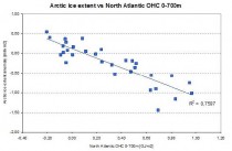
The temperatures in the arctic have indeed risen in recent years and ice has declined, bottoming out in 2007 but it is not unprecedented nor unexpected. The arctic temperatures and arctic ice extent varies in a very predictable 60-70 year cycle that relates to ocean cycles which are likely driven by solar changes. It has nothing to do with CO2, showing poor correlation and since cold open arctic ice is a significant sink for atmospheric CO2 just as warm tropical waters are the primary source.
In 2007, NASA scientists reported that after years of research, their team had assembled data showing that normal, decade-long changes in Arctic Ocean currents driven by a circulation known as the Arctic Oscillation was largely responsible for the major Arctic climate shifts observed over the past several years. These periodic reversals in the ocean currents move warmer and cooler water around to new places, greatly affecting the climate. The AO was at a record low level last winter explaining the record cold and snow in middle latitudes. A strongly negative AO pushes the coldest air well south while temperatures in the polar regions are warmer than normal under blocking high pressure. See post here.
We agree. And indeed both oceans play a role. In the record-setting (since satellite monitoring began in 1979) summer melt season of 2007, NSIDC itself before funding opportunist Serreze took over editorial control, noted the importance of both oceans in the arctic ice.
“One prominent researcher, Igor Polyakov at the University of Fairbanks, Alaska, points out that pulses of unusually warm water have been entering the Arctic Ocean from the Atlantic, which several years later are seen in the ocean north of Siberia. These pulses of water are helping to heat the upper Arctic Ocean, contributing to summer ice melt and helping to reduce winter ice growth.
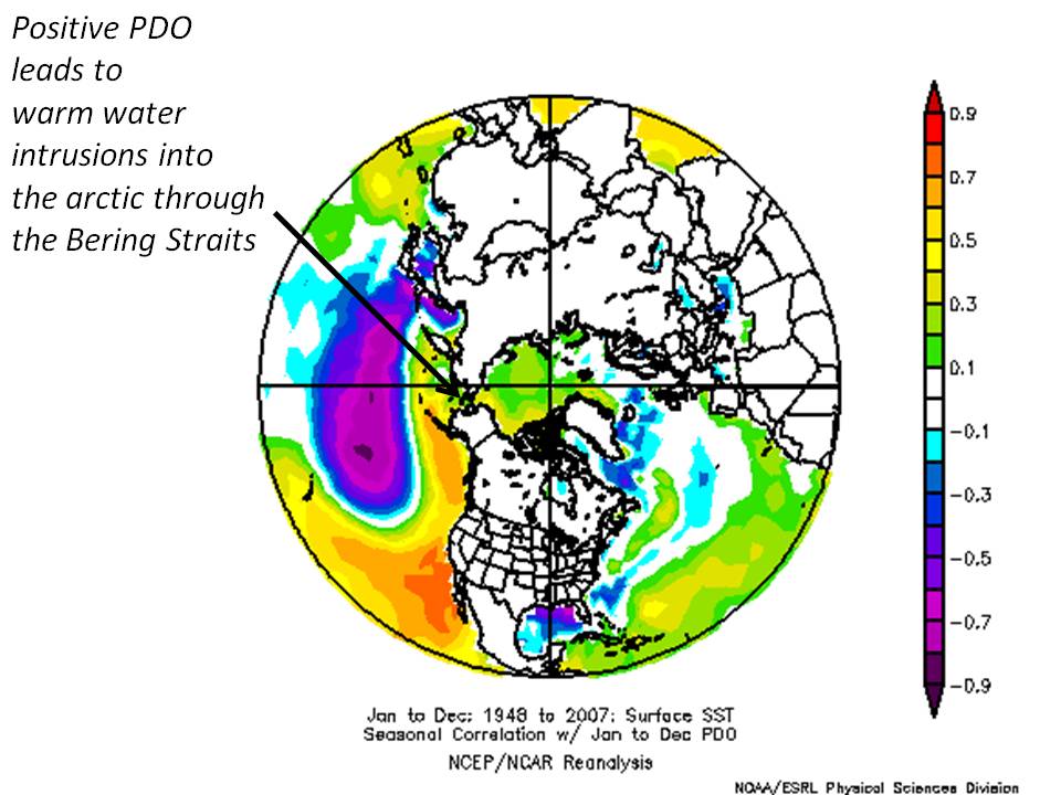
Another scientist, Koji Shimada of the Japan Agency for Marine-Earth Science and Technology, reports evidence of changes in ocean circulation in the Pacific side of the Arctic Ocean. Through a complex interaction with declining sea ice, warm water entering the Arctic Ocean through Bering Strait in summer is being shunted from the Alaskan coast into the Arctic Ocean, where it fosters further ice loss. Many questions still remain to be answered, but these changes in ocean circulation may be important keys for understanding the observed loss of Arctic sea ice.”
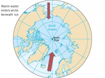
Enlarged here.
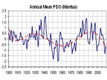
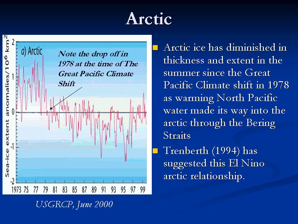
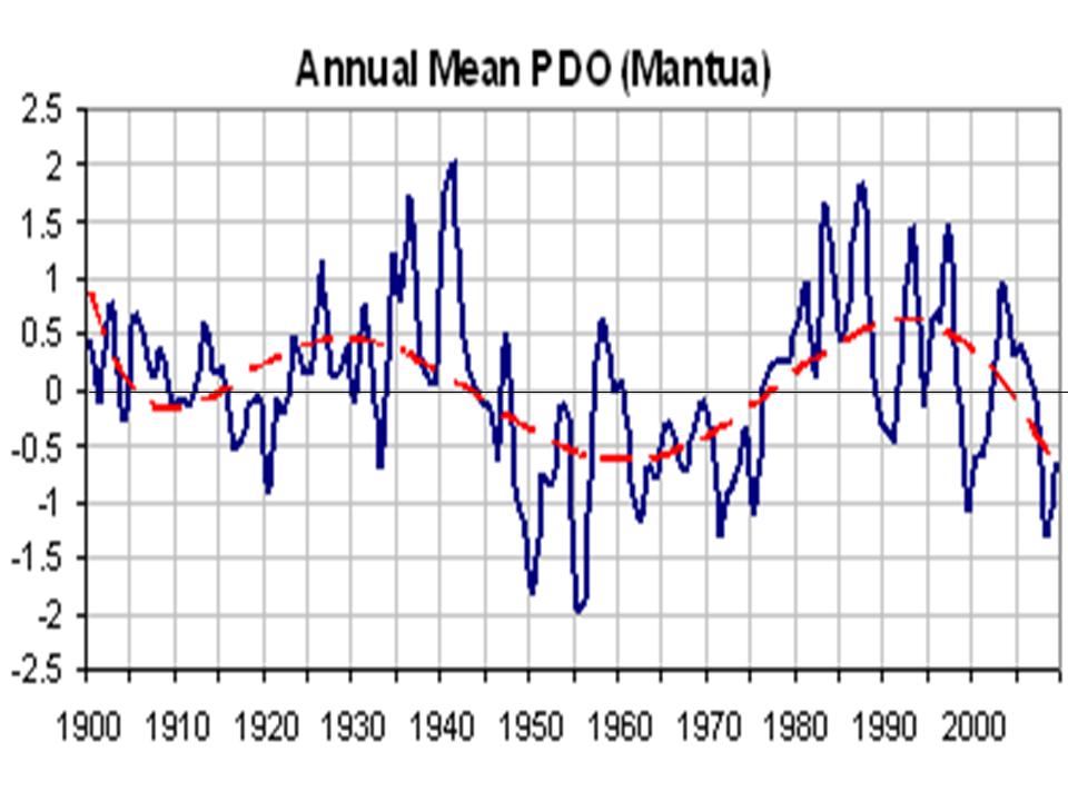
The Pacific warm mode favors more El Ninos and warmer water in the far northern Pacific including the Bering Straits. The PDO flipped into its warm mode in 1978 and the arctic temperatures began to warm and ice began to melt.

Enlarged here.

Enlarged here.
Enlarged here.
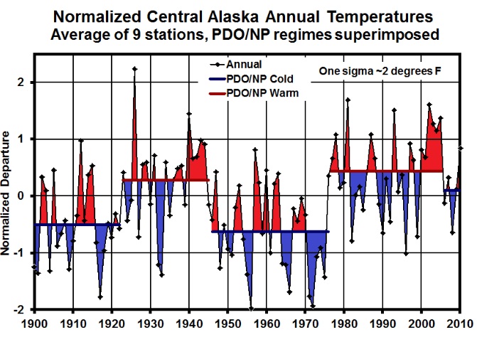
Notice how the temperatures in Alaska go through step changes tied to the PDO (Keen).
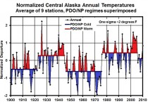
Enlarged here.
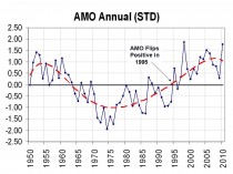
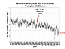
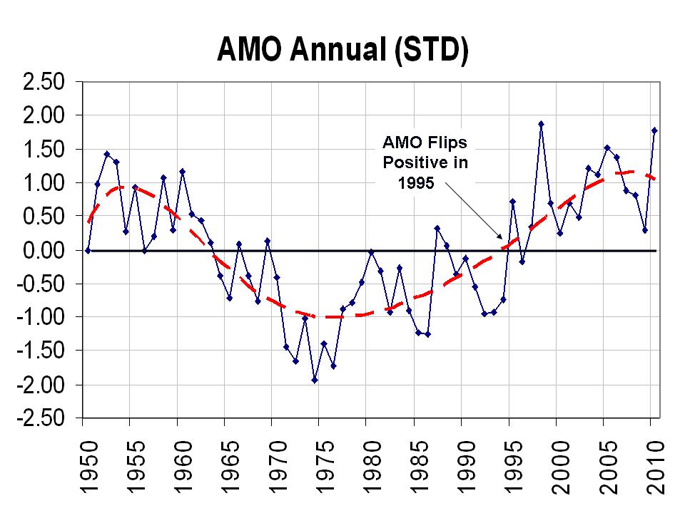
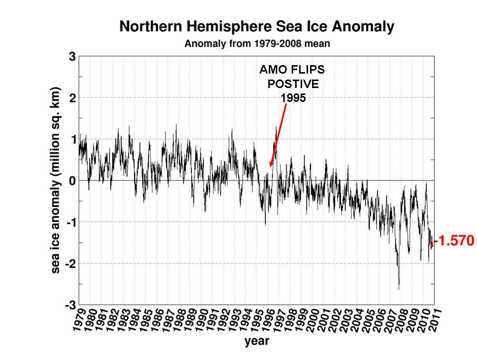
The Atlantic also cycles on a 60-70 year period. The Atlantic Multidecadal Oscillation or AMO returned to the positive warm mode in 1995.
Enlarged here.
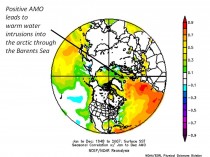
Frances et al. (GRL 2007) showed how the warming in the arctic and the melting ice was related to warm water (+3C) in the Barents Sea moving slowly into the Siberian arctic and melting the ice. She also noted the positive feedback of changed “albedo” due to open water then further enhances the warming.
Enlarged here.
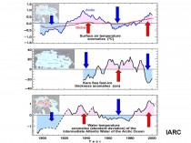
The International Arctic Research Center at the University of Alaska, Fairbanks showed how arctic temperatures have cycled with intrusions of Atlantic water - cold and warm.
Enlarged here.
The correlation was also confirmed by Juraj Vanovcan.
Enlarged here.
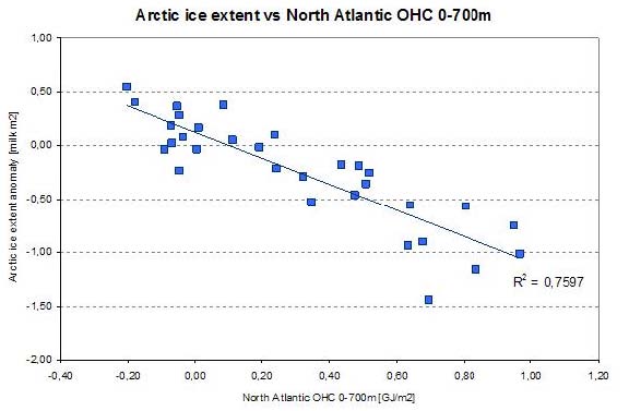
See how quickly the arctic ice reacts to warming of the Atlantic sea surface temperatures in 1995 (source Cryosphere Today). This marked a second leg down. We have seen large swings after the big dip in 2007 following a peak in Atlantic warmth in 2004-2005.
Enlarged here.
Although the PDO and AMO are measured differently, both reflect a tri-pole of ocean temperatures. Both have warm north and tropics and cool relative to normal in between in the positive phase and cold north and tropics and warm in between in the negative phase. By normalizing the two data sets and then adding the two, you get a measure of net warmth or cooling potential for both global and arctic temperatures. See how well the sum tracks with the arctic temperatures. Though we don’t have measurements of ice extent, there are many stories and anecdotal evidence that arctic ice was in a major decline from the 1920s to 1940s.

Enlarged here.
At the edge of the arctic Greenland behaves in the same way - with warming and cooling tied to the AMO.

Enlarged here.
Dr. Willie Soon has shown how the arctic temperatures match the solar Total Solar Irradiance (Hoyt/Schatten/Willson) well. Correlation is poor with CO2.
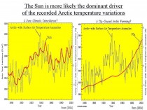
Enlarged here.
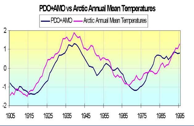
We see here how the annual TSI and annual PDO+AMO track together with arctic temperatures.

Enlarged here.
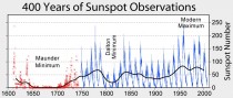
Though the current spike in the Atlantic temperatures and more high latitude blocking may cause another spike of melting in the next few winters as warm water from the AMO pop the last year works its way into the arctic, longer term you can expect arctic temperatures to decline and ice to rebound as the Pacific stays cold and the Atlantic cools and the sun stays in its 213 year Eddy minimum.
That doesn’t preclude some very cold and snowy winters short term. In 2008 glaciologist Bruce Molnia reported a bitterly cold Alaskan summer of 2008 following a La Nina winter with extreme cold and heavy snows resulted in area glaciers to expand, rather than shrink for the FIRST TIME IN RECORDED HISTORY. Summer temperatures, which were some 3 degrees below average, allowed record levels of winter snow to remain much longer, leading to the increase in glacial mass for the first time in at least 250 years.
See PDF here. See Verity Jones recent post on the arctic data here.
Enlarged here.
See more on glaciers and icecaps here.
See post by Arnd Bernaerts on Verity Jones’ Digging in the Clay here with much more on the arctic. See also here how the decade is already up for the arctic ice disappearing here. See this post by Steve Goddard on Greenland glaciers and sea level.
Summer Snow Falls on Mauna Kea after Al Gore’s “24-Hours of Reality” broadcasts from HawaiiBy Andrew Walden, Hawaii Free Press
Al Gore treated the globe to “24 Hours of Reality” Wednesday and Thursday, but before the finale, Mother Nature stepped in with a show of her own.
As Hour Six opened from the Hilo, Hawaii offices of the Mauna Loa CO2 observatory, Hawaii Lieutenant Governor Brian Schatz warned ominously that Hawaii is “particularly vulnerable to the impacts of climate change.”
Schatz mentioned, “rising sea levels, impacts to marine and costal eco-systems, and impacts to our fresh water supply from encroachment of sea water into our aquifers.”
The Lieutenant Governor didn’t mention “summer snow”, but that is exactly what Hawaii received. By sunrise, the crown of Mauna Kea--clearly visible across the saddle from the CO2 observatory on Mauna Loa--was dusted with about an inch of the white stuff.
Time-lapse video taken in the tropical moonlight shows snowfall at the Mauna Kea Astronomical Observatories beginning about 3AM Thursday morning - Hour 14 of the Gore “Reality Show.”
Hawaii’s mountain peaks also received several inches of unusual June snow.
This image shows June 5, 2012 Mauna Kea snowcap visible on upper right from the CO2 observatory on Mauna Loa.
“Reality” presenters included Maxine Burkett, an Associate Professor of Law and Director of the Center for Island Climate Adaptation and Policy at the University of Hawaii. Questioned about Hawaii snow, Burkett had a ready explanation: BIVN reports Burkett “said that warmer air holds more moisture. We can expect to see more rains - and greater drought - if trends continue. And Burkett says that without immediate action, trends will continue.”
If this year’s trends continue, Hawaii will soon have snow during July and August.
On May 21, 2007, the late Augie Auer, Chief of the Meteorological Service of New Zealand, said of Global Warming: “We’re all going to survive this. It’s all going to be a joke in five years.”
His prediction has come true eight months early.
By Meteorologist Art Horn
The 24 hour global warming marathon is called “reality.” The irony is that Al Gore does not understand reality and in truth, departed the world of reality a long time ago. The real world reality is that the weather has always been extreme at times and more quiescent at other times. Those living on earth in the real world have known this because they has studied weather history.
Large natural variability has always existed in the weather. Gore looks at extreme weather across the world, caused by the second strongest La Nina in the last 100 years and thinks it’s caused by the small one degree Fahrenheit temperature rise of the last 150 years. He ignores the real “reality” of the temperature record because it is inconvenient. Since 1900 there have been two periods of warming. One from 1910 to 1945 and another from 1977 to 1998. After the end of World War Two the global average temperature fell slightly until 1976, three decades of temperature decline despite rapidly increaseing carbon dioxide in the air. The temperature then increased from 1977 until 1998. Since the turn of the millennium the temperature trend has been flat, no increase. He talks about the massive amounts of carbon dioxide belched in the air but ignores that fact that since 1998 twenty five percent of all carbon dioxide emissions have be released yet there has been no temperature increase during this time, very inconvenient.
He has no sense of weather history, therefore everything that happens in the weather is new and dramatic to him. Polls show that people are questioning the “reality” of man made global warming. This has infuriated Gore as evidenced by his recent profanity laced public tirade this past summer. As his desperation grows so do his outlandish claims. There is no more natural varibility to the weather, it is all caused by man made global warming, according to Gore. When someone is drowning they yell louder and louder for help.
How would Al Gore respond to the winter heat wave of 1249 in England. That “winter [in England] there was so pleasant, sweet and warm, that people fancied the season was changed. There was no frost or snow the whole winter. Folks threw off their cloaks and went in the thinnest lightest summer dress.” That’s right, 762 years ago the winter in England was so warm that there virtually was no winter at all! If this happened again this year Gore would proclaim that this was irrefutable proof of man made global warming. All it would really prove is that Gore is desparate to reign supreme as the god of global warming wisdom. He needs to be adored by millions of believers who will cling to his every word. He lost his bid to be president of the most powerful nation in the world. Sitting high on his throne as the king of global warming awarness, saving us all from certain doom would be a sutable replacement for his planet sized ego.
And for the Green jobs agenda pushed so hard by Gore and Obama green squad, see Jon Stewart on Solyndra:
See also Greens Give Gore 2 Thumbs Down: Gore’s climate ‘reality’ show faces strongly negative reviews from his fellow global warming activists by Climate Depot that compiles global feedback to Gore’s fisaco.
I09, Nature Geosciences
When humans migrated to the Americas roughly 13 thousand years ago, they hunted megafauna like mammoths to extinction. The result? Scientists say that without giant animal farts, there was a massive depletion in atmospheric methane, possibly causing an ice age.

Over the weekend, a group of researchers published in Nature Geoscience the results of a study on climate change during the millennia after humans came to the New World, in the late Pleistocene about 13,000 years ago. When humans arrived in what later became the Americas, they hunted the giant woolly mammoths and mastodons to extinction - by 11,500 years ago, 80 percent of the mammoths and mastodons were gone. And that was roughly around the same time that the mini ice age called the Younger Dryas hit. Temperatures dropped an estimated 9-12 degrees C.
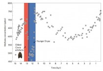
Above (enlarged at source here), you can see a rough timeline of of these events, with the Y axis representing methane concentrations in the air, and the X axis showing thousands of years before the present. As you can see, human settlements (associated with the “Clovis artefacts,” or tools) came before the extinction event, which precipitated the ice age.
After examining ice cores that contain atmospheric particulates from these eras, researchers discovered a precipitous decline in methane before the ice age, which they estimate might be entirely caused by the extinction of the megafauna. These creatures’ digestive cycles, like that of cows today, was pumping a lot of methane into the atmosphere. In fact, these megafauna were probably responsible for creating roughly 20% of atmospheric methane.
What this means is that humans have been affecting climate change for millennia. But it also suggests a grisly solution to our current climate change problems. If we killed off cows the way our ancestors killed off megafauna, could we counteract global warming?
See also James Delingpole’s 24 hours of ManBearPig on Al Gore’s assault on science and sensibility.
Play Methane Madness: put a cork in Gore’s climate day: ‘CFACT’s new game trains online players to help ‘Pal Gore’ control the climate by corking cows and watching them float away’ here.
Gore’s theme song:
By Anthony Watts
While there’s news of ocean heat content in the Atlantic being pumped up by “leakage” from the Indian Ocean, and NOAA proclaims that La Nina is back, Bob Tisdale finds that the global ocean heat content trend since the turn of the 21st century is flat. Worse than that, it widely diverges from climate models predicting a continued rise in OHC.
2nd Quarter 2011 NODC Global OHC Anomalies
by Bob Tisdale
The NODC updated its Ocean Heat Content Anomaly data to include the 2nd quarter 2011 data. (And they also updated their Thermosteric Sea Level Anomaly data, which is not discussed in this post) I will provide a more detailed discussion as soon as the KNMI Climate Explorer is updated with the 2ndquarter 2011 Ocean Heat Content data, which should be later this month.
THE GRAPHS
Figure 1 is a time-series graph of the NODC Global Ocean Heat Content Anomalies from the start of the dataset (1st Quarter of 1955) to present (2nd Quarter of 2011). The quarterly data for the world oceans is available through the NODC in spreadsheet (.csv ) form (Right Click and Save As: Global OHC Data). While there was a significant increase in Global Ocean Heat Content over the term of the data, Global Ocean Heat Content has flattened in recent years.
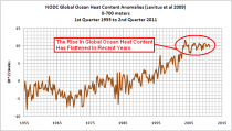
Figure 1 (enlarged)
And as many are aware, Climate Model Projections of Ocean Heat Content anomalies did not anticipate this flattening. Figure 2 compares the ARGO-era (2003 to present) NODC Global Ocean Heat Content anomalies to the GISS Model-E Projection of 0.7*10^22 Joules per year. The linear trend of the observations is approximately 7% of the trend projected by the model mean of the GISS Model-E.
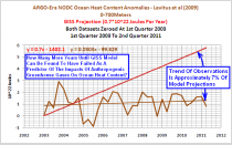
Figure 2 (enlarged)
The source of the 0.7*10^22 Joules per year GISS Model-E ensemble-mean trend was illustrated, clarified, and questioned in the post GISS OHC Model Trends: One Question Answered, Another Uncovered.
HOW MANY MORE YEARS UNTIL GISS MODEL-E CAN BE FOUND TO HAVE FAILED AS A PREDICTOR OF THE IMPACTS OF ANTHROPOGENIC GREENHOUSE GASES ON OCEAN HEAT CONTENT?
I asked the above question in Figure 2. It’s a rewording of the question asked by Roger Pielke Sr., in his post 2011 Update Of The Comparison Of Upper Ocean Heat Content Changes With The GISS Model Predictions. There he notes:
Joules resulting from a positive radiative imbalance must continue to be accumulated in order for global warming to occur. In the last 7 1/2 years there has been an absence of this heating. An important research question is how many more years of this lack of agreement with the GISS model (and other model) predictions must occur before there is wide recognition that the IPCC models have failed as skillful predictions of the effect of the radiative forcing of anthropogenic inputs of greenhouse gases and aerosols.
As far as I’m concerned, they have already failed for numerous reasons. I have illustrated and discussed in past posts how:
1. ENSO is responsible for much of the rise in Ocean Heat Content for many of the ocean basins,
2. A change in sea level pressure is likely the cause of the upward shift in North Pacific Ocean Heat content during the late 1980s,
3. And ENSO, changes in Sea Level Pressure, and the AMO/AMOC are major contributors to the rise in North Atlantic Ocean Heat Content.
And as far as I know, these are natural contributors to the rise that are overlooked by the GISS Model-E. This was further illustrated and discussed in Why Are OHC Observations (0-700m) Diverging From GISS Projections?
NOTES ABOUT THE ARGO-ERA GRAPH
There will be those who will attempt to dismiss the divergence between model projection and observations shown in Figure 2. Tamino tried to downplay the divergence in his post Favorite Denier Tricks, or How to Hide the Incline. I responded to Tamino with my post On Tamino’s Post “Favorite Denier Tricks Or How To Hide The Incline”. And there may be those who believe 2004 is a more appropriate year to use as the start of the ARGO-era OHC data, so for them, I illustrated how little difference it makes whether the ARGO-era starts in 2003 or 2004 in the post ARGO-Era Start Year: 2003 vs 2004. Note that there are two GISS Model-E projections illustrated in the sole graph in the post ARGO-Era Start Year: 2003 vs 2004. The one at 0.98*10^22 Joules per year, identified as Hansen/Pielke Sr., was found to be in error. This was discussed in the post GISS OHC Model Trends: One Question Answered, Another Uncovered.And of course, there is the fact that natural variables, which are not accounted for by the GISS Model-E, are major contributors to rise in Ocean Heat Content, as discussed in the four posts linked in the previous section.
DATASET INTRODUCTION
The NODC OHC dataset is based on the Levitus et al (2009) paper “Global ocean heat content(1955-2008) in light of recent instrumentation problems”, Geophysical Research Letters. Refer to Manuscript. It was revised in 2010 as noted in the October 18, 2010 post Update And Changes To NODC Ocean Heat Content Data. As described in the NODCs explanation of ocean heat content (OHC) data changes, the changes result from “data additions and data quality control,” from a switch in base climatology, and from revised Expendable Bathythermograph (XBT) bias calculations.
See full post with many hyperlinks here.