|
Jan 17, 2008
Gore Scientific “Adviser” Says That He Has No “Responsibility” for An Inconvenient Truth Errors
By Steve McIntyre, Climate Audit
In earlier posts, we observed that Al Gore’s An Inconvenient Truth claimed that “Dr Thompson’s thermometer” confirmed Michael Mann’s hockey stick, but, when analysed, what Gore described as “Dr Thompson’s thermometer” merely proved to be Michael Mann’s hockey stick mis-identified. No wonder it resembled Mann’s hockey stick - or, to use the phrase more common in climate science, no wonder there was a “remarkable” resemblance.
Hu McCulloch of Ohio State University now writes about a recent encounter with Lonnie Thompson, the serial ice core non-archiver: On January 11, Lonnie Thompson gave a talk on Climate change at Ohio State. After his talk, I asked him if the graph identified by Al Gore as “Dr. Thompson’s Thermometer” in his book and film was really based on his ice core research.
Thompson admitted that an error had been made, and even had a slide ready that showed the data of the Mann Hockey Stick plus Jones instrumental data that Gore’s figure was based on, alongside an average of dO18 z-scores from 6 of his Andean and Himalayan ice cores, similar to the 7-series graph that appeared in his 2006 PNAS article. He stated that he recognized the error right away, and even sent Gore (and Mann, as I recall) an e-mail pointing out the mistake.
When I pressed him if it wouldn’t be appropriate to make a more public announcement, given the high-profile nature of the error, Ellen Mosley-Thompson, his wife and co-author, stood up and offered that it was Gore’s error, not theirs, so that they had no responsibility for it, and that in any event there was no forum in which to make a correction. Thompson’s online CV says that he was on the “Science Advisory Board” for Inconvenient Truth prior to its release in April 2006. So he was on the Board but he didn’t bear any responsibility. Sure, Lonnie. Sure, Ellen.
Gore used the term “my friend Lonnie Thompson” and Thompson doesn’t know how to correct the error. Sure, Lonnie. “No responsibility.” “No forum”. No shame.
Read full blog and comments here.
Jan 17, 2008
What Can We Learn about Global Warming from Poor Reporting?
William M. Briggs, Climate Statistician
From today’s Syndney Morning Herald comes the headline: “Global warming to impact health”. First, by impact the reporter almost certainly means influence, a more accurate, but far less energetic and “actionable”, word. But never mind that. Our lesson instead comes from the story, one of a breed which appears almost daily in some major newspaper somewhere in the world. But before we can get to it, you first have to learn, if you do not already know it, the definition of tautology. A tautology is a statement which is always true; that is, no matter what happens in the word, no matter what conditions eventually hold, a tautology will be true. Some examples: “Either it will rain tomorrow or it won’t” and “Marxism is a stupid theory or it is not.”
Here, from the article we are studying, is the lead sentence; it is a tautological fragment, “Rises in temperature produced by global warming could result in an increase in the number of people being admitted to hospital with kidney disease, heart disease and mental illness in Australian cities.” To make this into a grammatically correct tautology we need only add the implied clause “or the rise in temperature will not result in an increase, etc., etc.” So the reporter has written something which is true, which will always be true, and will be true regardless whether mankind influences the climate or not. But he has written his tautology in such a way to show where his sympathies lie, much as I did in my second example. In any case, we have no grounds for criticizing the reporter on the grounds of accuracy. All such attempts, which I have seen from the skeptical community, are doomed to failure.
We now have to look at the “study” on which the reporter did his article. This will require some work from us, but it is exceedingly important that you understand this study, because it is entirely typical of academic work in this area. You will see more of its kind, and with increasing frequency, so it is imperative that you learn to recognize it and ascertain how to properly criticize it. Read more here.
Dr. William M. Briggs specializes in the statistics of forecast evaluation, serves on the American Meteorological Society’s Probability and Statistics Committee and is an Associate Editor of Monthly Weather Review.
Jan 12, 2008
Verification of IPCC forecasts
By Craig James, WOOD-TV Blog
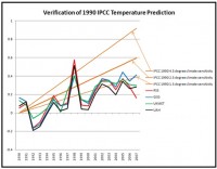
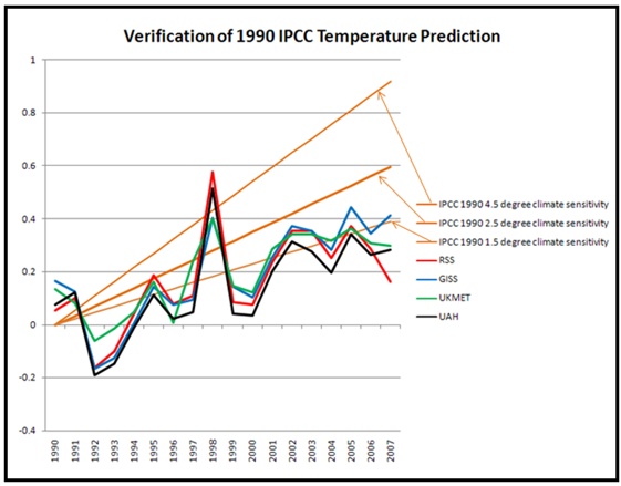
Dr. Roger Pielke Jr. (the son of Roger Pielke Sr.) is a professor of environmental studies at the University of Colorado. He has just posted, on his web site Prometheus, a comparison graph of the temperature forecasts from the IPCC vs several different calculations of the actual global temperatures going back to 1990. The three brown lines represent the forecasts of the IPCC using three different CO2 emissions scenarios. The red line are the temperatures obtained from Remote Sensing Systems (RSS satellite data). The dark blue line is from NASA and the Goddard Institute of Space Studies (GISS, this is Dr. Hansen’s data). The light blue line is from the United Kingdom Meteorological Office (UKMET) and the black line represents temperatures calculated from the University of Alabama in Huntsville (data from Drs. Christy and Spencer).
You can clearly see the effect of the strong El Nino in 1998 on the observed global temperatures. You can also see that the 2007 GISS data from Dr. Hansen is about .25 degrees Celsius warmer than the temperatures obtained from RSS. The UKMET and UAH numbers represent a good compromise and are very similar for 2007. Only Dr. Hansen’s data is still within the IPCC forecast range (he readily admits his data is the warmest because of the way he calculates warming in the Arctic). The other results are all COOLER than even the most conservative IPCC forecast.
See full size image here.
I have stated many times that the computer models are over forecasting warming and this is at least preliminary proof. The model errors are because of too many positive feedbacks, especially with water vapor. If the over forecasting trend continues for a few more years, even the most ardent alarmists will have to tone down their rhetoric. My congratulations to Dr. Pielke Jr. for posting this graph. Any bets on whether we’ll see this on the evening news?
Jan 11, 2008
21 Iranians Killed in 3-Day Snowstorm, and Snow falls for First Time in 100 years in Baghdad
The Guardian
The heaviest snowfall in more than a decade has left at least 21 people dead in Iran - some buried under avalanches, some frozen to death and others killed in traffic accidents, state media reported Monday. As much as 22 inches of snow has fallen in areas of northern and central Iran since Saturday, said meteorologist Ali Abedini. The storm has forced schools and government offices to close, blocking major roads and leading to the cancellation of all domestic and international flights.
At least 21 people have been killed and 88 others injured ... as a result of heavy snow, state-run radio reported. Some died of the severe cold, some were buried under avalanches and others died after their cars overturned on snow-covered roads. The cold weather has caused problems for residents in western Iran, with about a dozen towns suffering from gas cuts due to a surge in demand and a cut in gas exports from Turkmenistan. See photos here.
UPDATE: The first snow in 100 years fell on Baghdad, Iraq today Friday, January 11, 3008.
UPDATE: The cold reached into Saudi Arabia. and snow fell in the northern areas is what is called the coldest winter in 20 years. Meanwhile freezing weather killed over 100 in Afghanistan.
Jan 10, 2008
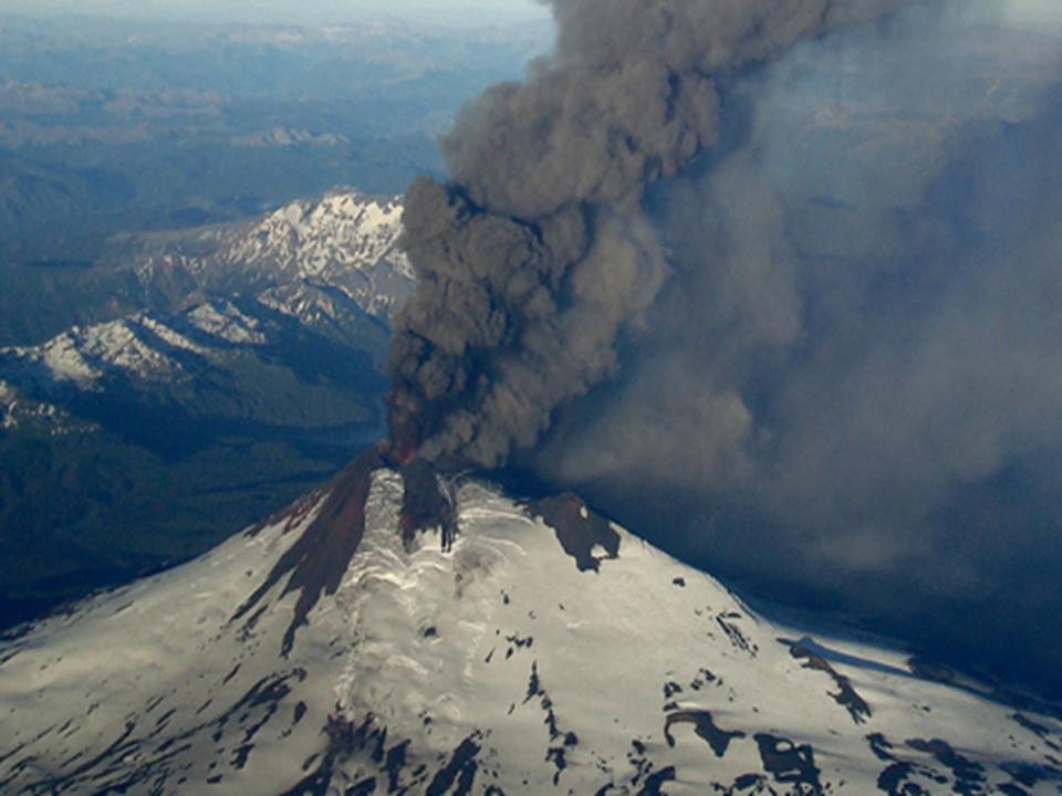
A Closer Look at Volcanic Activity
By Eugenio Hackbart, METSUL Meteorologia
There is not doubt the lack of volcanic activity played a major role in the warming trend of the last decade. ICECAP’s Joseph D’Aleo explained in a recent article how volcanoes contributed to multidecadal temperature variability since the 19th century.
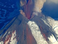
Therefore, we should pay a closer attention to volcanic activity around the world. In the first day of 2008 the Llaima volcano in southern Chile erupted (photo below from El Mercurio newspaper), sending up a huge plume of smoke and coating the surrounding wilderness park with ash. (Note the Smithsonian USGS Weekly Volcano Summary indicated ash reached a height of 41,000 feet). An ash cloud moved to the Province of Nequen im Argentina. The volcano is in the Araucania region in southern Chile, inside Conguillio National Park and about 50 miles from the city of Temuco. In recent days, activity at the Llaima Mountain subsided.

See full size image here
This Saturday (01/05) the huge Popocatepetl volcano, 40 miles south of Mexico City, expelled a 5 mile high cloud of smoke (water vapor and ashes), the highest in several years. Authorities do not expect any imminent eruption, but warning levels were raised. As RSS MSU and UAH MSU data indicate a cooling trend in the planet without any major volcanic eruption, can you imagine the effects of a Pinatubo event nowadays ?
See full size image here
Icecap Note: Thanks Eugenio for these startling images and keeping us up to date on this activity. Though these were ‘moderate’ events that are unlikely to have long lasting or major effects, we need as Eugenio stated to be vigilant to global volcanism and any strong eruption like Pinatubo and El Chichon that injected aerosols into the stable stratosphere 80,000-100,000 feet and more high and had global cooling effects that lasted 3 years or so.
|
|
|
|

