

By Alan Caruba
Lisa Jackson, Obama’s EPA director, has just announced the agency’s new auto regulations of gas mileage based on global warming. In addition, the agency asserts the right to regulate carbon dioxide (CO2) emissions under the Clean Air Act. There is absolutely no scientific justification for this and, indeed, many observers believe the EPA lacks the legal authority regarding its stance on CO2.
There is NO need to limit greenhouse gas emissions because there is NO “global warming.” Greenhouse gases are purported to be the primary cause of this fraud. The EPA, like a dozen other U.S. agencies, has been pushing the global warming fraud for decades. One more lie, even a whopper about CO2, is of little concern to the EPA at this point. Beyond the issue of scientific fraud, there are the scientific facts that demonstrate that CO2 plays a miniscule role, if any, as regards the Earth’s climate. Carbon dioxide is less than one percent of the Earth’s atmosphere (386 parts per million).
There is, in fact, no greenhouse effect. The most active element of the atmosphere is the 95% of water vapor that forms a protective layer around the Earth. The science involved is fairly simple. Clouds have a warming effect because, in order for water vapor to condense back into water droplets, the water molecules must first re-emit the energy they absorbed to become vapor. That latent heat causes the local environment to feel warmer. It is this constant interchange that determines whether wherever you’re at right now is warmer or cooler.

The public is rarely, if ever, told that meteorologists have NO idea why clouds act as they do. All they can do is track cloud activity via satellite images, but they can only accurately predict the weather at best for three to four days ahead. This is why, when you watch a televised weather forecast, they mostly just point to cloud systems.
The Earth’s oceans contain fifty times the CO2 in the Earth’s atmosphere. The Earth’s biomass, oceans, near-surface rocks and soils contain 100,000 times the carbon in the atmosphere.
To declare CO2 toxic, the EPA is saying that all that natural CO2, plus the six pounds of carbon dioxide that every human exhale every day is a “pollutant.”
How can carbon dioxide be a pollutant when all life on Earth is dependent upon it? CO2 is to vegetation what oxygen is to human and other animal life. Without CO2, all vegetation dies and then all animal life dies for lack of the nutrients provided by food crops.
The EPA will blame the generation of CO2 on energy use, but 97% of the Earth’s CO2 is produced by Nature! Only about 3% of all the CO2 in the atmosphere is produced by humans via industrial and transport activity. This estimate, in fact, comes from the UN Intergovernmental Panel on Climate Change! The IPCC’s other alleged climate data is subject to serious challenge, but this is not. It falls into the category of common knowledge among climate scientists.
Environmentalists are insanely opposed to all energy use with the exception of bicycles, canoes, and walking. They particularly hate automobiles, but these are the same people, along with the EPA, that have insisted on the inclusion of ethanol, otherwise known as moonshine, in every gallon of gasoline. The immediate result is less mileage per gallon and the production of more CO2!
None of these facts is a secret yet, since 1989, the U.S. government has spent $79 billion in taxpayer’s money on “climate change” research. To suggest that the government, using the data generated, has any “control” over the climate is absurd.
The result of all that government funded research has been a public that has been subjected to the massive fraud called global warming. Weather data provided by NASA and NOAA, for example, has had to have been withdrawn due to errors.
Not only has the scientific community learned that the IPCC data was manipulated and that efforts were made to suppress data refuting global warming, but the Earth has irrefutably been in a cooling cycle for over a decade at this point.
The EPA regulatory control of auto mileage and CO2 emissions is a complete fraud and a contemptible lie. In doing so it has become a gangster agency that has abandoned any credibility.
Finally, the Cap-and-Trade Act awaiting a vote in the Senate is based on the global warming fraud and, if enacted, would impose massive taxation on all energy use. It must be stopped. The EPA’s latest move must be stopped. The fate of the nation’s economy literally depends on this. Read Alan’s blog here.
VJones, Digging in the Clay
“Only he that has travelled the road knows where the holes are deep” (Chinese Proverb)
And so it is with climate data for China, for which there is only word - ‘interesting’...but I leave that to you to judge.
China is of similar size to the US - 9,600,000 sq. kilometers (3,700,000 sq. miles) and has 417 stations reporting climate data, of which (as of January 2009) 414 made it through into the GIStemp set of stations contributing to their climate analysis. The longest serving stations are Bejing and Shanghai. As we know from the ”station drop-out problem”, China is one of those countries that for which there was a large addition of thermometers in the 1950s and a massive loss of them from the GHCN record in 1990. Most of the discussions of this problem, for example at Lucia’s site The Blackboard, insist there is no effect on a global scale of this loss of thermometers. Nor should there be any effect from dropping thermometers from specifically cold regions. Nonetheless I am interested to see how this change affects the raw data.
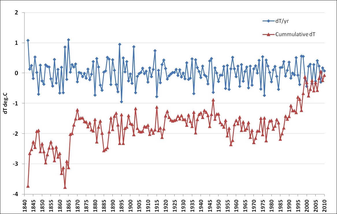
Figure 1. China - cumulative change of temperature (dT) and change per year (dT/yr) (enlarged here)
E.M. Smith kindly sent me his dT analysis of data from China (this is a version of First Differences). Figure 1 shows my plot of his data, and it is interesting to note that it is fairly flat. In fact of you plot a linear regression of the dT data between 1880 and 1990 the trend is just 0.09 deg.C per century. However, global warming really takes off in China in the 1990s. What a hockey stick!
I’ve been mainly concerned with trend data - i.e. using tables of the trend produced by a linear regression of individual station data. I’ve analysed data from the GISS combined/adjusted data set - i.e. that which has already gone though the GIStemp adjustment process that corrects for UHI effects etc. and therefore will actually contribute to the GIStemp output data; here I’ve only divided it by whether individual stations have an overall warming or cooling trend across the station data history.
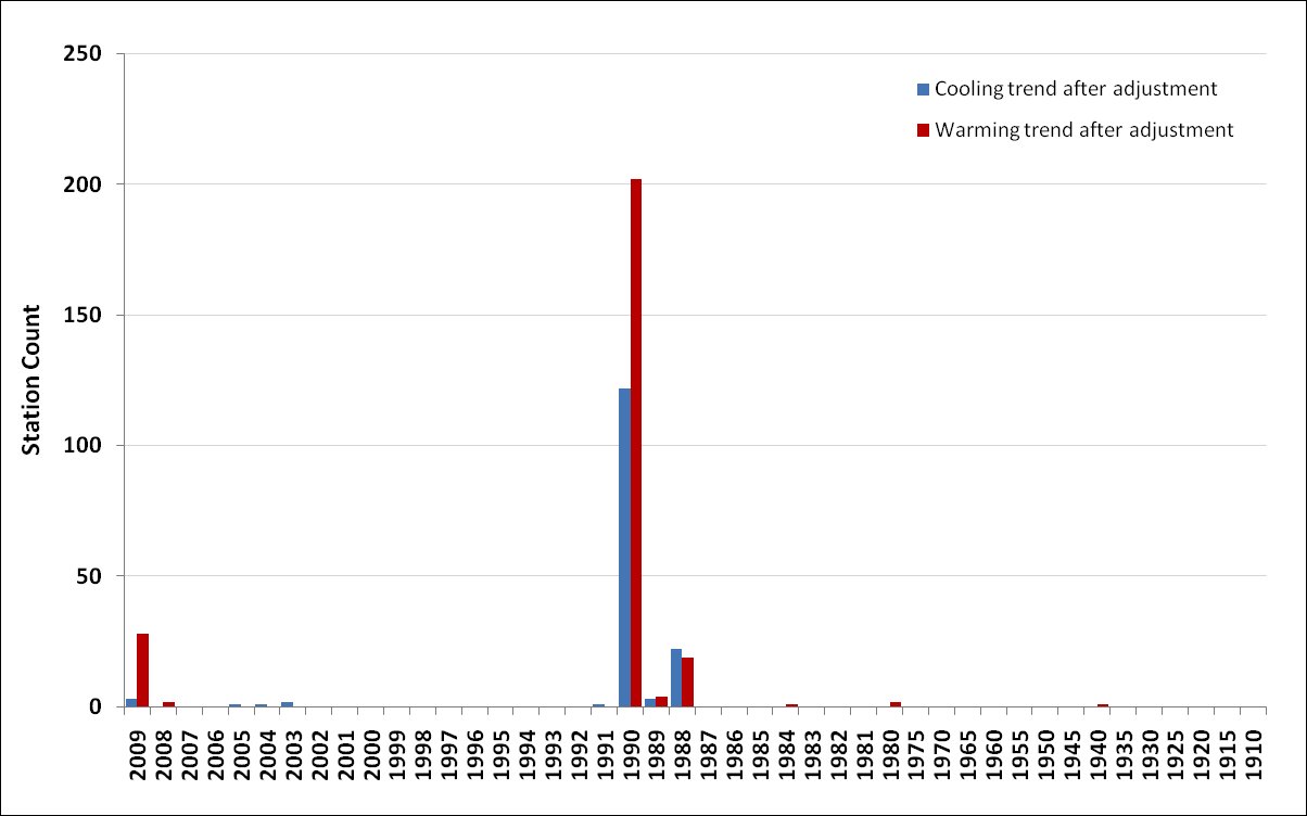
Figure 2. Counts of stations plotted again the year when the station ceased providing data in the GHCN v2.mean file (enlarged here).
I’ve used this data to plot (Figure 2) counts of years when stations were dropped from the database and clearly the data shows a small drop-off in thermometer numbers in 1988 and a huge loss in 1990. This is where, if there is one, I would expect to see an immediate effect on temperature differences. In 2009 we are left with twenty eight stations with an overall warming trend, of which eight are rural stations, and just three with a cooling trend (only one rural - 1939-present).
I’ve also examined in the same way the year of addition of stations. In this case an immediate effect would perhaps not be apparent as I would expect it might take several years for the trends of the new stations to assert themselves over the ‘noise’ of yearly weather fluctuations.
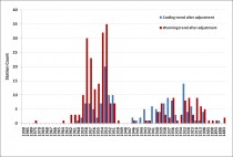
Figure 3. Counts of stations plotted again the year when the station was added to the GHCN v2.mean file (enlarged here)
In my file the data starts in 1880 and in Figure 3 you can see Beijing and Shanghai at the extreme right of the plot as the original two stations. A few additional stations are added in the late 19th century, but many stations are added after 1908 including, increasingly from 1933, ones with an overall cooling trend. From 1950, of the ones that are added, proportionately more of them have a warming trend. Could this show up in the raw data?
* A change from the addition of stations from 1908 (and perhaps from 1933)
* Change from the addition of stations in the 1950s
* Change from the loss of stations from 1988 and/or 1990
Now, before looking at this, we have to remember that an overall warming or cooling trend is just that; the world experienced cooling in the period 1940-1970 (as in Fig. 9 here), so we might expect some cooling in almost all stations in that period.
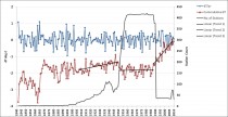
Figure 4. Trend additions to dT data from Figure 1 overlaid with the overall station count.
Linear regressions for periods are as follows:
1908-1950: y = 0.0118x - 24.2451, R^2 = 0.03141
1951-1988: y = 0.0013x - 4.3841, R^2 = 0.0032
1988-2010: y = 0.0668x - 134.24, R^2 = 0.7828
So the effect seen in Turkey in the previous post is even more in evidence here in China - major inflections in the shape of the raw data as a result of changes in station numbers and, as the analysis tentatively suggests, possibly station trend. As I said at the beginning - interesting. The question is - how does this bear though into the adjusted data (Figure 1 and 4 use unadjusted or ‘raw’ data)? And is this effect lost in the way stations are combined and anomalised in the final product? Now that we know “where the holes in the road are deep” I think it is clear where to look further. It is simple, the thermometer record in China is not stable; we need to be sure that this is not affecting the overall output and resulting in overstatement of any warming experienced by China. See more here.
By E.M. Smith, Musings from the Chiefio
This posting is a little bit different for me. First, the motivation. In looking at the GISS anomaly maps, Turkey is always roasting. There was something about that that just seemed wrong. It ought to have been a more random event; who was Hot Hot Hot and who was not.
So I took a look at the dT/dt report and and noticed that there was a clear “kink” in the data. It was running along flat, then about 1991 - 1995 it popped up and then continued running fairly flat with some rise. Odd, that ‘step function’. CO2 does not do a step function. Airports don’t do a step function. UHI does not do a step function…
(For folks new to this: dT/yr is the “sum of the changes of temperature, month now vs the same month that last had valid data, for each year”. An anomaly process similar to First Differences. Then dT is the running total of those changes, or the total change, the “Delta Temperature” to date.)

Click here to enlarge
Notice that the dT line is the “cumulative” dT/yr. Notice also that right around 1990 the dT/yr goes very small in range. The volatility just leaves it. So we see that dT is running along at a lower value, and dT/yr is dead flat for a couple of years, THEN about 1994 dT/yr pops up and dT starts a run for the moon. So what happened between 1990 and 1994?
The Great Dying Of Thermometers took out a lot of thermometers. Further, a bunch of old “modification flags” end and some new ones begin. Turkey had a fairly large number of thermometers, but that number plunges. Still, it’s a bit large for really seeing exactly what happens thermometer by thermometer. Looking at the temperature data directly, there were a lot of overlapping adds and drops.
So their is a bit of ‘feathering’ or ‘blending’ of the dropping, adding, and changing. I believe that is why when you look at the dT/yr right about 1989 - 1993 it goes to very small volatility, even though a large number of thermometers leave the record (or perhaps, because of it). Eventually we are left with a lot of new Modification Flag thermometers and very few of the older consistent record.
What is a “Modification Flag”? It is an indication that SOMETHING about that data record is different and that it needs different handling than the prior record. It could be a new thermometer at that location, or it could be a new Time Of Observation (changed procedures) or it might be simply that the thermometers and the TOBS are the same, but some “post processing” is different. A different QA method tossing out “outliers” or a different “TOBS adjustment” or just about anything. Basically, it means “Something that matters changed”. I’d say so…
Now look again at the dT/yr line. Notice anything? Run your eye along the peaks at about the 1.3 C level just above the 1 C line. Notice the consistent peaks? Now run your eye along the -1 C line. Notice the consistent peaks starting before 1970? Now run your eye along at about -0.5 C. Notice how much more area is in the down spikes before 1990 when compared with after? Something started to slightly clip the lower excursions in the ‘80s, but that 1990 change substantially eliminates them and strongly dampens or blunts any more than about -0.75 C and reduces the number significantly.
Don’t know what it was, but it happens at the same time the Mod Flags change. And we’ve seen this in Canada (as the Smith Effect at Fort Smith) and I’ve seen it in dozens of other cases around the planet. The “warmth” is from clipping of the cold spikes, and it has onset with the Mod Flag change.
Read more about Turkey and Mauritius here.
UPDATE: Also note this peer reviewed paper: Murat Turke, Utku M. Sumer, Gonul Kilic, State Meteorological Service, Department of Research, Climate Change Unit, 06120 Kalaba-Ankara, Turkey
ABSTRACT
The purpose of this study is to investigate the variations and trends in the long-term annual mean air temperatures by using graphical and statistical time-series methods. The study covers a 63-year period starting from 1930 and uses temperature records from 85 climate stations. First, spatial distributions of the annual mean temperatures and coefficients of variation are studied in order to show normal conditions of the long-term annual mean temperatures. Then variations and trends observed in the annual mean temperatures are investigated using temperature data from 71 climate stations and regional mean
series. Various non-parametric tests are used to detect abrupt changes and trends in the long-term mean temperatures of both geographical regions within Turkey and individual stations. The analyses indicate some noticeable variations and significant trends in the long-term annual mean temperatures. Among the geographical regions, only Eastern Anatolia appears to show similar behaviour to the global warming trends, except in the last 5 years. All the coastal regions, however, are characterized by cooling trends in the last two decades. Considering the results of the statistical tests applied to the 71 individual stations data, it could be concluded that annual mean temperatures are generally dominated by a cooling tendency in Turkey. The coldest years of the temperature records of the majority of the stations were 1933 and 1992, respectively.
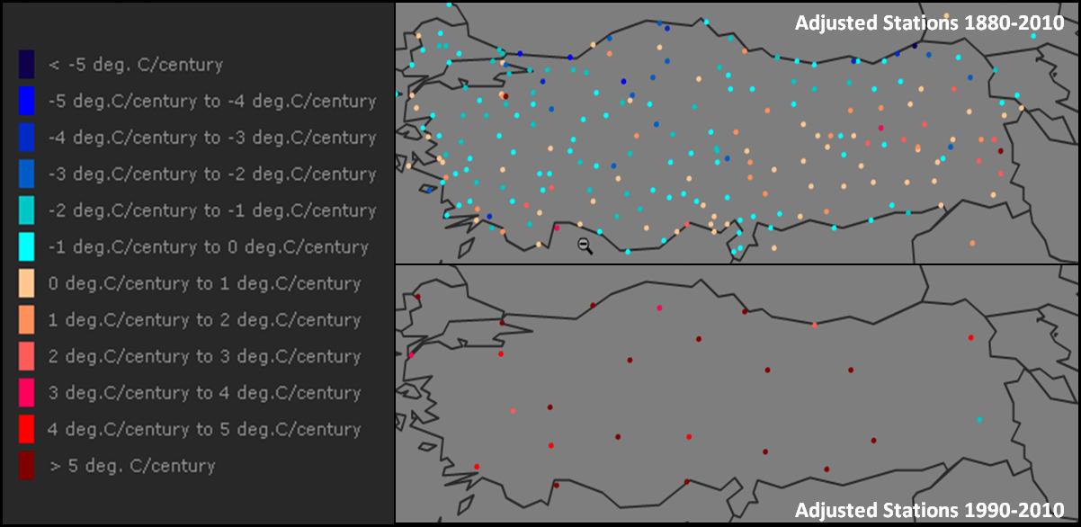
See in Digging in the Clay here much more, including this before and after map of the stations.
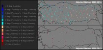
Maps showing station temperature trends for (top) all stations active during 1880 to 2010 and (bottom) for stations active after 1990
From the GISS site, their MAP shows loads of HOT.
-----------------------
Germany - Not Warming
This is an interesting little graph. It shows the “change of temperatures in a year”, that is the dT/yr, and the cumulative change over the life of all the thermometers, dT. What surprised me most when I made it was that it was so flat that the two lines were on top of each other. I had to make the dT/yr line semitransparent to make it readable. (Click here for a really big version).
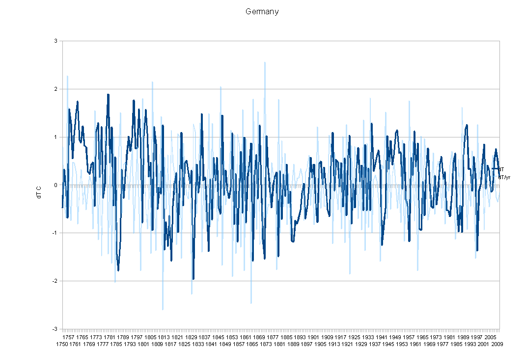
I was so surprised at the 1850 to date flatness that I extended it back to 1750 just to see if they were still stable in the far past. Yup. 260 years, flat. First off, this is interesting because the Germans are generally known for being real sticklers about issues of precision and quality. Not the sort of folks to cut corners on where or how temperatures are to be measured.
Secondly, because other countries in the same general area do have warming trends in their data. And then there is poor Turkey, burning up in comparison. All of which argues for instrument error as much more likely than CO2. At least, I can’t think of any way for CO2 to “Give Germany a pass”.
And yet Germany has a strong “Green” movement that is highly vocal about “Global Warming” and has policies promoting the various forms of carbon reduction. One can only guess that the politicians there don’t look at their own temperatures much.
But this did give me an idea on how to fix “Global Warming”. For any country who’s change of temperature over time is within a small fraction of flat, give them a complete “free ride” on all the Carbon Cap & Trade, CO2 Sequestration, Light Bulb Police, you name it. Declare them a “Guilt Free Zone”. Somehow I think we would find Global Warming evaporate in a tide of precision and calibration.
In that spirit, I hereby declare Germany a “Carbon Guilt-Free Zone”. See post here.
E.M. also calls attention to this post by Boballab on Costa Rica Warming which he shows to be an artifact of using anomalies from stations with different characteristics entering and exiting a region during the last century here. As PDF here.
By Joanne Nova
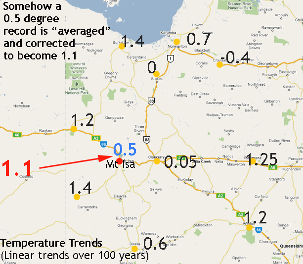
This is yet another example of things that don’t add up in the world of GISS temperatures in Australia. Previously, we’ve discussed Gladstone and Darwin.
Ken Stewart has been doing some homework, and you can see all the graphs on his blog. Essentially, the Bureau of Met in Australia provides data for Mt. Isa that shows a warming trend of about 0.5 degrees of warming over a century. GISS takes this, adjusts it carefully to “homogenize urban data with rural data”, and gets an answer of 1.1 degrees. (Ironically among other things, “homogenisation” is supposed to compensate for the Urban Heat Island Effect, which would artificially inflate the trend in urban centers.)
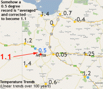
Enlarged here.
To give you an idea of scale, the nearest station is at Cloncurry, 106km east (where a flat trend of 0.05 or so appears in the graph). But, there are other trends that are warmer in other stations. Averaging the five nearest rural stations gives about 0.6 degrees; averaging the nearest ten stations gives between 0.6 and 0.88 degrees.
But, they increase the slope of the trendline from less than 0.5 to more than 1.1 degrees Celsius per 102 years by lowering the earlier data by 0.3C. They say they do this because they homogenise urban data for discontinuities caused by station shifts, Urban Heat Island (UHI), etc., by their stated method: “...[U]rban stations are adjusted so that their long-term trend matches that of the mean of neighboring rural stations. Urban stations without nearby rural stations are dropped.”
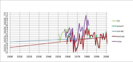
The Mt Isa Graph (enlarged here.)

The Giss (red) line shows a steeper warming trend, because earlier data is adjusted down.
But in the end, the temperatures don’t fit linear trends very well. In Bourketown, for example, there was a rise, but it was mostly during 1945 - 1988, and in the last twenty years, as Ken points out, there has been a significant fall.
Burketown 327km north east (enlarged here.)

By themselves, these minor revisions wouldnt be worth getting excited about, but the fact that they keep occurring and that they are so blatant and always in a warmer direction surely becomes too many nails in the coffin.
One can only assume that the people “adjusting” never thought anybody would check. And if billions of dollars were not on the table, probably nobody would have.
Thanks to Ken Stewart for his dedication. Read more and see comments here.
By the Washington Times
The Obama administration is poised to ban offshore oil drilling on the outer continental shelf until 2012 or beyond. Meanwhile, Russia is making a bold strategic leap to begin drilling for oil in the Gulf of Mexico. While the United States attempts to shift gears to alternative fuels to battle the purported evils of carbon emissions, Russia will erect oil derricks off the Cuban coast.
Offshore oil production makes economic sense. It creates jobs and helps fulfill America’s vast energy needs. It contributes to the gross domestic product and does not increase the trade deficit. Higher oil supply helps keep a lid on rising prices, and greater American production gives the United States more influence over the global market.
Drilling is also wildly popular with the public. A Pew Research Center poll from February showed 63 percent support for offshore drilling for oil and natural gas. Americans understand the fundamental points: The oil is there, and we need it. If we don’t drill it out, we have to buy it from other countries. Last year, the U.S. government even helped Brazil underwrite offshore drilling in the Tupi oil field near Rio de Janeiro. The current price of oil makes drilling economically feasible, so why not let the private sector go ahead and get our oil?
The Obama administration, however, views energy policy through green eyeshades. Every aspect of its approach to energy is subordinated to radical environmental concerns. This unprecedented lack of balance is placing offshore oil resources off-limits. The O Force would prefer the country shift its energy production to alternative sources, such as nuclear, solar and wind power. In theory, there’s nothing wrong with that, in the long run, assuming technology can catch up to demand. But we have not yet reached the green utopia, we won’t get there anytime soon, and America needs more oil now.
Russia more sensibly views energy primarily as a strategic resource. Energy is critical to Russia’s economy, as fuel and as a source of profit through export. Russia also has used energy as a coercive diplomatic tool, shutting off natural gas piped to Eastern Europe in the middle of winter to make a point about how dependent the countries are that do business with the Russians.
Now Russia is using oil exploration to establish a new presence in the Western Hemisphere. It recently concluded four contracts securing oil-exploration rights in Cuba’s economic zone in the Gulf of Mexico. A Russian-Cuban joint partnership will exploit oil found in the deep waters of the Gulf.
Cuba has rights to the area in which drilling will be conducted under an agreement the Carter administration recognized. From Russia’s perspective, this is another way to gain leverage inside what traditionally has been America’s sphere of influence. It may not be as dramatic as the Soviet Union attempting to use Cuba as a missile platform, but in the energy wars, the message is the same. Russia is projecting power into the Western Hemisphere while the United States retreats. The world will not tolerate a superpower that acts like a sidekick much longer.
---------------------------
British ads banned over climate change claims
by Staff Writers, London (AFP) March 17, 2010
Britain’s advertising watchdog has banned two government adverts for overstating the threat from climate change, it said on Wednesday.
The adverts used nursery rhymes including “Jack and Jill” to highlight the impact of global warming, but the Advertising Standards Authority (ASA) said they exaggerated the risk.
“Jack and Jill went up the hill to fetch a pail of water. There was none as extreme weather due to climate change had caused a drought,” read the copyline on one of the ads.
“Extreme weather conditions such as flooding, heat waves and storms will become more frequent and intense,” warned the advert, commissioned by the Department of Energy and Climate Change (DECC).
The second advert read: “Rub-a-dub-dub, three men in a tub—a necessary course of action due to flash flooding caused by climate change.”
“Climate change is happening. Temperature and sea levels are rising. Extreme weather events such as storms, floods and heat waves will become more frequent and intense,” it said.
And it warned: “If we carry on at this rate, life in 25 years could be very different.” The adverts were part of a DECC campaign last year which attracted 939 complaints.
Upholding the complaints, the ASA said that forecasts by the Intergovernmental Panel on Climate Change (IPCC) “involved uncertainties” that the adverts failed to reflect. Energy and Climate Change Secretary Ed Miliband downplayed the problem raised by the ASA. “The science tells us that it is more than 90 percent likely that there will be more extreme weather events if we don’t act. In any future campaign, as requested by the ASA, we will make clear the nature of this prediction.
“We will continue to provide public information about the dangers of climate change,” he added. See PDF.
By Robert W. Felix, IceAge Now
8 Mar 10 - “Almost all of the ice-covered regions of the Earth are melting - and seas are rising,” said Al Gore in an op-ed piece in the New York Times on February 27. Both parts of Gore’s statement are false. Never mind that Mr. Gore makes only passing reference to the IPCC’s fraudulent claims that the Himalayan glaciers will all melt by 2035. ("A flawed overestimate,” he explains.)
Never mind that Mr. Gore dismisses the IPCC’s fraudulent claims that the oceans are rising precipitously. ("Partly inaccurate,” he huffs.) Never mind that Mr. Gore completely ignores the admission by the CRU’s disgraced former director Phil Jones that global temperatures have essentially remained unchanged for the past 15 years. I’ll let someone else dissect Gore’s lawyering comments, and concentrate on just the one sentence about melting ice, because neither part of that sentence is true. Contrary to Gore’s assertions, almost all of the ice-covered regions of the Earth are growing, not melting - and the seas are not rising.
Let’s look at the facts.
If you click on the words “are melting” in Gore’s article, you’re taken to a paper by Michael Zemp at the University of Zurich. Mr. Zemp begins his paper by warning that “glaciers around the globe continue to melt at high rates.” However, if you bother to actually read the paper, you learn that Zemp’s conclusion is based on measurements of “more than 80 glaciers.” Considering that the Himalayas boast more than 15,000 glaciers, a study of “more than 80 glaciers” hardly seems sufficient to warrant such a catastrophic pronouncement. Especially when you learn that of those 80 glaciers, several are growing.
Growing. Not melting. “In Norway, many maritime glaciers were able to gain mass,” Zemp concedes. ("Able to gain mass” means growing.) In North America, Zemp also concedes, “some positive values were reported from the North Cascade Mountains and the Juneau Ice Field.” ("Displaying positive values” means growing.) Remember, we’re still coming out of the last ice age. Ice is supposed to melt as we come out of an ice age. The ice has been melting for 11,000 years. Why should today be any different? I’m guessing that most Canadians and Northern Europeans are very happy that the ice has been melting.
Unfortunately, that millenniums-long melting trend now appears to be changing. No matter how assiduously Mr. Gore tries to ignore it, almost all of the ice-covered regions of the Earth are now gaining mass. (Or, displaying positive values, if you will.) For starters, let’s look at those Himalayan glaciers. In a great article, entitled “World misled over Himalayan glacier meltdown,” Jonathan Leake and Chris Hastings show that the IPCC’s fraudulent claims were based on “speculation” and “not supported by any formal research.”
As a matter of fact, many Himalayan glaciers are growing. In a defiant act of political incorrectness, some 230 glaciers in the western Himalayas - including Mount Everest, K2 and Nanga Parbat - are actually growing. “These are the biggest mid-latitude glaciers in the world,” says John Shroder of the University of Nebraska-Omaha. “And all of them are either holding still, or advancing.”
And get this. Eighty seven of the glaciers have surged forward since the 1960s. So much for Mr. Gore’s “more than 80 glaciers.” (I don’t know how many Himalayan glaciers are being monitored, but my guess would be fewer than a thousand, so it’s possible that hundreds more are growing. There aren’t enough glaciologists in the world to monitor them all.) But we don’t need to look to the Himalayas for growing glaciers. Glaciers are growing in the United States. Yes, glaciers are growing in the United States.
Look at Washington State. The Nisqually Glacier on Mt. Rainier is growing. The Emmons Glacier on Mt. Rainier is growing. Glaciers on Glacier Peak in northern Washington are growing. And Crater Glacier on Mt. Saint Helens is now larger than it was before the 1980 eruption. (I don’t think all of the glaciers in Washington or Alaska are being monitored either.) Or look at California. All seven glaciers on California’s Mount Shasta are growing. This includes three-mile-long Whitney glacier, the state’s largest. Three of Mount Shasta’s glaciers have doubled in size since 1950.
Or look at Alaska. Glaciers are growing in Alaska for the first time in 250 years. In May of last year, Alaska’s Hubbard Glacier was advancing at the rate of seven feet (two meters) per day - more than half-a-mile per year. And in Icy Bay, at least three glaciers advanced a third of a mile (one-half kilometer) in one year. Oh, by the way. The Juneau Icefield, with its “positive values,” covers 1,505 square miles (3,900 sq km) and is the fifth-largest ice field in the Western Hemisphere. Rather interesting to know that Gore’s own source admits that the fifth-largest ice field in the Western Hemisphere is growing, don’t you think?
But this mere handful of growing glaciers is just an anomaly, the erstwhile Mr. Gore would have you believe. Well, let’s look at a few other countries. Perito Moreno Glacier, the largest glacier in Argentina, is growing. Pio XI Glacier, the largest glacier in Chile, is growing. Glaciers are growing on Mt. Logan, the tallest mountain in Canada. Glaciers are growing on Mt. Blanc, the tallest mountain in France.
Glaciers are growing in Norway, says the Norwegian Water Resources and Energy Directorate (NVE). And the last time I checked, all 50 glaciers in New Zealand were growing. But this is nothing. These glaciers are babies when you look at our planet’s largest ice masses, namely, the Antarctic and Greenland ice sheets. Contrary to what you may have heard, both of those huge ice sheets are growing.
In 2007, Antarctica set a new record for most ice extent since 1979, says meteorologist Joe D’Aleo. While the Antarctic Peninsula area has warmed in recent years, and ice near it diminished during the summer, the interior of Antarctica has been colder and the ice extent greater. Antarctic sea ice is also increasing. According to Australian Antarctic Division glaciology program head Ian Allison, sea ice losses in west Antarctica over the past 30 years have been more than offset by increases in the Ross Sea region, just one sector of east Antarctica.
The Antarctic Peninsula, where the ice has been melting, is only about 1/50th the size of east Antarctica, where the ice has been growing. Saying that all of Antarctica is melting is like looking at the climate of Oregon and saying that this applies to the entire United States. There was not any evidence of significant change in the mass of ice shelves in east Antarctica nor any indication that its ice cap was melting, says Dr. Allison. “The only significant calvings in Antarctica have been in the west.” And he cautioned that calvings of the magnitude seen recently in west Antarctica might not be unusual. “A paper to be published soon by the British Antarctic Survey in the journal Geophysical Research Letters is expected to confirm that over the past 30 years, the area of sea ice around the continent has expanded.”
What about Greenland? Greenland’s ice-cap has thickened slightly in recent years despite wide predictions of a thaw triggered by global warming, said a team of scientists in October 2005. The 3,000-meter (9,842-feet) thick ice-cap is a key concern in debates about climate change because a total melt would raise world sea levels by about 7 meters.
But satellite measurements show that more snow is falling and thickening the ice-cap, especially at high altitudes, according to the report in the journal Science. Te overall ice thickness changes are approximately plus 5 cm (1.9 inches) per year or 54 cm (21.26 inches) over 11 years, according to the experts at Norwegian, Russian and U.S. institutes led by Ola Johannessen at the Mohn Sverdrup center for Global Ocean Studies and Operational Oceanography in Norway. Not overwhelming growth, certainly, but a far cry from the catastrophic melting that we’ve been lead to believe.
Think about that. The Antarctic Ice Sheet is almost twice as big as the contiguous United States. Put the Antarctic and Greenland Ice Sheets together, and they’re one hundred times bigger than all of the rest of the world’s glaciers combined. More than 90 percent of the world’s glaciers are growing, in other words, and all we hear about are the ones that are shrinking.
But if so many of the world’s glaciers are growing, how can sea levels remain the same? They can’t. The sea level models are wrong. During the last ice age, sea levels stood some 370 feet (100 meters) lower than today. That’s where all of the moisture came from to create those two-mile-high sheets of ice that covered so much of the north. And just as the ice has been melting for 11,000 years, so too were sea levels rising during those same years.
But the rising has stopped. Forget those IPCC claims. Sea levels are not rising, says Dr. Nils-Axel Morner, one-time expert reviewer for the IPCC. Dr. Morner, who received his PhD in geology in 1969, is one of the greatest - if not the greatest - sea level experts in the world today. He has worked with sea level problems for 40 years in areas scattered all over the globe. “There is no change,” says Morner. “Sea level is not changing in any way.” “There is absolutely no sea-level rise in Tuvalo,” Morner insists. “There is no change here, and there is zero sea-level rise in Bangladesh. If anything, sea levels have lowered in Bangladesh.” “We do not need to fear sea-level rise,” says Morner. “(But) we should have a fear of those people who fooled us.”
So there you have it. More falsehoods from Al Gore, the multimillionaire businessman who some say is set to become the world’s first carbon billionaire.
Our glaciers are growing, not melting - and the seas are not rising. I agree with Dr. Morner, but I’d make it a tad stronger. We should have a fear of those people who have conned us.See post and more here.
By Chris Horner, Washington Times
Barack Obama promised many things on his way into office. Key among these was transparency and a vow to banish lobbyists from insider roles in the policy process.
Using the Freedom of Information Act (FOIA), the Competitive Enterprise Institute has confirmed that both promises are being aggressively violated.
In 2008 and 2009, Mr. Obama told Americans on no fewer than eight occasions to “think about what’s happening in countries like Spain [and] Germany” to see his model for successful “green jobs” policies, and what we should expect here.
Some Spanish academics and experts on that country’s wind- and solar-energy policies and outcomes took Mr. Obama up on his invitation, revealing Spain’s policies to be economic and employment disasters. The political embarrassment to the administration was obvious, with White House spokesman Robert Gibbs asked about the Spanish study at a press conference, and the president hurriedly substituted Denmark for Spain in his stump speech.
Team Obama was not amused, and they decided to do something about it. The crew that campaigned on change pulled out the oldest plan in the book - attack the messenger. The U.S. government’s response to foreign academics, assessing the impact in their own country of that foreign government’s policies, was to come after them in a move that internal e-mails say was unprecedented. They also show it was coordinated with the lobbyists for “Big Wind” and the left-wing Center for American Progress (CAP).
What emerged was an ideological hodgepodge of curious and unsupported claims published under the name of two young non-economist wind advocates. These taxpayer-funded employees offered green dogma in oddly strident terms and, along the way, a senior Obama political appointee may well have misled Congress.

Congress was naturally curious about how the administration would end up attacking foreign academics, so Rep. F. James Sensenbrenner Jr., Wisconsin Republican, asked how these unprecedented offensives were launched, given that National Renewable Energy Lab and the Energy Department immediately offered conflicting statements to the media and a congressional oversight office.
Mr. Sensenbrenner asked for details from Cathy Zoi, assistant secretary of energy for energy efficiency and renewable energy at the Department of Energy (DOE) and until recently, the CEO of Al Gore’s climate-advocacy group. She dodged four pointed questions.
However, the documents we uncovered reveal that her office was fully aware of the answers to these questions, but elected to keep the information to itself.
What transpired is difficult to discern with precision, as DOE continues to withhold numerous responsive documents. But it is clear that senior staff in Ms. Zoi’s office, and another under her authority, were told by the American Wind Energy Association (AWEA) of its concern over the foreign economic analysis because of the media and policymaker attention it was receiving.
The questions raised about green jobs also threatened the vast increase in Department of Energy spending to pursue green jobs. The Obama administration has poured cash into renewable-energy efficiency and renewable energy with abandon. One such program at the department has grown from a budget of $1.7 billion in 2008 to $18 billion in 2009.
What is clear is that the Department of Energy then worked with Center for American Progress and the industry lobby AWEA to produce an attack that would serve all their interests.
That may not be all because we have appealed energy’s decision to withhold numerous documents. Incredibly, it refuses to release documents exchanged between it and the pressure group CAP and lobbyist AWEA on the grounds that these are “inter-agency memoranda.”
So, lobbyists and lavishly funded political advocacy groups are, for purposes of secrecy, mere extensions of the Obama administration. Transparency in the Age of Obama means so transparent, you can’t see it. See also this post from James Delinpole on grren jobs.
Chris Horner is a senior fellow at the Competitive Enterprise Institute and author of the best-selling “Red Hot Lies: How Global Warming Alarmists Use Threats, Fraud and Deception to Keep You Misinformed” (Regnery, 2008).
And from Lucianne’s coverage of Chris’s story this comment on connecting the dots.
Here are some dots:
• The biggest producer of wind turbines in the US is General Electric. Most of these devices are manufactured overseas. The 1.5 MW machines are produced principally in Salzbergen Germany and Nobeljas, Spain. A more powerful 2.5 MW gearless version will be made by GE in China.
• GE also produces electric motors and recently acquired AstroPower the largest US producer of solar cells.
• The CEO and Chairman of GE is Jeffrey Immelt.
• A Year ago Immelt was named to President Obama’s Economic Advisory Board.
• President Obama is pushing hard for alternative enery resources and has allocated massive funding to support such technology as as wind turbines, electric automobiles and solar power.
• One hears scant mention of Immelt’s activities and the failure of wind-farm programs in Spain on business media programs like CNBC, or MSM news/talk shows like MSNBC.
• GE owns NBC Universal.
These are just some dots.
Now, •-•-•-•-•-•-• connect them.
-------------------------------
Solar Industry Learns Lessons in Spanish Sun
By Elisabeth Rosenthal, New York Times
Two years ago, this gritty mining city hosted a brief 21st-century gold rush. Long famous for coal, Puertollano discovered another energy source it had overlooked: the relentless, scorching sun. Two years ago, this gritty mining city hosted a brief 21st-century gold rush. Long famous for coal, Puertollano discovered another energy source it had overlooked: the relentless, scorching sun. Puertollano, a mining center, has wooed the solar industry. Armed with generous incentives from the Spanish government to jump-start a national solar energy industry, the city set out to replace its failing coal economy by attracting solar companies, with a campaign slogan: “The Sun Moves Us.”
Soon, Puertollano, home to the Museum of the Mining Industry, had two enormous solar power plants, factories making solar panels and silicon wafers, and clean energy research institutes. Half the solar power installed globally in 2008 was installed in Spain.
Farmers sold land for solar plants. Boutiques opened. And people from all over the world, seeing business opportunities, moved to the city, which had suffered from 20 percent unemployment and a population exodus.
But as low-quality, poorly designed solar plants sprang up on Spain’s plateaus, Spanish officials came to realize that they would have to subsidize many of them indefinitely, and that the industry they had created might never produce efficient green energy on its own.
In September the government abruptly changed course, cutting payments and capping solar construction. Puertollano’s brief boom turned bust. Factories and stores shut, thousands of workers lost jobs, foreign companies. Read more here.
By Dr. Bob Carter
On June 23, 1988, a young and previously unknown NASA computer modeller, James Hansen, appeared before a United States Congressional hearing on climate change. On that occasion, Dr. Hansen used a graph to convince his listeners that late 20th century warming was taking place at an accelerated rate, which, it being a scorching summer’s day in Washington, a glance out of the window appeared to confirm.
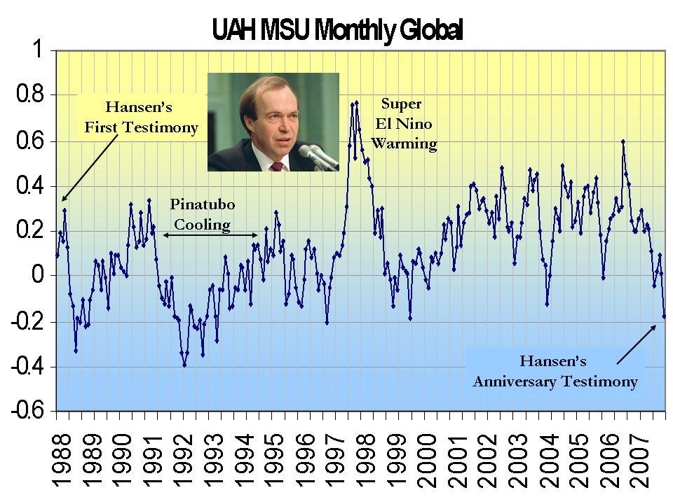

He wrote later in justification, in the Washington Post (February 11, 1989), that “the evidence for an increasing greenhouse effect is now sufficiently strong that it would have been irresponsible if I had not attempted to alert political leaders”.
Hansen’s testimony was taken up as a lead news story, and within days the great majority of the American public believed that a climate apocalypse was at hand, and the global warming hare was off and running. Thereby, Dr. Hansen became transformed into the climate media star who is shortly going to wow the ingenues in the Adelaide Festival audience.
Fifteen years later, in the Scientific American in March, 2004, Hansen came to write that “Emphasis on extreme scenarios may have been appropriate at one time, when the public and decision-makers were relatively unaware of the global warming issue. Now, however, the need is for demonstrably objective climate forcing scenarios consistent with what is realistic”.
This conversion to honesty came too late, however, for in the intervening years thousands of other climate scientists had meanwhile climbed onto the Hansenist funding gravy-train. Currently, global warming alarmism is fuelled by an estimated worldwide expenditure on related research and greenhouse bureaucracy of more than US$10 billion annually.
Scientists and bureaucrats being only too human, the power of such sums of money to corrupt not only the politics of greenhouse, but even the scientific process itself, should not be underestimated. In recognition of these events, the term Hansenism is now sometimes used to describe the climate hysteria which had, until recently, gripped western media sources and political, business and public opinion in a deadly grasp.
Histories of science contain an account of the ideological control of Soviet biology during the mid-20th century by plant scientist Trofim Lysenko, who by 1940 had risen to be Director of the influential Institute of Genetics of the Russian Academy of Sciences. Lysenko and his supporters rejected the “dangerous Western concepts” of Mendelian genetics and Darwinian evolution. They preferred the Lamarckian view of the inheritance of acquired characteristics; for instance, that cows could be trained to give more milk and their offspring would then inherit this trait.
Whilst this was not an unreasonable hypothesis to erect in the early 19th century, by the 1930s the idea had been tested in many ways and was known to be wrong. Requiring its application to agricultural and allied biological research in the USSR was disastrous, not least in the vicious persecution of scientists that took place, and the legacy of this sad episode still disadvantages Soviet biology today.
Lysenkoism grew from four main roots:
• a necessity to demonstrate the practical relevance of science to the needs of society;
• the amassing of evidence to show the “correctness” of the concept as a substitute for causal proof;
• noble cause corruption, whereby data are manipulated to support a cause which is seen as a higher truth; and
• ideological zeal, such that dissidents are silenced as “enemies of the truth”.
See full SPPI essay here.