

Eric Worrall
Ex-President Obama seems to have suggested in a speech that tearing up the Paris Agreement is a symptom of “an aggressive kind of nationalism” which threatens Democracy. My question - why doesn’t Obama mention all the greens who seem to think Democracy is an impediment to environmental progress?
Obama warns against aggressive’ nationalism, leaving Paris climate agreement
BY ALICIA COHN 07/01/17 07:41 AM EDT
Former President Obama on Saturday issued a strong warning against the new trend toward “an aggressive kind of nationalism” and emphasized the importance of the Paris climate agreement, which the U.S. plans to break.
Obama called out at least one of his successor’s policy changes without mentioning President Trump by name.
.....
Otherwise, he warned, “We start seeing a rise in sectarian politics, we start seeing a rise in an aggressive kind of nationalism, we start seeing both in developed and developing countries an increased resentment about minority groups and the bad treatment of people who don’t look like us or practice the same faith as us.”
....
He went on to note “the temporary absence of American leadership” on fighting climate change.
“In Paris, we came together around the most ambitious agreement in history to fight climate change,”
....
“If we don’t stand up for tolerance and moderation and respect for others, if we begin to doubt ourselves and all that we have accomplished, then much of the progress that we have made will not continue,” he said.
“What we will see is more and more people arguing against democracy, we will see more and more people who are looking to restrict freedom of the press, and we’ll see more intolerance, more tribal divisions, more ethnic divisions, and religious divisions and more violence,” he continued.
Read more here.
Can anyone think of a single mainstream climate skeptic who opposes Democracy?
Unfortunately I have not located a copy of ex-President Obama’s full speech. But even if my impression of what Obama said is wrong, it seems pretty cheeky for Obama to mix opposition to climate advocacy and accusations of threats to Democracy in the same speech, given the number of prominent greens who seem to think Democracy is not up to the job of saving us from Climate Change.
June 2017: Maryland Professor of Philosophy Firmin DeBrabander claims “climate change is not liable to be solved by democracies. Autocracies might do better”
April 2017: Neil DeGrasse Tyson claims elected “science deniers” are a threat to Democracy
March 2017: Disgraced Identity Thief Peter Gleick claims Democracy is under assault from [climate] liars
May 2016: Mark Diesendorf, Associated Professor University New South Wales, claims “Governments may need extraordinary emergency powers to implement rapid mitigation”
November 2015: Bill Gates, Founder of Microsoft Corporation, claims “If you’re not bringing math skills to the problem, then representative democracy is a problem.”
April 2015: Two University of Melbourne (Australia) Professors claim “the failure to tackle climate change speaks to an overall failure of our liberal democratic system”
January 2011: Former NASA GISS Chairman James Hansen praises the Chinese dictatorship’s ability to take “the long view” on climate change.
etc.
---------
It is all a monumental hoax based on a lie and and an agenda as my former compadre, John Coleman said. Al Gore’s new movie is coming out in August. Roger Revelle was Al’s hero and mentor. John did some research on Al and Revelle in this video and found Roger had a change of heart in his later year that Al conveniently ignored.
By Alejandro Lazo
U.S. States Defy Trump’s Climate Pact Withdrawal
After President Trump announces withdrawal from Paris accord, three states say they will form a coalition to uphold treaty
Updated June 2, 2017 10:35 p.m. ET
SAN FRANCISCO - A day after President Donald Trump’s decision to pull out of the Paris climate accord, states and cities around the country are vowing to adhere to their own aggressive climate policies, independent of the federal government.
Twenty states and Washington, D.C., have adopted their own greenhouse gas emission targets, according to the Center for Climate and Energy Solutions, and some press beyond the U.S. commitment under the accord, which sought to bring greenhouse emissions 26% to 28% below 2005 levels by 2025.
None, however, have gone further than California, which has emerged as a national ‘leader’ (Icecap Note: biggest loser with deficits in tens of billions) on climate policy and a potentially powerful counterweight to the Trump administration’s efforts to rollback U.S. commitments.
California Gov. Jerry Brown is encouraging states to pursue their own climate standards - developing his own international climate agenda, recruiting other states for climate pacts and pushing tougher standards than the federal government had under the Obama administration.
Following the Thursday announcement, Mr. Brown, New York Gov. Andrew Cuomo and Washington Gov. Jay Inslee said they would form a coalition of states committed to upholding the American side of the Paris treaty deal.
The governors called the coalition the United States Climate Alliance, which they said will “act as a forum to sustain and strengthen existing climate programs, promote the sharing of information and best practices, and implement new programs to reduce carbon emissions from all sectors of the economy.”
“California is on the field, ready for battle,” Mr. Brown said after Mr. Trump announced the U.S. would leave the deal.
Former New York Mayor Michael Bloomberg, the United Nations Secretary-General’s special envoy for cities and climate change, said through an adviser on Friday that those three states, along with a coalition of at least 100 businesses and 30 cities would on Monday submit a letter of intent to the U.N. indicating the coalition would meet the U.S. goals through their own commitments.
In a meeting with French President Emmanuel Macron and Paris Mayor Anne Hidalgo on Friday, Mr. Bloomberg said the U.S. will not need Washington to make good on its commitments.
“In the U.S., emission levels are determined far more by cities, states, and businesses than they are by our federal government,” Mr. Bloomberg said. “The fact of the matter is: Americans don’t need Washington to meet our Paris commitment, and Americans are not going to let Washington stand in the way of fulfilling it.”
On Friday, Mr. Brown leaves for climate talks in China. The California governor will also attend the United Nations Climate Change Conference in Bonn, Germany, “to represent subnational jurisdictions that remain committed to climate action.”
Mr. Brown, who has been a sharp critic of Mr. Trump’s environmental policies, said in an interview this week that “the president is not going to get very far denying science and denying reality” and says local governments must take the matter into their own hands.
“Obviously states can’t do what the federal government can do,” Mr. Brown said. “But I will tell you the president’s action - his action in undermining the Paris agreement - is going to ignite a prairie fire of activism to take even bolder steps to reduce greenhouse gases than even are being imagined today.”
California had a gross domestic product of $2.5 trillion in 2015 and the world’s sixth-largest economy - bigger than most of the 190 nations that signed the Paris accord. It is responsible for about 1% of the world’s carbon emissions, according to the California Air Resources Board.
Because of the sheer size of its market, and because it has a waiver from the Environmental Protection Agency allowing it to set its own tailpipe-emission standards that nine other states follow, California-emission policies can set the standard for the auto industry nationwide.
The state has the most ambitious greenhouse-gas emission reduction targets in the U.S. with the goal of achieving a 40% reduction in greenhouse gases by 2030, compared with 1990 levels, in part by adding 4.2 million zero-emissions vehicles on this car-centric state’s streets and highways.
By 2050, the state’s goal is to bring emissions 80% below 1990 levels.
On Wednesday, the California senate passed a bill that would mandate the state gets all of its energy from renewable sources by 2045, which drew praise from environmentalists but criticism from Republicans here who fear the state will lose more business as costs rise in California.
“If new technology can’t reach the goals this bill requires, it’s going to raise the price of electricity on businesses, which already pay a high cost for utilities and cite that as the number one reason they’re leaving California,” said Republican State Sen. Jeff Stone, of Riverside, Calif.
Still, Mr. Brown has pushed to extend California’s climate influence beyond state lines. Since 2015, Mr. Brown has formed a coalition of entities around the world - cities, states, countries and other jurisdictions - to limit the increase in global average temperature to below 2 degrees Celsius, a key long-term goal of the Paris talks.
Ten states and eight cities have joined Mr. Brown’s Under2 Coalition, encompassing about 89 million people, or about 28% of the U.S. population. In April, Canada and Mexico endorsed the measure; with that the coalition grew to include 170 jurisdictions on six continents, Mr. Brown’s office said.
Not all states were upset. In West Virginia, Sen. Shelley Moore Capito applauded the withdrawal, saying it would benefit the state’s ailing coal industry. “West Virginians have suffered tremendous economic calamity as a result of the Obama administration’s anti-coal agenda...,” the Republican senator said in a statement. “President Trump is standing with our West Virginia workers and businesses to keep jobs in our state.”
California has provided technical advice to Mexico and China to help those countries adopt climate policies. The governor has also forged an agreement with Oregon, Washington state and the Canadian province of British Columbia, formally aligning their climate and clean-energy policies.
“The California model is helping to catalyze global action,” said Nathaniel Keohane, vice president for global climate at the Environmental Defense Fund.
California has led on a key goal of climate change activists and scientists for years: developing a functioning cap and trade market, which seeks to reduce carbon emissions by imposing a limit on the amount of carbon dioxide released by industry, and then selling a finite number of permits every quarter for businesses to meet those allowances.
China is now looking to California as a model for how to integrate regional cap and trade-pilot programs it already has launched, said Severin Borenstein, a professor at the University of California, at Berkeley Haas School of Business.
This summer the cap-and-trade program faces a major test with the state legislature poised to debate whether to enact policies protecting and expanding the program from legal challenges after the California Chamber of Commerce sued the state, calling it an unconstitutional tax.
“California’s decisions about how to run a cap-and-trade program, or how to set up other greenhouse-gas regulations, have very large impacts on the rest of the country and the world,” Mr. Borenstein said.
California’s role as the nation’s climate leader isn’t new: A decade ago it carved out international deals and set policies on global warming without help from the Bush administration.
Since then, California has been joined by other states, including New York and Illinois, as well as cities including Chicago and New York City, in developing shared climate goals.
The state and local efforts will continue despite what the federal government does, but they won’t be as effective, said Karen Weigert, senior fellow at the Chicago Council on Global Affairs.
“It is a very different world when you have a White House leading the fight on the environment, or not leading the fight,” said Ms. Weigert, who served as Chicago’s first chief sustainability officer.
Mr. Cuomo last year signed legislation requiring 50% of New York’s electricity come from renewable energy sources like wind and solar by 2030. The state has a goal of reducing emission 80% from 1990 levels by 2050.
In May, Virginia Gov. Terry McAuliffe, a Democrat, signed an executive order taking an initial step in setting state-level standards on cutting carbon emissions. Michigan Gov. Rick Snyder, a Republican, in December signed a measure that requires the state’s utilities to lift the amount of electricity they generate from renewable sources to 15% by 2021 from 10% in 2015.
Twenty-nine states have adopted renewable portfolio standards, which require utilities to sell a certain amount, or percentage, of renewable electricity, according to the National Conference of State Legislatures.
“States have been doing this for a long time and long before there has been consideration at the federal level,” said Glen Andersen, energy program director at the NCSL. “They are able to act a little more quickly.”
Other states are ramping up their renewable-energy generation because prices are competitive and such projects add jobs, said Rachel Cleetus, the lead economist and climate policy manager at the Union of Concerned Scientists, a nonprofit (Icecap: a non-scientific environmental advocacy group sitting on $44M responsible for destroying higher education).
Texas, for instance, has become a leader in renewable-energy production, even without a legislative mandate. The state, which has a quarter of all the wind power in America, is getting 12.6% of its electricity from wind, according to the American Wind Energy Association.
U.S. cities also are adopting their own policies.
Chicago Mayor Rahm Emanuel this week said his city would “work with cities around the country to reduce our emissions in accordance with the Paris Agreement.”
Los Angeles Mayor Eric Garcetti this week said the city introduced a motion to adopt the principles of the Paris agreement “as the policy of the City of Los Angeles.” Mr. Garcetti is part of a coalition of 61 mayors that has vowed to uphold the agreement.
“We will intensify efforts to meet each of our cities’ current climate goals,” the coalition said.
----------
Democrats hope to use this issue in 2018 and 2020. A trillion dollars has been spent on this faux issue - (CO2 is not a pollutant but a plant fertilizer, soot is a pollutant but something we have already dealt with with technology in our power plants, factories and automobiles). Advocacy groups like the UCS, globalists and the UN under their control have forced the indoctrination of young and impressionable older people into believing CO2 is a pollutant and the cause of everything natural that is bad.
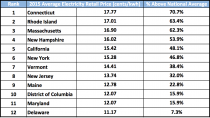
The democrats use the ‘GRUBER’ method of keep repeating a lie and “since Americans are stupid people, they will believe it”. The regions where they have taken this idea forward are paying the highest prices for electricity in the country (lower 48). In Europe where the green agenda has first been implemented, electricity prices are two to three times higher. You hear the democrats yelling bowing out of Paris will hurt the poor when in fact abiding with the Paris agreement would cause electricity and energy prices to rise significantly which hurts the poor and middle class.
300,000 German households had their electricity turned off for inability to pay and over 25% of UK residents are in energy poverty, many of them pensioners. That is coming here to the cities and states which are going to commit regardless of Trump. It will cost them jobs as industry exits. They will increase already high taxes or cry to DC for help as their deficits skyrocket.
Califronia and the green northeast which established the regional Greenhouse Gas Initiative (RGGI) pay the highest electricity prices in the lower 48 states already.
WAKE UP AMERICA.
James Delingpole
Under promise and over deliver.
As a businessman, Trump knows that those are the rules. And as president that’s just what he did today in his inspirational speech about pulling out of the Paris climate agreement.
It was inspirational because it articulated better than any world leader has ever done before why environmentalism is in fact such a harmful creed.
Rather than get bogged down in the “science” of climate change - an elephant trap so arranged by climate alarmists to make anyone who disagrees with them look ignorant or “anti-science” - he cut to the chase and talked about the important stuff that hardly ever gets mentioned by all the other politicians, for some reason: the fact that the climate change industry is killing jobs.
He talked about “lost jobs; lower wages, shuttered factories.”
He listed what the effects of implementing the Paris Agreement would be, by 2040, on key sectors of the US economy:
Paper down 12 percent
Cement down 23 percent
Iron and steel down 38 per cent
Coal down 86 percent
It was simple and it was brilliant. Here was Trump talking to his voter base, feeling American workers’ pain and telling them [he didn’t actually say this but this was the message]: “I won’t abandon you. I won’t sell you down the river, whatever the global elite may want and however much they try to bully me. You people come before all this green crap.”
And it also has the virtue of being true. Sure the actual figures may be guesstimates, but there’s no question that the tenor of his argument is quite accurate: climate regulation like the Paris agreement makes energy more expensive, slows economic growth and kills jobs, especially in the heavy industrial and fossil fuel sectors.
This argument ought to be low hanging fruit to any half way intelligent politician: it’s such an obvious way of connecting with the workers. Yet Trump is the only one who has ever said it. And hearing him say it was a reminder of why it was that he won the presidential election. He connects with his people in a way that so many politicians just don’t.
Compare and contrast with the other world leaders: Merkel, May, Macron, Trudeau, Turnbull - not one of those charlatans dares tell the truth about the global climate change industry, that it’s a racket which achieves nothing but simply transfers wealth from Western nations to countries like India and China.
The other clever thing about that speech, of course, is that he’d kept us guessing to the last. Me included.
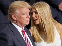
I thought he was going to fudge it much more than he did; that he’d end up compromising to please Ivanka.
But with this speech on Paris, President Trump has delivered.
Just when even some of his fans were starting to doubt him, he has made his presidency great again.
Paris Climate Cup
Final / OT
Swamp 0
Deplorables 1
In response to numerous requests, please see below. Thanks again for all you can do to flood the zone with public support for this pullout today…
Paul Teller
Special Assistant to the President for Legislative Affairs
The White House
THE WHITE HOUSE
President Trump’s announcement today that he is withdrawing the United States from the Paris climate agreement is a milestone, and we hope you won/t mind if we at the Cornwall Alliance say we’re proud to have helped bring it about by educating the American people and policymakers on the science, economics, ethics, and theology of climate change and climate and energy policy. Our press release is below, and we invite you to celebrate with us and, especially, to render thanksgiving to God in prayer!
For Immediate Release
Burke, VA, June 1, 2017 - President Donald Trump today announced his decision to withdraw the United States from the Paris climate agreement.
“Not only Americans but people all over the world should celebrate,” said Cornwall Alliance Founder and National Spokesman Dr. E. Calvin Beisner.
President Trump’s decision took courage in the face of pressure from many world leaders to remain in the agreement.
“But it’s the right decision,” Dr. Beisner said. “It’s right because, as former NASA scientist and leading climate alarmist Dr. James Hansen put it, “the Paris agreement is a fraud, really, a fake ...just worthless words.”
Why would someone like Hansen say that?
Because even assuming climate alarmists are right and human emissions of carbon dioxide are driving dangerous global warming, full implementation of the Paris agreement throughout this century would be no help to the environment or to people. Instead, it would be harmful to both.
And as President Trump said today, the Paris agreement is predicted by its proponents to “reduce global temperature by no more than 2 tenths of a degree Celsius.” That reduction would cost $23 to $46 trillion per tenth of a degree Fahrenheit - an amount that will have no effect on the environment or human wellbeing.
“It would trap billions in poverty for decades to come,” said Beisner. “Since a clean, healthful, beautiful environment is a costly good, this means prolonging environmental damage and delaying environmental improvement.”
And that’s assuming the alarmist predictions are accurate. Real life observations have proven the models, the only basis for those alarmist predictions, to be completely false. So not only is it all pain and no gain, it’s all pain and no gain for no reason.
We are grateful to President Donald J. Trump for his thoughtful exploration of the issues, his courageous leadership against great pressure, and his willingness to stand up for the American people.
But it is important to note that withdrawing from the Paris agreement, and opposing other environmental alarmist policies, is not just good for Americans, it is good for the citizens of all countries - especially the poor.
-------
Media contact: Megan Toombs, Director of Communications, Megan@CornwallAlliance.org, 703-569-4653
We are celebrating this victory, but there is still so much more to be done. Climate alarmists will only turn up the heat now, and we’ll need to continue to fight them tooth and nail. If you would like to make a donation to support the work of the Cornwall Alliance in opposing radical environmental policies.
------
Pre-Press Conference talking points:
Topline: The Paris Accord is a BAD deal for Americans, and the President’s action today is keeping his campaign promise to put American workers first. The Accord was negotiated poorly by the Obama Administration and signed out of desperation. It frontloads costs on the American people to the detriment of our economy and job growth while extracting meaningless commitments from the world’s top global emitters, like China. The U.S. is already leading the world in energy production and doesn’t need a bad deal that will harm American workers.
UNDERMINES U.S. Competitiveness and Jobs
* According to a study by NERA Consulting, meeting the Obama Administration’s requirements in the Paris Accord would cost the U.S. economy nearly $3 trillion over the next several decades.
* By 2040, our economy would lose 6.5 million industrial sector jobs - including 3.1 million manufacturing sector jobs
- It would effectively decapitate our coal industry, which now supplies about one-third of our electric power
- The deal was negotiated BADLY, and extracts meaningless commitments from the world’s top polluters
* The Obama-negotiated Accord imposes unrealistic targets on the U.S. for reducing our carbon emissions, while giving countries like China a free pass for years to come.
- Under the Accord, China will actually increase emissions until 2030
The U.S. is ALREADY a Clean Energy and Oil & Gas Energy Leader; we can reduce our emissions and continue to produce American energy without the Paris Accord
* America has already reduced its carbon-dioxide emissions dramatically.
- Since 2006, CO2 emissions have declined by 12 percent, and are expected to continue to decline.
- According to the Energy Information Administration (EIA), the U.S. is the leader in oil & gas production.
The agreement funds a UN Climate Slush Fund underwritten by American taxpayers
President Obama committed $3 billion to the Green Climate Fund - which is about 30 percent of the initial funding - without authorization from Congress
- With $20 trillion in debt, the U.S. taxpayers should not be paying to subsidize other countries’ energy needs.
- The deal also accomplishes LITTLE for the climate
According to researchers at MIT, if all member nations met their obligations, the impact on the climate would be negligible. The impacts have been estimated to be likely to reduce global temperature rise by less than 0.2 degrees Celsius in 2100.
By Anthony J. Sadar Sunday, May 21, 2017
ANALYSIS/OPINION:
Best practice in science is achieved through a minimum of two critical conditions: humility and perspective. If humility and perspective are ignored, science suffers.

The field of climate science is suffering from some lack of both humility and perspective.
This deficiency in climatology may certainly be unintentional. But, it is quite possible that the atmospheric topic of utmost interest and importance to many scientists and laymen alike - Earth’s future climate - has been degraded by groupthink. If so, the degradation by groupthink likely originated in the halls of academia, arguably the locus of the largest echo chamber on the globe. Therein, schoolyard science, with its frequent go-along-to-get-along environment and immature, name-calling attitude, can germinate and thrive.
Moreover, an exemplar of hubris is academic certitude over long-range climate outlooks - confident predictions of not just near-future average global conditions, but regional and local climes, for not just decades, but centuries into the future.
Indeed, sophisticated climate studies involve the highest level of computer modeling and require the brain power and computational capacity available in the academic community. But, because of the complexity of the challenge, a broad perspective is also required, and the campus, schoolyard setting is somewhat limited in this regard.
Enter the government to finance and run resource-intensive climate models and yet add its own inherent bias.
Government assistance often brings politically-driven science, cost overruns, redundant efforts, and the like.
That[s what the Trump administration is looking into, but is facing opposition from academia and government inspired “resistance.”
So, on with Science Marches and Climate Marches for more “settled science.”
Yet science is never really settled, especially when the perspective of a large group of well-qualified contributors are ignored or denigrated.
Atmospheric-science practitioners with years of field experience have been marginalized, and with them their fruitful insight into the operations of the climate system.
Many “contrarians” have challenged the carbon-dioxide-increase-leads-to-disastrous-climate-disruption hypothesis with, for instance, the fundamentals of atmospheric physics and chemistry that point to the controlling impact of water on the atmosphere. Water in all its phases - as ice in glaciers, snow cover, and cloud particles; as liquid in the oceans, cloud droplets, and rain; and as invisible airy vapor - mitigates temperature extremes and its related climate connections.
Furthermore, in addition to noting the substantial, and sometimes overwhelming, climatic influence of the occasional El Nino, Pacific Decadal Oscillation, North Atlantic Oscillation, and the like, challengers have also advanced concepts such as cosmic ray linkage with cloud condensation nuclei formation at different altitudes of the troposphere, stratospheric ozone depletion’s relationship with global warming, and the well-documented variation in solar radiation impact on temperature trends.
And, nothing beats proof of concept like reality. For nearly 20 years, global mean temperatures have been stubbornly stable when according to revered climate model predictions those temperatures should have been displaying a dramatic increase.
As physicist Richard P. Feynman once observed: “It doesn’t matter how beautiful your theory is, it doesn’t matter how smart you are. If it doesn’t agree with experiment, it’s wrong.” And, by extension, if your climate model’s forecast doesn’t agree with observation, it’s wrong.
Author Michael Crichton recognized that the work of science “has nothing whatever to do with consensus. Consensus is the business of politics. Science, on the contrary, requires only one investigator who happens to be right, which means that he or she has results that are verifiable by reference to the real world. In science consensus is irrelevant. What is relevant is reproducible results.”
While arrogance yields ignorance, humility is graced by wisdom. And, while narrow thinking limits expanded understanding, perspective broadens horizons.
At the risk of overdosing alliterations: An air of arrogance leads to an atmosphere of fear over pretentious predictions of a climate of calamity.
The outcome: People and planet suffer from misdirected talent and taxes.
The remedy: A potent prescription of humility and perspective.
Anthony J. Sadar is a certified consulting meteorologist and author of “In Global Warming We Trust: Too Big to Fail” (Stairway Press, 2016).
By Dr. Cliff Mass
The big front page story in the Seattle Times today, both online and in print, is about how climate change has caused the death of a 72-year old pine tree in the University of Washington arboretum. Unfortunately, the underlying premise of the story is false, representing another unfortunate example of exaggerating the impacts of global warming.
The writer of the story, Linda Mapes, could not have been more explicit:
The cause of death was climate change: steadily warming and drier summers, that stressed the tree in its position atop a droughty knoll.
So, lets check the data and determine the truth. My first stop was the nice website of the Office of the Washington State Climatologist (OWSC), where they have a tool for plotting climatological data. Here is the summer (June-August) precipitation for the Seattle Urban Site, about a mile away from the tree in question. It indicates an upward trend (increasing precipitation) over the period available (1895-2014), not the decline claimed by the article.
_thumb.png)
Or lets go to the Western Region Climate Center website and plot the precipitation for the same period, considering the entire Puget Sound lowlands (see below) using the NOAA/NWS climate division data set and for June through September. Very similar to the Seattle Urban Site. Not much overall trend, but there is some natural variability, with a minor peak in the 70s and 80s.
_thumb.gif)
It is also important to note that summer precipitation is relatively low in our region--most our precipitation arrives in four months from late fall to midwinter. Looking at annual precipitation (see below), we find the same story: modest upward trend in precipitation.
_(1)_thumb.png)
So the claim that summers in our region are drying is simple false. Busted.
So what about temperature? Let’s examine the maximum temperature trend at the same Seattle Urban location for summer (June through August). There is a slight upward trend since 1895 by .05F per decade. Virtually nothing.
_thumb.png)
What about the period in which the poor lived (it was planted in 1948)? As shown below, temperatures actually COOLED during that period.
_thumb.png)
You get the message, the claim that warming summer temperatures produced by “climate change” somehow killed this pine is simply without support by the facts.
So the bottom line of all this is that the climate record disproves the Seattle Times claim that warming and drying killed that pine tree in the UW arboretum. There is no factual evidence that climate change ended the 72-year life of that tree. The fact that a non-native species was planted in a dry location and was not watered in the summer is a more probably explanation.
Why is an important media outlet not checking its facts before publishing such a front page story? Linda Mapes is an excellent writer, who has done great service describing the natural environment of our region. Why was she compelled to put a climate change spin on a story about the death of a non-native tree?
Now something personal. Every time I correct misinformation in the media like this, I get savaged by some “environmentalists” and media. I am accused of being a denier, a skeptic, an instrument of the oil companies, and stuff I could not repeat in this family friendly blog. Sometimes it is really hurtful. Charles Mudede of the Stranger is one of worst of the crowd, calling me “dangerous” and out of my mind (see example below).
A postdoc at the UW testified at the Environment Committee of the Washington State House saying that I was a contrarian voice. I spoke to her in person a few days later and asked where my science was wrong--she could not name one thing. But she told me that my truth telling was “aiding” the deniers. We agreed to disagree.
My efforts do not go unnoticed at the UW, with my department chairman and leadership in the UW Climate Impacts Group telling me of “concerns” with my complaints about hyped stories on oyster deaths and snowpack. One UW professor told me that although what I was saying was true, I needed to keep quiet because I was helping “the skeptics.” Probably not good for my UW career.
I believe scientists must provide society with the straight truth, without hype or exaggeration, and that we must correct false or misleading information in the media. It is not our role to provide inaccurate information so that society will “do the right thing.” History is full of tragic examples of deceiving the public to promote the “right thing"--such as weapons of mass destruction claims and the Iraq War.
Global warming forced by increasing greenhouse gases is an extraordinarily serious challenge to our species that will require both mitigation (reducing emissions) and adaptation (preparing ourselves to deal with the inevitable changes). Society can only make the proper decisions if they have scientists’ best projections of what will happen in the future, including the uncertainties.
Addendum: Why Do I Spend More Time Dealing with Exaggerators Rather Than Skeptics
Some folks have complained that I spend more time in the blog correcting “Exaggerators” and “Hypers” than “Deniers” and “Skeptics”. Thus, they suggest I am a closet Denier or Skeptic myself. Let me explain. I deal with exaggerators more for two simple reasons:
1. I live in Seattle, WA. The media here (e.g., the Seattle Times, The Stranger, etc.), in concert with the left-leaning, environmental sentiments of the region, overwhelming tend towards exaggeration of the effects of global warming. Same thing with local politicians. If they went the other way (saying that global warming is nonsense), I would comment on it.
2. There are LOTS of scientists that are fact-checking skeptics but extremely few that are dealing with the exaggerators. There are a number of reasons for this, including the political leanings of many scientists.
Dr. Roy Spencer
April 26th, 2017
Ecoterrorism. Eco-terrorism is defined by the Federal Bureau of Investigation as “the use or threatened use of violence of a criminal nature against people or property by an environmentally oriented, subnational group for environmental-political reasons, or aimed at an audience beyond the target, often of a symbolic nature.” - Wikipedia
It appears that at least some people are beginning to take the shots fired into the side of our building a little more seriously.
By way of clarification, the March for Science here on Saturday did not pass right by our building, but started farther down our street. (As I’ve said before, the shots would not have been fired during the march. The expensive “boutique” FN Five-seven [5.7 mm] gun used has a loud report - everyone would have noticed.)
Also, there seems to be some disagreement whether all shots hit John Christy’s floor (4th floor of the NSSTC). UAH Chief of Staff Ray Garner has been quoted in this AL.com story that a few shots hit the third floor. I did not see those when surveying the outside; each floor has about 5 ft of window at the top, and 3 ft of siding below the window. Some of the bullets hit the siding below the window. Below the 4th floor would then be 5 feet of window on the third floor, and no third floor windows were hit that I could tell.
But it doesn’t really matter. The bullets all hit near John Christy’s office.
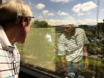
University of Alabama in Huntsville climate scientist Dr. John Christy looks at a bullet hole in the window of the office next to his at the university. Seven shots were fired at the building over the weekend of April 22-23, and Christy believes his floor was targeted. (Lee Roop/lroop@al.com)
In fact, these details miss the big picture of this event. Even if: (1) the bullets had hit the other end of the building, (2) on the first floor, (3) it didn’t happen on Earth Day weekend, and (4) there was no March for Science that weekend, I would still consider 7 shots fired into our building a probable act of ecoterrorism.
I am not surprised this happened at all.
For the last 25 years our science has been viewed as standing in the way of efforts to institute a carbon tax or otherwise reduce carbon dioxide emissions. The amount of money involved in such changes in energy policy easily run into the hundreds of billions of dollars...more likely trillions.
When I was at NASA, my boss was personally told by Al Gore that Gore blamed our satellite temperature dataset for the failure of carbon tax legislation to pass.
So why am I not surprised that our building was shot up?
Because people have been killed for much less reason than hundreds of billions of dollars.
This is why the FBI needs to get involved in this case, if they haven’t already. Ecoterrorism is a federal crime. There were federal employees in the building at the time the shots were fired into the building.
The original media reports that the event was a “random shooting” were, in my opinion, irresponsible. As far as I know, there were no questions asked of us, like “Do you know why someone might have intentionally shot into your building?”
Well, hell, yes I know why. And I’m a little surprised it didn’t happen sooner.
John and I have testified in congress many times on our work. John has been particularly effective in his testimony over the years. While I believe the shots were a “message” to us, I don’t think John or I are that worried for our personal safety. Whoever did this is most likely not going to approach us and physically threaten us in person. Instead, we mostly just get hate mail. Nevertheless, just in case I took personal defense training with firearms years ago.
I doubt that the perps will ever be identified. But if UAH employees want to have a sense of safety, it is not helpful for such an event to be deemed a “random shooting” within only six hours of it being reported, and the public told it won’t be investigated any further. Last evening, the UAH police sent out emails to everyone on campus asking for any additional information related to the shooting, and correcting their previous statement that no one was in the building during the shooting (NWS employees are here 24/7). The FBI needs to also be involved in this, sending a message that if anyone tries to do this again, there might be consequences.
The parents of students considering attending UAH would expect no less.
CLARIFICATION: I didn’t mean to imply the motive for the shooting was necessarily financial, although the perps could have been paid to do what someone else was afraid to do on their own. It’s more likely they are religiously motivated, hoping to Save the Earth. Of course, the evidence that more carbon dioxide in the atmosphere is good for life on Earth is not part of their religion.
--------
UAH Shooting Investigation Update, and Thanks
April 27th, 2017
John Christy met with the chief of police at UAH today, and I’m happy to report that, contrary to initial reports, the investigation into the seven shots fired into our building has not been dropped. UAH has also coordinated with other law enforcement, which is good.
I’d like to thank everyone who made the effort to spread the word about this event, which I consider a probable ecoterrorism attack. Rush Limbaugh also covered it, which I’m sure helped as well.
We have been asked to not make public any details of what they have learned so far. (So, please, don’t ask.)
What might surprise readers here is that our “reputation” (John Christy and me) has always been more widely known on a national and international level, than a local level. We think that local law enforcement personnel were probably not aware that scientists could be the potential targets of radicals...if that’s indeed what has happened.
I doubt we will learn much that we can divulge in the coming days and weeks. But the good news is that law enforcement is working on it. That’s all I wanted...for it not to be ignored.
By Thomas D. Williams, Ph.D.
In an open letter to Donald Trump, climate expert Dr. Duane Thresher has urged the President not to give in to his daughter Ivanka’s misguided views on global warming and her insistence that the U.S. remain in the Paris climate agreement ratified by Barack Obama last August.
‘Climate treaties like the Paris Agreement have little to do with climate,” Thresher notes in his letter, which he made available to Breitbart News. “They are about economic competition. As the greatest economy in the history of the world, other countries will do anything to cripple the United States.”
Thresher, who has a PhD in Earth & Environmental Sciences from Columbia University and NASA GISS and worked for years in climate monitoring, says he understands the President’s temptation to listen to his daughter’s advice, but begs him not to give in to that temptation.
“Countries like China will agree to anything in these treaties and simply ignore their obligations while demanding the United States fulfill theirs,” Thresher said, calling belief in global warming a “popular delusion.”
In his letter, Dr. Thresher also reminded President Trump of his campaign promises that led many Americans to vote for him.
“We who voted for you consider stopping this climate change madness one of your key promises,” Thresher said. “If you renege on it you will lose me and many others as supporters.”
After Trump’s election, in fact, a number of climate change skeptics were emboldened to take more public stands against the politically imposed “scientific consensus” of global warming, welcoming a new era of free debate about a hotly contested issue.
Scientists unconvinced by the party line on climate change applauded Trump’s appointment of Oklahoma Attorney General Scott Pruitt to head up the Environmental Protection Agency as an important step away from climate alarmism.
Even if Trump caves and stays in the Paris climate agreement, Thresher says, it won’t win him any friends. “Your opponents are not going to support you; they’ll just taunt you as being a flip-flopper,” he said.
“Climate science is one of the most fascinating sciences there is. To turn it into a lie for political purposes is a crime,” he stated, before urging the President to stand strong in his convictions.
“Make climate science great again,” he wrote.