


By Anthony Watts, WUWT
Here’s a bit of research that you don’t normally see in the MSM stories about glacier melt. It is backed up by a second and very interesting article (below) from 1947 in Geographical Review which says “Most of the worlds glaciers have been shrinking in recent decades.” Yet, news reports of the last decade would have you believe that glacier recession is an unprecedented phenomenon.
From ETH Zurich: The most recent studies by researchers at ETH Zurich show that in the 1940s Swiss glaciers were melting at an even-faster pace than at present. This is despite the fact that the temperatures in the 20th century were lower than in this century. Researchers see the main reason for this as the lower level of aerosol pollution in the atmosphere.

A glaciologist on the way to work on the Silvretta glacier (Image: Matthias Huss - ETH Zurich)
In Switzerland, the increase in snow in wintertime and the glacier melt in summertime have been measured at measurement points at around 3,000 metres above sea level - on the Clariden Firn, the Great Aletsch glacier and the Silvretta glacier - without interruption for almost 100 years. As part of his doctoral work, Matthias Huss used this unique range of measurements to examine how climate change in the last century affected the glaciers. The work was carried out under the supervision of Martin Funk, professor and head of the Department for Glaciology at the Laboratory for Hydraulics, Hydrology and Glaciology (’VAW’![]() at ETH Zurich, who is also co-author of the study.
at ETH Zurich, who is also co-author of the study.
Solar radiation as the decisive factor
In its work, the research team took into account the solar radiation measured on the Earth’s surface in Davos since 1934. Studies over the past two decades have shown that solar radiation varies substantially due to aerosols and clouds, and this is assumed to influence climate fluctuations. Recent years have seen the emergence of the terms ‘global dimming’ and ‘global brightening’ to describe these phenomena of reduced and increased solar radiation respectively. These two effects are currently the subject of more and more scientific research, in particular by ETH Zurich, as experts feel that they should be taken into account in the climate models (see ETH Life dated July 9, 2009)
The new study, published in the journal ‘Geophysical Research Letters’, confirms this requirement. This is because, taking into account the data recorded for the level of solar radiation, the scientists made a surprising discovery: in the 1940s and in the summer of 1947 especially, the glaciers lost the most ice since measurements commenced in 1914. This is in spite of the fact that temperatures were lower than in the past two decades. “The surprising thing is that this paradox can be explained relatively easily with radiation”, says Huss, who was recently appointed to the post of senior lecturer at the Department of Geosciences at the University of Fribourg in Switzerland.
On the basis of their calculations, the researchers have concluded that the high level of short-wave radiation in the summer months is responsible for the fast pace of glacier melt. In the 1940s, the level was 8% higher than the long-term average and 18 Watts per square metres above the levels of the past ten years. Calculated over the entire decade of the 1940s, this resulted in 4% more snow and ice melt compared with the past ten years.
Furthermore, the below-average melt rates at the measurement points during periods in which the glacier snouts were even advancing correlate with a phase of global dimming, between the 1950s and the 1980s.
Less snow fall and longer melt periods
The researchers arrived at their findings by calculating the daily melt rates with the aid of climate data and a temperature index model, based on the half-yearly measurements on the glaciers since 1914. These results were then compared with the long-term measurements of solar radiation in Davos.
Huss points out that the strong glacier melt in the 1940s puts into question the assumption that the rate of glacier decline in recent years “has never been seen before”. “Nevertheless”, says the glaciologist, “this should not lead people to conclude that the current period of global warming is not really as big of a problem for the glaciers as previously assumed”. This is because it is not only the pace at which the Alpine glaciers are currently melting that is unusual, but the fact that this sharp decline has been unabated for 25 years now. Another aspect to consider - and this is evidenced by the researchers’ findings - is that temperature-based opposing mechanisms came into play around 30 years ago. These have led to a 12% decrease in the amount of precipitation that falls as snow as a percentage of total precipitation, accompanied by an increase of around one month in the length of the melt period ever since this time. Scientists warn that these effects could soon be matched by the lower level of solar radiation we have today compared with the 1940s.
Reference
Huss M, Funk M & Ohmura A: Strong Alpine glacier melt in the 1940s due to enhanced solar radiation. Geophysical Research Letters (2009), 36, L23501, doi:10.1029/2009GL040789
Here’s the supporting article in Geographical Review, available here. See post here.
Dr. Richard Keen
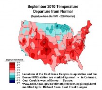
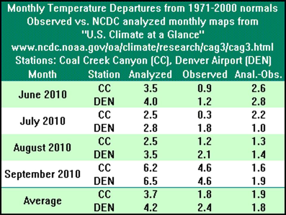
Each month, NCDC posts a “U.S. Climate at a Glance” summary on its website, featuring a color map of monthly mean temperature anomalies (departure from normal) for the entire U.S., based on an unspecified selection of stations.
Since July I’ve posted “spot checks” of these maps by comparing the maps with actual monthly temperature departures at two stations in Colorado, including Coal Creek Canyon, where I am the observer. Previous posts appear on ICECAP and Watt’s Up With That?.
Now I can add September to this comparison. September was an exceptionally warm month (second warmest at Coal Creek Canyon), with a “bull’s-eye” of 6+ degree warm anomalies over Colorado (see map). However, the observed anomalies were 4.6 degrees, nearly two degrees less.
Enlarged here.
So the story remains the same as in previous months (see table). The analyzed temperatures continue to run almost two degrees warmer than the actual station records. NOAA says little about which stations are used for their maps and how they do their analysis, so I cannot explain what stage of the NOAA analysis inflates the temperatures. All I can do is point out that their recent temperatures are inflated, and quite consistently.
Enlarged here.
By Roy W. Spencer, Ph. D.
There was a very clever paper published in Science this past week by Lacis, Schmidt, Rind, and Ruedy that uses the GISS climate model (ModelE) in an attempt to prove that carbon dioxide is the main driver of the climate system.
This paper admits that its goal is to counter the oft-quoted claim that water vapor is the main greenhouse gas in our atmosphere. (They provide a 1991 Lindzen reference as an example of that claim).
Through a series of computations and arguments, the authors claim that is actually the CO2, not water vapor, that sustains the warmth of our climate system.
I suspect this paper will result in as many opinions in the skeptic community as there are skeptics giving opinions. But unless one is very careful in reading this paper and knows exactly what the authors are talking about, it is easy to get distracted by superfluous details and miss the main point.
For instance, their table comparing the atmospheres of the Earth, Venus, and Mars does nothing to refute the importance of water vapor to the Earth’s average temperature. While they show that the atmosphere of Mars is very thin, they fail to point out the Martian atmosphere actually has more CO2 than our atmosphere does.
I do not have a problem with the authors’ calculations or their climate model experiment per se. There is not much new here, and their model run produces about what I would expect. It is an interesting exercise that has value by itself.
It is instead their line of reasoning I object to - what they claim their model results mean in terms of causation - in their obvious attempt to relegate the role of water vapor in the atmosphere to that of a passive component that merely responds to the warming effect of CO2…the real driver (they claim) of the climate system.
OUR ASSUMPTIONS DETERMINE OUR CONCLUSIONS
From what I can tell reading the paper, their claim is that, since our primary greenhouse gas water vapor (and clouds, which constitute a portion of the greenhouse effect) respond quickly to temperature change, vapor and clouds should only be considered “feedbacks” upon temperature change - not “forcings” that cause the average surface temperature of the atmosphere to be what it is in the first place.
Though not obvious, this claim is central to the tenet of the paper, and is an example of the cause-versus-effect issue I repeatedly refer to in the past when discussing some of the most fundamental errors made in the scientific ‘consensus’ on climate change.
It is a subtle attempt to remove water vapor from the discussion of “control” over the climate system - by definition. Only those of us who know enough of the details of forcing-feedback theory within the context of climate change theory will likely realize this, through.
Just because water vapor responds quickly to temperature change does not mean that there are no long-term water vapor changes (or cloud changes) - not due to temperature - that cause climate change. Asserting so is a non sequitur, and just leads to circular reasoning.
I am not claiming the authors are being deceptive. I think I understand why so many scientists go down this path of reasoning. They view the climate system as a self-contained, self-controlled complex of physically intertwined processes that would forever remain unchanged until some “external” influence (forcing) enters the picture and alters the rules by which the climate system operates.
Of course, increasing CO2 is the currently fashionable forcing in this climatological worldview.
But I cannot overemphasize the central important of this paradigm (or construct) of climate change theory to the eventual conclusions the climate researcher will inevitably make.
If one assumes from the outset that the climate system can only vary through changes imposed external to the normal operation of the climate system, one then removes natural, internal climate cycles from the list of potential causes of global warming. And natural changes in water vapor (or more likely, clouds) are one potential source of internally-driven change. There are influences on cloud and water vapor other than temperature which in turn help to determine the average temperature state of the climate system.
After assuming clouds and water vapor are no more than feedbacks upon temperature, the Lacis et al. paper then uses a climate model experiment to ‘prove’ their paradigm that CO2 drives climate - by forcing the model with a CO2 change, resulting in a large temperature response!
Well, DUH. If they had forced the model with a water vapor change, it would have done the same thing. Or a cloud change. But they had already assumed water vapor and clouds cannot be climate drivers.
Specifically, they ran a climate model experiment in which they instantaneously removed all of the atmospheric greenhouse gases except water vapor, and they got rapid cooling “plunging the climate into an icebound Earth state”. The result after 7 years of model integration time is shown in the next image.

Such a result is not unexpected for the GISS model. But while this is indeed an interesting theoretical exercise, we must be very careful about what we deduce from it about the central question we are ultimately interested in: “How much will the climate system warm from humanity adding carbon dioxide to it?” We can’t lose sight of why we are discussing all of this in the first place.
As I have already pointed out, the authors have predetermined what they would find. They assert water vapor (as well as cloud cover) is a passive follower of a climate system driven by CO2. They run a model experiment that then “proves” what they already assumed at the outset.
But we also need to recognize that their experiment is misleading in other ways, too.
First, the instantaneous removal of 100% of the greenhouse gases in the atmosphere except for water vapor causes about 8 times the radiative forcing (over 30 Watts per sq. meter) as does a 100% increase in CO2 (2XCO2, causing less than 4 Watts per sq. meter), something that will not occur until late this century - if ever.
This is the so-called ‘logarithmic effect’...adding more and more CO2 has a progressively weaker radiative forcing response.
Currently, we are about 40% of the way to that doubling. Thus, their experiment involves 20 times (!) the radiative forcing we are now experiencing (theoretically, at least) from over a century of carbon dioxide emissions.
So are we to assume that this dramatic theoretical example should influence our views of the causes and future path of global warming, when their no-CO2 experiment involves ~20 times the radiative forcing of what has occurred to date from adding more CO2 to the atmosphere?
Furthermore, the cloud feedbacks in their climate model are positive, which further amplifies the model’s temperature response to forcing. As readers here are aware, our research suggests that cloud feedbacks in the real climate system might be so strongly negative that they could more than negate any positive water vapor feedback.
In fact, this is where the authors have made a logical stumble. Everyone agrees that the net effect of clouds is to cool the climate system on average. But the climate models suggest that the cloud feedback response to the addition of CO2 to our current climate system will be just the opposite, with cloud changes acting to amplify the warming.
What the authors didn’t realize is that when they decided to relegate the role of clouds in the average state of the climate system to one of “feedback”, their model’s positive cloud feedback actually contradicts the known negative “feedback” effect of clouds on the climate’s normal state.
Oops.
(In retrospect, I suppose they could claim that cloud feedbacks switched from negative at the low temperatures of an icebound Earth, to being positive at the higher temperatures of the real climate system. But that might mess up Jim Hansen’s claim of strongly positive feedbacks during the Ice Ages).
CONCLUSION
Taken together, the series of computations and claims made by Lacis et al. might lead the casual reader to think, “Wow, carbon dioxide really does have a strong effect on the Earth’s climate system!” And, in my view, it does. But the paper really tells us nothing new about (1) how much warming we can expect from adding more CO2 to the atmosphere, or (2) how much of recent warming was caused by CO2.
The paper implies that it presents new understanding, but all it does is get more explicit about the conceptual hoops one must jump through in order to claim that CO2 is the main driver of the climate system. From that standpoint alone, I find the paper quite revealing.
Unfortunately, what I present here is just a blog posting. It would take another peer-reviewed paper that follows an alternative path, to effectively counter the Lacis paper, and show that it merely concludes what it assumes at the outset. I am only outlining here what I see as the main issues.
Of course, the chance of editors at Science allowing such a response paper to get published is virtually zero. The editors at Science choose which scientists will be asked to provide peer review, and they already know who they can count on to reject a skeptic’s paper.
Many of us have already been there, done that.
By Jay Dennis
Would generating more electricity from wind really help poor families or the environment?
We are often told we must end our “addiction” to oil and coal, because they harm the environment and Earth’s climate. “Ecologically friendly” wind energy, some say, will generate 20% of America’s energy in another decade, greatly reducing carbon dioxide emissions and land use impacts from mining and drilling.
These claims are a driving force behind the cap-tax-and-trade and renewable energy bills that Congress may try to ram through during a “lame duck” session - as well as the Environmental Protection Agency’s economy-threatening regulations under its ruling that carbon dioxide “endangers human health and welfare.”
It is true that we are commanded to be good stewards of the Earth and resources God gave us. We should conserve energy, use it wisely, and minimize harmful impacts on lands and wildlife. But we also need to safeguard our health and that of our neighbors, preserve jobs, and help poor families build wealth and improve their standard of living. I want all children, not just mine, to have a better future.
Heaven knows I’m not an engineer. But Robert Bryce’s readable book, “Power Hungry,” has opened my eyes and helped me appreciate what it really means to be good stewards - and why we depend on hydrocarbons for 85% of the energy that keeps our homes, businesses and communities running smoothly.
Bryce points out that we are no more “addicted” to fossil fuels than we are to food, housing and clothing. It’s simply that fossil fuels give us more abundant, reliable and affordable energy, from less land, than any alternatives we have today. They enable us to have jobs, hospitals, cars, schools, factories, offices, stores - and living standards better than royalty enjoyed a mere century ago. As fossil fuel consumption increases, so does agriculture, commerce, mobility, comfort, convenience, health and prosperity.
Oil, natural gas, coal and gasoline also give us huge amounts of energy from small tracts of land. One oil well producing just ten barrels a day provides the energy equivalent of electricity from wind turbines on half of Delaware, according to Bryce.
Wind-based electricity is unreliable. It’s available only when the wind is blowing enough but not too hard. It can add to our electrical grid, but can’t be depended on to power a business or operating room. And no factory or city can get by just on wind power - not in my lifetime, anyway. Wind as a primary or dominant energy source is simply a mirage.
Wind turbines actually generate electricity only seven hours a day on average - and 2 hours a day on sweltering Texas summer days and frigid Minnesota winter nights. That means every watt of wind power must be backed up by gas-fired generators that kick in every time the turbine blades stop turning.
And that’s just the beginning.
Wind turbine farms need ten times more steel and concrete than a nuclear, coal or gas power plant for the same amount of electricity. You also need thousands of tons of raw materials for the backup generators and the thousands of miles of new transmission lines to get the electricity to cities hundreds of miles from the wind farms. All these materials have to be dug out of the ground someplace.
All that mining and manufacturing is powered by fossil fuels, which requires more mining and drilling. The backup power plants have to be running constantly - and then roar to full strength every time the wind dies down. That’s like having to stop your car repeatedly for red lights along miles of highway: idling and then gunning it to 55 mph over and over. That uses huge amounts of fuel and emits enormous amounts of carbon dioxide and pollutants. In the end, we barely reduce America’s CO2 emissions - and may actually increase them.
Finally, even with billions of dollars in taxpayer subsidies, wind-based electricity is far more expensive than power generated by coal, natural gas or nuclear plants. That hurts families, sends business costs skyrocketing, and means people lose their jobs.
I’m not opposed to wind or solar or biofuels. I just don’t like it when our politicians, news media, environmental groups and government officials aren’t honest with us about these tradeoffs. Companies get fined for deceptive advertising. Politicians, journalists, eco-activists and bureaucrats should be held to the same standards.
Telling the truth is a basic moral principle. So is being a good steward of the Earth and its resources, by considering all the facts, the environmental impacts, and the harm to jobs and families from needlessly unreliable and expensive energy.
America can’t afford to shut down the fossil fuels that make our jobs and living standards possible - or slap huge new climate change taxes on them - before we have a real alternative to replace them, not just mirages.
Jay Dennis is senior pastor of the 10,000-member Church at the Mall in Lakeland, Fla., and a senior advisor for the Cornwall Alliance for the Stewardship of Creation.
Guest Post by Bob Tisdale, Watts Up With That
Guest Post by Bob Tisdale,
As noted in the post October 2010 Update to NODC Ocean Heat Content Data, the National Oceanographic Data Center has updated its OCEAN HEAT CONTENT (OHC) data. This is the dataset based on the Levitus et al (2009) paper “Global ocean heat content(1955-2008) in light of recent instrumentation problems”, Geophysical Research Letters. Refer to Manuscript.
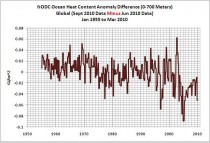
The update to the OHC data also included major changes, which have reduced the long-term rise in OHC. Refer to the gif animation, Figure 1, that shows the global OHC data from their June 2010 update (through March 2010) and from the most recent update and change (though June 2010). The revisions are considerable in many ocean basins. As described in their explanation of ocean heat content (OHC) data changes, the changes result from “data additions and data quality control,” from a switch in base climatology, and from revised Expendable Bathythermograph (XBT) bias calculations. (Refer to the NOAA FAQ webpage What is an XBT?) Immediately following Figure 1 is a link to a graph that shows the difference between the two global datasets, with the June 2010 update subtracted from the September 2010 update.
Enlarged animated image here. Figure 1: Global
Link to Graph of the Difference enlarged here.
Table 1 shows the OHC linear trends (in Gigajoules/Square Meter per Decade) for the global and hemispheric data and for the individual ocean basin subsets. Also shown are the differences (the data from the September 2010 update MINUS the data from the June 2010 update) and the percent change (difference divided by June 2010 update). Note: the June 2010 update included data through March 2010 and the September update/change included data through June 2010, but Table 1 only compares linear trends for the datasets through March 2010. As shown in Table 1, the linear trend for the Northern Hemisphere OHC data only dropped approximately 2%, while the Southern Hemisphere linear trend dropped about 16%. There was a minor increase in North Pacific trend (4%), while there were considerable drops in the linear trends of the South Atlantic (23%), South Pacific (17%) and the Southern Ocean (32%).
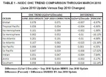
Table 1 enlarged here.
Figure 2 is the gif animation that shows the Southern Ocean OHC data (South of 60S) before and after the September 2010 changes. Prior to the mid-2000s and the introduction of ARGO buoys, the original data (through March 2010) simply appeared to be the climatology with some data added occasionally when it was available. The updated data seems to emphasize that appearance.
http://i54.tinypic.com/111sabn.jpg
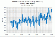
Figure 2 enlarged here of Southern Ocean
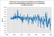
Link to graph of the difference enlarged here.
And there is good reason for that appearance. Like Sea Surface Temperature datasets based on buoys and ship sensors, there is very little Southern Hemisphere data, at all depths, prior to the ARGO buoys era. Figures 3 through 6 show the 3-month data distribution maps for January through March of 1955, 1975, 1995 and 2005, at depths of zero meters (surface), 250 meters, 500 meters and 700 meters. South of 60S there was little data even in 2005. The maps are available through the NODC Temperature data distribution figures webpage.
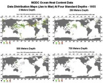
Map of coverage in 1955 enlarged here.
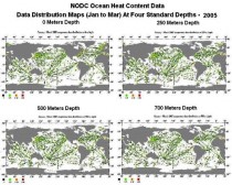
Map of coverage in 2005 enlarged here.
See much more on the effects of these changes on prior Bob Tisdale OHC analyses here.
By Thompson Ayodele
WHEN the World Bank held its annual meeting last weekend, there was much discussion of trade imbalances and currency wars, but nothing about Nigerian palm oil. That’s a shame, because the bank’s loans for plantation agriculture in sub-Saharan Africa and other developing regions - some $132 million of which have gone to palm oil cultivation - have been humanitarian and economic triumphs. Yet now, under misguided pressure from environmental groups, the bank is turning its back on the program.
Palm oil, which is extracted from the pulp of the oil palm, is an essential food in sub-Saharan Africa and other poor regions. Accounting for almost 40 percent of the world’s vegetable oils, it is an indispensable source of vitamins and calories. The developing world is heavily reliant on palm as a source of nutrition because the plant thrives in tropical climates and yields significantly more fats and calories than other options. It gives the developing world - where hundreds of millions of men and women still live on a few dollars a day - the most caloric bang for the buck.
Nigeria’s palm oil industry, which once led the world, was moribund by the end of the last century. But thanks to the World Bank program, it is now one of the world’s largest producers, after Indonesia and Malaysia. In addition to providing food, the palm oil sector offers jobs, employing tens of thousands of Nigerians who earn wages similar to those of college graduates. In a country where most people have limited education, this sector has been essential to helping the broader Nigerian economy grow.
The industry is also diverse, as both small-scale landholders and a growing number of industrial farms have used the World Bank loans to invest in more efficient harvesting and production techniques. The revival of the palm oil industry gives Nigeria hope that its economy will not be forever hostage to petroleum production - and the pollution and graft that inevitably accompany it.
But the bank’s legacy of success is now in serious jeopardy. Under the leadership of Robert Zoellick, a former United States trade representative, the bank has wavered from its poverty-reduction mission and is increasingly focusing on achieving fashionable political and social goals. As Mr. Zoellick put it, “We are all committed to ensuring that positive developmental outcomes - including environmental and social sustainability - are at the core of all our activities.”
This is a huge, and disturbing, change in direction. The World Bank was conceived out of the wreckage of World War II, and its mission has always been simple: extend low-interest loans from rich nations to support development projects in poor nations. Of necessity, many of these loans support agriculture-related projects. These projects do two crucial things. First, they help poor nations feed their populations. Second, they generate goods that can be traded in global markets, thus linking the developing world economically with the wealthy world.
The results have been extraordinary. According to the bank itself, since its inception, life expectancy in developing countries has risen by more than 20 years. Adult illiteracy in poor nations has been cut in half since 1980. And over the past two decades, the number of people living on less than $1 a day, while unacceptably high, has dropped for the first time.
But in many cases this progress has now run afoul of environmental groups that often put ideology ahead of the needs of the poor. And, unfortunately, these groups have persuaded Mr. Zoellick to suspend all loans for palm-related plantation agriculture indefinitely as the bank undertakes a review of its policies.
The critics of palm oil production, mostly in the United States and Europe, claim that it contributes to the destruction of forests. Yes, Nigeria has a problem with deforestation - but that is primarily in the country’s north, and almost all palm oil plantations are in the south. The forest depletion in the north is generally due to climate problems and the population’s reliance on firewood for fuel.
Indeed, the expected drop in palm oil production because of the World Bank’s decision is likely to worsen deforestation, as a weakened economy will force more Nigerians to chop down trees for cooking fuel and shelter.
The environmental effects of palm oil production around the world should certainly be given consideration, but any new regulations should not impede poverty alleviation in the developing world, as poverty is the biggest driver of ecological harm. And there are many multilateral organizations that focus on environmental health, including several within the United Nations, that are far better equipped than the World Bank to handle the job.
Mission creep is a threat to any large bureaucracy. What has made the World Bank almost uniquely successful over the last half-century has been its sustained focus on the most important humanitarian goal: lessening poverty. The moment the bank takes its eye off economic growth, it loses its reason for being. The residents of the developing world will be the casualties. See post here.
Thompson Ayodele is the director of the Initiative for Public Policy Analysis, an independent public policy group.
By Nicola Scafetta
From George Taylor, Founder of palmettoenergy.org, Los Altos, California
Nicola Scafetta has published the most decisive indictment of GCM’s I’ve ever read in the Journal of Atmospheric and Solar-Terrestrial Physics. His analysis is purely phenomenological, but he claims that over half of the warming observed since 1975 can be tied to 20 and 60-year climate oscillations driven by the 12 and 30-year orbital periods of Jupiter and Saturn, through their gravitational influence on the Sun, which in turn modulates cosmic radiation.
If he’s correct, then all GCM’s are massively in error because they fail to show any of the observed oscillations.
There have been many articles over the years which indicated that there were 60-year cycles in the climate, but this is the first one I’ve seen which ties them to planetary orbits.
- George
The paper is: Scafetta,N., Empirical evidence for a celestial origin of the climate oscillations and its implications. Journal of Atmospheric and Solar-Terrestrial Physics (2010),doi:10.1016/j.jastp.
2010.04.015
Abstract:
We investigate whether or not the decadal and multi-decadal climate oscillations have an astronomical origin. Several global surface temperature records since 1850 and records deduced from the orbits of the planets present very similar power spectra. Eleven frequencies with period between 5 and 100 years closely corresponding the two records. Among them, large climate oscillations with peak-to-trough amplitude of about 0.1 and 0.251C, and periods of about 20 and 60 years, respectively, are synchronized to the orbital periods of Jupiter and Saturn. Schwabe and Hale solar cycles are also visible in the temperature records. A 9.1-year cycle is synchronized to the Moon’s orbital cycles. A phenomenological model based on these astronomical cycles can be used to well reconstruct the temperature oscillations since 1850 and to make partial forecasts for the 21st century. It is found that at least 60% of the global warming observed since 1970 has been induced by the combined effect of the above natural climate oscillations. The partial forecast indicates that climate may stabilize or cool until 2030-2040. Possible physical mechanisms are qualitatively discussed with an emphasis on the phenomenon of collective
synchronization of coupled oscillators.
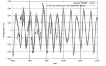
Enlarged here.
Rescaled SCMSS against two alternative pass-band filtered records of the temperature around its two decadal oscillation. The figures clearly indicate a strong coherence between the two records.
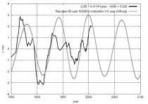
Enlarged here.
Length of the day (LOD) (black) against the 60-year modulation of the SCMSS (gray), which is related to the combined orbit of Jupiter and Saturn. The LOD is inverted and detrended of its linear trend, while the SCMSS is shifted by +5 years and opportunely rescaled for visual comparison. The correlation between the two records is evident.
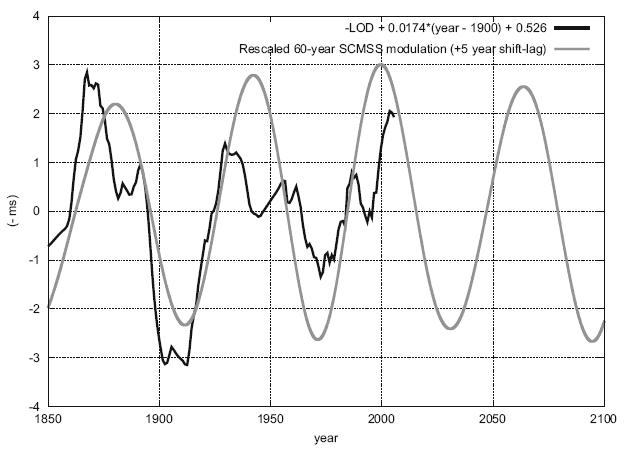
Read much more here. See also this post by Gerhard Lobert on cycles here.
By Lubos Motl, The Reference Frame
While most people with at least traces of rational thinking or common sense have largely seen through the nonsense of “climate disruption”, the AGW crusaders reacted in a simple way: they began to write bigger insanities than ever before, hoping that the low-to-nonexistent quality of their arguments can be compensated by their “intensity”.
A couple of fresh examples:

Global warming flattens skyscrapers
New Scientist has figured out some new science: “Earth is starting to crumble under the strain of climate change.” (This is a quote.)
Cities such as Seattle are going to be completely flattened soon. How does the Earth achieve this modest goal? It’s simple. Climate change is, first of all, detonating the volcanoes above such cities, Kate Ravilious professionally explains. Once the volcanoes explode because of the 0.013 C warming per year or so, they destroy all the skylines, too. No kidding. ![]()
---------
Americans fail because they can distinguish Sun and Earth
Canada’s CBC reported the results of a Yale poll about the Americans’ “knowledge” about climate change. See some details at the ACG blog. One of the insights that the Americans were expected to know, and this is a quote from CBC, was that:
“The greenhouse effect involves the trapping of the sun’s heat by gases in the earth’s atmosphere, such as carbon dioxide, nitrous oxide and methane.”
You know, the greenhouse gases are important because they trap the heat of the Sun, not the Earth. So the nations who live in the stratosphere are most threatened. That was their new kind of science. No wonder that most Americans failed in such a poll. If you choose Yale University and your IQ is outside the politically correct interval 0-70, you will fail, too. Before these arrogant people try to measure the knowledge of the Americans, shouldn’t they first try to realize that they’re among the biggest imbeciles in the country?
-----------
Tasmania runs backward in time
The people of Tasmania were showed the magic of climate modeling. They had to be advised by Sean Carroll because they think that even in the macroscopic world, you can simply run time backwards:
“When the new resolution was developed, the model was run backwards to 1960 and the output compared against known local temperatures and rainfall.”
Holy cow. The atmosphere is full of heat transfer - and other irreversible processes. Heat always goes from a warmer body to a cooler body and this process is irreversible. Every time it happens, the information gets lost. If you find a cool cup of soup on the kitchen table, you may try to run anything backwards but you won’t be able to retrodict when the soup was warm. This information got lost. Predicting how the soup will be cooled is possible, but retrodicting how and when it was “uncool” is not possible. The further you go, the more impossible it becomes. If you substitute the current conditions to the equations and if you run the equations backwards, the temperature differences etc. will inevitably exponentially increase. If they won’t, the equations are wrong.
Physical systems evolve to maximize the entropy. In the absence of external perturbations, it means that all the kinetic energy gets ultimately divided to the chaotic thermal energy and macroscopic motion stops. Only periodic external perturbations - that haven’t yet diminished because the “friction” terms are small (e.g. orbiting of the Earth around the Sun) - are able to cause periodic perturbations on the Earth.
The internal processes on the Earth are mostly irreversible macroscopic processes that destroy the information within a short time, and can’t be just “run backward” by 50 years even if you knew how to run them “forward”. The differential equations controlling any realistic model have lots of “friction” terms containing the first time derivatives that dissipate the energy and prevent us from making retrodictions.
Retrodicting the past is completely different from predicting the future and in macroscopic systems, it’s de facto impossible - something that the people behind those “models” are completely unaware of. Those people obviously don’t understand anything about macroscopic classical physics (and be sure that all other portions of physics are more difficult).
----------
AGW crusaders are complete hacks.
Old people cure global warming
Fast Company explains that the old people don’t usually drive Prius but their lower CO2 emissions are good to fight global warming, although old people are not quite as good as dead people. The message is that if the nations can’t kill themselves, they should at least try to get as old as possible. ![]()
------------
Andrew Dessler has seen a smoker
In Virginia, “Prof” Andrew Dessler has seen something unbelievable: a smoker of cigarettes. He may even have seen Richard Lindzen with his own eyes. That has been quite a breakthrough because throughout his life, Mr Dessler has only met politically correct heavy smokers of marijuana.
So Mr Dessler learned that Richard Lindzen is actually walking the walk, too. ![]() He described his shocking new experience as follows:
He described his shocking new experience as follows:
“Prior to this talk, Lindzen was outside smoking,” Dessler said motioning to Lindzen. “But not everyone wants to take that risk. This is just like climate change. Some of us aren’t willing to take that risk, but he is.”
As in the Nude Socialist story at the top, a volcano could have collapsed onto the cigarette. It’s risky.
If it’s “just like climate change”, I suppose that next time, they plan to physically prevent Richard Lindzen - and billions of other smokers in the world - from smoking outside and they will force them to buy some carbon credits and nicotine credits.
Via Marc Morano and Willie Soon