


By Viv Forbes, Carbon Sense Coalition
The Carbon Sense Coalition today claimed that Penny Wong’s Green Paper on the Carbon Reduction Scheme had been overtaken by scientific and political developments and was now almost legless. The Chairman of “Carbon Sense” Mr Viv Forbes said that of the three pillars of the government’s climate change policy, only one was sensible - “Adapting to Climate change that we cannot avoid”.
Politicians living in the Canberra hot house seem to think that controlling the climate is as simple as adjusting the thermostat in their air-conditioned offices. Man cannot control the weather and the only feasible climate policy is to make sure we have the brains, the freedom, the flexibility, the funds and the machinery to cope with whatever surprises the climate has in store for us. “Adapt or die” has been the guiding rule for every species since life began on this ever-changing earth.
The first pillar of the policy, “reducing greenhouse gas emissions” is based on flawed science and promoted by scare stories with no evidence to support them. The science shows clearly that carbon dioxide in the atmosphere cannot be a significant driver of global warming. Moreover, records going back 10,000 years confirm that CO2 does not drive temperature. Thus any attempts to reduce carbon emissions will be “pain for no gain”.
The third pillar of government climate change policy aims to “shape a global solution”. This policy is also flawed and should be abandoned. India, China and Russia do not believe that CO2 drives global temperatures and will only join a global agreement if it costs them nothing or, even better, they get paid “carbon sin dispensation money” by silly western nations. Russia has already banked huge carbon credit receipts and other nations are hoping to jump on this gravy train.
Moreover, anyone with a sensitive political antenna can see that in places like Britain, Germany, Canada and the US, the rising costs of food and energy, and the Green destruction of jobs, are worrying electors far more than a mythical global warming bogey-man that never arrives. For more comment see: “The One Legged Stool” a response to the Green Paper on the federal government carbon reduction scheme: This talks about the science, temperature trends and history, IPCC guesses and forecasts, the future of corals, species extinctions, sea level changes, drought forecasts, tipping points, the benefits of warming, the benefits of increased CO2 in the atmosphere, loaves and fishes tricks, and our future in sackcloth and sandals.
By Ernst-Georg Beck
The highlight of the 2001 climate report of the IPCC was undoubtedly the hockeystick graph, created by the Penn State University climate scientist Michael Mann. The curve was a reconstruction of the northern hemisphere’s temperature since 1000 B.C showing a linear contour until the 19th century and an abrupt rise since about 1900. Most remarkable was the absence of the well documented Medievial Warm Period (MWP) and the Little Ice Age (LIA) during the 17th century. Relying mostly on the treerings of bristlecone pines growing at extreme locations several groups of scientists meanwhile had falsified Mann’s study. In September 2008 M. Mann has published a new paper, using data from 9 different proxies and confirming the contradicted claims of his first article in 1998. Again he summarized: “Surface temperatures in the Northern Hemisphere were warmer over the last 10 years than any time during the last 1,300 years”. According to his updated temperature reconstruction modern temperatures exceed those of the MWP by approx. 0.8C.
A closer look to Mann’s paper will help us to find the truth:
1. His new temperature contour is very similar to his “contradicted hockeystick graph“. Thousands of studies round the world give evidence for a MWP and LIA showing much higher temperatures during MWP than today. The tree limits in the mountains or near the arctic circle had been several hundred meters higher respectively towards the north compared to today.
2. Mann is comparing smoothed decadal temperature reconstructions from proxies with the high resolution annual averages from direct measurements since 1850. This is not acceptable.
3. As direct measured temperature data he used the exaggerated data from CRU (UK), which display a rise of approx. 1.3C since 1850, in contrast to the 0.7 C by IPCC.
4. If these direct data were omitted (in red) the proxies clearly show higher temperatures during the MWP.
5. Using fig. 2 of his latest study we see the proxy data compared to the direct measurements since pre-industrial times 1850 (CRU). source: Mann et al. 2008 (fig. 2, extract) but there is absolutely no correlation in the second half of the 20th century when the CRU data claim a sharp rise of the temperature and the proxies suggest a cooling. Conclusion: If the reconstructions are valid modern measured temperature data published by CRU are in error.
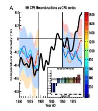
6. Mann exclusively had used data received on continents omitting ocean data despite of a 61% coverage of the northern hemisphere by oceans.
Mann’s new paper is another attempt to falsify climate history by selective and statistical fitted data. MWP and LIA are the most complete documented periods in climate history. The referees who passed such a most questionable piece of paper obviously agreed with Mann’s results to confirm IPCC’s man made greenhouse fantasies. See full pdf here. See Beck’s reconstruction of the CO2 based on direct chemical measurements and temperatures from proxies ignoring the urban contaminated station data over the same interval here.
By Steve McIntyre, Climate Audit
Notice of a new reconstruction by Mann and the Team is in many press clippings today, citing a PNAS article that is not (as I write) online. Rather than clutter other threads, here’s a placeholder thread pending my own response which may take a few days. Article is now online here. The most lengthy notice is here. In the pres release, Mann states that tree ring data is inessential to the present reconstruction, unlike the situation 10 years ago:
“Ten years ago, we could not simply eliminate all the tree-ring data from our network because we did not have enough other proxy climate records to piece together a reliable global record,” said Michael Mann, associate professor of meteorology and geosciences and director of Penn State’s Earth System Science Center. “With the considerably expanded networks of data now available, we can indeed obtain a reliable long-term record without using tree rings.” It’s interesting that Mann characterizes the past studies in this way as the previous studies had, at the time, made pretty specific claims purporting to be robust to the presence/absence of dendroclimatic indicators. For example, Mann et al 2000 stated:
We have also verified that possible low-frequency bias due to non-climatic influences on dendroclimatic (tree-ring) indicators is not problematic in our temperature reconstructions. Or here, Mann states: Whether we use all data, exclude tree rings, or base a reconstruction only on tree rings, has no significant effect on the form of the reconstruction for the period in question. This is most probably a result of the combination of our unique reconstruction strategy with the careful selection of the natural archives according to clear a priori criteria.
Now CA readers know that the presence/absence of tree rings (actually, bristlecones) had a “significant effect” on the AD1400 network - something that Mann knew as well from the analysis in the amusingly titled CENSORED directory (now deleted from his website), but here Mann artfully illustrated the AD1760 network where the results were advantageous. (In a securities offering, disclosure of the adverse AD1400 results would be obligatory, but seemingly not in climate science where authors are apparently permitted to report only results that go their way.) MBH98 stated: the long-term trend in NH is relatively robust to the inclusion of dendroclimatic indicators in the network, suggesting that potential tree growth trend biases are not influential in the multiproxy climate reconstructions.
So this isn’t the first time that Mann has claimed that his results are robust to the presence/absence of tree ring data. He is a serial utterer of this particular claim. It doesn’t look like there is anything very much from the ocean sediment world. Overall, I think that the selections are going to prove pretty familiar and that the MWP proxies are going to be the same tired old ones that we’re used to. See this story here. See much more on Mann’s same old story paper on (reconstructions/fabrications) here.
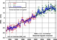
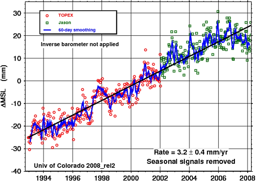
NASA JPL
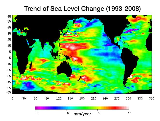
Warming water and melting land ice have raised global mean sea level 4.5 centimeters (1.7 inches) from 1993 to 2008. But the rise is by no means uniform. This image, created with sea surface height data from the Topex/Poseidon and Jason-1 satellites, shows exactly where sea level has changed during this time and how quickly these changes have occurred.
It’s also a road map showing where the ocean currently stores the growing amount of heat it is absorbing from Earth’s atmosphere and the heat it receives directly from the Sun. The warmer the water, the higher the sea surface rises. The location of heat in the ocean and its movement around the globe play a pivotal role in Earth’s climate.
Light blue indicates areas in which sea level has remained relatively constant since 1993. White, red, and yellow are regions where sea levels have risen the most rapidly - up to 10 millimeters per year - and which contain the most heat. Green areas have also risen, but more moderately. Purple and dark blue show where sea levels have dropped, due to cooler water.
The dramatic variation in sea surface heights and heat content across the ocean are due to winds, currents and long-term changes in patterns of circulation. From 1993 to 2008, the largest area of rapidly rising sea levels (red) and the greatest concentration of heat has been in the Pacific, which now shows the characteristics of the Pacific Decadal Oscillation (PDO), a feature that can last 10 to 20 years or even longer.
This image of sea level trend also reveals a significant area of rising sea levels in the North Atlantic where sea levels are usually low. This large pool of rapidly rising warm water is evidence of a major change in ocean circulation. It signals a slow down in the sub-polar gyre, a counter-clockwise system of currents that loop between Ireland, Greenland and Newfoundland. Such a change could have an impact on climate since the sub-polar gyre may be connected in some way to the nearby global thermohaline circulation, commonly known as the global conveyor belt. This is the slow-moving circulation in which water sinks in the North Atlantic at different locations around the sub-polar gyre, spreads south, travels around the globe, and slowly up-wells to the surface before returning around the southern tip of Africa. Then it winds its way through the surface currents in the Atlantic and eventually comes back to the North Atlantic. It is unclear if the weakening of the North Atlantic sub-polar gyre is part of a natural cycle or related to global warming. Read more here.
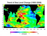
See larger image here.
Icecap Note: As the oceans have cooled with the PDO and La Nina, sea level rise has ceased in the last year plus as the oceans contract as they cool. This cooling is noted in the eastern Pacific and Indian Ocean (blue) associated with the flip of the PDO as noted. The Atlantic warming mentioned is characteristic of the natural multidecadal oscillation (AMO) in its warm mode since 1995.
See larger image here.
By Bob Ferguson, SPPI
In the most recent edition of its influential ScareWatch series, the Science and Public Policy Institute questions whether the Brookings Institute is familiar with basic geography, to say nothing of climate science. Says SPPI President, Robert Ferguson, “In an April 28 Washington Post opinion editorial worthy of a London tabloid, the President of Brookings and a resident policy wonk blamed Americans for the approaching reputed climate cataclysm, and listed out specific camp-fire apocalyptics - including the fanciful notion that the land-locked African nation of Mali will sink beneath the seas unless the American economy is shut down within the next seven years.”
The co-authors, who are currently working with Stanford University on a “global governance” project, whatever that may be, recite a well-worn litany about the “momentous political challenge” faced by the next US President because of warmer weather.
They say greenhouse gases are warming the Earth; that it will warm by more than 4.5 F by as soon as 2050, causing “vast regions” to “slide towards being uninhabitable”; that arable land will turn into desert; that the sea will rise to flood coastal areas from Manhattan and Florida to Bangladesh, St. Petersburg, and Mali; that the Gulf Stream will be altered; that Nevada will have no water at all; that cap-’n’-trade, windmills, solar panels, biofuels, and carbon-capture are the answer to this “existential threat to civilization”; and that Americans are guilty because the United States emits four times as much carbon per head as the Chinese and 12 times as much as the Indians.
SPPI examines each scare in turn. A few examples include:
“The planet will warm by 4.5 F by mid-century”: “Here, the authors are predicting that temperatures over the next 40 years will rise by 0.1 F per year. Temperature has been falling throughout the past seven years, so this forecast is already looking over-ambitious. In fact, temperature rose by only 1 F between 1907 and 2007, a rate of just 0.01 F per year. There is no credible scientific evidence to the effect that this long-run warming rate, which began 300 years ago and shows absolutely no sign of increasing despite the extra carbon dioxide in the air, will suddenly accelerate tenfold. Forecasts of this kind are scaremongering plain and simple, and are no longer credible in the least degree.
“Arable land will turn into desert”: “It will do no such thing. By the Clausius-Clapeyron relation, of which the Brookings Institute has perhaps not yet heard, in warmer weather the space occupied by the atmosphere is capable of carrying near-exponentially more water vapor than in colder weather. This relation establishes scientifically what has long been observed: that, in general, warmer weather is wetter weather.”
“Cap-’n’-trade will Save The Planet”: “Not that the planet needs saving: carbon dioxide concentrations were 20 times today’s level back in the Cambrian era, and temperatures were only 12 F above today’s. The planet survived just fine. The notion that emissions trading will make the slightest useful contribution to the future evolution of the Earth’s climate is as absurd scientifically as it is economically. Transferring Western jobs and carbon emissions to China and India, which will be the direct result of any emissions-trading program, will actually increase the planet’s carbon footprint. Also, carbon trading, which arbitrarily favors some industries at others’ expense, is nothing more than a system of Socialist rationing under the pietistic guise of Saving The Planet.” See entire paper here.
By Rodney Hyde, NZ MP
Speech to Parliament; Tuesday, 2 September 2008
I think I will be the only person speaking in this debate who has any qualifications in environmental science. It is not that that should count, but I think that it is significant for what I am about to say - that is, that the entire climate change - global warming hypothesis is a hoax, that the data and the hypothesis do not hold together, that Al Gore is a phoney and a fraud on this issue, and that the emissions trading scheme is a worldwide scam and swindle. All we have in this is a computer model. That is notoriously difficult, because the answers are written in the assumptions. Let me give members just one example.
Enacting this legislation will cost New Zealanders dear—that is the point of it - and it will drive up the costs of basic goods and services for New Zealanders probably by at least $500 or $600 a year. It will put businesses in New Zealand out of business. It will put farmers off their farms. And it will do all this for no impact on world weather, for no environmental gain, and for no conceivable advantage to New Zealand or to the world
The problem for the first two Intergovernmental Panel of Climate Change reports was what was called the medieval warming period, where a thousand years ago the Earth was warmer than it is now. Then, magically, an obscure physicist in the US came up with a new bit of analysis - the hockey stick - that showed world temperature to be flat and then rising dramatically as the world became industrialised. The Intergovernmental Panel on Climate Change grabbed this, put it on the front of its document, and repeated it five times.
Researchers all around the world were puzzled by this, because it did not fit any of their data. Eventually they got hold of that computer model and they discovered this: any numbers fed into that model would produce the hockey stick. We could take the Wellington telephone directory, feed it into the model that the Intergovernmental Panel on Climate Change used in 2001, and we would get the hockey stick that saw the world running scared, that saw policy-makers running scared, and saw Al Gore make his movie based on it.
The science was rubbish, because a computer model is not science. Science is about theories, hypothesis, and the testing of these against the facts. That is not what has happened in the basic science here. That is bad enough, but what is worse is the policy rationale underpinning this legislation. The Minister would come before the select committee and talk about a “cap and trade” but, when asked, would say: “Yes, there is no cap.” We are creating a market in hot air, without any quantified amount. Read full story here.
SPPI, Watts Up With That, Climate Audit
Don’t miss these posts on our fellow climate realist sites:
Frogs & Global Warming
By CO2 Science Craig Idso on SPPI
Back in 1995, schoolchildren in Minnesota discovered a number of frogs that had more than their normal complement of hind appendages. Further investigations revealed other abnormalities: missing limbs, twisted jaws and declining populations all around the globe. Was it checkout time for toads? The end of the world for amphibians? A harbinger of even more terrible things about to descend on the rest of the biosphere? As described in our Editorial of 1 June 1999, no speculation was too great for the fertile imaginations of scientists and journalists alike. More here.
Analysis of the Report, “Kansas: Assessing the Costs of Climate Change”
Written by SPPI
We’ve attempted to document the numerous weaknesses and shortcomings in the National Conference of State Legislatures (NCSL) report on Kansas. While there are certain aspects that to the layman may appear intrinsically scientific and of interest, its analysis and conclusions are unconvincing and unsupportable. Worse, they encourage public policy responses already doing harm, not good. Given its many problems, it is amazing the report is taken seriously at all. Shoddy science and a failure of the media and policy community to demand higher standards is not the best recipe for helping science contribute effectively to energy policy. Those who perpetuate such claims represented in this and similar reports are either ill-informed or dishonest. Read more here. See earlier part I here.
On Watts Up With That
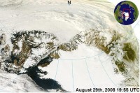
Meier of NSIDC on arctic melt: “it’s not going to make it to the North Pole” North Pole to remain frozen
By Bill Scanlon, Rocky Mountain News
Santa can rest easy. It’s looking like the ice at the North Pole won’t melt to water next month, as had been feared. It would have been the first time in thousands of years that the most northerly place on the planet would have been ice-free. “It’s quite unlikely at this point,” Walt Meier a research scientist at the University of Colorado’s National Snow and Ice Data Center, said today. The ice in the Arctic Ocean is at near historic lows, and breaks records every couple of years due to human-caused global warming, the scientists at NSIDC say. This spring, it was looking like the ice might retreat so far that the North Pole itself would be ice-free for at least a day in September - the height of the ice-melt season.
The chances were great enough that the scientists at NSIDC were laying almost even odds on it in an office pool. But while global warming is playing an important role, seasonal variability does, too. And this summer turned out to be a little cooler than last summer, when the record for ice retreat was set, Meier said. “We only have about two or three weeks more of ice melt, and it’s not going to make it to the North Pole,” Meier said.
On Climate Audit
By Ryan Maue, FSU
The North Atlantic tropics are becoming very active as the calendar approaches the climatological peak of the season. With high sea-surface temperatures and generally favorable atmospheric conditions (i.e. low vertical shear), every circulation or puff of convection must be watched for signs of organization. Currently, Gustav is rapidly reorganizing in the Caribbean and in 4-5 days, forecast to make landfall somewhere along the north Gulf coast. Tropical Storm Hanna has had some very interesting initial model forecasts as well. Here are some handy model guidance maps and sites to follow the storm over the next week. Read more here.
By Rick and Amy Rinehart
Our new book Dare to Survive: Death, Heartbreak and Triumph in the Wild offers a meteorological anecdote that should be of interest to readers of this site. (Our book can be described as a “true crime” type collection where nature is the bad guy in, among other calamities, severe weather events).
On December 7, 2006 NOAA predicted that, based on a strengthening El Nino event in the Pacific Ocean, winter would bring “increased storminess and wetter-then-average conditions across the southern tier of the U.S. from central and southern California across the Southwest to Texas and across the Gulf Coast to Florida and the Southeast.”
Accompanying the announcement in NOAA Magazine was a map of North America showing the continental weather outlook for December 2006 through February 2007. For Colorado’s Front Range, the urban strip east of the Continental Divide running from Fort Collins to Pueblo and including the metropolitan areas of Boulder, Denver, and Colorado Springs, the map was painted a dull brown, indicating above-average temperatures and below-average to average precipitation for the period.
NOAA’s forecast held up for exactly 13 days. On December 20 a strong low pressure system moved into Colorado, dumping 26 inches of snow in Boulder alone. “All-weather” Denver International Airport was shut down for 45 hours, stranding 3,000 passengers. Sixteen more inches of snow fell in Boulder from December 22-29.
Those looking for relief in January would have had to go to the unusually balmy New York and New England to escape the snow. The month was the seventh snowiest in Denver’s history, and the mean monthly temperature was almost 9 degrees below average. When the last snow disappeared from the ground on February 19, it marked the second-longest period of consecutive days with snow on the ground in the city’s history: 61.
See Denver Airport snow video here.
Eastern Colorado’s winter storms of 2006/07 not only demonstrated how difficult it is to forecast the weather beyond just a few days, but also how crippling they can be to a region’s economy and livelihood. Five people may have been killed in the December storms, though uncertainty about pre-existing conditions made it difficult to pin the blame directly on the weather. In southeastern Colorado, though, thousands of sheep and cattle died, many right in their feedlots. Businesses were crippled when snow-drifted highways regularly stranded trucks, which even when they got through had to deal with snow and ice-clogged alleyways. Supermarket shelves were empty for days on end, and it was difficult if not impossible to find one valued commodity, windshield-washer fluid, until February. The Colorado experience made fools out of two kinds of people: those who think that climate modeling is infallible, and those who think that weather and climate are forces of nature that we somehow have control over.
See printable document here. Buy book here.