By Joanne Nova
A big news day. It appears Steve McIntyre (volunteer unpaid auditor of Big-Government-Science) has killed the Hockey Stick a second time.

The details are on the last three days of Steve McIntyre’s site Climate Audit, and summed up beautifully on Watts Up. The sheer effrontery and gall appears to be breathtaking.
The Briffa temperature graphs have been widely cited as evidence by the IPCC, yet it appears they were based on a very carefully selected set of data, so select, that the shape of the graph would have been totally transformed if the rest of the data had been included.
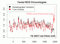
Kieth Briffa used 12 samples to arrive at his version of the hockey stick and refused to provide his data for years. When McIntyre finally got hold of it, and looked at the 34 samples that Briffa left out of his graphs, a stark message was displayed. McIntyre describes it today as one of the most disquieting images he’s ever presented.

Background
Since 1995 Kieth Briffa has been publishing graphs about temperature of the last thousand years. Like Michael Manns’ famous (and discredited) Hockey Stick graph, Briffa’s graphs were based on tree rings and appeared to show dramatic evidence that the current climate was extraordinarily warm compared to previous years. They were used in the infamous spagetti plots, and the IPCC 3rd Assessment Report, and recycled in other publications giving the impression they had been replicated. His work has even made it into school resources (Cimate Discovery, p4). His publications since 2000 are listed here.
Unaudited science
Suspiciously Briffa refused repeated requests to provide the Yamal data that his analysis was based on (something about the data belonging to the Russians). As Steve McIntyre points out, this kind of data should be archived and freely available after any peer reviewed paper is published.
Last year Briffa published a paper in a journal (Philosophical Transactions of Biology, the Royal Society) that did maintain basic standards (after being prodded) and a few days ago McIntyre noticed the data was finally up. This data had been used in papers going back as far as 2000. (And no one thought to politely inform McIntyre that the information he’d requested for years was now available?)
Hiding data in science is equivalent to a company issuing it’s annual report and telling the auditors that the receipts are commercial in confidence and they would just have to trust them. No court of law would accept that, yet at the “top” levels of science, papers have been allowed to sit as show-pieces for years without any chance that anyone could seriously verify their findings. In science, getting the stamp of Peer Review has become like a free pass to “credibility”.
Science is broken
So much for the repeat claims that peer review is a “rigorous process”. Those who keep telling us we have to “listen to the experts” and who put so much stock in a peer reviewed paper have been left hanging out to dry. Even if Briffa has a reason to exclude 2/3rds of the samples and somehow it’s just a coincidence that the ignored data were from slower growing trees, nothing changes the fact that he didn’t mention that in the paper, and nor, damningly, did he provide the data. It only takes a sentence to say (for example) “ABC tree chronologies excluded due to artificial herbicide damage” and it only takes a few minutes to email a data file.
Now we know why he might not have been so forthcoming with the data.
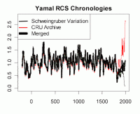
If all the tree rings are combined, the graph looks like this below. (I’ve added the black thick line to the original to make the merged data stand out). Obviously today is not as warm as things were 1000 years ago (at least not in far north Russia), and it’s also clear things have been warming since 1800 in Yamal. (image here)
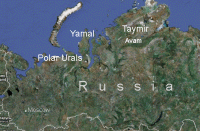
Here’s a map to help put places to the names. These are the four sites mentioned as sources of the tree ring data. Yamal and Taymir are roughly 400 km apart.

In the mid 1990’s the Polar Urals were the place to be for interesting tree rings, but then as the data got updated and yielded a medieval warm period that Team AGW preferred to ignore, they moved their focus to the Yamal Peninsula. There was plenty of data to pick from, but that’s the point. They chose 10 data sets from 1990, and only 5 post 1995. Which seems curious as presumably there is no shortage of 20 year old trees on the Yamal Peninsula. As Ross McKitrick notes, a small sample may have been passable, but it appears that these trees were not selected randomly.
McKitrick expands:
Thus the key ingredient in a lot of the studies that have been invoked to support the Hockey Stick, namely the Briffa Yamal series (red line above) depends on the influence of a thin subsample of post-1990 chronologies and the exclusion of the (much larger) collection of readily-available Schweingruber data for the same area.
Honest scientists who believe in there is a crisis in carbon must surely be starting to ask questions about what’s going on with their colleagues. If the evidence is so strong, so undeniable; if the warming recently has been so unprecedented, why won’t people offer their data up freely so that science can progress as fast as possible? When is deluding the public, other scientists and our elected representatives ever a useful thing to do? People have invested money and careers, governments have paid millions for reports, and billions for research; and companies have planned years ahead, all partly based on the Hockey Stick Graph.
If the data had been archived immediately for the public, the world could have had access to better information for nearly a decade.
See post here.
Albert Einstein: “Not everything that counts can be counted, and not everything that can be counted counts.”


