


By Dr. Tim Ball
Recent reports claim June was the warmest on record, but it seems to fly in the face of reports of record cold from around the world.
Reports from Australia say, “Sydney recorded its coldest June morning today since 1949, with temperatures diving to 4.3 degrees just before 6:00 a.m. (AEST).” “Experts say it is unusual to see such widespread cold weather in June.”

In the southern hemisphere reports of cold have appeared frequently but rarely make the mainstream media. “The Peruvian government has declared a state of emergency in more than half the country due to cold weather.” “This week Peru’s capital, Lima, recorded its lowest temperatures in 46 years at 8C, and the emergency measures apply to several of its outlying districts.”
“In Peru’s hot and humid Amazon region, temperatures dropped as low as 9C. The jungle region has recorded five cold spells this year. Hundreds of people - nearly half of them very young children - have died of cold-related diseases, such as pneumonia, in Peru’s mountainous south where temperatures can plummet at night to -20C.” “A brutal and historical cold snap has so far caused 80 deaths in South America, according to international news agencies. Temperatures have been much below normal for over a week in vast areas of the continent.”
“It snowed in nearly all the provinces of Argentina, an extremely rare event. It snowed even in the western part of the province of Buenos Aires and Southern Santa Fe, in cities at sea level.” (Source)
Evidence of the cold is reflected in the fact that Antarctic ice is continuing to reach record levels. “Antarctic sea ice peaks at third highest in the satellite record”.
The same contradictory evidence is happening in the Arctic. They claimed the most dramatic warming was occurring in the Arctic but this contradicts what the ice is doing. Ice continues its normal melt of the summer with a slowing rate slowed in the months of June and July. (Figure 1). The red line is for 2010.
So where are the stories coming from? It goes back to the manipulation of temperature data by the two main generators the Goddard Institute of Space Studies (GISS) and the Hadley Climate Research Unit (HadCrut). They use data provided by individual countries of the World Meteorological Organization. This is supposedly raw data, but in fact it has already been adjusted for various presumed local anomalies.
But the arctic warming is even more problematic. The Arctic Climate Impact Assessment (ACIA) is the source of data for Intergovernmental Panel on Climate Change yet it tells us there is no data for the entire Arctic Ocean Basin. Figure 2 shows the diagram from their report.
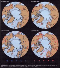
Figure 2: Weather stations for the Arctic.
Source: Arctic Climate Impact Assessment Report
This is why the map showing temperature for the Arctic shows “No data” for the region (Figure 3).
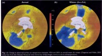
Figure 3: Temperatures for the period 1954 to 2003. They give the source as the CRU. Source: Arctic Climate Impact Assessment Report
So how do they determine that the Arctic is warming at all, let alone more rapidly than other regions? The answer is, with GISS at least, they use computer models to extrapolate. They do this by assuming that a weather station record is valid for a 1200 km region. Figure 4 shows the 1200 km smoothing results for the Arctic region (The green circle is 80N latitude.) showing the interpolation of southern weather stations to Arctic. Source: wattsupwiththat.com
Then we see what happens when the interpolation or smoothing is done using a more reasonable 250 km (Figure 5). Temperature pattern using a 250 km range for single station data. Source: wattsupwiththat.com
None of this is surprising because GISS have consistently distorted the record always to amplify warming. The problem of data adjustment is best illustrated by comparing the results of GISS and Hadcrut (Figure 6).
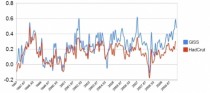
Figure 6: Comparison of Global temperature record. Source: Steve Goddard, WUWT.
The Hadcrut data shows what Phil Jones, former Director of the Climatic Research Unit (CRU) confirmed to the BBC that global temperatures have not increased since 1998. However, the GISS data shows a slight warming over the period and a significant increase from 2007. How can two records both using the same weather data achieve such different conclusions? The simple answer is they use different stations and adjust them differently, especially for such things as the Urban Heat Island Effect (UHIE).
There is another problem.
The number of stations used to produce a global average was significantly reduced in 1990 and this affected temperature estimates as Ross McKitrick showed (Figure 7). He wrote, “The temperature average in the above graph is unprocessed. Graphs of the ‘Global Temperature’ from places like GISS and CRU reflect attempts to correct for, among other things, the loss of stations within grid cells, so they don’t show the same jump at 1990.” McKitrick got the idea for the problem from an article by meteorologist Joe D’Aleo (2002).
The challenge is to produce meaningful long-term records from such interrupted data, but that is not the only problem because the loss of stations is not uniform. “The loss in stations was not uniform around the world. Most stations were lost in the former Soviet Union, China, Africa and South America."This is may explain the distortions currently occurring because it adds to the distortions that already exist toward eastern North American and western European stations. The pattern of temperatures of the Northern Hemisphere in the early spring and summer saw heat in eastern North America and Western Europe. There is a greater density of weather stations in these regions and they have the greatest heat island effect. The rest of the Northern Hemisphere and the Southern Hemisphere had cooler conditions but in the deliberately distorted record this was minimized.
McKitrick, Essex and Andersen, in “Does a global temperature exist?"concluded, “he purpose of this paper was to explain the fundamental meaninglessness of so-called global temperature data.” “But nature is not obliged to respect our statistical conventions and conceptual shortcuts.”
That is clearly the case this year and it confirms Alfred Whitehead’s observation that, “There is no more common error than to assume that, because prolonged and accurate calculations have been made, the application of the result to some fact of nature is absolutely certain”.
Read and see more here.