Joseph D’Aleo, CCM
UPDATE: See a full scientific evisceration of the National Geographic story here by Dr. Don Easterbrook. See also Nils Axel Morner add to Don’s post here.
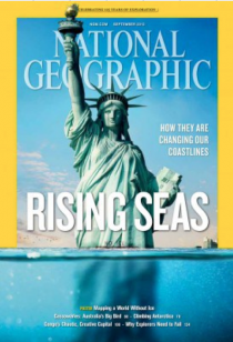
In the September 2013 issue of National Geographic, the feature story is on rising sea levels and how they are changing our coastlines. It shows a Statue of Liberty half submerged. The magazine in at least the past decade has adopted the failing climate change advocacy position prevalent in today’s mainstream media. It has become more science fiction than science fact. It is sad because it once was a very popular very balanced and informative trustworthy magazine. A lot of the hype on sea level rises including talk by Mayor Bloomberg of the need to spend $20 billion dollars to protect the city from rising seas and storms is based on faulty data.
The entire environmental movement is based on flawed theories and models. Whenever the data disagrees with the data they assume the data is wrong and adjust it to fit their projections.
The late, great Richard Feynman, a Cornell Physicist said about the scientific method that if data or experiments don’t support your theory no matter how beautiful it is or smart you are, the theory is wrong.
For example, global temperatures stopped warming close to 17 years ago and have cooled since 2002. This is while CO2 has increased over 11%. None of the climate change models used by the UN showed this hiatus. Claims of the warmest decade and very high ranking months and years are based entirely on our government manipulating climate data. In 1999 when NASA’s James Hansen observed relative to the US annual temperatures in the 20th century, that the 1930s was clearly the warmest decade and 1934 the warmest year, 1934 was a full 1.1F warmer than the spike in the super El Nino of 1998 in the NOAA’s/NASA’s prize US data set which adjusted for urban contamination.
That was inconvenient since their global data set that was not adjusted for urbanization was showing significant warming over the same period. NOAA in 2007 removed the urban adjustment and changed other processing steps. The result was now that 1998 became 0.2F warmer than 1934, a change of 1.3F. One data set that was not altered, the state all time record highs and lows, showed a very different story more like that depicted in 1999. 39 of the 50 all time state record highs occurred before 1960. The most, 23, occurred in the 1930s. More state record cold records than warm have been set since the 1940s.
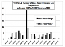
NOAA NCDC data compiled by Dr. John Christy for senate testimony in August 2012
The government loves to reinvent statistics. Does anyone really believe our real unemployment number is 7.3%? We get there by not counting people hopelessly unable to find employment. The CPI each month implies inflation is under control. But they exclude ‘volatile food and energy’. Sure boxer short prices are not rising at an alarming rate but gasoline is double what it was when Obama took office and a tank of heating oil may soon require a second mortgage. We shoppers all experience sticker shock when they go to buy package of chop meat. Sadly, this affects the poor and middle class the most as food and energy is what they spend the most money on. Europe went through this same green madness and is now abandoning it. That is not to say coproations don’t manipulate data when big money is involved - think Enron, MF Global, Bernie Madoff, and big pharma, but this is bigger and worse because it affects everyone.
But not the National Geographic, which had abdicated the once honest science for junk science advocacy. Let’s look at the facts.
Sea levels rise and fall as ocean temperatures rise and fall (causing expansion and contraction of the water) and as water is locked up in or increased in the major ice sheets in Antarctica and Greenland or during major glacial periods on the continents.
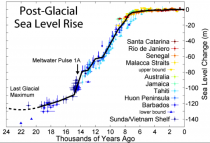
During the last glacial period, an ice sheet as much as 2 miles thick covered many parts of northern Europe and Asia and North America over Canada and the northern United States down to New York and south of Chicago. When the interglacial began and the ice retreated, meltwater caused a rapid sea level rise of 360 feet. In the last 8000 years sea level rise slowed to a crawl.
This figure shows sea level rise since the end of the last glacial episode based on data from Fleming et al. 1998, Fleming 2000, & Milne et al. 2005.
It likely varied with the cooling and warming periods that occur naturally. Global sea levels temporarily rise more when the ocean enter their warmer multidecadal phases and during major El Ninos and slow when the ocean basins cool and during major La Ninas.
Antarctica has been growing for 30 years, locking up more of the planet’s water in the icesheet. Greenland was 4C (8F) warmer than today’s level during the last interglacial without melting. With the Atlantic soon the head into its multidecadal cold mode and the sun into a 200 year slumber, cooling is likely to increase ice in Greenland. We already are seeing more snow in winter on land. 4 of the top 5 snowiest years for the hemisphere have occurred in the last 6 years.
Renowned oceanographic expert Nils-Axel Morner has studied sea level and its effects on coastal areas for some 45 years. Recently retired as director of the Paleogeophysics and Geodynamics Department at Stockholm University, Morner is past president (1999-2003) of the INQUA Commission on Sea Level Changes and Coastal Evolution, and leader of the Maldives Sea Level Project. In a 2010 paper in 21st Century Science and Technology Morner said
“While the IPCC and its boy scouts present wilder and wilder sea level predictions for the near future, the real observational facts demonstrate that sea level has remained virtually stable for the last 40-50 years.”
This is in sharp contrast with the model projections, similar to the way temperatures are defying the models.
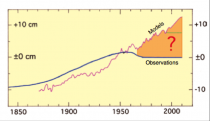
Morner (2011) Enlarged
TIDE GAUGES
Measurement sea level change at any location with tide gauges is complicated by the fact that the land is in many places sinking or rising. The mean of all the 159 NOAA tide gauge sites gives a rate of 0.5 mm/ year to 0.6 mm/year (Burton 2010). When you exclude those sites that represent uplifted and subsided areas, you are left with 68 sites of reasonable stability. These sites give a present rate of sea level rise in the order of 1.0 (+/- 1.0) mm/year (about 4 inches per century). Morner noted that most tide-gauges are installed on unstable harbor constructions or landing piers. Therefore, tide-gauge records are bound to exaggerate sea level rise.
A paper by Wenzel etal (2010) using a neural network on tide gauges found a mean sea level rise of 1.56 +/- 0.25 mm.yr from 1900 to 2006. They found the sea level changes are dominated by oscillations with periods of about 50-75 years, which relate nicely to the 60 year ocean oscillations.
SATELLITE ALTIMETRY
Satellite altimetry offers the reconstruction of sea level changes all over the ocean surface. The technology though has also produced disappointing results to the alarmist community as it has not shown the rise they expected.
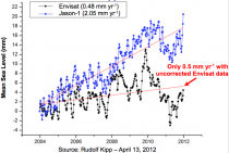
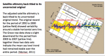
The Topex/Poseidon and later Jason missions recorded the variations of the ocean surface with high resolution. Having applied all technical correction needed, Menard 2000 and also Aviso 2000) presented a linear trend of 1.0 mm/year from 1992 to 2000. However, the rise came mostly from a spike due to the ocean warming from a super El Nino in 1997/98. Eliminating that spike, gave as change of 0 +/- 10mm. This graph provides no indication of any rise over the time-period covered (Morner 2004, 2007a, 2007c).
Morner presented this trend analysis that treated the 1997 El Nino peak (yellow) as a separate event superimposed on the long term trend. This shows a stability over the first 5 years blue and possibly over the whole time period covered (from Morner 2004, 2007c).
The IPCC in 2007 was actually conservative (an average of 15 inches) with their projections compared with others who projected a change of 3 feet up to 20 feet or more. If you recall in the movie, an inconvenient truth Al Gore used a crane to demonstrate how high 20 feet was. It appears, he could have instead stood on the Manhattan phone book.
But even the IPCC played data games. The IPCC combined tide gauge and altimetry and to their alarm, showed no change. But they made an ‘adjustment’ to the data using the sea level change from one of four Hong Kong gauges. It was the only one that showed a sea level rise, indicating that the land was likely subsiding there. At the Moscow global warming meeting in 2005, in answer to Morner’s criticisms about this “correction,” one of the persons in the British IPCC delegation said, “We had to do so, otherwise there would not be any trend.”
Satellite altimetry data also shows no consistent upward trend and to resolve this dilemma, corrections were applied including corrections assuming that land is still rebounding from the retreat of the glaciers 10,500 years ago (glacial isostatic adjustment).
As with the surface temperatures, most all of the increases are in the adjustments.
So what does all this data suggest for the National Geographic scenario of a 200 foot rise?
Of course if the recent sea level rise has been 0 and it continues so, it will never reach the level depicted in the National Geographic. If it is Morner’s 1 mm/year, which the tide gauges, without accounting for the 1997/98 El Nino spike suggest, it would take 65,200 years. If the rise of 7 inches the last century repeats, it would take 36,629 years. If the mid range 15 inches predicted by the IPCC in AR4 remains in the Fifth assessment and were to verify, it would take 17,112 years.
Considering the fact we are already well past 10,000 years into the current interglacial and interglacials historically ranged from 10-15,000 years, under none of these scenarios would we ever see the Lady Liberty swimming. In fact we are more likely to be able to walk to the statue on a frozen sea/river or encased in ice.

Day after Tomorrow still
See more here.National_Geographicnm.pdf


