


By Phil Green, Financial Post
A French scientist’s temperature data show results different from the official climate science. Why was he stonewalled? Climate Research Unit emails detail efforts to deny access to global temperature data.
By Phil Green
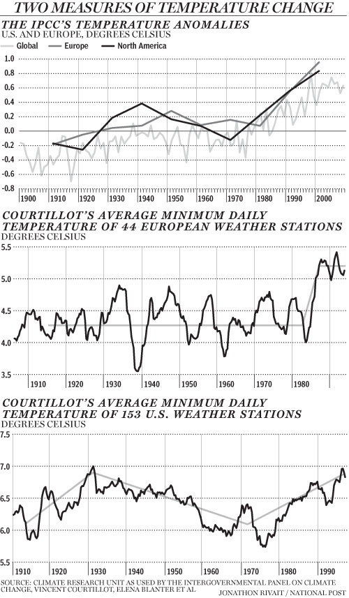
The global average temperature is calculated by climatologists at the Climatic Research Unit (CRU) at the University of East Anglia. The temperature graph the CRU produces from its monthly averages is the main indicator of global temperature change used by the International Panel on Climate Change, and it shows a steady increase in global lower atmospheric temperature over the 20th century. Similar graphs for regions of the world, such as Europe and North America, show the same trend. This is consistent with increasing industrialization, growing use of fossil fuels, and rising atmospheric concentrations of carbon dioxide.
It took the CRU workers decades to assemble millions of temperature measurements from around the globe. The earliest measurements they gathered came from the mid 19th century, when mariners threw buckets over the side of their square riggers and hauled them up to measure water temperature. Meteorologists increasingly started recording regular temperature on land around the same time. Today they collect measurements electronically from national meteorological services and ocean-going ships.
Millions of measurements, global coverage, consistently rising temperatures, case closed: The Earth is warming. Except for one problem. CRU’s average temperature data doesn’t jibe with that of Vincent Courtillot, a French geo-magneticist, director of the Institut de Physique du Globe in Paris, and a former scientific advisor to the French Cabinet. Last year he and three colleagues plotted an average temperature chart for Europe that shows a surprisingly different trend. Aside from a very cold spell in 1940, temperatures were flat for most of the 20th century, showing no warming while fossil fuel use grew. Then in 1987 they shot up by about 1 C and have not shown any warming since (below, enlarged here). This pattern cannot be explained by rising carbon dioxide concentrations, unless some critical threshold was reached in 1987; nor can it be explained by climate models.
Courtillot and Jean-Louis Le Mouel, a French geo-magneticist, and three Russian colleagues first came into climate research as outsiders four years ago. The Earth’s magnetic field responds to changes in solar output, so geomagnetic measurements are good indicators of solar activity. They thought it would be interesting to compare solar activity with climatic temperature measurements.
Their first step was to assemble a database of temperature measurements and plot temperature charts. To do that, they needed raw temperature measurements that had not been averaged or adjusted in any way. Courtillot asked Phil Jones, the scientist who runs the CRU database, for his raw data, telling him (according to one of the ‘Climategate’ emails that surfaced following the recent hacking of CRU’s computer systems) “there may be some quite important information in the daily values which is likely lost on monthly averaging.” Jones refused Courtillot’s request for data, saying that CRU had “signed agreements with national meteorological services saying they would not pass the raw data onto third parties.” (Interestingly, in another of the CRU emails, Jones said something very different: “I took a decision not to release our [meteorological] station data, mainly because of McIntyre,” referring to Canadian Steve McIntyre, who helped uncover the flaws in the hockey stick graph.)
Courtillot and his colleagues were forced to turn to other sources of temperature measurements. They found 44 European weather stations that had long series of daily minimum temperatures that covered most of the 20th century, with few or no gaps. They removed annual seasonal trends for each series with a three-year running average of daily minimum temperatures. Finally they averaged all the European series for each day of the 20th century.
CRU, in contrast, calculates average temperatures by month - rather than daily - over individual grid boxes on the Earth’s surface that are 5 degrees of latitude by 5 degrees of longitude, from 1850 to the present. First it makes hundreds of adjustments to the raw data, which sometimes require educated guesses, to try to correct for such things as changes in the type and location of thermometers. It also combines air temperatures and water temperatures from the sea. It uses fancy statistical techniques to fill in gaps of missing data in grid boxes with few or no temperature measurements. CRU then adjusts the averages to show changes in temperature since 1961-1990.
CRU calls the 1961-1990 the “normal” period and the average temperature of this period it calls the “normal.” It subtracts the normal from each monthly average and calls these the monthly “anomalies.” A positive anomaly means a temperature was warmer than CRU’s normal period. Finally CRU averages the grid box anomalies over regions such as Europe or over the entire surface of the globe for each month to get the European or global monthly average anomaly. You see the result in the IPCC graph nearby, which shows rising temperatures.
The decision to consider the 1961-1990 period as ‘normal’ was CRUs. Had CRU chosen a different period under consideration, the IPCC graph would have shown less warming, as discussed in one of the Climategate emails, from David Parker of the UK meteorological office. In it, Parker advised Jones not to select a different period, saying “anomalies will seem less positive than before if we change to newer normals, so the impression of global warming will be muted.” That’s hardly a compelling scientific justification!
It is well known to statisticians that in any but the simplest data sets, there are many possible ways to calculate an indicator using averages. Paradoxically, and counter-intuitively, they often contradict each other. As a simple example of how the same data can be teased to produce divergent results, consider the batting averages of David Justice and Derek Jeter. For each of three years in 1995-97, Justice had a higher batting average than Jeter did. Yet, overall, Jeter had the highest batting average.
In addition to calculating temperature averages for Europe, Courtillot and his colleagues calculated temperature averages for the United States. Once again, their method yielded more refined averages that were not a close match with the coarser CRU temperature averages. The warmest period was in 1930, slightly above the temperatures at the end of the 20th century. This was followed by 30 years of cooling, then another 30 years of warming.
Courtillot’s calculations show the importance of making climate data freely available to all scientists to calculate global average temperature according to the best science. Phil Jones, in response to the email hacking, said that CRU’s global temperature series show the same results as “completely independent groups of scientists.” Yet CRU would not share its data with independent scientists such as Courtillot and McIntyre, and Courtillot’s series are clearly different.
At the upcoming Copenhagen conference, governments are expected to fail to agree to an ambitious plan to cut greenhouse gas emissions. Here’s a more modest, if mundane goal for them: They should agree to share the data from their national meteorological services so that independent scientists can calculate global climatic temperature and identify the roles of carbon dioxide and the sun in changing it.
Phil Green is a statistician, president of Greenbridge Management Inc. and author of the upcoming book misLeading Indicators.
Read more here. See post on New Zealand temperatures here and on record highs and lows for the US here.