


By Frank Lansner, Guest post on Jo Nova
The mystery: We know when we drive through a city that temperatures warm from the fringe to the middle. We know UHI is real, but how much does it affect the official records? Is a 2010 city 0.3 K hotter than a 1960 city? How would we know?
Frank Lansner has come up with a way that might approximate the UHI effect - very roughly. It’s well known that UHI gets bigger as cities grow, but the devil is in the detail. Frank argues that it’s not just the size of the city that matters, but it’s growth rate.
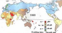
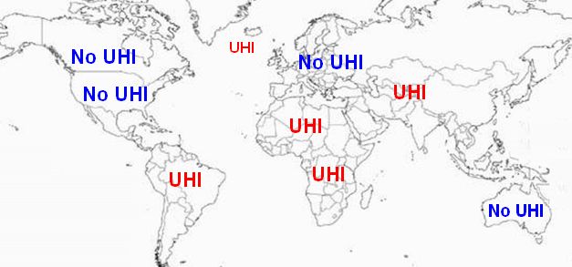
The USA is full of large cities, but there is not much difference between the trend in satellites and ground stations there. Frank’s approach could explain this - most of the growth in human population has come in regions like Africa, not the USA.
As argued in a previous article: we would expect to find more UHI error warming in areas with the largest population growth rate, not in areas with a constant population.

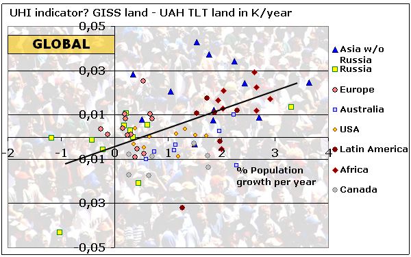
He figured that if we compare satellite records to ground stations and see if there is a divergence, we might be able to see an indicator of UHI. The info coming out of satellites ought not be affected as populations expand, but the ground stations are often near population centres and they gradually get surrounded with more square-kilometers of concrete and a bigger buffer of UHI. Hence Frank sectioned up the world, and looked at the trends from both sets of measurements.
None of this is simple as Frank points out. Populations don’t just grow evenly across regions, nor does each 10% increase in population translate into the same increase in industrial output (and presumably heat). Indeed Frank finds the trend changes in different regions of the world. What ever the reason, then the significant result of Frank’s analysis is that the ground based temperature stations contain, on average, nearly half a full degree (0.46 K) of extra heat trend 1979-2010 when compared to the satellite based data, and it occurs in exactly in the areas of the world with highest population growth rates: The developing countries.

WHY does ground based land temperatures show much more heat trend than UAH TLT in regions with high population rate compared to regions with low population rate?
So far, I have not managed to answer this without pointing to the obvious: UHI.
H/T SEPP