|
Feb 10, 2008
China Loses One-tenth of Forest Resources to Snow Havoc
China View
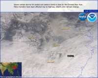
A total of 17.3 million hectares of forests, about one-tenth of China’s forest resources, have been damaged by the unprecedented snow wreckage, worst in at least five decades, with forests, bamboo and seedlings in some parts of the country seriously destroyed. In its latest report released on Friday, th State Forestry Administration (SFA) confirmed the total losses of forest in 18 provinces in southern China, saying that in the worst-hit region, nearly 90 percent of forests had been ruined. The administration didn’t give any figure for the value of the losses. Previous SFA report showed that by Jan. 31, disastrous winter weather had levied a toll of 16.2 billion yuan (about 2.5 billion U.S. dollars) in China’s forestry sector. See snow photo gallery here.
See satellite view of snow in China courtesy of NOAA OSEI below.

See a high resolution version here.
Feb 07, 2008
Brrrrr. Near-Record Cold Chills Interior Alaska
Newsminer.com
UPDATE: February 8th readings down to -72F at Chicken, just three shy of the February Alaska record. Cold spell longest since 2000. See these NWS Public Information Statements.
The National Weather Service sent out a notice this afternoon reporting some stunningly low temperatures, including an unofficial mark of 70 degrees below zero at Tok at 8 a.m. The last time an official temperature of 70 below or colder was recorded in Alaska came on Jan. 1, 2000, when a reading of 72 below zero was recorded at Chicken, the tiny community on the Taylor Highway in the Fortymile country east of Fairbanks and toward the Canadian border.

The coldest official temperature recorded in the state this morning was 67 below at O’Brien Creek, another spot on the Taylor Highway. Readings of 50 to 60 below zero were common throughout the Interior overnight. Chicken posted a temp of 65 below; Chalkyitsik and Fort Yukon had lows of 60 below; Northway and Beaver, 58 below; Eagle airport, 54 below; Manley, 51 below; Fort Greely, 50 below. Residents of the Fairbanks and North Pole areas also found themselves in the deepening freeze. The Woodsmoke subdivision in North Pole had the coldest temperature in the urban area at 52 below at noon. The noontime temperature at Fairbanks International Airport stood at 45 below. See story here.

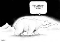
See full size cartoon here
Feb 06, 2008
The American Geophysical Union’s Official Position on Global Warming
By Sherwood, Keith and Craig Idso, CO2 Science
The American Geophysical Union (AGU) document entitled Human Impacts on Climate begins with the statement that “the earth’s climate is now clearly out of balance and is warming.” It sounds ominous, doesn’t it? But if mere warming or cooling is a sign of being out of balance, one could truthfully say that earth’s climate is almost always “out of balance,” which suggests that its current condition is actually normal.
The second declaration of the document says that many components of the climate system “are now changing at rates and in patterns that are not natural.” And unnatural climate change sounds even more ominous. But is this really the case?
The AGU Council next describes some of the climatic projections that are used to scare people into believing we must act decisively and soon if we are to prevent the mother-of-all-catastrophes. To their credit, however, they note that “with such projections, there are many sources of scientific uncertainty.” But to their discredit, they add that “none are known that could make the impact of climate change inconsequential,” implying there is nothing that can significantly change the model-based projections. In reality, however, there could well be several factors—all largely unknown to them—that may in fact be able to do what the Council essentially infers is impossible. When faced with the amazing complexity of nature, therefore, humility is much to be preferred over hubris.
In light of these several observations, the leadership of the American Geophysical Union would do well to restrict themselves to purely scientific matters and not delve into policy prescriptions, as they do in the final paragraph of their official statement. If the science of the subject ever becomes clear, the people of the world will know what to do about it; they are not dumb. Therefore, to try to tell them how to act now, when the science is not clear, is actually an admission of that fact, i.e., the fact that the science is not clear, just as it is also an indication of the possibility that something other than science alone may have prompted the Council’s recent reaffirmation of their “position” on this scientific matter. Read full review here.
Jan 30, 2008
Environmental Effects of Increased Atmospheric Carbon Dioxide
By Arther B. Robinson, Noah E. Robinson, Willie Soon, Oregon Institute of Science and Medicine on SPPI
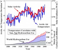
A review of the research literature concerning the environmental consequences of increased levels of atmospheric carbon dioxide leads to the conclusion that increases during the 20th and early 21st centuries have produced no deleterious effects upon Earth’s weather and climate. Increased carbon dioxide has, however, markedly increased plant growth. Predictions of harmful climatic effects due to future increases in hydrocarbon use and minor greenhouse gases like CO2 do not conform to current experimental knowledge. The environmental effects of rapid expansion of the nuclear and hydrocarbon energy industries are discussed.

See full size image here
There are no experimental data to support the hypothesis that increases in human hydrocarbon use or in atmospheric carbon dioxide and other greenhouse gases are causing or can be expected to cause unfavorable changes in global temperatures, weather, or landscape. There is no reason to limit human production of CO2, CH4, and other minor greenhouse gases as has been proposed.
We also need not worry about environmental calamities even if the current natural warming trend continues. The Earth has been much warmer during the past 3,000 years without catastrophic effects. Warmer weather extends growing seasons and generally improves the habitability of colder regions. As coal, oil, and natural gas are used to feed and lift from poverty vast numbers of people across the globe, more CO2 will be released into the atmosphere. This will help to maintain and improve thehealth, longvity, prosperity, and productivity of all people. The United States and other countries need to produce more energy, not less. The most practical, economical, and environmentally sound methods available are hydrocarbon and nuclear technologies.
Human activities are producing part of the rise in CO2 in the atmosphere. Mankind is moving the carbon in coal, oil, and natural gas from below ground to the atmosphere, where it is available for conversion into living things. We are living in an increasingly lush environment of plants and animals as a result of this CO2 increase. Our children will therefore enjoy an Earth with far more plant and animal life than that with which we now are blessed. Read this very thorough and optimistic analysis here.
Icecap Update: See interview of Dr. Arthur Robinson by William F. Jasper here.
Jan 30, 2008
Important Climate Science Posts
By Roger Pielke Sr., Climate Science
Icecap Note: Roger has a number of posts definitely worth a look on Climate Science now. The latest post deals with ”Difficulties With the Use of Observed Nocturnal Warming Trends as a Measure of Climate Trends.
In it, Roger concludes “From our papers (Pielke and Matsui 2005 and Lin et al. 2007), a conservative estimate of the warm bias resulting from measuring the temperature near the ground is around 0.21 C per decade (with the nightime T(min) contributing a large part of this bias). Since land covers about 29% of the Earth’s surface, the warm bias due to this influence explains about 30% of the IPCC estimate of global warming. In other words, consideration of the bias in temperature would reduce the IPCC trend to about 0.14 degrees C per decade, still a warming, but not as large as indicated by the IPCC.
This paper is part of a three part series. Part I was posted here. It discussed the serious limited value of the use of a global average surface temperature anomaly to diagnose the global radiative imbalance (i.e., global climate heat system changes). Roger reports Climate Science will present Part III in this series of presentations on our JGR paper within the next week or so.
On the site, Roger also has stories on two papers documenting the importance of land use changes in the United States and Australia and one reviewing a paper on the European Heat Wave in the summer of 2003, shown to be an event aggravated by unusually dry land (surface) conditions. See all these stories and more here.
|
|
|
|
