Aug 31, 2011
Climate prostitutes, charlatans and comedians
Paul Driessen
Their “research” would be hilarious if it didn’t cost taxpayers and consumers so dearly
Put these guys on Comedy Central. Put ‘em in an asylum… a mandatory restitution program… jail perhaps… or a witness protection program, if they turn state’s evidence on other perpetrators. But keep them away from our money - and our energy, economic, healthcare and education policies.
Climate prostitutes, parasites, charlatans and comedians have been devouring billions in US taxpayer dollars, year after year, plus billions more in corporate shareholder cash, activist foundation funds and state government grants. The laws, mandates, subsidies and regulations they advance have cost taxpayers and consumers still more billions for “alternative” energy and other schemes that send prices skyrocketing, kill jobs, and reduce health and living standards.
It’s time to end this destructive saga and, while we’re at it, pink-slip the politicians and bureaucrats who pour billions of hard-earned tax dollars into perpetual climate “research,” “education” and “environmental” programs. They’re actively complicit or have completely failed to perform proper due diligence.
Global cooling has morphed into global warming, climate change, global climate disruption, climate “weirding” and every extreme weather event - always manmade, always imminently catastrophic, always requiring eternal research and wrenching societal transformation, to “save the planet.”
The endless absurdity oozing out of the climate change cesspool would be hilarious if it weren’t so costly.
“Global warming: Is weight loss a solution?” the “peer-reviewed” International Journal of Obesity breathlessly wondered a few weeks ago. Most definitely. Fat people breathe more and thus emit more carbon dioxide. If the world’s 1.5 billion obese and overweight adults all lost 22 pounds apiece and kept if off for a year, the reduction in CO2 would equal 0.2% of global emissions from burning fossil fuels and manufacturing cement. (Translation: “health professionals” deserve more climate research loot.)
If you need more proof that “obesity and climate change are linked,” simply consider how awful life is now in Mexico, the same authors argued in an article for their Climate and Health Council. One in four Mexicans is now obese. “The planet is getting hotter, its people are getting fatter, and the use of fossil fuel energy is the cause of both. Large increases in motor vehicle traffic have decimated levels of physical activity. This, combined with increased availability of energy-dense food, has propelled the body mass index in the entire [Mexican] population upward.”
“Moving to a low-carbon economy could be the next great public health advance,” the C&HC “experts” suggested. But even eating less meat won’t be enough, nor reducing dependence on dairy products, nor even vegetarianism, pal reviewers intoned."We have to be vegans,” get rid of cars - and reduce human populations, perhaps with “China’s one-child policy (entailing elements of compulsion)” as the model.
Didn’t we try that low-carb, low-carbon stuff for most of human history? Aren’t they still trying it in Sub-Saharan Africa? Do we want dictatorial one-child policies in an era of “choice” and aging pensioners?
Some aren’t sure this meatless diet craze is crazy. They claim the link between climate change and raising animals for meat is borne out by Earth history. According to a Texas paleontologist, dung and flatulence from herds of hadrosaurs, the Cretaceous equivalent to modern cattle, could have contributed to Arctic warming 70 million years ago. Other scientists say the hypothesis is a load of coprolite.
Nearly 2,000 animal species “are fleeing global warming by heading north much faster than they were less than a decade ago,” asserts new “research” just published in the once-credible journal Science. The opportunistic species are moving at the breakneck speed of “about a mile a year,” intrepid climate-chaos promoter Seth Borenstein anxiously noted in his AP wire story.
The situation could quickly reverse if reduced solar activity and the past two years’ frigid Northern Hemisphere winters become the new norm. But neither Science nor the AP mentioned that or explained how the current migrations of opportunistic plants and critters differ from what’s been happening since the last Pleistocene glaciers retreated and the Little Ice Age ended.
Instead, we’ve been repeatedly treated to amusingly convoluted back-peddling from earlier pronouncements that ski resorts will be a thing of the past and “children just aren’t going to remember what snow is.” Now we’re told that global warming can worsen winters and increase snowfalls. In fact, as one Greenpeace activist explained, “Global warming can mean colder. It can mean wetter. It can mean drier. That’s what we’re talking about.”
Actually, what we’re talking about is Earth’s constantly changing weather and climate caused - not by hydrocarbon use - but by complex, chaotic, unpredictable atmospheric, oceanic, solar, planetary and other forces whose interactions and effects scientists are only beginning to understand. To respond adequately to them, we need building, heating, air conditioning and other technologies to adapt to, cope with, and protect our lives and property against those forces - and the prosperity to afford those technologies.
Unfortunately, anti-hydrocarbon policies, laws and regulations (often driven by alarmist climate “research” and horror stories) are making it increasingly difficult to address those needs. Rather than developing our nation’s own vast natural resource and human resources, America is wasting billions on politically correct technologies and companies, like Evergreen Solar, which got $486 million in taxpayer subsidies before going belly-up this month. As Al Gore likes to say, that is unsustainable.
Meanwhile, a steady stream of headline-grabbing “studies” continues to power the climate scare and renewable energy gravy train. Retired professor John Brignell’s website (http://www.numberwatch.co.uk/warmlist.htm) presents hundreds of absurd research claims, from the Alps melting and Amazon being destroyed, to “Italy robbed of pasta,” to the “world going up in flames” over resource scarcity and zebra mussels taking over the Thames River - all because of global warming. The website is not up-to-date, but here’s one recent gem he could add.
A new taxpayer-funded NASA/Penn State “scientific” study warns that “ecosystem-valuing universalist” (really “green") aliens might realize that we have been altering “the chemical composition of Earth’s atmosphere,” conclude that we have “ecological destructive tendencies,” and “wipe humanity out in order to preserve the Earth system as a whole.” (And you thought James Hansen and Michael Mann were the only loons collecting big bucks at these institutions of “vital research” and “higher education.")
This interminable pessimism undoubtedly prompted climate activist Danny Bloom to marry his “longtime companion and love of his life: Mother Earth” - in a charming ceremony officiated by an online justice of the peace. Perhaps he can consummate his marriage, using one of “the first-ever eco-friendly luxury condoms,” which were developed by “two French aristocrats” and introduced in the USA just in time for Valentine’s Day 2011. Unlike other condom manufacturers, the Original Condom Company is “extremely eco aware and makes every effort to cover [its] carbon footprint.”
These attention-getting stunts may not save the planet. But responsible citizens may be able to save the republic, by helping Congress, the White House and their “debt committee” find a few places where tens of billions are being wasted on excess bureaucrats, bogus research, useless reports and destructive policies.
President Reagan once observed that, if politics is the second oldest profession, it bears a striking resemblance to the first. A corollary might be that, even if the perpetrators are wearing eco-friendly luxury condoms, most citizens don’t like getting screwed by elected officials and unelected bureaucrats.
With Congress home for more fact-finding meetings with constituents, citizens have a perfect opportunity to send a powerful message. Let’s make the most of it.
______
Paul Driessen is senior policy advisor for the Committee For A Constructive Tomorrow and Congress of Racial Equality, and author of Eco-Imperialism: Green power - Black death.
Aug 29, 2011
Lawrence Solomon: Science getting settled
Lawrence Solomon
New, convincing evidence indicates global warming is caused by cosmic rays and the sun - not humans
The science is now all-but-settled on global warming, convincing new evidence demonstrates, but Al Gore, the IPCC and other global warming doomsayers won’t be celebrating. The new findings point to cosmic rays and the sun - not human activities - as the dominant controller of climate on Earth.
The research, published with little fanfare this week in the prestigious journal Nature, comes from über-prestigious CERN, the European Organization for Nuclear Research, one of the world’s largest centres for scientific research involving 60 countries and 8,000 scientists at more than 600 universities and national laboratories. CERN is the organization that invented the World Wide Web, that built the multi-billion dollar Large Hadron Collider, and that has now built a pristinely clean stainless steel chamber that precisely recreated the Earth’s atmosphere.
In this chamber, 63 CERN scientists from 17 European and American institutes have done what global warming doomsayers said could never be done - demonstrate that cosmic rays promote the formation of molecules that in Earth’s atmosphere can grow and seed clouds, the cloudier and thus cooler it will be. Because the sun’s magnetic field controls how many cosmic rays reach Earth’s atmosphere (the stronger the sun’s magnetic field, the more it shields Earth from incoming cosmic rays from space), the sun determines the temperature on Earth.
The hypothesis that cosmic rays and the sun hold the key to the global warming debate has been Enemy No. 1 to the global warming establishment ever since it was first proposed by two scientists from the Danish Space Research Institute, at a 1996 scientific conference in the U.K. Within one day, the chairman of the Intergovernmental Panel on Climate Change, Bert Bolin, denounced the theory, saying, “I find the move from this pair scientifically extremely naive and irresponsible.” He then set about discrediting the theory, any journalist that gave the theory cre dence, and most of all the Danes presenting the theory - they soon found themselves vilified, marginalized and starved of funding, despite their impeccable scientific credentials.
The mobilization to rally the press against the Danes worked brilliantly, with one notable exception. Nigel Calder, a former editor of The New Scientist who attended that 1996 conference, would not be cowed. Himself a physicist, Mr. Calder became convinced of the merits of the argument and a year later, following a lecture he gave at a CERN conference, so too did Jasper Kirkby, a CERN scientist in attendance. Mr. Kirkby then convinced the CERN bureaucracy of the theory’s importance and developed a plan to create a cloud chamber - he called it CLOUD, for “Cosmics Leaving OUtdoor Droplets.”
But Mr. Kirkby made the same tactical error that the Danes had - not realizing how politicized the global warming issue was, he candidly shared his views with the scientific community.
“The theory will probably be able to account for somewhere between a half and the whole of the increase in the Earth’s temperature that we have seen in the last century,” Mr. Kirkby told the scientific press in 1998, explaining that global warming may be part of a natural cycle in the Earth’s temperature.
The global warming establishment sprang into action, pressured the Western governments that control CERN, and almost immediately succeeded in suspending CLOUD. It took Mr. Kirkby almost a decade of negotiation with his superiors, and who knows how many compromises and unspoken commitments, to convince the CERN bureaucracy to allow the project to proceed. And years more to create the cloud chamber and convincingly validate the Danes’ groundbreaking theory.
Yet this spectacular success will be largely unrecognized by the general public for years - this column will be the first that most readers have heard of it - because CERN remains too afraid of offending its government masters to admit its success. Weeks ago, CERN formerly decided to muzzle Mr. Kirby and other members of his team to avoid “the highly political arena of the climate change debate,” telling them “to present the results clearly but not interpret them” and to downplay the results by “mak[ing] clear that cosmic radiation is only one of many parameters.” The CERN study and press release is written in bureaucratese and the version of Mr. Kirkby’s study that appears in the print edition of Nature censored the most eye-popping graph - only those who know where to look in an online supplement will see the striking potency of cosmic rays in creating the conditions for seeding clouds.
CERN, and the Danes, have in all likelihood found the path to the Holy Grail of climate science. But the religion of climate science won’t yet permit a celebration of the find.
Aug 28, 2011
Telegraph, BBC, and Independent geography FAIL: “Row to the Pole” never made it to the “North Pole”
By Anthony Watts
UPDATE: BBC (and now the Independent) commit the same FAIL. See below.
More “Row to the Pole” nonsense writ large:

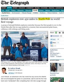
Ummmm…no, Mr. Hough, the Telegraph’s headline and story are simply wrong. You are a victim of spin and/or a failed geography lesson.
First congratulations, to the RttP team for reaching their destination, which is not a pole of any kind, much less the actual “North Pole”. I didn’t think they would make it.
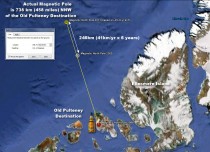
As I explained before the trip even started, there’s no ‘pole’ achievement here, not even close. They are 738 KM short of the actual magnetic pole. The 1996 magnetic pole doesn’t exist there anymore and thus can’t be a pole of any kind.
The Telegraph article says:
The successful trip to the Pole, described as the “greatest ocean rows of all time”, was only possible because of more seasonal ice-melt in the Arctic that has opened the waters up.
No mention of the fact that they aren’t even close. The actual North pole is 790 miles away:

The FAIL is strong with this one. h/t to reader “Angry Exile”
And the BBC is in on the act of shoddy journalism too:
Kitefreak says:
August 26, 2011 at 12:20 am
BBC reporting that the Pultney rowing expedition has reached “the north pole”. Reported on Radio Scotland at 8am (main news bulletin) and on the news website
Absolutely no mention on the radio or the website that it’s the magnetic north pole from ‘96, no, they just say the folks have rowed TO THE NORTH POLE.
Pure propaganda.
UPDATE: The BBC commits the same FAIL here:

What a bunch of liars.
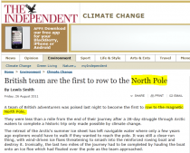
UPDATE2: The load of porkies continues…now the Independent repeats the lie.

Aug 26, 2011
Fewer Americans See Climate Change a Threat, Caused by Humans
US News
Though climate change hasn’t received quite the same attention it had back in 2006 and 2007, it’s not too surprising that the vast majority of Americans still know at least something about it. But what they know exactly is changing, and national politics certainly seems to be playing a part.
According to a Gallup poll released Friday, 96 percent of Americans in 2010 said they know a great deal or something about climate change. And while that’s down 1 percentage point from 2007 to 2008, it’s not a significant change, especially considering how media attention to the issue has dropped off quite significantly since around 2007, when coverage was at its peak. [Read: Do Americans care about climate change anymore?]
However, what Americans who know about climate change think about it has changed quite a bit - namely, they see it as less of a problem - and that change has happened much more rapidly than in the four other top greenhouse gas emitting countries, China, Russia, Japan, and India. In 2010, according to the poll, only 55 percent of Americans believed climate change was a threat to them and their families. That’s down 9 percentage points from 64 percent in 2007 and 2008. Also, the percentage of people who believe climate change results all or in part from human causes is down a full 11 percentage points. While 61 percent of Americans in 2007 and 2008 believed that humans were at least partially responsible for climate change, only half believed so in 2010.
In Japan, where a higher percentage of people say they know about climate change, the same decline in threat perception and belief in human causes happened too, though less significantly. In Russia, people’s perception of threat went up from 2007 and 2008, but there was no change in the belief in human causes. Then, by contrast, in India, more people in 2010 (an increase of 16 percentage points, from 58 percent to 74 percent) believe that climate change is caused by humans. That same increase happened in China, though it was not as significant. [Read more from the Energy Intelligence blog.]
What’s interesting about these results is that climate change has been a predominantly international issue, with the United Nations and its International Panel on Climate Change taking the lead on many initiatives and scientific reports. But, it’s clear that rather than listen to the multilateral body - which continues to publicize both the threat and human causes of climate change - people, especially in the United States, are much more tuned in to the politics and the news of their own country.
In America, at least, the strong push from many climate change skeptics, which are now represented by many Republicans in Congress, appear to be making a difference in public views, particularly on the issue of whether humans are the cause. The more conservatives make noise denying the problem of climate change, perhaps, the more people, especially their base, catch on to that view. The decrease in media coverage may also play a role in the public’s perception of threat, as climate change has been put on the backburner in favor of energy security and green jobs. [Read about whether global warming will matter in the 2012 elections.]
As Hurricane Irene bears down on the East Coast this weekend, expect a round of commentary from groups like the Natural Resources Defense Council calling attention to the effects of climate change. But, with the trend shifting away from believing in such warnings, it’s unlikely that many Americans will even take notice.
A commenter was quick to point out the Exxon and Koch funding of the skeptics. I responded: “So what. Exxon gave $100 million to Stanford to support their global warming propaganda programs. BP gave $500 million to U Cal Berkeley.
The environmental advocacy groups of which you may be a part, George Soros and the government through its grant fire hose funnelled through the corrupt NSF has funded alarmism to the tune of $10.2 Billion.
Do you want any sensible person to believe that comes with no strings attached or that that funding isn’t a huge incentive for the grant toting corrupted scientists to deliver a message that will keep that funding going. Even NOAA’s chief administrator, formerly with EDF said in 1999 the social and environmental needs required scientists to provide support in exchange for contract funding.
Thank God for Koch and anyone else for any help in getting the truth exposed and the green energy policies that have paralyzed the EU shot down in the US. Please send some our way.”
Aug 18, 2011
CO2 increase would be a boon to humanity
By Kevin Mooney
Government agencies and international institutions that have worked tenaciously to vilify carbon dioxide (CO2) as a dangerous pollutant have done a great public disservice, Dr. Craig Idso, a scientist and author told audience members at the American Legislative Exchange Council’s (ALEC) annual meeting earlier this month. Contrary to what has been widely reported, CO2 is a key component to life on earth that could be beneficial to the environmental and humanity in particular, Idso explained during his talk in New Orleans.
The Environmental Protection Agency’s (EPA) endangerment finding issued back in December 2009 claims that the “elevated concentration” of GHG (Greenhouse) emissions in the atmosphere “endangers public health and welfare.” The EPA also claims it has the authority to issue new regulations under the Clean Air Act (CAA).
But Idso, who is the chairman of the Center for the Study of Carbon Dioxide, argues that conventional thinking is exactly wrong. He spells out in 55 ways, listed in alphabetical order, how CO2 actually enhances environmental conditions in a new book entitled: “The Many Benefits of Atmospheric CO2 Enrichment.” Idso co-authored the book with his father Dr. Sherwood Idso.

Enlarged
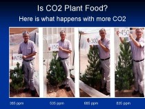
“Plants in a CO2 enriched atmosphere generally prefer warmer temperatures than those exposed to air with lower CO2,” Idso said as he described a series of experiments. “The doubling of the air’s CO2 concentration typically boosts the optimum temperature for plant photosynthesis by several degrees centigrade and this also raises the temperature at which plants experience heat related death.”
As a result of higher atmospheric CO2, earth’s plants are likely to sustain themselves within large portions of their natural habitats, which will also work to the advantage of animal life that depends on those plants, Idso observed.
“The end result is a future where there will likely be a great CO2 induced proliferation of regional biodiversity as opposed to extinctions of species globally,” he said. “Lots of peer reviewed research supports this outcome.”
Roger Helmer, a member of the European Parliament, and a noted climate skeptic, also took part in the panel discussion. Organizations like the United Nations International Panel on Climate Change (IPCC), omit key pieces of information from their reports, he said.
“Everyone knows CO2 is a greenhouse gas, what very few people seem to know is that water vapor is a much more significant greenhouse gas and so as far as I know we will not be able to control water vapor in the atmosphere as long as the wind blows over the ocean,” he noted.
Although the IPCC warns that heightened counts of CO2 will also accelerate the amount of water vapor, this reasoning overlooks the possibility of “negative feedbacks,” Helmer pointed out.
“It could also be that water vapor makes more clouds and this would increase the earth’s albedo and this means more sunlight and more energy would be reflected back into space,” he explained.
A renewed appreciation for CO2 as a naturally occurring, life sustaining element can help to redirect public policy away from costly, counterproductive initiatives favored by green groups, Robert Ferguson, president of the Science and Public Policy Institute (SPPI), suggested. Ferguson chaired the panel discussion.
Kevin Mooney is a contributing editor to Americans for Limited Government.
See also Erl Happ’s What is the Optimum Temperature?
What he found was that temperatures in different regions and seasons moved in different directions at the same time. While one region or season was cooling another was warming. So this regional/seasonal disparity very strongly made an explanation in terms of CO2 useless. AGW theory could explain uniform warming only and uniform warming is NOT happening.
|


