|
Apr 03, 2012
Carbon cycle questions
By Judith Curry
I just finished listening to Murry Salby’s podcast on Climate Change and Carbon. Wow.
The abstract for his talk is here:
PROFESSOR MURRY SALBY
Chair of Climate, Macquarie University
Atmospheric Science, Climate Change and Carbon - Some Facts
Carbon dioxide is emitted by human activities as well as a host of natural processes. The satellite record, in concert with instrumental observations, is now long enough to have collected a population of climate perturbations, wherein the Earth-atmosphere system was disturbed from equilibrium. Introduced naturally, those perturbations reveal that net global emission of CO2 (combined from all sources, human and natural) is controlled by properties of the general circulation - properties internal to the climate system that regulate emission from natural sources. The strong dependence on internal properties indicates that emission of CO2 from natural sources, which accounts for 96 per cent of its overall emission, plays a major role in observed changes of CO2. Independent of human emission, this contribution to atmospheric carbon dioxide is only marginally predictable and not controllable.
Professor Murry Salby holds the Climate Chair at Macquarie University and has had a lengthy career as a world-recognised researcher and academic in the field of Atmospheric Physics. He has held positions at leading research institutions, including the US National Center for Atmospheric Research, Princeton University, and the University of Colorado, with invited professorships at universities in Europe and Asia. At Macquarie University, Professor Salby uses satellite data and supercomputing to explore issues surrounding changes of global climate and climate variability over Australia. Professor Salby is the author of Fundamentals of Atmospheric Physics, and Physics of the Atmosphere and Climate due out in 2011. Professor Salby’s latest research makes a timely and highly-relevant contribution to the current discourse on climate.
The podcast for his talk is here. Unfortunately there is no video so you can’t see his graphs. But the talk is very lucid, you can certainly get the point. The entire podcast is an hour, with his formal presentation about a half hour, and questions for the remaining half hour.
This talk was given in June at the IUGG meeting in Melbourne Australia, and apparently created quite a stir. A journal paper is in press, expected to be published in about 6 months. Some of the results will be in his forthcoming book Physics of the Atmosphere and Climate that will be available Sept 30.
Andrew Bolt has some reactions in the Herald Sun:
Salby’s argument is that the usual evidence given for the rise in CO2 being man-made is mistaken. It’s usually taken to be the fact that as carbon dioxide concentrations in the atmosphere increase, the 1 per cent of CO2 thats the heavier carbon isotope ratio c13 declines in proportion. Plants, which produced our coal and oil, prefer the lighter c12 isotope. Hence, it must be our gasses that caused this relative decline.
But that conclusion holds true only if there are no other sources of c12 increases which are not human caused. Salby says there are - the huge increases in carbon dioxide concentrations caused by such things as spells of warming and El Ninos, which cause concentration levels to increase independently of human emissions. He suggests that its warmth which tends to produce more CO2, rather than vice versa - which, incidentally is the story of the past recoveries from ice ages.
The Earth’s carbon cycle is not a topic on which I have any expertise. A good overview article is provided by NASA’s earthobservatory.
Climate models have begun to include an interactive carbon cycle in the CMIP5 simulations. NASA has been trying to launch a satellite to measure global carbon, an effort which remains troubled and plagued by continuing delays.
JC comments: If Salby’s analysis holds up, this could revolutionize AGW science. Salby and I were both at the University of Colorado-Boulder in the 1990&2000s, but I don’t know him well personally. He is the author of a popular introductory graduate text Fundamentals of Atmospheric Physics. He is an excellent lecturer and teacher, which comes across in his podcast. He has the reputation of a thorough and careful researcher. While all this is frustratingly preliminary without publication, slides, etc., it is sufficiently important that we should start talking about these issues. I’ll close with this text from Bolt’s article:
He said he had an “involuntary gag reflex” whenever someone said the “science was settled”.
“Anyone who thinks the science of this complex thing is settled is in Fantasia.”
See more here. Sydney Institute has put up a video of this talk (with graphs). Worth a view.
--------------------
Nature will soon be posting another rushed flawed paper ...claiming CO2 preceded not follows temperatures. See evidence why that is not the case in A new paper in Nature suggests CO2 leads temperature, but has some serious problems. Meanwhile see:
Improved Proxy Record of Past Warm Climates Needed
Before the end of the present century, atmospheric carbon dioxide (CO2) is projected to reach the high levels last seen in past warm periods such as the Eocene (~40 million years ago) [Beerling and Royer, 2011]. Climate reconstructions from sediment cores (proxy data) and paleoclimate modeling studies show that such higher CO2 periods are characterized by warmer temperatures, smaller ice sheets, and higher sea level than today. The proxy record of past warm climates is thus fundamental in guiding scientists understanding of future climate changes. However, we believe that currently available data sets are not yet adequate for this task.
And also this post, actually a testimony to congress.
Mar 28, 2012
Another blow to warmist hysteria over weather is not climate: “2011 damage is similar to 1974”
By Anthony Watts, Watts Up With That
Until the April 26/27th 2011 tornado outbreak, The April 3rd 1974 was the biggest outbreak of tornadoes in US history. Last year, the usual suspects railed about how the outbreak was a clear consequence of global warming> climate change> climate disruption, even going so far as saying such linkage was “required by ethics” (insert facepalm here). I called them all “Hucksters”. The wailing was sort of like when 1934 was the warmest year in the USA until James Hansen came along and “adjusted” 1998 to be warmer.

Icecap Note: Courtesy of Roger Pielke Jr and Anthony Watts. Should be stamped on most government reports, MSM articles and Science and Nature and AGW journal AGW papers as a reader beware warning.
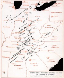
Here is the 1974 April 3-4 Outbreak

I and many others said it connecting AGW to the 2011 outbreak was rubbish- there’s no connection in the data, and that it was what you expect to get when you have La Nina conditions like we did in the spring 0f 2011. WeatherBell’s Joe D’Aleo even predicted the likelihood of severe weather ahead of time based on La Nina conditions and snow cover. (Update: Here’s two reports from him before the outbreaks
La Ninas are often far more costly than El Ninos (PDF)
La Nina of 2010 2nd strongest (PDF)
During El Niño the jet stream is oriented from west to east across the southern portion of the United States. Thus, this region becomes more susceptible to severe weather outbreaks. During La Niña the jet stream and severe weather is likely to be farther north.
Note the collision zone in the US southeast during La Nina patterns. 1974 was a La Nina year too.
Then the wailing shifted to monetary damage claims, about how much more damage there was than in 1974 in terms of cost, not just in tornadoes, but well, everything weather related. While I can’t comment on everything, I can say with certainty the tornado claims are rubbish thanks to a new paper just published by Kevin Simmons, Daniel Sutter and Dr. Roger Pielke Jr..
Simmons, K., D. Sutter, R.A. Pielke, Jr. (2012), Blown away: monetary and human impacts of the 2011 U.S. tornadoes. Extreme events and insurance: 2011 annus horribilis (Edited by C. Courbage and W.R. Stahel) The Geneva Reports: Risk and Insurance Research , Published March 2012.
Pielke Jr. writes on his blog:
1. When using our dataset, it is best to use the damage numbers as tabulated by the US NWS as they are consistent over time
2. That said, 2011 damage is qualitatively indistinguishable from 1974 and 1954 1953 at > $20B
3. That would give a simple baseline expectation of 1 in 20 for 2011, but half or twice that would not be implausible given the uncertainties, so between 1 in 10 and 1 in 40
4. For 2012 and looking ahead there are two big question marks, one more certain than the other. Urbanization is increasing, which means that the chance of large losses increases (somewhat at the expense of smaller and medium losses of course). And there has been a notable and significant decline in the incidence of strong tornadoes in recent decades
Here’s the summary from the report:
As 2011 began, the big news in the American sports world was the showdown between Auburn and Oregon for the national championship in college football. The big political story was the Tea Party, which had just helped Republicans regain control of the U.S. House of Representatives. In Hollywood, speculation was rife on who would win an Oscar. In other words, 2011 began as most years do. No one foresaw that the first five months of the year would reset the expectations of meteorologists, insurance companies, and the public regarding the toll tornadoes can impose on the U.S. today.
The decades leading up to 2011 convinced many that the tornado threat had been reduced to the point that 100 fatality tornadoes and 500 fatality years were in the past. After all, neither figure had been exceeded in the U.S. in over 50 years. The National Weather Service implemented a nationwide network of Doppler weather radars in the 1990s. Warning lead time doubled, and then almost doubled again, providing sufficient time for families to receive a warning and take shelter. Television stations used sophisticated graphics to cover tornadoes with ever-increasing accuracy. Street level tracking software allowed TV viewers to know the exact location of a tornado and how close it might get to their home.
In this environment, a tornado that killed 10 or more people was national news and could grab the attention of the public for days and perhaps weeks. In 1999 one of the most powerful tornadoes ever documented struck a metropolitan area and resulted in 36 deaths, which while tragic, was only a fraction of the toll that might have been expected from a tornado like this at the start of the 20th century. The benchmark for what constituted a major tornado event was much different than 1974, when the 3-4 April “Super Outbreak” killed over 300 people. Things were different now, or so many people thought.
We begin by summarising the damages and fatalities from U.S. tornadoes in 2011. Next, we examine the tornado outbreak as it relates to the historical record. The next section looks at the role that extreme weather played, followed by a discussion of some of the vulnerabilities that are known to increase fatalities from tornadoes. We then consider what can be done to limit damages and fatalities from future tornado outbreaks. Finally, we discuss whether or not this was an event that can be expected to occur again and then we conclude.
Three previous seasons - 1953, 1965 and 1974 - now rival damage in 2011. Normalised damage exceeded US$20 billion in 1953 and 1965 and exceeded US$10 billion in 1974. The 1953 season provides perhaps the best historical comparison with 2011, as much of the damage in 1965 and 1974 occurred in just one outbreak. Damage in 1965 is attributable to the Palm Sunday outbreak, while damage in 1974 occurred in the 2-3 April “Super Outbreak”. 1953 had multiple damaging outbreaks in different parts of the country. One of the worst tornadoes of 1953 occurred in Worcester, MA, and ranked first in normalised damage until the Joplin tornado of 2011.
This echoes what I have been saying, from The folly of linking tornado outbreaks to “climate change”:
Historically, there have been many tornado outbreaks that occurred well before climate change was on anyone’s radar. Here’s a few:
1908 Southeast tornado outbreak 324 fatalities, 1,720 injuries
1920 Palm Sunday tornado outbreak 380 fatalities, 1215 injuries
1925 Tri-State tornado 747 fatalities, 2298 injuries
1932 Deep South tornado outbreak 330 fatalities, 2145 injuries
1952 Arkansas-Tennessee tornado outbreak 208 fatalities
1965 Palm Sunday tornado outbreak 256 fatalities
April 3-4 1974 Super Outbreak 315 fatalities
All of these occurred before “climate change” was even on the political radar. What caused those if “global warming” is to blame? The real cause is La Nina, and as NOAAwatch.gov indicates on their page with the helpful meter, we are in a La Nina cycle of ocean temperature in the Pacific.
I recommend reading my essay: Why it seems that severe weather is “getting worse” when the data shows otherwise - a historical perspective
Mar 25, 2012
Cherry Pie or Baloney sandwich?
Meteorologist Joe Bastardi
In a piece of defensive journalism from Tom Yulsman of the Boulder Stand challenges the Stand Climate skeptics on record heat: have a nice big slice of cherry pie. He claims we are cherry picking when sites like Climate Depot ably compile evidence that the world is cooling even as the US has a non winter and record March. It really frosts advocacy journalists when we have a comeback to their attempt to use extremes of all types and weather elsewhere to counter their attempts to use and extreme event, month or even season to drive home their ideology. NCAR is no objective source anymore thanks to government largesse.
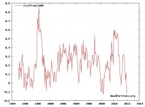
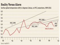
In actual fact we have gone not just a decade without warming, but really no statitistically significant changes have occurred for a full 17 years globally in sharp contrast to IPCC projections. Recall none other than Ben Santer of LLL had said it falsification of AGW needed not a few years, not even a full decade but 17 years of non-warming. Even with massive still ongoing after climategates manipulation of the data to induce false warming, the data from the site the author recommends (Wood for Trees) does exactly that - falsify man made global warming. The 17 years started in a cold period and ended in a cold period with three El Nino spikes in between. We end the period 0.3C colder than we began.

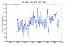
As for the Yulsman yarn, this comment by Steve Goddard “I wonder why he forgot to mention that temperatures in his hometown (Boulder, CO) have been declining since the 1930s?”

Joe Bastardi responsed as well in great detail:
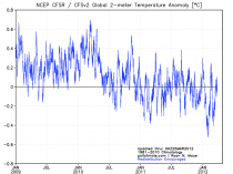
Just what is so mysterious about the Change in the Pacific ocean cycle to cold 3 years ago and this response globally:

Source
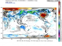
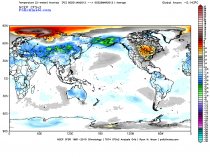
So is the satellite lying? Now let me ask you this. If this is global warming, why is the March temp globally below normal?

The temperature is above the red heat wave in the US and since the year began why is it below normal (see global average top right).

Source
IF YOU WERE IN ASIA, WOULD YOU BE TOUTING GLOBAL WARMING?
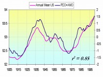
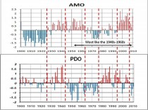
Okay let’s look at this… the correlation between temps and the oceanic cycles, we just came out of the warm PDO and are going into the cycle we were in during the 60s and 70s.

Source

Enlarged
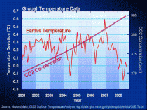
Now contrast that with the CO2 charts vs temperatures during the leveling, and now the recent cooling.

Source
Where is the IPCC trapping hot spot that was supposed to lead to the feedback that was supposed to cause the explosive warming? Educate yourself, dont be lead to the slaughter like sheep. READ THIS
Finally the IPCC 3 scenarios, CO2, and the actual temps.. Its below their mid point, below their bottom point and heading the other way

Another source.
So how the heck can you say its cherry picking when it fits perfectly with climate cycle theory that say the ocean cools, the air then cools above (much like turning down a thermostat, the air in your house cools before surfaces do) THEN THE LOWEST LEVELS COOL. This is right on target with forecasts made by Bill Gray years ago, since you are close to where Dr Gray is, why don’t you ask him, My forecast stands, made 4 years ago, that the cooling would start ( it has as you can see on the observed objective data) and by 2030 we are back to where we were in the late 1970s WHEN THE PACIFIC WAS ENDING ITS COLD CYCLE. Look for yourself at the PDO values above
We started objective measuring of temps via satellite in 1978, at the END OF THE COLD CYCLE. Just what do you think is going to happen globally when the world’s number one source of energy, the tropical Pacific, warms? And when the Atlantic does to, it means the global temp rises as heat is a measure of energy. The continents warm and that in turn warms the arctic. However the turn to the opposite is starting now. It is intuitive that the drop starts and it is. There is no tipping point, the IPCC panic forecast is busting and we are causing untold misery by tying up the life line of our economy over a ghost that will be proven to be a scam.
The idea that there is a well oiled machine is nonsense. I don’t ask anyone to trust me, just take an hour out of your day to read the other side of this issue and you will understand that people that are pushing this want you to believe its complex. Well its not. The sun, the oceans and to some extent, volcanic activity, far outstrip the ability of a “greenhouse” gas that is 400 times LESS PREVALENT than the number one greenhouse gas, water vapor, that occupies only .04% of the atmosphere, has a heavier specific gravity than air (1.5 to 1.0) heats and COOLS faster than air and has different radiative properties. Do you understand how small the odds of this having anything to do with the climate is. And the screams or derision are coming because with the change in the ocean and even solar cycles, the major disconnect has started, showing CO2’s relationship to temperature is coincidental and all we need do, since we are no where near the tipping point, since RECORD COLD has been occurring in the very places the IPCC were going to be warm with the trapping hot spots, is watch the data, WITHOUT ADJUSTMENT, just the pure satellite data that I showed you above, that you can watch every day.
Going forward, the global temp will RISE back to above normal for a time over the next 3 months, but the drop will start again against the normals and when we look at this chart next year.

Source
It will have had a lower spike down than this year.
That is the difference between me and these folks pushing this issue. I will make a forecast that you can see, right or wrong, over a definable period of time. I will ask you to read for yourself and test the ideas I have. Not simply ask you to follow like sheep to the slaughter and trust their dire predictions for many decades after many of us will be gone. Its your life, your country. At least look at the issues from all angles before you support blindly what the government’s well funded warming lobby is telling you.
Mar 25, 2012
Hadley HADsst3 Dirty Little Adjustments
Musings from the Chiefio
There’s an interesting, if long and complicated, article about the adjustments to the Sea Surface Temperature set done in the revision to HADsst3. The basic conclusion that there’s not a good reason for the assumptions about what kind of temperature measuring was done, and the adjustments are making the data worse (less accurate) not better.
Conclusion
HadSST3 contains a series of adjustments. With the exception of the war-time glitch, they are not obvious from study of the record. Their existence is based on speculation and hypothesis. Calculation of the biases involves inverting a significant portion of written records meta-data for the period of the principal adjustment and ignoring detailed studies on the proportion and timing of changes in data sampling methods as well a speculation as to the magnitude of the various effects.
The principal effect of these adjustments is to selectively remove the majority of the long term variation from the earlier 2/3 of the data record and to disrupt circa 10-11y patterns clearly visible in the data. These changes are fundamentally altering the character of the original data.
The strong similarity in form between the variations in the original ICOADS data and the corrections deemed necessary to correct sampling biases is remarkable. All the more so in view of the lack of documentary information on which to base the estimated magnitude and timing of the adjustments.
The analysis presented here indicates that, outside the immediate war-time period, these adjustments are distorting and degrading the data rather than improving it.
A number of different analyses suggest that a simple correction to the war-time period (as was used before the creation of the Hadley Centre) provides a more coherent and credible result.
Comparison to studies of non SST data suggest that much of the variation in ICOADS is quite possibly due to real climate signals, not instrument bias. These variations require proper investigation, not a priori removal from the climate record.
All I can say is “Ouch! Thats gotta hurt!” 
One can only hope that someday a full understanding of the land temperature adjustments can similarly be made.
Mar 24, 2012
FactCheck.org misrepresents the dangers of carbon dioxide
By James D. Agresti
FactCheck.org is a project of the Annenberg Public Policy Center of the University of Pennsylvania. Its mission is to “apply the best practices of both journalism and scholarship” to “reduce the level of deception and confusion in U.S. politics.”
FactCheck.org recently published an article entitled “Santorum’s science,” by Lori Robertson. In this piece, Robertson criticizes Rick Santorum for a statement he made about global warming on March 12th in Biloxi, Mississippi. Alluding to the fact that carbon dioxide (CO2) is a vital ingredient for plant life, Santorum quipped, “The dangers of carbon dioxide? Tell that to a plant, how dangerous carbon dioxide is.”
Robertson attempts to refute Santorum’s remark by declaring:
“Too much” CO2 “is definitely a bad thing.”
“Exposure to high levels of CO2 can cause ‘headaches, dizziness, restlessness ... coma, asphyxia to convulsions ... and even frostbite if exposed to dry ice,’ which is solid CO2.”
“Plants do, in fact, absorb CO2. But even plants might not like too much of it. A 2008 study conducted at the University of Illinois found that instead of increasing organic matter in soil, higher carbon dioxide levels actually led to less organic matter.”
These statements are materially misleading. Let’s examine them one at a time.
FactCheck.org: “Too much” CO2 “is definitely a bad thing.”
The same can be said of just about every substance known to man. The most basic principle of toxicology is that “the dose makes the poison.” As explained in a Cambridge University Press textbook, Understanding Environmental Pollution (page 60), “Anything is toxic at a high enough dose. Even water, drunk in very large quantities, may kill people by disrupting the osmotic balance in the body’s cells.”
Likewise, even oxygen can be toxic when breathed in high concentrations. Per The Johns Hopkins Manual of Gynecology and Obstetrics (page 40), “when there is too much oxygen ... the lungs may be damaged, as in acute repository distress syndrome (ARDS).”
Thus, it is meaningless to proclaim that “too much” of any particular substance is “a bad thing.” Instead, the pertinent matter is, “When does it become a bad thing?” which leads directly to the next point.
FactCheck.org: “Exposure to high levels of CO2 can cause ‘headaches, dizziness, restlessness...coma, asphyxia to convulsions… and even frostbite if exposed to dry ice,’ which is solid CO2.”
This statement is irrelevant to the issue at hand. Santorum was speaking about global warming and atmospheric CO2- not ventilation deathtraps, industrial hazards, and dry ice. The truth is that atmospheric CO2 levels don’t approach anywhere near the doses that can cause the symptoms that Robertson lists.
Using data from multiple academic sources, Just Facts has documented that carbon dioxide produces no adverse physiological effects on humans until concentrations exceed 50 times the level in Earth’s atmosphere. Furthermore, natural emissions of CO2 outweigh man-made emissions by a factor of twenty to one.
Some of Robertson’s confusion may stem from the source that she cites for the dangers of CO2, which is a cut sheet from the Wisconsin Department of Health and Family Services. This document contains a major recurring error. The figures given for CO2 concentrations that cause various adverse effects are mistaken by more than a factor of ten.
For example, the cut sheet says that exposure to CO2 concentrations above 5,000 parts per million (ppm) “may lead to serious oxygen deprivation resulting in permanent brain damage, coma and even death.” As detailed by the National Research Council (and many other academic sources), humans can be routinely exposed to more than ten times this level of CO2 for days on end without any indications of permanent brain damage or threat of death. In fact, it takes prolonged CO2 exposures of more than 20,000 ppm just to cause occasional, mild headaches.
FactCheck.org: “Plants do, in fact, absorb CO2. But even plants might not like too much of it. A 2008 study conducted at the University of Illinois found that instead of increasing organic matter in soil, higher carbon dioxide levels actually led to less organic matter.”
First, according to the article that Robertson cites for this claim, this study found that higher CO2 levels “may” have led to less organic matter in the soil of a certain soybean crop. This is different from claiming that higher CO2 “actually” led to less organic matter in plant soil.
Far more significantly, Robertson fails to mention that the study found “a 30 percent increase in above- and below- ground soybean biomass” among the crops exposed to more CO2. In plain language, these soybean plants grew 30% larger. They did, in fact, “like” the added CO2.
Note that this study was conducted at a CO2 level of 550 ppm, as compared to the current atmospheric CO2 concentration of about 387 ppm. Bear those figures in mind, because the study’s result accords with an academic text that explains how to increase the productivity of commercial greenhouses:
Plants need water, light, warmth, nutrition and CO2 to grow. By increasing the CO2 level in the greenhouse atmosphere (typical to 600 ppm instead of normal 400 ppm value), the growth for some plants can be stimulated in an important way, with often yield increases up to 20%, especially for tomato, cucumber, strawberry, etc. but also for potted plants and cut flowers.
In sum, Santorum is correct. CO2 concentrations well above todays atmospheric levels are typically beneficial to plants.
Icecap Note: We breathe out air at 40,000ppm. Most workplaces and classrooms, auditoriums have levels 1000-2000 ppm. Submarines have measured levels of 6000-11,000ppm with not documented effects. Although we applaud the efforts fo fact checking on politicians and groups like the American Lung Association, AARP, etc, they haave to do a better job. The details in this fact check on factcheck could have been easily found on CO2Science.org .
|
|
|
|


