Mar 05, 2012
More about the NZ temperature record
Richard Treadgold, Climate Coversation Group
Errors in the new 7SS
The shocking breakthrough in our audit is that NIWA didn’t use the adjustment method they said they would use. Barry Brill, chairman of the Coalition, released an overview entitled New Zealand Unaffected by Global Warming (pdf, 1.3 MB). The discovery that the country hasn’t experienced global warming is another startling finding. In Chapter 8, on page 24, he identifies nine criticisms of NIWAs newest 7SS. These multiple defects destroy the credibility of the 7SS as a source of the NZTR.

Enlarged.
1.It contradicts every other record of NZ temperatures.
2.Its warming trend comes almost entirely from the Auckland and Wellington stations, which are contaminated with false warming from UHI. The 7SS makes no adjustments for UHI.
3.It uses adjustments derived from comparisons between “isolated stations” in direct defiance of the scientific authorities.
4.It finds warming only by disregarding the statistical techniques it said it would use - Rhoades & Salinger. The reality is that New Zealand has had no strong warming for a hundred years.
5.It gives no margins of error for its adjustments and always applies changes, even when the method says they are unjustified.
6.The strong warming is created by implausible accumulating adjustments, which are not random, as we would expect, but slanted in the direction of warming.
7.To verify the 7SS, NIWA wheeled in the 11SS, which they themselves invented, has data missing everywhere and is laughably unscientific.
8.The refusal to release the BoM review documents under the Official Information Act (by both NIWA and the BoM) raises the question of what they’re hiding.
9.Most of the warming in the 7SS occurs during the first half of the century, which contradicts NIWAs official advice that our warming was driven by global CO2 emissions - which are concentrated in the last 40 years.
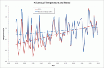
NIWA shows 168% more warming than Rhoades & Salinger -the method NIWA claimed to use but did not. The blue dashed line shows the warming trend when the method is used correctly. The red line reveals NIWAs outrageous fraud - it’s much stronger warming, but it’s empty of truth.
1. It contradicts every other record of NZ temperatures.
The temperature readings themselves, both ancient and modern, provide clear evidence that theres been little warming. Modern temperatures in Auckland, Wellington and Christchurch are about 0.5C below the 1860s, and the New Zealand mean now is 0.2C below the 1860s mean, so there’s been no warming. NIWA’s story of strong warming is believable only if they fault the accuracy of the old readings. But they don’t.
If they did, and they “adjusted” the oldest temperatures downward, their already strong warming would give off the distinct smell of fish.
2. Its warming trend comes almost entirely from the Auckland and Wellington stations, which are contaminated with false warming from UHI.
The peer-reviewed literature says clearly that records from these two cities are contaminated with an urban heat island (UHI) effect and show false warming. If you don’t correct for UHI, the series you finish up with is skewed in favour of warming. Why haven’t NIWA’s team made some correction for UHI? UHI also affects the other four urban stations, but no corrections were made there either.
3. It uses adjustments derived from comparisons between “isolated stations” in direct defiance of the scientific authorities.
Here’s what our audit says:
The technique NIWA has used for all their adjustments (excepting overlaps) is the “neighbouring stations” method. It is important to note that in reality NIWA seldom uses truly neighbouring stations. In most cases the stations chosen are from some distance away, especially for the earlier records. For example, Dunedin is compared against Albert Park in Auckland. For the purposes of this document, we shall however refer to all station comparisons as “neighbouring”, even though many are not.
So NIWA have used the “Clayton’s” neighbouring stations method - the neighbouring stations method you use when you’re not using a neighbouring stations method. If the methodology requires the use of neighbouring stations for comparisons, why have NIWA disregarded that requirement?
This is a nonsense. It is a waste of taxpayers’ money. It’s a caricature of the scientific method. And it will become the laughing stock of the climate world.
4. It disregards the statistical techniques it said it would follow - Rhoades & Salinger.
After we published Are we feeling warmer yet? (AWFWY) we asked NIWA what adjustments they had made to the temperature record. Their constant theme was that they had followed the scientific literature and we ought to know what it said.
For the methodology, they referred us to Salingers thesis (which proved useless) and R&S (which didn’t). Later, when they announced their reconstruction of the 7SS, they said they would use R&S for the adjustments.
But they didn’t use R&S. Why didn’t they keep their word?
5. It gives no margins of error for its adjustments and always applies changes, even when the method says they are unjustified.
6. The strong warming is created by implausible accumulating adjustments, which are not random, as we would expect, but slanted in the direction of warming.
The chances of replicating the first series without knowing the original method used are astronomical. In fact, it’s incredible that it happened. The further chance that all the adjustments should almost universally conspire to alter the trend to warming is too incredible and probably constitutes evidence of intent.
7. To verify the 7SS, NIWA wheeled in the 11SS, which they themselves invented within a few days of our AWFWY paper, has data missing everywhere and is laughably unscientific.
Only about a week after we published AWFWY, NIWA put out a media release saying:
Dr Jim Salinger has identified from the NIWA climate archive a set of 11 stations with long records where there have been no significant site changes. When the annual temperatures from all of these sites are averaged to form a temperature series for New Zealand, the best-fit linear trend is a warming of 1C from 1931 to 2008.
And with that, cherry-picking data to prove a scientific case became an officially-sanctioned strategy. Comment on that, you bright boys at Hot Topic!
8. The refusal to release the BoM review documents under the Official Information Act (by both NIWA and the BoM) raises the question of what they’re hiding.
We still await a response from the Ombudsman from our request made in May last year, although it follows our complaint about NIWA’s original refusal in 2010. Their tardiness in this case is outrageous. It constitutes a severe condemnation of the conduct of that formerly useful office. If a small number of those new functionaries in the Ministry for the Environment calculating carbon footprints and assembling long inventories of obscure greenhouse gases being emitted by innocent New Zealand manufacturers might be diverted to the Ombudsmans office, we might see some useful work accomplished.
9. Most of the warming in the 7SS occurs during the first half of the century, which contradicts NIWA’s official advice that our warming was driven by global CO2 emissions - which are concentrated in the last 40 years.
These contradictions and mysteries mark NIWA’s latest attempt to hoodwink the public over the national temperature record.
It seems incredible that this agency has a monopoly on government advice on climate science.
Feb 26, 2012
Is The Window Closing?
By Art Horn, ICECAP Meteorologist
The historical temperature record shows that the earth has warmed about 1.3 degrees Fahrenheit since 1850. But does that warming prove that we caused it? Our leaders in Washington say adding more carbon dioxide to the air is closing the window at the top of the atmosphere and allowing less heat to escape to space. The answer as to whether this is true or not is not going to come from looking at how much the earth has warmed up in the last 150 years. This planet has warmed and cooled so many times in the past that the current temperature trend is just a repeat of what has happened many, many times before. There are simply too many natural temperature cycles caused by too many forces of nature that will mask any underlying forcing mechanism. Thankfully there is a new way to find an answer. With the advent of the satellite era in the 1960s a revolutionary method of how to evaluate our possible impact on climate was born.
The satellites have the advantage of being free of all the effects that make surface temperature measurements so unreliable in evaluating our impact on climate. They can measure the entire irradiance of the earth from their perch high above the atmosphere without the problems ground based thermometers have. Problems like changing thermometer technology over the last 150 years. Problems such as urban sprawl spreading into the countryside warming long term temperature readings that once were cooler when they were in a rural setting. Problems such as the uneven distribution of thermometers around the world and the lack of them over the oceans. The satellites are free of all of this and have been measuring the amount of long wave radiation (heat) escaping from the atmosphere into space since the mid 1970s. The satellites know the size of the window and how much heat is getting through.
If the man made greenhouse gas theory is correct the amount of heat going through the window into space should be decreasing over the last few decades, the window at the top of the atmosphere should be closing. Since 80% of all man made carbon dioxide emissions have been produced after 1940 we should be able to detect how much the window is closing over the last nearly four decades. If it is closing, less heat can sneak through to space and the atmosphere below will gradually warm up. The beauty of the satellites is that we can objectively deduce if it is closing. If it is, this would be significant evidence that burning of fossil fuels is strengthening the natural greenhouse effect and causing man made global warming.
So what do the satellites show? Since the mid-1970s the satellite data show no trend either up or down in outgoing long wave radiation. Plain and simple, the satellites say the window is just as wide open now as it was in 1974. The average value of outgoing long wave radiation through the last nearly four decades is about 232.5 watts per square meter. As stated above, there has been very little long term variation in this number since 1974. However, during that time carbon dioxide has increased from 330 parts per million to 392 parts per million today, an increase of 62 parts per million. The pre-industrial revolution carbon dioxide base line value is about 280 parts per million. Since then we have seen a rise of 112 parts per million. The 62 parts per million rise since 1974 represents a 55% increase in atmospheric carbon dioxide over the 1850 level. Surly such a significant rise in carbon dioxide should be closing the window up there, if the theory is correct, but its not.
Is it possible that in some places the window is closing and not in others? No, it doesnt matter where you look. The data shows no trend up or down at either of the poles. Water vapor is most of the greenhouse effect but at the poles, where there is much less water vapor due to the colder temperature, carbon dioxide is a more significant warming agent. But even in those locations where it should be most obvious, there is no indication that the window is closing, at either pole. The data shows the window is not closing above the tropics where the largest amount of outgoing long wave radiation is found. If the greenhouse effect is becoming more potent the out going long wave radiation would show a noticeable decreasing trend over the last nearly four decades in all of these regions but it does not. If the trend were there the satellite data would detect it. Actually since 2003 the amount of heat escaping to space has increased slightly. This increase is just part of the small natural variation that occurs over time and likely does not represent any long term trend.
Real world evidence from nearly four decades of satellite data has proven that large increases in carbon dioxide have not shown any sign of closing the window at the top of the atmosphere. No amount of computer modeling or rhetoric from famous people or proclamations from large institutions or speeches from our leaders in Washington can change this. The data alone should be enough for thoughtful, reasonable people to re-consider the causes of climate change. Unfortunately we are dealing with people and institutions with many different agendas in the global warming arena. Many of these individuals and institutions have a major financial stake in bolstering the man made global warming scare. Makers of windmills and solar panels are not going to suddenly admit that the greenhouse effect is not getting stronger. Their entire livelihood depends on it. The recent scandals of failed alternative energy companies are everywhere. Billions and billions of taxpayer dollars are being sucked out of our bankrupt economy only to see it washed down the drain by failed wind and solar companies. All because our leaders will not recognize that the window up there above us is just as wide open as it always has been.
Fossil fuels will be the energy source that powers the future for many decades to come. Knowledgeable people will continue to point out the overt flaws in the man made global warming theory. These flaws have resulted in destructive policies that threaten your safety and prosperity, no matter what political party you belong to. The satellites say the window in the sky is open. The question is, when will our leaders open their eyes.
ICECAP.US does not get money from oil companies or any other energy company. We do not have wealthy behind the curtain foundations to support us. We are fighting a grass roots battle to tell the truth about the war against our way of making energy and ultimately our prosperity. Please consider donating any amount of money to us so that we may continue to speak out against the ignorant and biased main stream media and the current administration. Your future and mine depend on it.
Feb 24, 2012
The Skeptic’s Case
By David Evans
We check the main predictions of the climate models against the best and latest data. Fortunately the climate models got all their major predictions wrong. Why? Every serious skeptical scientist has been consistently saying essentially the same thing for over 20 years, yet most people have never heard the message. Here it is, put simply enough for any lay reader willing to pay attention.
What the Government Climate Scientists Say

The climate models. If the CO2 level doubles (as it is on course to do by about 2070 to 2100), the climate models estimate the temperature increase due to that extra CO2 will be about 1.1C × 3 = 3.3C.[1]
The direct effect of CO2 is well-established physics, based on laboratory results, and known for over a century.[2]
Feedbacks are due to the ways the Earth reacts to the direct warming effect of the CO2. The threefold amplification by feedbacks is based on the assumption, or guess, made around 1980, that more warming due to CO2 will cause more evaporation from the oceans and that this extra water vapor will in turn lead to even more heat trapping because water vapor is the main greenhouse gas. And extra heat will cause even more evaporation, and so on. This amplification is built into all the climate models.[3] The amount of amplification is estimated by assuming that nearly all the industrial-age warming is due to our CO2.
The government climate scientists and the media often tell us about the direct effect of the CO2, but rarely admit that two-thirds of their projected temperature increases are due to amplification by feedbacks.
What the Skeptics Say

Figure 2
The skeptic’s view. If the CO2 level doubles, skeptics estimates that the temperature increase due to that extra CO2 will be about 1.1C × 0.5 ≈ 0.6C.[4]
The serious skeptical scientists have always agreed with the government climate scientists about the direct effect of CO2. The argument is entirely about the feedbacks.
The feedbacks dampen or reduce the direct effect of the extra CO2, cutting it roughly in half.[5] The main feedbacks involve evaporation, water vapor, and clouds. In particular, water vapor condenses into clouds, so extra water vapor due to the direct warming effect of extra CO2 will cause extra clouds, which reflect sunlight back out to space and cool the earth, thereby reducing the overall warming.
There are literally thousands of feedbacks, each of which either reinforces or opposes the direct-warming effect of the extra CO2. Almost every long-lived system is governed by net feedback that dampens its response to a perturbation. If a system instead reacts to a perturbation by amplifying it, the system is likely to reach a tipping point and become unstable (like the electronic squeal that erupts when a microphone gets too close to its speakers). The earth’s climate is long-lived and stable - it has never gone into runaway greenhouse, unlike Venus - which strongly suggests that the feedbacks dampen temperature perturbations such as that from extra CO2.
What the Data Says
The climate models have been essentially the same for 30 years now, maintaining roughly the same sensitivity to extra CO2 even while they got more detailed with more computer power.
· How well have the climate models predicted the temperature?
· Does the data better support the climate models or the skeptic’s view?
Air Temperatures
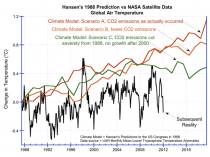
One of the earliest and most important predictions was presented to the US Congress in 1988 by Dr James Hansen, the “father of global warming”:

Figure 3. Hansen’s predictions to the US Congress in 1988,[6] compared to the subsequent temperatures as measured by NASA satellites.[7]
Hansen’s climate model clearly exaggerated future temperature rises.
In particular, his climate model predicted that if human CO2 emissions were cut back drastically starting in 1988, such that by year 2000 the CO2 level was not rising at all, we would get his scenario C. But in reality the temperature did not even rise this much, even though our CO2 emissions strongly increased which suggests that the climate models greatly overestimate the effect of CO2 emissions.
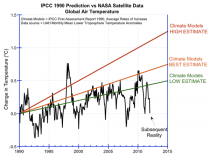
A more considered prediction by the climate models was made in 1990 in the IPCC’s First Assessment Report:[8]

Figure 4 Predictions of the IPCC’s First Assessment Report in 1990, compared to the subsequent temperatures as measured by NASA satellites.
It’s 20 years now, and the average rate of increase in reality is below the lowest trend in the range predicted by the IPCC.
Ocean Temperatures
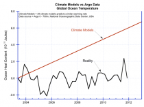
The oceans hold the vast bulk of the heat in the climate system. We’ve only been measuring ocean temperature properly since mid-2003, when the Argo system became operational.[9][10] In Argo, a buoy duck dives down to a depth of 2,000 meters, measures temperatures as it very slowly ascends, then radios the results back to headquarters via satellite. Over 3,000 Argo buoys constantly patrol all the oceans of the world.

Figure 5. Climate model predictions of ocean temperature,[11] versus the measurements by Argo.[12] The unit of the vertical axis is 10^22 Joules (about 0.01C).
The ocean temperature has been basically flat since we started measuring it properly, and not warming as quickly as the climate models predict.
Atmospheric Hotspot
The climate models predict a particular pattern of atmospheric warming during periods of global warming; the most prominent change they predict is a warming in the tropics about 10 km up, the “hotspot.”
The hotspot is the sign of the amplification in their theory (see figure 1). The theory says the hotspot is caused by extra evaporation, and by extra water vapor pushing the warmer, wetter lower troposphere up into volume previously occupied by cool dry air. The presence of a hotspot would indicate amplification is occurring, and vice versa.
We have been measuring atmospheric temperatures with weather balloons since the 1960s. Millions of weather balloons have built up a good picture of atmospheric temperatures over the last few decades, including the warming period from the late 1970s to the late ‘90s. This important and pivotal data was not released publicly by the climate establishment until 2006, and then in an obscure place.[13] Here it is:

Figure 6. On the left is the data collected by millions of weather balloons.[14] On the right is what the climate models say was happening.[15] The theory (as per the climate models) is incompatible with the observations. In both diagrams the horizontal axis shows latitude, and the right vertical axis shows height in kilometers.
In reality there was no hotspot, not even a small one. So in reality there is no amplification - the amplification shown in figure 1 does not exist.[16]
Outgoing Radiation

The climate models predict that when the surface of the earth warms, less heat is radiated from the earth into space (on a weekly or monthly time scale). This is because, according to the theory, the warmer surface causes more evaporation and thus there is more heat-trapping water vapor. This is the heat-trapping mechanism that is responsible for the assumed amplification in figure 1.
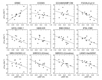
Satellites have been measuring the radiation emitted from the earth for the last two decades. A major study has linked the changes in temperature on the earth’s surface with the changes in the outgoing radiation. Here are the results:
Outgoing radiation from earth (vertical axis) against sea-surface temperature (horizontal), as measured by the ERBE satellites (upper-left graph) and as “predicted” by 11 climate models (the other graphs).[17] Notice that the slopes of the graphs for the climate models are opposite to the slope of the graph for the observed data.
This shows that in reality the earth gives off more heat when its surface is warmer. This is the opposite of what the climate models predict. This shows that the climate models trap heat too aggressively, and that their assumed amplification shown in figure 1 does not exist.
Conclusions
All the data here is impeccably sourced - satellites, Argo, and weather balloons.[18]
The air and ocean temperature data shows that the climate models overestimate temperature rises. The climate establishment suggest that cooling due to undetected aerosols might be responsible for the failure of the models to date, but this excuse is wearing thin - it continues not to warm as much as they said it would, or in the way they said it would. On the other hand, the rise in air temperature has been greater than the skeptics say could be due to CO2. The skeptic’s excuse is that the rise is mainly due to other forces - and they point out that the world has been in a fairly steady warming trend of 0.5C per century since 1680 (with alternating ~30 year periods of warming and mild cooling) where as the vast bulk of all human CO2 emissions have been after 1945.
We’ve checked all the main predictions of the climate models against the best data:
Test
Climate Models
Air temperatures from 1988:
Overestimated rise, even if CO2 is drastically cut
Air temperatures from 1990
Overestimated trend rise
Ocean temperatures from 2003
Overestimated trend rise greatly
Atmospheric hotspot
Completely missing → no amplification
Outgoing radiation
Opposite to reality → no amplification
The climate models get them all wrong. The missing hotspot and outgoing radiation data both, independently, prove that the amplification in the climate models is not present. Without the amplification, the climate model temperature predictions would be cut by at least two-thirds, which would explain why they overestimated the recent air and ocean temperature increases. Therefore,
* The climate models are fundamentally flawed. Their assumed threefold amplification by feedbacks does not in fact exist.
* The climate models overestimate temperature rises due to CO2 by at least a factor of three.
* The skeptical view is compatible with the data.
Some Political Points
The data presented here is impeccably sourced, very relevant, publicly available, and from our best instruments. Yet it never appears in the mainstream media have you ever seen anything like any of the figures here in the mainstream media? That alone tells you that the “debate” is about politics and power, and not about science or truth.
This is an unusual political issue, because there is a right and a wrong answer, and everyone will know which it is eventually. People are going ahead and emitting CO2 anyway, so we are doing the experiment: either the world heats up by several degrees by 2050 or so, or it doesn’t.
Notice that the skeptics agree with the government climate scientists about the direct effect of CO2; they just disagree about the feedbacks. The climate debate is all about the feedbacks; everything else is merely a sideshow. Yet hardly anyone knows that. The government climate scientists and the mainstream media have framed the debate in terms of the direct effect of CO2 and sideshows such as arctic ice, bad weather, or psychology. They almost never mention the feedbacks. Why is that? Who has the power to make that happen?
Dr. David M.W. Evans consulted full time for the Australian Greenhouse Office (now the Department of Climate Change) from 1999 to 2005, and part time 2008 to 2010, modeling Australias carbon in plants, debris, mulch, soils, and forestry and agricultural products. Evans is a mathematician and engineer, with six university degrees including a PhD from Stanford University in electrical engineering. The area of human endeavor with the most experience and sophistication in dealing with feedbacks and analyzing complex systems is electrical engineering, and the most crucial and disputed aspects of understanding the climate system are the feedbacks. The evidence supporting the idea that CO2 emissions were the main cause of global warming reversed itself from 1998 to 2006, causing Evans to move from being a warmist to a skeptic.
Feb 22, 2012
Breaking: EPA scrubs grants database of Gleick grants
By Steve Milloy
Here’s the timeline:
■Yesterday at 11:41 am we reported that EPA has awarded Peter Glieck’s Pacific Institute $468,000 in grants.
■Later in the afternoon, the National Center for Public Policy Research issued a media release calling for Congressional hearings into the EPA grants to Gleick.
■Today, a JunkScience.com commenter Brian Carter reported that the links in our original post didn’t work.
■We confirmed Carter’s observation around 12:30pm today.
Fortunately, we saved a PDF file of one of the EPA grants to Gleick. So unless JunkScience.com gets Stalinized
Click for:
■ The EPA web pages documenting the $25,000 grants.
■ EPA - Grant Awards Database - All Awards to Non-ProfitsA list of EPA’s grants to nonprofits that omits mention of Gleick’s Pacific Institute.
■ Click for a search of EPA’s Grants Database that returns no results for Pacific Institute.
------------
Fakegate Illustrates Global Warming Alarmists’ Deceit and Desperation
By James Taylor, Heartland Institute
There never was a “leaker” in the shameful Fakegate scandal. In the end, there was only a forger, a fraudster and a thief. Alarmist scientist Peter Gleick has admitted that the latter two were one and the same person - himself. I suspect we will soon learn the identity of the forger, as well.
With the weight of damning evidence closing in on him, Gleick has admitted in his Huffington Post blog that he was the alleged “Heartland Insider” who committed fraud and identity theft, lying and stealing his way into possession of Heartland Institute internal personnel documents and then sending those private documents to global warming activist groups and left-leaning media. Gleick sent to the press an additional document, a fake “2012 Climate Strategy,” that he claims he did not write.
In short, Gleick set up an email account designed to mimic the email account of a Heartland Institute board member. Gleick then sent an email from that account to a Heartland Institute staffer, in which Gleick explicitly claimed to be the Heartland Institute board member. Gleick asked the staffer to email him internal documents relating to a recent board meeting. Soon thereafter, Gleick, while claiming to be a “Heartland Insider,” sent those Heartland Institute documents plus the forged “2012 Climate Strategy” document to sympathetic media and global warming activists.
While the legitimate Heartland Institute documents revealed personal, confidential and private information about Heartland Institute personnel, donors and programs, there was nothing scandalous in the documents. The documents merely showed the inner workings of an influential public policy organization operating on a budget that was quite small compared to environmental activist groups such as Greenpeace, the Sierra Club and Environmental Defense. Indeed, the internal documents refuted the false, yet often repeated assertions that the Heartland Institute’s powerful climate realism message is largely funded by Big Oil, Big Coal or Big Whatever.
The only thing that would seem to undermine the Heartland Institutes credibility was the wording of the fake “2012 Climate Strategy” document. Computer forensics experts quickly discovered the climate strategy document was created by a different computer program and at a different time than the legitimate documents. The climate strategy document was also written in much different language, style, format and font than the legitimate documents. And long before Gleick confessed to being the fraudster and thief at the heart of the stolen documents, analysts noted a striking similarity between the language and style of the forged document and the language and style of Gleicks public writings.
The real story in this Fakegate scandal is how the global warming movement is desperate, delusional and collapsing as global warming fails to live up to alarmist predictions. People with sound science on their side do not need to forge documents to validate their arguments or make the other side look bad. Also, people who are so desperate as to forge documents in an attempt to frame their rivals are clearly not above forging scientific data, studies and facts to similarly further their cause.
It is both striking and telling how global warming activists have failed to condemn the acts of forgery in the Fakegate scandal. For global warming activists, the ends justify the means - any means necessary to sell their alarmist message, even if they must sink to forgery and fakery.
It is also worth noting that Gleick repeatedly claims in his confession that his misconduct was motivated by a desire to create a rational public debate on global warming and that he was trying to fight back against the people he claims are seeking to prevent such a debate. Yet in January 2012 the Heartland Institute cordially invited Gleick to publicly debate me at our 2012 annual benefit dinner. All Gleick would had to have done is defeat me in that debate and he could have accomplished his twin goals of promoting public debate and embarrassing the Heartland Institute. Yet Gleick declined to participate in such a fair and open debate, and then on the very next day committed his acts of fraud and theft against the Heartland Institute.
Beyond our invitation to Gleick, the Heartland Institute has cordially invited dozens of scientists who believe humans are creating a global warming crisis to give presentations and to debate skeptics at our annual global warming conferences. Only one such scientist has ever accepted our offer.
If Gleick is indeed concerned about people preventing a public debate on global warming, he perhaps should have targeted his global warming activist colleagues rather than the Heartland Institute.


