

By Bruce Hall, Hall of Records
The NCAR [National Center for Atmospheric Research] study titled “The relative increase of record high maximum temperatures compared to record low minimum temperatures in the U.S.” was published October 19, 2009.”
Abstract
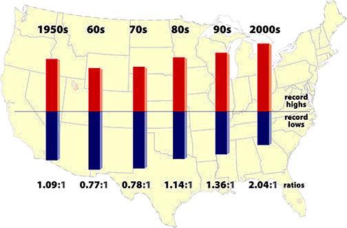
The current observed value of the ratio of daily record high maximum temperatures to record low minimum temperatures averaged across the U.S. is about two to one. This is because records that were declining uniformly earlier in the 20th century following a decay proportional to 1/n (n being the number of years since the beginning of record keeping) have been declining less slowly for record highs than record lows since the late 1970s. Model simulations of U.S. 20th century climate show a greater ratio of about four to one due to more uniform warming across the U.S. than in observations. Following an A1B emission scenario for the 21st century, the U.S. ratio of record high maximum to record low minimum temperatures is projected to continue to increase, with ratios of about 20 to 1 by mid-century, and roughly 50 to 1 by the end of the century.” The following is a graphic representation of the study from the UCAR website (below, enlarged here):

“This graphic shows the ratio of record daily highs to record daily lows observed at about 1,800 weather stations in the 48 contiguous United States from January 1950 through September 2009. Each bar shows the proportion of record highs (red) to record lows (blue)for each decade. The 1960s and 1970s saw slightly more record daily lows than highs, but in the last 30 years record highs have increasingly predominated, with the ratio now about two-to-one for the 48 states as a whole.”
While this study does use sound methodology regarding the data it has included, it falls short of being both statistically and scientifically complete. Hence, the conclusions from this study are prone to significant bias and any projections from this study are likely incorrect.
Comments
The NCAR Study contains at least two biases:
The selection of 1950 through 2006 significantly biases the outcome of this study because the U.S. was entering a cooling period in the 1960s and 1970s which creates the illusion of unusual subsequent warming from 1980 through 2006. During the last decade, a large reduction of rural reporting stations in the U.S. has biased records toward urbanized and urbanizing areas. Land use changes as well as deterioration of urban siting versus NOAA standards [here] have resulted in a bias toward over-reporting/erroneous reporting of high temperature records and an under-reporting of low temperature records.
The charts in the Surface Stations study nearly 4/5ths of the U.S. weather stations and demonstrate a significant bias toward errors greater than +2C or about three times the total trend reported for global warming.
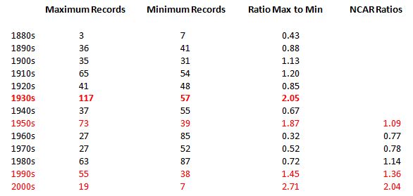
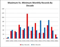
Comparison of Statewide Monthly Temperature Records with the NCAR Study
Let us look at the statewide monthly maximum and minimum records by decade beginning in 1880. Those records are used to calculate a ratio of maximum and minimum records by decade and then compared with the NCAR study ratios (below, enlarged here).
There are two aspects of this comparison that jump out to the reader:
The 1930s were, by far, the hottest period for the time frame. The ratio of maximum to minimum temperatures is greater in the 2000s, but the absolute number of monthly statewide extreme records is far less significant making the ratio far less significant.
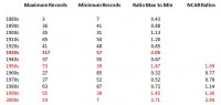
The general pattern of ratios for the monthly records follows reasonably closely to the pattern of the daily individual location records, on a decadal basis. Now let us take the two data sets and plot the ratios and see what conclusions we might draw remembering that in absolute terms, the 1930 had a much higher frequency of maximum temperature extremes than the 1990s or 2000s or the combination of the last two decades (below, enlarged here).
Keep in mind that there are significant biases toward recording daily warmer temperatures due to the closure of thousands of rural stations and expansion of urban areas into previously rural or suburban areas, creating enormous “heat sinks,” that prevent night time temperatures from dropping to the extent that they would in a nearby rural setting. Hence more stations reporting greater frequencies of maximum temperatures and fewer minimums.
Conclusion
The oscillating or cyclical nature of our climate is completely overlooked when one takes a small time frame such as the 1950s through 2006 and extrapolates a full century beyond. Even 130 years of data, starting from a relatively cold period, gives a very brief look at climate history for the U.S. and certainly one that is not sufficient to extrapolate a general warming trend, much less an accelerating one.
In the face of the recent decline in new all-time monthly statewide maximum records, it is more probably that we may be facing a cyclical decline in our overall temperature and that something similar to the 1960s and 1970s may be a far more realistic projection. Our most recent winters have been particularly colder than long-term averages and minimal sunspot activity may be another harbinger of this normal cyclical variation in our relatively stable climate.
For more information about this and related topics, please check out the following blogs: Climate Science, Icecap, Watts Up With That? The authors have contributed ideas and advice for this post. See much more detail in the full post here. See also Roger Pielke Sr.’s post on the NCAR study here.
Icecap Note: Thanks Bruce for this detailed analysis. The NCAR study is another example of a cherry picking study with a period of study beginning near the start of the PDO cold period that started in 1947 and carried through the warm PDO. The current decade of state data is showing fewer records not an acceleration. See comments by Roger Pielke Sr. early this upcoming week here and Anthony Watts here and World Climate Report new here.
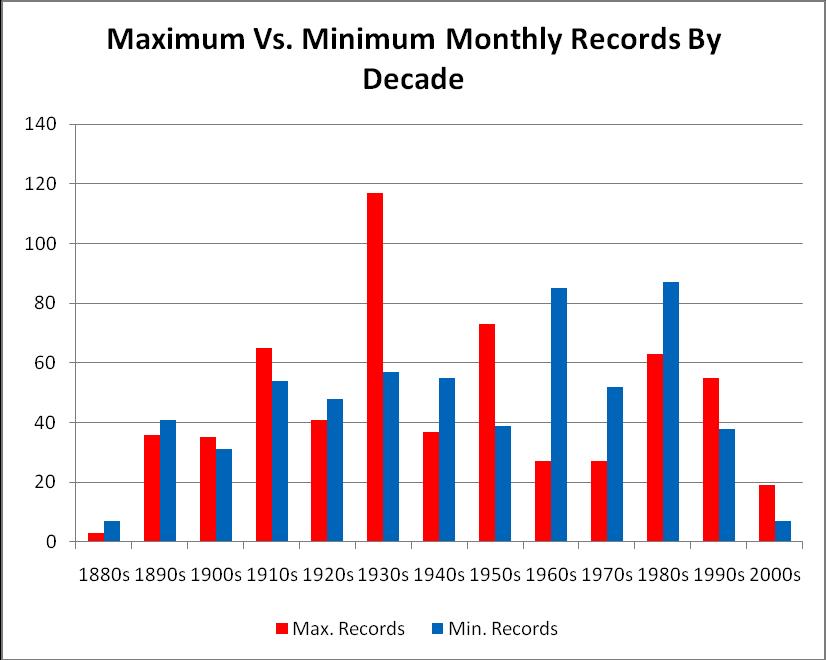
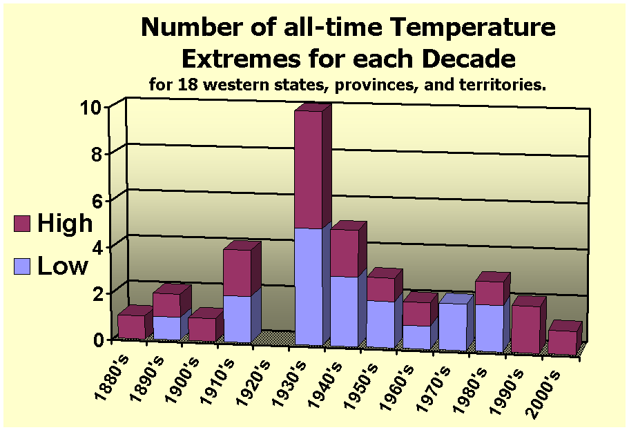
Dr. Richard Keen, University of Colorado has added “My book, Skywatch West, covers the weather and climate of the 11 western states, plus Alaska, plus 6 western Canadian provinces and territories. The chapter on temperature extremes includes a chart of the occurrences (by decade) of the all-time extreme temperatures for each of the 18 states, provinces, and territories (a total of 36 records in all) (below, enlarged here). Some fun statistics from this are: of the all-time record maximum temperatures, 10 occurred before 1940 (the first six decades), and 8 after (the second six decades). For record minimum temperatures, the reverse is true: 8 records before 1940, 10 afterwards. Half of the records - 8 maximum and 10 minimum, a total of 18 - occurred during the middle three decades of the 1930’s, 40’s, and 50’s, and of these nearly a third of the total (10) were during the 1930’s alone. No records occurred in the 2000’s up to the publication date of the book (2004). Since then Arizona’s record maximum was tied, but not broken, in 2007.” (below, enlarged here)
UPDATE: See Bruce’s follow-up study with projections of the observed cyclical trends here.