

By Dr. Richard Keen, University of Colorado
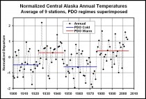
I recently completed a study of central Alaska’s climate. For this study I computed the average annual temperature for nine long-term Alaskan stations (and station combinations), which are: Eagle/Dawson, Ft. Yukon/Central, Fairbanks University, McKinley Park, Talkeetna, Gulkana / Kennecott / Chitina / McCarthy, Yakutat, Cordova, and Valdez. Then I averaged the nine stations for a regional mean (below, enlarged here). The data source was NCDC.
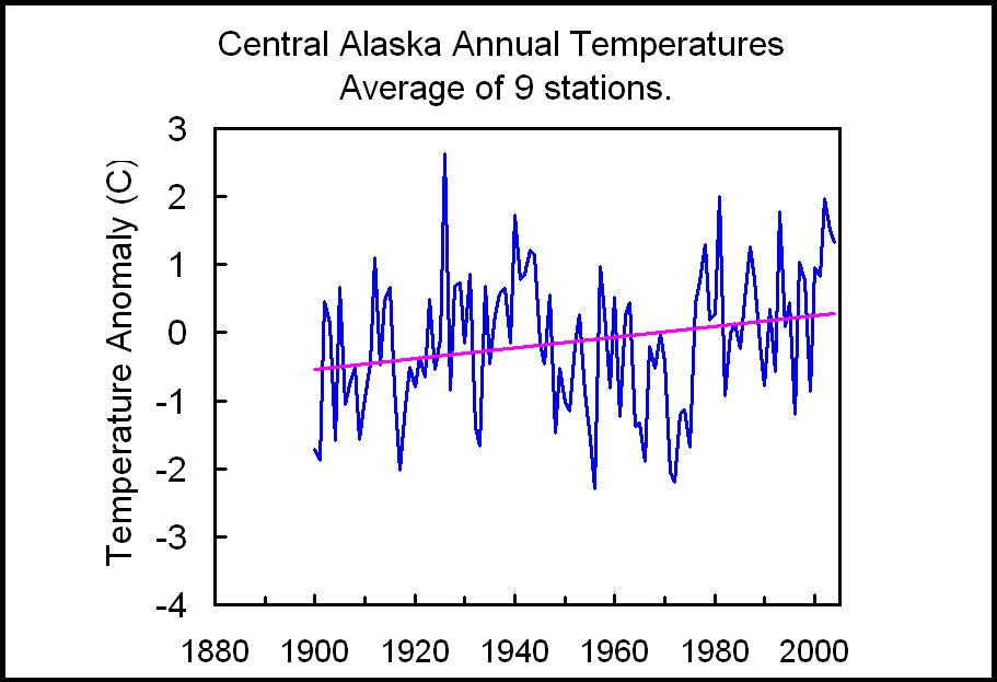
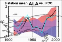
For comparison with the IPCC thumbnail for Alaska (I hope you can find an enlarged version of this), I replotted the regional temperatures as ten-year averages (below, enlarged here).
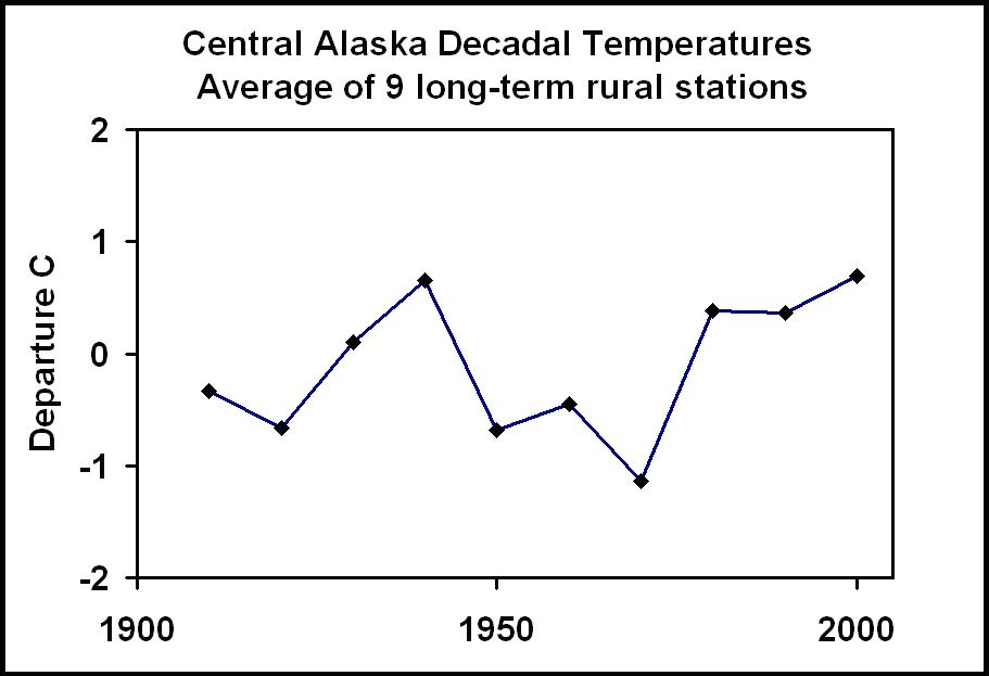
My averages show that the past three decades have shown no warming (since the PDO shift in 1977), and are in fact no warmer than the 1935-1944 decade. This is very different from the IPCC which shows a substantial warming over the past three decades. See the plot of annual versus the PDO stages (below enlarged here).
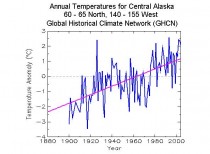
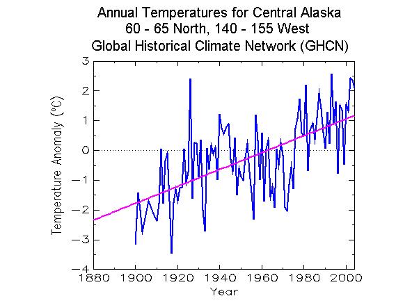
The annual values on the next plot clearly show the dominance of the PDO in Alaskan climate. Next is a graph of the GHCN annual temperatures for the same region. The GHCN data is dominated by an upward trend. My analysis gives an upward linear trend of 0.69 C/century (due to starting during a cold PDO and ending during a warm PDO), while the GHCN trend is 2.83 C/century - over 2 degrees larger!
Enlarged here.
Here is a blow up of the IPCC graph for Alaska (below, enlarged here.)
My study and the GHCN use the same stations, because there are no other long-term stations in the regions. I applied no “corrections” beyond offsets used when combining two or more stations with overlapping records (no other adjustments were warranted). One can only guess what “corrections” were applied to the GHCN and IPCC data sets, but I can easily guess their magnitude - about 1 degree. Curiously, the magnitude of the adjustments is about the same as the “global warming” signal of the past century.
I’d be interested if other readers can provide similar comparisons with other parts of the world.
See PDF here.
---------------------------
Critique Of NCAR Cherry Picking Temperature Record Study
Dr. Richard Keen, University of Colorado
Icecap Note: This is a follow-up to the posting now in Cold Storage below, on the NCAR Meehl etal study of record highs and lows that cherry-picked the starting year as 1950. The following is a graphic representation of the study from the UCAR website (below, enlarged here):
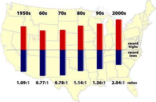

Bruce Hall did an analysis and follow-up. He extended the time period back to the start of the century and found the 1930 had a much higher frequency of maximum temperature extremes than the 1990s or 2000s or the combination of the last two decades (below, enlarged here).
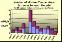
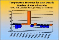
Dr. Richard Keen of the University of Colorado provided evidence from the western parts of the US and Canada supporting Bruce’s findings (below, enlarged here).
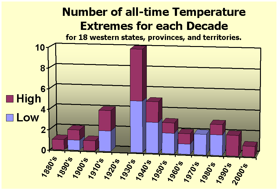
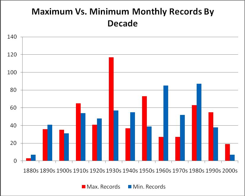
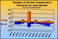
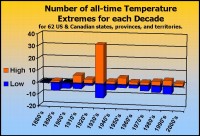
There were links also to WUWT, World Climate Report studies as well. Here below, Dr. Keen follows up his analysis expanding to all of the US and Canadian provinces and territories and shows there is no warming trend the last century.
Thanks for posting my chart of Western US and Canadian extreme temperature records by decade. I’m sure that by now the usual suspects have accused us of picking all of their cherries by showing only the western half of North America. Therefore, I spent the evening creating more charts for all 50 US states and 12 Canadian provinces and territories (excluding Nunavut, which was part of the Northwest Territories until recently).
I’m sending charts for the US, for Canada, and for the two combined. They tell the same story that my earlier Western North American graph showed, but more dramatically! MORE THAN HALF of the state and provincial maximum temperature records were set during the single decade of the 1930’s, and only 29 percent of these records were set since 1950. This means that by considering temperatures after 1950, Meehl et al. removed most of the really good heat records from the data pool, and artificially inflated the number of maximum temperature records (and thus, the max to min ratio). In other words, many of the maximum temperature records since 1950 would not be daily records for the entire period of record for these stations.
Meehl et al. calculate the max-to-min record ratio for each decade, but the difference (max MINUS min) is more illustrative (and not influenced by choice of denominator). That chart clearly shows the dominance of maximum temperature records during the 1930’s, and that since then most decades have had more minimum records set, and since 1940 minimum records have outnumbered maximum records by a ratio of 3 to 2 (or 1.5 to 1, if you prefer). Meehl et al. achieved opposite ratios by removing the extremes of the 1930’s.
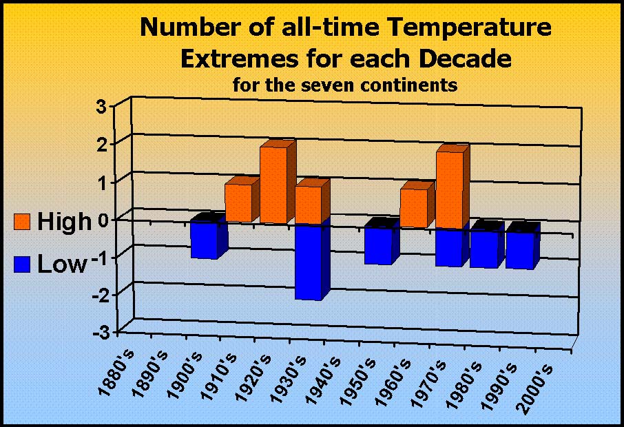
No doubt the cherry pickers will note that although most of North American is included in this analysis (and not just the US), I deftly left out the Yamal Peninsula, which, as we all know, is the true key to global climate. So I’ve created one more graph - a tally of the records for the seven continents, including Asia, which includes Siberia, where the Yamal Peninsula resides. What’s it show? Since 1950, 3 maximum and 4 minimum records have been set for the continents, a fairly even break.
Finally, although I consider linear trend lines somewhat useless and occasionally deceptive, I plotted those for each graph. In all cases, the trend line is virtually indistinguishable from the zero-value axis, so it is not shown. The bottom line is that if one wishes to express climate change by the varying number of temperature extremes, there has been no climate change for over 100 years.
See larger here.
See larger here.
See larger here.

See larger here.
----------------------------
Met Office to re-examine 160 years of climate data
By Ben Webster, Times Online
The Met Office plans to re-examine 160 years of temperature data after admitting that public confidence in the science on man-made global warming has been shattered by leaked e-mails.
The new analysis of the data will take three years, meaning that the Met Office will not be able to state with absolute confidence the extent of the warming trend until the end of 2012.
The Met Office database is one of three main sources of temperature data analysis on which the UN’s main climate change science body relies for its assessment that global warming is a serious danger to the world. This assessment is the basis for next week’s climate change talks in Copenhagen aimed at cutting CO2 emissions.
The Government is attempting to stop the Met Office from carrying out the re-examination, arguing that it would be seized upon by climate change sceptics.
The Met Office works closely with the University of East Anglia’s Climatic Research Unit (CRU), which is being investigated after e-mails written by its director, Phil Jones, appeared to show an attempt to manipulate temperature data and block alternative scientific views.
The Met Office’s published data showing a warming trend draws heavily on CRU analysis. CRU supplied all the land temperature data to the Met Office, which added this to its own analysis of sea temperature data.
Since the stolen e-mails were published, the chief executive of the Met Office has written to national meteorological offices in 188 countries asking their permission to release the raw data that they collected from their weather stations.
The Met Office is confident that its analysis will eventually be shown to be correct. However, it says it wants to create a new and fully open method of analysing temperature data.
The development will add to fears that influential sceptics in other countries, including the US and Australia, are using the controversy to put pressure on leaders to resist making ambitious deals for cutting CO2.
The UN’s Intergovernmental Panel of Climate Change admitted yesterday that it needed to consider the full implications of the e-mails and whether they cast doubt on any of the evidence for man-made global warming. Read post here.
Icecap Note: How are they planning to deal with the ‘lost’ data. See also how they say it will be three years to assess the degree of warming. They are going into this assuming warming will be found, not unbiased. Note also how Brown and his party object to the 3 year study as they know, they wont be around in 3 years. See here how Brown and in the US the equally clueless Markey are heavily vested in action on global warming are attacking skeptics for actions to derail Copenhagen. It has the smell of panic and desparation.