Monday, April 23, 2012 By Marc Morano - Climate Depot
Alert: ‘Gaia’ scientist James Lovelock reverses himself: I was ‘alarmist’ about climate change & so was Gore! ‘The problem is we don’t know what the climate is doing. We thought we knew 20 years ago’
Climate Shocker: In 2007, Lovelock Predicted Global Warming Doom: ‘Billions of us will die; few breeding pairs of people that survive will be in Arctic’
MSNBC, perhaps the most unlikely of news sources, reports on what may be seen as the official end of the man-made global warming fear movement.
MSNBC April 23, 2012: ‘Gaia’ scientist James Lovelock reverses himself: I was ‘alarmist’ about climate change & so was Gore! ‘The problem is we don’t know what the climate is doing. We thought we knew 20 years ago’
Contrast Lovelock’s 2012 skeptical climate views with his 2007 beliefs during the height of the man-made climate fear movement. [ Flashback 2007: Lovelock Predicts Global Warming Doom: ‘Billions of us will die; few breeding pairs of people that survive will be in Arctic’ ]
How fitting that a major organ of the man-made climate fear promotion, MSNBC, would deliver one of the final and most dramatic death knells to the climate movement.
More MSNBC article excerpts:
Lovelock pointed to Gore’s “An Inconvenient Truth” and Tim Flannery’s “The Weather Makers” as other examples of “alarmist” forecasts of the future..."The problem is we don’t know what the climate is doing. We thought we knew 20 years ago. That led to some alarmist books - mine included - because it looked clear-cut, but it hasn’t happened,” Lovelock said. “The climate is doing its usual tricks. There’s nothing much really happening yet. We were supposed to be halfway toward a frying world now,” he said. “The world has not warmed up very much since the millennium. Twelve years is a reasonable time… it (the temperature) has stayed almost constant, whereas it should have been rising—carbon dioxide is rising, no question about that,” he added...Asked if he was now a climate skeptic, Lovelock told msnbc.com: “It depends what you mean by a skeptic. I’m not a denier.” He said human-caused carbon dioxide emissions were driving an increase in the global temperature, but added that the effect of the oceans was not well enough understood and could have a key role. “It (the sea) could make all the difference between a hot age and an ice age,” he said. ‘I made a mistake’ As “an independent and a loner,” he said he did not mind saying “All right, I made a mistake.” He claimed a university or government scientist might fear an admission of a mistake would lead to the loss of funding.”
End MSNBC article excerpt.
------------------
Climate Depot began reporting on Lovelock’s conversion away from climate fears in 2010 as he began reconsidering the alleged “settled science.” See below for Climate Depot’s reporting on the evolution of James Lovelock’s climate views.
SHOCK 2010: UK Green Guru James Lovelock Reconsiders Warming Views?!: Lovelock: Man-made Carbon Emissions ‘Have Saved Us from A New Ice Age’—Lovelock: ‘I hate all this business about feeling guilty about what we’re doing. We’re not guilty’—‘We haven’t learned the lessons of the ozone-hole debate. It’s important to know just how much you have got to be careful’—‘According to Dr Lovelock’s Gaia theory, the earth is capable of curing itself. A planet that is effectively alive can regulate itself and its composition and climate,” he said’
2010 Shock: Green Guru Lovelock warms to skeptics! ‘The skeptics have kept us sane...They have kept us from regarding climate science as a religion. It had gone too far that way’
Enviro Guru James Lovelock Admits Obvious: ‘Peer-review process can be exceedingly prejudiced and exert censorship even’
Green Guru James Lovelock Admits the Obvious: ‘Everybody might be wrong. Climate change may not happen as fast as we thought, and we may have 1,000 years to sort it out’
James Lovelock on Ozone hole science: ‘We should have been warned by the CFC/ozone affair because the corruption of science in that was so bad...’ ‘Something like 80% of the measurements being made during that time were either faked, or incompetently done’
Lovelock: ‘We haven’t got the physics worked out yet...I think the public are right. That’s why I’m soft on the sceptics. Science has got overblown’
2010: Green Guru Lovelock Says Warmists ‘Scared Stiff’: ‘The great climate science centers around the world are more than well aware how weak their science is’
Green Guru James Lovelock: Humans are too stupid to prevent global warming—Urges ‘putting democracy on hold for a while’ to battle warming—Lovelock on Climategate: Scandal left him feeling ‘utterly disgusted’—‘Fudging the data in any way whatsoever is quite literally a sin against the holy ghost of science’
-----------------
McIntyre Tires of the Science - Mann and the broader enabling opportunistic community
I had also spent some time considering a response to Mann’s book. It amazes me that a reputable scientific community would take this sort of diatribe seriously. Mann’s world is populated by demons and bogey-men. People like Anthony Watts, Jeff Id, Lucia, Andrew Montford and myself are believed to be instruments of a massive fossil fuel disinformation campaign and our readers are said to be “ground troops” of disinformation. The book is an extended ad hominem attack, culminating in salivation in the trumped up plagiarism campaign against Wegman, arising out of copying of trivial “boilerplate” by students (not Wegman himself). Wegman’s name nearly 200 times in the book (more, I think, than anyone else’s).
Virtually nothing in its discussion of our criticism can be taken at face value. Mann begins his account by re-cycling his original outright lie that we had asked him for an “excel spreadsheet”. Mann’s lies on this point had been a controversy back in November 2003. The incident was revived by the Penn State Investigation Committee, which had (anomalously on this point) asked Mann about an actual incident. Instead of “forgetting”, as any prudent person would have done, Mann brazenly repeated his earlier lie to the Penn State Investigation Committee. Needless to say, the “Investigation” Committee didn’t actually investigate the lie by crosschecking evidence, but accepted Mann’s testimony as ending the matter. In the book, instead of leaving well enough alone, Mann once again re-iterated the lie.
Or to pick another example, Mann noted the controversy about the contaminated Korttajarvi sediments (Tiljander), but conceded nothing. Mann said that there was no “upside down” in their “objective” methods and asserted that his results were “insensitive to whether or not these records were used”, a statement contradicted in the SI to Mann et al 2009. In any sane world, Mann would have issued a retraction of the many claims of Mann et al 2008 that depended on the contaminated Korttajarvi sediments. But instead, more attacks on critics.
Picking all the spitballs off the wall is laborious, to say the least.
Perhaps because I was sick, perhaps because I was tired, but, for whatever reason, one day I woke up and I was sick and tired both of the Team and the broader “climate community” that enables them and in which they thrive. I sense that the wider public has a similar attitude.
-----------------
ABC Reporter Mocks Global Warming ‘Denialists,’ Calls for More Alarmist Advocacy
ABC reporter and global warming enthusiast Bill Blakemore on Sunday condescendingly dismissed climate change skeptics as “denialists.” In a piece on ABCNews.com, he called for yet more advocacy on the part of journalists.
After noting that confidence in the science of climate change has varied from year to year, Blakemore huffed that these beliefs “don’t seem to be responding all that much, [Professor Jon Krosnick] says, to whatever the global warming denialist campaigns may have been doing.”
Blakemore then lectured meteorologists for not being biased enough:
A number of America’s TV meteorologists and other broadcast weatherpersons have been accused by peer-reviewed climate scientists either of being greatly uninformed about the science of the basics of manmade global warming, or, at the very least, of shying away from any mention of it during broadcasts for fear of losing ratings by driving their audience away with worrisome news.
Instead, complain these scientists, U.S. TV weather journalists, feeling the need to provide some explanation for the unusual weather, often escape into a simplistic nearest-cause answer, blaming the extreme weather on “the jet stream,” while avoiding the science that connects the jet stream’s behavior to manmade global warming … as well as ignoring other larger global patterns that also project such extremes.
Of course, as a recent MRC analysis found out, this isn’t true. ABC so called weatherman Sam Champion in 2008 wondered, “Could global warming one day force us into space to live?”
During another Champion segment in 2007, Good Morning America wondered if “billions” will die from global warming.
Is that “shying away” from global warming disaster talk?
Blakemore himself has a history of climate change alarmism:
“Life around the globe now appears to be under non-stop stress from the heat. NASA scientists say no natural climate cycles can explain it. The heat must be caused in large measure at least by greenhouse gas emissions.... NASA scientists now calculate, Robin, that the planet has at most ten years during which serious greenhouse gas emission cuts have to get well underway, or else by the time today’s kids are reaching middle age, turning about 40, they say the Earth will start to experience temperatures higher than it has known in half a million years.”
- ABC’s Bill Blakemore, Good Morning America, Dec. 15, 2006.
“Many scientists say that it [the Western wildfires] fits exactly into the pattern predicted for global warming....[San Bernadino Fire Chief Mat Fratus] told me he also worries about how all the carbon from the fires only contributes to global warming. That fact about forest fires is something that Al Gore also points out in his new book, and that book is now near the top of the bestseller list. It seems that people are really starting to pay attention to global warming.”
- ABC’s Bill Blakemore, Good Morning America, June 20, 2006.
A previous Blakemore article from April 1st featured these leading headlines:
Global Warming Denialism ‘Just Foolishness,’ Scientist Peter Raven Says U.S. prestige falling as world has ‘pretty well given up’ on any American leadership facing climate change.
Clearly, Blakemore is doing his part for climate change alarmism.
ICECAP NOTE: I attended a Society of Environmental Journalist meeting in BTV in 2007 in which Blakemore was on a panel of advocacy journalists. He remarked he used to pal around with Dr. Bill Gray and laugh about the bad global warming science. Then Hansen and other alarmists educated him and he never spoke to another skeptic again and never would. He said he decided Bill was an old fool based on what his new friends told him. Don’t expect honest unbiased science from ABC’s Blakemore as we saw this week from Lovelock.
------------------
Last Days of the Global Warming Scam
Is the Pope Catholic? What would people say if he were to come out and admit he might be wrong about the divinity of Christ?
That is essentially what has occurred in the Church of the Green Goddess; James Lovelock, father of the Gaia hypothesis, Defender of the Environmentalist Faith, most radical of Global Warming alarmists, has recanted!
Well, he has retreated, at any rate. Much like the legend of Galileo he has mumbled under his breath “and yet it still moves” (an unproven comment attributed to Galileo at his heresy trial.) Lovelock has stated that, while he was “alarmist” still there is Global Warming, but we just can’t seem to find it. We’ve checked all the usual places; in the oceans, in the troposphere, in the ice caps, in the dryer, under the couch, under the pile of junk mail, and the missing heat just isn’t to be found. That tricky Gaia! She likes to play with us so!In an interview with MSNBC Lovelock made such statements as:
“The problem is we don’t know what the climate is doing. We thought we knew 20 years ago. That led to some alarmist books - mine included - because it looked clear-cut, but it hasn’t happened,”
“The climate is doing its usual tricks. There’s nothing much really happening yet. We were supposed to be halfway toward a frying world now,”
“The world has not warmed up very much since the millennium. Twelve years is a reasonable time… it (the temperature) has stayed almost constant, whereas it should have been rising—carbon dioxide is rising, no question about that....”
Lovelock was wise to walk this back; too much of the evidence simply fails to justify the catastrophic vision of Global Warming theory.
There is the matter of the missing heat which alarmists theorize is hiding at the bottom of the oceans. But they have no mechanism for this heat moving downward, something heat does not normally do, and cannot find it through deep-sea probes. While Arctic ice has been weak, it has reached a new high for recent years. Himalayan glaciers have stubbornly failed to melt and some have even grown. Worldwide precipitation has stubbornly failed to increase in a statistically meaningful way . There is no solid evidence that sea level rise has accelerated in recent years . Oh, and it hasn’t warmed since Bill Clinton’s first term in office.
The next few years should be fun, as Alarmist scientists, desperate to disassociate themselves from this failed theory, run for the tall grass. The Alpha Male of the pack has just retreated.
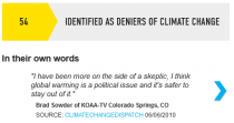
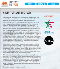
I’ve talked about the slimy “Forecast the Facts” campaign before, where they are attempting to label your local TV weatherperson/meteorologist as a “denier” and pressure TV station management into making that person “toe the line” by having a bunch of fake form letters sent by “local viewers”. It is simply paid astroturfing.
For example, look how they label KOAA-TV’s Brad Sowder for not even wanting to take a position because it is a “political issue”:
Political is right, because today, those flailing PR geniuses at The Center for American Progress aka Think Progress, a front organization for all things left and “progressive” with a now $30 million+ annual budget (From 2008: CAP, which has 180 staffers and a $27 million budget, devotes as much as half of its resources to promoting its ideas through blogs, events, publications and media outreach. Source: Bloomberg ) let it slip (whether by design or accident we don’t know) that THEY are behind this “Forecast The Facts” outfit.
We always wondered who was funding this hate campaign against your local TV meteorologist, now we know, here’s the screencap with the proof:
Even though there is no hint of this association on the “Forecast The Facts” about page. Pants on fire and all that.
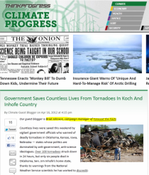
For those who don’t know, Brad Johnson of Think Progress, is one of the worst offenders of political climate alarm hype on the planet. He’s paid to make up stuff like blaming the people who like in Oklahoma for their political views, and bad weather is the punishment:
Obviously Johnson has learned nothing in a year, because what he says today is the same brand of irrational ugliness and hate, bold mine:
Countless lives were saved this weekend by vigilant government officials who warned of deadly tornadoes in Oklahoma, Kansas, Iowa, Nebraska - states whose politics are dominated by anti-government, anti-science ideologues.Over 100 tornadoes struck down in 24 hours, but only six people died in Oklahoma, Sen. Jim Inhofe’s home state, thanks to warnings from the National Weather Service scientists he has worked to discredit
Wichita, Kansas, the headquarters of Koch Industries, suffered $280 million in damage from a ferocious twister, but the “ever-increasing government” demonized by the Koch brothers prevented any loss of life.
Support your local TV weathercaster and meteorologist, don’t let them be cowed by well funded political sliming coming from The Center For American Progress.
And the next time someone tells you that “skeptics are well funded”, remind them of how much money CAP gets and how they put it to use.
Big news last week was that new findings published in Nature magazine showed that human emissions of aerosols (primarily from fossil fuel use) have been largely responsible for the multi-decadal patterns of sea surface temperature variability in the Atlantic ocean that have been observed over the past 150 years or so. This variability - commonly referred to as the Atlantic Multidecadal Oscillation, or AMO - has been linked to several socially significant climate phenomena including the ebb and flow of active Atlantic hurricane periods and drought in the African Sahel.
This paper marks, in my opinion, the death of credibility for Nature on global warming. The first symptoms showed up in 1996 when they published a paper by Ben Santer and 13 coauthors that was so obviously cherry-picked that it took me and my colleagues about three hours to completely destroy it. Things have gone steadily downhill, from a crazy screamer by Jonathan Patz on mortality from warming that didn’t even bother to examine whether fossil fuels were associated with extended lifespan (they are), to the recent Shakun debacle. But the latest whopper, by Ben Booth and his colleagues at the UK Met Office indeed signals the death of Nature in this field.
The U.K. Met Office issued a press release touting the findings by several of their researchers, and didn’t pull any punches as to the study’s significance. The headline read “Industrial pollution linked to ‘natural’’disasters” and included things like:
These shifts in ocean temperature, known as the Atlantic Multidecadal Oscillation or AMO, are believed to affect rainfall patterns in Africa, South America and India, as well as hurricane activity in the North Atlantic - in extreme cases leading to humanitarian disasters.
Ben Booth, a Met Office climate processes scientist and lead author of the research, said: “Until now, no-one has been able to demonstrate a physical link to what is causing these observed Atlantic Ocean fluctuations, so it was assumed they must be caused by natural variability.
Our research implies that far from being natural, these changes could have been largely driven by dirty pollution and volcanoes. If so, this means a number of natural disasters linked to these ocean fluctuations, such as persistent African drought during the 1970’s and 80’s, may not be so natural after all.”
An accompanying “News and Views” piece in Nature put the findings of Booth and colleagues in climatological perspective:
If Booth and colleagues’ results can be corroborated, then they suggest that multidecadal temperature fluctuations of the North Atlantic are dominated by human activity, with natural variability taking a secondary role. This has many implications. Foremost among them is that the AMO does not exist, in the sense that the temperature variations concerned are neither intrinsically oscillatory nor purely multidecadal.
But not everyone was so impressed with the conclusions of Booth et al.
For instance, Judith Curry had this to say at her blog, “Climate Etc.,”
Color me unconvinced by this paper. I suspect that if this paper had been submitted to J. Geophysical Research or J. Climate, it would have been rejected. In any event, a much more lengthy manuscript would have been submitted with more details, allowing people to more critically assess this. By publishing this, Nature seems to be looking for headlines, rather than promoting good science.
And Curry has good reason to be skeptical.
“In press” at the journal Geophysical Research Letters is a paper titled “Greenland ice core evidence for spatial and temporal variability of the Atlantic Multidecadal Oscillation” by Petr Chylek and colleagues, including Chris Folland of the Hadley Centre of the UK Met Office.
In this paper, Chylek et al. examine evidence of the AMO that is contained in several ice core records distributed across Greenland. The researchers were looking to see whether there were changes in the character of the AMO over different climatological periods in the past, such as the Little Ice Age and the Medieval Warm Period - periods that long preceded large-scale human aerosol emissions. And indeed they found some. The AMO during the Little Ice Age was characterized by a quasi-periodicity of about 20 years, while the during the Medieval Warm Period the AMO oscillated with a period of about 45 to 65 years.
And Chylek and colleagues had this to say about the mechanisms involved:
The observed intermittency of these modes over the last 4000 years supports the view that these are internal ocean-atmosphere modes, with little or no external forcing.
Better read that again. “...with little or no external forcing.”
Chylek’s conclusion is vastly different from the one reached by Booth et al., which in an Editorial, Nature touted as [emphasis added]:
[B]ecause the AMO has been implicated in global processes, such as the frequency of Atlantic hurricanes and drought in the Sahel region of Africa in the 1980s, the findings greatly extend the possible reach of human activity on global climate. Moreover, if correct, the study effectively does away with the AMO as it is currently posited, in that the multidecadal oscillation is neither truly oscillatory nor multidecadal.
Funny how the ice core records analyzed by Chylek (as opposed to the largely climate model exercise of Booth et al.) and show the AMO to be both oscillatory and multidecadal - and to be exhibiting such characteristics long before any possible human influence.
Judith Curry’s words “By publishing this, Nature seems to be looking for headlines, rather than promoting good science” seem to ring loud and true in light of further observation-based research.
As a climate scientist, I am quite familiar with the background facts that Prof Michael E. Mann (now at Penn State U) so shamelessly distorts in his new book The Hockey Stick and the Climate Wars: Dispatches from the Front Lines.
First, the scientific background:
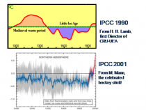
Mann’s claim to fame derives from his contentious (and now thoroughly discredited) “hockeystick” research papers (in Nature 1998 and Geophysical Research Letters 1999). His idiosyncratic analysis of proxy (non-thermometer) data from sources like tree rings, ice cores, ocean sediments, etc. did away with the well-documented Medieval Warm Period (MWP - 900-1200AD) and Little Ice Age (LIA - 1400-1800AD)—documented by Prof. H.H. Lamb, the founding director of the Climate Research Unit of East Anglia U (CRU-EAU). Mann then asserted that the 20th century was the warmest in 1,000 years. His temperature graph, shaped like a hockeystick (on its side) immediately became the poster child of Al Gore and the IPCC, the U.N. science panel, to support their claim of anthropogenic global warming (AGW).
Two Canadian statisticians, Steven McIntyre and Ross McKitrick, soon found serious errors in Mann’s analysis; they even showed that random data fed into Mann’s algorithm would produce “hockeysticks.” To add insult to injury, while the 2001 IPCC report used Mann’s result to bolster its AGW claim, the most recent 2007 IPCC report no longer relies on it. Mann still defends it—sort of—and so do some of his uncritical supporters. We have had no word yet from Al Gore.
In his book, Mann distorts the e-mail record from the “Climategate” leak; those e-mails have not been altered or edited in any way. They document a conspiracy among a clique of British and U.S. climate scientists to control what goes into IPCC reports, and to keep contrary views by skeptics from being published in recognized science journals by manipulating the peer-review process.
The most complete discussion of the Climategate e-mails can be found in The Hockeystick Illusion: Climategate and the Corruption of Science by Andrew W. Montford. A more technical discussion has been ongoing in McIntyre’s blog at www.climateaudit.org.
Mike Mann also attempts to mislead readers by citing “facts.” He does this by mixing up temperature level (measured in degrees C) with temperature trends (degC per decade)—hoping no one would notice. While current levels are high (since the climate is still recovering from the LIA), the trend has been essentially zero for more than a decade—in spite of rapidly rising CO2 concentrations.
In reading Mann’s original papers, I noticed something very strange: his temperature record (blue curve in the IPCC report) based on proxy data suddenly stops in 1978 and is joined smoothly to the thermometer record from weather stations (red curve), which shows a steep rise in temperature. By contrast, atmospheric temperatures measured from weather satellites show only insignificant warming between 1978 and 1997—as do the independent data from weather balloons around the world.
Puzzled by this disparity, I e-mailed Mann (then at the U. of Virginia) and politely asked about his post-1978 proxy temperatures. All I got in return was a nasty reply—which only served to confirm my suspicion that Mann was hiding the data because they disagreed with the widely accepted thermometer record, which had suggested the existence of global warming. I believe that this is the true meaning of the phrase “Mike’s Nature trick,” used in the leaked Climategate e-mails—in conjunction with “hide the decline.” It all suggests manipulation of crucial data.
Naturally, I am anxious to learn if Mann’s suppressed post-1978 data show a warming. If they don’t, then the U.N.-IPCC’s case for AGW collapses—and so do all policies to control the greenhouse gas CO2. These policies include emission trading ("cap & trade"), carbon sequestration from power plants, and various costly schemes for developing alternative, “green” forms of energy. We may have already wasted hundreds of billions of dollars—for no good purpose. If so, then Mann and his supporters have much to answer for.
The Legal Phase
In 1999, Mann joined the U. of Virginia faculty as an assistant professor and left for Penn State six years later after failing to gain tenure. In fact, he was a member of my Department of Environmental Sciences, although we did not overlap.
In 2010, Virginia’s newly elected Attorney General Kenneth Cuccinelli, following Virginia FATA (Fraud Against Taxpayer Act) law, issued a Civil Investigative Demand on the university for Mann’s e-mails, work notes, and other documentation. The university, a state-supported institution, has resisted this demand, citing “academic freedom” and similar excuses. They have employed a private law firm and spent about $1 million so far.
I am quite disappointed by my university’s opposition to releasing Mann’s e-mails to Virginia’s AG. Those e-mails could clear up the mystery of “Mike’s Nature trick” and reveal hidden data. I am told that no objection was raised by UVa when Greenpeace requested the e-mails of skeptical faculty—including mine—under the Freedom of Information Act (FOIA). So much for the university’s “principled defense” of academic freedom.
Virginia’s Supreme Court has now turned down AG Cuccinelli’s demand, based on a technicality in the interpretation of the Virginia law. But the American Tradition Institute is trying to extract Mann’s e-mails from UVa, using the FOIA. Their chance for success is good—particularly since not only does the university now admits that some 12,000 e-mails exist (previously claimed to have been deleted)—but it has also released these e-mails to Michael Mann, even though he is no longer a faculty member.
As Tom Jackman reports (Wash Post, March 21):
The ATI case began quietly in January 2011, with a FOIA request to UVa for e-mails to and from Mann and 39 people, involving five grant programs. Seven months later, UVa produced almost 1,800 e-mails, but said it was withholding another 12,000, which they argued were not public record, or were exempt under Virginia FOIA law 2.2-3705.4(4). The case is scheduled for argument on April 16 in Manassas (in Prince William County, Virginia), in suburban Washington, DC. From there, the case will likely begin its ascent up the appeals court ladder and is poised to make law on how Virginia institutions may use FOIA to withhold from some and give to others. Not to mention create an international stink—if Mann’s e-mails show he has manipulated climate change data, an accusation for which he claims to have been cleared.
As Jackman further reports, Mann said his shared interest, with UVa, in his e-mails means that the e-mails can be released to him, but not to climate skeptics. The American Tradition Institute, the conservative group hoping to show that climate change scientists like Mann manipulated their data, argues that UVa can’t give the e-mails to one person and not another. By giving the e-mails to Mann, the university has waived any exemptions it’s claiming from the state Freedom of Information Act, ATI’s lawyer David Schnare argues.
Schnare then cited a Virginia attorney general’s opinion from 1983 that once a public body disseminates any record, “those records lose the exemption accorded by” FOIA. Federal case law appears to be clearer that “selective disclosure ... is offensive to the purposes underlying the FOIA and intolerable as a matter of policy.”
Meanwhile, a new angle has developed in Vancouver, BC. Canadian climatologist Tim Ball jokingly wrote that “Mann should not be at Penn State but in a State Pen[itentiary].” Mann then improvidently sued Ball for libel. But this now leaves Mann open for the pre-trial discovery process, including a deposition under oath. We shall see how this case develops. Tim Ball has many ways to make his case in his defense. I am hoping he will focus on the suppressed post-1978 data. It would be fitting if Mann’s data are used to destroy the IPCC’s case for AGW.
One way or another, the truth will come out. And when it does, we will witness a major earthquake that will encompass IPCC scientists, politicians in America and Europe, and the U.N. Let’s hope we don’t have to wait too long for this to happen.
S. Fred Singer is professor emeritus at the University of Virginia and director of the Science & Environmental Policy Project. His specialty is atmospheric and space physics. An expert in remote sensing and satellites, he served as the founding director of the US Weather Satellite Service and, more recently, as vice chair of the US National Advisory Committee on Oceans & Atmosphere. He is a senior fellow of the Heartland Institute and the Independent Institute. In 2007, he founded and chaired NIPCC (Nongovernmental International Panel on Climate Change). For recent writings, see and also Google Scholar. With about 2,000 other scientists who participated in the Intergovernmental Panel on Climate Change, including Michael Mann, he jointly received the Nobel Peace Prize in 2007.
We should all be grateful for the Heartland Institute and for its Nobel Mission to bring enlightenment and truth to the Anthropogenic Global Warming (AGW) question. The recent illegal acquiring of internal documents from this Chicago based institute helps remind us what a unique and important organization it is. The Heartland Institute has given a great boost and encouragement to so many of us who have attended any one or up to six of their international climate science meetings that were held in New York, Wash. D.C., and Chicago between 2008-2011.
Before the Heartland meetings and the skeptical AGW internet blog activity I felt rather alone and shunned as a result of my long-time and strongly held views regarding the lack of scientific validity of the AGW hypothesis. It is surprising that this hypothesis has captured so much government and public support in the US, Canada, Australia and all across Europe. If ever there was a bubble getting close to bursting, the AGW hypothesis will provide in coming years another good example. We should expect to see future articles and/or books describing ‘The rise and fall’ of the AGW theory - similar to recent or coming books about Enron and Bernie Madoff, etc.
Heartland’s many reports and articles have given the public a more balanced and realistic assessment of the AGW theory (in my view) than have the overly biased warming pronouncements of the four IPCC reports. The Heartland meetings have given AGW skeptics such as myself new information and showed us that we have ever so many talented colleagues from all over the globe who share our skeptical views. The Heartland meetings have given me a stronger belief in my own AGW skepticism and a renewed desire to devote the greater part of my remaining years towards bringing honesty and scientific objectivity to this important global issue. Too much damage has already been done by those seeking to profit from this overblown and fabricated warming threat.
Until the basic scientific flaws in the AGW theory are recognized and broadly accepted (as they eventually will have to be) it will not be possible for the scientific community and society to put this pernicious and harmful hoax to rest. The wide acceptance of this theory has had a profound negative influence on the US and the world. AGW’s basic scientific flaws must be made known as soon as possible so that re-indoctrination of the public as to the fallacy of this hypothesis can go forward. This will help reduce the current economic, political, and psychological harm which is occurring around the globe due to AGW’s unrealistic warming propaganda and prevent greater harm in future years.
The Heartland Institute has worked hard to try to open up this much needed scientific dialog on the AGW topic. James Taylor of Heartland has invited both warming advocates and warming skeptics to the Heartland conferences. He has offered substantial honorariums to a number of prominent AGW proponents if they would attend and engage in open dialog. But the global warmers have refused to come. We think this is because the AGW advocates fear that they cannot adequately defend the physics behind their warming pronouncements against knowledgeable AGW skeptics. In addition, the mainstream media has mostly refused to attend and report on these very enlightening AGW discussions.
No matter what ones prior AGW views were, you could not attend any of the Heartland conferences and not come away without believing that the basic science behind the AGW hypothesis is questionable, and also thinking that the public has been presented with a very biased and exaggerated viewpoint of global warming by a compliant media. Our country’s media has not done its usual and expected journalistic job of probing and working behind the scenes to verify the validity of the AGW hypothesis or to print hardly any contrary articles to the warming hypothesis. The belief in the AGW hypothesis has grown rapidly. It has become established in the public’s mind as a realistic projection of the future rise in global temperature. This has allowed the EPA to be able to pass many needlessly restrictive regulations that are hurting our economy. It is also leading our school children to become indoctrinated into believing this faulty warming theory and for many of them to become needlessly concerned about the future world they will live in as adults. The media’s long and continuous unrealistic global warming reporting has caused many of our state and local government officials to pass costly legislation mandating expensive and unnecessary “save the environment” actions such as mandated shifts to various percentages of renewable energy and to undertake other costly green initiatives of marginal utility.
Funding Imbalance. Looking over the stolen internal Heartland budget information we see how small have been Heartland’s climate related financial resources in comparison with our federal government’s vast expenditures (Figure 1). Most of our government’s expenditures have gone to support any and all potential research that might, in any way, help verify the coming global warming arguments. Implicit in this global warming support has been the rejection of any grant proposals intended to show faults in the global warming arguments.
Figure 1. 2011 US government spending on climate change research by various government agencies (green) compared to the climate funding of the Heartland Institute (red). Data is from the American Association for the Advancement of Science Report.
Despite the gross financial imbalance between the Heartland Institute and our federal government’s warming directed climate budgets, the Heartland Institute has taken on for itself the monumental task of trying to open up a scientific dialog between the pro-AGW and the AGW skeptics. This dialog was intended to determine how realistic is the science behind the AGW hypothesis? This has lead the Heartland Institute to confronting the large groups of scientists, government officials, environmentalists, media, etc. who have been united in their warming beliefs and proud of their success in public indoctrination of the global warming concept. The science is settled they say and all that remains is for the world to follow their advice on the need to reduce CO2 emissions.
The warmers say we must all start to make major alterations in our lifestyles by switching away from our dependence on fossil fuels and going to renewable energy. However, it is estimated that (non-subsidized) renewable electrical energy generation (wind and solar) costs about 3-5 times more than does electricity generated from fossil fuels. This is especially the case with the new shale-oil natural gas fracking techniques. The standard of living of the industrial world will be substantially reduced if changes from fossil fuel to renewable energy were to be made in any substantial way.
Most of us would likely agree to switch to renewable energy for a high percentage of our electricity and to making the necessary draconian changes in our life styles if we were convinced that the science behind the AGW hypothesis was rock solid. But the science behind AGW is certainly not believable to most of us older meteorology-climate specialists who have studied the atmosphere and the oceans over our long careers. We should not make the recommended changes from fossil fuel to renewable energy. The global warmers have been playing the American public for suckers! But the public is wiser than they think. Within the next decade it will be the warmers who will be seen as the real suckers for naïvely thinking that such a flawed warming hypothesis could be forever sold to the American public.
It is impossible for us skeptics to believe that the doubling of CO2 which causes a global average infrared (IR) radiation blockage to space ~3.7 Wm-2 for doubling of CO2 can be very much of a climate altering feature. Especially when we contrast this 3.7 Wm-2 IR blockage (from a doubling of CO2) with the much larger and continuous 342 Wm-2 average short-wave radiation impinging on the earth and the near balancing concomitant 342 Wm-2 net long-wave and solar (albedo) energy going back to space.
The global climate will be little affected by this small amount of 3.7 Wm-2 IR energy blockage to space due to a doubling of CO2. It is this lack of scientific believability and the large economic and social disruptions which would result if the industrial world were to switch to renewable energy that motivates us skeptics to rebel against such obvious exaggerated claims for CO2 increase.
It is only at the Heartland conferences and on the many new skeptical AGW blog sites that the many AGW scientific inconsistencies are being brought forth and discussed. The scientific journals, for the most part, will not accept papers that do not adhere to the AGW hypothesis. It is primarily the internet blogs on which the real AGW science is now taking place.
Intolerance of Other Points-Of-View. More than 20 years ago, Al Gore was already condemning scientists who dared challenge the warming consensus. In Time magazine in 1989, he wrote,
“The fact that we face an ecological crisis without any precedent in historic times is no longer a matter of any dispute worthy of recognition. And those who, for the purpose of maintaining balance in debate, take the contrarian view that there is significant uncertainty about whether it’s real are hurting our ability to respond.”
On Gore’s repressive, suffocating approach towards science, William Happer (former Director of Energy Research for DOE) stated,
“Many atmospheric scientists are afraid for their funding, which is why they don’t challenge Al Gore and his colleagues. They have a pretty clear idea of what the answer they’re supposed to get is. The attitude in the administration is, ‘If you get a wrong result, we don’t want to hear about it’ ... I was told that science was not going to intrude on policy.” (Ronald Barley, “Political Science”, Reason Magazine, December 1993)
This is the type of attitude I have found so prevalent in the government agencies I have dealt with or tried to seek funding from over the last quarter century. Funding was going to go to only those who agreed with or did not openly doubt the wisdom of the AGW hypothesis.
Learning that global warming politics was going to trump scientific objectivity a new type of modus operandi was thrust upon the research grant seekers in this broad discipline area. A new group of recent Ph.D. and older scientists decided that to receive research grant support they had to play along with the governmental warming policies. They quickly began cranking out paper after paper showing CO2‘s surprising strong influence on climate. A competitive race was soon underway to see who could ‘out-warm’ the other. And the best and most convincing of the warmers received the biggest grants and the most media coverage. The goal was to verify that rising levels of CO2 were indeed causing climate changes that posed a serious threat to society. Many proved to be very ingenious at arranging data sets or adjusting their numerical models to give the desired warming or climate change results. And all the best warming scenarios made it into well trumped press releases. Any negative results were not covered.
Origin of the AGW hypothesis. The AGW climate scare of the last 30 years did not come to the forefront from individual scientists beginning to coalesce around the idea that rising levels of CO2 might pose a serious future climate threat to society. This threat was, by contrast, imposed upon the world from ‘above’ by the coming together of globally influential politicians, environmentalists, internationalists, etc. who knew little about climate but saw great political opportunities to be had by using the rising CO2 levels as a scare tactic. People respond best out of fear. But lasting response to fear must have a firm basis in truth. The AGW does not.
Had I not spent my whole career (of nearly 60 years) in the meteorology-climate area and knew about AGW only from what I read or heard from the mainstream media, I may have been susceptible to accepting much of the AGW propaganda. This is why so many talented scientists from other fields have been unconsciously sucked into the wide orbit of AGW believers. Very few individuals have the long and broad ranging technical background in meteorology-climate to be able to well understand and attack the basic flaws of the AGW hypothesis. I am surprised at how many of my younger and less experienced meteorology-climate colleagues are willing to accept the science behind the AGW arguments - many just out of mindlessly going along with the consensus, and many out of worry about being typed as an AGW skeptic and losing future research funding opportunities. And not-a-small number of our more experienced meteorology-climate specialists, who should have known better or privately had serious doubts about AGW theory, nevertheless went along with the AGW theory in order to obtain or to continue their research support. This posed a terrible dilemma for many who had to choose between their belief and/or their career.
The warnings of President Eisenhower of the capture of overwhelming government support by an elite industrial-military complex are now being realized. But in this more recent version it is our country’s global warming - environmental - world government elites who have captured our country’s overwhelming government support for AGW funding and society intervention. The just published book by Senator James Inhofe titled “The Greatest Hoax” gives much information on the recent political history of the AGW controversy and states how the warmers may now have overplayed their hand. Senator Inhofe points out just how wild and unreasonable has been the statements of so many prominent celebrities, and high ranking government, and congressional officials, and the media people on the alleged human warming topic. And how there is so little scientific subsidence behind their warming statements. Another book titled “Climatism” by Steve Goreham (2010) gives a wealth of scientific background information on the many flaws and inconsistencies of the AGW hypothesis. Goreham has suggested that the world is now experiencing the effects of a new type of ‘ism’ similar to communism, socialism, fascism, totalitarianism, of the past. In our current political era of such wide belief in human-induced global warming, Goreham suggested that the term Climatism is appropriate. I expect this new ‘ism’ will, in time, follow the fate of these earlier ‘isms’ and for much of the same reasons.
Industry - Business Losses. The US industrial and business sectors and their clients and customers are being strongly swayed by the continual media and governmental harping of the dangers of rising levels of CO2. Many American industries and businesses are expending significant resources to demonstrate to their clients and customers that they are accommodating to the threat of rising CO2 levels and global temperature rises by going green. This is adding economic burdens to their operations. American industry and business has, in general, accepted the governments and the media’s warming pronouncements. They have not been skeptical enough at inquiring as to the real scientific validity of the AGW threat. They need to realize that the government and media hyping of the warming threat could, in time, prove to have been greatly exaggerated or possibly be completely bogus. Their expensive PR actions to gain the good will of the public and their clients will have been seen, in time, to have been largely unnecessary when the AGW threat is finally exposed as the hoax it is.
American industry and business groups should begin hedging their bets as to the AGW theory being valid. This can be done by making financial contributions to the Heartland Institute or other private groups dedicated to an unbiased analysis of the AGW threat. Future financial resources can be saved if it is realized that the science behind the AGW hypothesis is going to be largely discredited within the next 5-10 years.
Private Funding Hypocrisy. Why is the massive federal funding support that is going to climate researchers who believe in the AGW hypothesis considered a beneficial national expenditure while any comparatively pittance of private financial support that goes to those who question the validity of the AGW hypothesis believed to be tainted with charges of special interest and anti-science? In the present climate funding milieu, AGW funding for research by our federal government is not and should not be thought of as being any less contaminated with bias than research support coming from the private sector. With regards to the AGW question, I believe the Heartland Institute to be more objective and more honest than my federal government is and has been.
Illustration. Peter Gleick’s purpose in hacking into the Heartland Institute’s private files was to get information on their donors - hoping that the Heartland Institute might be shown to have received contributions from energy companies or the Koch Brothers, etc. The hypocrisy of such reasoning by Gleick and the warming crowd to assume that the federal funds they receive to justify the faulty AGW theory are not as or more contaminated with bias than would be any funds from private energy groups. Nearly all AGW federal support at this time is reeking with warming bias. You must have a warming bias (and/or hide any AGW skepticism you might have) to get any federal funding support in the first place.
Heartland’s courageous battle against the entangling power and ubiquitous presence of those who are attempting to push us towards a world climate crisis - world government –- and religious environmentalism should be applauded. Heartland Director Joseph Bast and his small capable staff are confronting a juggernaut of massive federal funding and massive media propaganda. We should admire their heroic efforts and also give our appreciation to the small group of backers who have had the courage to help and support the Heartland Institute.
I have absolutely no doubt that the AGW hypothesis will become fully discredited within the next decade or so. A doubling of CO2 near the end of the 21st century should, by itself, only bring about a global warming of about 0.3C or only about one-tenth of the ~3C global warming projected by nearly all of the GCM models (see Appendix).
America’s economic growth and its confidence in the future will be greatly enhanced when the false dangers of the AGW hypothesis threat have been fully exposed and put behind us. America independence requires that we avoid the controlling tentacles of world government based on an unrealistic fear of human-induced climate degradation.
Charlie Wilson (former CEO of GM and Secretary of DOD in the mid-1950s) made the then famous but controversial statement that “What’s good for General Motors is good for the country”. A more relevant statement for today would be (in my opinion) ‘What is good for the Heartland Institute is good for our country and for the world’. Ten years from now, when the scientific relevancy of the AGW theory has been thoroughly discredited we will be better able to appreciate the accuracy of this statement.
About the Author. William M. Gray is a Professor Emeritus of Atmospheric Science at Colorado State University where he has been in residence for the last 51 years. He has forecast, taught and performed research in tropical meteorology, the global general circulation and hurricanes for his whole career.

