For one, you can offer to your Weather enthusiast friends, a subscription to Weatherbell with blogs and commentary by Joe Bastardi, Joe D’Aleo and Ryan Maue. Also a dynamite model page, and coming soon weather data and model based meteograms. Go to weatherbell.com.
There is the Icecap Amazon Book Store, with small percentage going to Icecap.
Also why not go to our friend Mish Michaels new site naturalcloudcover.com and purchase organic clothing with a weather theme with proceeds that support the Blue Hill Observatory.
And of course, Anthony Watts has a Weather Shop with great weather instruments.
------------
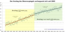
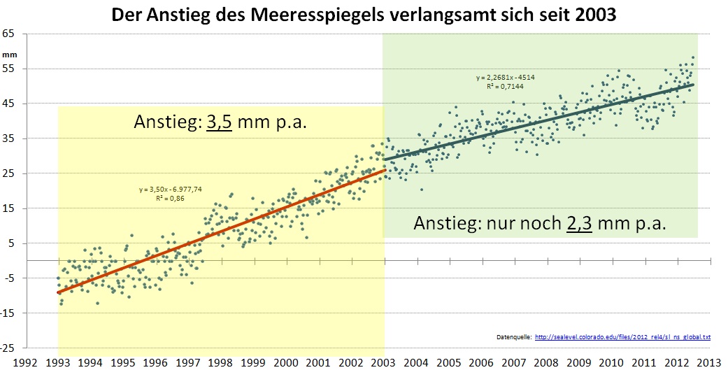
Meteorologist Klaus-Eckart Puls: Sea Level Rise Has Slowed 34% Over The Last Decade! P Gosselin on 6. Dezember 2012
German veteran meteorologist Klaus-Eckart Puls here has done an analysis of sea level rise. Contrary to claims made by fringe alarmist physicists, we see that sea level rise has decelerated markedly since 2003.
From 1993 to 2003, sea level rose 3.5 mm/year. Over the next decade, sea level rose only 2.3 mm/year! Source, then supplemented by EIKE.
In his report, Puls writes that even TOPEX and JASON 1+2 show no acceleration. “The acceleration calculated by the models and constantly reported by the media does not exist!”
Puls adds:”
It is obvious to see that sea level rise has slowed down significantly. In view of the relatively short time frame in which the measurements have been made, it should not be speculated on whether the deceleration in the rise is a trend change or if it is only noise. What is certain is that there is neither a ‘dramatic’ rise, nor an ‘acceleration’. Conclusion: Climate models that project an acceleration over the last 20 years are wrong.”
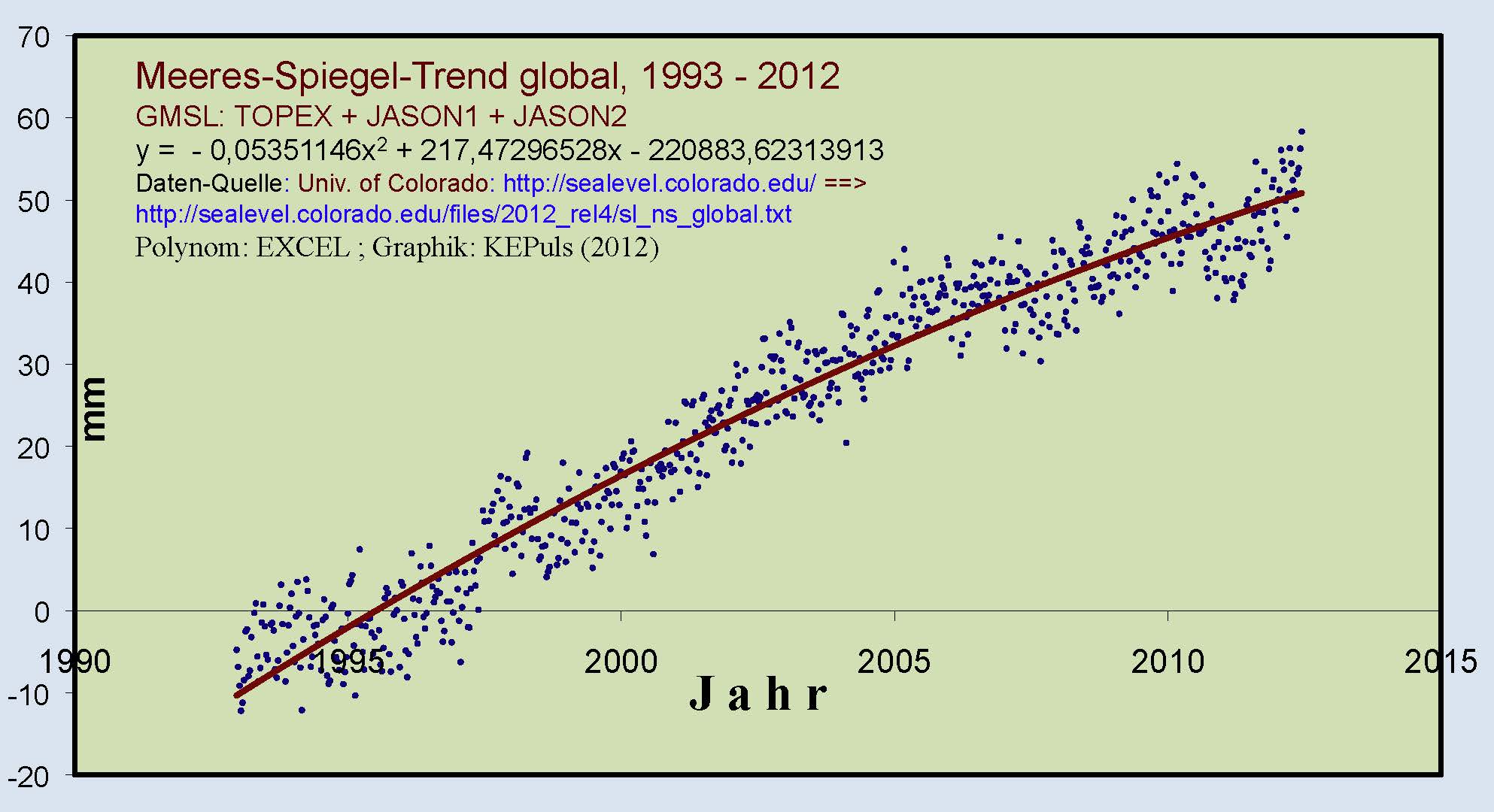
In the chart that follows, Puls fitted a polynomial curve to the data from TOPEX and JASON 1+2:
“The result is no surprise. The 20-year data series of global sea level rise shows a weakening!” No wonder con-artist Al Gore bought a mansion on the beachfront. It’s great living in a world of suckers and dimwit media.
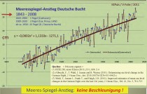
But let’s not rely solely on the satellite data, which has been around only a measly 20 years, to infer a trend. Let’s compare it to tide gauges, which have been used well over one hundred years. Puls presents the following chart of the trend of the German bight”.
Sea level rise at the German bight. Source: see graphic.
Puls writes:
An evaluation shows: Also tide gauges indicate a slow-down in sea level rise, and do so with a statistically very ‘robust’ dataset of 160 years. Also there has been an evaluation of numerous tide gauages globally, see Die kalte Sonne.de, p=4429.
Conclusion:
We have found no indication that sea level has accelerated over the last 30 years. It doesn’t look good for the fans of acceleration.”
Puls summarizes:
The latest alarmist reports on the supposedly dramatic sea level rise for the present and the future cannot be confirmed by actual measurements. Quite to the contrary, they are refuted by the data. Globally neither tide nor satellite data show an acceleration of sea level rise. Rather they show a slow-down. Moreover they starkly contradict the previous and current claims coming from climate institutes. Also there are good indications that the satellite data were ‘overly corrected’ using inflated amounts.”
by Professsor Morner, world-class expert on sea level
Main points
- At most, global average sea level is rising at a rate equivalent to 2-3 inches per century. It is probably not rising at all.
- Sea level is measured both by tide gauges and, since 1992, by satellite altimetry. One of the keepers of the satellite record told Professor Morner that the record had been interfered with to show sea level rising, because the raw data from the satellites showed no increase in global sea level at all.
- The raw data from the TOPEX/POSEIDON sea-level satellites, which operated from 1993-2000, shows a slight uptrend in sea level. However, after exclusion of the distorting effects of the Great El Nino Southern Oscillation of 1997/1998, a naturally-occurring event, the sea-level trend is zero.
- The GRACE gravitational-anomaly satellites are able to measure ocean mass, from which sea-level change can be directly calculated. The GRACE data show that sea level fell slightly from 2002-2007.
- These two distinct satellite systems, using very different measurement methods, produced raw data reaching identical conclusions: sea level is barely rising, if at all.
- Sea level is not rising at all in the Maldives, the Laccadives, Tuvalu, India, Bangladesh, French Guyana, Venice, Cuxhaven, Korsør, Saint Paul Island, Qatar, etc.
- In the Maldives, a group of Australian environmental scientists uprooted a 50-year-old tree by the shoreline, aiming to conceal the fact that its location indicated that sea level had not been rising. This is a further indication of political tampering with scientific evidence about sea level.
- Modelling is not a suitable method of determining global sea-level changes, since a proper evaluation depends upon detailed research in multiple locations with widely-differing characteristics. The true facts are to be found in nature itself.
- Since sea level is not rising, the chief ground of concern at the potential effects of anthropogenic “global warming” that millions of shore-dwellers the world over may be displaced as the oceans expand is baseless.
- We are facing a very grave, unethical “sea-level-gate”.
A new paper published in the Journal of Climate examines global average sea-level rise during the 20th century and finds
1) Global sea level rise was constant throughout the 20th century, with “small or no acceleration, despite the increasing anthropogenic forcing,” in other words, increased CO2 has not accelerated sea-level rise.
2) The rate of glacier mass loss “was not smaller in the first than in the second half of the century,” in other words, increased CO2 has not accelerated glacier mass loss.
3) Future projections of sea-level rise “depend on the existence of a relationship between global climate change and the rate of sea-level rise, but...such a relationship is weak or absent during the 20th century.” In other words, alarmist projections of sea-level rise are based upon false assumptions of a human influence on sea-levels which is not found by observations.
In sum, global sea-level rise during the 20th century was constant, not accelerated, and shows no evidence of “climate change” or human influence.
Sea level rose more than 3 times faster than the 20th century from the last ice age 20,000 years ago until about 8,000 years ago. During meltwater Pulse 1A shown above, sea levels rose about 15 times faster than during the 20th century. Sea level rise has been at a relatively constant, low level during the past 8,000 years.
A new study by the Center for the Study of Carbon Dioxide and Global Change—The State of Earth’s Terrestrial Biosphere: How is it Responding to Rising Atmospheric CO2 and Warmer Temperatures?—refutes claims by the United Nations’ Intergovernmental Panel on Climate Change (IPCC) that global warming is stressing Earth’s natural and agro-ecosystems by reducing plant growth and development.
“Such claims are simply not justified when one examines the balance of evidence as reported in the peer-reviewed scientific literature,” says Dr. Craig Idso, author of the report. “Far from being in danger, the vitality of global vegetation is better off now than it was a hundred years ago, 50 years ago, or even a mere two-to-three decades ago.” And “the observed increases in vegetative productivity and growth are happening in spite of all the many real and imagined assaults on Earth’s vegetation that have occurred during this time period, including wildfires, disease, pest outbreaks, deforestation, and climatic changes in temperature and precipitation.”
Specific findings in the meta-analysis examining hundreds of scientific studies on the subject include:
1. The productivity of the planet’s terrestrial biosphere, on the whole, has been increasing with time, revealing a great greening of the Earth that extends throughout the entire globe.
- Satellite-based analyses of net terrestrial primary productivity (NPP) reveal an increase of around 6-13% since the 1980s.
2. There is no empirical evidence to support the model-based IPCC claim that future carbon uptake by plants will diminish on a global scale due to rising temperatures. In fact, just the opposite situation has been observed in the real world.
- Earth’s land surfaces were a net source of CO2-carbon to the atmosphere until about 1940. From 1940 onward, however, the terrestrial biosphere has become, in the mean, an increasingly greater sink for CO2-carbon.
- Over the past 50 years, for example, global carbon uptake has doubled from 2.4 plus/minus 0.8 billion tons in 1960 to 5.0 plus/minus 0.9 billion tons in 2010.
3. There is compelling evidence that the atmosphere’s rising CO2 content - which the IPCC considers to be the chief reason behind all of their concerns about the future of the biosphere (via the indirect threats they claim it poses as a result of CO2-induced climate change) - is actually most likely the primary cause of the observed greening trends.
4. In the future, Earth’s plants should be able to successfully adjust their physiology to accommodate a warming of the magnitude and rate-of-rise that is typically predicted by climate models to accompany the projected future increase in the air’s CO2 content. And factoring in the plant productivity gains that will occur as a result of the aerial fertilization effect of the ongoing rise in atmospheric CO2, plus its accompanying transpiration-reducing effect that boosts plant water use efficiency, the world’s vegetation possesses an ideal mix of abilities to reap a tremendous benefit in the years and decades to come.
Given these findings, the report contends that the recent “greening of the Earth” observed by a host of scientists will likely continue throughout the years and decades to come. Government leaders and policy makers should take notice of the findings of this important new assessment on the state of the Earth’s terrestrial biosphere.
The report can be viewed or downloaded at the website of the Center for the Study of Carbon Dioxide and Global Change here. Questions about the report can be addressed to Dr. Craig Idso at the email address contactus@co2science.org.
The main misconception among those who believe in human-induced global warming is to assume that all the many large and varying energy terms of the natural climate system remain constant over long periods and that the only changes that matter for climate are the very miniscule variations of human affects. As extensive and tragic as Sandy’s destruction has been, it is not at all beyond the range of what is known about the natural variability of the different meteorological elements which came together to produce it. What is more amazing, at least from an intellectual point-of-view, is the number of prominent government officials, the media, and private citizens who have concluded that Sandy’s destruction was the result (or partly the result) of human influences.
There is no rational basis for such a conclusion other than the prevalent psychological need of so many people to assign a simple explanation for any unusually rare and destructive weather event. Associated with this need for a simple explanation is the parallel psychological need of so many to find a scapegoat for our misfortunes? And this need for a scapegoat can often take the form of blaming ourselves (original sin) or the society in which we live.
History tells us of the strong link between the deteriorating weather which occurred in Europe between the Medieval Warm Period (MWP) and the Little Ice Age (LIA), and the burning of women believed to be witches. Estimates are that fifty thousand or more witches were burned to death during the 15th through 17th centuries in Europe. These women were imagined to have a pack with the Devil that enabled them to bring forth damaging weather events or deterioration of climate. And if the weather improved after such burnings it was taken as a sign that these women did indeed have a direct link to the Devil.
Despite the world’s enlightenment that has occurred since those times… there appears to still be a residue desire within our human nature, even today, for an easy explanation for unusual damaging events, a need to find a scapegoat and a need to look to ourselves for part of the explanation of destructive weather events like hurricanes, tornadoes, droughts, heat waves, floods, etc. Blaming last summer’s US droughts, wild fires, and hot weather on human-induced climate change is a recent example. As if we humans would ever be able to influence such large and unique nature events!
Why must we, as in previous ages, continue to try to suggest that humans may have been a contributing element in major destructive weather events? If it were really possible for humans to be a contributor to severe weather or worsening climate, would it not also be logical to believe that humans might also be a contributing element to spells of good weather or favorable climate change?
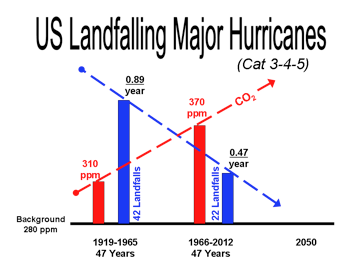
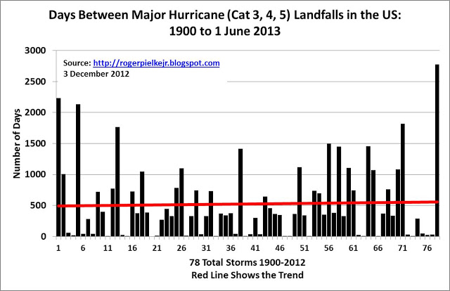
The longest recorded period of no major (Cat 3, 4, 5) hurricane landfalls in the US has occurred during the last seven years (2006 to 2012). We have also had 20 fewer major US hurricane landfall events in the last 47 year period (1966 to 2012) than we had during the earlier 47 year (1919 to 1965) period. And this decrease in landfalling major hurricanes occurred during the time of rising CO2 levels. If humans could really influence destructive climate-weather events like Sandy, should they not also be able to take some credit for influencing the recent decades of reduced number of US landfalling major hurricanes? Landfalling US major hurricanes are known to cause about 80-85 percent of all normalized US landfalling tropical cyclone destruction.
It appears that we humans have, unknowingly, made an enormous contribution in recent decades to the reduction of US hurricane destruction (see Figure). Should we not pat ourselves on the back and continue to increase our fossil-fuel utilization?
Illustration of how US landfalling major hurricane numbers have been trending downward while atmospheric CO2 amounts have been increasing. Roger Pielke Jr.
The graph above provides an update to data on the remarkable ongoing US “intense hurricane drought.” When the Atlantic hurricane season starts next June 1, it will have been 2,777 days since the last time an intense (that is a Category 3, 4 or 5) hurricane made landfall along the US coast (Wilma in 2005). Such a prolonged period without an intense hurricane landfall has not been observed since 1900.
Some thoughts:
Even with hurricane Sandy and its wide impacts, things will indeed get worse. The US coastlines as a whole have actually been very lucky with respect to hurricanes since 2005, with aggregate damage (even including aggressive estimates for Sandy) 2006-2012 falling at or below the historical average. Sandy made landfall as a post-tropical cyclone of hurricane strength—a phenomena that has only been documented 3 times since 1900 (1904, 1924, 1925—later this week I’ll have a post on Sandy damage estimates).
The long-term intense hurricane drought means that a mere “regression to the mean” will see more hurricane landfalls and considerably higher damage in the years to come. The fashionable talk these days of a “new normal” is of course utter bullsh*t. Just wait until we return to the “old normal”—I know that it may be hard to believe, but both hurricane damage and climate hype are set to increase dramatically in the years to come.
----------------
Guest comment BK
“The long-term intense hurricane drought means that a mere “regression to the mean” will see more hurricane landfalls and considerably higher damage in the years to come. The fashionable talk these days of a “new normal” is of course utter ( ) . Just wait until we return to the “old normal”—I know that it may be hard to believe, but both hurricane damage and climate hype are set to increase dramatically in the years to come.”
Want to talk about “normal”? The period from 1970 to present has been remarkably quiet meteorologically for hurricane impacts to the U.S. Yes, 2004 and 2005 were very bad, but it is isolated to those two years in a 42 year period taking the seasons as a whole (not talking about number of named storms per season here either, but that has it’s own share of problems over the climatic record).
Now, if you look at the period 1925-1969, it was way worse, again, strictly from a meteorological standpoint. If you look at the number of major hurricane landfalls in the U.S from that period and where they hit, it is no contest to the current period. There were not just a few bad seasons for landfalls either, they were spread out over multiple years, esp. if you look at Florida, which in itself much worse b/c we had time rebuilt after one, and a few years later, it all get damaged/destroyed again. And there is New England...1938, 1944, 1954 (2), and 1960? That averages one hurricane every 4-5 years over that 22 year period. How many hurricanes have made landfall over Long Island or the New England coast since 1960?, three...Belle (1976), Gloria (1985), and Bob (1991).
So when talking about “normals” you have to be very careful. I will state the disclaimer than I realize hurricanes are only one part of equation in global climate, but 1) they are an important factor in the grand scheme of things I believe b/c of their enormous heat extraction and dissipation both from the air and sea and heat distribution between the tropics and polar regions, and 2) individual hurricane strikes are often used as poster childs to say the wx is getting worse. They are getting worse, but only from a sociological and economical point of view, not meteorological. We need to stick to the science of meteorology itself here if we are to properly view things in the correct perspective. The shock and awe factor is not part of practicing good objective science.
I discussed Sandy in this WUWT TV segment. I was not aware I was on camera at the end when I did my Andrea Bocelli imitation. I usually do radio with my eyes closed so I am not distracted.
Unlike previous gatherings of the Conference of Parties (COP) to the UN Framework Convention on Climate Change, the 18th one occurring in Doha, Qatar between November 26 and December 7 is likely to shun media coverage of their schemes to enrich participants who want massive transfers of money from developed to undeveloped nations. Thieves work best in the dark.
These are the folks who came up with the Kyoto Protocols that were intended to reduce “greenhouse gas” emissions, primarily carbon dioxide (CO2), in order to save the Earth from becoming a crispy desert as the result of global warming. Adopted on December 11, 1997, the protocols set “binding targets for 37 industrialized nations and the European community with the goal of reducing 1990 levels of CO2 over a five-year period 2008 to 2012.” Two major emitters, China and India, were exempted from the Protocols, thus rendering it even more idiotic than it already was.
The UN explained this, saying “Recognizing that developed countries are principally responsible for the current high levels of GHG emissions in the atmosphere as a result of more than 150 years of industrial activity, the Protocol places a heavier burden on developed nations under the principle of ‘common but differentiated responsibilities.’” In other words, developed nations have more money and any “industrial activity” must be punished for causing “global warming.”
The problem for the Protocols was that the United States Senate unanimously rejected to signing on to this hoax. Then, in 2009, the exposure of emails between the “scientists” responsible for the data the UN Intergovernmental Panel on Climate Change (IPCC) was putting out to scare the pants off of everyone about “global warming” - since dubbed Climategate - revealed they were not only rigging the computer models, but were increasingly worried that the planet had entered a new, perfectly natural, cooling cycle.
It is worth noting that, in 2011, Canada, Japan and Russia announced they would not take on further Kyoto targets. The Canadian government invoked Canada’s legal right to formally withdraw from the Kyoto Protocol on December 12 2011. Having initially committed to cutting its greenhouse emissions to 6% below 1990 levels by 2012, Environment Minister Peter Kent had earlier cited Canada’s liability to “enormous financial penalties” under the treaty unless it withdrew. Smart people those Canadians, leading the way for Japan and Russia to depart as well.
The Kyoto Protocols were an international deception perpetrated by the UN. The Earth has been cooling for the past sixteen years. Carbon Dioxide has nothing - zero - to do with the planet’ s temperature and all warming comes from the Sun.
Even so, representatives to COP 18 are gathering to create a “Green Climate Fund” for the same purpose that existed in 1997.
Not long ago Christiana Figueres, the executive secretary of the UN Framework Convention on Climate Change, was interviewed by Elizabeth Kolbert of Yale Environment 360, and it appeared in the Nov 21 edition of The Guardian, a British newspaper. She babbled on about “the inevitability of world economies making the transition to a low-carbon future” and “the need for politicians to feel the same urgency as climate scientists about the threats posed by global warming.”
As we have seen, there are bad climate scientists who rig the computer models representing a huge rise in the Earth’s overall average temperature and there are good climate scientists who have waged a long and increasingly successful effort to debunk the greatest hoax of the modern era. The bad ones profit from the grants and other financial support they receive. They good ones are defamed as “skeptics” and “deniers.”
In 1992, Al Gore launched his global warming career and road to riches with a book, “Earth in the Balance.” Among his more insane recommendations was the elimination of the internal combustion engine within twenty-five years. Those engines can be found under the hood of the millions of cars that are a very popular form of transportation.
Ron Arnold, Executive Vice President of the Center for the Defense of Free Enterprise, recently cited a report by the Virginia-based Science and PublicPolicy Institute - a leading opponent of global warming - regarding the complete futility of any effort by the U.S. to reduce CO2 emissions. Its author, Paul Knappenberger, based his assumptions on an IPCC report spelling out a scenario in which “the U.S. as a whole stopped emitting all carbon dioxide emissions immediately.”
He found that “the ultimate impact on projected global temperature rise would be a reduction or a ‘savings’ of approximately 0.08 degrees Centigrade by the year 2050 and 0.17 degrees Centigrade by the year 2100”; results that would be negligible.
Arnold noted that “not only do the rest of the world’s new emissions completely replace ours in just 6.6 years, but China’s growth alone replaces them in less than 11 years.”
If you want to know about the Earth’s “balance” than it is useful to know that the release of carbon dioxide comes in part from its several hundred active volcanoes, from forest fires, and from the many animals, including humans, who exhale it. Without CO2, every tree, every blade of grass, and all the crops of the Earth would die and, shortly thereafter, all human and animal life would die as well.
The Earth balances CO2 emissions with carbon sinks that absorb and release it as they have done for much of its 4.5 billion years of existence.
If there was any truth to the claim that CO2 is heating the Earth, one would have to ignore all of its previous ice ages that were followed by natural warming periods, including the most recent mini-ice age from about 1300 to 1850.
In addition to COP 18, the U.S. Environmental Protection Agency is about to unleash an avalanche of new regulations all aimed at reducing CO2 emissions by everything from utilities to major industries, as well as smaller ones such as your local bakery.
The “science” the EPA cites is totally bogus. It will close many of the coal-fired utilities that produce the bulk of the nation’s electricity. Inside of a decade the EPA may put them all out of business.
There are vast forces, all masquerading as “saving the Earth”, at the international and national level that are seeking to wreck all the technological advances the people of the Earth take for granted and the citizens of the United States need to survive. That’s all you really need to know about COP 18 and the EPA.
This Nov. 16 announcement from our National Academies is a great example of propaganda promoting fear of catastrophic global warming from burning fossil fuels. Just in time for Congress in this lame-duck session to be influenced to pass bills supporting these allegations such as the wind production tax credit (TPC).
It would take years to respond to all this material taking normal weather events occurring the past 50 years when atmospheric carbon dioxide levels have steadily risen 25 percent and show the same events happened when carbon dioxide levels were not increasing. Past history shows very little, if any, linking of atmospheric carbon dioxide changes to weather, or climate, events.
One of their papers discusses changes in Arctic sea ice from 1979 to present measured by satellites. September 16 we had the smallest Arctic sea ice area measured over the 33-year period of satellite measurements. They will not mention as of November 14, Arctic sea ice has recovered more than 2 million square miles of ice since the low of 860,000 square miles September 16. This is the fastest recovery of sea ice from summer lows recorded by satellite measurements.
In addition, for 2012 Antarctic sea ice levels are at record highs. This is verified by going to the University of Illinois website showing all satellite sea ice measurements. Past records by mariners show Arctic sea ice in late summers a century or more ago was probably smaller than the 2012 low.
The National Academies like to stir up angst over sea ice melting by conjuring up images of low level cities like New York or Miami being submerged from oceans rising. Members preparing these reports are not observant enough to notice ice melting in martinis do not increase drink sizes.
This type of activity by the National Academies is very damaging to the country. It is part of this monstrous waste of tax dollars and economy destroying efforts promoting the global warming scare and futile attempts at mitigation using impractical, unreliable, and uneconomical renewable energy sourcessolar, wind, battery powered cars, ethanol from corn, other biofuels, biomass, etc.
Furthur damages are the waste of time of potential scientific talent who could be doing research to promote the welfare of society. Perhaps an even greater damage to the country is the National Academies efforts at supplying this material to teachers around the country so they can add more propaganda to their teaching. I have often asked what is more important to students studying climate science that we may never comprehend and is of interest to only a few individuals or rigorously studying the Periodic Table?
Many in the country are concerned that graduates from our high schools have poor skills in mathematics, reading, science, and communications. I add to this list a lack of inquisitiveness or questioning events surrounding them. Wasting students time over propaganda has to be a major factor in these deficiencies. The National Academies should exercise better judgment.
-----------------------
CROCK OF THE WEEK
Die Zeit portrays Michael Mann as a humble and innocent scientist who today is being relentlessly tormented and persecuted by Morano and the skeptics just because his results are unpopular. While Morano lives “in a big Victorian home”, is chauffeured around in a limousine and “eats steak at the exquisite Capital Grill”, Mann lives in a humble little home, lit up by wind power, and is worried about his 7-year old daughter’s future.
In reality, Morano lives in a relatively mall 2000 sguare foot vinyl sided home with his small family. He worries about the future of our country because of unwise energy and regultory policy thanks to the bad science propagated by Mann and his rent seeking colleagues. If Mann’s daughter’s future is in jeopardy it will by what her dad has wrought.


