Aug 01, 2012
Baltimore City weather station artificially heated by solar panels and more
By: Justin Berk
We have had some very hot days in the summer of 2012. We have also had some crazy temperatures reported from the National Weather Service (NWS) station at the Maryland Science Center. This is a sore subject because I have tried to raise objectionable concerns about the quality of the weather data and that gets lost in the entire Global Warming/Climate Change debate. That can and should be a separate issue. However I maintain the same response to everyone: Pollution is bad, but bad data is as well. Warming is not the question. How much warming is. My main goal is to maintain the integrity of the weather reporting sites so that they keep up with standards set forth by NOAA. Scientifically speaking any measuring for the purpose of collecting data should be accurate and follow a set guidelines. The station in question here (KDMH) represents Baltimore City from the Inner Harbor. It violates multiple NOAA regulations to be considered a legitimate station. In its short life however, since being instituted in 1998, it has gained even more problems.
I want to be clear that I have a good relationship with the Maryland Science Center. In fact, I met my wife there when she was working as an educator in 2000. The issues I raise here are not their responsibility, but that of NOAA and NWS.
View slideshow: Multiple artificial heating sources for Baltimore City weather station
Multiple heat sources in close proximity to NWS weather station in Baltimore City contradict NOAA’s guidelines
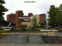
Photo credit: Justin Berk
Going Green turned up the heat
The most recent problem started in January of 2011 when The Maryland Science Center ran into controversy over their proposed solar panel project. It was a two row carport over the existing parking lot on the east side of the museum. Residents of Federal Hill objected to the potential obstruction to their views. It turns out the solar panel carport was to range between 7-10 feet high and had little impact to the view. In fact on the cloudy day I took the photos, they are hard to see, but the problems impacted the weather station.
The main issue is that these are solar panels on a metal structure. Solar panels are designed to do one thing: Absorb sunlight. At best they have a 12%-20% efficiency to convert that light into electrical energy. Much of the rest is infrared radiation, or heat! The metal carport structure also serves as a source of absorbing and radiated heat.
This carport is located less that 10 meters (30 feet) due south of the NWS weather station. A south wind on a hot sunny day would take this heat and transfer it direction over the weather station. The irony is that while attempting to be environmentally sound, solar panels do not function well when they get too hot. Their conversion to electricity decreases and they add extra heat to their surroundings. That is not a dig at the technology, but merely a fact. So when Baltimore’s Inner Harbor reported a high of 107F on July 18, it was enhanced by this structure. The WeatherBug station, located on the roof of the museum with good ventilation was a more respectable 101F. The six degree difference is actually more common than just the peak of the heat.
This location was mentioned on national headlines and is set up by NWS to be the primary station for zip codes in Baltimore City and much of Baltimore County. I had mentioned that if your phone or local Weather Channel report said 107F that day, it was wrong and doing you a disservice.
The irony of the photos in the slide show that support my concern is that they were taken on a cloudy cool day, In fact I went to visit the museum with my family on July 21, 2012 when Baltimore set a record cool max temperature for the date.
Pre-existing violations of KDMH as a weather station:
1. Proximity to the building: I understand that a city should have weather conditions, but most are urban heat islands with a microclimate that absorb heat through asphalt, brick, metal, and various other elements of city dwellings. However, the NWS weather station was placed next to a the Maryland Science Center Museum… a brick building. This contradicts NOAA’s standards that a weather station must be located at least 100 feet away from any structural influence.
Even NOAA’s page on Weather Stations addresses this question:
“Q. Could stations located in potentially warmer locations near buildings and cities influence temperature readings?
Yes. That is one reason why NOAA created the Climate Reference Network. These stations adhere to all of the established monitoring principles and are located in unpopulated areas. They are closely monitored and are subject to rigorous calibration procedures. It is a network designed specifically for assessing climate change.”
2. Wind: There is no wind sensor on KDMH because it is blocked by The Maryland Science Center. This was known when the station was installed, but the location was maintain. Here clip from section 2.1 of NOAAs Guidelines for Meteorological Station Reconnaissance:
“A horizontal distance of ten times the height of an obstruction should be maintained, between the wind sensor and the obstruction, for the surrounding area to be considered open terrain. An obstruction can be manmade (building) or natural (tree).”
The Maryland Science Center is 5 stories tall. KDMH is actually closer than the roof was be compared to the base turned on its side. So the violation of wind
3. Pavement: The present location of KDMH is a fenced in area next to the museum. However is has bout 1 foot of grass between the asphalt pavement just to its north. Despite an area of grass, it is surrounded by a parking made of asphalt, cobblestone, and concrete to its east and south. Farther to the north is water of Baltimore’s Inner Harbor. Considering section 2.2 of the NOAA Guideline manual, this is also a violation:
“2.2 Air temperature/Relative humidity
Standard mounting elevation is 1.2 to 2.0 m (4.0 to 6.5 ft) above grade. The sensor should be mounted over a plot of open level ground at least 9 m (30 ft) in diameter. The ground beneath the sensor should be short grass or natural earth, not asphalt, concrete, areas of standing water, etc.
The distance between the sensor and any obstruction should be at least 4 times the height of the obstruction (40 m for a 10-m obstruction). It should be at least 30 m (100 ft) from large paved areas and not close to steep slopes.”
Other weather station violations
This is one of many examples of artificial warming weather stations across the nation. There have been arguments about the work done at surfacestations.org that claimed 80% of US weather stations had some violation of NOAA guidelines. See 20 examples for yourself here.
Yesterday Anthony Watts released his research station with claims that artificial warming accounts for 50% of the warming reported in the US. I cannot attest to the rest , but I can say that in addition to our BWI cited problems in close proximity to runways, I would hope that more attention is made to this matter.
Recent similar temperature stories:
Baltimore’s Record High of 104F on July 7, 2012
Baltimore’s temperature at BWI seems too high
NOAA Climate Report missing a lot of data
What can be done?
First, I wish NWS would maintain awareness of influences around all weather stations. Baltimore City is not alone. NWS should do a comparative study with the WeatherBug station already in place at the Maryland Science Center. It was carefully installed and calibrated to account for the environment and avoid artificial influences. The two organizations have already have worked together on many projects and this would be an easy fix. Secondly, scout a better location. The top of Federal hill would provide an optimal assessment in the heart of the city without any impact from the low elevation.
Most importantly: Stop using this as an official weather station! Even the folks at Weather Underground have been identifying this as a station of record for the city. We had enough problems with The Custom House housing the weather station for decades on it’s roof. I contest that this present location is worse. It doesn’t matter what your stance is about Global Warming, you should want accurate data to support any research.
Jul 26, 2012
Summertime and the twisters are missing
Bob Henson, UCAR
though some isolate tornadoes are possible in the notheast the next few days, we are very likely to end up July with the record lowest number of tornadoes for the month on record, in sharp contrast to how we started the season at the end of February. Then the media stories said ‘here we go again’.
Over a year ago at the launch of Weatherbell, JB and my first posts were on the likelhood of a blockbuster tornado/severe weather/flooding 2011 spring season, given the powerful jet fed by enhanced contrast coming off the second strongest La Nina on the record (behind 1954-56 or 1917/18 depending on whether you use the MEi or SOI measures). Though the mainstream media laid the blame for the severe weather on global warming, we suggested it was the strong La Nina and the cold upper atmosphere, possibly leftover from from the very long quiet solar minimum.
Since greenhouse warming is supposed to at the surface have the greatest effect in higher latitudes (aloft in the tropica), the contrst should diminish not increase and thermal gradient baroclinic fed winter and spring storms and thus tornadoes should diminish not increase as they promised. A cooling earth, leads to greater contrast and more of these storms. It also leads to an expanded vortex which can lead to more meridional patterns with sharp ridges and troughs that lead to extremes of temperatures. As we have shown, the variability in these modes is lowest and that leads to more extremes and persistence. Thus summer while the center of the US baked, Alaska was having a year w/o a summer as was northern Europe, to the southeast, another ridge over southeast Europe and western Russia is also bring heat and drought. I was pleased to see this story by Bob Henson of UCAR who tells it like it is.
JULY HEADS FOR A RECORD-LOW TORNADO COUNT
Heat and drought are punishing much of the United States right now, but there’s actually some good weather news to report. This month is on track to produce fewer tornadoes than any July on record, and by a long shot.
As of July 23, this month has produced a paltry total of 14 tornado reports, according to preliminary data from NOAA’s Storm Prediction Center (SPC). While there could be more twisters before month’s end, a major outbreak doesn’t appear likely at all.
The chart below shows just how unusual this month has been, compared to past Julys. Graphed in blue are the final July tornado counts from the 1950s (when modern records began) to 2011. The next-most-quiet July after 2012 is 1960, which saw a total of 42 tornadoes - three times what we’ve seen thus far this month. Many Julys have produced more than 100 twisters.
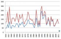
Enlarged
The number of U.S. tornadoes reported each July (blue line) has gradually risen since the 1950s, with more observers and cameras watching the skies. The red line shows an estimate of how many tornadoes might have been observed if modern observing technologies and practices were in place throughout the entire period. The blue diamond at lower right shows this year’s July total: a mere 14 tornadoes, as of the 23rd of the month. (Data courtesy Harold Brooks, NOAA Storm Prediction Center; illustration by Wes Shifrin, UCAR.)
The results get even more interesting when you adjust the numbers for “report inflation.” Tornado reports have gradually increased since the 1950s, especially for weak twisters. This appears to be a byproduct of the steady growth of interest in storm spotting and tornado chasing, along with the advent of inexpensive, high-quality digital photo and video tools. The attention and technology have combined to boost the reported numbers of weak tornadoes, whereas the strongest ones are being observed about as often as they were 50 or 60 years ago-a clue that it’s observing practice rather than climate change behind the trend.
Shown in red are the tornado counts as adjusted for report inflation by Harold Brooks (National Severe Storms Laboratory) and Greg Carbin (SPC). This procedure boosts the numbers in earlier years to replicate what might have been observed if Twitter, smartphones, and chase tours had been around at the time. The adjustment is smaller for more recent years, zeroing out for the current year. What this means is that the dearth of tornadoes in July 2012 becomes still more impressive. In the adjusted data, the quietest July is 2007, with 73 tornadoes-more than five times the current total for this month.
Enlarged
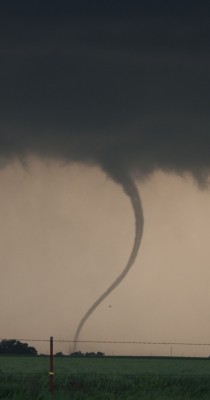
One of the country’s most active tornado days of 2012 was April 14, when 153 twisters were reported, including this one near Cherokee, Oklahoma. Since that date, tornadic activity has run far below average. (Photo Bob Henson.)
In fact, this month could end up producing fewer tornadoes than any month on record for meteorological summer (June, July, and August). Among these, the old record is 20, set in August 1957. The inflation-adjusted number for that month would be 39.
Drought at work
What’s going on? Clearly, this month’s vanishing act is related to the intense ongoing drought, which is the nation’s most widespread since the 1950s. If thunderstorms aren’t happening, you can’t get a tornado - but not all thunderstorms can produce twisters. Violent tornadoes, in particular, need a complex blend of upper-level winds, unstable air near the ground, and other ingredients still being studied. This month, where thunderstorms have managed to form, they’ve been largely of the scattered, “air mass” variety, driven by local instability and limited by the lack of strong upper-level winds.
The drought’s onset this spring is mirrored in the rapid dropoff of tornado activity shown in the inflation-adjusted graphic at the bottom of this page. After a spate of deadly twisters in early April, tornado counts were at near-record highs for the time of year. After that point, activity plummeted, and 2012 is now in the bottom quarter of years, as ranked by total tornadic activity through mid-July.
Interestingly, prior to 2012, the three most tornado-starved Julys in the adjusted data are 2002, 2006, and 2007. Both 2002 and 2006 were among the nation’s warmest 10 Julys in the last century, just as this one is shaping up to be. When a summer month is unusually hot, it generally means the polar jet stream has been shunted well to the north by domes of high pressure. That means less upper-level energy to fuel tornadic thunderstorms. Nontornadic storms (which rely less on wind shear and more on heat and moisture) may still pop up, assuming drought hasn’t taken hold.
Even without taking inflation into account, there’s no doubt tornadoes have been remarkably scant this month. For residents of the U.S. heartland, where the drought and heat are laying waste to crops and yards, that’s at least something to be grateful for.
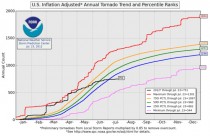
This “inflation-adjusted” graphic shows the progress of tornado reports for this year (black line) as compared to the highest (red) and lowest (magenta) accumulated totals for each day of the year, going back to 1954. By mid-April, around 500 tornadoes had already been reported-close to a record number. Tornado activity dropped off rapidly through the rest of the spring and early summer, as drought began gripping much of the central and eastern United States. The current total puts 2012 among the 25% of years with the least tornado activity (blue line). (Illustration courtesy NOAA Storm Prediction Center.)
Jul 20, 2012
Bond Event Zero
Musings of the Chiefio
I’ll be expanding this posting over time. For right now, I’m putting up a skeleton just to anchor the space and get me doing something.
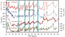
So what is a Bond Event? They are abnormally cold periods that happen about every 1470 years. We are likely headed into one now, IMHO. While the world panics over heating, it ought ot be planning how to grow more wheat without northern fields like Canada or northern Eurasia.
Enlarged
I’d hoped to not last long enough to reach the next Bond Event, however, we have 3 nagging little points:
1) It’s a 1470 year or so cycle and the last one started about 1470 years ago...take a look at what was happening in about 530 to 540 A.D. It was cold, and dark, and the sun wasn’t very bright… In fact, they called it The Dark Ages.
2) The sun has gone very very quiet. Not pleasing in the context of #1.
3) We’ve had a sudden onset of more cold and more snow at the poles with the oceans cooling starting in 2003 (it takes a while to cool a few gigatons of water...)
Now to me it’s pretty clear that we have a very warm ocean (and will for a few more years) especially in the tropics, putting lots of water into the air - being by definition hot and humid, not snowy… That air then hits a very very cold polar region and dumps boat loads of snow. That than accelerates the run to the cold side…
So we will be in this ‘battle ground’ state for a few more years, but only as long as it takes to cool the ocean enough to make us really wish for the good old days of a warm climate with plenty of food to eat.
Please note: Computer climate models don’t mean a darned thing if they can not explain Bond Events:
http://en.wikipedia.org/wiki/1500-year_climate_cycle
It is my opinion that we are watching the early stages of an entry into a Bond Event (and will be for the next 30 years or so) and I can only hope that we find a way to mitigate the extreme cold that is headed our way with the attendant crop failures at northern latitudes. We ought to know in about 15 years… geological time is slow like that, even the fast whip of a 1500 year cycle takes decades to observe at the inflection points.
So welcome to “Bond Event Zero” (copyright E.M. Smith) hold on to your hats, it’s going to be a bumpy ride…
You can expect crop failures, some modest famine, and wars fought over warm places to live. The history of these cold periods (where the historical episodes were named “pessimums” before we knew they were periodic) is not encouraging.
“The Iron Age Cold Epoch (also referred to as Iron Age climate pessimum or Iron Age neoglaciation) was a period of unusually cold climate in the North Atlantic region, lasting from about 900 BC to about 300 BC, with an especially cold wave in 450 BC during the expansion of ancient Greece. It was followed by the Roman Age Optimum (200 BC - 300 AD).”
“The Migration Period Pessimum (also referred to as Dark Ages Cold Period) was a period of cold climate in the North Atlantic region, lasting from about 450 to about 900 AD.[1] It succeeded the Roman Age Optimum and was followed by the Medieval Warm Period.
This Migration Period Pessimum saw the retreat of agriculture, including pasturing as well as cultivation of crops, leading to reforestation in large areas of central Europe and Scandinavia.[2] This period corresponds to the time following the Decline of the Roman Empire around 480 and the Plague of Justinian (541-542).[3] Climatically this period was one of rapid cooling indicated from tree-ring data[4] as well as sea surface temperatures based on diatom stratigraphy in Norwegian Sea[5], which can be correlated with Bond event 1 in the North Atlantic sediments.[6] It was also a period of rising lake levels, increased bog growth and a peak in lake catchment erosion.”
And just until I get a better layout done, here is the text from the wiki page on Bond Events:
Bond event
From Wikipedia, the free encyclopedia
(Redirected from 1500-year climate cycle)
Temperature proxies from GISP2 plus Bond events
Bond events are North Atlantic climate fluctuations occurring every ≈1,470 years throughout the Holocene. Eight such events have been identified. Bond events may be the interglacial relatives of the glacial Dansgaard-Oeschger events.
The theory of 1,500-year climate cycles in the Holocene was postulated by Gerard C. Bond of the Lamont-Doherty Earth Observatory at Columbia University, mainly based on petrologic tracers of drift ice in the North Atlantic.[1][2]
The existence of climatic changes, possibly on a quasi-1,500 year cycle, is well established for the last glacial period from ice cores. Less well established is the continuation of these cycles into the holocene. Bond et al. (1997) argue for a climate cyclicity close to 1470 plus/minus 500 years in the North Atlantic region. In their view, many if not most of the Dansgaard-Oeschger events of the last ice age, conform to a 1,500-year pattern, as do some climate events of later eras, like the Little Ice Age, the 8.2 kiloyear event, and the start of the Younger Dryas.
The North Atlantic ice-rafting events happen to correlate with most weak events of the Asian monsoon over the past 9,000 years,[3][4] as well as with most aridification events in the Middle East.[5] Also, there is widespread evidence that a ≈1,500 yr climate oscillation caused changes in vegetation communities across all of North America.[6]
For reasons that are unclear, the only Holocene Bond event that has a clear temperature signal in the Greenland ice cores is the 8.2 kyr event.
The hypothesis holds that the 1,500-year cycle displays nonlinear behavior and stochastic resonance; not every instance of the pattern is a significant climate event, though some rise to major prominence in environmental history.[7] Causes and determining factors of the cycle are under study; researchers have focused attention on patterns of tides, variations in solar output, and “reorganizations of atmospheric circulation."[7]
List of Bond events
Most Bond events do not have a clear climate signal; some correspond to periods of cooling, others are coincident with aridification in some regions.
≈1,400 BP (Bond event 1) - roughly correlates with the Migration Period Pessimum (450900 AD)
≈2,800 BP (Bond event 2) - roughly correlates with the Iron Age Cold Epoch (900300 BC)[8]
≈4,200 BP (Bond event 3) - correlates with the 4.2 kiloyear event
≈5,900 BP (Bond event 4) - correlates with the 5.9 kiloyear event
≈8,100 BP (Bond event 5) - correlates with the 8.2 kiloyear event
≈9,400 BP (Bond event 6) - correlates with the Erdalen event of glacier activity in Norway,[9] as well as with a cold event in China.(10)
≈10,300 BP (Bond event 7) - unnamed event
≈11,100 BP (Bond event 8) - coincides with the transition from the Younger Dryas to the boreal
References
Bond, G.; et al. (1997). “A Pervasive Millennial-Scale Cycle in North Atlantic Holocene and Glacial Climates”. Science 278 (5341): 1257-1266. doi:10.1126/science.278.5341.1257
Bond, G.; et al. (2001). “Persistent Solar Influence on North Atlantic Climate During the Holocene”. Science 294 (5549): 2130-2136. doi:10.1126/science.1065680.
Gupta, Anil K.; Anderson, David M.; Overpeck, Jonathan T. (2003). “Abrupt changes in the Asian southwest monsoon during the Holocene and their links to the North Atlantic Ocean”. Nature 421 (6921): 354-357. doi:10.1038/nature01340.
Yongjin Wang; et al. (2005). “The Holocene Asian Monsoon: Links to Solar Changes and North Atlantic Climate”. Science 308 (5723): 854-857. doi:10.1126/science.1106296.
Parker, Adrian G.; et al. (2006). “A record of Holocene climate change from lake geochemical analyses in southeastern Arabia”. Quaternary Research 66 (3): 465-476. doi:10.1016/j.yqres.2006.07.001.
Viau, Andre E.; et al. (2002). “Widespread evidence of 1,500 yr climate variability in North America during the past 14 000 yr”. Geology 30 (5): 455-458. doi:10.1130/0091-7613(2002)0302.0.CO;2.
Cox, John D. (2005). Climate Crash: Abrupt Climate Change and What It Means for Our Future. Washington DC: Joseph Henry Press. pp. 150-155. ISBN 0309093120.
Swindles, Graeme T.; Plunkett, Gill; Roe, Helen M. (2007). “A delayed climatic response to solar forcing at 2800 cal. BP: multiproxy evidence from three Irish peatlands”. The Holocene 17 (2): 177-182. doi:10.1177/0959683607075830.
Dahl, Svein Olaf; et al. (2002). “Timing, equilibrium-line altitudes and climatic implications of two early-Holocene glacier readvances during the Erdalen Event at Jostedalsbreen, western Norway”. The Holocene 12 (1): 1725. doi:10.1191/0959683602hl516rp.
Zhou Jing; Wang Sumin; Yang Guishan; Xiao Haifeng (2007). “Younger Dryas Event and Cold Events in Early-Mid Holocene: Record from the sediment of Erhai Lake”. Advances in Climate Change Research 3 (Suppl.): 1673-1719.
Jul 16, 2012
Case studies from around the world: no evidence of accelerating sea level rise over the last 30 year
by Sebastian Luning, Fritz Vahrenholt
1. GPS-monitored global tide gauges
In 2009 Guy Woppelmann et al examined what effects vertical land movement had on the sea level data from tide gauges and published their results in the Geophysical Research Letters. The scientists evaluated globally 227 stations whose elevation was monitored by GPS. 160 of these stations were located at a distance maximum 15 km from the coast. By measuring the vertical movement of the tide gauges, they were able to apply a correction. From this they calculated a mean global sea level rise of 1.61 mm/year over the last century. Figure 1 shows that sea level rise has remained constant since 1940, no acceleration over the last 70 years!
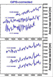
Figure 1: Sea level development for that last 100 years for northern Europe (top) and northwest America (bottom) based on tide gauges. No acceleration since 1940. Source: Woppelmann et al. (2009). Enlarged
2. Arctic Ocean shows no acceleration
2. Another important paper appeared in June, 2012 in the Geophysical Research Letters. A team lead by Olivier Henry of the Centre National de la Recherche Scientifique in Toulouse, France, examined 62 tide gauges along the coast of Norway to Russia over the last 62 years. The study yielded some surprising results. Beginning in 1950 Arctic sea level remained relatively stable (Figure 2). Sea level then began to rise in 1980 and reached a high point in 1990, which has yet to be surpassed. From 1995 to 2009 the authors calculated a mean sea level rise rate of 4 mm/year.
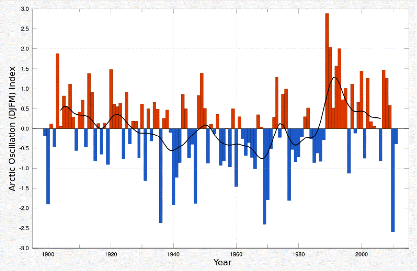
What is especially fascinating is that sea level at this region was in sync with the Arctic Oscillation (AO), see Figures 2 and 3. Theres been a decoupling only for the last 10 years, which is too short a time period to draw any sound conclusions. One thing is certain: The AO will also impact sea level behaviour there in the future.
Not only does temperature impact sea levels globally, but so do natural oceanic cycles. Ocean cycles can lower or raise sea levels, and accelerate or slow them down. An overall acceleration in sea level rise in the Arctic Ocean due to melting ice over the last 30 years cannot be detected.
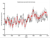
Figure 2: From 1950 to 2000 sea level changes are predominantly in sync with the Arctic Oscillation (black curve). Figure from Henry et al (2012).Enlarged
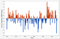
Figure 3: Arctic Oscillation Index (Source: Wikipedia).Enlarged
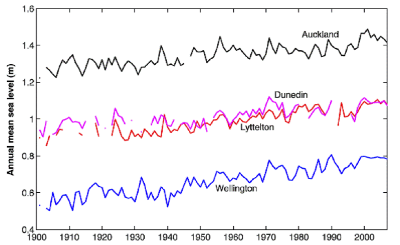
3. New Zealand
Now let’s go to the other side of the globe - New Zealand, where only a few tide gauges go back to 1900. John Hannah and Robert Bell of the University of Otago and the National Institute of Water and Atmospheric Research respectively published a paper in January 2012 in the Journal of Geophysical Research. The new curves show that sea level rise has been steady since 1940 (Figure 4). The development in New Zealand is similar to the global situation. The long-term New Zealand trend is 1.7 mm sea level rise per year.

Figure 4: Sea level development from four New Zealand coastal tide gauges. Here there’s been no acceleration in sea level rise over the last 70 years. Figure from Hannah & Bell (2012).Enlarged
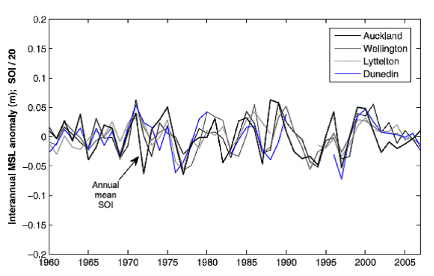
Particularly interesting in the Hannah and Bell study is that New Zealand sea level rise is characterized by decadal cycles. Sea level rose and dropped in sync with the Pacific ocean cycles (Southern Oscillation Index, SOI and others), see Figure 5. Also see report from the NIPCC.

Figure 5: Shown are four New Zealand sea level tidal gauge series (thin curves), along with the Southern Oscillation Index (bold black curve). Source of figure:Hannah & Bell (2012). Enlarged
4. Tasmania
In January, 2012, an international team led by Roland Gehrels of the University of Plymouth published a new study in the Earth and Planetary Science Letters examining the sea level history of Tasmania. Using cores taken from salt marshes, they reconstructed sea level development for the last 6000 years. Especially interesting are the last 200 years.
Sea level rose between 1900 and 1950 at a rate of 4.2 mm per year (Figure 6), but slowed down considerably in the second half of the 20th century to an average of only 0.7 mm per year - similar to southern New Zealand. No sea level rise acceleration is detectable in the Australian New Zealand region over the last decades. In fact, just the opposite is true. Sea level rise slowed down in the second half of the century.
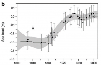
Figure 6: Sea level rise around Tasmania over the last 200 years. Sea level rise slowed down during the second half of the 20th century. Source of diagram:Gehrels et al. (2012). Enlarged
5. Tarawa Atoll
Simon Donner of the University of British Columbia closely examined sea level development for the last 20 years for the Japanese atoll Tarawa and published his findings in the journal Eos in April 2012. Now hold on to your seat: tide gauges show that the sea level around Tarawa did not rise at all during this period (Figure 7)!
Moreover, the sea level fluctuations depicted by the curve are mainly due to the El Nino effect. In 1998 sea level dropped a full 45 cm as the transition was made from a powerful El Nino to a La Nina. Also see articles by Mark Lynas and Roger Pielke Sr.
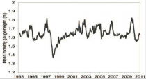
Figure 7: Sea level development around the Tarawa atoll based on tide gauges. There is no detectable rise. Diagram source: Donner (2012). Enlarged
6. Bay of Biscay
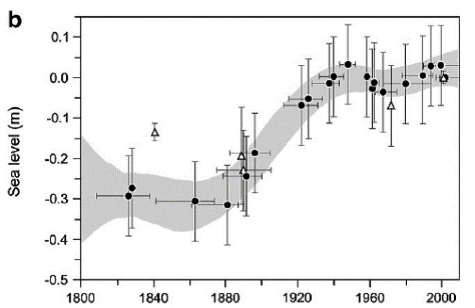
In May, 2012, a study by Eduardo Leorri of East Carolina University appeared in the Quaternary Science Reviews. Examining sediment cores, the scientists studied sea level development of the Bay of Biscay for the period going back 10,000 years. As Figure 8 shows, sea level rise slowed down 7000 years ago.
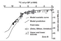
Figure 8: Sea level rise in the Bay of Biscay. Diagram source: Leorri et al. (2012). Enlarged
Leorri and his team compared the results to coastal tide gauge readings from the region for the last 200 years. From 1800 to 1900 (Figure 9), sea level was stagnant. Then it began to rise around 1900. But no unusual acceleration can be detected over the last 30 years.
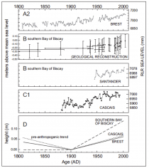 Figure 9: Coastal tide gauge measurements from the Bay of Biscay. Diagram source: Leorri et al. (2012). Enlarged Figure 9: Coastal tide gauge measurements from the Bay of Biscay. Diagram source: Leorri et al. (2012). Enlarged
7. Tony Brown, sea level of the last 2000 years.
A comprehensive presentation of pre-industrial sea level development was made by Tony Brown, who published his results at Judith Curry’s blog (blog article, detailed pdf-version). Readers should refer to pages 23-26, where Brown brings up some interesting points on sea level rise over the last 2000 years. Referring to the work of Aslak Grinsted of the University of Lapland from 2010 in the Journal Climate Dynamics, it is discussed whether the sea level of today has reached the levels of the Medieval Warm Period.
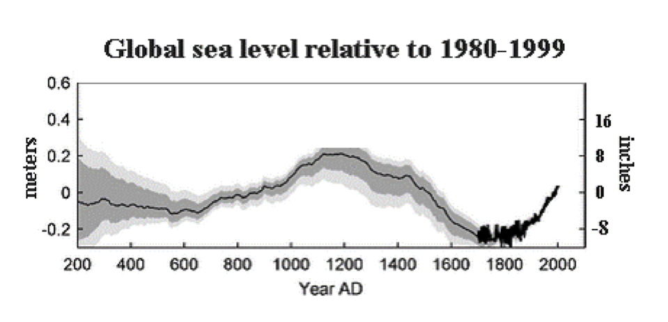
In any case, natural and anthropogenic causes have to be considered and properly attributed. Like the Hockey Stick episode, sea level development can in no way be considered as a monotone and non-eventful phenomenon. It too has varied naturally over the centuries, and the natural factors will continue to play a major role.
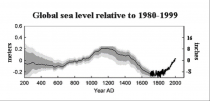
Figure 10: Sea level development model of the last 2000 years. The bold black curve starting in 1700 is a geological reconstruction by Jevrejeva et al. (2006). Modified as to Grinsted et al. (2010). Enlarged
In May, 2012 at WUWT, Paul Homewood led an interesting discussion on whether sea level rise accelerated during the recent decades when compared to the 20th century. He concludes that satellite measurements may be flawed.
In summary, our global sea level journey produced some good results, some very remarkable results, depending on your point of view. Signs of an accelerating sea level over the last 30 years could not be found in any of the studies.
It doesn’t look good for the acceleration fans.
Jul 09, 2012
June 2012 U.S. Temperatures: Not That Remarkable
by Roy W. Spencer, Ph. D.
I know that many journalists who lived through the recent heat wave in the East think the event somehow validates global warming theory, but I’m sorry: It’s summer. Heat waves happen. Sure, many high temperature records were broken, but records are always being broken.
And the strong thunderstorms that caused widespread power outages? Ditto.
Regarding the “thousands”: of broken records, there are not that many high-quality weather observing stations that (1) operated since the record warm years in the 1930s, and (2) have not been influenced by urban heat island effects, so it’s not at all obvious that the heat wave was unprecedented. Even if it was the worst in the last century for the Eastern U.S. (before which we can’t really say anything), there is no way to know if it was mostly human-caused or natural, anyway.
“But, Roy, the heat wave is consistent with climate model predictions!”. Yeah, well, it’s also consistent with natural weather variability. So, take your pick.
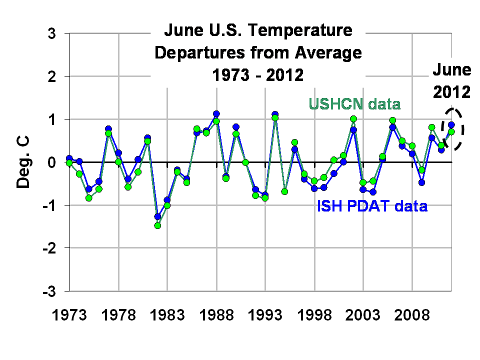
For the whole U.S. in June, average temperatures were not that remarkable. Here are the last 40 years from my population-adjusted surface temperature dataset, and NOAA’s USHCN (v2) dataset (both based upon 5 deg lat/lon grid averages; click for large version):
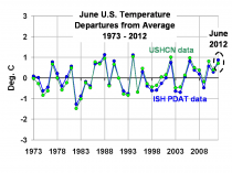
Certainly the U.S drought conditions cannot compare to the 1930s.
I really tire of the media frenzy which occurs when disaster strikes...I’ve stopped answering media inquiries. Mother Nature is dangerous, folks. And with the internet and cell phones, now every time there is a severe weather event, everyone in the world knows about it within the hour. In the 1800s, it might be months before one part of the country found out about disaster in another part of the country. Sheesh.

Enlarged
-----------------
This is What Summer Looks Like
By Dr. Anthony Lupo
It is early July, and we may finally at the end of a record setting heat wave. As usual, several scientists were quoted saying something along the lines of “this is what global warming looks like” [1]. They say that heat waves such as the one occurring this year are becoming more common and will happen more in the future. We also heard that this heat wave is unprecedented and more widespread than ever. While some sources cautioned that this singular event might not be attributed to global warming, it came with the typical caveat that these are the kind of events that are projected to occur in a warmer world.
The definition of an extreme event is one that a) occurs rarely or in the tail(s) of a statistical distribution, or b) an event that causes extreme physical burdens or economic hardship for humans and/or the environment. Since heat waves have an impact in real human terms, using the former definition would not be practical. Also, by the former definition, the frequency of heat waves would not change assuming a normal distribution regardless of how much climate changed.
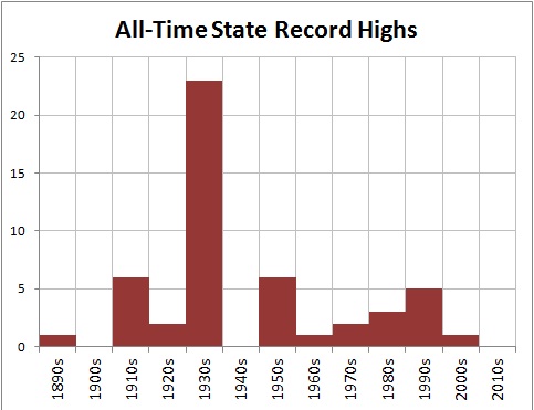
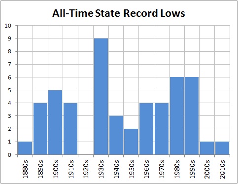
While it is true that the globe today is warmer than it was in the early 20th century, the same cannot be said of the United States [2]. The 30-year periods encompassing the 1930s are as warm, or warmer than, the 1981-2010 means depending on the region [2].
If it is true that global temperatures today are warmer than those of the early 20th century, then more extremes could be likely using the latter definition above and assuming that, during both periods, the temperature distributions could be described as a normal distribution or “bell curve”.
Changes in variability would make the assessment of climate change more difficult. A temperature distribution shorter and fatter (taller and skinnier) than the normal, means the climate is more (less) variable. Thus, it is possible that under conditions of a modest rise in temperature over a 100 year period, for example, heat waves could become less frequent. This would indicate the modest temperature rise was accompanied by a reduction in temperature variability. This situation likely describes US temperatures over the last century or more, and the analysis below will support the conjecture.
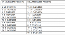
Then, in order to discuss the change in the frequency of extreme events, such as the recent heat wave, a benchmark or threshold could be chosen. In our region, the Missouri region, it makes sense to measure extreme heat waves using the number of consecutive 100 F maximums as one yard stick, since this would be a value most people in our region could agree is extreme. From June 26th to July 7th, or on 11 consecutive days, we experienced 100 F maximums in Columbia and Saint Louis. How does this stack up against the record books?
Table 1 shows that this heat wave ranks as number six and two events of all-time for Columbia and Saint Louis, respectively. But, Table 1 also demonstrates that only two (one) top 10 heat waves have occurred in the last 20 years in Columbia (Saint Louis). In fact, for both cities, most of these occurred in the early part of the 20th century! Was this heat wave the most widespread? Certainly, Washington, DC has been hot as of late, but similarly, the number of extreme hot days there also occurred earlier in the 20th century [3]. Additionally, it can be inferred that the heat waves and droughts of the 1930s were as expansive or more so that today [4]. Finally, Table 1 shows that this years event can’t even lay claim to the earliest such event to occur in the summer season
It is still quite early in the summer of 2012, and the current heat wave has exacerbated the ongoing drought occurring over a large fraction of the US agricultural region. It is a serious event that bears watching, and this year has the potential to join the list of some of the most memorable drought years. But, it is not symptomatic of anthropogenic global warming.
Table 1. The top 10 heat waves in Saint Louis and Columbia, MO as measured by the number of consecutive days over 100 F. Source: Saint Louis National Weather Service. (http:www.nws.noaa.gov) The table shows rank, number of days, and the ending date for each event.
Enlarged
[1] Washington Times
[2] Lupo, A.R., 2011: Is Warmer Really the New Normal? A paper written for: http://www.icecap.us
[3] The Climate Depot (2012). See also.
[4] Fye, F.K., D.W. Stahle, and E.R. Cook, 2003: Paleoclimatic analogs to twentieth century moisture regimes across the United States. Bull. Amer. Meteor. Soc., 84, 901 - 910.
-----------------
Enlarged
All time state record highs

Enlarged
All time state record lows

Enlarged
|

