Mar 06, 2012
Matt Ridley: The Beginning Of The End Of Wind
Matt Ridley, the Spectator in GWPF
The government has finally seen through the wind-farm scam - but why did it take them so long?
To the nearest whole number, the percentage of the world’s energy that comes from wind turbines today is: zero. Despite the regressive subsidy (pushing pensioners into fuel poverty while improving the wine cellars of grand estates), despite tearing rural communities apart, killing jobs, despoiling views, erecting pylons, felling forests, killing bats and eagles, causing industrial accidents, clogging motorways, polluting lakes in Inner Mongolia with the toxic and radioactive tailings from refining neodymium, a ton of which is in the average turbine - despite all this, the total energy generated each day by wind has yet to reach half a per cent worldwide.
If wind power was going to work, it would have done so by now. The people of Britain see this quite clearly, though politicians are often wilfully deaf. The good news though is that if you look closely, you can see David Cameron’s government coming to its senses about the whole fiasco. The biggest investors in offshore wind - Mitsubishi, Gamesa and Siemens - are starting to worry that the government’s heart is not in wind energy any more. Vestas, which has plans for a factory in Kent, wants reassurance from the Prime Minister that there is the political will to put up turbines before it builds its factory.
This forces a decision from Cameron - will he reassure the turbine magnates that he plans to keep subsidising wind energy, or will he retreat? The political wind has certainly changed direction. George Osborne is dead set against wind farms, because it has become all too clear to him how much they cost. The Chancellor’s team quietly encouraged MPs to sign a letter to No. 10 a few weeks ago saying that ‘in these financially straitened times, we think it is unwise to make consumers pay, through taxpayer subsidy, for inefficient and intermittent energy production that typifies onshore wind turbines’.
Putting the things offshore may avoid objections from the neighbours, but (Chancellor, beware!) it makes even less sense, because it costs you and me - the taxpayers - double. I have it on good authority from a marine engineer that keeping wind turbines upright in the gravel, tides and storms of the North Sea for 25 years is a near hopeless quest, so the repair bill is going to be horrific and the output disappointing. Already the grouting in the foundations of hundreds of turbines off Kent, Denmark and the Dogger Bank has failed, necessitating costly repairs.
In Britain the percentage of total energy that comes from wind is only 0.6 per cent. According to the Renewable Energy Foundation, ‘policies intended to meet the EU Renewables Directive in 2020 will impose extra consumer costs of approximately 15 billion pounds per annum or 670 per household. It is difficult to see what value will be got for this money. The total carbon emissions saved by the great wind rush is probably below 1 per cent, because of the need to keep fossil fuels burning as back-up when the wind does not blow. It may even be a negative number.
America is having far better luck. Carbon emissions in the United States fell by 7 per cent in 2009, according to a Harvard study. But the study concluded that this owes less to the recession that year than the falling price of natural gas - caused by the shale gas revolution. (Burning gas emits less than half as much carbon dioxide as coal for the same energy output.) The gas price has fallen even further since, making coal seem increasingly pricey by comparison. All over America, from Utah to West Virginia, coal mines are being closed and coal plants idled or cancelled. (The US Energy Information Administration calculates that every $4 spent on shale purchases the same energy as $25 spent on oil: at this rate, more and more vehicles will switch to gas.)
So even if you accept the most alarming predictions of climate change, those turbines that have ruined your favourite view are doing nothing to help. The shale gas revolution has not only shamed the wind industry by showing how to decarbonise for real, but has blown away its last feeble argument - that diminishing supplies of fossil fuels will cause their prices to rise so high that wind eventually becomes competitive even without a subsidy. Even if oil stays dear, cheap gas is now likely to last many decades.
Though they may not admit it for a while, most ministers have realised that the sums for wind power just don’t add up and never will. The discovery of shale gas near Blackpool has profound implications for the future of British energy supply, which the government has seemed sheepishly reluctant to explore. It has a massive subsidy programme in place for wind farms, which now seem obsolete both as a means of energy production and decarbonisation. It is almost impossible to see what function they serve, other than making a fortune from those who profit from the subsidy scam.
Even in a boom, wind farms would have been unaffordable - with their economic and ecological rationale blown away. In an era of austerity, the policy is doomed, though so many contracts have been signed that the expansion of wind farms may continue, for a while. But the scam has ended. And as we survey the economic and environmental damage, the obvious question is how the delusion was maintained for so long. There has been no mystery about winds futility as a source of affordable and abundant electricity - so how did the wind-farm scam fool so many policymakers?
One answer is money. There were too many people with snouts in the trough. Not just the manufacturers, operators and landlords of the wind farms, but financiers: wind-farm venture capital trusts were all the rage a few years ago - guaranteed income streams are what capitalists like best; they even get paid to switch the monsters off on very windy days so as not to overload the grid. Even the military took the money. Wind companies are paying for a new 20 million pound military radar at Brizlee Wood in Northumberland so as to enable the Ministry of Defence to lift its objection to the 48-turbine Fallago Rig wind farm in Berwickshire.
The big conservation organisations have been disgracefully silent on the subject, like the Royal Society for the Protection of Birds, which until last year took generous contributions from the wind industry through a venture called RSPB Energy. Even journalists: at a time when advertising is in short supply, British newspapers have been crammed full of specious but lucrative ‘debates’ and supplements on renewable energy sponsored by advertising from a cohort of interest groups.
And just as the scam dies, I find I am now part of it. A family trust has signed a deal to receive 8,500 a year from a wind company, which is building a turbine on land that once belonged to my grandfather. He was canny enough not to sell the mineral rights, and the foundations of the turbine disturbs those mineral rights, so the trustees are owed compensation. I will not get the money, because I am not a beneficiary of the trust. Nonetheless, the idea of any part of my family receiving ‘wind-gelt’ is so abhorrent that I have decided to act. The real enemy is not wind farms per se, but groupthink and hysteria which allowed such a flawed idea to progress - with a minimum of intellectual opposition. So I shall be writing a cheque for 8,500, which The Spectator will give as a prize to the best article devoted to rational, fact-based environmental journalism.
It will be called the Matt Ridley prize for environmental heresy. Barring bankruptcy, I shall donate the money as long as the wind-gelt flows - so the quicker Dave cancels the subsidy altogether, the sooner he will have me and the prizewinners off his back.
Entrants are invited forthwith, and a panel of judges will reward the most brilliant and rational argument - that uses reason and evidence - to gore a sacred cow of the environmental movement. There are many to choose from: the idea that wind power is good for the climate, or that biofuels are good for the rain forest, or that organic farming is good for the planet, or that climate change is a bigger extinction threat than invasive species, or that the most sustainable thing we can do is de-industrialise.
My donation, though significant for me, is a drop in the ocean compared with the money that pours into the green movement every hour. Jeremy Grantham, a hedge-fund plutocrat, wrote a cheque for 12 million to the London School of Economics to found an institute named after him, which has since become notorious for its aggressive stance and extreme green statements. Between them, Greenpeace and Worldwide Fund for Nature (WWF) spend nearly a billion a year. WWF spends $68 million a year on ‘public education’ alone. All of this is judged uncontroversial: a matter of education, not propaganda.
By contrast, a storm of protest broke recently over the news that one small conservative think-tank called Heartland was proposing to spend just $200,000 in a year on influencing education against climate alarmism. A day later, the William and Flora Hewlett Foundation, with assets of $7.2 billion, gave a grant of $100 million to something called the ClimateWorks Foundation, a pro-wind power organisation, on top of $481 million it gave to the same recipient in 2008. The deep green Sierra Club recently admitted that it took $26 million from the gas industry to lobby against coal. But money is not the only reason that the entire political establishment came to believe in wind fairies. Psychologists have a term for the wishful thinking by which we accept any means if the end seems virtuous: ‘noble-cause corruption’. The phrase was first used by the Chief Inspector of Constabulary Sir John Woodcock in 1992 to explain miscarriages of justice. It is better that some innocent men remain in jail than the integrity of the English judicial system be impugned,’ said the late Lord Denning, referring to the Birmingham Six.
Politicians are especially susceptible to this condition. In a wish to be seen as modern, they will embrace all manner of fashionable causes. When this sets in - groupthink grips political parties, and the media therefore decide there is no debate the gravest of errors can take root. The subsidising of useless wind turbines was born of a deep intellectual error, one incubated by failure to challenge conventional wisdom.
It is precisely this consensus-worshipping, heretic-hunting environment where the greatest errors can be made. There are some 3,500 wind turbines in Britain, with hundreds more under construction. It would be a shame for them all to be dismantled. The biggest one should remain, like a crane on an abandoned quay, for future generations to marvel at. They will never be an efficient way to generate power. But there can be no better monument to the folly of mankind.
-----------------
Wind Turbine Syndrome affects more people than previously thought
Posted on March 6, 2012 by Anthony Watts
by Mark Duchamp
A survey was conducted on wind farm noise as part of a Masters dissertation by Zhenhua Wang, a graduate student in Geography, Environment and Population at the University of Adelaide, Australia. The results show that 70% of respondents living up to 5km away report being negatively affected by wind turbine noise, with more than 50% of them “very or moderately negatively affected”. This is considerably higher than what was found in previous studies conducted in Europe.
The survey was made in the vicinity of the Waterloo wind farm, South Australia, which is composed of 37 Vestas V90 3 MW turbines stretching over 18 km. These mega turbines are reported to be emitting more low frequency noise (LFN) than smaller models, and this causes more people to be affected, and over greater distances, by the usual symptoms of the Wind Turbine Syndrome (WTS): insomnia, headaches, nausea, stress, poor ability to concentrate, irritability, etc, leading to poorer health and a reduced immunity to illness.
The Danish government recognised recently that LFN is an aggravating component in the noise that affects wind farm neighbours. This prompted their issuing regulations that limit low-frequency noise levels inside homes to 20 dB(A). Unfortunately, as denounced by Professor Henrik Moller, they manipulated the calculation parameters so as to allow LFN inside homes to actually reach 30 dB(A) in 30% of cases. “Hardly anyone would accept 30 dB(A) in their homes at night”, wrote the Professor last month.
A summary of the Australian survey has been published (3), but the full Masters dissertation has not been made available to the public. In the interest of public health, the European Platform against Windfarms (EPAW) and the North-American Platform against Windpower (NA-PAW), have asked the University of Adelaide to release this important document.
A neighbour of the Waterloo wind farm, Mr Andreas Marciniak, wrote to a local newspaper last week: “Do you think it’s funny that at my age I had to move to Adelaide into my Mother’s shed and my brother had to move to Hamilton into a caravan with no water or electricity?” (4) Both Mr Marciniak and his brother have been advised by their treating doctors, including a cardiologist, to leave their homes and not return when the wind turbines are turning.
How many people will be forced to abandon their homes before governments pay attention, wonder the thousands of windfarm victims represented by EPAW and NAPAW. “It’ll take time to gather enough money for a big lawsuit”, says Sherri Lange, of NAPAW, “but time is on our side: victim numbers are increasing steadily.”
Contacts:
Mark Duchamp +34 693 643 736 (Spain) Skype: mark.duchamp
Executive Director, EPAW
www.epaw.org
save.the.eagles@gmail.com
Your BEST chance to stop expensive, subsidized, land-intensive, bird-killing, scenery-wrecking, health-impairing wind energy projects in the United States is to make three quick phone calls - today - one each to:
Senator Mark Warner 202-224-2023
Senator Jim Webb 202-224-4024
(or your own two senators, if you don’t live in Virginia, through the Senate switchboard: 202-224-3121)
And one to Senate Minority Leader Mitch McConnell (R-KY) 202-224-2541
Urge them to oppose Senator Maria Cantwell’s Amendment to the Transportation Bill (and ANY other extension of the wind energy PTC).
Lobbyists for greed energy are still trying to extract more of our tax dollars through the Transportation bill. Industrial wind projects should not get one more dollar of tax subsidies. After decades of subsidies, they need to operate on a level playing field, without us and our children and grandchildren subsidizing them any longer with borrowed billions.
Thanks to YOUR earlier calls, the Senate has already defeated Senator Mike Bennett’s (D-CO) proposed “non-germane” amendment #1709 to the Transportation Bill, to extend the wind energy Production Tax Credit (PTC).
In one more desperate attempt to slip this in unnoticed amid the general wrangling over this bill, Senator Cantwell (D-WA) introduced another slightly differently worded amendment to extend the PTC. It was just submitted today and is so new even they didn’t have a number for it.
Negotiations are on-going to determine which amendments will be included with this bill, and this will likely be decided this week between Senators Reid and McConnell.
Remember: without the PTC, the US wind energy business will likely collapse. That would be a good thing, because wind turbines generate too much ultra-expensive electricity when it is not needed, and too little when it is most needed. They kill eagles, hawks, falcons, migratory birds, and bats. They are not clean, green, cheap (much less free), sustainable or environment-friendly.
PLEASE CALL TODAY.
The telephone number may be busy, and you might have to try again or wait a bit. But that’s because your friends are also calling ... and we are making a difference. YOUR CALL IS IMPORTANT, SO PLEASE BE PATIENT.
Hopefully will be the last bill this year (with bipartisan support) that the lobbyists have any hope of slipping this PTC provision in. Your calls may make that happen, too. If there is another attempt, we will let you know.
Please pass this information on to friends and colleagues on your email lists!
Mar 05, 2012
More about the NZ temperature record
Richard Treadgold, Climate Coversation Group
Errors in the new 7SS
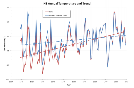
The shocking breakthrough in our audit is that NIWA didn’t use the adjustment method they said they would use. Barry Brill, chairman of the Coalition, released an overview entitled New Zealand Unaffected by Global Warming (pdf, 1.3 MB). The discovery that the country hasn’t experienced global warming is another startling finding. In Chapter 8, on page 24, he identifies nine criticisms of NIWAs newest 7SS. These multiple defects destroy the credibility of the 7SS as a source of the NZTR.
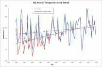
Enlarged.
1.It contradicts every other record of NZ temperatures.
2.Its warming trend comes almost entirely from the Auckland and Wellington stations, which are contaminated with false warming from UHI. The 7SS makes no adjustments for UHI.
3.It uses adjustments derived from comparisons between “isolated stations” in direct defiance of the scientific authorities.
4.It finds warming only by disregarding the statistical techniques it said it would use - Rhoades & Salinger. The reality is that New Zealand has had no strong warming for a hundred years.
5.It gives no margins of error for its adjustments and always applies changes, even when the method says they are unjustified.
6.The strong warming is created by implausible accumulating adjustments, which are not random, as we would expect, but slanted in the direction of warming.
7.To verify the 7SS, NIWA wheeled in the 11SS, which they themselves invented, has data missing everywhere and is laughably unscientific.
8.The refusal to release the BoM review documents under the Official Information Act (by both NIWA and the BoM) raises the question of what they’re hiding.
9.Most of the warming in the 7SS occurs during the first half of the century, which contradicts NIWAs official advice that our warming was driven by global CO2 emissions - which are concentrated in the last 40 years.
NIWA shows 168% more warming than Rhoades & Salinger -the method NIWA claimed to use but did not. The blue dashed line shows the warming trend when the method is used correctly. The red line reveals NIWAs outrageous fraud - it’s much stronger warming, but it’s empty of truth.
1. It contradicts every other record of NZ temperatures.
The temperature readings themselves, both ancient and modern, provide clear evidence that theres been little warming. Modern temperatures in Auckland, Wellington and Christchurch are about 0.5C below the 1860s, and the New Zealand mean now is 0.2C below the 1860s mean, so there’s been no warming. NIWA’s story of strong warming is believable only if they fault the accuracy of the old readings. But they don’t.
If they did, and they “adjusted” the oldest temperatures downward, their already strong warming would give off the distinct smell of fish.
2. Its warming trend comes almost entirely from the Auckland and Wellington stations, which are contaminated with false warming from UHI.
The peer-reviewed literature says clearly that records from these two cities are contaminated with an urban heat island (UHI) effect and show false warming. If you don’t correct for UHI, the series you finish up with is skewed in favour of warming. Why haven’t NIWA’s team made some correction for UHI? UHI also affects the other four urban stations, but no corrections were made there either.
3. It uses adjustments derived from comparisons between “isolated stations” in direct defiance of the scientific authorities.
Here’s what our audit says:
The technique NIWA has used for all their adjustments (excepting overlaps) is the “neighbouring stations” method. It is important to note that in reality NIWA seldom uses truly neighbouring stations. In most cases the stations chosen are from some distance away, especially for the earlier records. For example, Dunedin is compared against Albert Park in Auckland. For the purposes of this document, we shall however refer to all station comparisons as “neighbouring”, even though many are not.
So NIWA have used the “Clayton’s” neighbouring stations method - the neighbouring stations method you use when you’re not using a neighbouring stations method. If the methodology requires the use of neighbouring stations for comparisons, why have NIWA disregarded that requirement?
This is a nonsense. It is a waste of taxpayers’ money. It’s a caricature of the scientific method. And it will become the laughing stock of the climate world.
4. It disregards the statistical techniques it said it would follow - Rhoades & Salinger.
After we published Are we feeling warmer yet? (AWFWY) we asked NIWA what adjustments they had made to the temperature record. Their constant theme was that they had followed the scientific literature and we ought to know what it said.
For the methodology, they referred us to Salingers thesis (which proved useless) and R&S (which didn’t). Later, when they announced their reconstruction of the 7SS, they said they would use R&S for the adjustments.
But they didn’t use R&S. Why didn’t they keep their word?
5. It gives no margins of error for its adjustments and always applies changes, even when the method says they are unjustified.
6. The strong warming is created by implausible accumulating adjustments, which are not random, as we would expect, but slanted in the direction of warming.
The chances of replicating the first series without knowing the original method used are astronomical. In fact, it’s incredible that it happened. The further chance that all the adjustments should almost universally conspire to alter the trend to warming is too incredible and probably constitutes evidence of intent.
7. To verify the 7SS, NIWA wheeled in the 11SS, which they themselves invented within a few days of our AWFWY paper, has data missing everywhere and is laughably unscientific.
Only about a week after we published AWFWY, NIWA put out a media release saying:
Dr Jim Salinger has identified from the NIWA climate archive a set of 11 stations with long records where there have been no significant site changes. When the annual temperatures from all of these sites are averaged to form a temperature series for New Zealand, the best-fit linear trend is a warming of 1C from 1931 to 2008.
And with that, cherry-picking data to prove a scientific case became an officially-sanctioned strategy. Comment on that, you bright boys at Hot Topic!
8. The refusal to release the BoM review documents under the Official Information Act (by both NIWA and the BoM) raises the question of what they’re hiding.
We still await a response from the Ombudsman from our request made in May last year, although it follows our complaint about NIWA’s original refusal in 2010. Their tardiness in this case is outrageous. It constitutes a severe condemnation of the conduct of that formerly useful office. If a small number of those new functionaries in the Ministry for the Environment calculating carbon footprints and assembling long inventories of obscure greenhouse gases being emitted by innocent New Zealand manufacturers might be diverted to the Ombudsmans office, we might see some useful work accomplished.
9. Most of the warming in the 7SS occurs during the first half of the century, which contradicts NIWA’s official advice that our warming was driven by global CO2 emissions - which are concentrated in the last 40 years.
These contradictions and mysteries mark NIWA’s latest attempt to hoodwink the public over the national temperature record.
It seems incredible that this agency has a monopoly on government advice on climate science.
Mar 01, 2012
The Sun Back in a Funk
By Joseph D’Aleo
THE SUN BACK IN A FUNK

Enlarged
One sole spot of significance to end February.
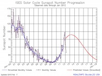
Enlarged
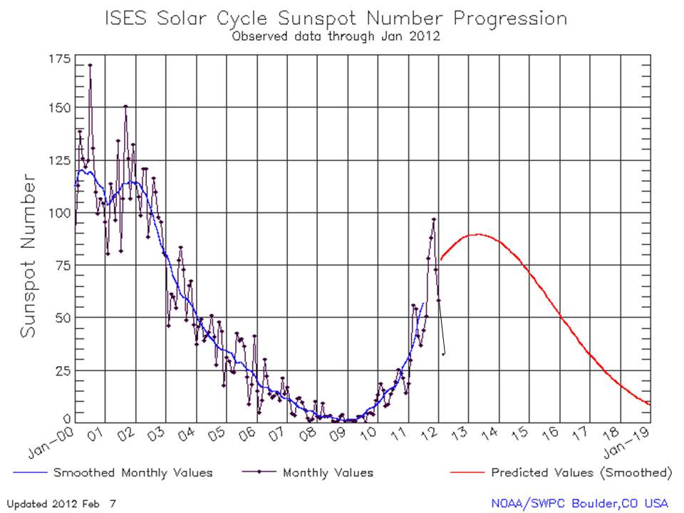
The February sunspot number came in at an amazing 33.1 three years and 3 months into the new cycle. Often cycles are peaking at this point. This cycle has been declining in recent months.
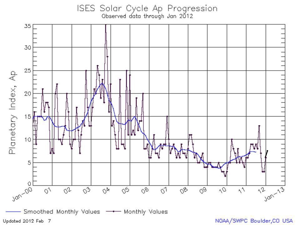
The magnetic field as indicated by the Ap Index remains very low as it has been since 2006.

Enlarged
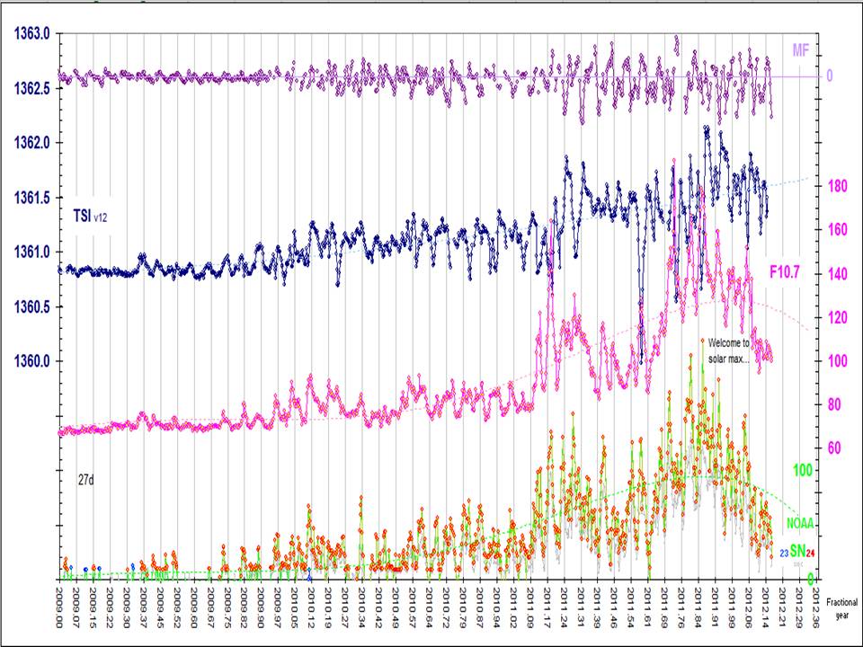
Many of the solar parameters peaked in November and have declined.

Enlarged
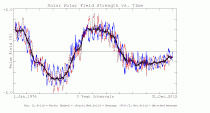
Normally a solar max occurs when the magnetic fields flip sign in the two solar hemispheres. the northern flipped briefly but returned but is close, the southern hemisphere has not yet changed. the sign of the southern hemisphere in red reversed on this Wilcox Solar Observatory plot so we can see the two together. Every time they convincingly cross the 0 line, the cycle peaks. You can see we are getting close.
Enlarged
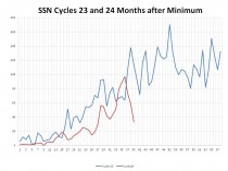
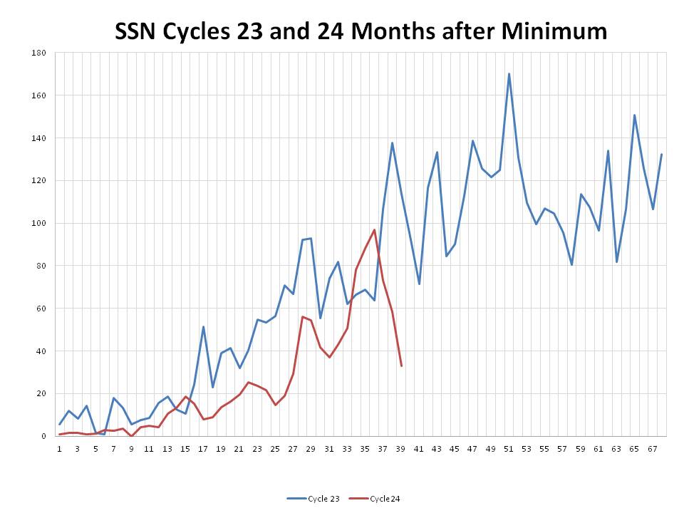
Here is how the SSN compares month by month cycles 23 and 24.
Enlarged
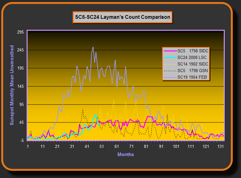
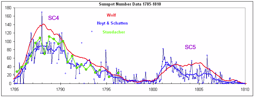
Since our ability to see spots today is greater than it was a century ago, a group has develop a Layman’s Count that only counts spots large enough to have been seen before. This is a little like hurricane and tornado counts which are higher today because we have better technology to see them (note February not yet included). The Layman’s Count has this cycle looking like cycle 5 in the early 1800s. Interestingly that cycle had an early spike like this one and then relaxed into a long, low plateau max and then long minimum.

Enlarged

Enlarged
Feb 26, 2012
Is The Window Closing?
By Art Horn, ICECAP Meteorologist
The historical temperature record shows that the earth has warmed about 1.3 degrees Fahrenheit since 1850. But does that warming prove that we caused it? Our leaders in Washington say adding more carbon dioxide to the air is closing the window at the top of the atmosphere and allowing less heat to escape to space. The answer as to whether this is true or not is not going to come from looking at how much the earth has warmed up in the last 150 years. This planet has warmed and cooled so many times in the past that the current temperature trend is just a repeat of what has happened many, many times before. There are simply too many natural temperature cycles caused by too many forces of nature that will mask any underlying forcing mechanism. Thankfully there is a new way to find an answer. With the advent of the satellite era in the 1960s a revolutionary method of how to evaluate our possible impact on climate was born.
The satellites have the advantage of being free of all the effects that make surface temperature measurements so unreliable in evaluating our impact on climate. They can measure the entire irradiance of the earth from their perch high above the atmosphere without the problems ground based thermometers have. Problems like changing thermometer technology over the last 150 years. Problems such as urban sprawl spreading into the countryside warming long term temperature readings that once were cooler when they were in a rural setting. Problems such as the uneven distribution of thermometers around the world and the lack of them over the oceans. The satellites are free of all of this and have been measuring the amount of long wave radiation (heat) escaping from the atmosphere into space since the mid 1970s. The satellites know the size of the window and how much heat is getting through.
If the man made greenhouse gas theory is correct the amount of heat going through the window into space should be decreasing over the last few decades, the window at the top of the atmosphere should be closing. Since 80% of all man made carbon dioxide emissions have been produced after 1940 we should be able to detect how much the window is closing over the last nearly four decades. If it is closing, less heat can sneak through to space and the atmosphere below will gradually warm up. The beauty of the satellites is that we can objectively deduce if it is closing. If it is, this would be significant evidence that burning of fossil fuels is strengthening the natural greenhouse effect and causing man made global warming.
So what do the satellites show? Since the mid-1970s the satellite data show no trend either up or down in outgoing long wave radiation. Plain and simple, the satellites say the window is just as wide open now as it was in 1974. The average value of outgoing long wave radiation through the last nearly four decades is about 232.5 watts per square meter. As stated above, there has been very little long term variation in this number since 1974. However, during that time carbon dioxide has increased from 330 parts per million to 392 parts per million today, an increase of 62 parts per million. The pre-industrial revolution carbon dioxide base line value is about 280 parts per million. Since then we have seen a rise of 112 parts per million. The 62 parts per million rise since 1974 represents a 55% increase in atmospheric carbon dioxide over the 1850 level. Surly such a significant rise in carbon dioxide should be closing the window up there, if the theory is correct, but its not.
Is it possible that in some places the window is closing and not in others? No, it doesnt matter where you look. The data shows no trend up or down at either of the poles. Water vapor is most of the greenhouse effect but at the poles, where there is much less water vapor due to the colder temperature, carbon dioxide is a more significant warming agent. But even in those locations where it should be most obvious, there is no indication that the window is closing, at either pole. The data shows the window is not closing above the tropics where the largest amount of outgoing long wave radiation is found. If the greenhouse effect is becoming more potent the out going long wave radiation would show a noticeable decreasing trend over the last nearly four decades in all of these regions but it does not. If the trend were there the satellite data would detect it. Actually since 2003 the amount of heat escaping to space has increased slightly. This increase is just part of the small natural variation that occurs over time and likely does not represent any long term trend.
Real world evidence from nearly four decades of satellite data has proven that large increases in carbon dioxide have not shown any sign of closing the window at the top of the atmosphere. No amount of computer modeling or rhetoric from famous people or proclamations from large institutions or speeches from our leaders in Washington can change this. The data alone should be enough for thoughtful, reasonable people to re-consider the causes of climate change. Unfortunately we are dealing with people and institutions with many different agendas in the global warming arena. Many of these individuals and institutions have a major financial stake in bolstering the man made global warming scare. Makers of windmills and solar panels are not going to suddenly admit that the greenhouse effect is not getting stronger. Their entire livelihood depends on it. The recent scandals of failed alternative energy companies are everywhere. Billions and billions of taxpayer dollars are being sucked out of our bankrupt economy only to see it washed down the drain by failed wind and solar companies. All because our leaders will not recognize that the window up there above us is just as wide open as it always has been.
Fossil fuels will be the energy source that powers the future for many decades to come. Knowledgeable people will continue to point out the overt flaws in the man made global warming theory. These flaws have resulted in destructive policies that threaten your safety and prosperity, no matter what political party you belong to. The satellites say the window in the sky is open. The question is, when will our leaders open their eyes.
ICECAP.US does not get money from oil companies or any other energy company. We do not have wealthy behind the curtain foundations to support us. We are fighting a grass roots battle to tell the truth about the war against our way of making energy and ultimately our prosperity. Please consider donating any amount of money to us so that we may continue to speak out against the ignorant and biased main stream media and the current administration. Your future and mine depend on it.
Feb 24, 2012
The Skeptic’s Case
By David Evans
We check the main predictions of the climate models against the best and latest data. Fortunately the climate models got all their major predictions wrong. Why? Every serious skeptical scientist has been consistently saying essentially the same thing for over 20 years, yet most people have never heard the message. Here it is, put simply enough for any lay reader willing to pay attention.
What the Government Climate Scientists Say
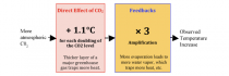
The climate models. If the CO2 level doubles (as it is on course to do by about 2070 to 2100), the climate models estimate the temperature increase due to that extra CO2 will be about 1.1C × 3 = 3.3C.[1]
The direct effect of CO2 is well-established physics, based on laboratory results, and known for over a century.[2]
Feedbacks are due to the ways the Earth reacts to the direct warming effect of the CO2. The threefold amplification by feedbacks is based on the assumption, or guess, made around 1980, that more warming due to CO2 will cause more evaporation from the oceans and that this extra water vapor will in turn lead to even more heat trapping because water vapor is the main greenhouse gas. And extra heat will cause even more evaporation, and so on. This amplification is built into all the climate models.[3] The amount of amplification is estimated by assuming that nearly all the industrial-age warming is due to our CO2.
The government climate scientists and the media often tell us about the direct effect of the CO2, but rarely admit that two-thirds of their projected temperature increases are due to amplification by feedbacks.
What the Skeptics Say
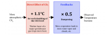
Figure 2
The skeptic’s view. If the CO2 level doubles, skeptics estimates that the temperature increase due to that extra CO2 will be about 1.1C × 0.5 ≈ 0.6C.[4]
The serious skeptical scientists have always agreed with the government climate scientists about the direct effect of CO2. The argument is entirely about the feedbacks.
The feedbacks dampen or reduce the direct effect of the extra CO2, cutting it roughly in half.[5] The main feedbacks involve evaporation, water vapor, and clouds. In particular, water vapor condenses into clouds, so extra water vapor due to the direct warming effect of extra CO2 will cause extra clouds, which reflect sunlight back out to space and cool the earth, thereby reducing the overall warming.
There are literally thousands of feedbacks, each of which either reinforces or opposes the direct-warming effect of the extra CO2. Almost every long-lived system is governed by net feedback that dampens its response to a perturbation. If a system instead reacts to a perturbation by amplifying it, the system is likely to reach a tipping point and become unstable (like the electronic squeal that erupts when a microphone gets too close to its speakers). The earth’s climate is long-lived and stable - it has never gone into runaway greenhouse, unlike Venus - which strongly suggests that the feedbacks dampen temperature perturbations such as that from extra CO2.
What the Data Says
The climate models have been essentially the same for 30 years now, maintaining roughly the same sensitivity to extra CO2 even while they got more detailed with more computer power.
· How well have the climate models predicted the temperature?
· Does the data better support the climate models or the skeptic’s view?
Air Temperatures
One of the earliest and most important predictions was presented to the US Congress in 1988 by Dr James Hansen, the “father of global warming”:
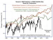
Figure 3. Hansen’s predictions to the US Congress in 1988,[6] compared to the subsequent temperatures as measured by NASA satellites.[7]
Hansen’s climate model clearly exaggerated future temperature rises.
In particular, his climate model predicted that if human CO2 emissions were cut back drastically starting in 1988, such that by year 2000 the CO2 level was not rising at all, we would get his scenario C. But in reality the temperature did not even rise this much, even though our CO2 emissions strongly increased which suggests that the climate models greatly overestimate the effect of CO2 emissions.
A more considered prediction by the climate models was made in 1990 in the IPCC’s First Assessment Report:[8]
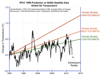
Figure 4 Predictions of the IPCC’s First Assessment Report in 1990, compared to the subsequent temperatures as measured by NASA satellites.
It’s 20 years now, and the average rate of increase in reality is below the lowest trend in the range predicted by the IPCC.
Ocean Temperatures
The oceans hold the vast bulk of the heat in the climate system. We’ve only been measuring ocean temperature properly since mid-2003, when the Argo system became operational.[9][10] In Argo, a buoy duck dives down to a depth of 2,000 meters, measures temperatures as it very slowly ascends, then radios the results back to headquarters via satellite. Over 3,000 Argo buoys constantly patrol all the oceans of the world.
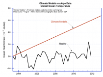
Figure 5. Climate model predictions of ocean temperature,[11] versus the measurements by Argo.[12] The unit of the vertical axis is 10^22 Joules (about 0.01C).
The ocean temperature has been basically flat since we started measuring it properly, and not warming as quickly as the climate models predict.
Atmospheric Hotspot
The climate models predict a particular pattern of atmospheric warming during periods of global warming; the most prominent change they predict is a warming in the tropics about 10 km up, the “hotspot.”
The hotspot is the sign of the amplification in their theory (see figure 1). The theory says the hotspot is caused by extra evaporation, and by extra water vapor pushing the warmer, wetter lower troposphere up into volume previously occupied by cool dry air. The presence of a hotspot would indicate amplification is occurring, and vice versa.
We have been measuring atmospheric temperatures with weather balloons since the 1960s. Millions of weather balloons have built up a good picture of atmospheric temperatures over the last few decades, including the warming period from the late 1970s to the late ‘90s. This important and pivotal data was not released publicly by the climate establishment until 2006, and then in an obscure place.[13] Here it is:

Figure 6. On the left is the data collected by millions of weather balloons.[14] On the right is what the climate models say was happening.[15] The theory (as per the climate models) is incompatible with the observations. In both diagrams the horizontal axis shows latitude, and the right vertical axis shows height in kilometers.
In reality there was no hotspot, not even a small one. So in reality there is no amplification - the amplification shown in figure 1 does not exist.[16]
Outgoing Radiation
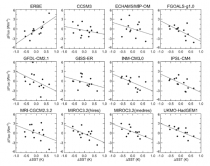
The climate models predict that when the surface of the earth warms, less heat is radiated from the earth into space (on a weekly or monthly time scale). This is because, according to the theory, the warmer surface causes more evaporation and thus there is more heat-trapping water vapor. This is the heat-trapping mechanism that is responsible for the assumed amplification in figure 1.
Satellites have been measuring the radiation emitted from the earth for the last two decades. A major study has linked the changes in temperature on the earth’s surface with the changes in the outgoing radiation. Here are the results:
Outgoing radiation from earth (vertical axis) against sea-surface temperature (horizontal), as measured by the ERBE satellites (upper-left graph) and as “predicted” by 11 climate models (the other graphs).[17] Notice that the slopes of the graphs for the climate models are opposite to the slope of the graph for the observed data.
This shows that in reality the earth gives off more heat when its surface is warmer. This is the opposite of what the climate models predict. This shows that the climate models trap heat too aggressively, and that their assumed amplification shown in figure 1 does not exist.
Conclusions
All the data here is impeccably sourced - satellites, Argo, and weather balloons.[18]
The air and ocean temperature data shows that the climate models overestimate temperature rises. The climate establishment suggest that cooling due to undetected aerosols might be responsible for the failure of the models to date, but this excuse is wearing thin - it continues not to warm as much as they said it would, or in the way they said it would. On the other hand, the rise in air temperature has been greater than the skeptics say could be due to CO2. The skeptic’s excuse is that the rise is mainly due to other forces - and they point out that the world has been in a fairly steady warming trend of 0.5C per century since 1680 (with alternating ~30 year periods of warming and mild cooling) where as the vast bulk of all human CO2 emissions have been after 1945.
We’ve checked all the main predictions of the climate models against the best data:
Test
Climate Models
Air temperatures from 1988:
Overestimated rise, even if CO2 is drastically cut
Air temperatures from 1990
Overestimated trend rise
Ocean temperatures from 2003
Overestimated trend rise greatly
Atmospheric hotspot
Completely missing → no amplification
Outgoing radiation
Opposite to reality → no amplification
The climate models get them all wrong. The missing hotspot and outgoing radiation data both, independently, prove that the amplification in the climate models is not present. Without the amplification, the climate model temperature predictions would be cut by at least two-thirds, which would explain why they overestimated the recent air and ocean temperature increases. Therefore,
* The climate models are fundamentally flawed. Their assumed threefold amplification by feedbacks does not in fact exist.
* The climate models overestimate temperature rises due to CO2 by at least a factor of three.
* The skeptical view is compatible with the data.
Some Political Points
The data presented here is impeccably sourced, very relevant, publicly available, and from our best instruments. Yet it never appears in the mainstream media have you ever seen anything like any of the figures here in the mainstream media? That alone tells you that the “debate” is about politics and power, and not about science or truth.
This is an unusual political issue, because there is a right and a wrong answer, and everyone will know which it is eventually. People are going ahead and emitting CO2 anyway, so we are doing the experiment: either the world heats up by several degrees by 2050 or so, or it doesn’t.
Notice that the skeptics agree with the government climate scientists about the direct effect of CO2; they just disagree about the feedbacks. The climate debate is all about the feedbacks; everything else is merely a sideshow. Yet hardly anyone knows that. The government climate scientists and the mainstream media have framed the debate in terms of the direct effect of CO2 and sideshows such as arctic ice, bad weather, or psychology. They almost never mention the feedbacks. Why is that? Who has the power to make that happen?
Dr. David M.W. Evans consulted full time for the Australian Greenhouse Office (now the Department of Climate Change) from 1999 to 2005, and part time 2008 to 2010, modeling Australias carbon in plants, debris, mulch, soils, and forestry and agricultural products. Evans is a mathematician and engineer, with six university degrees including a PhD from Stanford University in electrical engineering. The area of human endeavor with the most experience and sophistication in dealing with feedbacks and analyzing complex systems is electrical engineering, and the most crucial and disputed aspects of understanding the climate system are the feedbacks. The evidence supporting the idea that CO2 emissions were the main cause of global warming reversed itself from 1998 to 2006, causing Evans to move from being a warmist to a skeptic.
|

