

By Joseph D’Aleo, CCM
In the story below in Icecap in the News on “Welcome back to the 1950s and soon the 1960s and 1970s and then 1800” I showed how temperatures correlate well with natural cycles.
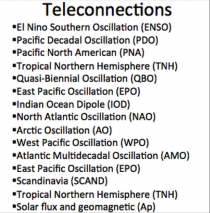
At Weatherbell, Joe Bastardi and I use data sets in our work to correlate with the many natural cycles as measured in teleconnections. We generally use the reanalysis data sets from NCEP and the climate division data from NOAA.
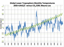
The most reliable data sets are likely the satellite sets because of very nearly global coverage and the lack of contamination from local heat sources. The average of the two satellite sets (RSS and UAH) shows a step change with the super El Nino and little change post 1998.
But the NOAA temperature land/ocean based data sets keep changing. Ryan reassures us the reanalysis data set, which is based on hourly observations is not adjusted. Climate division data though is a different story. So when we do a composite after June for a set of years, we will get a different result. There are three major surface data centers, NOAA in Asheville, NASA Goddard in New York City, and Hadley in the UK.
But we here I’ll focus on NOAA here. NOAA is the source of the base data that NASA and Hadley use before adding their own adjustments and additional data (NASA Antarctic and extrapolated arctic and Hadley their own ocean data).
The first USHCN 1221 station data set was released in 1990 with a UHI adjustment. It was generally regarded as the world’s best because of the long history for most stations and the stability of the network.
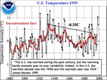
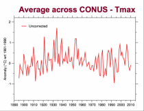
In the 1999 USHCN plot, it showed the 1930s was the warmest decade and 1934 the warmest year (1.1F warmer than the super El Nino of 1997/98). Hansen said so in this plot on the GISS web site of the NOAA data set. The trend peak to peak of the 5 year mean was down.
I praised NOAA NCDC for its efforts to get it right although a decade later we discovered siting in many cases increasingly did not meet standards thank to a move to ASOS with sensors near tarmac, changing technology requiring cabling of the sensors to the weather office often putting the sensors near buildings, driveways, parking lots, air conditioning exhausts or other heat sources. Numerous sites were placed at heat generating waste treatment plants. Even the GAO scolded NOAA for over 40% of their stations not meeting the minimum criteria NOAA itself had in the specifications. The UHI adjustment offset some of these biases.
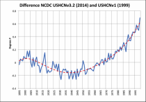
Most of the original correlation studies I did used this data set. But the inconsistency of warming relative to the global data set (GHCN), which showed much more warming late century put political pressure on NCDC to make the two data sets more consistent. Instead of trying to find the metadata to add UHI adjustments to the GHCN, the changes were made to the US adjustments.
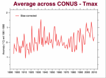
They removed the UHI adjustment, replacing it with algorithms to find previously undocumented inhomogeneities (station moves), and a change to the time of observation adjustment and a new final step with homogenization (blending of data stations). 2 versions later the data set shows the changes made to the annual values in degrees F. The warming increased 0.8F from 1930 to 1990 simply due to adjustments. There was with the adjustments, cooling of the 1920s to 1950s and warming post the 1960s.
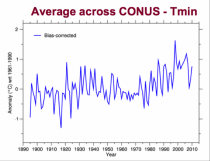
UHI mainly affects minimum temperatures. Maximum temperatures are a better indicator of the true trends. Even bias corrected maxima shows the recent peak no higher than the 1930s.
The minima (and in the end the mean) clearly shows the recent warmth which is consistent with UHI.
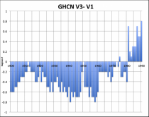
The global set meanwhile has undergone changes too since V1. V3 and V1 are plotted here. The reasons include changing station sets and application of the same kinds of adjustments.
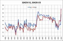
The difference is even more remarkable than the US (1.2F or so). In other words most of the apparent warming in the data set since the late 1800s is in the adjustments. This is the CHANGE made to the global mean temperature NOT the global mean temperature.
The Latest Change - US state data.
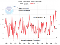
Locally we used the NCDC USHCN Climate at a Glance in talks. I gave one such invited talk in Maine to a local group a few years ago.
Here was the Maine plot of annual temperatures the last time I downloaded it. It showed no trend since 1895. The warmest year was 1913 with a bookend spike a century later in 2010. Both followed high latitude volcanism, in 1913 following 1912 Novarupta in Alaska and 2010 following series of eruptions in Alaska and Iceland. These high latitude volcanoes produce more high latitude blocking (Oman 2004). This is especially true with very low solar geomagnetic years. These blocks mean a maritime flow into southeast Canada and Maine making the winters and springs less snowy and cold.
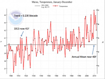
This spring, NCDC announced a new version of the US data set replacing the USHCN used at Climate at a Glance with a new GHCN based Climate DIvision alternative. Maine suddenly has a 0.23/decade warming trend and 1913 was 5F colder and not even close to 2010.
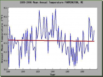
We can still access in places the original raw data. The raw rural data for Farmington Maine, near one of the big ski areas is very instructive and shows a nice sine wave in sync with the 60-70 year PDO/AMO cycles and more like USHCN v1 and TMAX. The station was discontinued after 2006. I’ll let you speculate why.
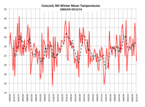
Concord, NH is an urban area, but the airport is a well-known cold spot compared to Manchester, which is often the warmest station in the state. The sensors must be well placed.
I had to do a winter plot of Concord temperatures since 1868/69 and found little change over the entire period of record - again this is raw archived data downloaded from the PWM web site.
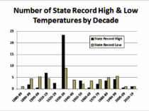
The record highs and lows are also not adjusted and look more like USHCN v1 with 23 record highs in the 1930s and 38 before 1960 and more record cold than highs since the 1940s.
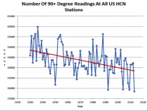
The number of 90F temperatures at all USHCN station (raw, unadjusted) shows a similar downtrend.
Keep these in mind when you hear NOAA give a ranking of a month or year or hear the speeches why POTUS through the EPA is taking strong action.