

Joseph D’Aleo, CCM
By Joseph D’Aleo
The most significant uncertainties that must be dealt with to properly analyze temperature trends are detailed below. We touch on alarmist claims that are seen in greater detail in the sections of this document summarized in the January 21st blog post under Joe’s Blog.
-------------------
NOAA and NASA can be counted on virtually every month or year’s end to religiously and confidently proclaim that the latest global average surface temperature (GAST) is among the warmest on record. Back in the 1970s when an assessment of a global temperature was first attempted, the scientists recognized that even land-only surface temperature data was a significant challenge given that most of the reliable data was limited to populated areas of the U.S, Europe and eastern China with just spotty often intermittent data from vast land areas elsewhere.
Temperatures over oceans, which covered 71% of the globe, were measured along shipping routes mainly in the Northern Hemisphere erratically and with varying measurement methods. Despite these shortcomings and the fact that absolutely no credible grid level temperature data existed over the period from 1880 to 2000 in the Southern Hemisphere’s oceans (covering 80.9% of the Southern Hemisphere), global average surface temperature data estimation and publication by NOAA and NASA began in the early 1990s.
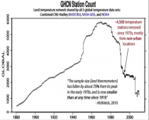
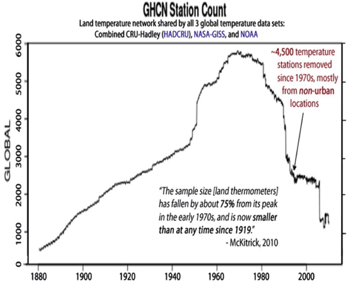
In this era of ever-improving technology and data systems, one would assume that measurements would be constantly improving. This is not the case with the global observing network. The world’s surface observing network had reached its golden era in the 1960s to 1980s, with more than 6,000 stations providing valuable climate information.
DATA DROPOUT
The number of weather stations providing data to GHCN plunged in 1990 and again in 2005 (as stations in the oversampled lower 48 states were thinned out). The sample size has fallen by over 75% from its peak in the early 1970s, and is now smaller than at any time since 1919. The collapse in sample size has increased the relative fraction of data coming from airports to 49 percent (up from about 30 percent in the 1970s). It has also reduced the average latitude of source data and removed relatively more high-altitude monitoring sites (McKitrick 2010).
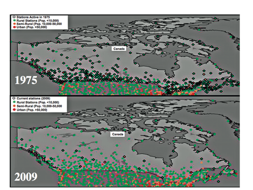
We could show many regional or country examples but here is one, Canada. NOAA GHCN used only 35 of the 600 Canadian stations in 2009. Verity Jones plotted the stations from the full network rural, semi-rural and urban for Canada and the northern United States both in 1975 and again in 2009. She also marked with diamonds the stations used in the given year. Notice the good coverage in 1975 and very poor, virtually all in the south in 2009. Notice the lack of station coverage in the higher latitude Canadian region and arctic in 2009.
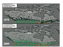
Enlarged
Canadian stations used in annual analyses in 1975 and 2009 (source: Verity Jones from GHCN).
Just one thermometer remains in the database for Canada for everything north of the 65th parallel. That station is Eureka, which has been described as “The Garden Spot of the Arctic” thanks to the flora and fauna abundant around the Eureka area, more so than anywhere else in the High Arctic. Winters are frigid but summers are slightly warmer than at other places in the Canadian Arctic.
Environment Canada reported in the National Post, that there are 1,400 stations in Canada with 100 north of the Arctic Circle, where GHCN includes just one.
MISSING MONTHLY DATA
After the 1980s, the network suffered not only from a loss of stations but an increase in missing monthly data. To fill in these large holes, data were extrapolated from greater distances away.
Forty percent of GHCN v2 stations have at least one missing month, It reached 90% in Africa and South America.
_thumb.png)
Analysis and graph: Verity Jones Enlarged
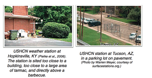
BAD SITING
According to the World Meteorological Organization’s own criteria, followed by the NOAA’s National Weather Service, temperature sensors should be located on the instrument tower at 1.5 m (5 feet) above the surface of the ground. The tower should be on flat, horizontal ground surrounded by a clear surface, over grass or low vegetation kept less than 4 inches high. The tower should be at least 100 m (110 yards) from tall trees, or artificial heating or reflecting surfaces, such as buildings, concrete surfaces, and parking lots.
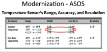
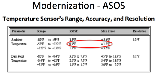
Very few stations meet these criteria. The modernization of weather stations in the United States replaced many human observers with instruments that initially had warm biases (HO-83) and later cold biases (MMTS) or were designed for aviation and were not suitable for precise climate trend detection [Automates Surface Observing Systems (ASOS) and the Automated Weather Observing System (AWOS). Note the specifications required a RMSE of 0.8F and max error of 1.9F. ASOS was designed to supply key information for aviation such as ceiling visibility, wind, indications of thunder and icing. They were not designed for assessing climate.
Also, the new instrumentation was increasingly installed on unsuitable sites that did not meet the WMO’s criteria. During recent decades there has been a migration away from old instruments read by trained observers. These instruments were generally in shelters that were properly located over grassy surfaces and away from obstacles to ventilation and heat sources.
Today we have many more automated sensors (The MMTS) located on poles cabled to the electronic display in the observer’s home or office or at airports near the runway where the primary mission is aviation safety.
The installers of the MMTS instruments were often equipped with nothing more than a shovel. They were on a tight schedule and with little budget. They often encountered paved driveways or roads between the old sites and the buildings. They were in many cases forced to settle for installing the instruments close to the buildings, violating the government specifications in this or other ways.
Pielke and Davey (2005) found a majority of stations, including climate stations in eastern Colorado, did not meet WMO requirements for proper siting. They extensively documented poor siting and land-use change issues in numerous peer-reviewed papers, many summarized in the landmark paper “Unresolved issues with the assessment of multi-decadal global land surface temperature trends (2007).
In a volunteer survey project, Anthony Watts and his more than 650 volunteers at www.surfacestations.org found that over 900 of the first 1,067 stations surveyed in the 1,221 station U.S. climate network did not come close to the Climate Reference Network (CRN) criteria. 90% were sited in ways that result in errors exceeding 1C according to the CRN handbook.
Only about 3% met the ideal specification for siting. They found stations located next to the exhaust fans of air conditioning units, surrounded by asphalt parking lots and roads, on blistering-hot rooftops, and near sidewalks and buildings that absorb and radiate heat. They found 68 stations located at wastewater treatment plants, where the process of waste digestion causes temperatures to be higher than in surrounding areas. In fact, they found that 90% of the stations fail to meet the National Weather Service’s own siting requirements that stations must be 30 m (about 100 feet) or more away from an artificial heating or reflecting source.
The average warm bias for inappropriately-sited stations exceeded 1C using the National Weather Service’s own criteria, with which the vast majority of stations did not comply.

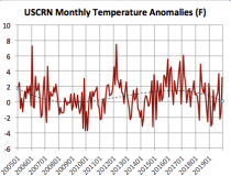
In 2008, Joe D’Aleo asked NOAA’s Tom Karl about the problems with siting and about the plans for a higher quality Climate Reference Network (CRN at that time called NERON). Karl said he had presented a case for a more complete CRN network to NOAA but NOAA said it was unnecessary because they had invested in the more accurate satellite monitoring. The Climate Reference Network was capped at 114 stations and did not provide meaningful trend assessment for about 10 years. Here is the latest monthly time series - now 15 years.
BTW, in monthly press releases no satellite measurements are ever mentioned, although NOAA claimed that was the future of observations.
URBANIZATION/LAND USE CHANGES
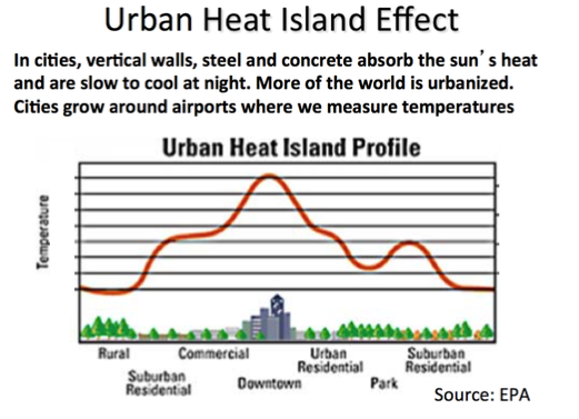
The biggest issue though to accurate measurement is urbanization. Bad siting usually enhances the warming effect. Weather data from cities as collected by meteorological stations are indisputably contaminated by urban heat-island bias and land-use changes. This contamination has to be removed or adjusted for in order to accurately identify true background climatic changes or trends.
In cities, vertical walls, steel and concrete absorb the sun’s heat and are slow to cool at night. In surrounding suburban areas (often where airports are located), commercialization and increased population densities increase the temperatures at night relative to the surrounding rural areas. More and more of the world is urbanized (population increased from 1.5 B in 1900 to over 7.1 billion today.
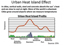
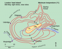
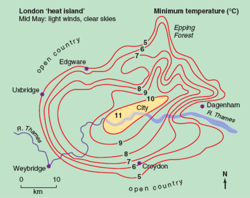
The EPA depicts the typical temperature distribution from city center to rural, similar to the observed minimum temperature analysis surrounding London in mid May (about a 10F difference is shown).
Oke (1973) found a village with a population of 10 has a warm bias of 0.73C, a village with 100 has a warm bias of 1.46 C, a town with a population of 1000 people has a warm bias of 2.2 C, and a large city with a million people has a warm bias of 4.4C.
Zhou et al (2005) have shown global data bases (for China) not properly adjusted for urbanization. Block (2004) showed the same problem exists in central Europe. Hinkel et al (2003) showed even the village of Barrow, Alaska with a population of 4600 has shown a warming of 3.4F in winter over surrounding rural areas, These are but a handful of the dozens of studies documenting the UHI contamination.
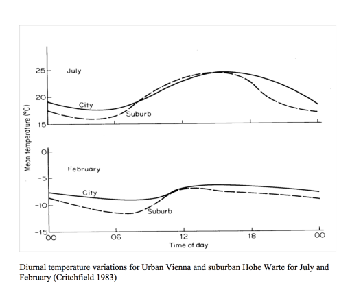
Most confirm the warming is predominantly at night. During the day when the atmosphere is well mixed, the urban and rural areas are much the same. This analysis by in Critchfield (1983) for urban Vienna and suburban Hohe Warte shows the temperature traces for February and July.

Tom Karl whose paper in 1988 defined the UHI adjustment for the first version of USHCN (which was removed in version 2) wrote with Kukla and Gavin in a 1986 paper on Urban Warming:
“MeteoSecular trends of surface air temperature computed predominantly from urban station data are likely to have a serious warm bias… The average difference between trends (urban siting vs. rural) amounts to an annual warming rate of 0.34C/decade… The reason why the warming rate is considerably higher [may be] that the rate may have increased after the 1950s, commensurate with the large recent growth in and around airports.... Our results and those of others show that the urban growth inhomogeneity is serious and must be taken into account when assessing the reliability of temperature records.”
Inexplicably, the UHI adjustment Karl argued for was removed in USHCNv2.
This concerned some
_thumb.png)
Doug Hoyt, once chief scientist at Raytheon wrote: “It is not out of the realm of possibility that most of the twentieth century warming was urban heat islands.’
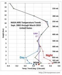
It continues to show up in the data. The nighttime temperatures the last 17 years (NASA AIRS) have warmed in the United States while daytime changes, the best measure of any warming have been very small.
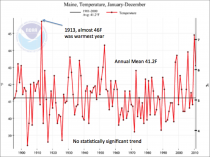
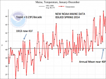
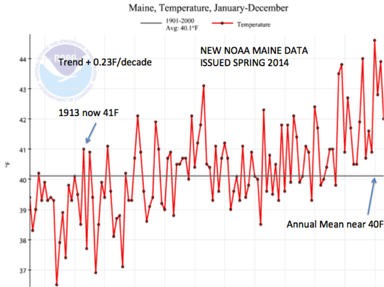
As an example of before and after, the average annual temperatures for the state of Maine downloaded in 2010 before the change (-0.01F/decade) and after the change in 2012 (+0.23F/decade) says it all. We could provide literally hundreds of other examples. Bloggers in many other countries have shown startling examples of fraud.
ADJUSTMENTS MADE
INFILLING
This is needed when a station is missing data for a month or months. It is accomplished using anomalies. For areas where there are adequate close-by surrounding stations, the assumptions that despite the local temperature differences, most sites will have a similar anomaly (departure from normal) is a reasonable one. But for infilling they can go as far as 1200 km (750miles) away to find data. At longer ranges this become problematic. Take for example northern Canada or the arctic where they must extrapolate over vast distances.
HOMOGENIZATION
This adjustment that blends data for all stations was designed to detect previously undisclosed inhomogeneities (station moves or siting changes) and adjust for urbanization. It may help detect siting discontinuities but is not an adequate substitute for UHI adjustment. The rural stations if properly sited and the Climate Reference network of stations should be reference to adjust the urban stations.
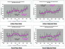
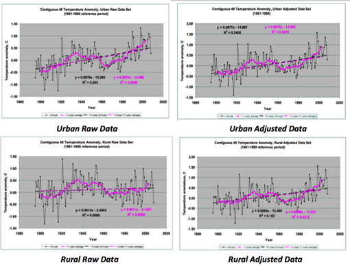
Instead through homogenization the rural areas are contaminated by urban stations, Dr. Edward Long from NASA examined a set of rural and urban stations in the lower 48 states both raw and adjusted. After adjustment, the rural warming rates increased 5 fold while urban warming rates were only slightly reduced. This augmented not eliminated UHI contamination.
OCEAN DATA
The other data set that presents a challenge for a precise assessment of global average surface temperature (GAST) is world’s oceans, which cover 71% of the globe.

Major questions persist about how much and when to adjust for changing coverage and measurement techniques from buckets to ship intake, to moored and drifting buoys, satellite skin temperature measurements and now ARGO diving buoys.
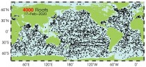
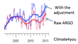
ARGO network of 3341 diving buoys and floats introduced in 2003 (now 4000) were designed to improve the assessment going forward.
But despite the fact this technology was designed specifically for the purpose, the early ARGO buoys, disappointed by showing no confirmation of an upward trend. So the data from the buoys was “adjusted.” John Bates, data quality officer with NOAA admitted “They had good data from buoys...and “corrected” it by using the bad data from ships. You never change good data to agree with bad, but that’s what they did - so as to make it look as if the sea was warmer.”


.png)
That was just the latest example of data manipulation. Initially, this global data had a cyclical pattern similar to previously reported Northern Hemisphere data (high in the 1930s and 40s, low in the 70s). Then, as time progressed, the previous officially reported GAST data history was modified, removing the cycle and creating a more and more strongly upward sloping linear trend in each freshly reported historical data set. Peer reviewed, published and readily reproducible research has shown that: “The conclusive findings were that the three GAST data sets are not a valid representation of reality.”
In fact, the magnitude of their historical data adjustments, which removed their cyclical temperature patterns are completely inconsistent with published and credible U.S. and other temperature data. Thus, despite current assertions of record-setting warming, it is impossible to conclude from the NOAA and NASA data sets that recent years have been the “warmest ever.”
See detailed Research Report here.
All our efforts are volunteer (pro-bono). Help us with a donation if you can (left column).