Sep 19, 2014
Climate Hype Exposed
by CFACT
September 18, 2014

Click for full report
CFACT releases a new report on the eve of the New York UN climate summit.
The report is authored by Paul Driessen with contributions from Marc Morano.
Executive Summary
Launched in 1988 at the urging of activists opposed to hydrocarbon energy, economic growth, and modern living standards, the Intergovernmental Panel on Climate Change (IPCC) was originally charged with assessing possible human influences on global warming and potential risks of human-induced warming. Over the subsequent decades, however, the IPCC increasingly minimized non-human factors, to the extent that it now claims only human influences matter - and any climate changes would “threaten our planet.”
The climate change scientist-government-industrialist complex has grown increasingly wealthy and powerful. It now spends billions of dollars annually on climate and weather research, focusing almost exclusively on carbon dioxide and other “greenhouse” gases, and many billions more on renewable energy research and subsidies that raise energy prices, cost jobs, and reduce living standards.
Indeed, laws and regulations implemented in the name of preventing climate change have increased the cost of virtually everything people make, grow, ship, drive, eat, and do. They affect our lives, liberties, livelihoods, living standards, health, and welfare. Expert analysts calculate that climate-related rules will cost U.S. families and businesses almost $51 billion and 224,000 U.S. jobs every year through 2030 on top of the $1.9 trillion in regulatory costs that Americans already pay every year.
With so much at stake, it is essential that climate research is honest, accurate and credible, and that the resultant energy and climate policies are based on sound, replicable science. Instead, the studies and reports are consistently defective and even deceitful. They incorporate every study financed by this multi-billion-dollar system that supports the “dangerous manmade climate change” thesis - no matter how far-fetched and indefensible their claims might be - and ignore all contrary studies and experts. They rely on faulty, manipulated data, secretive working sessions that revise the “science” to reflect political “summaries,” and computer models that completely fail to predict actual real-world climate trends.
Because average global temperatures have not risen for 18 years (and have even cooled slightly), even the terminology has shifted: from global warming to climate change, climate disruption, and extreme weather.
Relying on the IPCC work, the $2.5-billlion-a-year U.S. Global Change Research Program (GCRP) issued a 2014 National Climate Assessment (NCA) that claimed climate change “is already affecting” the lives of Americans in a “multitude of ways.” President Obama said its effects “are already being felt in every corner of the United States.” The U.S. Environmental Protection Agency (EPA) and other federal agencies use IPCC studies to justify costly vehicle mileage standards, delays and bans on oil and gas drilling and pipelines, and rules that are closing hundreds of coal-fired power plants and preventing new ones from being built.
As ClimateDepot.com director Marc Morano explains, the IPCC is “a political body masquerading as a science body.” It makes its pseudo-science fit its political agenda. The GCRP and the EPA do likewise. Their actions violate information quality laws and basic standards of sound science and peer review - to drive an anti-growth, anti-fossil fuel agenda. They exaggerate every conceivable cost associated with hydrocarbons, but completely ignore even the most obvious and enormous benefits of using fossil fuels.
Now the White House wants to commit the United States to a new international “agreement” on climate change, energy use, economic growth, and wealth redistribution - without presenting it to Congress, in violation of constitutional requirements that any treaty receive the “advice and consent” of the Senate.
Every American concerned about our nation’s future should read this report, to understand what is happening and what is at stake. They should resist these actions by unelected, unaccountable regulators, challenge them in courts and legislatures, and demand that every study, report, and proposed rule be presented for review by citizens, legislators, and independent experts outside the closed circles of the climate change scientist-government-industrialist complex. If the climate alarmists are truly confident in their claims and have nothing to hide, they should be happy to participate in this honest, common sense approach.
See more here.
Sep 16, 2014
A NEW PROFESSIONAL SOCIETY FOR METEOROLOGY AND CLIMATOLOGY
Contact Anthony Watts Telephone 530-342-7291
Email contact@theoas.org Website http://theoas.org

FOR IMMEDIATE RELEASE September 16, 2014
A NEW PROFESSIONAL SOCIETY FOR METEOROLOGY AND CLIMATOLOGY
The Open Atmospheric Society takes a new approach to atmospheric science, becoming the first society of its kind to be a cloud-based online organization.
September 16, 2014: The Open Atmospheric Society, known as “The OAS” for short announces its formation, and readiness to accept charter members. The purpose of The OAS is to provide a paperless and entirely online professional organization that will represent individuals who have been unrepresented by existing professional organizations that have become more activist than science based in their outlook. It also aims to provide a professional peer reviewed publication platform to produce an online journal with a unique and important requirement placed up-front for any paper submitted; it must be replicable, with all data, software, formulas, and methods submitted with the paper. Without those elements, the paper will be rejected. This focus on replicability up front is not found in other similar organizations that publish scientific results.
John Coleman, Founder of The Weather Channel had this to say
It is very gratifying to hear of the formation of The Open Atmospheric Society. A new Meteorological organization and scientific publication have been greatly needed for more than a decade. It is unfortunate that the American Meteorological Society has become totally politicized and conducts itself in total violation of the basic scientific principal of open debate; encouraging competing points of view to be presented and published.
allowed my Professional Membership in the AMS expire many years ago after being an active member, attending National Conferences and reading The Bulletin of the AMS for many years. Several events occurred that made it clear to me that the society was in the control of people who were using it to complete their personal agendas and the Society would was becoming closed and dogmatic. I look forward to membership in the OAS
Joseph D’Aleo AMS Fellow, and Certified Consulting Meteorologist adds:
The AMS, AGU and other professional society editors have slow-walked and thrown up obstacles to papers that challenge the “consensus” position, usually forcing authors to go elsewhere to publish their work. They have fast tracked other papers when issues arose that threatened that position. The AMS had policy advocacy as one of the top organizational goals. A professional scientific society should only advocate for good science and leave the policymaking to those elected to determine the policies based on the very best science.
The OAS, whose motto: verum in luce means “truth in the light”, offers not only a place for a free exchange of ideas, but a unique Internet cloud-based journal publishing platform providing emphasis on open review and reproducibility requirements up-front. Here are a few points of interest:
Open membership - Associate members, anyone who has an interest in atmospheric science, can join at a basic rate, providing interdisciplinary membership. Professional full voting members, will require a degree in atmospheric sciences or related earth disciplines, or three published papers in these subjects. Student members get a reduced rate, similar to associate members with option to full member elevation.
Open journal - The Journal of the OAS will be free to read by the public. Open science - a transparent online peer review process
No other journal asks this upfront: strict OAS Journal submission requirements - technical submissions to the Journal by members must include all source data, software/code, procedures, and documentation to ensure reproducibility of the paper’s experiment or analysis by external reviewers.
Author account - each author and co-author will have accounts for collaboration, submitting papers, making edits, and responding to reviewers.
Emphasis on reasonable publication turnaround, 3 months or less.
DOI’s will be assigned and provided with each publication.
The OAS will offer press releases and web video assistance for authors to explain papers clearly and effectively to the general public. It will also occasionally offer statements and positions regarding atmospheric science as it relates to current news.
Organizational activity will be conducted entirely online - This means no costly brick and mortar infrastructure, no costly postal mailings journals, and no need for warehousing paper files and publications.
The formation of The OAS represents a new way of conducting the scientific method, and welcomes those who feel their professional interests are not being served with the current collection of professional societies who focus on meteorology and climatology. The upcoming Journal of the Open Atmospheric Society has been assigned an official ISSN publication number by the Library of Congress (ISSN 2373-5953) and is registered with CrossRef, the world’s leading scientific publication identifier providing Digital Object Identifiers (DOI) for publications.
If you would like more information about this new society, please email us at contact@theoas.org or visit online at http://theoas.org to learn more or to become a member.
Sep 01, 2014
Why Arctic Ice Extent Is Up Over 60% In The Last Two Years
by stevengoddard
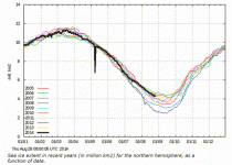
The Danish Meteorological Institute shows a 63% increase in Arctic sea ice extent since the same date in 2012, and an increase of 76% since the 2012 summer minimum. Current extent is 4.4 million sq km, up from 2.7 million sq km on August 28, 2012.

Enlarged
Sea ice extent in recent years (in million km2) for the northern hemisphere, as a function of date.
COI | Centre for Ocean and Ice | Danmarks Meteorologiske Institut
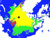
My methodology is similar numerically to DMI’s, I used maps from the Japan Aerospace Exploration Agency to generate the map below. Green shows ice gain since the same date in 2012, and red shows ice loss. My calculation shows a 64% increase in ice, almost identical to the calculations from DMI.

Enlarged
A favorite comment from alarmists is “the increase in ice extent is meaningless, because the ice is getting thinner”
They have it exactly backwards. The reason why ice extent is up, is because the ice is thicker. The animation below, based on maps from NSIDC, shows the movement of older, thicker ice into the western Arctic over the past two years. The color scale represents the age of the ice, i.e. five year old ice is red. You can see how older, thicker ice is moving towards Alaska, and accumulating. The amount of five year old ice has more than doubled over the past two years.

Animating ice 2012-2014
Starting in 1988, winter winds began pushing older, thicker ice out into the North Atlantic. This went on until a few years ago, and caused the lower summer minimums seen over the past 15 years. Younger, thinner ice melts out more easily in the summer.
But since 2011, the winter winds have reversed. Ice is now getting pushed away from the Atlantic side, and is accumulating on the Pacific side - where it is preserved. If this wind pattern continues for a few more years, summer ice extent will soon return to the levels seen in the 1980’s.
A few years ago, experts claimed that all of the older thicker ice had disappeared. As usual, they had absolutely no clue what they were talking about.
(Reuters) The multiyear ice covering the Arctic Ocean has effectively vanished, a startling development that will make it easier to open up polar shipping routes, an Arctic expert said on Thursday.
Vast sheets of impenetrable multiyear ice, which can reach up to 80 meters (260 feet) thick, have for centuries blocked the path of ships seeking a quick short cut through the fabled Northwest Passage from the Atlantic to the Pacific. They also ruled out the idea of sailing across the top of the world.
But David Barber, Canada’s Research Chair in Arctic System Science at the University of Manitoba, said the ice was melting at an extraordinarily fast rate.
“We are almost out of multiyear sea ice in the northern hemisphere,” he said in a presentation in Parliament. The little that remains is jammed up against Canada’s Arctic archipelago, far from potential shipping routes.
Scientists link higher Arctic temperatures and melting sea ice to the greenhouse gas emissions blamed for global warming.
Multiyear Arctic ice is effectively gone: expert | Reuters
The ice loss was caused by winter winds pushing the thicker ice out into the North Atlantic. Unless “scientists” can link “greenhouse gas emissions” to the direction of Arctic winter winds, they probably shouldn’t lie about the state of their knowledge
Aug 26, 2014
Big Wind’s latest deceitful ad campaign
Mary Kay Barton
If you watch much mainstream TV, you’ve probably seen Siemens’ new multi-million-dollar advertising blitz to sell the American public on industrial wind. Why the sudden ad onslaught? Watch the video below.
The wind business abroad has taken a huge hit of late. European countries have begun slashing renewable mandates, due to the ever-broadening realization that renewables cost far more than industrial wind proponents have led people to believe: economically, environmentally, technically, and civilly.
Siemens’ energy business took a 48m Euro hit in the second quarter due to a bearings issue with onshore turbines, and a 23m charge due to ongoing offshore grid issues in Germany - on top of subsidy and feed-in tariff cutbacks, recent articles have pointed out.
As Siemens’ tax-sheltering market dries up in Europe, its U.S. marketing efforts are clearly geared toward increasing its income and profits via wind’s tax sheltering schemes in the United States. The company stands to make millions, so Siemens ad campaign is obviously part of an overall pitch to persuade Congress to extend the hefty wind Production Tax Credit (PTC), more accurately called “Pork-To-Cronies.” As Warren Buffett recently admitted, “We get tax credits if we build lots of wind farms. That’s the only reason to build them. They don’t make sense without the tax credit.”
Taxpayers and ratepayers, beware!
President Obama often says he intends to “close corporate loopholes,” but his PTC and other policies continue funneling billions of taxpayer dollars to his wealthy corporate insiders and campaign contributors - while we continue to rack up unconscionable debt for our children and grandchildren.
Increasing public awareness of the wind energy scam has led to increased opposition to extending any more corporate welfare to Big Wind via the PTC and energy investment tax credit (ITC). Enter another bureaucratic end-run around once clear statutory language by this Administration.
As reported by the Wall Street Journal, the increasingly politicized IRS recently relaxed the definition of “commence construction” to the point where the definition bears no resemblance to the actual words. During a hearing by the House Energy Policy, Health Care and Entitlements subcommittee last October, Curtis G. Wilson of the IRS admitted that developers can now game the system to the point where projects built years in the future could still meet the eligibility requirement for “commence” now.
U.S. taxpayers and ratepayers are doomed when, instead of allowing the markets to work, crony-corruptocrats are picking the winners and losers in the energy marketplace, using such nefarious tactics.
Sadly, most people don’t even know the difference between energy and power. This reality has built the framework for the biggest swindle ever perpetrated on citizens worldwide. Many have bought into the alarmist argument that “we have to do something” to stop “dangerous manmade global warming.” Enter the wind industry sales department, primed to capitalize on public fears and alarmist hype.
Siemens also needs to convince the 80% of U.S. citizens who live in suburbia that industrial wind factories are “environment-friendly,” and everyone loves them. Thus, as usual for these disingenuous ad campaigns, a sprawling wind facility is pictured among green fields, with no homes anywhere to be seen, no birds are being slaughtered, while a happy Iowa leaseholder smiles and says she loves wind.
A drive out Route 20A in Wyoming County, western New York State, however, tells a far different story. The western side of Wyoming County - which used to be some of the most beautiful countryside in New York State, has been industrialized with 308 giant, 430-foot-tall towers, and their 11-ton, bird-chopping blades spinning overhead, only hundreds of feet from peoples’ homes and roadways. There’s no doubt that Siemens won’t be showing you this reality in any of their TV ads!
Unfortunately for the residents of Orangeville in Wyoming County, greed at the top in Washington, DC determined their fate. The sole reason Invenergy went ahead with its plan to build its 58-turbine project was that, in the early morning hours of January 1, 2013, the PTC was added as pork for companies sucking at the wind welfare teat.
Ever appreciative of the handouts, Invenergy owner Ukrainian Michael Polsky rewarded President Obama by holding a $35,000 a plate fundraiser at his Chicago mansion. Mr. Obama is so committed to Big Wind that he’s even legalized 30-year eagle kill permits just for the wind industry. Anyone else harming an eagle, or even possessing a single bald eagle feather, is penalized with an iron fist.
There you have it corporate cronyism in all its glory, with bird murder as its crowning achievement.
Word of impending lawsuits lingers in Orangeville. It remains to be seen if disenchanted leaseholders will end up suing Big Wind, as others have. In the meantime, we’re hoping we don’t have any 11-ton blade breaks that throw shrapnel for thousands of feet, or any airplanes crashing into wind turbines during fog, as occurred in South Dakota earlier this year, killing all four on board. (I’ll bet you won’t be seeing any of these facts in Siemens’ ads, either.)
Our elected officials need energy literacy. Even a small dose would help.
What’s most frustrating, when attempting any kind of correspondence regarding these energy issues with many elected officials, is the kind of response I received from Senator Chuck Schumer (D-NY) when I wrote him a letter about ending the Wind PTC. Senator Schumer never even mentioned the PTC in his response. Instead, he rambled on about the need to “reduce foreign oil imports,” and increase “efficiency” - neither of which has a thing to do with wind-generated electricity.
Mr. Schumer recently feigned alarm following complaints by citizens about soaring electric rates - demanding answers about it, while simultaneously supporting yet another Wind PTC extension (plus other rate-increasing “renewable” projects). Senator Schumer’s hypocrisy is outrageous, and unacceptable.
Perhaps it’s time for U.S. ratepayers and taxpayers to demand that their elected officials first pass an energy literacy exam, before they pass such cost-exorbitant, “green” boondoggles on to consumers.
Congress is on vacation through Labor Day, which makes this the perfect time to approach your senators and representatives while they’re home. Attend town hall meetings and in-district fundraisers. Remind your representatives that we put them in office, and that we can also vote them out!
Since energy plays a pivotal role in our national economy - impacting the cost of absolutely everything else - candidates should have “energy” listed on their “issues” webpage.
Good candidates will support an “All of the Sensible” energy policy, as opposed to the “All of the Above” energy policy which President Obama has been pushing on behalf of the “green” movement. “Sensible” alternative energy options are those that are backed up by scientific and economic proof that they provide net societal benefits. Industrial wind fails this test miserably!
For more information, refer friends and elected officials to Robert Bryce’s excellent book, Power Hungry: The myths of “green” energy and the real fuels of the future.
Continue to call and write their offices, and encourage them to oppose any extension of the PTC and ITC! Write letters to your local newspapers, copy their district offices, and post information on their social media pages (e.g., Face Book & Twitter).
We must demand accountability from elected officials, or vote them out! Reliable, affordable energy is what has made America great. We need to keep it that way.
Aug 23, 2014
The Real Story
Joe D’Aleo, CCM
I had planned another topic but felt obliged to correct the misinformation in the letters by Mr. Atwood the last two weeks. He obviously spends a lot of time mining the web for information and knows more than the average person but as you know, you can find on the web, information that can support your ideas. He frequently mentions Wikipedia, which he says he trusts because it is ‘moderated’.
Wikipedia is a useful resource but should come with a disclaimer - user beware!
Many of us use Wikipedia to recall the name of an actor, a favorite movie, the name or year of a song, find out how old an actor or singer we like is. You need to be careful though about biographies, history, politics and science, because the material is open source and often not true or at least slanted.
In a story this April ”Wikipedia: where truth dies online” ,"Spiked on-line” warned that not all Wikipedia publishes can be trusted. “There are over 21 million editors with varying degrees of competence and honesty...Many teachers warn their students to exercise extreme caution when using it. (Note: some teachers forbid citing Wikipedia in a paper).”
Lawrence Solomon for CBSNEWS wrote how some issues like climate have the information controlled by editors or administrators who have a clear bias.
“Kim Dabelstein Petersen is a Wikipedia “editor” who seems to devote a large part of his life to editing reams and reams of Wikipedia pages to pump the assertions of global-warming alarmists and deprecate or make disappear the arguments of skeptics.
Holding the far more prestigious and powerful position of “administrator” is William Connolley...a software engineer and sometime climatologist (he used to hold a job in the British Antarctic Survey), as well as a serial (but so far unsuccessful) office seeker for England’s Green party.
And yet by virtue of his power at Wikipedia, Connolley, a ruthless enforcer of the doomsday consensus, may be the world’s most influential person in the global warming debate… William Connolley rode shotgun on just about any climate related article on that website.”
As of a year ago Mr. Connolley had edited 5,428 Wikipedia articles, almost all on climate and complaints about his zealotry ultimately earned him a suspension.
There are other sites like Skeptical Science that Mr. Atwood references, but they have the same bias (here and here).
Now to address the Bruce’s other claims with facts.
The grand maximum did not occur 50 years ago but over the period from 1950 to 1990 with multiple peaks around 1958, 1980, 1990. Ilya G. Usoskin of the Sodankyla Geophysical Observatory at the University of Oulu, Finland published in Living Reviews of Solar Physics a paper examining records from two isotope proxies (Be10 and C14) and found that solar activity at the end of the 20th century was at the highest levels of the past 1200 years.
The IPCC and warmists like to use the solar brightness (the visible part of the solar spectrum) which changes only 0.1 to 0.2% during the 11 year solar cycle to try and discount the solar climate connection, but they ignore other solar variables which greatly amplify the small change in the visible light like ultraviolet (which changes 6-8%), geomagnetic and the effect of the solar wind on cloud enhancing cosmic rays. You have to consider the total solar effect.
UK Professor Lockwood in 2013 found the measurement of the solar wind and record low magnetic fields during the long and record low minimum 2007 to 2009 provided some important clues for understanding the solar dynamo and explaining both the Dalton minimum near 1800 and the deeper Maunder Minimum (1640-1700). Lockwood, the Russian Pulkovo Observatory, NASA’s Hathaway and many, many other solar scientists predict a turn to much colder as we dive deeper into the upcoming next Grand Solar Minimum. The cooling winters after 1995 (2.26F for the last 20 years for the US) reflect the initial decline that began after the final 1990 peak (there is a lag of 5-8 years).
A 2014 paper by Chinese scientists (Zhao etal) reported the impact of carbon dioxide on climate change may have been overstated with the total solar activity giving a better explanation of changes in the Earth’s temperature. Indeed, the greenhouse models are all failing miserably. The IPCC admitted to low understanding of water vapor, clouds, solar and ocean cycles, all far more important than CO2, so that is no surprise.
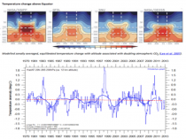
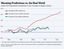
The greenhouse theory is falsified by the facts warming is not global, that the so called atmospheric tropical hot spot, the signature feature of the heat trapping theory was absent and that the greenhouse models have failed.

Enlarged

Enlarged
Yes at the surface, there was model predicted warming in higher latitudes, but that has been observed only in the Northern Hemisphere (and ended 17 years ago - see last link) and the arctic (which is also cyclical.
Satellites, weather balloons and ocean buoys have all shown there has been no warming in the tropics from the high atmosphere all the way down 300 meters int the tropical oceans.
Finally the health study Bruce mentioned was one the EPA found impossible to defend in congress. Health claims do not relate to CO2 but to soot, which is why they no longer talk CO2 but ‘carbon pollution’. With every breathe, we exhale 100 times the CO2 than the air contains so it obviously doesn’t cause premature deaths or children’s asthma.
Soot is a problem in China but no longer in the US. Small particulates have declined 50% the last 15 years here and are below the EPA standard.

Enlarged
Real data suggests they are not a health hazard. See this story debunking the role particulates had even when they were more prevalent. The famous pollution episodes in Donora, PA in 1948 occurred due to trapping of other chemical pollutants and in London in 1952 from sulfuric acid mist from burning of high sulfur coal in a pea-soup inversion fog.
I had lunch with Dr. John Dale Dunn, an emergency physician with experience in epidemiology at Fort Hood and saw his presentation at the recent ICCC9 Heartland Institute conference where over 600 real scientists from over 14 countries convened to report on the real truth about climate change.
John and I agreed the EPA health risk claims are totally bogus and what is ignored is the far more serious threat due from the cold where countries (like the UK) abandoned coal and fossil fuel to chase the environmental dream of unreliable wind and solar and where prices rose so much as to make energy unaffordable for those on fixed incomes and the poor. See the deadly results of cold homes. That is where we will be going, if we ‘buy insurance’ and allow the EPA to run amuck ‘just in case’.
|


