Oct 23, 2012
The Disaster Business: Scientists Denounce Dubious Climate Study by Insurer
By Axel Bojanowski, Spiegel On-line
Whether it’s hurricanes, thunderstorms or tornadoes, extreme weather is big business for insurers. Now German re-insurer Munich Re claims to have found proof that man-made climate change is causing more weather catastrophes in North America. Scientists are outraged.
Insurance companies have long been in the business of betting on the dangers of weather. And it has become commonplace for large insurance companies to mail out marketing flyers to potential customers warning of an increase in inclement weather. German global insurance giant Allianz is one of many companies that have created a market for policies that “reduce the risks associated with climate change.”
Meanwhile, Munich Re, the world’s largest re-insurer of insurance companies in the event of extreme damage payments, has also announced an important finding: Natural disasters over the past 30 years have already shown the initial “footprint” of man-made climate change in North America, the German company claims. Many media outlets promptly ran last week’s press release as news, stating that a prominent insurance company had warned of an increase in the number of natural disasters. But scientists have criticized the re-insurer for rushing to reach its conclusions.
The truth is that the United Nations Intergovernmental Panel on Climate Change (IPCC) has in fact been warning of an increase in heat waves, torrential rains and floods. But in most cases, it has not been proven that climate change has made the weather any more extreme. In some instances there are facts to suggest this, but in most these conclusions are driven by perceptions. It is not a foregone conclusion that things will necessarily get worse. According to an IPCC report, there may be fewer cold weather disasters and storms in the future in some places.
Most Disaster Premiums Come from the US
Although it is considered a fact that humans are warming the climate through emissions, when it comes to assessments about extreme weather, the experts at the UN climate council are reserved. They argue that it could take decades before the new climate is palpable. With all the natural fluctuations in the climate, it generally only becomes apparent in the later stages that the frequency of extreme conditions is increasing. By then, of course, it may also be too late to limit climate change.
The main problem is the rarity of extreme events—and a lack of data about them. That alone makes it difficult to assess the situation. Vast amounts of data are required in order to determine whether an increasing greenhouse gas effect has already changed the frequency of extreme weather in past decades.
But Munich Re appears to feel it is in the best position to provide such answers. The company, whose most important market is in the United States, claims to have the “world’s most comprehensive database on natural disasters.”
“Well over half of the natural disaster premiums come from the USA,” says Munich Re board member Peter Röder, who is responsible for the North American market.
‘A Strong Chain of Evidence’
Roder said the company is “highly exposed” in the US, particularly in the area of hurricane insurance. At a recent talk with journalists in Munich, Roder said the company is “very satisfied” with its premiums covering weather disasters in the United States. He said the company had already factored in expectations for more intense hurricanes.
And new data from Munich Re also seems to support this strategy. Since 1980, the property damage caused by weather disasters has quintupled, Munich Re has reported. “Nowhere in the world is the rising number of natural catastrophes more evident than in North America,” said Munich Re’s head of GeoRisk Research, Peter Hoppe, in a company video. “Previously, there had not been such a strong chain of evidence.”
‘No Such Claims’
But scientists claim there is a lack of evidence. “The press release suggests that a ‘footprint’ of climate change has been found in loss data,” said environmental researcher Roger Pielke Jr. of the University of Colorado in Boulder. “But the report has no such claims.”
Clifford Mass, a professor of atmospheric sciences at the University of Washington in Seattle, added: “Most of it makes no sense and is contradictory to observed trends.”
According to the Munich Re study, total damages from weather-related disasters in North America from 1980 to 2011 amounted to $1.6 trillion, of which $510 billion was covered by insurance. Around 30,000 people died. The most expensive disaster so far was Hurricane Katrina in New Orleans in 2005.
Hoppe believes that the warming of oceans has precipitated hurricanes. “The higher the (sea) surface temperatures are, the higher the risk of high-intensity hurricanes. We have seen globally, but also in the northern Atlantic Ocean, that these sea surface temperatures have increased significantly already due to global warming,” he added in the video. Of course, other forces can also hinder tropical cyclones, including wind shears and dust clouds.
The Mystery of Tropical Cyclones
In order to determine whether hurricanes have, in fact, grown more dangerous or whether there are merely more housing units that have been affected by them, researchers have to find a way to make the storms of past decades comparable to one another. They calculate the effect hurricanes would have had if the number of housing units had been as dense then as it is today.
One of these studies, completed by Pielke four years ago, came to a surprising conclusion. If the same number of housing units had been built at the time, then the most damaging single storm would have been the Great Miami hurricane of 1926 , followed by Katrina in 2005 and two hurricanes in Galveston, Texas, in 1900 and 1915. The report did not find any trend in increasing intensity in hurricanes.
Pielke and two other colleagues are also set to present similarly surprising findings in an upcoming study on tornadoes in the United States that will soon be published by the journal Environmental Hazards. An analysis of 56,457 tornadoes since 1950 has shown if the same number of housing units had existed over the past six decades, then the amount of damage caused by tornadoes actually would have gone down, according to Pielke.
Suspicious Press Release
In light of these contradictions, other statements in the Munich Re study also seem doubtful. Storms and heavy rain have increased in many parts of the inland US, the re-insurer writes, referring to a three-year-old study from Cornell University. But for an “initial climate change footprint,” this source is already far too old.
The development corresponds to expectations, the insurer says. Warm air holds more moisture, which can potentially be released by stronger storms, a phenomenon that the IPCC also predicts will bring more heavy rains.
Scientists say they can prove that a stronger greenhouse effect has created heavier rain in the United Kingdom, but what happens in any given region still depends on the local atmospheric conditions. Naturally, no climate insurance premium would be limited by such considerations though.
Pielke criticizes Munich Re for its approach. “If Munich Re believes it has found the footprint of human-caused climate change in disaster data, then they should prepare a scientific paper and send it to Science or Nature, where it would be a major finding,” he says. “Releasing such claims via promotional press release suggests otherwise.”
Atmospheric researcher Mass agrees. “Climate change is serious, but hyping and distorting past trends is not the responsible way to deal with it.”
Politicians Co-Opt Climate Change
So far, Pielke says, scientists have been unable to identify man-made climate change in catastrophe damage data. There also doesn’t seem to be a trend toward stronger heatwaves in the US, despite this summer’s drought. Indeed, the data shows that droughts in the US have become shorter and less frequent in the last decades.
The scientific journal Nature recently underlined the weather problem in an editorial. Given the technical difficulties, perhaps it doesn’t make sense to automatically lump these problems together with climate change, it says. “Especially in poor countries, the losses arising from extreme weather have often as much to do with poverty, poor health and government corruption as with a change in climate.”
Meanwhile, leading politicians repeatedly attempt to use natural disasters as evidence for man-made climate change. More intense weather extremes have become a “new reality,” European Commissioner for Climate Action Connie Hedegaard said in September. Climate change is the “new normal,” she added.
These kind of statements are likely to be welcomed by insurers, but not by scientists or the general public. A statement once made by the recently deceased Austrian climate researcher Reinhard Böhm seems appropriate: “One shouldn’t allow short-term gimmicks that enjoy a certain acceptance to bury the credibility of science.”
Oct 21, 2012
Ice and snow come roaring back
First from Anthony Watts, WUWT
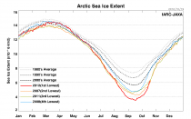
After all of the news about a minimum record ice extent last month, this is interesting. As we know when water loses its ice cover, it allows a lot of heat to radiate into space as LWIR. many predictied that as a result of the extra open ocean surface, we see a very fast refreeze in the Arctic. It appears they were right. In fact, this is the fastest monthly scale refreeze rate in the NSIDC satellite record going back to 1979.
Here’s JAXA data plotted to show what has happened:

Enlarged
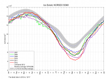
From the blog sunshine hours, here’s an analysis using NSIDC data:


===================
Today is day 291 in the Arctic. The minimum in 2012 was on day 260 or 31 days ago.
If you calculate the percentage of ice gained (the refreeze) 31 days after minimum, then 2012 is the fastest refreeze ever!
Arctic Sea Ice Extent has increased by 43.8% since the minimum was reached.
Extents are in millions of sq km.
(And note I am using NSIDC data here and their algorithm is making the refreeze appear slow compared to NORSEX)

Enlarged
Nansen Environmental and Remote Sensing Center (NERSC) – Arctic Regional Ocean Observing System (ROOS). Nansen data (CSV file with both extent and area) can be downloaded here.
-------------------
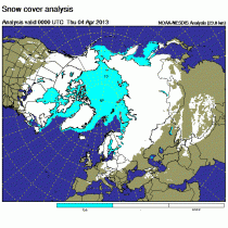
Here is the latest Northern Hemisphere snowcover.

Enlarged
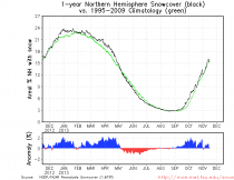
Here is the annual plot of daily hemipsheric snowcover anomalies the last year from Ryan Maue’s former FSU colleague Dr Bob Hart. Even with the lower 48 states barren of snow last winter, the hemiphere had again been above the normal.

Enlarged
We have popped again above the normal even with less arctic ice than normal. It is likely to really pop by week 2 when the cold blasts occur in North America and Eurasia.
Extensive snowcover makes a BIG difference in winter cold air mass production.
Oct 15, 2012
Reminder: Spain’s Green Disaster a Lesson for America
Dale Hurd, CBN News
BARCELONA, Spain—It was just last year that President Obama was touring Solyndra headquarters and telling us green technology was the future:
“The future is here. We are poised to transform the ways we power our homes and our cars and our businesses,” Obama said.
The president said America had better get on board or else fall behind the rest of the world in the growth of renewable or “green” technology.
Spain’s Colossal Failure
One the nations he held up as an example for America’s green technology effort was Spain.
However, President Obama may like Spain’s green technology program, but the Spanish—not so much. One study has declared it a colossal failure.
The Spanish recently threw out their socialist government over their terrible economy and a 22 percent unemployment rate.
Green technology was supposed to be Spain’s path to more jobs and a cleaner more prosperous future. It wasn’t.
“Politicians told us some years ago that they found a new way of investing or doing public investing in a new sector, in the renewable energies, that would create a sort of new economy with new jobs, green jobs, so called green jobs,” Dr. Gabriel Calzada Álvarez, with King Juan Carlos University in Madrid, said.
But what the Spanish got was a big helping of a Solyndra style business debacle: a lot of taxpayer money down the drain and jobs that cost a fortune to create.
A Job Killer
Calzada, an economist, studied Spain’s green technology program and found that each green job created in Spain cost Spanish taxpayers $770,000. Each Wind Industry job cost $1.3 million to create.
“President Zapatero, for example, when he came in to power, said he knew, ‘he knew’ that solar energy was the future,” Calzada said. “He ‘knew’ this, so he put all the public money and investment into this model.”
But Calzada’s study found that for every four jobs created by Spain’s expensive green technology program, nine jobs were lost.
Electricity generated was so expensive that each “green” megawatt installed in the power grid destroyed five jobs elsewhere in the economy by raising business costs.
Unsafe Conditions
Marta Sabina lives on the outskirts of Barcelona in one of Spain’s new green technology apartment buildings.
It has been a nightmare for this mother of three young children. Her toilet uses recycled water with chemicals in it.
She said it’s unsafe for her children and often looks no different from toilet water that hasn’t been flushed.
“A lot of times I am coming to the bathroom and I am pushing all the time because the water is dirty and I don’t know if it’s the kids because they have not pushed or if because it’s the water,” Sabina said. “Sometimes it smells very bad and it’s very dirty and it’s not for kids.”
Sabina has also had to heat her family’s hot water on the stove because the building’s solar water heater didn’t work for three years.
Breaking the Bank
Spain’s green technology dream was costing the nation more than $15 billion a year before the government had to slash it because it had failed and Spain was going broke.
The Obama Administration’s 2007 stimulus package included $80 billion for green jobs.
“Green energy is not ready for prime time,” Seton Motley, president of Less Government, said. “It’s not ready for private sector production.”
“Everything that requires government money means there’s no market for it,” he explained. “Because if there was a market for it, there’d be plenty of private capital to invest in it and people saying, ‘Let’s go forward.’”
The market didn’t like General Motors, which faced bankruptcy. Then Washington came to the rescue. Uncle Sam bought 500-million shares of General Motors, which have since lost $15 billion in value.
“I can’t think of, off the top of my head, a bigger loser than GM, as far as most money in one place that’s going down the tubes,” Motley said.
Environmental Dream Buster
The Spanish could have taught the Americans a thing or two about government money down the tubes.
Spain spent billions on an environmental dream that helped make their economy worse and added to the nation’s already crushing government debt.
And now Spain’s future is looking more like what Greece is facing.
Spain Admits “Green Jobs” Program A Disaster (2010 link)
Eventually, no matter hard one tries to wish it away, reality will smack you in the face. Hard.
As predicted was inevitable, today the Spanish newspaper La Gaceta runs with a full-page article fessing up to the truth about Spain’s “green jobs” boondoggle, which happens to be the one naively cited by President Obama no less than eight times as his model for the United States. It is now out there as a bust, a costly disaster that has come undone in Spain to the point that even the Socialists admit it, with the media now in full pursuit. [...]
La Gaceta boldly exposes the failure of the Spanish renewable policy and how Obama has been following it. The headline screams: “Spain admits that the green economy as sold to Obama is a disaster.”
According to the Spanish government, the policy has been such a failure that electricity prices are skyrocketing and the economy is losing jobs as a result (emphasis added):
The internal report of the Spanish administration admits that the price of electricity has gone up, as well as the debt, due to the extra costs of solar and wind energy. Even the government numbers indicate that each green job created costs more than 2.2 traditional jobs, as was shown in the report of the Juan de Mariana Institute. Besides that, the official document is almost a copy point by point of the one that led to Calzada being denounced [lit. “vetoed"] by the Spanish Embassy in an act in the U.S. Congress.
The presentation recognizes explicitly that “the increase of the electric bill is principally due to the cost of renewable energies.” In fact, the increase in the extra costs of this industry explains more than 120% of the variation in the bill and has prevented the reduction in the costs of conventional electricity production to be reflected on the bills of the citizens.
[Translation of Spanish article provided by Chris Horner]
Despite these facts, which quite frankly have been known for quite some time, the Obama administration is still planning to move ahead with its own policy based explicitly on the Spanish one. As Horner states:
That fight [over the “green economy” policy] begins anew next week with the likely Senate vote on S.J. Res. 26, the Murkowski resolution to disapprove of the Environmental Protection Agency’s attempt to impose much of this agenda through the regulatory back door without Congress ever having authorized such an enormous economic intervention.
Just as with the ObamaCare boondoggle that was rammed into law despite its (a) known problems that are only now being admitted to, (b) real costs that are only now becoming evident, and (c) unacceptability to the vast majority of Americans, Obama is going full steam ahead with this “green economy” nonsense. Regardless of facts or reality, this administration is dead set on re-creating America in the image it likes best (i.e. European social democracy), regardless of the costs. So long as we end up with all the bells and whistles that are the hallmarks of our European betters (e.g. universal health care, carbon taxes, depleted military, enhanced welfare state, overwhelming government controls of the economy, sufficiently apologetic “transnationalist” foreign policy), the actual results of that transformation are unimportant. We may end up an economic basket case a la Greece, but hey, at least we’ll have all the nanny-state accouterments necessary to commiserate with the cool European kids.
It’s gotten to the point where pointing out that the emperor has no clothes only results in naked orgies of Utopian spending. This cannot end well.
H/T Tom Nelson
Oct 12, 2012
Antarctic consensus “flips”. Warmer water means “more” sea ice!
By Joanne Nova
In a move of Olympian audacity, Seth Borenstein keeps a straight face and shamelessly shifts to pretending that more Antarctic sea-ice fits their climate change theory. Yet again climate models fail to predict things in advance, they only do the post modern type of prediction - the bury-my-bewilderment type, after the fact. Once more, nothing can disprove the theory of man-made climate catastrophe.
The oceans are warming, but that now means less sea ice in the Arctic, and more sea-ice in the Antarctic. Of course!
Shifts in wind patterns and the giant ozone hole over the Antarctic this time of year - both related to human activity - are probably behind the increase in ice, experts say. This subtle growth in winter sea ice since scientists began measuring it in 1979 was initially surprising, they say, but makes sense the more it is studied.
The only point of science is to predict things. But when alarmist predictions turn out to be wrong, Borenstein and co don’t adjust the theory, they pretend post hoc that the new results “fitted” all along, and radiate collective amnesia about the hundreds of times they “experts” predicted the opposite.
Antarctic sea ice hit record highs in late September. Skeptics pointed out that out, and asked why alarmists didn’t mention it, and news outlets ignored it. It’s taken the PR team three long weeks to come up with the big idea that really, this doesn’t show the models are wrong for the 40th time. In PR it helps to pretend your scientists are not surprised.
“Antarctic sea ice hasn’t seen these big reductions we’ve seen in the Arctic. This is not a surprise to us,” said climate scientist Mark Serreze, director of the NSIDC.
No surprise? But look at what they used to say:
The IPCC Experts in AR4 prediction (thanks to Bishop Hill)
“In 20th- and 21st-century simulations, antarctic sea ice cover is projected to decrease more slowly than in the Arctic (Figures 10.13c,d and 10.14),”
In other words, they didn’t predict the outcome, and they didn’t get the cause right either, but as long as they can pretend it’s man-made they can keep telling us off in the press, and asking for larger grants.
See also IPCC #15.4.4where they discuss the impact of decreasing sea ice, but not of the possibility it might increase.
Many predictions are about the ice shelves, not the sea-ice specifically, but we have to ask what conditions could warm both the seas and the ice shelves, and yet create record levels of sea ice? How did these predictions pan out?
USGS (2010):
Ice shelves are retreating in the southern section of the Antarctic Peninsula due to climate change. This could result in glacier retreat and sea-level rise if warming continues
Could sea ice increase, and ice shelves melt?
British Antarctic Survey:
A thaw of Antarctic ice is outpacing predictions by the U.N. climate panel and could in the worst case drive up world sea levels by 2 meters (6 ft) by 2100, a leading expert said on Wednesday.
Byrd Polar Research Center at Ohio State University:
Most models predict that both precipitation and temperature will increase over Antarctica with a warming of the planet.
Al Gore, Jan 2012
What happens to the rest of the world as that frozen water is released, at ever increasing rates, as a result of the rising temperatures caused by climate change?
[In 1988] Scientists expected that as climate change accelerated, Antarctica would be one of the fastest warming areas of the planet. This prediction has proven true
Latest ICEsat estimates thanks to Zwally et al:
“During 2003 to 2008, the mass gain of the Antarctic ice sheet from snow accumulation exceeded the mass loss from ice discharge by 49 Gt/yr”
Latest GRACE satellite data shows Antarctica is gaining ice mass also.
Watch how they dishonestly shift gear, never admitting they were completely wrong, instead they “transmute” the cause. They said Antarctic sea ice would decrease, instead it hit record highs, but now, it’s still “man-made”, it’s just the evil CFC’s again:
Climate change has created essentially a wall of wind that keeps cool weather bottled up in Antarctica, NASA’s Abdalati says.
And the wind works in combination with the ozone hole, the huge gap in Earth’s protective ozone layer that usually appears over the South Pole. It’s bigger than North America.
It’s caused by man-made pollutants chlorine and bromine, which are different from the fossil fuel emissions that cause global warming. The hole makes Antarctica even cooler this time of year because the ozone layer usually absorbs solar radiation, working like a blanket to keep the Earth warm.
In 2007 “experts” suggested that the winds helped to melt the ice:
Some researchers are suggesting that the strengthening of the westerlies may be playing a role in the collapse of ice shelves along the Antarctic Peninsula.
Steve Goddard comments: It is the new kind of ice which is created by heat, rather than cold.
Which scientist predicted that the Antarctic would cool?
It was Henrik Svensmark. His theory points out that the Antarctic is unlike any other place on Earth. It’s so blindingly white, that it’s the only place where an increase in cloud cover lowers the albedo (which means the region absorbs more energy, and reflects less). That means when the rest of the world warms due to lowered cloud cover, the Antarctic will cool, and vice versa. I don’t know if cloud cover explains what is happening at the moment, perhaps Svensmark’s theory doesn’t help here either, but at least he made a prediction that can be checked.
What happens to sea levels?
And again, in the real world, they can’t just mess with one factor and keep everything else the same if global “pollution” means more Antarctic sea ice now, what does that mean for all the sea level disasters we’re told to expect?
REFERENCES:
Zwally, H. Jay; Li, Jun; Robbins, John; Saba, Jack L.; Yi, Donghui; Brenner, Anita; Bromwich, David Mass, 2012: Gains of the Antarctic Ice Sheet Exceed Losses, Surv Geophys
Oct 02, 2012
Dr Tim Ball: Obama’s Democratic Convention Climate Change Comments Fail Fact Checking
Dr Tim Ball
UPDATE: A February survey of 4,778 farmers across the nation’s Corn Belt found that while roughly two-thirds believe the climate is changing, just 8 percent believe human activities are the primary cause
Tom Nelson
Public opinion: Most farmers see climate change but can’t see humans causing it—10/05/2012—www.eenews.net
A new crop of opinion polls suggests many U.S. farmers believe the climate is changing, but few lay the blame on man-made greenhouse gas emissions. Fewer still favor policies to cut greenhouse gas emissions. And many are turned off by even the mention of “climate change,” which they consider a highly politicized phrase.
A February survey of 4,778 farmers across the nation’s Corn Belt found that while roughly two-thirds believe the climate is changing, just 8 percent believe human activities are the primary cause. Preliminary results from a similar poll conducted in Mississippi, North Carolina, Texas and Wisconsin in 2009 show 40 to 50 percent of commercial farmers in those states don’t believe climate change has been scientifically proved, while roughly 70 percent believe climate shifts will have little effect on crop yields.
Even in tiny Yolo County, Calif., a solidly Democratic outpost in a blue state, just 35.2 percent of 162 farmers surveyed by researchers at the University of California, Davis, agreed that human activities are “an important cause” of climate change. And respondents were equally divided when asked whether climate change would benefit or harm agriculture on a global scale. Perhaps unsurprisingly, polls also show few growers are willing to accept measures designed to combat climate change.
Farmers and probably sailors agree with the over 33,000 scientists and nearly 10,000 PhD who signed the Petition project rejecting consensus science. Of course this group has been dismissed as a few kooks by the environmental reporters and rent seeking college professors and researchers at the Labs benefiting from the tens of BILLIONS of dollars of government largesse to give the environmentalists and politicians with other agendas the cover to pretend its all about saving the planet.
---------
Tim Ball
Many organizations “fact-check” economic claims of politicans at US election Conventions, but climate facts need scrutiny. In his Democratic convention speech President Obama said;

Enlarged
“And yes, my plan will continue to reduce the carbon pollution that is heating our planet-because climate change is not a hoax. More droughts and floods and wildfires are not a joke. They are a threat to our children’s future and in this election you can do something about it.”
What is carbon pollution? Carbon, is a solid not a greenhouse gas. Do you mean CO2, a naturally occurring gas essential to plant life, and not a pollutant? It’s unclear because you say, incorrectly, it’s causing climate change. Projected warming and climate change due to CO2 only occurs in predetermined Intergovernmental Panel on Climate Change (IPCC) computer models that exclude major mechanisms and whose projections are consistently wrong.
What does “climate change is not a hoax” mean? Nobody ever said it was a hoax. The hoax is the science and Reports of the IPCC.
Disconnected comments continue. Nobody ever said droughts, floods and wildfires are a joke. A real joke is the prefix “more” because all these events are within natural variability. It’s the same mythology used about increased number of hurricanes.
Most peer-reviewed solar activity science is excluded from the IPCC Reports. There are three solar activities, but only changes in electromagnetic radiation (insolation) are included. They exclude the Milankovitch Effect of changing orbit, tilt and precession of the equinox and Svensmark’s cosmic explanation of solar effects on temperature.
The IPCC said insolation explained over 50 percent of temperature change up until 1950, but since then they’re over 90 percent certain human produced CO2 is the cause. This result was a product of their computer models.
A British Broadcasting Corporation (BBC) story linked recent weather with that of the Little Ice Age (LIA). They said;
“Astronomers have reported that the Sun is at its dimmest for almost a century.”
The BBC identified two previous coolings caused by reduced solar activity, the Dalton (1795-1823) and Maunder (1645-1715) Minimums.

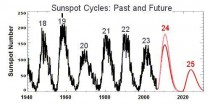
Cycle 24 likely will not reach 75 total sunspots. Two experts, Mausami Dikpata of the National Center for Atmospheric Research and NASA Solar Physicist David Hathaway predicted over 150 sunspots.

Original caption: Past sunspot cycles up to the spring of 2006 are shown in black.The two future sunspot cycle predictions are shown in red (Hathaway) and pink (Dikpata).
The current level of 75 sunspots for Cycle 24 is their projection for Cycle 25. Only two periods, the Dalton Minimum and the Maunder Minimum had equal or lower readings.
The IPCC ignored the sunspot and temperature relationship because there was no explanatory mechanism. But one appeared in 1991 and in 1996 Friis-Christensen, Director of the Danish National Space Institute said,
“All these consistent scientific results illustrate that the current climate models used to predict future climate are lacking important parts of the physics”
The mechanism appeared more fully in 1997 as the Cosmic Theory (CT) defined by Svensmark and Friis-Christensen. The 2001 IPCC Report mentioned it briefly, but it was omitted in the 2007 Report.
The CT is now confirmed. Low cloud amounts vary as cosmic rays are varied by strength of the Sun’s magnetic field. Clouds are the shade in the global greenhouse. Sunspots aren’t the cause, but a manifestation of changes in the Sun’s magnetic field. The most recent confirmation appeared on Sept 6, 2012 and says,
“Given the wide, and perhaps at times excessive, interest in tying carbon dioxide to climate, there has been relatively little work investigating the solar-climate connection.”
Mr President, your comments are scientifically meaningless. With your access to qualified researchers one must conclude they are political. You said people can do something about climate change. That’s false. German Physicist and meteorologist Klaus-Eckhart Plus said about climate change,
“There’s nothing we can do to stop it. Scientifically it is sheer absurdity to think we can get a nice climate by turning a CO2 adjustment knob.”
He said this after educating himself about IPCC science, which apparently directs your views.
“Ten years ago I simply parroted what the IPCC told us. One day I started checking the facts and data – first I started with a sense of doubt but then I became outraged when I discovered that much of what the IPCC and the media were telling us was sheer nonsense and was not even supported by any scientific facts and measurements. To this day I still feel shame that as a scientist I made presentations of their science without first checking it.”
World leaders making presentations before checking the science and facts is more shameful.
|


