Aug 08, 2009
What Caused the Paleocene-Eocene Temperature Maximum
SEPP Science Editorial
One of the striking features of the thermal history of the earth is the unusually rapid and strong warming about 55 million years ago, termed the PETM. It was recently again discussed in a paper by Zebee et al in Nature Geoscience online: 13 July 2009 | doi:10.1038/ngeo578.
The paper brought great joy and jubilation to both climate skeptics and climate alarmists. Skeptics latched on to the authors’ statement that GH models could not explain the rapid temperature rise in relation to the observed rise of CO2. Alarmists, on the other hand, warned that such rapid and strong temperature excursions might even be possible today unless we restrain CO2 emissions.
Of course, it is difficult to be certain about the direction of cause-effect from a correlation of temperature and CO2, since the data lack adequate time resolution. It might therefore be appropriate to develop a different hypothesis, which happens to make use of two papers I already published (in 1971 and 1988). Many authors seem to accept that the cause of the temperature rise was the rapid release of methane trapped in clathrates in ocean sediments, which then was oxidized to CO2. The problem with this simple idea is there may not be sufficient oxygen, particularly in the deep ocean, to accomplish this chemical transformation. This will be particularly true if large bursts of methane are released in bubbles that travel rapidly to the sea surface.
Once in the atmosphere, methane released in these large quantities could survive for a long time, simply by depleting the available hydroxyl (OH) radicals, which exist only in minute concentrations in the steady state. As a consequence, not only would this methane exert a strong GH effect, but large amounts of
methane could percolate into the stratosphere, and there be photolyzed by solar ultraviolet radiation to eventually form both water vapor and CO2, and contribute to destruction of ozone ("Stratospheric Water Vapour Increase Due to Human Activities.” Nature 233:543-547. 1971).
These large amounts of water vapor released into the normally dry stratosphere can lead to important consequences, including the formation of cirrus clouds (consisting of ice particles) in the vicinity of the cold tropopause. Tabulated physical measurements give us the ‘complex refractive index’ of water and ice. Therefore, a direct calculation based on Mie theory can provide the optical properties of the cirrus cloud cover ("Re-Analysis of the Nuclear Winter Phenomenon.” Meteorology and Atmospheric Physics 38:228-239. 1988).
If the cloud cover is very thick, it could exhibit an appreciable optical albedo. But my analysis shows that as the cloud thins, it retains a large infrared opacity, sufficient to cut off any thermal radiation from the earth’s surface in the IR window of the atmosphere (8-12 microns). Such a GH effect is quite powerful for warming the global climate; it depends, of course, also on the areal coverage of the cirrus cloud. It might be strong enough to enhance the warming of the earth and therefore accelerate a further release of methane from the ocean, a kind of positive feedback that could explain the observed large temperature increase.
But so far all of this is simply hypothesis and speculation. Some obvious questions remain:
* How to test this hypothesis? One would expect to find some evidence concerning anoxic effects in the ocean, including a die-off of marine organisms. The CO2 increase observed could partly be caused by a degassing of a warming ocean.
* And could such an effect happen now? Not likely. We have to remember that temperatures near the P-E boundary had been unusually high for long periods of time. In fact, the earth was completely ice-free, including also the polar regions. This is quite different from the present situation. Further, nothing of the sort has happened during the much warmer (compared to today) Holocene Temperature Optimum, 8000-5000 years ago.
Aug 07, 2009
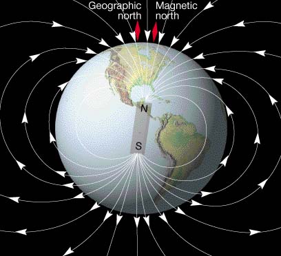
The earth’s magnetic field impacts climate: Danish study
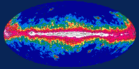
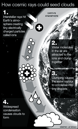
The latest Scientific Alliance Newsletter story “Time for a New Paradigm for Climate Change” notes “Henrik Svensmark and colleagues from the Danish National Space Centre have published a paper in the same journal which gives support for the hypothesis that cosmic rays, modulated by the solar wind, can indeed alter the degree of cloud cover and hence affect temperature (Svensmark et al; Cosmic ray decreases affect atmospheric aerosols and clouds; Geophysical Research Letters; Vol 36, L15101, doi:10.1029/2009GL038429, 2009). Their measurements indicate that cloud cover measured over oceans decreases to a minimum approximately a week after cosmic ray minima. The effect can take large quantities of liquid water out of the atmosphere. This hypothesis may or may not be right, but it remains a working possibility and should certainly not be dismissed lightly.”
The following older post describes this process:
COPENHAGEN (AFP)—The earth’s climate has been significantly affected by the planet’s magnetic field, according to a Danish study that could challenge the notion that human emissions are responsible for global warming. “Our results show a strong correlation between the strength of the earth’s magnetic field and the amount of precipitation in the tropics,” one of the two Danish geophysicists behind the study, Mads Faurschou Knudsen of the geology department at Aarhus University in western Denmark, told the Videnskab journal.

See larger image here.
He and his colleague Peter Riisager, of the Geological Survey of Denmark and Greenland (GEUS), compared a reconstruction of the prehistoric magnetic field 5,000 years ago based on data drawn from stalagmites and stalactites found in China and Oman. The results of the study, which has also been published in US scientific journal Geology, lend support to a controversial theory published a decade ago by Danish astrophysicist Henrik Svensmark, who claimed the climate was highly influenced by galactic cosmic ray (GCR) particles penetrating the earth’s atmosphere.
Svensmark’s theory, which pitted him against today’s mainstream theorists who claim carbon dioxide (CO2) is responsible for global warming, involved a link between the earth’s magnetic field and climate, since that field helps regulate the number of GCR particles that reach the earth’s atmosphere.
“The only way we can explain the (geomagnetic-climate) connection is through the exact same physical mechanisms that were present in Henrik Svensmark’s theory,” Knudsen said. “If changes in the magnetic field, which occur independently of the earth’s climate, can be linked to changes in precipitation, then it can only be explained through the magnetic field’s blocking of the cosmetic rays,” he said
See larger image here.
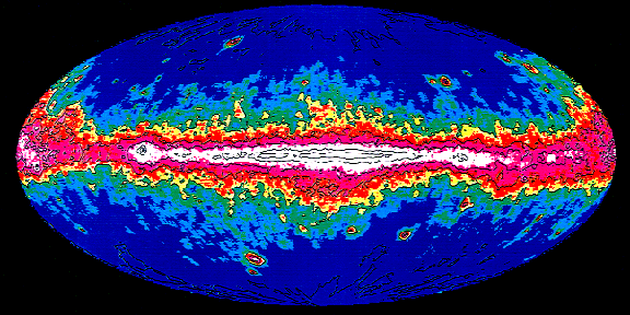
Svensmark’s Theory Explained
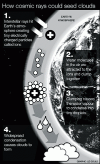
Man-made climate change may be happening at a far slower rate than has been claimed, according to controversial new research. Scientists say that cosmic rays from outer space play a far greater role in changing the Earth’s climate than global warming experts previously thought. In a book, to be published this week, they claim that fluctuations in the number of cosmic rays hitting the atmosphere directly alter the amount of cloud covering the planet.
High levels of cloud cover blankets the Earth and reflects radiated heat from the Sun back out into space, causing the planet to cool.
Henrik Svensmark, a weather scientist at the Danish National Space Centre who led the team behind the research, believes that the planet is experiencing a natural period of low cloud cover due to fewer cosmic rays entering the atmosphere. This, he says, is responsible for much of the global warming we are experiencing. He claims carbon dioxide emissions due to human activity are having a smaller impact on climate change than scientists think. If he is correct, it could mean that mankind has more time to reduce our effect on the climate.
See larger image here.
Read more here.
Henrik Svensmark Book “The Chilling Stars” is available here.
Aug 04, 2009
A growing population might be warming Eastern African nights
By Dr. John Christy
HUNTSVILLE, Ala. (July 28, 2009) - Nights are getting hotter in Nairobi (photo) and other inland cities as growing populations change sensitive local weather patterns, according to research at The University of Alabama in Huntsville.

Night time low temperatures over cities and towns in Kenya and Northern Tanzania climbed 0.56 C (about one degree Fahrenheit) over the past 35 years while daytime high temperatures were stable, says Dr. John Christy, director of UA Huntsville’s Earth System Science Center and a former teacher at a Baptist high school in Kenya.
“That’s a clear signal that human development is changing temperatures at the surface by changing the natural surface,” Christy said. “If this change was caused by increases in greenhouse gases like carbon dioxide you would expect to see both day and night time temperatures rising.”
Results of this research were published in June by the American Meteorological Society’s “Journal of Climate.” Population growth and its associated development warm air near the surface at night by disrupting the formation of a cool, shallow layer of air that often collects near the ground after sundown while warmer air is suspended above it.
Development and population growth do at least three things to disrupt the boundary layer and bring warmer air down to the surface:
- Buildings increase the surface “roughness,” which increases turbulence in surface breezes;
- Asphalt and concrete absorb more solar radiation than the natural landscape. They release that energy as heat after sunset (something they do more efficiently than soil and plant cover). This heat warms the air near the surface, delaying or preventing the cool boundary layer from forming.
- Small particles (called aerosols) in exhaust from cars and trucks as well as smoke from cooking and heating fires may trap heat rising from the surface that otherwise would radiate into space. This is similar to the warming caused by low-lying night clouds.
“You aren’t really adding any heat to the environment, you’re just mixing heat that was already there down through the boundary layer to the surface,” said study co-author Dick McNider, professor emeritus at UAHuntsville. “Every time the shallow boundary layer breaks up, the surface temperature goes up three, four, five degrees or more. If that happens several times during the year, it is going to show up as a warming trend. It is going to look like heat is being added to the system.”
That regional surface warming trend is exactly what is seen in the major surface datasets, which collect data from a small number of automated thermometers in Nairobi and a few other urban areas in East Africa. By comparison, Christy looked at data from 111 places in which weather data was recorded as far back as 1904. These include former British coffee and tea plantations, and town weather stations operated by railroads, planters and British colonial officials.
“We see the greatest warming in the past 50 years,” Christy said. “That’s when you see the nighttime trend start upward. That’s when the population boomed. Just since I was there in 1973 to 1975 the population has jumped from 14 million to about 38 million people.
“When I taught in Nyeri, it was a town of about 10,000 people with dirt (or mud) streets leading down to the market. Now it’s a city of about 100,000 people. It’s easy to see how the local thermometer would be influenced by that growth. “When you drive into those cities at night you just see a pall of smoke,” Christy said. “Much of the tropical, less-developed world is going to have this meteorological feature, so any indication of a warming climate is going to be influenced by population growth and nighttime minimum temperatures.”
Because of that and other problems discovered in a 2006 study of temperature trends in Central California, Christy says the most accurate way to measure
climate trends at the surface is to measure only daytime maximum temperatures. During most days convection from daytime heating has always mixed air from the surface with air in the troposphere and vice versa, so daytime surface readings have always measured temperatures in a larger portion of the atmosphere.
Christy also looked at upper atmosphere temperature data collected by satellites and by thermometers carried aloft by balloons launched from Nairobi. Neither shows a warming trend over East Africa. Christy led the study with help from UA Huntsville colleagues McNider and William Norris.
EDITORS: A pdf file of the “Journal of Climate” paper referenced above is available. Please e-mail your request to Phillip Gentry at gentryp@uah.edu.
See Icecap’s EPA comment on the Urban Heat Island, which is not adjusted for in the global data bases used by NOAA and Hadley.
Aug 03, 2009
Mild season in Tornado Alley frustrates scientists
By Melanie S. Welte
This has been an unusually mild year in Tornado Alley, which is good news, of course, for the people who live here, but a little frustrating to scientists who planned to chase twisters as part of a $10 million research project.
“You’re out there to do the experiment and you’re geared up every day and ready. And when there isn’t anything happening, that is frustrating,” said Don Burgess, a scientist at the University of Oklahoma. But he was quick to add that he is pleased the relative quiet has meant fewer injuries and less damage.
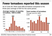
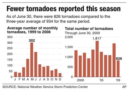
Nationwide, there were 826 tornadoes this year through June 30, compared with an average of 934 for the same period during the previous three years, according to the National Severe Storms Laboratory in Norman, Okla. Most twisters strike in Tornado Alley, which generally extends from Texas and Oklahoma to Kansas, Nebraska, Iowa and Minnesota.
During a remarkable 17-day lull from mid-May through early June, there were no tornado watches issued anywhere in the United States. And that is typically the height of the season in Tornado Alley.
“It was very, very unusual,” said Joe Schaefer, director of the Storm Prediction Center in Norman, which, like the Severe Storms lab, operates under the National Weather Service.
Meteorologists are attributing the relative calm not to anything dire, like global warming, but to the shifts in the jet stream that happen from time to time. When the jet stream runs south to north in the spring over the central states, there are usually plenty of tornadoes. When it’s more west to east, as it is this year, tornadoes are less common.
The serenity has proved exasperating for people like Burgess and other researchers working on Vortex2, a project funded by the National Science Foundation and the National Oceanic and Atmospheric Administration to study tornadoes in May and June. Except for one twister in Wyoming, the researchers were left with little to examine. The relative calm follows a horrific 2008, when 1,304 tornadoes and 121 deaths were recorded by the end of June. In all of last year, there were 1,691 tornadoes and 126 deaths.
See larger image here.
Organizers of Vortex2 had hoped that a close-up look at killer storms this year by more than 100 scientists and assistants from various universities and the government would help them forecast storms more accurately and increase warning times. “There weren’t any tornadoes to find,” said Harold Brooks, a research meteorologist with the Severe Storms Laboratory. And when tornadoes did form, only a couple of funnel clouds would appear at a time, not the dozens that can materialize.
“No long tracks, massive killer tornadoes,” Schaefer said. “They’ve been coming in onesies and twosies.” Even in this quiet year, there have been devastating storms. The worst tornado hit the night of Feb. 10 in Lone Grove, Okla., killing eight people in a mobile home park. Also in February, one person died when a twister destroyed a church and mobile homes in Hickory Grove, Ga. Through the end of June, tornadoes had killed 21 people nationwide. “If we get rid of the February outbreak, it’s been a fairly good year,” Schaefer said. Read full story here.
Jul 24, 2009
Debunking the Claims Heat Waves are Becoming More Common
By Joseph D’Aleo
Although there has been some high heat in the southern Plains and most recently the southwest, for many areas of the lower 48 states, unless August turns around big time, it may be remembered as “a year without a summer.” After some early heat with 92F in April, Central Park peaked at 86F in May, just 84F in June and so far in July 86F. As of the 28th, June/July ranked as the second coldest since 1869 behind only 1881. It may slip a little with warmth the last few days. In Boston, the June/July combo will rank 7th coldest in 138 years.
In Chicago, Tom Skilling tells us this July likely to be the first ever not to reach 87F in 139 years of record keeping.
June was below normal in the southwest and all across the northern tier. July for the first three weeks was exceptionally cold, in many places ranking among the top 5 coldest. More seasonable temperatures the last week of the month (especially in the east) will diminish the anomalies a little but the month will end up cold (below with larger image here).
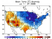
There really has been no heat wave so far in most of the major metropolitan areas, saving on air conditioning but with both chilly temperatures and frequent rains, cutting back on summer beach traffic and outdoor activity. Many experienced forecasters in the Great Lakes and northeast have noted similarities to the volcanic summer of 1992 (more on that next week).
Yet this year, NOAA and the EPA released reports suggesting heat wave frequency was increasing and would continue to do so this century. The reports were based on the IPCC findings but unencumbered by the facts, armed with supercharged models and emboldened by an alarmist administration, the authors made even more extreme even ridiculous claims.
ONE CLAIM - HEAT WAVES INCREASING
The UN, NOAA and the EPA in their analyses made the following claims:
Widespread changes in extreme temperatures have been observed in the last 50 years. Globally, cold days, cold nights, and frost have become less frequent, while hot days, hot nights, and heat waves have become more frequent.
Severe heat waves are projected to intensify in magnitude and duration over the portions of the U.S. where these events already occur, with potential increases in mortality and morbidity, especially among the elderly, young and frail.
REALITY
There is no indication that record heat is increasing in frequency, in fact the data shows a precipitous decline in the number of heat records in recent decades. The early 20th century dominates the heat statistics for the United States and the world.
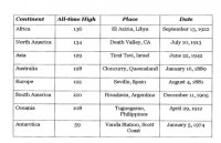
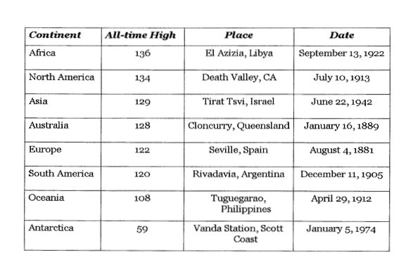
The presumption that global heat waves and extremes have increased in frequency is not supported by the official government data. NOAA’s NCDC shows that record high temperature by continent have occurred mainly in the 1880s and early 1900s, with only 1 post 1950 (Antarctica in 1974) (below with larger image here).
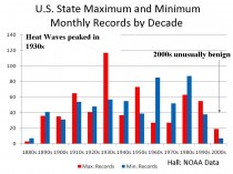
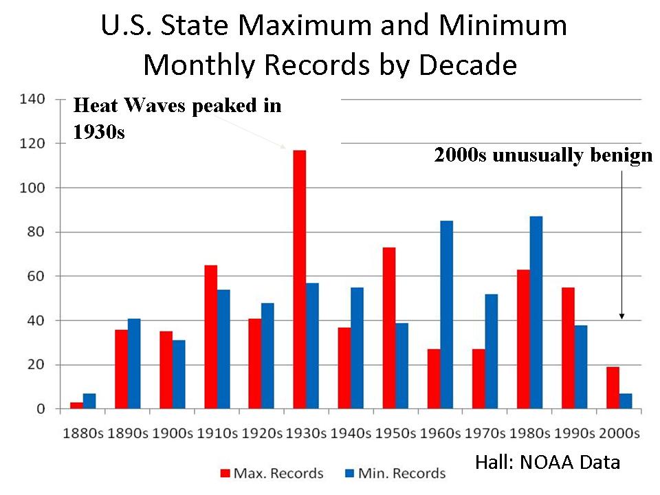
In the United States, there has been almost a total absence of new statewide records. There was no evidence of extreme warming based on temperature extremes (compiled by Bruce Hall below with larger image here).
See animation of statewide records by decade here.
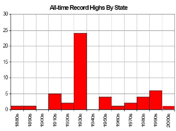
When examined on a state by state basis, the 1930s jumps out as the warmest decade with 24 state records. 37 records occurred before the 1970s (below with larger image here).

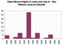
In Des Moines, Iowa, a continental climate far away from any large scale maritime influence, one would expect to see the effects of global warming extremes most. However that is not the case in the peak heat months of June and July. The last record highs in the months of June and July were in 1988. Here again, the 1930s dominate with 33 of the possible 61 record daily highs (below with larger image here).
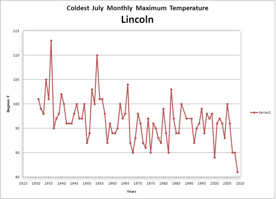
In Lincoln, IL, the July annual maximum has been declining.

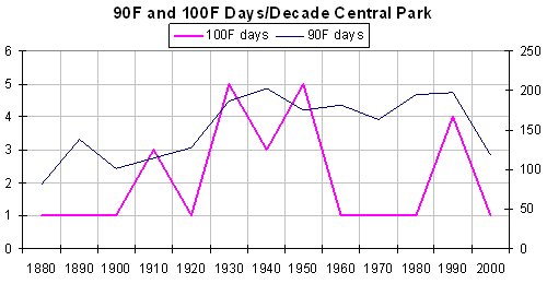
In Central Park, New York, where urbanization warmth is certainly an issue, the peak warmth again occurred early in the period with 100F days peaking in the 1930s and 1950s and 90F degree days the 1940s, a secondary maximum occurred in the 1990s but the number of extreme heat days with one summer to go has declined this decade (below with larger image here).
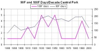
Source NWS Central Park - 90F days, 100F days
The heat was clearly most dominant in the middle of the 20th century with a “secondary” smaller max in recent decades. Here too, there is no evidence of an increasing trend.
See word doc of this introduction here. See a more complete analysis including evidence the models are failing and that morbidity for cold is greater than heat and that overall morbidity for extremes had been declining for decades not increasing here.
Read other takes on this issue by Mark Vogan here and here and Bruce Hall here.
See Climate Depot’s very detailed compilation of cold and snow stories in the story: Climate Fear Promoters Explain Record Cold and Snow: ‘Global warming made it less cool’ - Switch from predictions of ‘climate crisis’ to “global warming made it less cool’ here.
|

