Sep 14, 2010
Five Reasons Why Water Vapor Feedback Might Not Be Positive
By Roy W. Spencer, Ph. D.
Since it has been a while since I have addressed water vapor feedback, and I am now getting more questions about it, I thought this would be a good time to revisit the issue and my opinions on the subject.
Positive water vapor feedback is probably the most “certain” and important of the feedbacks in the climate system in the minds of mainstream climate researchers. Weak warming caused by more carbon dioxide will lead to more water vapor in the atmosphere, which will then amplify the weak warming through water vapor’s role as the atmosphere’s primary greenhouse gas.
Positive water vapor feedback makes sense intuitively. Warmer air masses, on average, contain more water vapor. Warmer air is associated with greater surface evaporation rates, which is the ultimate source of almost all atmospheric water vapor.
And since water vapor is the atmosphere’s main greenhouse gas, most scientists have reasonably inferred that climate warming will be enhanced by increasing water vapor amounts. After all, water vapor feedback is positive in all of the IPCC climate models, too.
But when one looks at the details objectively, it is not so obvious that water vapor feedback in the context of long-term climate change is positive. Remember, it’s not the difference between warmer tropical air masses and cooler high-latitude air masses that will determine water vapor feedback...its how those air masses will each change over time in response to more carbon dioxide. Anything that alters precipitation processes during that process can cause either positive or negative water vapor feedback.

Enlarged here.
Here are some of those details.
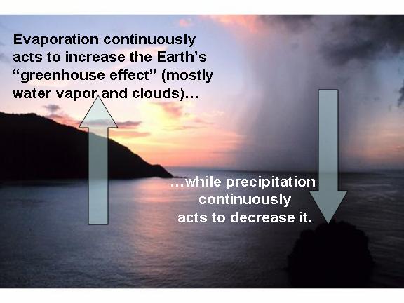
1) Evaporation versus Precipitation
The average amount of water vapor in the atmosphere represents a balance between two competing processes: (1) surface evaporation (the source), and (2) precipitation (the sink). While we know that evaporation increases with temperature, we don’t know very much about how the efficiency of precipitation systems changes with temperature.
The latter process is much more complex than surface evaporation (see Renno et al., 1994), and it is not at all clear that climate models behave realistically in this regard. In fact, the models just “punt” on this issue because our understanding of precipitation systems is just not good enough to put something explicit into the models.
Even cloud resolving models, which can grow individual clouds, have gross approximations and assumptions regarding the precipitation formation process.
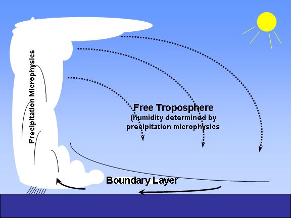
2) Negative Water vapor Feedback Can Occur Even with a Water Vapor Increase
Most atmospheric water vapor resides in the lowest levels, in the ‘turbulent boundary layer’, while the water vapor content of the free troposphere is more closely tied to precipitation processes. But because the outgoing longwave radiation is so much more sensitive to small changes in upper-layer humidity especially at low humidities (e.g. see Spencer & Braswell, 1997), it is possible to have a net increase in total integrated water vapor, but negative water vapor feedback from a small decrease in free-tropospheric humidity. See #4 (below) for observational support for this possibility.

Enlarged here.
3) Cause Versus Effect
Just because we find that unusually warm years have more water vapor in both the boundary layer and free troposphere does not mean that the warming caused the moistening.
There are a variety of processes (e.g. tropospheric wind shear causing changes in precipitation efficiency) which can in turn alter the balance between evaporation and precipitation, which will then cause warming or cooling as a RESULT OF the humidity change - rather than the other way around.
This cause-versus-effect issue has been almost totally ignored in feedback studies, and is analogous to the situation when estimating cloud feedbacks, the subject of our most recent paper.
Similar to our cloud feedback paper, evidence of causation in the opposite direction is the de-correlation between temperature and humidity in the real world versus in climate models (e.g. Sun et al., 2001).
4) Evidence from Radiosondes
There is some evidence that free tropospheric vapor has decreased in recent decades (e.g. the Paltridge et al., 2009 analysis of the NCEP Reanalysis dataset) despite this being a period of surface warming and humidifying in the boundary layer. Miskolczi (2010) used the radiosonde data which provide the main input to the NCEP reanalysis to show that the resulting cooling effect of a decrease in vapor has approximately counterbalanced the warming influence of increasing CO2 over the same period of time, leading to a fairly constant infrared opacity (greenhouse effect).
Of course, water vapor measurements from radiosondes are notoriously unreliable, but one would think that if there was a spurious drying from a humidity sensor problem that it would show up at all altitudes, not just in the free troposphere. The fact that it switches sign right where the turbulent boundary layer pushes up against the free troposphere (around 850 mb, or 5,000 ft.) seems like too much of a coincidence.
5) The Missing “Hot Spot”
Most people don’t realize that the missing tropospheric “hot spot” in satellite temperature trends is potentially related to water vapor feedback. One of the most robust feedback relationships across the IPCC climate models is that those models with the strongest positive water vapor feedback have the strongest negative lapse rate feedback (which is what the “hot spot” would represent). So, the lack of this negative lapse rate feedback signature in the satellite temperature trends could be an indirect indication of little (or even negative) water vapor feedback in nature.
Conclusion
While it seems rather obvious intuitively that a warmer world will have more atmospheric water vapor, and thus positive water vapor feedback, I’ve just listed the first 5 reasons that come to my mind why this might not be the case.
I am not saying that’s what I necessarily believe. I will admit to having waffled on this issue over the years, but that’s because there is evidence on both sides of the debate.
At a minimum, I believe the water vapor feedback issue is more complicated than most mainstream researchers think it is. See post here.
Sep 13, 2010
GISS On Track For Hottest Year Ever
By Steve Goddard
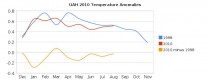
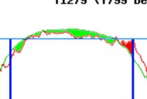
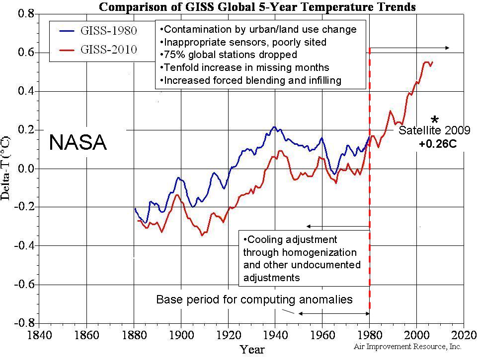
It appears almost certain that GISS will declare 2010 to be the hottest year ever (below, enlarged here).
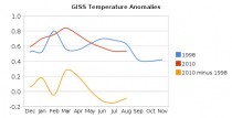
It is also almost certain that UAH, RSS and HadCrut will not agree with GISS. They will most likely place 2010 below 1998 (below, enlarged here).
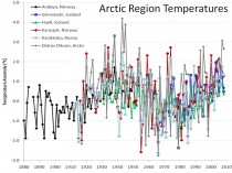
Dr Hansen has recognized the discrepancy, and explains it by his “better Arctic coverage”
The blink comparator here (still below) shows GISS June-August (baseline 1958-2002) extrapolated (1200 km) vs June-August measured (250 km.) Note the large holes and the fact that there is little or no measured data north of 80N. Also note that GISS shows the region north of 80N as well above normal, despite the paucity of actual temperature data.
By contrast, DMI has a lot more actual temperature data, and shows June-August 2010 (north of 80N) well below the 1958-2002 mean.
The DMI closeup below (enlarged here) shows 5518 pixels below normal and 1471 pixels above normal from June through August.
So which temperature record do you trust? Is 2010 really the “hottest year ever?”
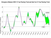
See post and comments here. See an earlier post on GISS divergence here. See the divergence of GISS from Hadley CRU Temperatures below, enlarged here.
ICECAP NOTE: The many issues with the surface data set like urbanization unaccounted for, bad siting, inappropriate instrumentation, land use changes, station dropout and a tenfold increase in missing months leaving large holes requiring infilling from as much as 1200km away as in this arctic example, changing ocean measurement methods all induce uncertainty and predominantly warm biases. NASA and NOAA allows these to contaminate (warm) recent decades while applying homogenization and other “adjustments” to cool off the prior warm period further ensuring recent high rankings and greater century trends when raw, rural, well sited data shows little trend or even cooling.
Enlarged here.
Sep 10, 2010
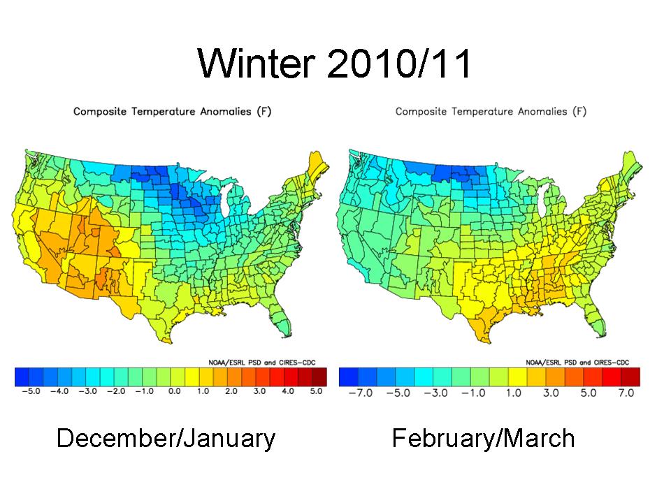
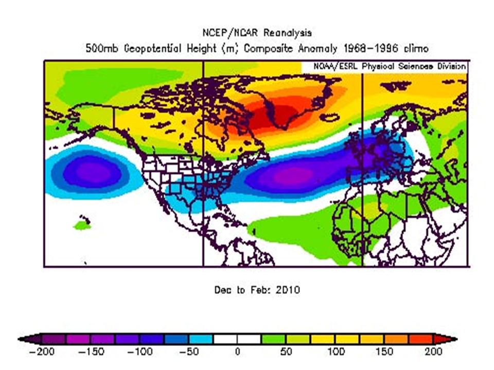
First Look at December to March Global Patterns
By Joseph D’Aleo
Last winter despite a strong El Nino was very cold (all-time coldest in some areas) in many parts of the Northern Hemisphere. A strong La Nina has come on during the summer, a very hot one (all-time in some of the very same areas where the winter was very cold). Other areas had record cool summer. The anomalies were not so much a case of extremes just persistence of the same pattern due to a stuck jet stream configuration.
Persistence is a characteristic of low solar years. The last several years have seen a lot of persistence within seasons. Strong El Ninos and La Ninas also tend to exhibit higher persistence.
What about this winter? Well with a strong La Nina, cold PDO, warm Atlantic (AMO), QBO transitioning to westerly and a still low solar suggests the following.
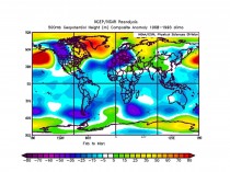
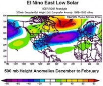
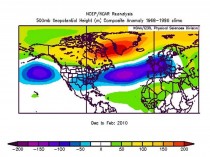
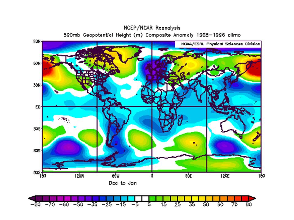
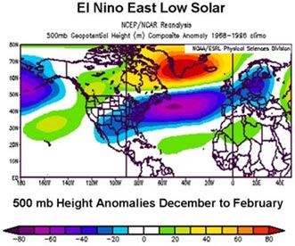
The 500mb geopotential height anomalies for the globe for December/January:

Enlarged here.
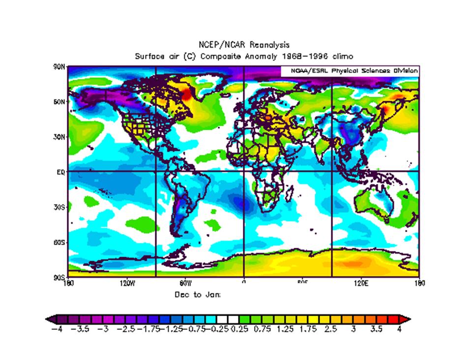
The surface temperature anomalies globally for December/January:

Enlarged here.
The 500 mb geopotential height anomaly for February/March:
Enlarged here.
The surface temperature anomaly for February/March:
Enlarged here.
The winter (December/January and then February/March) for the United States:
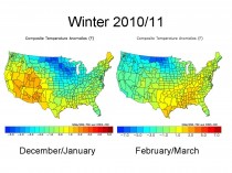
Enlarged here.
For the US, this implies another cold winter for the upper Midwest, probably again heavy snows for the northwest, Rockies, Northern Plains, Midwest and northern New York and New England with ice storm threat(s) further south.
The same for Europe and western Asia:
Enlarged here.
This should mean more snow and cold for Great Britain and eventually much of Europe where they are getting used to weather more like the Dalton Minimum with snowy winters and long cold spells.
The winter should start out cold in central and eastern United States, Western Europe and China. A cool summer start seems in the cards for South America. The late winter looks very cold in Europe and western Asia, while the cold retreats west in the United States. Blocking in the Arctic/North Atlantic, last year at a 60 year record level, appears to be again a major factor.
If you ask does this approach work, see how it worked last year when in the fall we predicted this pattern (height anomalies which correspond to surface temperature anomalies) for the winter at 500mb (enlarged here):
This is what the 500mb anomalies actually looked like (enlarged here):
More to come. PDF
See Joe Bastardi’s take on it here. Joe nailed last winters heavy snow and cold in the south up to the Mid-Atlantic.
---------------
Multidecadal Tendencies in ENSO and Global Temperatures Related to Multidecadal Oscillations
Energy & Environment, Volume 21, Numbers 5, pp. 437-460, September 2010, Joseph D’Aleo, Don Easterbrook
Abstract: Perlwitz etal (2009) used computer model suites to contend that the 2008 North American cooling was naturally induced as a result of the continent’s sensitivity to widespread cooling of the tropical (La Nina) and northeastern Pacific sea surface temperatures. But they concluded from their models that warming is likely to resume in coming years and that climate is unlikely to embark upon a prolonged period of cooling. We here show how their models fail to recognize the multidecadal behavior of sea surface temperatures in the Pacific Basin, which determines the frequency of El Ninos and La Ninas and suggests that the cooling will likely continue for several decades. We show how this will be reinforced with multidecadal shift in the Atlantic (and declining solar activity).
See publication here. More to come.
See also Dr. Willie Soon’s Insight on future climate entitled “Hot Air”. He asks is carbon dioxide really the monster driving climate change? If not,
maybe we should prepare for a colder world here.
Sep 06, 2010
Misinformation on the Website Skeptical Science - Getting Skeptical About Global Warming Skepticism
By Roger Pielke Sr.
There is a weblog called “Skeptical Science - Getting Skeptical About Global Warming Skepticism” that has a misleading post on ocean heat content titled
Ocean cooling: skeptic arguments drowned by data
The post starts with
In 2008, climate change sceptic Roger Pielke Sr said this: “Global warming, as diagnosed by upper ocean heat content has not been occurring since 2004”. It is a fine example of denialist spin, making several extraordinary leaps:
•that one symptom is indicative of the state of an entire malaise (e.g. not being short of breath one day means your lung cancer is cured).
•that one can claim significance about a four year period when it’s too short to draw any kind of conclusion
•that global warming has not been occurring on the basis of ocean temperatures alone
So much for the hype. What does the science say about the temperature of the oceans - which, after all, constitute about 70% of the Earth’s surface? The oceans store approximately 80% of all the energy in the Earth’s climate, so ocean temperatures are a key indicator for global warming.
No straight lines
Claims that the ocean has been cooling are correct. Claims that global warming has stopped are not. It is an illogical position: the climate is subject to a lot of natural variability, so the premise that changes should be ‘monotonic’ - temperatures rising in straight lines - ignores the fact that nature doesn’t work like that. This is why scientists normally discuss trends - 30 years or more - so that short term fluctuations can be seen as part of a greater pattern. (Other well-known cyclic phenomena like El Nino and La Nina play a part in these complex interactions).
The post starts by mislabeling me as a “climate change sceptic” and a “denialist”. Not only is this completely incorrect (as can be easily confirmed by reading our article
Pielke Sr., R., K. Beven, G. Brasseur, J. Calvert, M. Chahine, R. Dickerson, D. Entekhabi, E. Foufoula-Georgiou, H. Gupta, V. Gupta, W. Krajewski, E. Philip Krider, W. K.M. Lau, J. McDonnell, W. Rossow, J. Schaake, J. Smith, S. Sorooshian, and E. Wood, 2009: Climate change: The need to consider human forcings besides greenhouse gases. Eos, Vol. 90, No. 45, 10 November 2009, 413. Copyright (2009) American Geophysical Union),
but it sets the tone of their post as an ad hominem attack, rather than a discussion of the issue.
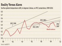
The author of this post documents in the figures that they present, that upper ocean heat, in terms of its annual average, did not accumulate during the period ~2004 through 2009. This means that global warming halted on this time period. There is no other way to spin this data.
The claim in the post (apparently written by Graham Wayne) Does ocean cooling prove global warming has ended? that “The most recent ocean measurements show consistent warming” is false (unless the author of this post has new data since 2009 which may show warming). The recent lack of warming (the data do not support a cooling, despite what the Skeptical Science weblog reports) does not prove or disprove whether global warming over a longer term has ended.
However, the ocean heat content provides the most appropriate metric to diagnosis global warming in recent (since ~2004 when the Argo network became sufficiently dense) and upcoming years, as recommended, of example, in Pielke Sr., R.A., 2008: A broader view of the role of humans in the climate system. Physics Today, 61, Vol. 11, 54-55.
The author of the post on Skeptical Science continues to present misinformation in their Intermediate level post where it is stated: “Early estimates of ocean heat from the Argo showed a cooling bias due to pressure sensor issues. Recent estimates of ocean heat that take this bias into account show continued warming of the upper ocean. This is confirmed by independent estimates of ocean heat as well as more comprehensive measurements of ocean heat down to 2000 metres deep.”
This is an erroneous statement. There was not continued warming for the time period 2004 to 2009, as confirmed by Josh Willis in Pielke Sr., R.A., 2008: A broader view of the role of humans in the climate system. Physics Today, 61, Vol. 11, 54-55. Recently, Josh Willis reported that an updated analysis will be available this Fall.
What the Skeptical Science fails to recognize is that with respect to the diagnosis of global warming using Joules of heat accumulation in the oceans, snapshots of heat content at different times are all that is needed. There is no time lag in heating or cooling. The Joules are either there or they are not. The assessment of a long-term linear trend is not needed.
For example, if the ocean lost its heat in one or two years (such as from a major volcanic eruption), the global warming “clock” would be reset. The Skeptical Science statements that “Claims that the ocean has been cooling are correct. Claims that global warming has stopped are not” illustrates their lack of understanding of the physics. If ocean cooling does occur, it DOES mean global warming as stopped during that time period.
What would be useful is for the weblog Skeptical Science authors to discuss the value of using (and issues with using) the accumulation of Joules in the climate system as the primary metric to monitor global warming. See post here.
ICECAP NOTE: Note how whenever data doesn’t support the models or theory, somehow something must be wrong with it - here they wrongly ascribe the cooling to sensor problems. However, they ignore the many issues with the surface data set like urbanization unaccounted for, bad siting, inappropriate instrumentation, land use changes, changing ocean measurement methods which have much larger errors, inconveniently warm biases.
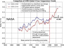
Enlarged here.
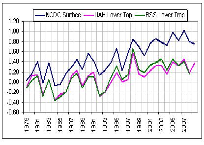
This difference has been growing with time. See the difference of the NOAA global land temperatures and the satellite derived (UAH) temperatures here. They started out about the same in 1979 but now land station data according to NOAA is 0.5C warmer than the satellite when the climate models predict that the satellites which measure the lower troposphere should be warmer than the land because that is where the heat is supposedly trapped by greenhouse gases.

Enlarged here.
While Skeptical Science tries to respond to Roger, maybe they want to explain this additional inconvenient truth.
Also Graham Wayne brings up the need to look at longer periods like 30 years to find trends - decadal trends may be misleading. However, Wayne neglects to note that the PDO and AMO ocean factors both have 30-40 year long regimes with alternating trends. The warm trend from the late 1970s to early 2000s was a warm regime like the 1910s to 1940s. The trend change that started in 2002 that will resume shortly is likely to be a cold trend period like the 1940s to 1970s or if your consider solar more like the early 20th or early 19th century.
Sep 06, 2010
Greenland Temperatures of the Past Millennium Based on Nitrogen and Argon Isotopic Ratios
By Dr. Craig Idso, NIPCC
Reference: Kobashi, T., Severinghaus, J.P., Barnola, J.-M., Kawamura, K., Carter, T. and Nakaegawa, T. 2010.
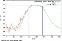
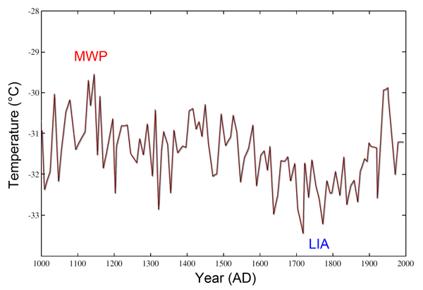
Persistent multi-decadal Greenland temperature fluctuation through the last millennium. Climatic Change 100: 733-756. According to Kobashi et al. (2010) “in Greenland, oxygen isotopes of ice (Stuiver et al., 1995) have been extensively used as a temperature proxy, but the data are noisy and do not clearly show multi-centennial trends for the last 1,000 years in contrast to borehole temperature records that show a clear ‘Little Ice Age’ and ‘Medieval Warm Period’ (Dahl-Jensen et al., 1998).” However, they note that nitrogen (N) and argon (Ar) isotopic ratios—15N/14N and 40Ar/36Ar, respectively—can be used to construct a temperature record that “is not seasonally biased, and does not require any calibration to instrumental records, and resolves decadal to centennial temperature fluctuations.” Kobashi et al. further describe the development of such an approach, after which they use it to construct a history of the last thousand years of central Greenland surface air temperature, based on values of isotopic ratios of nitrogen and argon previously derived by Kobashi et al. (2008) from air bubbles trapped in the GISP2 ice core that had been extracted from central Greenland (72 degrees 36 minutes N, 38 degrees 30 minutes W).
The figure below depicts the central Greenland surface temperature reconstruction produced by the six scientists; and as best as can be determined from this representation, the peak temperature of the latter part of the Medieval Warm Period—which actually began some time prior to the start of their record, as demonstrated by the work of Dansgaard et al. (1975), Jennings and Weiner (1996), Johnsen et al. (2001) and Vinther et al. (2010)—was approximately 0.33C greater than the peak temperature of the Current Warm Period, and about 1.67C greater than the temperature of the last decades of the 20th century. In addition, it is worthy to note that between about 1400 and 1460 there was also a period of notable warmth in Kobashi et al.’s temperature reconstruction, which aligns well with the “Little” Medieval Warm Period, the peak temperature of which was about 0.9C greater than the temperature of the last decades of the 20th century and the first decade of the 21st century.
Central Greenland surface temperature reconstruction for the last millennium. Adapted from Kobashi et al. (2010). Enlarged here.
These findings, the authors say, “show clear evidence of the Medieval Warm Period and Little Ice Age in agreement with documentary evidence,” and those data clearly show that the Medieval Warm Period was at times considerably warmer than the Current Warm Period has been to date, and that even the Little Medieval Warm Period was considerably warmer than it was over the last decades of the twentieth century, as well as the first decade of the 21st century. Thus, there is no compelling reason to believe that the 20th-century increase in the air’s CO2 content (a 100-ppm rise above what it was during the warmer Medieval Warm Period) was the cause of 20th-century global warming, especially when climate alarmists claim that such warming, when it occurs, should be most evident and earliest expressed in high northern latitudes, and even more so in light of the fact that there is a millennial-scale climatic cycle that alternately brings the earth relatively warmer and cooler century-scale conditions throughout both glacial and interglacial periods alike.
Additional References
Dahl-Jensen, D., Mosegaard, K, Gundestrup, N., Clew, G.D., Johnsen, S.J., Hansen, A.W. and Balling, N. 1998. Past temperatures directly from the Greenland ice sheet. Science 282: 268-271.
Dansgaard, W., Johnsen, S.J., Reech, N., Gundestrup, N., Clausen, H.B. and Hammer, C.U. 1975. Climatic changes, Norsemen and modern man. Nature 255: 24-28.
Jennings, A.E. and Weiner, N.J. 1996. Environmental change in eastern Greenland during the last 1300 years: evidence from foraminifera and lithofacies in Nansen Fjord, 68N. The Holocene 6: 179-191.
Johnsen, S.J., Dahl-Jensen, D., Gundestrup, N., Steffensen, J.P., Clausen, H.B., Miller, H., Masson-Delmotte, V., Sveinbjörnsdottir, A.E. and White, J. 2001. Oxygen isotope and palaeotemperature records from six Greenland ice-core stations: Camp Century, Dye-3, GRIP, GISP2, Renland and NorthGRIP. Journal of Quaternary Science 16: 299-307.
Kobashi, T., Severinghaus, J.P. and Kawamura, K. 2008. Argon and nitrogen isotopes of trapped air in the GISP2 ice core during the Holocene epoch (0-11,600 B.P.): methodology and implications for gas loss processes. Geochimica et Cosmochimica Acta 72: 4675-4686.
Stuiver, M., Grootes, P.M. and Brazunias, T.F. 1995. The GISP2 δ18O climate record of the past 16,500 years and the role of the sun, ocean, and volcanoes. Quaternary Research 44: 341-354.
Vinther, B.M., Jones, P.D., Briffa, K.R., Clausen, H.B., Andersen, K.K., Dahl-Jensen, D. and Johnsen, S.J. 2010. Climatic signals in multiple highly resolved stable isotope records from Greenland. Quaternary Science Reviews 29: 522-538.
See post here. H/T SEPP
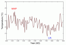
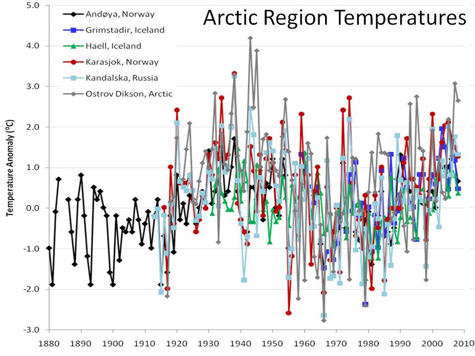
Icecap Note: In this story , Steve Bloom, of the SFO Sierra club who used to haunt the Climate Science blog of Roger Pielke Sr. when he allowed comments, asked in a comment on this alarmist friendly blog if there was any credible recon on the existence of the Medieval Warm Period or Little Ice Age as depicted in the image there (below, enlarged here).
The latter (LIA) is well covered in the literature and the art of the time. The MWP is supported by this post and also in the CO2Science blog where they have compiled and documented peer review studies by 869 individual scientists from 516 separate research institutions in 43 different countries supporting the existence of a global MWP. Of course since Bloom only looks at blogs sites like on the right side of that story’s site, he, like most other true believers, would never learn the inconvenient truths.
This chart (below, enlarged here) by Richard Alley of Penn State, no skeptic, shows Greenland temperatures are unusually cold in recent decades with each successive warm period diminishing.

|

