Mar 30, 2009
Cost Works Against Alternative and Renewable Energy Sources in Time of Recession
By Matthew L. Wald, New York Times
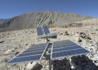
Windmills and solar panel arrays have become symbols of America’s growing interest in alternative energy. Yet as Congress begins debating new rules to restrict carbon dioxide emissions and promote electricity produced from renewable sources, an underlying question is how much more Americans will be willing to pay to harness the wind and the sun.
Curbing carbon dioxide emissions - a central part of tackling climate change - will almost certainly raise electricity prices, experts say. And increasing the nation’s reliance on renewable energy will in itself raise costs. Fifteen months into a recession, that prospect does not sit well in some quarters. “Consumers right now are extremely price-sensitive,” said Barry Moline, executive director of the Florida Municipal Electric Association, whose member utilities serve about three million people. Federal efforts to rein in carbon dioxide emissions are starting to seem inevitable. The Environmental Protection Agency last week moved to regulate heat-trapping gases as harmful pollutants. And the Obama administration and Democratic leaders in Congress are hoping to push through a cap-and-trade bill that would force polluters to curb their emissions or buy permits from cleaner producers. Congress is also discussing whether to require that a certain percentage of the nation’s electricity come from renewable sources.
The effect of any these measures will be to increase the cost of electricity. Regulation of carbon dioxide emissions will increase the cost of burning coal, a carbon-heavy energy source and currently the cheapest form of fossil fuel. Higher production costs will result in higher electricity rates. A quota for renewable energy sources will also raise rates because utilities will pass on increased costs to consumers.

And wind and solar power are generally more expensive than the fossil fuels they are meant to supplant. If carbon dioxide penalties made coal power more expensive, as some environmentalists argue is inevitable, the relative cost of renewable energy might decrease. But consumers will still pay more. Some experts not aligned with either camp estimate that wind power is currently more than 50 percent more expensive than power generated by a traditional coal plant. Built into the calculation is the need for utilities that rely heavily on wind power to build backup plants fired by natural gas to meet electricity demand when winds are calm. Read more here.
Mar 30, 2009
Bogeymen of the C02 Hoax Losing Ground
By Dr. Timothy Ball
“You can discover what your enemy fears most by observing the means he uses to frighten you.” Eric Hoffer
James Hansen, head of NASA Goddard Institute of Space Studies (GISS), and Andrew Weaver, lead author of the UN Intergovernmental Panel on Climate Change (IPCC) Reports, made statements clearly designed to frighten people.
Both men are politically active in climate change and at the forefront of the attempt to convince the world that CO2 is a problem. Their remarks are intended to scare people by threatening impending doom - nothing new - except there is increasing urgency and fear because their message is failing. As Andrew Weaver summarized, “All those fossil fuel emissions need to be eliminated. And we must do so quickly if we are to have any chance of stabilizing the climate and maintaining human civilization as we know it.”
Hansen increases urgency for action claiming we are on the verge of a tipping point, defined as follows. “Tipping points can occur during climate change when the climate reaches a state such that strong amplifying feedbacks are activated by only moderate additional warming.” We’re reaching a tipping point, but it’s not the one Hansen anticipates. We’re close to the point where the public and politicians realize they have been totally deceived about the nature and cause of climate change. Even before a shift to concern about the economy polls showed a growing shift in public opinion.
Weaver is also troubled by his own definition of dramatic change occurring. He wrote in a March 24 article, in the Vancouver Sun, “There are many depressing things about being a climate scientist these days. The emerging data is going from bad to worse and the political leadership is still acting as if we have all the time in the world to deal with global warming.” Yes, it’s depressing but because people are not fooled any more and politicians are not acting as Weaver expects. And yes, emerging data is going from bad to worse, but only because it shows CO2 is not causing warming.
Other remarks by both men indicate their fear. For example, Hansen said, “The democratic process doesn’t seem to be working.” It’s a bizarre comment from a civil servant prior to his apparently breaking US law (the Hatch Act) again by participating in a public protest at the headquarters of E.ON, a power firm in Coventry, England. The push for elimination of CO2 emissions is failing because, despite his histrionics, democracy is working.
A few days later in the Vancouver Sun article ironically titled “‘Environmentalists’ are abandoning science,” Weaver wrote, “The scientific community has a very solid understanding of what is causing global warming: It is overwhelmingly because of the combustion of fossil fuels. Thus, the solution to the problem is as simple as it is daunting: The elimination of fossil fuel use in our economies.”
Weaver claims he and his IPCC colleagues “have been as a clear as we know how about the science and the measures needed.” This is simply not the case. Their rules mean they only look at human causes of climate change. They produce a political summary for policymakers then used to make sure the science report agrees with the summary. (Canada Free Press)
More important, the entire claim of human caused CO2 global warming is based on computer models that simply can’t work. It’s not surprising Hansen and Weaver are computer modelers; they have the most invested in these claims and the most to lose professionally and politically. I watched over the years as computer modelers took over and dominated climate science, particularly through the IPCC. But as Freeman Dyson, Professor Emeritus of Physics at Princeton, said in the May 1999 issue of the American Physical Society and still valid today, “They are not yet adequate tools for predicting climate.” However, “If we persevere patiently with observing the real world and improving the models, the time will come when we are able both to understand and to predict. Until then, we must continue to warn the politicians and the public: don’t believe the numbers just because they come out of a supercomputer.”
Read much more here.
Mar 29, 2009
Set Phasers on Stun
By Roy W. Spencer, Ph. D.
I’ve been receiving a steady stream of e-mails asking when our latest work on feedbacks in the climate system will be published. Since I’ve been trying to fit the material from three (previously rejected) papers into one unified paper, it has taken a bit longer than expected but we are now very close to submission. We’ve tentatively decided to submit to Journal of Geophysical Research (JGR) rather than any of the American Meteorological Society (AMS) journals. This is because it appears that JGR editors are somewhat less concerned about a paper’s scientific conclusions supporting the policy goals of the IPCC - regulating greenhouse gas emissions. Indeed, JGR’s instructions to reviewers is to not reject a paper simply because the reviewer does not agree with the paper’s scientific conclusions. More on that later.
As those who have been following our work already know, our main conclusion is that climate sensitivity has been grossly overestimated due to a mix up between cause and effect when researchers have observed how global cloud cover varies with temperature. To use my favorite example, when researchers have observed that global cloud cover decreases with warming, they have assumed that the warming caused the cloud cover to dissipate. This would be a positive feedback since such a response by clouds would let more sunlight in and enhance the warming.
But what they have ignored is the possibility that causation is actually working in the opposite direction: That the decrease in cloud cover caused the warming not the other way around. And as shown by Spencer and Braswell (2008 J. Climate), this can mask the true existence of negative feedback. All 20 of the IPCC climate models now have positive cloud feedbacks, which amplify the small about of warming from extra carbon dioxide in the atmosphere. But if cloud feedbacks in the climate system are negative, then the climate system does not particularly care how much you drive your SUV. This is an issue of obvious importance to global warming research. Even the IPCC has admitted that cloud feedbacks remain the largest source of uncertainty in predicting global warming.
Significantly, our new work provides a method for identifying which direction of causation is occurring (forcing or feedback), and for obtaining a more accurate estimate of feedback in the presence of clouds forcing a temperature change. The method involves a new way of analyzing graphs of time filtered satellite observations of the Earth (or even of climate model output). Well at least I thought it was new way of analyzing graphs. It turns out that we have simply rediscovered a method used in other physical sciences: phase space analysis. This methodology was first introduced by Willard Gibbs in 1901.
I am confident the work will get published eventually. But even if it didn’t, our original published paper on the issue has laid the groundwork, it would just take awhile before the research community understands the implications of that work. What amazes me is the resistance there has been to ‘thinking out of the box’ when trying to estimate the sensitivity of the climate system. Especially when it has been considered to be ‘thinking in the box’ by other sciences for over a century now.
The new paper title is, “Phase Space Analysis of Forcing and Feedback in Models and Satellite Observations of Climate Variability”. It just rolls of the tongue, doesn’t it? And it is truly unfortunate that the AMS, home of Lorenz’s first published work on chaos in 1963, has decided that political correctness is more important than the advancement of science. Read more here.
Mar 28, 2009
Record Flooding on Red River of the North - Another Blizzard Underway
NOAA and AP
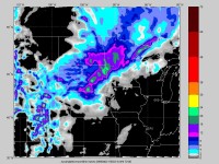
Flooding continues over North Dakota, the northeast third of South Dakota,and northwest Minnesota. On the Red River at Fargo (Cass County), North Dakota, the National Weather Service has issued projections of a crest of 43 feet, 24 feet above flood stage. That’s as high as the levees go and is nearly 3 feet above the previous all-time record of 40.1 feet set in 1897.
Volunteers and national guardsmen are out in force, building levees, rescuing and evacuating those that need to get to higher ground. Cold temperatures are hampering efforts, freezing damp sandbags and making the job that much more strenuous for volunteers. 800 more National Guard troops and 150 Red Cross personnel are arriving in the area this weekend. The cold has slowed the melt and the river rise but milder temperatures especially Sunday will increase the melting of the recent snow in the basin.

Elsie, one of two Stensgard family dogs, sands on the earthen and sandbag dike surrounding the Stensgard home, not pictured, which overlooks a flooded outbuilding as the Red River continues to rise, Wednesday, March 25, 2009 in Fargo, N.D. Due to the flooding, the Stensgard home can only be reached by boat. (AP Photo/Carolyn Kaster). See larger photo here.See photo Journal here.

Officials patrol the swollen Red River between Morehead, MN and Fargo, ND. See larger photo here.
Upate: As expected another storm is underway Monday with another heavy precipitation event with 6-18 inches of snow.

See larger image here.
Mar 25, 2009
Correlation between Cosmic Rays and Ozone Depletion
By Q.-B. Lu, Department of Physics and Astronomy, University of Waterloo,ON
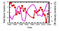
This Letter reports reliable satellite data in the period of 1980–2007 covering two full 11-yr cosmic ray (CR) cycles, clearly showing the correlation between CRs and ozone depletion, especially the polar ozone loss (hole) over Antarctica. The results provide strong evidence of the physical mechanism that the CRdriven electron-induced reaction of halogenated molecules plays the dominant role in causing the ozone hole. Moreover, this mechanism predicts one of the severest ozone losses in 2008-2009 (ended up among the largest) and probably another large hole around 2019-2020.
There is interest in studying the effects of galactic cosmic rays (CRs) on Earth’s climate and environment, particularly on global cloud cover in low atmosphere (3 km) [1-5] and ozone depletion in the stratosphere [6-16]. The former has led to a different scenario for global warming, while the latter has provided an unrecognized mechanism for the formation of the O3 hole. The discovery of the CR-cloud correlation by Svensmark and Friis-Christensen has motivated the experiments to investigate the physical mechanism for the correlation. In contrast, the CR-driven electron reaction mechanism for
O3 depletion was first unexpectedly revealed from laboratory measurements by Lu and Madey. Then the evidence of the correlation between CRs, chlorofluorocarbon (CFC) dissociation, and O3 loss was found from satellite data by Lu and Sanche: the O3 hole is exactly located in the polar stratosphere and at the altitude of 18 km where the CR ionization shows a maximum.
CRs are the only electron source in the stratosphere, while halogen(Cl, Br)-containing molecules are long known to have extremely large cross sections of dissociative attachments of low-energy electrons. The latter reaction will be greatly enhanced when halogenated molecules are adsorbed or buried at the surfaces of polar molecular ice, relevant to polar stratospheric cloud (PSC) ice in the winter polar stratosphere, as firstly discovered by Lu and Madey and subsequently confirmed by others in experiments and theoretical calculations.

Percentage variations of CR intensity and annual mean total ozone with latitudes 0-60S during the period of 1980-2007. Larger image here.
Read the paper here. This was first reported last year in this story here. Another nail in the coffin for the CFCs role in the ozone hole - first challenged in 2007 here in a Nature article.
|
