Aug 24, 2008
No Trend in Drought or Floods
Climate Skeptic
It is often said by warming alarmists that a) global warming will increase both extremes of droughts and floods and b) that we already see these conditions accelerating (ie with California droughts and this year’s midwestern floods). The recent NOAA/NASA draft CCSP climate change report I commented on last week said
“Temperature and precipitation have increased over recent decades, along with some extreme weather events such as heat waves and heavy downpours.
Widespread increases in heavy precipitation events have occurred, even in places where total amounts have decreased. These changes are associated with the fact that warmer air holds more water vapor evaporating from the world’s oceans and land surface. Increases in drought are not uniform, and some regions have seen increases in the occurrences of both droughts and floods”
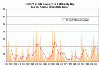
The Antiplanner, in an article on firefighting, shares this data at the National Climate Data Center that I had never seen before. It is the monthly estimate of the percent of US land area subject to extremes of wet or dry weather. First, the dry weather:

See larger image here
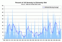
And then the wet weather:

See larger image here
There is no trend here, and certainly no acceleration of a trend, merely what is obviously a cyclical phenomenon.
I am constantly amazed at the ability of alarmists to dedice the second derivitive of natural phenomenon (eg an acceleration in a rate of change) from single data points (e.g. 2008 flooding in the Midwest). Read more here.
Aug 23, 2008
Australian Space Weather Agency Revises Solar Cycle 24 Start, Adding 6 Months
By Anthony Watts, Watts Up With That
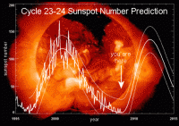
Solar Cycle 24 just can’t seem to get rolling. IPS announced today (IPS is the Australian Space Weather Agency), that it has changed its forecast for Solar Cycle 24, pushing it’s start into the future by six months. They write:
Due to the proximity of the IPS predicted rise of solar cycle 24 to observed solar cycle 23 solar minimum values, and the apparent lack of new Cycle 24 sunspots, IPS has again moved the predicted solar cycle away by 6 months.
The announcement came on the IPS web page, today, on the day that two small cycle 23 sunspots have started to appear near the solar equator. Many had expected more cycle 24 spots to be visible by now, but the sun remains quiet, and has been producing more cycle 23 spots than cycle 24 spots so far since the first cycle 24 spot was seen on January 4th, 2008.
NASA’s David Hathaway is still expecting a start of cycle 24 this year, with an upturn soon, late in 2008 or early 2009. As many of you know, the sun has been very quiet, especially in the last month. In a July 11th 2008 NASA news release article titled What’s Wrong with the Sun? (Nothing) solar physicist David Hathaway goes on record as saying: “It does seem like it’s taking a long time,” allows Hathaway, “but I think we’re just forgetting how long a solar minimum can last.”

See larger image of the steepening Hathaway curve here
The new IPS prediction puts the sunspot upturn to begin around April to July 2009. It will be interesting to see if Hathaway follows with a new prediction in the wake of the IPS announcement. There already has been one change in Hathaway’s prediction this year, so it would not be surprising to see another.
Icecap Note: NOAA SWPC and most other sites (one exception was Catania Friday though gone today) did not count the small apparent spots this month and are still registering a “0” for monthly sunspot number with 33 straight days of no sunspots (see daily and monthly counts here and here). The final monthly International Sunpot number will come from Belgium based on observations from the various global solar sunspot monitoring centers.
Aug 21, 2008
India’s Future Climate: No Cause for Alarm
By Dr. Madhav Khandekar
India as a whole is dominated by the monsoonal climate where the summer rainfall (called the southwest monsoon, June-September) is the most important climate event. Traditionally, India has been an agricultural country where timely arrival of summer rainfall becomes critical for the monsoon crops (known as Kharif), most important of which is rice, grown primarily in the Peninsular India. The four summer months provide an average of about 85 cm ( ~40 inches) of rainfall over most of India. (this is one of largest amount of seasonal rainfall anywhere in the world over a large area like India). Outside of summer monsoon, India does experience winter rains via the northeast monsoon season (December-February) which provides rains (albeit much smaller amount) to the southeast Peninsular region of India and parts of Sri Lanka. In the northwest parts of India, some winter rains are produced (~5 cm) in the wake of western disturbances which are part of mid-latitude weather systems making their way into northwest India through the western Himalayan passes. The southwest monsoon season is the most important rainy season for India’s agriculture and also for re-charging of water levels in a large number of reservoirs in and around big cities in the Peninsular India like Mumbai, Pune, Hyderabad and Bangalore. This is also the season for many rivers to be recharged and distribute their water to a large number of villages and towns.
The Indian Monsoon together with the south Asian monsoon is the largest seasonal abnormality in the global climate system and impacts about 60 percent of world humanity at present. In broader (simpler) terms, the Indian monsoon is often described as a large-scale sea-breeze circulation in response to ‘hot’ land surface and ‘cool’ oceans (Arabian Sea in the west and Bay of Bengal in the east) during the pre-monsoon months. In reality the Indian Monsoon is one of the most complex features of the earth’s climate which cannot be adequately simulated by climate models at present (Shukla 2007). In the last 25 years, hundreds of studies have been published on Indian/Asian monsoon and it is now widely accepted that the Indian monsoon onset and intensity are controlled by large-scale features of the atmosphere like the ENSO (El Nino-Southern Oscillation) cycle in the equatorial Pacific, the Eurasian snow cover during the preceding winter and the equatorial stratospheric Quasi-Biennial wind Oscillation, known in scientific literature as the QBO.
Will the Indian monsoon be adversely affected by climate change in future? Recent studies do not suggest any adverse impact at this point in time. The Indian monsoon has always exhibited significant departures from normal from time to time as can be seen in Figure 2 which shows seven major droughts and six major floods in the 150-year instrumental record. These droughts and floods are part of natural climate variability and do not show any linkage to climate change, human-induced or otherwise. The IPCC 2007 climate change documents project a mean temperature increase of about 10C for India in the next thirty years, while projecting less than 5 percent increase in monsoon precipitation. Several recent studies have identified a number of uncertainties in these projections and the future warming of the earth’s surface is now projected to be only about 10C to 1.50C over the next 100 years. In any case, the revised projections suggest only marginal changes in India’s climate over the next thirty years or more. The possibility of catastrophic future climate change impacts for India (ex. escalated sea-level rise on east or west coast) appears to be small at this time. Read more here.
Aug 17, 2008
Caspar and the Jesus paper
Bishop Hill Blog
There has been the most extraordinary series of postings at Climate Audit over the last week. As is usual at CA, there is a heavy mathematics burden for the casual reader, which, with a bit of research I think I can now just about follow. The story is a remarkable indictment of the corruption and cyncism that is rife among climate scientists, and I’m going to try to tell it in layman’s language so that the average blog reader can understand it. As far as I know it’s the first time the whole story has been set out in a single posting. It’s a long tale - and the longest posting I think I’ve ever written and piecing it together from the individual CA postings has been a long, hard but fascinating struggle. You may want to get a long drink before starting, and those who suffer from heart disorders may wish to take their beta blockers first.
At some time or another, most people will have seen the hockey stick - the iconic graph which purports to show that after centuries of stable temperatures, the second half of the twentieth century saw a sudden and unprecedented warming of the globe. This was caused, we were told, by mankind burning fossil fuels and releasing carbon dioxide into the atmosphere. For a while, the hockey stick was everywhere - unimpeachable evidence that mankind was damaging the planet - an impact that would require drastic measures to reverse. The stick’s most famous outing however was just a couple of years ago when it made a headlining appearance in Al Gore’s drama-documentary, An Inconvenient Truth. The revelation of the long, thin graph with its dramatic temperature rise in the last few decades, and the audience gasps that accompanied it, is something of a key moment for many environmentalists.
Shortly after its publication, the hockey stick and its main author, Michael Mann, came under attack from Steve McIntyre, a retired statistician from Canada. In a series of scientific papers and later on his blog, Climate Audit, McIntyre took issue with the novel statistical procedures used by the hockey stick’s authors. The controversy raged for several years, involving blue riband panels, innumerable blog postings, endless name-calling and dark insinuations about motivations and conflicts of interest. In May 2005, at the height of the controversy, and on the very day that McIntyre was making a rare public appearance in Washington to discuss his findings, two Mann associates, Caspar Amman and Eugene Wahl, issued a press release in which they claimed that they had submitted two manuscripts for publication, which together showed that they had replicated the hockey stick exactly, confirmed its statistical underpinnings and demonstrated that McIntyre’s criticisms were baseless. This was trumpeted as independent confirmation of the hockey stick. A few eyebrows were raised at the dubious practice of using a press release to announce scientific findings. Some also noted that on the rare occasions that this kind of announcement is made, it tends to be about papers that have been published, or at least accepted for publication. To make such a dramatic announcement about the submission of a paper was unusual in the extreme.
That the statistical foundations on which they had built this paleoclimate castle were a swamp of misrepresentation, deceit and malfeasance was, to Wahl and Amman, an irrelevance.
Read more about this long saga in this excellent summary here.
Aug 16, 2008
Backcasting with Computer Climate Models
Climate Skeptic
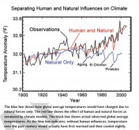
I found the chart below in the chapter Global Climate Change of the NOAA/NASA CCSP climate change report. I thought it was illustrative of some interesting issues:

See larger image here
The Perfect Backcast
What they are doing is what I call “backcasting,” that is, taking a predictive model and running it backwards to see how well it preforms against historical data. This is a perfectly normal thing to do.
And wow, what a fit. I don’t have the data to do any statistical tests, but just by eye, the red model output line does an amazing job at predicting history. I have done a lot of modeling and forecasting in my life. However, I have never, ever backcast any model and gotten results this good. I mean it is absolutely amazing. Of course, one can come up with many models that backcast perfectly but have zero predictive power.
In fact, it is fairly easy to demonstrate that the models are far better at predicting history than they are at predicting the future. This is the reason that neither this nor any other global warming alarmist report every shows a chart grading how model forecasts have performed against actual data: Because their record has been terrible. After all, we have climate model forecasts data all the way back from the late 1980’s—surely 20+ years is enough to get a test of their performance.
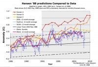
Below is the model forecasts James Hansen, whose fingerprints are all over this report, used before Congress in 1988 (in yellow, orange, and red), with a comparison to the actual temperature record (in blue).

See larger image here
You can see the forecasts began diverging from reality even as early as 1985. By the way, don’t get too encouraged by the yellow line appearing to be fairly close—the Hansen C case in yellow was similar to the IPCC B1 case which hypothesizes strong international CO2 abatement programs which have not come about. Based on actual CO2 production, the world is tracking, from a CO2 standpoint, between the orange and red lines. However, temperature is no where near the predicted values.
So the climate models are perfect at predicting history, but begin diverging immediately as we move into the future. That is probably why the IPCC resets its forecasts every 5 years, so they can hit the reset button on this divergence.
Read more here.
|
