Jun 24, 2011
Is the PDO real or a skeptic invention
By Joseph D’Aleo, CCM, AMS Fellow
Warmist ‘scientists’ and psuedo-scientists’ are quick to question the role of the sun and oceans in multi-decadal climate changes. We saw the spin machine rush into action after the announcements from the American Astronomical Society meeting in Austin about the results of three separate studies that the sun could be heading into a more-dormant period, with activity greatly reduced or even eliminated like the Maunder Minimum during the Little ice Age. They swung into action after Don Easterbrook wrote on the implications of the quiet sun with the cooling Pacific and Joe Bastardi’s interview on Fox in which he talked about the ‘Triple Crown of Cooling - a quiet sun, cooling oceans potentially augmented by volcanism.
They won’t and can’t deny ENSO, the short term oscillations in the tropical Pacific that can cause large swings of global temperatures. You may hear them use La Ninas to explain away cool years and can’t wait for the New Year’s day to end when El Nino’s develop to predict the year will be the warmist ever due to greenhouse gases. They will never admit to the multidecadal cycles in the oceans as these might explain some or most of the warming they want you to believe are the result of your driving SUVs and our burning fossil fuels. While Joe Bastardi and I readily admit man has an affect on our climate through factors, especially locally like urbanization, land use changes, the addition of aerosols, etc, we believe natural factors can’t be neglected. We have used them for years successfully in our forecasting and are doing so now every day on WEATHERBELL.
Let’s look at one of these natural drivers, the PDO today.
The “Pacific Decadal Oscillation” (PDO) is a long-lived El Nino-like pattern of Pacific climate variability according to scientists at JISAO at the University of Washington.
“While the two climate oscillations have similar spatial climate fingerprints, they have very different behavior in time. Fisheries scientist Steven Hare coined the term “Pacific Decadal Oscillation” (PDO) in 1996 while researching connections between Alaska salmon production cycles and Pacific climate (his dissertation topic with advisor Robert Francis).
Two main characteristics distinguish PDO from El Nino/Southern Oscillation (ENSO): first, 20th century PDO “events” persisted for 20-to-30 years, while typical ENSO events persisted for 6 to 18 months; second, the climatic fingerprints of the PDO are most visible in the North Pacific/North American sector, while secondary signatures exist in the tropics - the opposite is true for ENSO.
Several independent studies find evidence for just two full PDO cycles in the past century: “cool” PDO regimes prevailed from 1890-1924 and again from 1947-1976, while “warm” PDO regimes dominated from 1925-1946 and from 1977 through (at least) the mid-1990’s. Shoshiro Minobe has shown that 20th century PDO fluctuations were most energetic in two general periodicities, one from 15-to-25 years, and the other from 50-to-70 years.”
The PDO index is derived as the leading PC of monthly SST anomalies in the North Pacific Ocean. It was found while researchers at the University of Washington were trying to find reasons why salmon fisheries exhibited a distinct multidecadal behavior.
The landmark paper can be found here: Mantua, N.J. and S.R. Hare, Y. Zhang, J.M. Wallace, and R.C. Francis,1997: A Pacific interdecadal climate oscillation with impacts on salmon production. Bulletin of the American Meteorological Society, 78, pp 1069-1079.
Their abstract:
Evidence gleaned from the instrumental record of climate data identifies a robust, recurring pattern of ocean-atmosphere climate variability centered over the mid-latitude Pacific basin. Over the past century, the amplitude of this climate pattern has varied irregularly at interannual-to-interdecadal time scales. There is evidence of reversals in the prevailing polarity of the oscillation occurring around 1925, 1947, and 1977; the last two reversals correspond with dramatic shifts in salmon production regimes in the North Pacific Ocean. This climate pattern also affects coastal sea and continental surface air temperatures, as well as streamflow in major west coast river systems, from Alaska to California.
The ENSO and PDO climate patterns are clearly related, both spatially and temporally, to the extent that the PDO may be viewed as ENSO-like interdecadal climate variability (Tanimoto et al. 1993; ZWB). While it may be tempting to interpret interdecadal climatic shifts as responses to individual (tropical) ENSO events, it seems equally conceivable that the state of the interdecadal PDO constrains the envelope of interannual ENSO variability.”
The authors made no claim as to which (PDO or ENSO) was the chicken and which the egg.
“The ENSO and PDO climate patterns are clearly related, both spatially and temporally, to the extent that the PDO may be viewed as ENSO-like interdecadal climate variability (Tanimoto et al. 1993; ZWB). While it may be tempting to interpret interdecadal climatic shifts as responses to individual (tropical) ENSO events, it seems equally conceivable that the state of the interdecadal PDO constrains the envelope of interannual ENSO variability.”
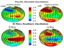
Indeed you can see clearly they similarity of the ENSO and the PDO in ‘ocean temperature distribution’ in the two positive PDO Index and El Nino and negative PDO and La Nina.

Enlarged
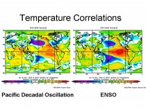
The temperature correlations over land are almost identical.

Enlarged
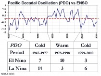
You can see support for the paper’s findings of the Great Pacific Climate Shift in 1977. You can support for the flip back in 1999 as Dr. Don Easterbrook found and published and posted on.

Enlarged
During the positive phase see the dominance of more frequent, stronger, longer La Ninas and the positive PDO mode, more frequent, stronger and longer El Ninos.

Enlarged

Enlarged
The PDO is a very useful tool for forecasters. With other ‘teleconnections’ like the AMO, ENSO, QBO, IOD, WP, EPO, solar, we have a good basis for skillful seasonal prediction. There are more tools that help intraseasonally.
Modelers and warmists can’t admit to the PDO or AMOs existence or importance as it would provide an alternative reason for the warming during the period from 1977 to 1998. They have staked out the position that the warming entirely man-made, to keep their gravy train of funding going. They do the same for solar. Mann’s recent claim that man’s induced warming is 20 times more important than solar is laughable. They conveniently focus solely on brightness changes ignoring all the solar amplification factors. Modelers and those who are agenda driven live in a virtual model world whhich they think is reality. Ironically when the data doesn’t jive with their model forecasts, they usually don’t adjust the models but find reasons to ‘correct’ the data to match the models to claim victory.
“When data conflicts with models, a small coterie of scientists can be counted upon to modify the data to agree with models’ projections,” MIT meteorologist Dr. Richard Lindzen.
UKMet’s principle research scientist John Mitchell: “People underestimate the power of models. Observational evidence is not very useful,” adding, “Our approach is not entirely empirical.”
In the real world, the PDO is a real ‘natural’ climate driver more reliable for forecasting the future than the climate models. Let us prove it to you on Weatherbell.
Jun 24, 2011
The science is settled: US liberals really are the dumbest creatures on the planet
By James Delingpole
MSNBC’s Chris Matthews: journalism needs less truth, less balance
Today I am in New York on my publicity tour for Watermelons and as I sat at breakfast this morning, chomping on an Ess-a-bagel and reading Thomas Sowells Basic Economics I found myself wondering - not for the first time ‘ why it is that liberal-lefties manage to be so utterly wrong about everything.
“Because they’re stupid,” said a libertarian friend of mine.
“Oh come on, not all of them surely? A bit misguided, maybe but...” I protested.
“No really theyre stupid because they’re not interested in facts. They just want to construct their pretty little narrative about the world, regardless of whether or not it has any bearing on reality. And then they want to dump it on us. And ruin our lives. So not just stupid but evil too.”
Well, you know me: what a big-hearted, sensitive, caring, emollient kind of guy I am. I thought these words were harsh, really harsh. But that was before I saw this video.
It features Chris Matthews, one of America’s most popular liberal talk show hosts, talking to a liberal journalist from liberal blogsite Salon called Joan Walsh and another liberal journalist from liberal Rolling Stone magazine on the liberal politics programme Hardball. And guess what these liberals believe the problem with Climate Change is? Go on: think of the most stupid, reality-denying, fact-ignoring, evidence-torturing tosh anyone involved in the media could possibly have to say on the subject. (H/T Climate Depot)
Yes, that’s right.
They think that the naughty yellow pixies who pull the special, magic Climat-O-Levers which control the weather have been paid by evil capitalists with fat cigars in their mouth and $ signs on their pinstripe suits to make the world’s climate all horrid so that poor, underprivileged and disabled people and endangered creatures suffer - and that the reason we dont know about it is because the media is run by evil Conservatives who want to keep this truth a secret.
Well, almost. What these liberal opinion-formers actually think - and you’ve really got to hand it to them: not even a lobotomised amoeba could beat them in a competition for dumbest creature on the planet, these three are absolute champs, Matthews especially, make no mistake - is as follows.
They think the main reasons for the public’s growing scepticism on Climate Change are 1. The media has been far too balanced on the subject and is not pushing the eco-message hard enough. 2. Big business is funding Climate Denialism. 3. Evil Conservatives - led by Evil Talk Show Hosts Rush Limbaugh and Glenn Beck - are deliberately telling lies about Climate Change. 4. The Republican party is “anti-science”.
My favourite bit is the one where Chris Matthews, who I believe takes himself seriously as a journalist, declares: “I hate that even-handed, so-called objective journalism. You know, you can’t say something isn’t true if its true...”
Do you know, on that last point at least I totally agree with Chris Matthews. So let’s examine a few of the claims which he and his two guest liberal echo chambers made on Hardball.
1. The media under-reports climate change. Oh yes. That will explain, for example, the recent widely reported story Decline Of Oceans Worse Than Previously Thought - given unquestioning coverage everywhere from the Sydney Morning Herald, the New York Times and Time magazine to the BBC. Yet as research from Ben Pile at Climate Resistance shows, most of these experts offering their supposed expert views on the imminence of pelagic climate doom were in fact just an ad hoc group of activists from heavily politicised organisations like Greenpeace and Pew Environment Group. Such is the state of Environmental reporting around the world these days: it consists of little more than lovingly transcribed press releases from hardcore ecoloon pressure groups.
2 Jo Nova has estimated that the amount spent by government agencies, left-leaning charitable foundations and big business promoting “global warming” is approximately 3,500 times more than the amount spent funding climate change scepticism.
3. With notable exceptions such as Fox news, US conservative talk radio, the generally right-leaning blogosphere and one or two papers such as Canada’s National Post, the Wall Street Journal and the Daily Express (and increasingly, the Mail) there are few media outlets in the world which broadcast anything other than green propaganda. Far from being evil, the likes of Beck and Limbaugh are islands of truth in a (presumably doomed, increasingly acidified) ocean of lies. (I’d be interested if Matthews could produce some concrete examples of these “lies” that Limbaugh and Beck have told on climate change).
4. Would that be “science” in the sense used by Al Gore, as in the received wisdom of a self-selecting cabal of post-normal activist scientists who dominate organisations like the IPCC, the National Academy of Sciences and the Royal Society. If so, then the Republican party is indeed “anti-science” because - with notable exceptions such as Mitt Romney and Newt Gingrich, of whom more in a subsequent post, very likely to be entitled “Mitt Romney prefers dog poop yogurt” - bases its scientific views on old fashioned virtues like rationalism, empiricism and open-minded, honest research rather than junk science dogma.
If we’re talking about science in the more old fashioned sense of the word as it might have been understood by, say Newton or Popper, rather than James Hansen or Al Gore, then no, the Republicans are not “anti-science.”
Jun 17, 2011
The Demise of Sunspots - Deep Cooling Ahead?
Don J. Easterbrook, Professor of Geology, Western Washington University, Bellingham, WA
The three studies released by NSO’s Solar Synoptic Network this week, predicting the virtual vanishing of sunspots for the next several decades and the possibility of a solar minimum similar to the Maunder Minimum, came as stunning news. According to Frank Hill, “the fact that three completely different views of the Sun point in the same direction is a powerful indicator that the sunspot cycle may be going into hibernation.” The last time sunspots vanished from the sun for decades was during the Maunder Minimum from 1645 to 1700 AD was marked by drastic cooling of the climate and the maximum cold of the Little Ice Age.
What happened the last time sunspots disappeared?
Abundant physical evidence from the geologic past provides a record of former periods of global cooling. Geologic records provide clear evidence of past global cooling so we can use them to project global climate into the future - the past is the key to the future. So what can we learn from past sunspot history and climate change?
Galileo’ perfection of the telescope in 1609 allowed scientists to see sunspots for the first time. From 1610 A.D. to 1645 A.D., very few sunspots were seen, despite the fact that many scientists with telescopes were looking for them, and from 1645 to 1700 AD sunspots virtually disappeared from the sun (Fig. 1). During this interval of greatly reduced sunspot activity, known as the Maunder Minimum, global climates turned bitterly cold (the Little Ice Age), demonstrating a clear correspondence between sunspots and cool climate. After 1700 A.D., the number of observed sunspots increased sharply from nearly zero to more than 50 (Fig. 1) and the global climate warmed.

FIGURE 1. Sunspots during the Maunder Minimum (modified from Eddy, 1976).
The Maunder Minimum was not the beginning of The Little Ice Age - it actually began about 1300 AD - but it marked perhaps the bitterest part of the cooling. Temperatures dropped ~4 C (~7 F) in ~20 years in mid-to high latitudes. The colder climate that ensued for several centuries was devastating. The population of Europe had become dependent on cereal grains as their main food supply during the Medieval Warm Period and when the colder climate, early snows, violent storms, and recurrent flooding swept Europe, massive crop failures occurred. Winters in Europe were bitterly cold, and summers were rainy and too cool for growing cereal crops, resulting in widespread famine and disease. About a third of the population of Europe perished.
Glaciers all over the world advanced and pack ice extended southward in the North Atlantic. Glaciers in the Alps advanced and overran farms and buried entire villages. The Thames River and canals and rivers of the Netherlands frequently froze over during the winter. New York Harbor froze in the winter of 1780 and people could walk from Manhattan to Staten Island. Sea ice surrounding Iceland extended for miles in every direction, closing many harbors. The population of Iceland decreased by half and the Viking colonies in Greenland died out in the 1400s because they could no longer grow enough food there. In parts of China, warm weather crops that had been grown for centuries were abandoned. In North America, early European settlers experienced exceptionally severe winters.
So what can we learn from the Maunder? Perhaps most important is that the Earth’s climate is related to sunspots. The cause of this relationship is not understood, but it definitely exists. The second thing is that cooling of the climate during sunspot minima imposes great suffering on humans - global cooling is much more damaging than global warming.
Global cooling during other sunspot minima
The global cooling that occurred during the Maunder Minimum was neither the first nor the only such event. The Maunder was preceded by the Sporer Minimum (~14101540 A.D.) and the Wolf Minimum (~1290-1320 A.D.) and succeeded by the Daltong Minimum (1790-1830), the unnamed 1880 - 1915 minima, and the unnamed 1945-1977 Minima (Fig. 2). Each of these periods is characterized by low numbers of sunspots, cooler global climates, and changes in the rate of production of 14C and 10Be in the upper atmosphere. As shown in Fig. 2, each minimum was a time of global cooling, recorded in the advance of alpine glaciers.

Figure 2. Correspondence of cold periods and solar minima from 1500 to 2000 AD. Each of the five solar minima was a time of sharply reduced global temperatures (blue areas).
The same relationship between sunspots and temperature is also seen between sunspot numbers and temperatures in Greenland and Antarctica (Fig. 3). Each of the four minima in sunspot numbers seen in Fig. 3 also occurs in Fig. 2. All of them correspond to advances of alpine glaciers during each of the cool periods.

Figure 3. Correlation of sunspot numbers and temperatures in Greenland and Antarctica (modified from Usoskin et al., 2004).
Figure 4 shows the same pattern between solar variation and temperature. Temperatures were cooler during each solar minima.

Figure 4. Solar irradiance and temperature from 1750 to 1990 AD. During this 250-year period, the two curves follow remarkably similar patterns (modified from Hoyt and Schatten, 1997). Each solar minima corresponds to climatic cooling.
What can we learn from this historic data? Clearly, a strong correlation exists between solar variation and temperature. Although this correlation is too robust to be merely coincidental, exactly how solar variation are translated into climatic changes on Earth is not clear. For many years, solar scientists considered variation in solar irradiance to be too small to cause significant climate changes. However, Svensmark (Svensmark and Calder, 2007; Svensmark and Friis-Christensen, 1997; Svensmark et al., 2007) has proposed a new concept of how the sun may impact Earths climate. Svensmark recognized the importance of cloud generation as a result of ionization in the atmosphere caused by cosmic rays. Clouds reflect incoming sunlight and tend to cool the Earth. The amount of cosmic radiation is greatly affected by the suns magnetic field, so during times of weak solar magnetic field, more cosmic radiation reaches the Earth. Thus, perhaps variation in the intensity of the solar magnetic field may play an important role in climate change.
Are we headed for another Little Ice Age?
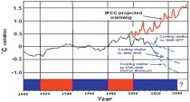
In 1999, the year after the high temperatures of the 1998 El Nino, I became convinced that geologic data of recurring climatic cycles (ice core isotopes, glacial advances and retreats, and sun spot minima) showed conclusively that we were headed for several decades of global cooling and presented a paper to that effect (Fig. 5). The evidence for this conclusion was presented in a series of papers from 2000 to 2011 (The data are available in several GSA papers, my website, a 2010 paper, and in a paper scheduled to be published in Sept 2011). The evidence consisted of temperature data from isotope analyses in the Greenland ice cores, the past history of the PDO, alpine glacial fluctuations, and the abrupt Pacific SST flips from cool to warm in 1977 and from warm to cool in 1999. Projection of the PDO to 2040 forms an important part of this cooling prediction.

Figure 5. Projected temperature changes to 2040 AD. Three possible scenarios are shown: (1) cooling similar to the 1945-1977 cooling, cooling similar to the 1880-1915 cooling, and cooling similar to the Dalton Minimum (1790-1820). Cooling similar to the Maunder Minimum would be an extension of the Dalton curve off the graph.
So far, my cooling prediction seems to be coming to pass, with no global warming above the 1998 temperatures and a gradually deepening cooling since then. However, until now, I have suggested that it was too early to tell which of these possible cooling scenarios were most likely. If we are indeed headed toward a disappearance of sunspots similar to the Maunder Minimum during the Little Ice Age then perhaps my most dire prediction may come to pass. As I have said many times over the past 10 years, time will tell whether my prediction is correct or not. The announcement that sun spots may disappear totally for several decades is very disturbing because it could mean that we are headed for another Little Ice Age during a time when world population is predicted to increase by 50% with sharply increasing demands for energy, food production, and other human needs. Hardest hit will be poor countries that already have low food production, but everyone would feel the effect of such cooling. The clock is ticking. Time will tell!
Larger images and references can be found in the PDF.
Jun 15, 2011
Sun’s Fading Spots Signal Big Drop in Solar Activity
by Denise Chow, SPACE.com Staff Writer
Update:
See John Coleman’s report on KUSI on the solar downturn here.
Some unusual solar readings, including fading sunspots and weakening magnetic activity near the poles, could be indications that our sun is preparing to be less active in the coming years.
The results of three separate studies seem to show that even as the current sunspot cycle swells toward the solar maximum, the sun could be heading into a more-dormant period, with activity during the next 11-year sunspot cycle greatly reduced or even eliminated.
The results of the new studies were announced today (June 14) at the annual meeting of the solar physics division of the American Astronomical Society, which is being held this week at New Mexico State University in Las Cruces.
“The solar cycle may be going into a hiatus,” Frank Hill, associate director of the National Solar Observatory’s Solar Synoptic Network, said in a news briefing today (June 14).
The studies looked at a missing jet stream in the solar interior, fading sunspots on the sun’s visible surface, and changes in the corona and near the poles. [Photos: Sunspots on Earth’s Star]
“This is highly unusual and unexpected,” Hill said. “But the fact that three completely different views of the sun point in the same direction is a powerful indicator that the sunspot cycle may be going into hibernation.”
Spots on the sun
Sunspots are temporary patches on the surface of the sun that are caused by intense magnetic activity. These structures sometimes erupt into energetic solar storms that send streams of charged particles into space.
Since powerful charged particles from solar storms can occasionally wreak havoc on Earth’s magnetic field by knocking out power grids or disrupting satellites in orbit, a calmer solar cycle could have its advantages.
Astronomers study mysterious sunspots because their number and frequency act as indicators of the sun’s activity, which ebbs and flows in an 11-year cycle. Typically, a cycle takes roughly 5.5 years to move from a solar minimum, when there are few sunspots, to the solar maximum, during which sunspot activity is amplified.
Currently, the sun is in the midst of the period designated as Cycle 24 and is ramping up toward the cycle’s period of maximum activity. However, the recent findings indicate that the activity in the next 11-year solar cycle, Cycle 25, could be greatly reduced. In fact, some scientists are questioning whether this drop in activity could lead to a second Maunder Minimum, which was a 70-year period from 1645 to 1715 when the sun showed virtually no sunspots. [Video: Rivers of Fire Inflame Sunspots]
Hill is the lead author of one of the studies that used data from the Global Oscillation Network Group to look at characteristics of the solar interior. (The group includes six observing stations around the world.) The astronomers examined an east-west zonal wind flow inside the sun, called torsional oscillation. The latitude of this jet stream matches the new sunspot formation in each cycle, and models successfully predicted the late onset of the current Cycle 24.
“We expected to see the start of the zonal flow for Cycle 25 by now, but we see no sign of it,” Hill said. “The flow for Cycle 25 should have appeared in 2008 or 2009. This leads us to believe that the next cycle will be very much delayed, with a minimum longer than the one we just went through.”
Hill estimated that the start of Cycle 25 could be delayed to 2021 or 2022 and will be very weak, if it even happens at all.
The sun’s magnetic field
In the second study, researchers tracked a long-term weakening trend in the strength of sunspots, and predict that by the next solar cycle, magnetic fields erupting on the sun will be so weak that few, if any, sunspots will be formed.
With more than 13 years of sunspot data collected at the McMath-Pierce Telescope at Kitt Peak in Arizona, Matt Penn and William Livingston observed that the average magnetic field strength declined significantly during Cycle 23 and now into Cycle 24. Consequently, sunspot temperatures have risen, they observed.
If the trend continues, the sun’s magnetic field strength will drop below a certain threshold and sunspots will largely disappear; the field no longer will be strong enough to overcome such convective forces on the solar surface.
In a separate study, Richard Altrock, manager of the Air Force’s coronal research program at NSO’s facility in New Mexico, examined the sun’s corona and observed a slowdown of the magnetic activity’s usual “rush to the poles.”
“A key thing to understand is that those wonderful, delicate coronal features are actually powerful, robust magnetic structures rooted in the interior of the sun,” Altrock said. “Changes we see in the corona reflect changes deep inside the sun.”
Altrock sifted through 40 years of observations from NSO’s 16-inch (40 centimeters) coronagraphic telescope.
New solar activity typically emerges at a latitude of about 70 degrees at the start of the solar cycle, then moves toward the equator. The new magnetic field simultaneously pushes remnants of the past cycle as far as 85 degrees toward the poles. The current cycle, however, is showing some different behavior.
“Cycle 24 started out late and slow and may not be strong enough to create a rush to the poles, indicating we’ll see a very weak solar maximum in 2013, if at all,” Altrock said. “If the rush to the poles fails to complete, this creates a tremendous dilemma for the theorists, as it would mean that Cycle 23’s magnetic field will not completely disappear from the polar regions.
No one knows what the sun will do in that case.”
If the models prove accurate and the trends continue, the implications could be far-reaching.
“If we are right, this could be the last solar maximum we’ll see for a few decades,” Hill said. “That would affect everything from space exploration to Earth’s climate.”
Jun 14, 2011
Estimates of Global Food Production in the Year 2050: Will We Produce Enough to Feed the World?
By Craig Idso, CO2 Science
Government leaders and policy makers should take notice of the findings of this important new analysis of the world food situation; for doing what climate alarmists claim is needed to fight global warming will surely consign earth’s human population to a world of woe, while doing next to nothing in terms of altering the current warm phase of the planet’s surface temperature.
A new study by the Center for the Study of Carbon Dioxide and Global Change—Estimates of Global Food Production in the Year 2050: Will We Produce Enough to Adequately Feed the World?—reveals that a very real and devastating food crisis is looming on the horizon, and continuing advancements in agricultural technology and expertise will most likely not be able to bridge the gap between global food supply and global food demand just a few short years from now.
Crop yield and production data were utilized to identify the crops that supply 95% of the food needs of (1) the world, (2) six large regions into which the world may be divided, (3) twenty sub-regions, and (4) the world’s twenty-five most populated countries. Recent productivity trends of these key crops were then projected to the year 2050 for each of the specified geographical areas, revealing that expected advances in agricultural technology and expertise will increase the food production potential of many countries and regions. However, these advances will not increase production fast enough to meet the needs of the planet’s even faster-growing human population. But when the positive impact of Earth’s rising atmospheric CO2 concentration on crop yields was considered, the severity of the pending food shortage was found to be considerably lessened.
“Having evolved at much higher levels of atmospheric CO2 than those of the current geological period, many land plants grow substantially better with more CO2,” says Dr. William Happer, Cyrus Fogg Brackett Professor of Physics at Princeton University, who states that the report “provides a very thorough review of the beneficial role of increased CO2 on mankind’s most important agricultural crops.”
In order to avoid the unpalatable consequences of unprecedented widespread hunger - and even starvation - in the years and decades ahead, the study’s author, Dr. Craig Idso, contends that “a commitment similar to that which drove the Apollo moon-mission is needed to increase crop yields per unit of land area, per amount of nutrients applied, and per amount of water used.” And about the only way of successfully doing so without the taking of unconscionable amounts of land and water from nature and thereby driving untold numbers of plant and animal species to extinction, is to “invest the time, effort and capital that is required to identify, and to then use, the major food crop genotypes that respond most strongly to atmospheric CO2 enrichment.”
However, rising CO2 concentrations are considered by many people to be the primary cause of what is claimed to be unprecedented global warming; and if regulations restricting anthropogenic CO2 emissions are enacted to fight this perceived but likely phantom problem, Idso contends that they will “greatly exacerbate” food shortfalls by reducing the CO2-induced yield enhancements that are needed to supplement the productivity increases provided by expected future advances in agricultural technology and expertise. And in the wake of such emissions regulations, hundreds of millions of people the world over will likely experience significant hunger and malnutrition.
Government leaders and policy makers should take notice of the findings of this important new analysis of the world food situation; for doing what climate alarmists claim is needed to fight global warming will surely consign earth’s human population to a world of woe, while doing next to nothing in terms of altering the current warm phase of the planet’s surface temperature.
The report can be viewed or downloaded at the website of the Center for the Study of Carbon Dioxide and Global Change. Questions about the report can be addressed to Dr. Craig Idso at the email address contactus@co2science.org.
|
