Excerpts from Doney’s recent congressional testimony [link]
Rebuttal
Craig Idso has written comprehensive rebuttal to the NRDC film “Acid Test: The Global Challenge of Ocean Acidification.” [link]
So what’s the story here? Are coral reefs really in their last decades of existence? Will the shells of other calcifying marine life also dissolve away during our lifetimes? The NRDC film certainly makes it appear that such is the case; but a little scientific sleuthing reveals nothing of substance in this regard. In fact, even a cursory review of the peer-reviewed scientific literature reveals that an equally strong case, if not a more persuasive one, can be made for the proposition that the ongoing rise in atmospheric CO2 concentration will actually prove a boon to calcifying marine life. Sadly, however, the NRDC chose to present an extreme one-sided, propagandized view of ocean acidification; and in this critique we present the part of the story that they clearly don’t want you to know. [25 pages of text, 13 pages of references]
From the Conclusions:
In conclusion, based on the many real-world observations and laboratory experiments described above, it is clear that recent theoretical claims of impending marine species extinctions, due to increases in the atmosphere’s CO2 concentration, have no basis in empirical reality. In fact, these unsupportable contentions are typically refuted by demonstrable facts. As such, the NRDC’s portrayal of CO2-induced ocean acidification as a megadisaster-in-the-making is seen, at best, to be a one-sided distortion of the truth or, at worst, a blatant attempt to deceive the public.
Surely, the NRDC and the scientists portrayed in their film should have been aware of at least one of the numerous peer-reviewed scientific journal articles that do not support a catastrophic, or even a problematic, view of the effect of ocean acidification on calcifying marine organisms; and they should have shared that information with the public. If by some slim chance they were not aware, shame on them for not investing the time, energy, and resources needed to fully investigate an issue that has profound significance for the biosphere. And if they did know the results of the studies we have discussed, no one should ever believe a single word they may utter or write in the future.
Finally, if there is a lesson to be learned from the materials presented in this document, it is that far too many predictions of CO2-induced catastrophes are looked upon as sure-to-occur, when real-world observations show such doomsday scenarios to be highly unlikely or even virtual impossibilities. The phenomenon of CO2-induced ocean acidification is no different. Rising atmospheric CO2 concentrations are not the bane of the biosphere; they are an invaluable boon to the planet’s many life forms.
JC comment: So whose view of the ocean acidification is correct: Doney’s or Idso’s? In this instance, it is instructive for me to describe my own reasoning process, since I come to this topic with very little first hand knowledge, beyond understanding the basic chemistry of the problem.
When I saw Scott Doney listed as a witness for this hearing, I was very pleased, since he is a scientific heavy hitter on this subject. However, upon reading the first page of his testimony, the following statement raised my skeptical hackles, especially since their was no evidence or reference to support this:
Today the surface ocean is almost 30% more acidic than it was in pre-industrial times.
I found Doney’s testimony to be highly normative, something that I am not a fan of in testimony by scientists. I did a word search, looking for ‘uncertain’, ‘disagreement’, ‘debate’, ‘unknown’. The only statements I found were:
Decisions should incorporate precautionary considerations to account for the fact that potential carbon dioxide thresholds are presently unknown for many aspects of ocean acidification.
The potential biological consequences due to acidification are slowly becoming clearer at the level of individual species, but substantial uncertainties remain particularly at the ecosystem level.
For these reasons, Doney’s testimony didn’t score too high on my credibility meter, in spite of my acknowledgement of his expertise and stature in the field.
I figured that there has to be another side to this story, so I did a quick Google search and spotted Idso’s document. Idso’s document clearly states that there is another side to this story. Idso’s approach is more credible IMO, since he acknowledges that there are two sides to the story, that at this point may be equally plausible. I searched for the same 4 words; only spotted one use of ‘unknown’, so I am not sure how useful my little litmus test was.
The issue is this: failure of the ‘mainstream’ experts to adequately discuss uncertainty and alternative viewpoints leaves a void to be filled by the likes of Idso, with the inadvertent effect of elevating Idso’s essay more than it probably deserves.
That said, I cannot personally judge whether Doney’s or Idso’s arguments are better scientifically, without digging into the primary literature myself; and even then I am not sure how confident I would be in my own ability to assess this.
Warmist Kevin Drum on selling the global warming hoax:
“...anecdotal evidence (mild winters, big hurricanes, wildfires, etc.) is probably our best bet. We should milk it for everything it’s worth”
OK, so yesterday’s hearing really was entitled, “Climate Change: It’s Happening Now”. I like my title better.
In this exceedingly rare photo of me actually cracking a smile, note my subliminal shout out to the “Koch” brothers (whom I’ve never met, btw...I don’t even know what they do):
Spencer-EPW-testimony-7-18-2013
From the opening remarks made by the Democrats on the Environment and Public Works (EPW) Committee, apparently you can see climate change yourself just by looking in your backyard, or seeing how far from shore fishermen must go now to catch fish, or even (help me with the logic on this one) the fact that smoking causes cancer.
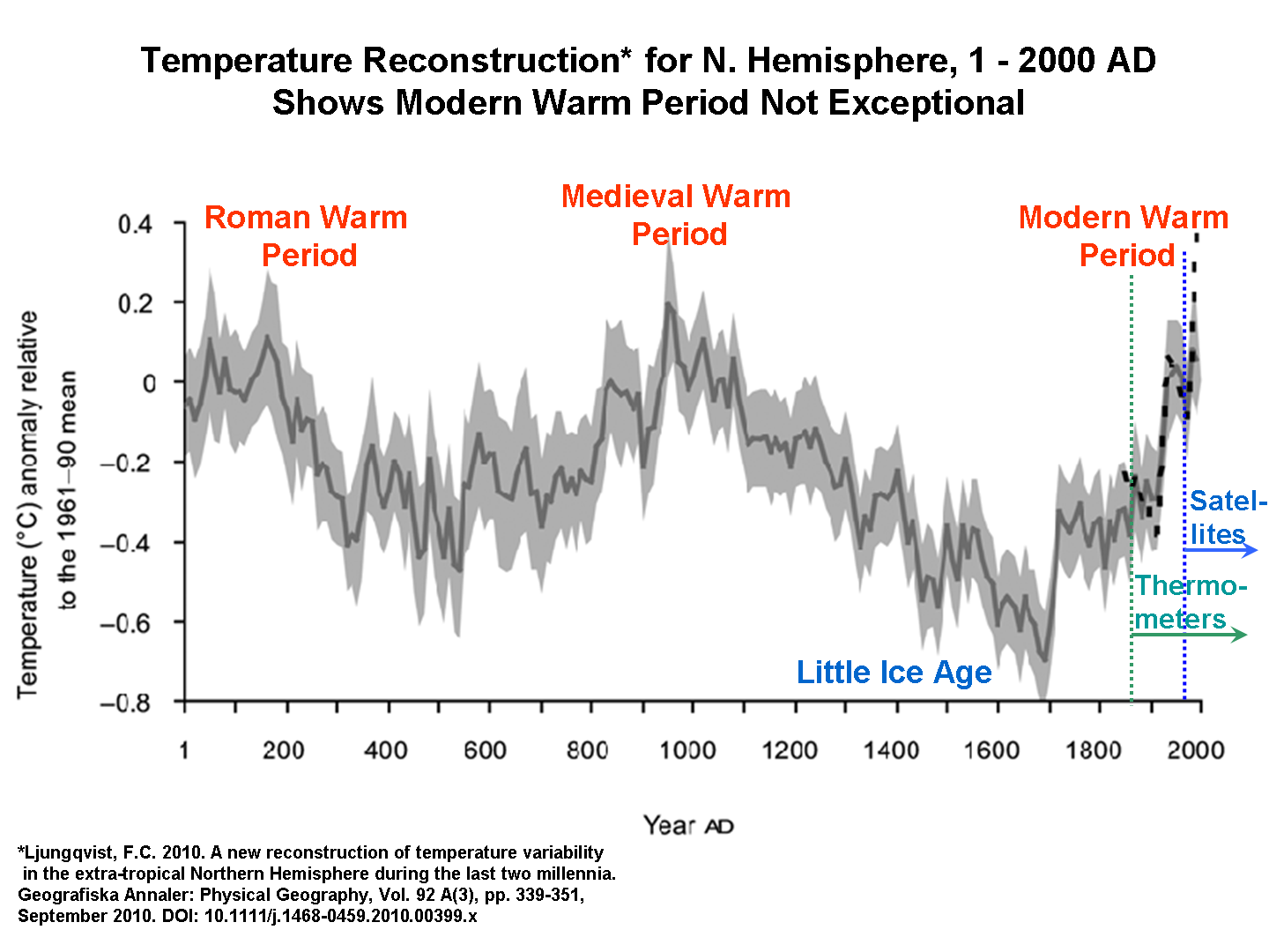
I just submitted my updated written testimony (Spencer_EPW_Written_Testimony) to include the following chart (Click for full size):
2000-yr-temperature-variations
This chart illustrates that, yes, we are currently warm, but not significantly warmer than the Medieval Warm Period (MWP) or the Roman Warm Period (RWP). So how is it we know today’s warmth is human-caused, when the last two warm periods couldn’t have been caused by humans? Hmmm?
And if you want to hit me with a Hockey Stick, might I remind you that there are many more papers supporting the MWP and RWP than there are supporting the Hockey Stick’s slick revision of history?
Or does “consensus” only count when it supports your side?
What’s that you say? The hockey stick is now the “new consensus”? So a scientific consensus can be wrong, after all? Hmmm.
Hearing Post Mortem
The advertised star of the show was Heidi Cullen (aka “de-certify all TV meteorologists who don’t toe the line on global warming Heidi") who did an admirable job of presenting a litany of half-truths (hurricanes have increased [except in the last 7 years]; strong tornadoes have decreased [but she couldn’t bring her self to actually say that]; wildfire acres burned have increased dramatically [but the number of wildfires have decreased dramatically...all consistent with the USFS “let it burn” policy]; droughts and floods have increased [except NOAA’s charts say there is no change over the last 100 years], etc.).
Roger Pielke, Jr. was absolutely devastating in his testimony. Here’s a guy who claims to largely support the IPCC party line, even claiming increasing CO2 is having a “profound” effect on the climate system, yet he chides those who would try to use severe weather as evidence of climate change. The evidence simply isn’t there. Very Lomborgian, sans the sexy T-shirt.
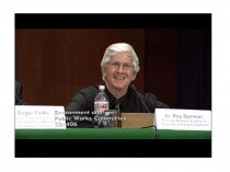
During my testimony (in the Flash video, starting about 3:04 for my oral, and 3:23 for follow-up questions/interrogation) I decided to depart from my usual practice of reading of a prepared text to just winging it. There is VERY little you can cover in 5 minutes, and there were a number of things I would have liked to have said, but there simply isn’t time… that’s just the way committee hearings go.
All of the senators were moving in an out of the hearing room for a floor vote, so there were only 2-4 senators present at any given time.
Thanks to all of those who have posted and e-mailed supportive comments...I really appreciate it. Getting flogged in public by Sen. Boxer (last time I testified) and Sen. Whitehouse (this time) is not one of my favorite activities. But I warned the staffers I wasn’t going to be pushed around this time without some pushing back. I think we did OK for a hearing where the witness numbers were stacked against us.
--------
This from Forbes:
BOXER’S OWN EXPERTS CONTRADICT OBAMA ON CLIMATE CHANGE
Expert witnesses called by Sen. Barbara Boxer to testify during Senate Environment and Public Works hearings Thursday contradicted a key assertion made by President Barack Obama on climate change.
Speaking at a Democratic fundraiser less than a month before directing the U.S. Environmental Protection Agency to impose costly new restrictions on carbon dioxide emissions, Obama said, “we also know that the climate is warming faster than anybody anticipated five or 10 years ago.”
“I don’t have much patience for people who deny climate change,” Obama added.
During Thursday’s Environment and Public Works hearings, Sen. David Vitter asked a panel of experts, including experts selected by Boxer, “Can any witnesses say they agree with Obama’s statement that warming has accelerated during the past 10 years?”
Nobody said a word. After several seconds of deafening silence, Weather Channel meteorologist and global warming activist Heidi Cullen attempted to change the subject. Cullen said our focus should be on longer time periods rather than the 10-year period mentioned by Obama. When pressed, however, she contradicted Obama’s central assertion and said warming has slowed, not accelerated.
Several minutes later, Sen. Jeff Sessions returned to the topic and sought additional clarity. Sessions recited Obama’s quote claiming accelerating global warming during the past 10 years and asked, “Do any of you support that quote?”
Again, a prolonged and deafening silence ensued. Neither Cullen nor any of the other experts on the panel spoke a word, not even in an attempt to change the subject.
Boxer may have envisioned her high-profile global warming hearings as an opportunity to build momentum for congressional or EPA action to restrict carbon dioxide emissions. Instead, the very global warming activists she called to serve as expert witnesses delivered a crushing blow to Obama’s central justification for expensive new restrictions on carbon dioxide emissions.
-------
Roger Pielke Jr.’s testimony was also powerful (here)
‘It is further incorrect to associate the increasing costs of disasters with the emission of greenhouse gases’
Globally, weather-related losses ($) have not increased since 1990 as a proportion of GDP (they have actually decreased by about 25%) and insured catastrophe losses have not increased as a proportion of GDP since 1960.
* Hurricanes have not increased in the US in frequency, intensity or normalized damage since at least 1900. The same holds for tropical cyclones globally since at least 1970 (when data allows for a global perspective).
* Floods have not increased in the US in frequency or intensity since at least 1950. Flood losses as a percentage of US GDP have dropped by about 75% since 1940.
* Tornadoes have not increased in frequency, intensity or normalized damage since 1950, and there is some evidence to suggest that they have actually declined.
* Drought has “for the most part, become shorter, less frequent, and cover a smaller portion of the U. S. over the last century.” Globally, “there has been little change in drought over the past 60 years.”
* The absolute costs of disasters will increase significantly in coming years due to greater wealth and populations in locations exposed to extremes. Consequent, disasters will continue to be an important focus of policy, irrespective of the exact future course of climate change.’
----------
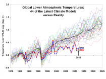
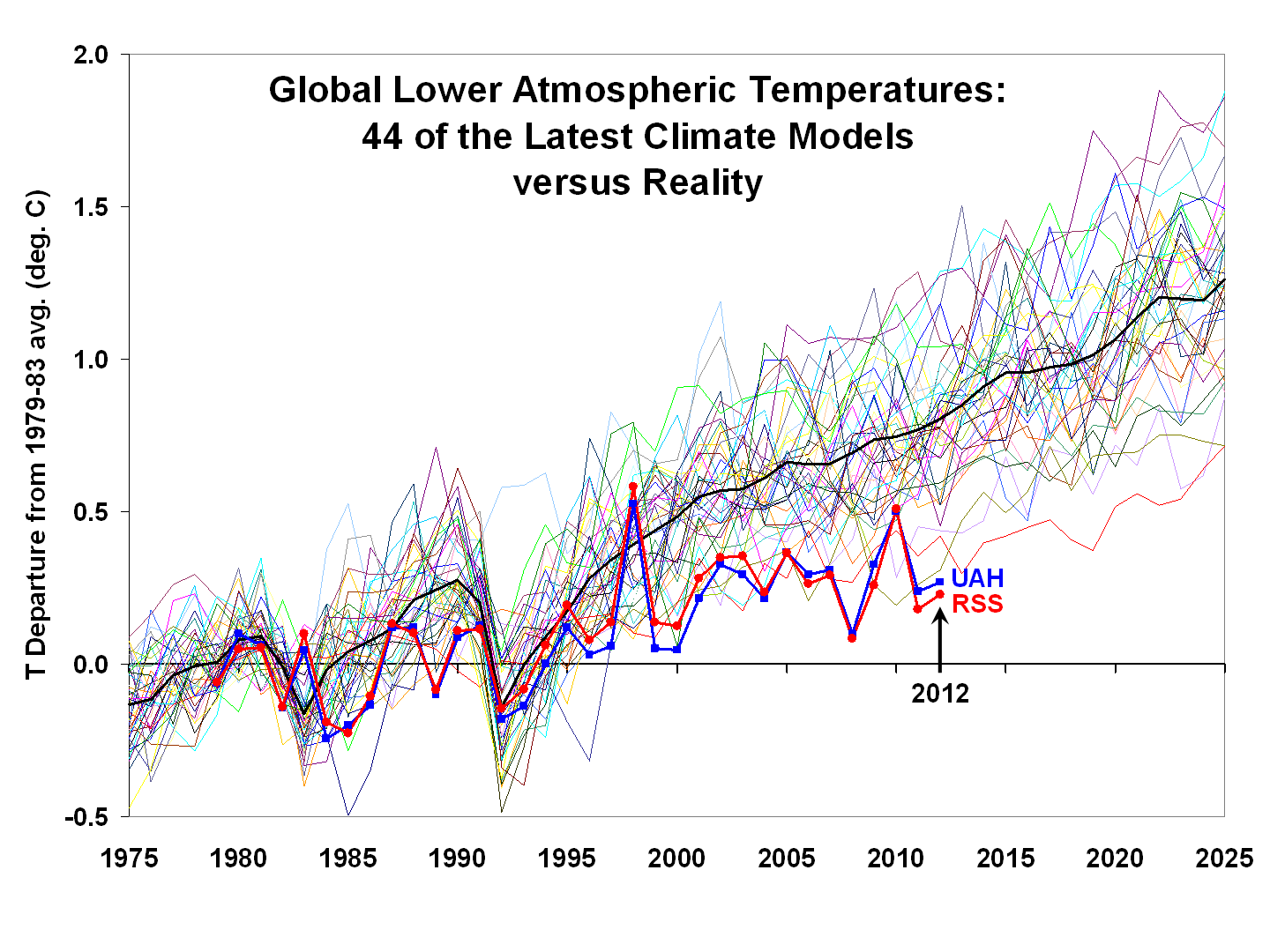
New article in Nature laments the dismal failure of climate models Hockey Schtick
Here is why:
New article in Nature laments the dismal failure of climate models
An article published today in Nature laments the dismal failure of climate models to predict climate a mere 5 years into the future, much less a century from now:
“The dramatic warming predicted after 2008 has yet to arrive.”
“It’s fair to say that the real world warmed even less than our forecast suggested,” [modeller] Smith says. “We don’t really understand at the moment why that is."”
“Although I have nothing against this endeavour as a research opportunity, the papers so far have mostly served as a ‘disproof of concept’,” says Gavin Schmidt. Schmidt says that these efforts are “a little misguided”. He argues that it is difficult to attribute success or failure to any particular parameter because the inherent unpredictability of weather and climate is built into both the Earth system and the models. “It doesn’t suggest any solutions,” he says.
“Because the climate does not usually change drastically from one year to the next, the model is bound to start off predicting conditions that are close to reality. But that effect quickly wears off as the real climate evolves. If this is the source of the models’ accuracy, that advantage fades quickly after a few years.”
“Kevin Trenberth, a climate scientist at the National Center for Atmospheric Research in Boulder, Colorado, says that it could be a decade or more before this research really begins to pay off in terms of predictive power, and even then climate scientists will be limited in what they can say about the future.”
Once again, modellers attempt to explain away their failures due to the dubious excuse of Trenberth’s “missing heat” sinking undetected to the bottom of the ocean.
-----------
University scientists and BOM lie carried on Live Science (Lie Science?)
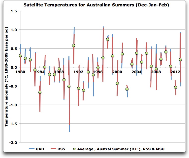
Human-caused global warming played a role in making this past summer Australia’s hottest on record, a new study suggests.
The summer of 2012-2013 probably won’t retain its title for long; researchers say record-breaking scorching summers are five times more likely to occur now in Australia due to climate change.
“Our research has shown that, due to greenhouse gas emissions, these types of extreme summers will become even more frequent and more severe in the future,” study author Sophie Lewis of the University of Melbourne said in a statement.
Australia’s summer occurs from December to February, during the Northern Hemisphere’s winter. In those three months between 2012 and 2013, the country’s average temperature was 83.5 degrees Fahrenheit (28.6 degrees Celsius), 2 degrees F (1 degree C) above normal, according to Australia’s Bureau of Meteorology. It broke the previous summer temperature record, set in the 1997-1998 season, by 0.18 degree F (0.1 degree C).
Unusually high temperatures gripped nearly the entire country, with just three percent of Australia experiencing below-normal temperatures. Bush fires and flooding, combined with the extreme heat, prompted Australians to call it the “angry summer.”
Lewis and colleagues looked at climate observations and more than 90 climate model simulations of summer temperatures in Australia over the past 100 years. They found that human influences likely stoked the record heat during a summer when Australians may have otherwise expected cooler temperatures.
“This extreme summer is not only remarkable for its record-breaking nature but also because it occurred at a time of weak La Nina to neutral conditions, which generally produce cooler summers,” Karoly said. “Importantly, our research shows the natural variability of El Nino Southern Oscillation is unlikely to explain the recent record temperatures.” The El Nino Southern Oscillation is a climate cycle that can impact weather and climate systems around the globe; it’s El Nino phases features warmer-than-normal sea surface temperatures in the tropical Pacific Ocean, while the La Nina phase features cooler-than-normal temperatures.
Climate describes weather that occurs over long periods, such as decades, centuries or millennia, and scientists are typically quick to point out that no individual storm, heat wave or unusual season can be directly blamed on climate change. But researchers have said that global warming can make some events, on average, more severe and more frequent than they would have been in the past.
The research has been accepted for publication in the journal Geophysical Research Letters (once a reputable journal).
The satellites tell the real story. Note how last year was 5th coldest summer. Karoly is a warmist ‘scientist’ once spreading the big lie in the US. Good riddance.
Update: The Whitehouse releases a laughable state by state climate impact report
Posted on June 26, 2013 by Anthony Watts
UPDATE: Uproariously laughable now, the White House state climate impact report claims there are 31 counties in Hawaii, when there are actually 4, see below. Anthony
This is verbatim from the White House Blog today, see my comments here.
-------------------
As for the action plan, there were two documents provided to the press: a fact sheet/summary and the full plan. Both are available as PDF’s at the end of this essay. I see a lot of “pie in the sky” language in the plan document, with little in the way of concrete ideas. It seems just another expansion of “big government” bureaucracy with little tangible benefit to the American citizen.
This is by no means a complete point by point commentary, I’m just touching on things that caught my eye. Readers are encouraged to submit responses to specific points in the comments section below.
THE GOOD:
1. There is no carbon tax/excise tax increase on gasoline that I can find. Some people thought there may be a plan to tack on some sort of additional carbon tax for gasoline, or some pitch for the excise tax to be increased by congress.
2. The claim is made that “the President’s plan will help American families cut energy waste, lowering their gas and utility bills.” A worthy goal to be sure, but, knowing that government doesn’t do anything well or efficiently, I seriously doubt we’ll see lower utility bills. I expect the opposite.
3. The plan “invests to strengthen our roads, bridges, and shorelines so we can better protect people’s homes, businesses, and way of life from severe weather.” Hurricane Sandy would have had less impact if NYC had better sea defenses, so building up these long ignored issues is a no-brainer. But, at what cost and from what funding?
4. The plan “Commits to partnering with industry and stakeholders to develop fuel economy standards for heavy-duty vehicles to save families money at the pump and further reduce reliance on foreign oil and fuel consumption post-2018”. On the surface this seems good, because better fuel efficiency is always a good thing, but at the same time this might translate into an unreachable draconian CAFE standard that automakers don’t even have technology for now.
5. The plan calls for “investment in a range of energy technologies, from advanced biofuels and emerging nuclear technologies - including small modular reactors - to clean coal.” Biofuels are a waste of effort and money IMHO, small modular nukes sound good, as does clean coal. I like the clean coal part if only for the irritant factor it will be for the greens.
6. They haven’t declared fossil fuels to be evil. The plan says “Spurring Investment in Advanced Fossil Energy Projects: In the coming weeks, the Department of Energy will issue a Federal Register Notice announcing a draft of a solicitation that would make up to $8 billion in (self-pay) loan guarantee authority available for a wide array of advanced fossil energy projects under its Section 1703 loan guarantee program.” Again, that will tweak the greens.
7. There’s no mention of the KXL pipeline at all, but there is this bit of language:
“In addition, when it comes to the oil and gas sector, investments to build and upgrade gas pipelines will not only put more Americans to work, but also reduce emissions and enhance economic productivity.” The document then goes on to mention the Bakken Oil field as an example, but seems not limited to this.
My take on this: I think what is going on here with this document is that Obama is throwing environmentalists a bone, especially with coal power plant restrictions mentioned, while at the same time telegraphing that KXL is likely to happen. As I’ve said before, the Canadian Tar Sands oil will get burned someplace, and the USA may as well take advantage of the opportunity.
8. Launching a Climate Data Initiative: Consistent with the President’s May 2013 Executive Order on Open Data and recognizing that freely available open government data can fuel entrepreneurship, innovation, scientific discovery, and public benefits the Administration is launching a Climate Data Initiative to leverage extensive federal climate relevant data to stimulate innovation and private sector entrepreneurship in support of national climate change preparedness.
This sounds good, but I’m not sure it will do anything to improve the already shoddy surface temperature data. For example, NCDC spent millions on the Climate Reference Network, but has yet to even mention it in their monthly State of the Climate Reports.
9. Many of these things will take years to implement, and by then we might have some sanity in the White House. What can be done by executive order can be undone by executive order.
10. This plan is likely to put backlashes in place on Democrats from the citizenry, thus perhaps enabling a power shift in the Senate.
THE BAD:
1. More hand-outs for an already bloated climate science culture.
Developing Actionable Climate Science: The President’s Fiscal Year 2014 Budget provides more than $2.7 billion, largely through the 13-agency U.S. Global Change Research Program, to increase understanding of climate-change impacts, establish a public-private partnership to explore risk and catastrophe modeling, and develop the information and tools needed by decision-makers to respond to both long-term climate change impacts and near-term effects of extreme weather.
Apparently Obama never got the memo that climate models aren’t working.
2. More regulations on existing power plants, as if they don’t have enough already. This will translate into higher electricity prices everywhere.
President Obama is issuing a Presidential Memorandum directing the Environmental Protection Agency to work expeditiously to complete carbon pollution standards for both new and existing power plants. This work will build on the successful first-term effort to develop greenhouse gas and fuel economy standards for cars and trucks.
Great, I can just see the warning sticker on my next new car. Warning: This vehicle emits dangerous carbon pollution known to the Federal Government to cause bad weather. A tax is paid at purchase to mitigate your contribution to bad weather by daring to own this vehicle.
3. Pie in the sky savings.
Establishing a New Goal for Energy Efficiency Standards: In President Obama’s first term, the Department of Energy established new minimum efficiency standards for dishwashers, refrigerators, and many other products. Through 2030, these standards will cut consumers’ electricity bills by hundreds of billions of dollars and save enough electricity to power more than 85 million homes for two years. To build on this success, the Administration is setting a new goal: Efficiency standards for appliances and federal buildings set in the first and second terms combined will reduce carbon pollution by at least 3 billion metric tons cumulatively by 2030 equivalent to nearly one-half of the carbon pollution from the entire U.S. energy sector for one year while continuing to cut families’ energy bills.
Yeah, people are going to just rush right out and buy new appliances in this economy. That’s the ticket. Better efficiency is a good thing, but I think the adoption rate will be slower than they think.
4. Outright lies. (from the fact sheet)
“In the President’s first term, the Department of Energy and the Department of Housing and Urban Development completed efficiency upgrades in more than one million homes, saving many families more than $400 on their heating and cooling bills in the first year alone.”
Really? Where? In the greenest state of the union, California, my electricity bill has increased since 2008. I recently put solar on my home not as a climate hedge, but as a hedge against skyrocketing electricity rates.
5. The trucking industry is going to get hit again. This will translate into higher cost for goods.
During the President’s second term, the Administration will once again partner with industry leaders and other key stakeholders to develop post-2018 fuel economy standards for heavy-duty vehicles to further reduce fuel consumption through the application of advanced cost-effective technologies and continue efforts to improve the efficiency of moving goods across the United States.
6. Fast-tracking green energy, more pie in the sky since just about every green initiative and handout in Obama’s first term has ended in failure.
Accelerating Clean Energy Permitting: In 2012 the President set a goal to issue permits for 10 gigawatts of renewables on public lands by the end of the year. The Department of the Interior achieved this goal ahead of schedule and the President has directed it to permit an additional 10 gigawatts by 2020. Since 2009, the Department of Interior has approved 25 utility-scale solar facilities, nine wind farms, and 11 geothermal plants, which will provide enough electricity to power 4.4 million homes and support an estimated 17,000 jobs.
Green jobs aren’t generally like real jobs, there’s usually a handout or subsidy tied to them, and they tend to be transient, because after the solar field or wind farm is built, what then?
7. No comprehensive nuclear power plan, no mention of a Thorium reactor initiative, much like China is doing. A Thorium power initiative would go a long way to having safe, clean, and reliable electricity infrastructure without this nuclear waste issues that plague Uranium based reactors. Instead, they are chasing after wasteful biofuels initiatives which will do little. Have a bad crop year? Sorry, you can’t fill up with biodiesel.
8. Giveaways.
Mobilizing Climate Finance: International climate finance is an important tool in our efforts to promote low-emissions, climate-resilient development. We have fulfilled our joint developed country commitment from the Copenhagen Accord to provide approximately $30 billion of climate assistance to developing countries over FY 2010-FY 2012. The United States contributed approximately $7.5 billion to this effort over the three year period.
9. Higher prices at the pump.
President Obama is calling for the elimination of U.S. fossil fuel tax subsidies in his Fiscal Year (FY) 2014 budget, and we will continue to collaborate with partners around the world toward this goal.
This will of course get passed on to consumers.
THE UGLY:
1. Multiple citations of the crazy idea that carbon dioxide is “carbon pollution”, when it is essential to almost all life on Earth.
The phrase “carbon pollution” is mentioned 21 times.
2. Equating carbon dioxide to mercury and arsenic, which is just nuts.
Cut Carbon Pollution in America: In 2012, U.S. carbon emissions fell to the lowest level in two decades even as the economy continued to grow. To build on this progress, the Obama Administration is putting in place tough new rules to cut carbon pollution just like we have for other toxins like mercury and arsenic so we protect the health of our children and move our economy toward American-made clean energy sources that will create good jobs and lower home energy bills.
3. Elevating a fake crisis.
While this progress is encouraging, climate change is no longer a distant threat we are already feeling its impacts across the country and the world. Last year was the warmest year ever in the contiguous United States and about one-third of all Americans experienced 10 days or more of 100-degree heat. The 12 hottest years on record have all come in the last 15 years. Asthma rates have doubled in the past 30 years and our children will suffer more asthma attacks as air pollution gets worse. And increasing floods, heat waves, and droughts have put farmers out of business, which is already raising food prices dramatically.
No mention or recognition of the siting issues and adjustments that lead to these temperatures:
The claim of “The 12 hottest years on record have all come in the last 15 years.” isn’t supported by the state all time high temperature records, it only exists in the highly adjusted national average.
This graph by Alabama State Climatologist, Dr. John Christy:
And asthma attacks? Really? Pollution levels are down since the 1970’s. Unless you live in China, air pollution is now far less than what it once was.
Summary:
I’m not impressed at all with the Obama plan. It lacks real vision, and seems written mainly to appease activist groups. While there are some glimmers of positive things in it, the lack of a real way forward (solar, biofuels, and wind aren’t it) combined with new restrictions can only mean higher energy prices in our future, most of it due to government meddling in the free market.
Like most everything from this president, it is likely to be mostly lip service and tied up in legal battles for years. By that time Obama will no longer be President, and we’ll be left to wrestle with the consequences.
The documents: (Thanks to Marc Morano of CFACT for getting access to these documents.)
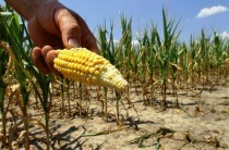
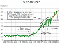
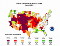
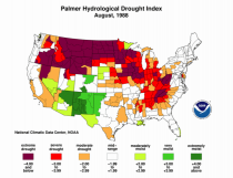
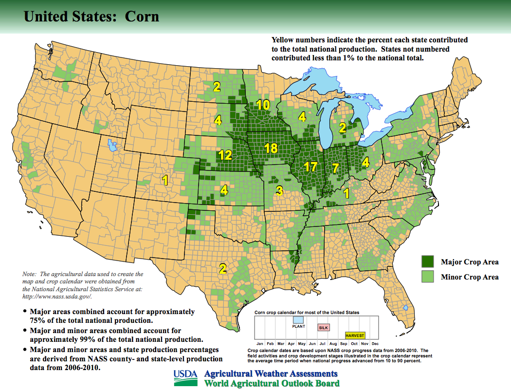
The 2012 drought, which affected more than half the country was the largest drought extent in the United States since the 1930s. It was more extreme than the conditions in 1988. U.S. Department of Agriculture Drought Disaster Declarations reached more than 2,600 of the Nation’s 3,143 counties. The drought did $30B in damage. The final yield of 123.4 bushels per acre compared to the early USDA forecast of record yields of 166 bushels/acre due to record early planting.
Despite the fact the drought was worse than 1988, yields were 50% higher. Part of that are improved hybrids and farming practices but part is the positive effect of CO2, which produces more growth and makes plants more drought resistant. The 1988 drought in 2012 dollars produced between $80B and $120B in losses.
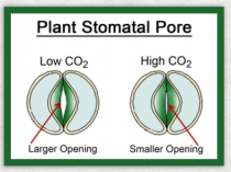
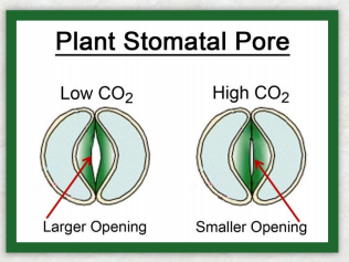
Under conditions of atmospheric CO2 enrichment, plant growth is more vigorous and plant canopies shield the ground from the hot sun, keeping the soil cooler and moister. Also importantly, stomatal apertures typically decrease, thereby reducing stomatal conductance and transpirational water losses from plants.
Water Stress: When plants are growing under less than optimal conditions of soil water availability, the percent growth enhancement due to atmospheric CO2 enrichment is generally greater than it is when water is readily available to them.
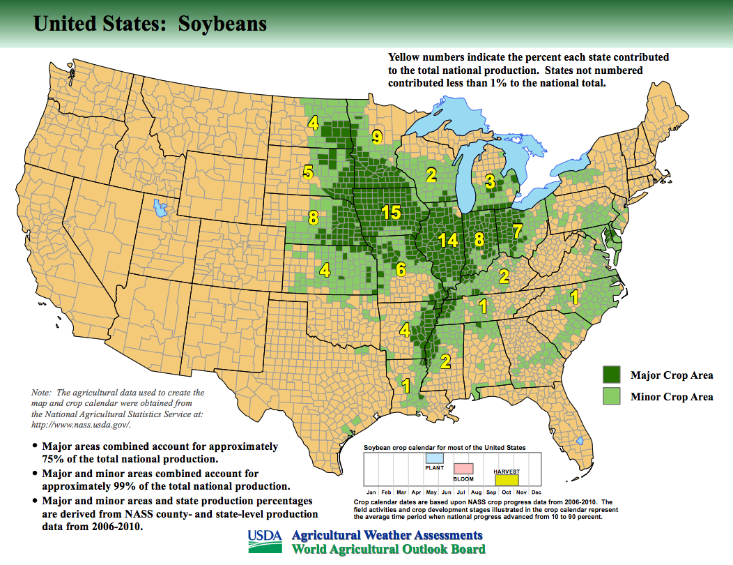
Elevated levels of CO2 thus tend to compensate for less than optimal water supplies; and they help plants recover, both more quickly and more completely, when they have experienced a period of severe water stress. This was seen with soybeans, which recovered more than expected when cooler less stressful conditions developed in August.
Water Use Efficiency: With higher concentrations of CO2 in the air, greater photosynthetic carbon uptake typically occurs. In addition, less water is lost via transpiration, as many plants exhibit decreased stomatal conductances at elevated CO2. Hence, the amount of carbon gained per unit of water lost via transpiration, or water use efficiency, generally increases substantially with atmospheric CO2 enrichment, sometimes even doubling with a doubling of the air’s CO2 content.
CROP YEAR 2013
In the June WASDE report, the USDA projected corn production down 135 million bushels to 14.0 billion with the average yield projected at 156.5 bushels per acre, down 1.5 bushels from last month. Despite rapid planting progress during mid-May across the Corn Belt, rains and cool temperatures since have delayed the completion of planting in parts of the western Corn Belt and raised the likelihood that seasonally warmer temperatures and drier conditions in late July will adversely affect pollination and kernel set in a larger share of this year’s crop.
Still that yield would be 26.8% higher than 2012 and production up 29.9%. This does not account for acres abandoned due to delayed planting due to cold, late snows and flooding and acres intended for corn planting where beans were instead planted or replaced flooded corn. In the June 28 report, the USDA will adjust acreage and production accordingly.
Joe D’Aleo is Chief Meteorologist for Agriculture at Weatherbell Analytics, providing global weather forecasting for grain and softs commodities. Joe and his co chief meteorologist Joe Bastardi who focuses more on energy, utilize natural factors to predict short, medium and long range weather. Between them they have 70 years experience. Go to weatherbel.com. for a trial. The two Joes both blog daily and post videos for weather enthusiasts as well as serve industry. All services include includes unique global modeling by Dr Ryan Maue and unique data and forecast portals.
National Academies of Science defines a scientific theory as
“a well-substantiated explanation of the natural world that can incorporate facts, laws, inferences, and tested hypotheses.”
Dr Richard Feynman, Cornell Physicist in a lecture explained how theorys that failed the test of data or experiment are falsified ("wrong") and must be discarded.
GLOBAL WARMING THEORY HAS FAILED
(1) Warming not ‘global’. It is shown in satellite data to be northern hemisphere only
(2) It is now not warming. Warming (global mean and northern hemisphere) stopped in the 1990s
(3) Models suggest atmosphere should warm 20% faster than surface but surface warming was 33% faster during the time satellites and surface observations used. This suggests GHG theory wrong, and surface temperature contaminated
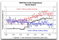
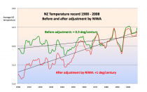
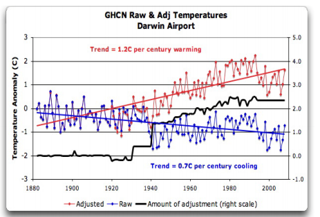
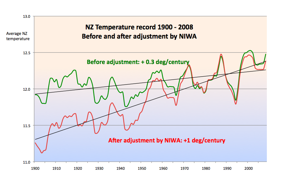
(4) Temperatures longer term have been modified to enhance warming trend and minimize cyclical appearance. Station dropout, missing data, change of local siting, urbanization, instrumentation contaminate the record, producing exaggerating warming. The GAO scolded NOAA for poor compliance with siting standards.
(5) Those who create the temperature records have been shown in analysis and emails to take steps to eliminate inconvenient temperature trends like the Medieval Warm Period, the 1940s warm blip and cooling since 1998. Steps have included removal of the urban heat island adjustment and as Wigley suggested in a climategate email, introduce 0.15C of artificial cooling of global ocean temperatures near 1940.
(6) Forecast models have failed with temperature trends below even the assumed zero emission control scenarios
(7) Climate models all have a strong hot spot in the mid to high troposphere in the tropical regions. Weather balloons and satellite show no warming in this region the last 30 years.
(8) Ocean heat content was forecast to increase and was said to be the canary in the coal mine. It too has stalled according to NOAA PMEL. The warming was to be strongest in the tropics where the models were warming the atmosphere the most. No warming has been shown in the top 300 meters in the tropical Pacific back to the 1950s.
(9) Alarmists had predicted permanent El Nino but the last decade has featured 7 La Nina and just 3 El Nino years. This is related to the PDO and was predicted by those who look at natural factors.
(10) Alarmists had predicted much lower frequency of the negative modes of the AO and NAO due to warming. The trend has been the opposite with a record negative AO/NAO in 2009/10
(11) Alarmists predicted an increase in hurricane frequency and strength globally but the global activity had diminished after 2005 to a 30+ year low. The U.S. has gone seven consecutive years without a landfalling major hurricane, the longest stretch since the 1860s
(12) Alarmists have predicted a significant increase in heat records but despite heat last two summers, the 1930s to 1950s still greatly dominated the heat records. Even in Texas at the center of the 2011 heat wave, the long term (since 1895) trends in both temperature and precipitation are flat. And when stations with over 80 years of temperature data were considered, the number of heat records last July were not extraordinary relative to past hot summers.
(13) Extremes of rainfall and drought were predicted to increase but except during periods of strong El Nino and La Nina, no trends are seen
(14) Alarmists indicated winter would become warmer and short. The last 15 years has seen a decline in winter temperatures in all regions. In places winter have been the coldest and longest in decades and even centuries.
(15) Alarmists had indicated snow would become increasingly rare in middle latitudes especially in the big cities where warming would be greatest. All time snow records were set in virtually all the major cities and northern hemisphere snow coverage in winter has increased with 4 of the top 5 years since 2007/08. Also among the east coast high impact snowstorms tracked by NOAA (NESIS), 11 of the 46 have occurred since 2009.
(16) Alarmists had indicated a decline of Antarctic ice due to warming. The upward trends since 1979 continues.
(17) Alarmists had indicated Greenland and arctic ice melt would accelerate. The arctic ice tracks with the Atlantic Multidecadal Oscillation and the IARC shows the ice cover was similarly reduced in the 1950s when the Atlantic was last in a similar warm mode. In Greenland, the warmth of the 1930s and 1940s still dominates the records and longer term temperatures have declined.
(18) Sea level rise was to accelerate upward due to melting ice and warming. Sea levels actually slowed in the late 20th century and have declined or flattened the last few years. Manipulation of data (adjustment for land rises following the last glaciation) has been applied to hide this from the public.
(19) Alarmists claimed that drought western snowpack would diminish and forest fires would increase in summer. Snowpack and water equivalent were at or near record levels in recent winters from Alaska to the Pacific Northwest and Northern Rockies. Glaciers are advancing. Fires have declined.
(20) Alaska was said to be warming with retreating glaciers. But that warming is tied intimately to the PDO and the North Pacific pattern NP and happens instantly with the flips from cold to warm and warm to cold. Two of the coldest and snowiest winters on records occurred since the PDO/NP flipped cold again (2007/08 and 2011/12). January 2012 was the coldest on record in many towns and cities and snowfall was running 160 inches above normal in parts of the south. Anchorage Alaska set an all time record for seasonal snow in 2011/12. In 2007/08, glaciers all advanced for the first time since the Little Ice Age. In 2011/12, the Bering Sea ice set a new high in the satellite era. Latest ever ice out date records were set in May 2013.
(21) Mt. Kilimanjaro glacier was to disappear due to global warming. Temperatures show no warming in recent decades. The reduction in glacial ice was due to deforestation near the base and the state of the AMO. The glaciers have advanced again in recent years
(22) Polar bears were claimed to be threatened. Polar bear populations instead have increased to record levels and threaten the populace.
(23) Australian drought was forecast to become permanent. Steps to protect against floods were defunded. Major flooding did major damage and rainfall has been abundant in recent years tied to the PDO and La Nina as predicted by honest scientists in Australia. All years with La Nina and cold PDO composited show this rainfall. Drought was associated with El Ninos and warm PDO fro 1977 to 1998
(24) The office of the Inspector General report found that the EPA cut corners and short-circuited the required peer review process for its December 2009 endangerment finding, which is the foundation for EPA’s plan to regulate greenhouse gases. The Government Accountability Office (GAO) report confirmed that EPA’s Integrated Risk Information System (IRIS) program-which EPA acknowledges is the “scientific foundation for decisions” - is flawed, echoing previous concerns from the National Academy of Sciences (NAS) that the agency is basing its decisions on shoddy scientific work.
(25) Of 18,531 citations in the 2007 IPCC Assessment Report, 5,587 or 30% were non-peer-reviewed material, including activist tracts, press releases, and in one amazing case, “Version One” of a Draft. In important instances, IPCC lead authors chose non-peer-reviewed material, or papers of low credibility, favoring their argument, in the face of prolific peer-reviewed material to the contrary. Instances include alleged climate relevance to malaria, hurricanes, species extinction, and sea levels.
Given the failures of global warming science, just a few mentioned here, the most disreputable alarmists like Oreskes, Cook and Trenberth and the demagogue party have tried to convince the uninformed by using the consensus argument. See the latest failed attempt here. It was also described on Forbes here.
“Historically, the claim of consensus has been the first refuge of scoundrels; it is a way to avoid debate by claiming that the matter is already settled. Whenever you hear the consensus of scientists agrees on something or other, reach for your wallet, because you’re being had. Let’s be clear: the work of science has nothing whatever to do with consensus. Consensus is the business of politics.” Michael Crichton 17 January 2003 speech at the California Institute of Technology


_thumb.jpeg)


