|
Jun 09, 2008
Much More to the Earth’s Climate Dynamics than Human Activity
By Richard Mackey. Submission to Garnaut Review
The linked to in-depth submission with a list of recommendations was made to the Australian Garnaut Review for consideration before making more unwise policy decisions about actions to offset climate change. Though they were meant for the Australian government, decision and policy makers should be made aware of these facts before going ahead here in the United States and elsewhere to take action that would greatly exaggerate the harm already done by prior actions or lack of actions by our presidents and congress of both parties (in part thanks to extensive lobbying by environmentalists) over the last three decades that has left us much more dependent on foreign oil when we could and should be energy independent.
While we are shocked by $4 per gallon gasoline, in countries that are energy independent, gasoline prices are absurdly cheap. In Venezuela gasoline is 12 cents a gallon. In Saudi Arabia it’s 45 cents a gallon. This is made all the more painful by the Chinese drilling for oil just 60 miles off the Florida coast while regulations prevent drilling for the oil and gas we have that could meet our total oil needs for 60 years and natural gas for 40 years giving us time to develop alternative energies. We haven’t built a nuclear plant in decades or a refinery for gasoline since the Carter administration. Instead we go down the ridiculous path of ethanol from corn that drives up all food prices without reducing emissions.
Richard starts out: “The scientific investigation of the Earth’s climate dynamics examines all the factors that give rise to climate change. Policy advice about what a government might do ameliorate the impact of climate dynamics, or more realistically, adapt efficiently to expected impacts of climate dynamics, would have to have regard to all of the main classes of results of this scientific investigation. If it didn’t, the policy advice would be flawed. If the Commonwealth Government was presented with a partial and biased analysis based merely on some aspects of climate dynamics, and policy advice was based only on a limited evaluation of some of those aspects, the legislative and budget measures implemented by the Commonwealth would join the catalogues of bad policy referred to in this Submission.”
He then goes on to recommend they hear a review of all the factors in climate change, hear about the shortcomings of the IPCC report, recognize that large scale oscillations are the norm and adopt a policy that adapts to change, advise research organizations to resume research into the areas of relationships between solar variability and climate dynamics; the natural internal variability of the climate system; and relationships between climate dynamics and the massive re-engineering of the planet by human beings over the last 300 years or so, and based on the finding of the submission, recognize that taxes (direct or indirect), tax expenditures, subsidies, grants, economic transfers or other forms of assistance or industry and/or workforce regulation are not warranted. He then goes into great detail on many of these issues and the science behind them.
Jun 08, 2008
The Death Blow to Anthropogenic Global Warming
By Stephen Wilde, Fellow of the Royal Meteorological Society
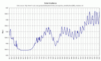
The influence of the sun has been discounted in the climate models as a contributor to the warming observed between 1975 and 1998. Those who support the theory of anthropogenic global warming (AGW), now known as anthropogenic climate change so that recent cooling can be included in their scenario, always deny that the sun has anything to do with recent global temperature movements. The reason given is that Total Solar Irradiance (TSI) varied so little over that period that it cannot explain the warming that was observed. I dont yet accept that TSI tells the whole story because it is ill defined and speculative as regards it’s representation of all the different ways the sun could affect the Earth via the entire available range of physical processes. Despite the limitations of TSI as an indicator of solar influence I think there are conclusions we can draw from the records we do have. Oddly, I have not seen them discussed properly anywhere else, especially not by AGW enthusiasts.

This link shows a larger graph of TSI from 1611 to 2001.
Throughout the period 1961 to about 2001, there was a steady cumulative net warming effect from the sun. The fact that the TSI was, on average, level during that period is entirely irrelevant and misleading. It is hardly likely that such a high level of TSI compared to historical levels is going to have no effect at all on global temperature changes and indeed during most of that period there was an enhanced period of positive Pacific Decadal Oscillation that imparted increasing warmth to the atmosphere. This link contains details of my view that the sun drives the various oceanic oscillations which in turn drive global temperature variations with all other influences including CO2 being minor and often cancelling themselves out leaving the solar/oceanic driver supreme.
Does anyone really think that the CO2 we produce is effective enough to reduce that risk to zero when we have plenty of astronomic evidence of an imminent reduction in solar activity? And, moreover, the real world temperature movements are currently a good fit with the solar driver theory both as regards to warming spell, the subsequent stall and the recent turn downwards. The AGW risk analysis process (if anyone ever bothered with one) is seriously flawed. Read more here.
Jun 06, 2008
Global Whining vs. the Truth
By Brian Sussman, KSFO, San Francisco Meteorologist in the American Thinker
105 degrees tomorrow? We’ll be sending you out live,” the television producer informed me. Like most TV Meteorologists, I loathed the heat wave live-remotes. I would much rather work in a controlled environment, complete with air conditioning and a green Chroma-key screen. And during extreme weather events, the studio lent itself to professionalism rather than playing on emotion. “Let me guess, the bank in Walnut Creek?” I said sarcastically. I had been through this drill many times. “Perfect location. Plus, a lot of viewers with ratings meters out there.” Walnut Creek is an upscale town 30 miles east of San Francisco. It is sheltered from the cooling influences of the coast and the Bay by a modest mountain range.

As a result, in the summer that region can bake. The bank not only referenced the name of the town, but had a thermometer that was several degrees off, thanks to the heat absorbing black asphalt on the adjacent multi-lane street and the pavement of the nearby parking lot. The producer knew 105 would easily read 110. On air, I always quickly explained the reason for the soaring temperature reading for our audience, but it was not enough. The misleading visual message was absolutely clear: 110 in Walnut Creek-another sign of climate doom! No doubt about it, the climate was under assault. It had to be global warming.
No, it’s global whining. Even without the bogus bank thermometer, a heat wave-or even a hot year-does not indicate global warming. More important, such weather does not point to any warming created by mankind’s utilization of fossil fuels. But telling that to the stooges on Capital Hill who are debating energy policies like Cap and Trade is like trying to tell the TV producer not to mislead the audience by sending the weatherguy to the bank thermometer in Walnut Creek.
Cries of out of control global warming become more dubious when one looks at the hottest decade in modern history, the 1930s. One might make the argument that the incredible rise in temperatures in the 1930s coincided with the first notable increase in CO2, thus, the gas can be linked to global warming —but not honestly. While levels of carbon dioxide continued to increase during the following three decades, temperatures actually decreased. All this said, when examining the data from the most trusted sites within the Historical Network beginning in 1930 to present, there has actually been a net-decrease in temperature. This decrease is noted in all quarters of the continental United States. Read more here.
Brian Sussman is a radio talk show host on KSFO-AM in San Francisco and formerly an award-winning television meteorologist. His forthcoming book, “Global Whining, a Denier’s Handbook” is being represented by WordServe Literary Group, Ltd.
Jun 05, 2008
Painting by Numbers: NASA’s Peculiar Thermometer
By Steven Goddard, The Register
The story is that the world is heating up - fast. Prominent people at NASA warn us that unless we change our carbon producing ways, civilisation as we know it will come to an end. At the same time, there are new scientific studies showing that the earth is in a 20 year long cooling period. Which view is correct? Temperature data should be simple enough to record and analyze. We all know how to read a thermometer - it is not rocket science. Previously we looked at how US temperature data sets have been adjusted - with more recent versions of historical data sets showing a steeper rise in temperature than they used to. Here, we’ll be looking at current NASA data and why their temperature maps appear hot-red, even when others are cool-blue.
So how does NASA’s data compare with other temperature sources? As we explained in our earlier article, NASA data is derived from a grid of ground-based thermometers. During the last thirty years, we also have the benefit of more sophisticated technology - satellites which can indirectly record temperatures across most of the planet. The satellite data is from Remote Sensing Systems (RSS) and the University of Alabama at Huntsville (UAH).
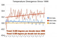
In 1998 (left side of the graph below) NASA and the satellite data sources RSS and UAH all agreed quite closely - within one-tenth of a degree. Ten years later - in March 2008 - NASA is reporting temperature anomalies more than 0.5 degrees warmer than UAH. The divergence between NASA and UAH has increased at a rate of 0.13 degrees per decade (red lines below.) In contrast, RSS has converged with UAH over the period and is now within 0.02 degrees (blue lines below.)

See larger graph here
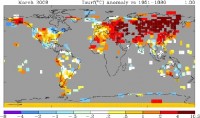
The divergence is now quite striking. Looking closer at March 2008, NASA’s data shows the month as the third warmest on record. In sharp contrast, UAH and RSS satellite data showed March as the second coldest on record in the southern hemisphere, and just barely above average for the whole planet. How could such a large discrepancy occur? Viewing the NASA 250-mile map for March below, what immediately grabs the attention is that NASA has essentially no data (gray areas) in most of Canada, most of Africa, the Greenland ice sheet, and most of Antarctica. This begs the question, how can one calculate an accurate “global temperature” while lacking any data from large contiguous regions of three continents? So what was NASA missing?

See larger map here
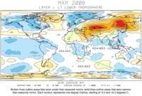
NASA Temperatures March, 2008 - 250-mile smoothing radius - looks hot. We can find NASA’s lost continents in the UAH satellite data for March below.

See larger map here
Not surprisingly, the missing areas in Canada and Africa were cold. The NASA data thus becomes disproportionately weighted towards warm areas - particularly in the northern hemisphere. As can be seen in the UAH satellite map above, the warm areas actually made up a relatively small percentage of the planet. The vast majority of the earth had normal temperatures or below. Given that NASA has lost track of a number of large cold regions, it is understandable that their averages are on the high side.
Cherry picking is a second important issue with NASA’s presentation is that they use the time period of 1951-1980 as their choice of baseline. This was a well known cold spell. Whatever motivations NASA had for picking the 1951-1980 baseline undoubtedly have some valid scientific basis. Yet, when the data is calibrated in lockstep with a very high-profile and public political philosophy, we should at least be willing to ask some hard questions. Dr. James Hansen at GISS is the person in charge of the NASA temperature data. He is also the world’s leading advocate of the idea of catastrophic global warming, and is Al Gore’s primary climate advisor. The discrepancies between NASA and other data sources can’t help but make us consider Einstein’s advice: “If the facts don’t fit the theory, change the facts.” Read full post here.
Jun 04, 2008
Army: Sun, Not Man, Is Causing Climate Change
By Noah Shachtman, Danger Room
The Army is weighing in on the global warming debate, claiming that climate change is not man-made. Instead, Dr. Bruce West, with the Army Research Office, argues that “changes in the earth’s average surface temperature are directly linked to the short-term statistical fluctuations in the Sun’s irradiance and the longer-term solar cycles.”
In an advisory to bloggers entitled “Global Warming: Fact of Fiction [sic],” an Army public affairs official promoted a conference call with West about “the causes of global warming, and how it may not be caused by the common indicates [sic] some scientists and the media are indicating.”
In the March, 2008 issue of Physics Today, West, the chief scientist of the Army Research Office’s mathematical and information science directorate, wrote that “the Sun’s turbulent dynamics” are linked with the Earth’s complex ecosystem. These connections are what is heating up the planet. “The Sun could account for as much as 69 percent of the increase in Earth’s average temperature,” West noted.
West acknowledges that the IPCC and other scientific groups have “conclude[d] that the contribution of solar variability to global warming is negligible.” He argues that these groups have done a poor job modeling the Sun’s impact, however, and that’s why they have “significantly over-estimated” the “anthropogenic contribution to global warming.” Read more here.
|
|
|
|


