May 22, 2009
“Is The U.S. Surface Temperature Record Reliable?”
By Anthony Watts on Climate Science
Anthony Watts, author of the weblog Watts Up With That, has completed an outstanding, clearly written report that documents a major problem with the use of the United States Historical Climatology Network (USHCN) to assess multi-decadal surface temperature trends. The report is “Watts, A. 2009: Is the U.S. Surface Temperature Record Reliable? 28 pages, March 2009 The Heartland Institute.
The Executive Summary reads:
“Global warming is one of the most serious issues of our times. Some experts claim the rise in temperature during the past century was “unprecedented” and proof that immediate action to reduce human greenhouse gas emissions must begin. Other experts say the warming was very modest and the case for action has yet to be made. The reliability of data used to document temperature trends is of great importance in this debate. We can’t know for sure if global warming is a problem if we can’t trust the data.
The official record of temperatures in the continental United States comes from a network of 1,221 climate-monitoring stations overseen by the National Weather Service, a department of the National Oceanic and Atmospheric Administration (NOAA). Until now, no one had ever conducted a comprehensive review of the quality of the measurement environment of those stations.
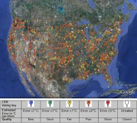
During the past few years I recruited a team of more than 650 volunteers to visually inspect and photographically document more than 860 of these temperature stations. We were shocked by what we found. We found stations located next to the exhaust fans of air conditioning units, surrounded by asphalt parking lots and roads, on blistering-hot rooftops, and near sidewalks and buildings that absorb and radiate heat. We found 68 stations located at wastewater treatment plants, where the process of waste digestion causes temperatures to be higher than in surrounding areas.
In fact, we found that 89 percent of the stations - nearly 9 of every 10 - fail to meet the National Weather Service’s own siting requirements that stations must be 30 meters (about 100 feet) or more away from an artificial heating or radiating/reflecting heat source. In other words, 9 of every 10 stations are likely reporting higher or rising temperatures because they are badly sited.

Larger image here. Lampasas Texas shown as an example.

It gets worse. We observed that changes in the technology of temperature stations over time also has caused them to report a false warming trend. We found major gaps in the data record that were filled in with data from nearby sites, a practice that propagates and compounds errors. We found that adjustments to the data by both NOAA and another government agency, NASA, cause recent temperatures to look even higher.
The conclusion is inescapable: The U.S. temperature record is unreliable. The errors in the record exceed by a wide margin the purported rise in temperature of 0.7C (about 1.2F) during the twentieth century. Consequently, this record should not be cited as evidence of any trend in temperature that may have occurred across the U.S. during the past century. Since the U.S. record is thought to be “the best in the world,” it follows that the global database is likely similarly compromised and unreliable.
This report presents actual photos of more than 100 temperature stations in the U.S., many of them demonstrating vividly the siting issues we found to be rampant in the network. Photographs of all 865 stations that have been surveyed so far can be found here , where station photos can be browsed by state or searched for by name.”
This is a report that is very much worth reading! Hardcopies are available for purchase from The Heartland Institute 19 South LaSalle Street #903 Chicago Illinois 60603.
May 21, 2009
Meaningless, Unfunded Climate Plans Forge Ahead - This is How Climate Research Works Too
By Paul Chesser, globalwarming.org
With the EPA and Congress barreling towards greenhouse gas regulation, you might think that all the states and local governments putting together their own plans might declare victory and move on to more pressing matters like creating make-work with federal stimulus money. You’d be wrong.
The Almanac newspaper reports today that the Menlo Park (Calif.) City Council earlier this week approved a climate action plan created by its volunteer Green Ribbon Citizens’ Committee. As with TARP, however, it appears local leaders may only be willing to go as far as tax-grabbers from larger jurisdictions will pay for them to go:

The City Council approved the plan in a unanimous vote at its May 19 meeting. Prepared by a consultant that specializes in creating climate strategies for local jurisdictions and revised by city staff members, the plan expands upon and fleshes out a dense list of recommendations prepared by the volunteer Green Ribbon Citizens’ Committee in late 2007, council members say.
They acknowledge, however, that (the plan is) incomplete. The city exhausted the $38,000 it expects to receive in grant money to prepare the plan before it had a chance to fully revise the document, and council members look poised to allow a city commission to work on the plan - possibly in consultation with the Green Ribbon committee.
Undoubtedly it was the “consultant” who exhausted the $38k (which the city doesn’t even have yet!). Pretty good gig when these eco-consultants can drop their “climate plan” template on a municipality and collect a cool five-figure (plus?) sum for filling in the blanks. By the way, local watchbloggers, you might check how these consultants are working, lobbying, and wining and dining city officials to get these deals. Back to The Almanac:
Much of the discussion at the May 19 meeting centered on how the city could quantify its efforts to rein in the amount of greenhouse gases emitted into the Earth’s atmosphere. In an impassioned speech to the council, Mitch Slomiak, head of the Green Ribbon committee, urged the city to set measurable goals in reducing emissions, and to treat its “carbon budget” in the same way it regards its general operating fund budget. You know, like their personal slush fund and favor factory. Like Waxman-Markey.
But council members struggled with how to make the issue tangible. Easy - make it as tangible as CO2! Unlike most of the line items in the city’s budget, a decreased carbon output won’t provide a direct benefit to the city. Hmm - truly a dilemma for politicians who expect something in exchange for wasting their constituents’ money.
“One might almost conclude that anything we do here is basically symbolic, and setting an example,” said Councilman Andy Cohen. Money quote: About as close as you’ll get to hearing a global warming alarmist politician saying their climate plans are meaningless.
Councilman John Boyle said he was struggling with the idea of how the plan would fit in with the city’s budget. He noted that even actions that would pay for themselves, such as installing solar panels on city buildings, often take decades to recoup their costs.
But you’re forgetting all the green jobs!
The plan leaves much to be desired, but council members say that approving it is an important gesture - and that its existence may help the city in competing for grants, especially through the federal stimulus bill. Aha, the real motive - meaningless gestures paid for by (not yet issued) grants, so you can get more grants! Read more here.
May 15, 2009
Arctic Cooling has Begun
By Peter Taylor
What follows is the first guest post on Talking About The Weather. I chose Peter Taylor’s short essay on the Arctic out of respect for Peter’s research, his calm during intense debates, and the focus he brings to the issues. As Peter makes clear, those “banking” on rapid Arctic sea ice deterioration in the decades ahead seem to know very little about climate cycles. Harold Ambler
I hope to be around in 2020, when some have suggested those of us on the sceptics’ side should have been vindicated, but I think we will prevail much sooner. The Arctic heat-wave of 1920-1940 is of course well-known to real Arctic climate scientists. I reviewed 32 temperature data sets for Arctic stations to 2004 some with very long records. In 2006 I could find only one with higher temperatures in 2004 than in the late 1930s or early 1940s - that was on the eastern coast of Greenland. Fear-mongering regarding Arctic sea ice is the most acute of all that brought forward by global warming doomsayers.

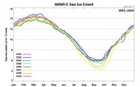
Image courtesy of the USGS.
Since then I have reviewed dozens of papers on surface air temperature, sea surface temperatures, ice-mass, glacier speeds and sea-ice, and all show a clear cyclic pattern of roughly 70 years. Some Greenland and Alaskan temperatures peaked in 2006-2008, but the pattern looks set to repeat. The latest Arctic heat wave is not identical to the last - firstly it is higher, by maybe 20% in some places, and secondly, the hot-spots are different. But one thing is clear - it is driven by two distinctive factors - a 14% increase in clouds over the North Pole and Beaufort Sea between 1980-2000, and the incursion of warm Atlantic water under the ice and into the Beaufort Gyre. The rapid summer ice loss is due to melting from above (infra red from the clouds) and below (warm Atlantic water).
The strength of the Beaufort Gyre determines how far Atlantic water penetrates the Arctic - when the Pacific Decadal Oscillation is warm and Alaskan Shelf winds are low, the gyre weakens and may reverse flow; when cold (as it has been since late 2006), the Alaskan interior cools, the winds strengthen and the gyre strengthens accordingly - there is a lag of a few years.
Thus, this domino effect from the Pacific will eventually reach the area between Greenland and Norway and summer sea-ice ought to return to the long-term norm (unless there really is a strong greenhouse element - which I can't see it greater than the difference between this warm period and the last - i.e. about 20%) and unless there is an even steeper decline in global temperatures due to the quiet sun effect.
On the latter - there is a body of evidence that during quiet solar periods, the jetstream is shifted along with Arctic pressure systems that lead to blocking high pressure over Iceland - sending the jetstream further south and cooling western Europe. The eastern seaboard of the USA gets a little warmer, but the mid-West suffers late springs, dry summers, and bitter winters - not good for the breadbasket of the world! We should get to see this play out over the next five years. See post on Harold Ambler's Talking about the Weather site here. H/T Climate Depot.

See larger here.
May 14, 2009
Will Anybody Notice Global Cooling
By Norm Kalmanovitch, Friends of Science
It is inconceivable that even after a decade since global warming ended and seven years into a cooling trend with no end of cooling in sight, that world leaders are unaware of these facts and are still pursuing initiatives to stop global warming. Something is terribly wrong with the official international science bodies such as the IPCC who have not come forward and properly informed the world leaders of current global temperatures.
Something is terribly wrong with the individual government science bodies who did not come forward and inform their own leaders when it was certain that global warming had ended, or when there was sufficient data to claim that we are now in a cooling trend. It is not as though this is highly guarded secret data that can only be accessed by a limited group of people. The global temperature data is in fact readily available from several public sites and can be downloaded at no cost.
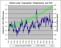
For the past year Friends of Science has been maintaining a graph of satellite temperature data and atmospheric CO2 concentration data on their website. This graph is updated every month as the new data becomes available. The cooling trend that started in 2002 is highlighted by a straight line best fit posted on this graph. The numerical value for this trend is 0.25C/decade of cooling!

By contrast the forcing parameter of the IPCC climate models would dictate that the effect of the 10ppmv increase in CO2 should cause a temperature increase of 0.15C/decade. If in fact there is any validity to the claims of CO2 increases causing warming; the fact that we are cooling at twice the rate that the climate models say we should be warming, is a clear indication that natural forces are about three times stronger than the maximum possible effects from CO2 increases.
Quantum physics clearly demonstrates that the effect of current increases in CO2 can have only a small and diminishing effect on global temperature with further increases in concentration. Since the natural effects dominate, and physics dictates that the effect of increasing emissions is only a small fraction of the effect commonly accepted; it is clear that any initiatives aimed at reducing CO2 emissions for the purpose of reducing global warming are entirely without merit and serve no purpose whatsoever.
This is not a trivial issue because these initiatives to stop global warming have caused great suffering to the poorest people of the world. Biofuel initiatives have caused a global food crisis as food crops were forced to compete with biofuel crops driving the price of basic food staples beyond the means of the poor. The attempt to replace inexpensive coal fired power plants with very expensive and unreliable alternate energy sources such as wind power, has raised the cost of power not only affecting the poor, but also industry further reducing the ability to compete with countries using inexpensive power to manufacture products.
Unfortunately the AGW concept is so engrained in the public psyche through the graphic propaganda of the last several years that all verbal arguments against this ideology fall on deaf ears, and get shouted down by an indoctrinated crowd. While these people are deaf they are not blind, and no matter how loud the shouting, a graphic representation of increasing CO2 and decreasing global temperatures will be seen above the din.
If every presentation contained a graph similar to the one on the Friends of Science website this “visual” will eventually get in front of leaders who will be forced to reconsider the global warming initiatives that have been so costly to the world.
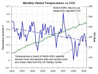
Icecap Note: Below is a plot of the average of the satellite and the Hadley Center global monthly temperatures versus the monthly seasonally adjusted CO2 from NOAA ESRL since 2002. Note the clear downtrend in temperatures even as CO2 continues to rise.

Larger image here.
May 09, 2009
Have Changes In Ocean Heat Falsified The Global Warming Hypothesis?
By William DiPuccio on Climate Science
The Global Warming Hypothesis
Albert Einstein once said, “No amount of experimentation can ever prove me right; a single experiment can prove me wrong.” Einstein’s words express a foundational principle of science intoned by the logician, Karl Popper: Falsifiability. In order to verify a hypothesis there must be a test by which it can be proved false. A thousand observations may appear to verify a hypothesis, but one critical failure could result in its demise. The history of science is littered with such examples.
A hypothesis that cannot be falsified by empirical observations, is not science. The current hypothesis on anthropogenic global warming (AGW), presented by the U.N.’s Intergovernmental Panel on Climate Change (IPCC), is no exception to this principle. Indeed, it is the job of scientists to expose the weaknesses of this hypothesis as it undergoes peer review. This paper will examine one key criterion for falsification: ocean heat.
Ocean heat plays a crucial role in the AGW hypothesis, which maintains that climate change is dominated by human-added, well-mixed green house gasses (GHG). IR radiation that is absorbed and re-emitted by these gases, particularly CO2, is said to be amplified by positive feedback from clouds and water vapor. This process results in a gradual accumulation of heat throughout the climate system, which includes the atmosphere, cryosphere, biosphere, lithosphere, and, most importantly, the hydrosphere. The increase in retained heat is projected to result in rising atmospheric temperatures of 2-6C by the year 2100.
In 2005 James Hansen, Josh Willis, and Gavin Schmidt of NASA coauthored a significant article (in collaboration with twelve other scientists), on the “Earth’s Energy Imbalance: Confirmation and Implications” (Science, 3 June 2005, 1431-35). This paper affirmed the critical role of ocean heat as a robust metric for AGW. “Confirmation of the planetary energy imbalance,” they maintained, “can be obtained by measuring the heat content of the ocean, which must be the principal reservoir for excess energy” (1432).
In 2007 Roger Pielke, Sr. suggested that ocean heat should be used not just to monitor the energy imbalance in the climate system, but as a “litmus test” for falsifying the IPCCs AGW hypothesis (Pielke, “A Litmus Test”, climatesci.org, April 4, 2007).
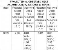
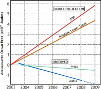
A comparison of these projections to observed data is shown below. Despite expectations of warming, temperature measurements of the upper 700m of the ocean from the ARGO array show no increase from 2003 through 2008. Willis calculates a net loss of -0.12 (plus or minus 0.35) x 1022Joules per year (Pielke, Physics Today,55) from mid-2003 to the end of 2008 (Dr. Pielke received permission from Josh Willis to extend the ARGO data to the end of 2008).
According to a recent analysis of ARGO data by Craig Loehle, senior scientist at the Illinois-based National Council for Air and Stream Improvement, the loss is -0.35 (plus or minus 0.2) x 1022Joules per year from mid-2003 to the end of 2007 (see Loehle, 2009: “Cooling of the global ocean since 2003.” Energy & Environment, Vol. 20, No. 1&2, 101-104(4)). Loehle used a more complex method than Willis to calculate this trend, enabling him to reduce the margin of error.
My calculations for observed global heat, shown below, are based on observed upper ocean heat. Since upper ocean heat is calculated to be 80% of the global total, observed global heat equals approximately 125% (1/0.8) of the observed upper ocean heat.
PROJECTED vs. OBSERVED HEAT ACCUMULATION, 2003-2008 (6 YEARS)
Model
Projected Global Heat Accumulation

Heat Deficit. The graph below shows the increasing deficit of upper ocean heat from 2003 through 2008 based on GISS projections by Hansen, Willis, Schmidt, et. al. Actual heat accumulation is plotted from observed data (using ARGO) and shows the overall linear trend (after Willis and Loehle). Seasonal fluctuations and error bars are not shown.

Read full post here.
|
