Sep 15, 2012
Galileo Movement responds back to smear tactics

Dear friends and supporters,
The Galileo Movement is disappointed that the fabricated smear originating from the Sydney Morning Herald (SMH) that The Galileo Movement is anti-Semitic is still being reported as fact. To prevent this ridiculous, vile claim being spread further, we’d like to highlight a few facts and expose the techniques and the dishonest tactics used by people too lazy to do real research, who wish to silence us by calling us anti-Semitic.
Firstly, the claims are preposterous. Both Directors of the Galileo Movement have a strong Jewish heritage, including John’s wife who is a Holocaust survivor and Case’s mother, most of whose family were murdered for being Jewish.
Secondly, the Galileo Movement has never spoken or published anything that is anti-Semitic. The non-profit group of unpaid volunteers have a single, publicly stated purpose - to remove the unnecessary and damaging ‘Carbon Dioxide Tax’, its derivatives and the means by which such negative, economic and socially destructive legislation may be reintroduced.
The Galileo Movement promotes science and the scientific method. Yet in order to distract people from these inconvenient facts which they obviously have no answer to, some people attack the messenger, rather than discuss the science. The method of censor through denigration is further discussed here.
The process of trying to discredit us began with Sydney Morning Herald reporter Ben Cubby, who contacted us to ask our opinion of the Muller et al (alarmist) and Watts et al (sceptic) papers which were released the day before. The recording of the interview with our Project Leader Malcolm Roberts, presents a clear and precise scientific explanation of the problems with Muller’s paper. Additionally, he spoke at length outlining the motives of those supporting AGW including, academics feeding off taxpayer grants, politicians seeking political benefit and bankers harvesting carbon credits. Of the 48 minute interview, Cubby strangely chose to virtually ignore almost all of the science and facts (plus mention of the Watts et al paper) and instead chose to highlight the banking industries comment.
The smear was created when Mike Carlton, also from the SMH, with no proof or without contacting us, linked a discussion on banks making profits from Carbon Trading to “In Rightspeak, understand, that’s code for the Great Jewish Conspiracy”. Afterwards, others began repeating this fabricated connection as if it were a proven, undoubtedly hoping to stop others listening to our science based critique.
Malcolm Roberts, our Project Leader, used the term ‘banking families’ during the interview to describe the major banking institutions that plan to profit from the trading and financing of CO2 abatement.
Neither Malcolm, nor ourselves, were aware that using the term ‘family’, when referring to banks, could in any context be anti-Semitic. We submit that any reasonable person would take the meaning at face value. Finding non-existent meanings and hidden codes are the tricks our opponents use. They revert to these tired and transparent techniques to desperately avoid discussing the science.
How could Mike Carlton’s ill-informed opinion find its way into a mainstream Australian newspaper? Why did a reporter like Ben Cubby ignore basic science? Is it bias or groupthink?
We have a few ideas for the Sydney Morning Herald that they might to report on. It’s readers will find these both interesting and also puzzling as to why they have not heard such facts previously. Let’s start with:
- Why not request your reporters to ask scientists to provide empirical evidence that an increase in human CO2 production caused the slight increase in atmospheric temperature, a warming trend that ended in 1998 and explain why global temperatures have not risen since despite increasing human CO2 production?
- Why not also ask scientists to explain why computer models supposedly simulating Earth’s future temperature to warm with projected increased CO2 concentrations, can’t explain why the atmospheric temperature has not warmed since 1998?
- Could you ask your reporters to explain how spending $257 billion on renewable energy to produce only 3% of the world electricity is economically sustainable when only $302 billion was spent on fossil fuels and nuclear energy to produce the remaining 97%?
- Is the SMH aware that the August, 2010 report by the world’s peak scientific academic body, the Inter Academy Council revealed fundamentally that none of the UN IPCC’s 800 statements of certainty could be trusted? Is the SMH aware that CSIRO lacks empirical scientific evidence for the claim that human CO2 caused global warming and climate change and that CSIRO’s core climate claims contradict empirical scientific evidence. Why has the SMH failed to hold both these bodies accountable for their unfounded, unscientific and false claims about human CO2?
The Galileo Movement will continue to hold to account those in science, economics and politics who continue to promote unscientific, dishonest and unfounded claims of man-made global warming. We will continue to stand by fellow sceptics who find themselves being falsely smeared by their opponents.
Regards John Smeed & Case Smit
Sep 13, 2012
The Truth Behind the Shrinking Arctic Ice Cap
By Joe Bastardi, Weatherbell
There is no sugar coating the fact that the Arctic sea ice is well below normal.
The AGW agenda is jumping all over this metric as evidence that catastrophic global warming is upon us. After all, they really can no longer use earth’s actual air and ocean temperatures as proof since they have leveled off, and are now cooling. The disconnect with C02, still on the rise, cannot be denied.
As you can see, I admit Arctic sea ice is on the decline, but the question is, why?
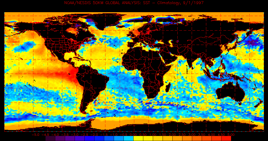
The answer can be seen through natural causes. A look at the ocean temperatures globally over the past 15 years, or since the global temperatures reached a peak in the major el Nino of 1997-1998 supplies the answer. Notice on Sept 1, 1997, most of the northern hemisphere ocean was quite warm, the southern hemisphere cooler. This is an example of the warm phases of the Pacific Decadol Oscillation and the Atlantic Multidecadol Oscillation both occurring at once. A tremendous input of heat (oceans have 1000 times the heat capacity of air) into the atmosphere has to be occurring, causing a rise in the global temperature which was well documented through the 1990s.
But one also notices a counter cooling in much of the southern hemisphere oceans.
Since dry air over land warms more than air over the ocean, the response of the warming ocean when that air came over the drier land was more of a rise in temperatures over the continents than fall over the southern hemisphere oceans . So it appears that the earth is warming. After all if you have many more samples of warm than cold, your answer has to come up warmer, right? However, is there a change in the total energy budget of the earth? If there is not then what goes up, must come down. The earths temperature rose in response to the warming Pacific, which started the northern ice cap melting. The Atlantic is in its warm stage now, so the ice cap is being attacked from the ocean also. Once the Atlantic comes out of its warm phase in 10 to 15 years, the ice cap will rebound.
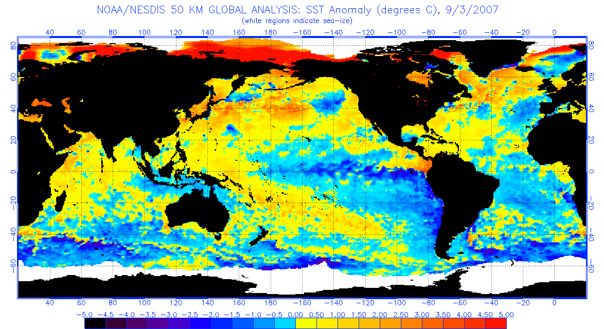
Below are charts in 5 year increments that show a reversal has occurred in the Pacific:
2002
2007
2012 at the height of the La Nina
The current water temperature anomaly shows very warm water in the north Atlantic, a product of the warm cycle of the Atlantic we are in like the 1950s, and this continues to attack the ice cap.
But is the lack of ice at times that unusual? Apparently not as photographic evidence shows. Here is a picture of a submarine surfacing at the North Pole in August of 1959—another period of known warmth similar to the cycle we are in now.
More startling to me was this picture that shows large amounts of open water at the North Pole in May of 1987 with three subs surfacing.
Wind and storminess can also have an effect on the Arctic ice, which is what recently happened. A fierce storm broke up a lot of the ice and shoved much of it southeast into the center of the ice cap. But when viewing this 30 day loop of the arctic, notice how fast the rebound from the low point has been in the past 30 days, with a shrinkage because of the storm, then the ice rapidly rebounding (make sure to put this into a loop).
The recent pronouncement that Greenland had the most rapid melt period on record is another example of neglecting the actual facts to come up with an objective idea. If you would like to read more on that matter, here is a nice link.
The reason we are seeing all this is because we have seen a distortion of the global temperature pattern the past 30 years brought about by the warm phase of the Pacific, which started the warming of the northern hemisphere, followed by the Atlantic warming. The response was greater over land where air is dry and can be easily warmed! How can we test this theory, besides waiting for it to simply recover once the Atlantic turns colder? Well we have a hint, and it’s in the southern hemisphere. After all, we have to think globally, right? That is what we hear: GLOBAL warming. So we should also have the southern hemisphere shrinking if they are correct and my hypothesis is wrong.
Let’s evaluate, shall we?
Over the past 30 years there has been a rise in the southern ice cap! One would never know it given all the hysteria about the northern ice cap, or some spots on Antarctica being warmer than normal ( it can’t be cold everywhere).
I spoke on this matter at the Heartland conference ICCC7. Because the southern hemisphere ice cap is surrounded by ocean, the implication of an expanding southern hemisphere ice cap, even though it appears smaller than the northern shrinkage, is that there is no net change in the overall heat capacity of the entire ocean/air system. This would imply the northern shrinkage is simply a cyclical event. In fact, the increase in the south is actually quite remarkable since it takes more energy loss to cool the water enough around the southern hemisphere ice cap than it does energy gain to warm the dry, colder air over land surrounding the northern hemisphere ice cap The warming of that air, combined with the warm cycle still present in the Atlantic means there should be a shrinking northern ice cap. This is yet another challenge I have laid at the feet of the AGW community: The idea that the global temperature as measured objectively by satellites will return to where it was in the late 1970s by 2030 and the northern ice cap will also. Truth be told, we will be in real trouble if there is no warming response to the oceans in the southern hemisphere and shrinking back of that ice cap! That is more of a concern to many of us than the idea the planet is about to burn up. It’s ice, not fire that should be the concern, especially when one looks at some of the ideas on the solar cycles and temperatures, as well as the economic and social repercussions of a colder planet. For your benefit, here’s a recent paper on the matter of sunspots and global temperatures.
As a nation, we must use what has made us successful to progress. The limiting of energy sources based on faulty ideas and partial truths has lead to a weakening of our country and increased misery among our people. For example: Gas is nearly 4 dollars a gallon now, and the shame is that there is no reason based on what we should be doing, for that to be happening. This is taking hundreds of billions of dollars out of our economy and redistributing it elsewhere. Regulations based on worry about things that are cyclical in nature and explainable based on the total picture and body of evidence, are also taking hundreds of billions of dollars out of the economy.
The sad truth is this: A nation built on the freedoms to confront reality, will not survive if shackled by policies that chase utopian ghosts.
The tale of the ice cap is a prime example of this.
See also this PDF.
PLEASE JOIN Joe Bastardi, Ryan Maue and I on Weatherbell.com where we post for the weather and climate enthusiasts and provide services for industry. Ryan has created a masterful model page that grows everyday in value added products. Site is being redesigned shortly.
Sep 07, 2012
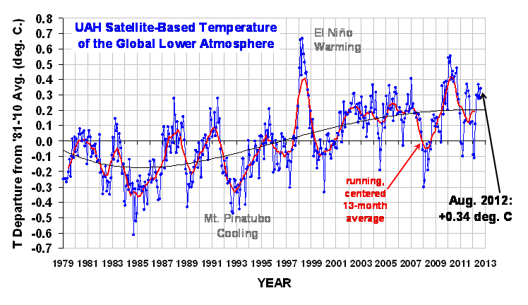
UAH Global Temperature Update for August, 2012: +0.34 degrees C
By Dr. Roy Spencer
September 6th, 2012
The global average lower tropospheric temperature anomaly for August (+0.34 C) was up from July 2012 (+0.28 C):

Enlarged
Here are the monthly departures from the 30-year (1981-2010) average:
YR MON GLOBAL NH SH TROPICS
2012 1 -0.09 -0.06 -0.12 -0.13
2012 2 -0.11 -0.01 -0.21 -0.27
2012 3 +0.11 +0.13 +0.10 -0.10
2012 4 +0.30 +0.41 +0.19 -0.12
2012 5 +0.29 +0.44 +0.14 +0.03
2012 6 +0.37 +0.54 +0.20 +0.14
2012 7 +0.28 +0.45 +0.11 +0.33
2012 8 +0.34 +0.38 +0.31 +0.26
As a reminder, the most common reason for large month-to-month swings in global average temperature anomalies (departures from normal) is small fluctuations in the rate of convective overturning of the troposphere, discussed here.
--------------
Spurious Warmth in NOAA’s USHCN from Comparison to USCRN
August 22nd, 2012
It looks like the Gold Standard (USHCN) for U.S. temperature monitoring is spuriously warmer than the Platinum Standard (USCRN)
After Anthony Watts pointed out that the record warm July announced by NOAA based upon the “gold standard” USHCN station network was about 2 deg. F warmer than a straight average of the 114 core US Climate Reference Network (USCRN) stations, I thought I’d take a look at these newer USCRN stations (which I will call the “Platinum Standard” in temperature measurement) and see how they compare to nearest-neighbor USHCN stations.
USCRN Stations in Google Earth
First, I examined the siting of the core set of 114 stations in Google Earth. Most of them are actually visible in GE imagery, as seen in this example from Kentucky (click for full-size image):

The most identifiable features of the USCRN sites are the three white solar radiation shields over the 3 temperature sensors, and the circular wind shield placed around the precipitation gauge.
While most of the CRN sites are indeed rural, some of them are what I would call “nearly rural”, and a few will probably have limited urban heat island (UHI) effects due to their proximity to buildings and pavement, such as this one next to a 300 meter-diameter paved surface near Palestine, TX which NASA uses as a research balloon launch site:

The larger image (from October) suggests that the ground cover surrounding the paved area is kept free of vegetation, probably by spraying, except right around the weather sensors themselves.
A few station locations have 2 USCRN sites located relatively close to each other, presumably to check calibration. A particularly interesting pair of sites is near Stillwater, OK, where one site is a few hundred meters from residential Stillwater, while the paired site is about 2.4 km farther out of town:

Enlarged
Whether by design or not, this pair of sites should allow evaluation of UHI effects from small towns. Since the temperature sensors (Platinum Resistance Thermometers, or PRTs) are so accurate and stable, they can be used to establish fairly tiny temperature differences between the few CRN neighboring station pairs which have been installed in the U.S.
From my visual examination of these 114 USCRN sites in Google Earth, the “most visited” site is one in rural South Dakota, which apparently is quite popular with cattle, probably looking for food:

Just 1 km to the southwest is this even more popular spot with the locals:

Hopefully, this USCRN site will not experience any BHI (Bovine Heat Island) effects from localized methane emissions, which we are told is a powerful source of greenhouse warming.
Elevation Effects
One important thing I noticed in my visual survey of the 114 USCRN sites is the tendency for them to be placed at higher elevations compared to the nearby USHCN sites. This is a little unfortunate since temperature decreases with height by roughly 5 deg. C per km, which is 0.5 deg. C per 100 meters, an effect which cannot be ignored when comparing the USCRN and USHCN sites. Since I could not find a good source of elevation data for the USCRN sites, I used elevations from Google Earth.
USCRN and USHCN Station Comparisons
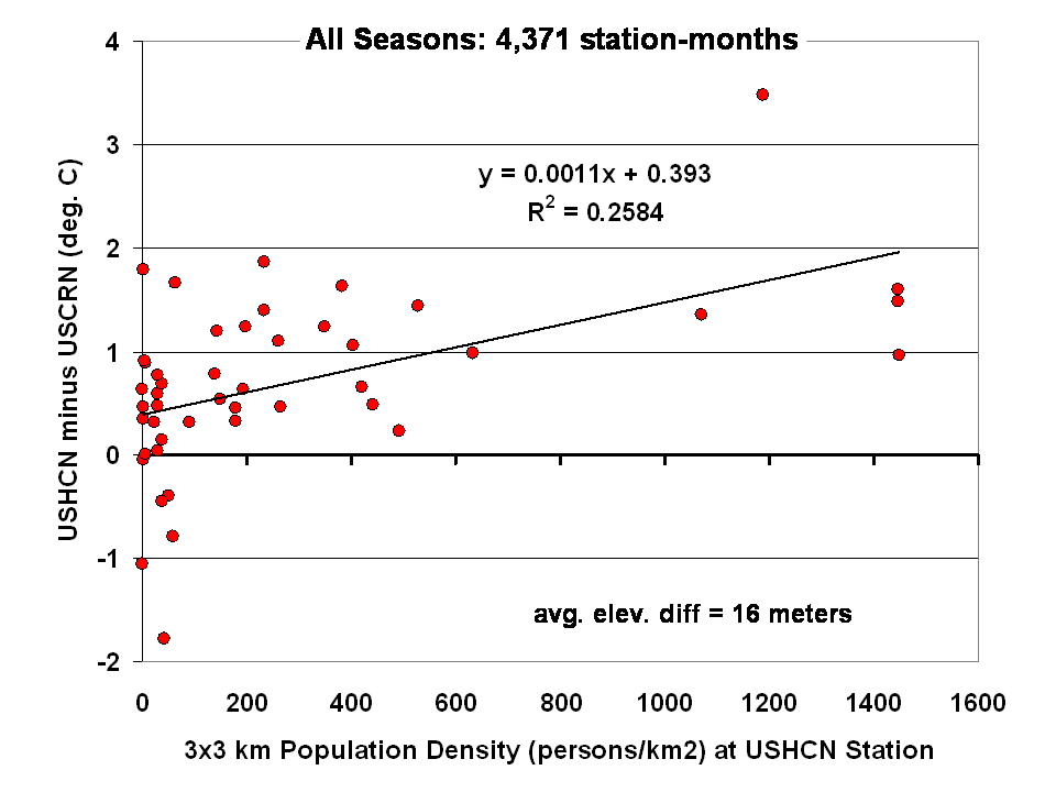
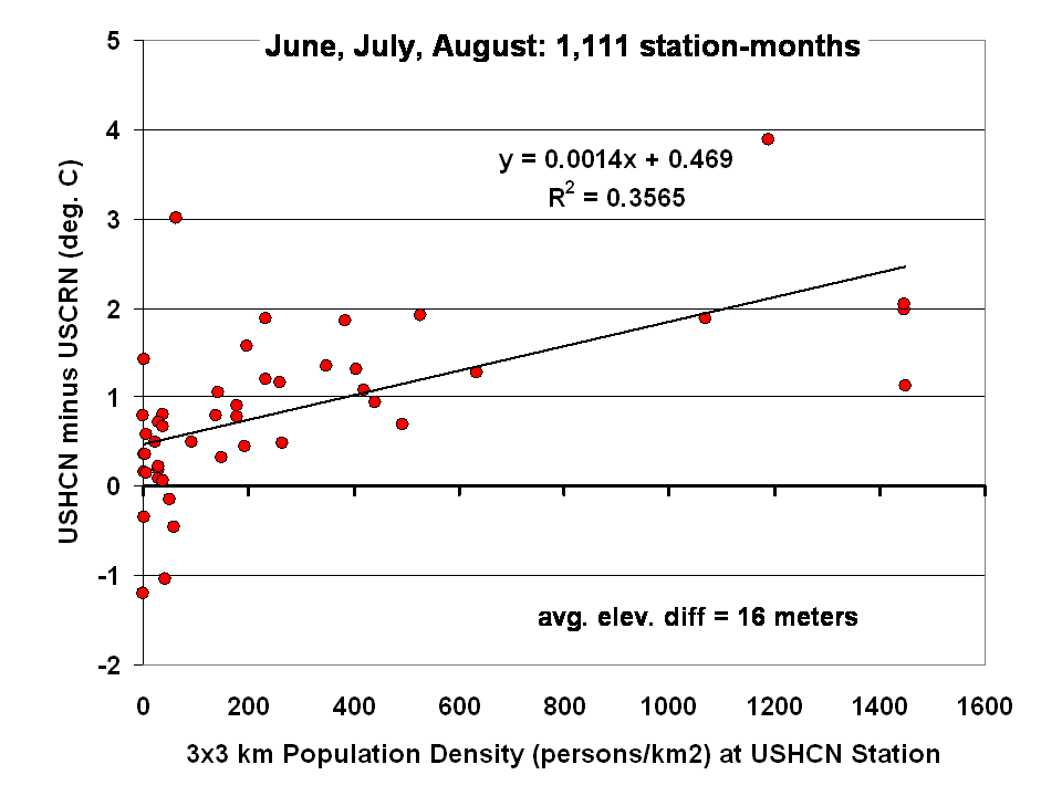
As a first cut at the analysis, I compared all available monthly average temperatures for HCN-CRN station pairs where the stations were no more than 30 km apart in distance and 100 m in elevation. This greatly reduces the number of USCRN stations from nominally 114 to only 42, which were matched up with a total of 46 USHCN stations.
The results for all seasons combined shows that the USHCN stations are definitely warmer than their “platinum standard” counterparts:

Enlarged
The discrepancy is somewhat greater during the warm season, as indicated by the results for just June-July-August:

Regarding that Stillwater, OK USCRN station pair, the site closest to the Stillwater residential area averaged 0.6 deg. C warmer year-round (0.5 deg. C warmer in summer) than the more rural site 2 km farther out of town. This supports the view that substantial UHI effects can arise even from small towns.
The largest UHI effects in the above plots are from USHCN Santa Barbara, CA, with close to 4 deg. C warming compared to the nearby USCRN station. Both stations are located about the same distance (a few hundred meters) from the Pacific Ocean.
What Does this Mean for U.S Temperature Records?
I would say these preliminary results, if they pan out, indicate we should be increasingly distrustful of using the current NOAA USHCN data for long-term trends as supporting evidence for global warming, or for the reporting of new high temperature records. As the last 2 plots above suggest:
1) even at “zero” population density (rural siting), the USHCN temperatures are on average warmer than their Climate Reference Network counterparts, by close to 0.5 deg. C in summer.
2) across all USHCN stations, from rural to urban, they average 0.9 deg. C warmer than USCRN (which approaches Anthony Watt’s 2 deg. F estimate for July 2012).
This evidence suggests that much of the reported U.S. warming in the last 100+ years could be spurious, assuming that thermometer measurements made around 1880-1900 were largely free of spurious warming effects. This is a serious issue that NOAA needs to address in an open and transparent manner.
The good news is that the NOAA U.S. Climate Reference Network is a valuable new tool which will greatly help to better understand, and possibly correct for, UHI effects in the U.S. temperature record. It is to their credit that the program, now providing up to 10 years of data, was created.
Sep 06, 2012
Vote: Should Solar and Wind Power be Subsidized?
WSJ Poll
Intro from Dr. John Droz
Sorry to bother you again, but the federal wind subsidy (PTC) is the most important matter on our plate for the rest of 2012.
AWEA is encouraging their allies to vote in this Wall Street Journal poll. They got a big head start here, and are currently ahead.
Are we really going to let them send a national message that wind energy actually needs MORE subsidies???
Whether you are a US citizen or not, please go and vote against such subsidies. subsidies have spurred the growth of renewable-energy production in recent years, but many of those subsidies are set to expire soon unless Congress acts.
Supporters say the subsidies will allow renewable technologies to grow enough to become cost-competitive with conventional energy sources - and that their benefits include reduced pollution and decreased dependence on foreign oil.
Critics want to scale back or eliminate the subsidies, arguing that renewable sources have had decades to get established but still aren’t cost-competitive with conventional energy.
Whether you are a US citizen or not, please go to this Wall Street Journal poll and vote against extending the PTC. Please pass it on to your lists. The WSJ is planning on doing an article about the results, so we need the results to be good! Here is a good discussion of the PTC. US citizens should make sure to get up-to-speed with what is on our PTCFacts.
I saw the “Obama 2016” movie a few weeks ago, and I would endorse it. Here is an interesting review from an unexpected source.
This is a MUST WATCH 1 minute video for all US citizens. Please pass it on.
Our proposed national energy slogan is “All of the Sensible” (in contrast to the absurd “All of the Above"). Please pass it on.
----------
Tell us what you think in advance of a special report well be publishing in The Wall Street Journal. We may use some of your comments in print.
Vote here.
Sep 04, 2012
Arctic Sea Ice Record Low Is “Broken”
By Art Horn
On Monday, August the 27th 2012 the headline read “Arctic Ice Melts to record Low: US Researchers.” The New York Times rolled out “Satellites show sea ice in Arctic is at a record low”. These headlines claim this is yet another sign that man made global warming is real and is a threat to our future. Most people that read these headlines will not understand what is really behind them. Briefly, the amount of ice in the Arctic Ocean varies significantly through the year. Due to the tilt of the earth’s axis of 23.5 degrees from the vertical, the Arctic Ocean freezes solid in the winter when sun is below the horizon for months and the temperature plunges to 40 to 60 degrees below zero and colder. In the Arctic summer the sun is above the horizon 24 hours a day. The temperature climbs into the 30s and the ice melts until the fall when the sun gets lower and lower in the sky and eventually disappears into the dark of winter again. Given this large variation in Arctic sunlight and temperature through the year, there has always been a cyclic change in the amount of ice in the Arctic. The claim is that because there has been less ice in the Arctic Ocean at the end of the summer in recent years, this is proof of man made global warming.
The new “record low amount” of sea ice in the Arctic will be trumpeted by many as a sure sign that increases in atmospheric carbon dioxide from burning fossil fuels is its cause. We teach young people history so they can hopefully place current events in some kind of proper context. In the same light, only by understanding the history of Arctic sea ice comings and goings will we be able to truly grasp the nature of how the Arctic ice varies naturally. Armed with that knowledge, in theory, we can then make wise decisions about what kinds of energy will drive the future. Unfortunately, it seems all written accounts of what the ice is doing in the Arctic lack any historical perspective. It would seem that either the writers don’t know the history or they choose not to include it.
Walt Meier, a scientist at the National Snow and Ice Data Center in Boulder, Colorado said that on one level the new record was “just a number and occasionally records are going to get set.” However he went on to say “But in the context of what’s happened in the last several years and throughout the satellite record, it’s an indication that the Arctic sea ice cover is fundamentally changing.”
It is this last quote that is most revealing. His statement strongly suggests that he believes that the changes in Arctic sea ice are unique. He states that “throughout the satellite record” the behavior of the Arctic sea ice has fundamentally changed. This statement is fundamentally not true. The satellite era he refers to started in 1979 with the launch and positioning of polar orbiting satellites. Orbiting from pole to pole, these satellites give scientists an all encompassing view of the amount of ice in the Arctic Ocean throughout the year, but the whole “history” is only 33 years old. For the first 15 years of satellite observations the amount of ice in the Arctic Ocean showed virtually no change from 1979 to 1994. By the late 1990s it was apparent that the amount of ice was starting to decline. So the “fundamental change” did not occur through the whole period of satellite measurement but started in the mid 1990s. Despite claims that this decline is being caused by increases in carbon dioxide the real answer is found in the cyclic warming and cooling of the North Atlantic Ocean.
Dr. William Gray of Colorado State University used this cycle of warming and cooling to correctly forecast the era of increased hurricane activity we are experiencing now. He made that prediction in the middle 1980s, ten years before the active hurricane cycle began. He knew then that the period of cooler North Atlantic water temperature that dominated the 1960s and through the 1980s would not last. He knew that the Atlantic Multi-Decadal Oscillation (AMO) would eventually turn warm again and this warmer water would fuel increased hurricane activity. This same warming of the North Atlantic waters, that started in the mid 1990s, coincides exactly with the decrease in the amount of ice in the Arctic Ocean. It is no mystery and is not caused by increases in atmospheric carbon dioxide which have been increasing steadily since we started measuring it in 1958. When the AMO is in its warm phase the Gulf Stream flows faster and pumps a larger volume of warmer water into the Arctic, raising the temperature and reducing the amount of ice. This warming lasts typically 25 to 35 years followed by a corresponding cooler phase. So if the North Atlantic Ocean temperature is cyclical the question now is this, what was the state of the Arctic ice the last time the Arctic was this warm?
“Our generation is living in a period when remarkable changes are taking place. Certainly these widely distributed phenomena cannot be due to the action of the Gulf Stream, which however naturally, receives its share of the greater general warmth.” Written by Professor L. Berg of the Soviet Academy of Sciences in the 1930s. During those years Soviet ice-breakers were in Arctic waters never reached by other vessels. The Soviet ship Sadko sailed in ice free waters to within 500 miles of the North Pole in 1935. This is not surprising. The AMO was in the warm phase in the 1930s and the NASA temperature data show that the Arctic temperature was as warm as it is today. It is odd (but not very surprising) that when the subject of melting Arctic ice is making headlines the stories never mention the warmth of the 1930s in the Arctic caused by the warm AMO. Perhaps it would make the news a little less dramatic.
The evidence of a warmer Arctic in the 1930s is abundant. Changes in the climate at Spitsbergen, Norway in the waters far to the north are a good indicator of the magnitude of the warming in the Arctic. “The effect (warming) was indeed remarkable. The salty Atlantic water penetrated farther into the Arctic to such a degree that, for example, the average length of the coal shipping season at Spitsbergen almost doubled in length, from 95 days from 1909-1912 to 175 days from 1930 to 1938”...Manley (1941). Another author wrote this, “The warming got a phenomenal increase in the 1930s of 9 degrees (Celsius). The culmination of this development is not yet foreseen. The winter of 1936/37 (at Spitsbergen) was warmer than all previous records, and the winter of 1937/38 broke this (those) records as well and was, in average 16 (Celsius!) degrees warmer than the winter of 1916/17. There can be no doubt that the temperature increase in the Arctic represents the largest climatic change since regular meteorological records are recorded”...Scherhag, February 1939. Now doesn’t that sound familiar!
And then there is the issue of the great Arctic Storm of 2012. The storm peaked on August the 6th with a central barometric pressure of 964 millibars. This reading is extremely low for the Arctic in the summer indicating a very powerful storm. As a consequence of the storm, from august 7th through the 9th the sea ice in the Arctic declined 200,000 square kilometers or 77,220 square miles! The August 26th 2012 sea ice coverage was listed as being 4.10 million square kilometers or 1.58 million square miles. This figure is 70,000 square kilometers or 27,000 square miles below the September 18th 2007 record of 4.17 million square kilometers or 1.61 million square miles. The very strong winds associated with the storm produce large waves that broke up the ice. So as it turns out it wasn’t global warming that decreased the ice to “record” levels, it was a powerful storm. It is unlikely the media outlets will report this important detail.
Hysteria over man made global warming has clouded our view of what nature has been doing all along, causing cyclic warming and cooling in the Arctic and across the globe. A more reasoned historical perspective shows that the warming in the Arctic today is very similar to the warming there in the 1920s and 30s. We live in a world of rapidly changing communications technologies. Once dominant media outlets are shrinking, seeing reduced income and are trying to figure out how to survive. In this rapidly changing world of communications a reasoned, historical approach to understand our changing climate doesn’t get as much attention as yelling fire in a crowded room.
|

