

Guest essay by David Archibald
From a post a couple of days ago: “an F10.7 flux above 100 causes warming and below that level causes cooling.” Greg asked “Can you prove that?” I already had in this WUWT post from 2012. But it is worth revisiting the subject because it answers the big question - If all the energy that stops the Earth from looking like Pluto comes from the Sun, what is the solar activity level that corresponds to our average climate? Because solar activity is falling and climate will follow.
As Nir Shaviv observed, the oceans are a big calorimeter. First, proof of concept comes from a much smaller body of water: Lake Victoria in East Africa. Back in the 1920s it was realized that the level of Lake Victoria went up and down with the solar cycle. Then the relationship broke down in the 1930s, corresponding to the beginning of the Modern Warm Period, before resuming again in the 1970s.
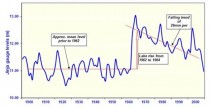
Figure 1: Lake Victoria lake level 1896 to 2005 (data courtesy of Dr Peter Mason)
If we take out the period of non-correlation and detrend afterwards for the 2 metre rise from 1962 to 1964, this is what the relationship between lake levels and solar cycles looks like:
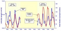
Figure 2: Solar Cycles and Lake Victoria lake level 1896 to 2005
The relationship is very clear, in fact beyond indisputable. It also holds true for the body of water that covers 70 percent of the Earth’s surface as shown by Figure 3:
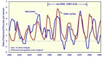
Figure 3: Solar Cycles and Sea Level 1909 to 2000
From that data, a 33-year subset from 1948 to 1987 has a high correlation:
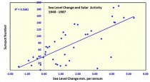 Figure 4: Sea Level Change and Solar Activity 1948 to 1987
Bingo. If we take the change in sea level from one year to the next plotted against average sunspot number for that year, we get a near-straight line relationship. The breakover between sea level rise and sea level fall, and thus warming or cooling climate, is a sunspot number of 40, which in turn corresponds to an F10.7 flux of 100. The average sunspot number over the Holocene was 40 which in turn makes sense of the last half-century of climate. The Earth's climate was in equilibrium with an average sunspot number of 40, and the higher solar activity of recent years disturbed that. Now we are returning to normal.
At the end of this decade, at the solar cycle 24/25 minimum, we might get a few years of as much as 2.0 mm per annum sea level fall. If you don't believe that, perhaps you would rather believe this:
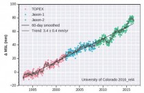
Figure 5: Global Mean Sea Level Time Series 1993 to 2016
That is from the clown show that is the Colorado University Sea Level Research Group.
That graphic is based on satellite data and shows a scary, nearly monotonic sea level rise of 3.4 mm per annum. How they get that is explained in this graph:
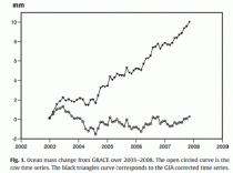
Figure 6: Creating a graph that keeps the grant money flowing
Figure 6, from this paper, shows that sea level, as measured by satellites - the lower line, has been flat. How they generate the graph they need, the upper line, is by adding an isostatic adjustment, which is a number plucked from thin air. No more needs to be said.