

By Joanne Nova
The line blurs between peer-reviewed-science and peer-reviewed-public-relations.
The Big-Scare-Campaign needed an answer to the missing hot-spot question. They needed to find the “hot spot”, or failing that, at the very least provide a “hot spot” type graph that would answer the critics; something that passed for a scientific answer that might fool journalists and bloggers. The failure to find the projected hot spot is so damning, and so obviously not what the models predicted, that there is a veritable industry of people working hard to find a reason why the weather balloon results must be wrong. Steven Sherwood creatively even resorted to throwing out the thermometer readings entirely and using wind shear instead. (If only we’d known! All those years and we didn’t need the thermometers?)
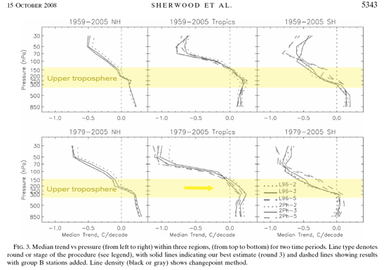
In Robust Tropospheric Warming Revealed by Iteratively Homogenized Radiosonde Data (March 2008) Sherwood et al combine both windshear and temperature data to reconsider the radiosondes yet again. The Scientific Guide to The Skeptics Handbook and others use the graph from the top left corner of this paper (Fig 1 here) to suggest that the hot spot is not missing, or that the “fingerprint” was found. Sure enough, it’s a cute graph. Looks “hot”, right?
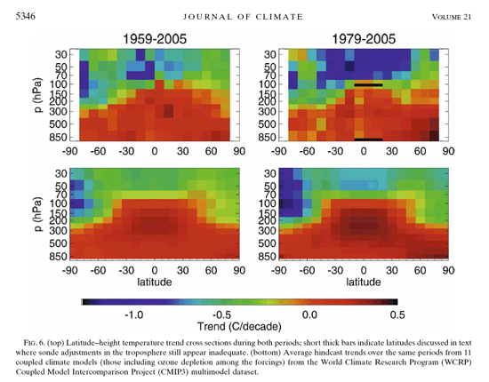
Fig 1. Sherwood 2008: observations (top two) vs models(bottom two). (Note the scale on the enlarged image!)
Peek closely at the scale of the graph. Note the color of zero - that’s right - if there was no global warming in the entire atmosphere, no change, nothing at all happening, the Sherwood interpretation would look like one giant hot-spot:
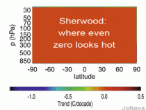
No change means still looking “hot”
With poor resolution and a carefully chosen color scale the top graphs give the glancing impression that models aren’t doing too badly. But the color scale above is not just counter intuitive, it actively prevents anyone from comparing the trend in the upper troposphere with the surface. Any warming trend at all is “red”. Trend information is lost within the graph. (I considered trying to recolor it but all reds are red if you know what I mean. 101 shades of red might work well for snakes with infrared acuity).
None of the authors, editors, or peer reviewers apparently had any problem with a graph with the meaningless scale. It’s just another endorsement of what you get with anonymous unpaid reviewers.
Here (below) are the earlier graphs that this paper is obviously a response too. Note back in the original CCSP documents that the colour scale helped the reader understand what was happening (even if pink is a questionable choice for the ultra cold). The models predicted a fingerprint of well mixed greenhouse gases that would look like graph A below. The stratospheric cooling (the blue bit at the top) is due to both carbon dioxide as well as declining ozone levels. The warming bit in the bottom half is possibly due to carbon dioxide (in part). But the red hot spot is due to feedbacks from humidity and clouds, with some latent heat release - at least in theory anyway.
In reality the radiosondes don’t find anything like that pattern, which tells us the feedback effects predicted by the models are not describing the real world very well.
Fig 3. The missing hot spot is obvious in these CCSP images (enlarged here).
Broadly consistent?
Can the claim be made that after Sherwood’s adjustments the radiosondes are broadly consistent with models? It all depends on how broad your consistency is. When a zero trend is almost “consistent” with a 0.25 warming trend (namely consistently red), what’s the difference?
In the same vein, I guess the number 1 is broadly consistent with “2”.
Make no mistake, Sherwood was looking for the missing hot spot. In the introduction he makes it clear that’s what this is all about:
The question of whether tropospheric temperatures are participating as expected in climate change has been controversial, with some observing systems reporting changes that are inconsistent with the models (CCSP 2006; National Research Council 2000)… that discrepancies between expected and measured tropospheric warming rates have not been fully explained in the tropics (CCSP 2006).
The title may sound impressively “robust” but the dodgy color choice and the fine print tell a different story. In the abstract no one is exactly gushing:
“The meridional variations of zonally aggregated temperature trend since 1979 moved significantly closer to those of the Microwave Sounding Unit (MSU) after data adjustment. Adjusted data from 5S to 20N continue to show relatively weak warming, but the error is quite large, and the trends are inconsistent with those at other latitudes.”
Note this set of graphs in his Fig 3 (especially the centre ones of the tropics, most particularly 1979-2005):
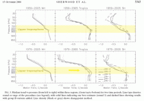
Sherwood 2008 Fig 3 (enlarged here): The upper troposphere over the tropics (150 hPs - 300 hPa) is supposed to warm about twice as fast than the surface. The warming trend from 1979-2005 should be stronger than the longer timespan. (Yellow annotation added by Jo Nova showing the zone where the models predict the greatest warming trend.)
In the conclusion, Sherwood comments on the trend that is within uncertainty bounds (and it happens to be in the lower half of the troposphere), but I can’t see any equivalent numerical focus on the important zone from 150 - 350 hPa (which I highlighted above), and was the apparent reason for doing more adjustments.
Our 1979 - 2005 trends for 850–300 hPa in the tropics are 0.15 - 0.07C decade. This is within uncertainty of the roughly 0.17-0.22 expected on the basis of surface trends of 0.12 - 0.14C decade (CCSP 2006; Santer et al. 2005), and the agreement would improve if one were to remove the deep tropical stations whose behavior is inconsistent with the rest of the network.
There is no justification in the paper for saying that the adjusted sonde data now finally agrees “broadly” with the models. It’s 10 years since the data from the 1979-1999 warming period came in, and team after team has reanalyzed the data every way they can think of, and almost all the reanalyzing seems to be in a non-random model-friendly direction.
The IPCC is 90% sure a disaster is on the way, but ask for evidence that the models are right about the feedbacks and the aggressive certainty evaporates into vague lines about how things are not inconsistent, if you (insert caveat), and (insert adjustment), and (insert particular dataset, in a particular era). Sherwood might have improved the trends, but if he’d have found the holy-grail he’d have said so.
Hat tip to the anonymous person or collective who wrote The “Guide” and to John Cook (maybe the same person) who drew my attention to the Sherwood graph. There’s plenty more to come
References: STEVEN C. SHERWOOD, CATHRYN L. MEYER, AND ROBERT J. ALLEN, HOLLY A. TITCHNER, Robust Tropospheric Warming Revealed by Iteratively Homogenized Radiosonde Data, JOURNAL OF CLIMATE, vol 21 p5336 [PDF]
See Joanne’s excellent post here.
By Louise Gray, Environment Correspondent
“We have said with an extraordinary post-imperial arrogance that we are going to show the world what it should do,” the former chancellor cautions. “We are going to be a great example. Well, we have been an example of what not to do - by damaging our own economy to no conceivable purpose.”
Western countries may be prepared to sign up to swingeing emissions cuts, Lord Lawson believes emerging nations, such as India and China, will never agree to them. It is arrogant of rich nations, such as Britain, to ask them to adopt a policy that might limit economic growth, he says.
He acknowledges that the world has grown warmer in the past 100 years, and that it is likely that man-made greenhouse gases “played a part” in that warming. But he believes the science is uncertain: “We need to get off this absurd carbon-cessation hook that will be hugely damaging to the economy and society. What we should be doing is monitoring what is happening very carefully and closely and preparing to adapt to any changes that might occur.”
The last round of United Nations talks on climate change in Copenhagen at the end of 2009 failed, but the issue came up again at the G8 last weekend, and the UN will resume talks at the end of this year towards getting a global deal. Despite support for a global agreement on climate change among his Tory colleagues, including the Prime Minister, Lord Lawson said it was misguided.
He also said domestic policy to cut greenhouse emissions by 80 per cent by 2050 would drive manufacturing abroad and limit growth.
However, Chris Huhne, the Energy and Climate Change Secretary, has said Britain would continue the policy of the last administration by committing to cut emissions first before asking poorer countries to take action.
“Europe must take a lead in securing an international climate agreement, though we can’t just click our fingers and hope the rest of the world will follow. We’ve got to make real emission cuts at home, and work constructively with all other nations in achieving that ambitious deal,” he said.
See post here.
Posted by Christopher C. Horner
This is how low profiles in courage in Massachusettss U.S. Senate representation has fallen, and how bad the media-leftist complex has gotten. Today’s Washington Post carries an homage by columnist E.J. Dionne to Sen. John Kerrys passion to push an energy bill.
The absurd, offending sentence is Which brings us back to Kerry, who in a talk with me made no apologies for his eagerness to get an energy bill. Well. Yes. Hes eager to tell you how his cap-and-trade global warming bill is an energy bill, rebranding it after pollster Stanley Greenberg instructed Democrats that cap-and-trade and global warming werent selling, and they had to rebrand it as energy.

Which calls into question the breathtaking courage, passion, etc. This is Kerrys second cap-and-trade global warming bill just this Congress. After the first floundered, he came out muttering about how mean it is to describe the bill as cap-and-trade - the central component of both is cap-and-trade, of course - on the grounds that I dont know what cap-and-trade means (he said that, incidentally, just after the Greenberg memo urging such abandonment).
Then, in delaying the introduction of his second bill, drafted with long-time cap-and-trader Sen. Joe Lieberman (I-CT), Kerry insisted it wasnt even an environment bill in order to not get his bill associated with Earth Day moonbattery - it was slated to be introduced with media fanfare as such. Quoth Kerry, “This is not Earth Day-related,” he said. This was a jobs bill. This is an energy independence, national security bill. Its not wrapped to one week or another.
Kerrys cup of courage runneth over!
He is lauded for his courage for insisting that his cap-and-trade global warming bill isn’t a cap-and-trade global warming bill (a term that poll-tests terribly) but is instead really an energy security, jobs and national security bill (which poll quite well). Even though its still cap-and-trade, and a global warming bill is there some other reason we must reduce CO2 emissions? - only this time with a gas tax tossed in on top.

And this is fawned upon by the establishment press as admirably forthright. Pathetic. See more here.