

Joe D’Aleo of IceCap and WeatherBell asked me to take a look at the September 18, 2012 NOAA Northeast Fisheries Science Center press release Sea Surface Temperatures Reach Record Highs on Northeast Continental Shelf.
While the press release does not state that the warming was caused by man, that doesn’t stop the comical comments by alarmists on the threads of blog posts at websites like ThinkProgress.
Note to alarmist bloggers at ThinkProgress: The NOAA Northeast Fisheries Science Center forgot to tell you something. Global sea surface temperatures have warmed. There’s no question about that- However-There is no evidence of an anthropogenic component in the sea surface temperature records for the past 30 years. More on that later.
The press release includes the typical coulda statement (my boldface):
“A pronounced warming event occurred on the Northeast Shelf this spring, and this will have a profound impact throughout the ecosystem,” said Kevin Friedland, a scientist in the NEFSC’s Ecosystem Assessment Program. “Changes in ocean temperatures and the timing of the spring plankton bloom could affect the biological clocks of many marine species, which spawn at specific times of the year based on environmental cues like water temperature.”
In other words, he doesn’t know, so he’s elected to speculate - which is a fancy-schmancy synonym for guess.
Of interest to me was the claim in the press release:
Friedland said the average sea surface temperature (SST) exceeded 10.5 degrees C (51F) during the first half of 2012, exceeding the previous record high in 1951. Average SST has typically been lower than 9 degrees C (48F) over the past three decades. Sea surface temperature in the region is based on both contemporary satellite remote-sensing data and long-term ship-board measurements, with historical SST conditions based on ship-board measurements dating back to 1854.
Whenever I see a statement like that in a press release, without a graph to support it, I wonder what are they’re trying to hide. That is, if there really was something awful, they’d show it. We don’t need to do a complex evaluation, catching the exact coordinates of the shelf, from North Carolina northward. All we have to do is look at a big chunk of data to get an idea of what they’re not showing.
The start date of 1854 indicates the referenced sea surface temperature dataset is NOAA’s ERSST.v3b. So let’s take a look at the data since then for a major portion of the Northeast Continental Shelf to see what the NOAA Northeast Fisheries Science Center isn’t telling us. We’ll use the coordinates of 40N-45N, 75W-65W. The area excludes the more southern “skinny” portions of the Northeast Continental Shelf, from Cape Hatteras to New Jersey, but these coordinates capture the big block of the shelf, including the area of greater concentrations of biomass from the map they provided, which I’ve annotated in Figure 1.
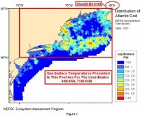
(Note: The press release says to “Click on photo to launch Atlantic cod distribution slide show”. I’ve clicked and haven’t gotten a slide show.)
First, the claim that the first 6 months of 2012 set a new record, just surpassing the previous record high in 1951:
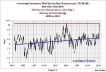
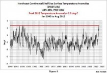
Figure 2 illustrates the average January to June sea surface temperatures for the Northeast Continental Shelf, from 1854 to 2012. I’ve also included the 2012 value as a horizontal line to make it easy to see if 2012 was in fact warmest. The 2012 value was warm, but the value in 1951 was slightly higher. However, I am not using the entire shelf shown in the NOAA map, so we should expect some minor differences. I know what some readers are thinking: the Northeast Fisheries Science Center simply extended data farther south along the coast until they found the coordinates then needed to make their claim. That could be true. But it’s not worth the time to verify.
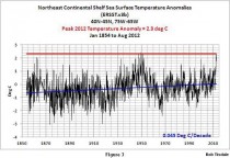
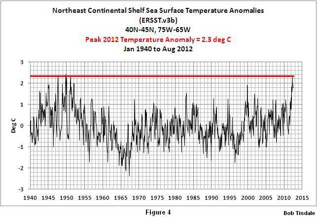
The monthly sea surface temperature anomalies for the region from January 1854 to August 2012 are shown in Figure 3. Looking at anomalies, we can see that the peak 2012 value was met or exceeded three times in the past, in the late-1940s and early-1950s. This is clearer in Figure 4 which excludes the data before the 1940s. The 2012 high value in Figure 4 certainly doesn’t look very alarming - just another warm month. Or you might think: why was it so cool for the other decades in between the early 1950s and now? Nope, they definitely would not have presented a graph like Figure 4.
The next illustration, Figure 5, is a comparison of the Atlantic Multidecadal Oscillation (AMO), determined using ERSST.v3b data, and detrended sea surface temperatures for the Northeast Continental Shelf. Detrending is the same process used to determine the AMO index. Both datasets have been smoothed with 121-month running-average filters like the AMO index. Instead of the 60- to 65-year “cycle” in the AMO data, the detrended and smoothed Northeast Continental Shelf shows a more complex mode of decadal variability that is not in synch with the basin. If the alternating large and small amplitude variations were to continue, we should be expecting another large amplitude “cycle” next. Note: I began the last sentence with “If”.
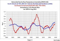
In other words, if the next cycle is of the larger amplitude, then in years to come, we should expect to see more notices of record high sea surface temperatures on the Northeast Continental Shelf from the NOAA Northeast Fisheries Science Center.
A NOTE ABOUT THE CLAIMS OF HIGH TEMPERATURES AT DEPTH
Parts of the press release also included statements about record high temperatures at depth. For example:
Ocean bottom temperature data cited in the advisory posted today came from a variety of sources, including eMOLT, a cooperative research program between the Northeast Fisheries Science Center and lobstermen who deploy temperature probes attached to lobster traps. While some of the temperature probes from the eMOLT program are still in the water and have not yet been returned, those that have been returned indicate that bottom water temperatures in 2012 were the warmest since the eMOLT program began in 2001.
What the press release fails to tell you is what causes the water temperatures to warm suddenly at depth - or as they called it earlier in the press release: “a pronounced warming event”.
The Gulf Stream is the western boundary current portion of the North Atlantic gyre. The North Atlantic gyre is driven by the east-to-west trade winds in the tropics and the Westerlies (west-to-east winds) at mid-latitudes. The sun warms the water in the tropics, and it is carried poleward by the Gulf Stream so that it can be radiated into space easier at higher latitudes. The cooled water returns to the tropics by the eastern boundary current along the west coast of Africa.
If the trade winds were to increase in the tropics, and if the Westerlies did not increase in strength proportionally at mid-latitudes, then the warm water that’s carried north by the Gulf Stream would “stack up” or pool along the east coast of the United States. The same thing would happen if the Westerlies were to slow at mid-latitudes, while the trade winds in the tropics remained constant. In other words, weather can cause “a pronounced warming event.”
Ocean Heat Content is a dataset that includes the measured temperature of the oceans to depths of 700 meters (about 2300 feet), but they also include salinity in that dataset because the heat content is also affected by how much salt the water contains. The units are therefore in Gigajoules per square meter and not temperature.
The long-term warming of ocean heat content can be impacted by prolonged and short-term changes in weather. To show the best example of this, we need to switch to North Pacific Ocean Heat Content data. The North Pacific like the ocean basins in each hemisphere has a gyre. The western boundary current there is called the Kuroshio Current, and the California Current is the eastern boundary current. The same basic process is involved: sun-warmed ocean water from the tropics is carried north by the Kuroshio Current so it can be radiated to space.
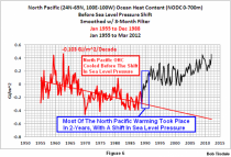
Figure 6 shows the Ocean Heat Content of the North Pacific, north of 20N, from 1955 to present. Notice how, from 1955 to 1988, North Pacific Ocean Heat content cooled - not warmed. Then it warmed in a major step increase over a 2-year period. Without that step increase, North Pacific Ocean Heat Content would have cooled from 1955 to present.
A note on the graph says “Most Of The Warming Took Place In 2 Years, With A Change In Sea Level Pressure”. To some that may seem confusing. They think: how could a change in sea level pressure cause Ocean Heat Content to rise? An AGW-proponent actually called me a clown recently for stating that the rise in Ocean Heat Content was caused by a change in sea level pressure. That blogger failed to realize the change in sea level pressure reflected a change in the wind patterns of the North Pacific. And that’s the basis for my earlier discussion of changes in the strengths of westerlies and trade winds.
I find it amazing that anthropogenic global warming proponents can’t see the significance of Figure 6. To them only greenhouse gases can warm the oceans. In the real world, Mother Nature simply throws a switch for a few years and presto, a warmer North Pacific.
THERE IS NO EVIDENCE OF AN ANTHROPOGENIC COMPONENT IN THE SEA SURFACE TEMPERATURE RECORDS FOR THE PAST 30 YEARS
I made the above statement earlier in this post. For more than 3 ½ years, I have been illustrating and discussing that fact here at Climate Observations. The two most recent posts on the subject were A Blog Memo to Kevin Trenberth of NCAR and How Much of an Impact Does the Atlantic Multidecadal Oscillation Have on Arctic Sea Ice Extent? They were also cross posted at WattsUpWithThat here and here.
To carry the discussion further and make it easier to understand for people without technical backgrounds, I’ve recently published an e-book (pdf) about the phenomena called El Nino and La Nina and its long-term effects. It’s titled Who Turned on the Heat? with the subtitle The Unsuspected Global Warming Culprit, El Nino Southern Oscillation.
The book is intended for persons (with or without technical backgrounds) interested in learning about El Nino and La Nina events and in understanding the natural causes of the warming of our global oceans for the past 30 years. Because land surface air temperatures simply exaggerate the natural warming of the global oceans over annual and multidecadal time periods, the vast majority of the warming taking place on land is natural as well. The book is the product of years of research of the satellite-era sea surface temperature data that’s available to the public via the internet. It presents how the data accounts for its warming - and there are no indications the warming was caused by manmade greenhouse gases. None at all. The book also includes a discussion of the natural warming of Ocean Heat Content data. In fact, Figure 6 above is Figure 5-55 from Who Turned on the Heat?
Who Turned on the Heat? was introduced in the blog post Everything You Every Wanted to Know about El Nino and La Nina...Well Just about Everything. The Updated Free Previewincludes the Table of Contents; the Introduction; the beginning of Section 1, with the cartoon-like illustrations; the discussion About the Cover; and the Closing.