


OPEN LETTER
To the Right Honorable Jean Charest, Premier of Quebec
July 16th 2012
Dear Sir,
The World Council for Nature (WCFN), considering that the implantation of wind turbines in the countryside causes collateral damages to the fauna and its habitat, wishes to bring to your attention the fact that investing in windfarms will not bring any positive return to the population of Quebec or to the health of the planet. You already have more clean energy than you need and must sell it often at a loss because your neighbors no longer really need it. It is therefore absurd to invest huge sums of public funds to produce more of it, at a price four times higher (1).
It is no secret that Hydro Quebec finds it increasingly difficult to sell its surpluses, which amount to about 8,700,000,000 kWh a year. It is also paying close to 150 million dollars each year to the thermal power station of Becancour, to produce NO electricity. This amounts to $900 million paid to date, for nothing (2). What a miscalculation! What a waste!
Yet you are presently investing considerable amounts of public money into more generating capacity, imposing to Quebeckers windfarms that they don’t need. It is simply nonsensical. Windfarms won’t make Quebec “greener”, on the contrary. It is already ahead of the world on that score, covering as it does its electricity needs with hydro power, which is “clean”.
What you are actually doing is replacing a clean and cheap energy which has no ill effects on the ealth of neighbors or on birds and bats (hydro), by another which causes multiple collateral damages and costs four times as much (windfarms) (1).
Windfarms destroy landscapes and kill millions of birds and very useful bats (3) for no gain whatsoever. They emit infrasound that cause sleep deprivation to neighbors, up to 10 km away for the larger models (e.g. 3 MW). Coming on top of plentiful hydro they duplicate the ecological impacts and financial investments, and this to satisfy the same demand for electricity. It is the opposite of ecological, and amounts to throwing away billions of dollars of public funds as wind energy is heavily subsidized.
Windfarms in Quebec are a redundant investment, completely useless because you already have too much energy, clean and cheap to boot. They are also redundant in the rest of the world, but in the case of Quebec it is plain as the nose in the face.
I live in Spain, a country which is technically bankrupt in part because of subsidies to renewable energies, which have increased the country’s sovereign debt by some 30 billion dollars to date, plus 8 billion more each year because the subsidies are guaranteed for 20 years. We produce the same amount of electricity as before, but it costs much more. As for our 18,000 wind turbines, they haven’t even reduced our consumption of fossil fuels, because of problems caused by their intermittency (4).
Have you considered the loss of value of properties that are or will be affected by the sight of these industrial installations, and by the infrasound they emit, which cause sleep deprivation? We are talking about cumulative losses in the billions of dollars, which will impoverish Quebec as a whole, in addition to rising electricity bills and the loss of tourism potential.
Last but not least, economists have shown that large subsidies and high energy prices both contribute to the destruction of jobs across the economy, whereas wind farms create very few permanent ones (5). Spain is a good example, with 25% unemployment.
Please, Mr Charest, do not destroy la Belle Province, its nature, and its future.
Contact :
Mark Duchamp
President
Tel : +34 693 643 736
save.the.eagles@gmail.com
References :
(1) The wind-power rates are more than twice as high as nuclear, and four times those of hydro.
(2) Globe and Mail: ”Did Hydro Quebec miscalculate? “
$900 million wasted with Becancour, and a surplus of 8.7 TW
(3) Wind farms kill millions of birds and bats a year:
(5) Five jobs destroyed for each “green job” subsidized
AUDITOR GENERAL of ONTARIO:
Green jobs kill other jobs in the economy
GREEN JOBS ARE A BURDEN, NOT A BENEFIT FOR THE ECONOMY
The Beacon Hill Institute, 25 June 2009
David Whitehouse
Schneider et al 2012 in a poster presentation to the two-day, “Taking the temperature of the Earth Conference,” that ends today, has the clever idea of looking at the temperatures of lakes and reservoirs around the world. They point out that in situ observations of lake surface temperatures are very rare on a global scale, but infrared imagery from space can be used to infer water surface temperatures of lakes and reservoirs.
They provide data for 169 of the largest inland water bodies world- wide using three satellite-borne instruments. Together they provide daily to near-daily data from 1981 through to the present, allowing them to calculate 25-year trends of nighttime summertime/dry-season surface temperature.
They find that the surface temperatures of the water bodies have been “rapidly warming” with an average rate of 0.350 plus/minus 0.11 deg C per decade for the period 1985–2010.
Two years ago Schneider et al published what was then described as the first global survey of lake temperatures. Then the researchers found a decadal trend of 0.45 deg C.
The researchers say the results provide a critical new independent data source on climate change that indicates lake warming in certain regions is greater than expected based on air temperature data.
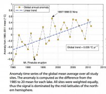
Their graph of temperature anomaly (click to enlarge) looks very familiar to anyone who is knows the global temperature datasets over the past thirty years. However, I don’t think their regression line is a good description of the data. My preliminary calculations suggest that there is no statistically significant trend post-1997. Hence an alternate description of their findings is that the world’s large bodies of water show the well known standstill of the past decade or so seen in global temperatures.
Note: While it is possible to draw a linear regression line between 1997 and 2011 (you can draw a trendline through almost anything) that yeilds 0.1 deg per decade it is statistically meaningless given the large variance of the data. The error on the trendline is several times its magnitude, and it is highly sensitive to moving the start and endpoint by a year or two. Conclusion: No statistically significant trend post-1997. Since 1997 the data is best represented by a straight line of mean 0.21 deg with a large standard deviation of 0.95 deg. Below is the post-1997 portion of the researcher’s graph. It is easy to see that the trendline calculated from the 1985-2011 data does not fit this section of the data in which there is no trend. Click here to enlarge.
Plotted without any extra information, here is the post-1997 data. Click here to enlarge.
By Peter Foster, Financial Post
Maurice Strong sees the cratering of his Stewie Griffin-style plan to rule the world
The “failure” of Rio+20 is a cause for celebration, even if you can’t afford the champagne and foie gras that ecocrats served themselves as their hopes for “Sustainia” retreated into the policy fog. A mostly “B” list of government leaders (No Barack Obama. No David Cameron. No Stephen Harper. No Angela Merkel) was set to adopt a pablum-filled 283-point “vision” on Friday that was finalized before they arrived.
“[N]othing less than a disaster for the planet,” declared Nnimmo Bassey, Nigerian poet and chair of Friends of the Earth International. “[A]n epic failure,” claimed Kumi Naidoo, Greenpeace International executive director. “[A] colossal waste of time,” chimed in Jim Leape, international director-general of World Wildlife Fund.
An umbrella group of NGOs bemoaned the official text’s lack of mention of “planetary boundaries, tipping points or planetary carrying capacity,” the very shibboleth’s of radical environmentalism’s zero-sum thinking.
Significantly, the mother and father of sustainable development, Gro Harlem Brundtland and Maurice “Chairman Mo” Strong, carped - or should that be gro-aned and mo-aned - from the Rio sidelines. Ms. Brundtland was the figurehead of the 1987 Brundtland report, which spilled sustainable development all over the policy map, while Mr. Strong orchestrated the 1992 Rio conference, which the current 50,000-strong flop is intended to commemorate.
According to Ms. Brundtland, Rio+20’s failure is due to the eurozone crisis and the power of Tea Party climate deniers.
Mr. Strong was flown in from China at UN (that is, taxpayers’![]() expense to be regaled by a group of corporations on Monday as a “very special guest of honour.” Mr. Strong is less than happy at the cratering of his Stewie Griffin-style master plan to rule the world, which has always clashed rather alarmingly with his problems in steering small companies, not to mention his implication in the UN/Iraqi oil-for-food scandal.
expense to be regaled by a group of corporations on Monday as a “very special guest of honour.” Mr. Strong is less than happy at the cratering of his Stewie Griffin-style master plan to rule the world, which has always clashed rather alarmingly with his problems in steering small companies, not to mention his implication in the UN/Iraqi oil-for-food scandal.
One wonders if these aged eco-doomsters were embarrassed by support from Iranian President Mahmoud Ahmadinejad, who called for rich countries to eschew “materialist” desires and pursue “spiritual” development. Mr. Ahmadinejad also suggested that: “The collapse of the current atheistic order is reaching its time.”
Perhaps so - the social democratic replacement for God is certainly proving to have feet of clay in Europe - but it looks more than doubtful that Gaia’s green caliphate will be taking over, even if the iconic statue of Christ the Redeemer, which looks down on Rio, was illuminated with green light for the conference.
The high priests of the new green world order crave cash, but calls for humanity to fork over for Gaia’s “services” are falling on deaf ears, and not just because of the global economy. One problem is that Gaia has no bank account. UN Secretary-General Ban Ki-Moon, while ritually bemoaning the weakness of Rio+20’s outcome, declared this week that “Nature does not negotiate with human beings.” But then neither does she speak through a green self-elect. Gaia’s service fees would wind up in the coffers of the guys and gals who brought you not just oil-for-food, but a human rights system ruled by the world’s worst rights abusers, utterly corrupted climate science and peace in Syria.
The failure of Rio does not mean disregard for “The Environment.” Environmental protection is a branch of human protection. The environment has no value except for what it means to humans. The outrage that this observation will promote serves to prove the point. The environment can no more value itself than it can express outrage. Human development inevitably involves disturbance of land and potential pollution of air and water. The issue is never people versus the environment. It is the interests of some people vs. the interests of others. The question is one of balance, and that pollution should not be suffered without compensation. A bigger question is one of entirely bogus eco scares being manufactured as a rationale for payoffs to the very kleptocrats who are responsible for global poverty.
Canada should be justly proud of being in the vanguard of this return to balance both via its withdrawal from Kyoto and the environmental provisions of Bill C-38, which do not seek to trash safeguards - as alarmists have suggested - but to eliminate duplication, bureaucratic overreach, and the potential for sheer obstructionism.
Naturally, the threat of sustainable ideology is not over. Too many bureaucrats at the UN and national level are invested in it. Too much NGO fund raising relies on it.
Significantly, the official text talks of working with NGOs, despite their lack of political legitimacy. The text also still calls for more power for the United Nations Environment Program (UNEP). At least there is no mention of a World Environmental Organization, which would have been just as useless but would have threatened endless further negotiations on purpose, membership, funding, etc. etc.
There remain calls to tie down a set of Sustainable Development Goals, which should be good for another hundred reports and a dozen conferences. An Intergovernmental Science-Policy Platform on Biodiversity and Ecosystem Services (IPBES) is also on the drawing board. This will reportedly do for biodiversity what the Intergovernmental Panel on Climate Change (IPCC) did for climate science: pervert it for political ends.
The Rio+20 text was originally sold as promoting “The Future We Want.” However, the “We” in question was always a self-selected group of UN bureaucrats, alarmist NGOs, corporate rent-seekers and main chancers whose interests were sharply at odds with those of ordinary people. Rio+20’s failure should be celebrated as The Future We Avoided.
Now it is time for us to celebrate and thumb our noses at Maurice and the phoney extremist NGOs who fawn care about the environment but for whom it is all about power and control over our lives and what energy we use, what foods we eat, etc.

Dr. Ross McKitrick
When policymakers think about climate change, it’s about forecasting changes where people actually live - in local regions - rather than potential global impacts. But how good are climate models at predicting regional climate patterns? Useful climate models should not only get global trends right, but also regional patterns of change. Recent research has identified that, with few exceptions, climate models not only fail to do better than random guesses, in many cases they are actually worse.
Statistical analysis using available socioeconomic data has been shown to provide more successful explanations of regional climate change than the supercomputer climate modelling systems (General Circulation Models or GCMs), which underpin Intergovernmental Panel on Climate Change (IPCC) claims about “greenhouse gas” warming and forecasts of future warming. The IPCC climate calculations all assume that “greenhouse gases” play the dominant role in climate change.
Professor Ross McKitrick (University of Guelph, Canada and an IPCC expert reviewer) and Lise Tole of Strathclyde University evaluated a range of socioeconomic data against the 22 available IPCC GCMs to find which approach best explains the regional pattern of recent temperature trends around the world. They concluded that you need both, especially socioeconomic data.
Their much simpler rival statistical model had nothing to do with “greenhouse gases” but explained regional warming patterns due to urbanisation, socioeconomic and industrial development much better than the GCMs. While both might be partly right, the polarised IPCC assumptions that socioeconomic patterns have no climate impact and that temperature changes must be due to carbon dioxide emissions have never been proven to be factual.
Their research identified that 10 of the 22 GCM models predicted climate patterns opposite to observed records. The next ten GCM models showed improved predictions, but were not better than random guesses. Only two GCMs showed significant evidence of explanatory power.
They studied whether each of the 22 GCMs does such a good job explaining climate change data that the socioeconomic data could be ignored, or vice versa. In all 22 cases there was no chance of ignoring the socioeconomic data. On the other hand, only three of the 22 GCMs provided useful outputs but with one giving results opposite to the observed patterns. All 22 cases confirmed the importance of including the urbanisation and industrial development measures which IPCC claims are irrelevant.
The researchers then evaluated combinations of both types of models which again confirmed that socioeconomic data were essential explanatory factors. From over 500 million combinations, they identified that three of the seven regional socioeconomic variables and three of the 22 GCMs were relevant for a valid model of temperature change patterns over the Earth’s surface. The three useful climate models were from China, Russia and the US NCAR while GCM models from the main US government sources (NASA and NOAA), Australia, Canada, France, Germany, Japan, Norway and the U.K., could be ignored as they failed to exhibit any explanatory power for the regional pattern of surface temperature trends in any test, alone or in any combination.
Two important conclusions arise from their study. The significant explanatory power of their socioeconomic factors confirms that the temperature records are seriously ‘contaminated’ by urban and industrial development impacts, contrary to the 2010 U.K. Muir Russell Climategate Inquiry finding.
Second, since regional climate predictions made by contemporary climate models proved basically worthless, government policies based on those predictions will be equally useless.
Dr. Anthony Lupo
As we enter summer, the narrative is that the January to May period nationally has been the warmest on record, approximately 5.0 degrees Fahrenheit above the long term average [1]. This came on the heels of an incredible month of March which was 8.6 degrees Fahrenheit above the long term average and the warmest since 1895 [1]. The days were warm and spring came early. But we also heard about how this was not really a good thing, that this March was somehow unnatural, like “the weather equivalent of baseball player on steroids” [2]. The implication is that humans are the driving force behind the warmth.
In the Missouri region, March was about 15.2 degrees above the 1981-2010 normal. The year-to-date is running about 7.4 degrees Fahrenheit above the same benchmark for January to May. In fact, this year-to-date is running some 2.8 degrees ahead of the next closest January to May which was way back in 1921! March itself shattered the previous record for that month beating out March 1946, the previous standard, by a whopping 3.7 degrees! How unprecedented is such an occurrence?
While they don’t happen often, monthly temperature anomalies of 10 - 15 degrees above normal do happen here in the middle of the continent where weather extremes are typically greater in magnitude. Remarkable cold anomalies have occurred as well historically, for example, our region experienced temperatures that were 16.0, 15.8, and 15.2 degrees below the normal during January 1977, March 1960, and December 1983, respectively.
Then, was March 2012 really a new standard among warm anomalies? In our region, it was not. One can go all the way back to 1889 and find that December was an incredible 16.8 degrees above the latest climate normal for 1981-2010 (which was the same as 1891-1920 for December). During that month, only seven nights experienced temperatures below freezing and only two below 20 degrees. No day time highs were colder than freezing and only the last two days of the month averaged below freezing. A check of daily weather maps [3], such as they were in those days, reveals that the warmth was also widespread in a manner similar to that of March 2012. During that Holiday season, Jack Frost took a lot of time off from nipping at noses!
The year 1889 is not a period one typically associates with human induced global warming. Also, warm (or cold) anomalies such as this do not typically occur in isolation. One can then study the periods leading up to and following such an event, and a comparison of March 2012 with the December 1889 period can be done.
We should note that both months occurred during a year that could be classified as weakly La Nina (although the jury may be out on 2011 – 2012 whether it meets the exact criterion) [4]. The temperatures were cooler than normal leading up to December 1889. In the following nine months, however, six were warmer than normal, four including the two immediately following were well above the normal. March 2012 was preceded by three straight mild winter months, and was followed by a normal April. May returned to warmer conditions again, and the first half of June has been only marginally warmer than normal in this region.
Examining the precipitation leading up to each month including that month, the 1889 period was drier than normal as the precipitation was only about 75% of normal regionally. The March 2012 period was wetter than normal, but given the warm temperatures, there was likely more evaporation than normal. Dew point records are not available for the earlier period, and are not yet entirely available for the December 2011 - March 2012 period. It can safely be assumed that both periods were a bit dry, which would help create the favorable conditions for warmer temperatures in each month.
Further a comparative study of the atmosphere for these two periods is currently underway, and it can be seen from looking at the monthly composite upper air maps for both periods that the coldest air was bottled up to the north in the Arctic, while the eastern two-thirds of the nation were under a fairly strong ridging event (Fig. 1). This means that both periods experienced more sunshine during the month, and overall similar mechanisms may have been at work in producing December 1889 and March 2012, and both may have been the result of a similar confluence of atmospheric and oceanic forcing over North America.
And while North America has been warm from late 2011 and into 2012, similar circumstances are not happening globally[1]. Will such a warm event occur again soon over North America? Given the historical record, it is not very likely. But the bottom line is that the occurrence of these events has a readily explainable cause that does not invoke excess carbon dioxide.
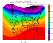
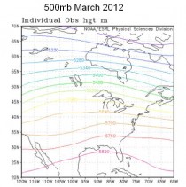
Figure 1. The 500 hPa maps for December 1889 (top) and March 2012 (bottom). The map for December 1889 was derived with much less data, and uses a slightly different map projection.
References:
[1] State of the Climate National Overview.
[2] Borenstein, S., 2012: Start of 2012, March shatter US heat records. For the Associated Press, for example see:
[3] Daily Weather Maps.
[4] Center for Ocean and Atmospheric Prediction Studies.
By Peter Ferrara, American Spectator
What would you do if gangs of robbers roamed your neighborhood at night, breaking into your neighbors’ houses and stealing their family jewels and life savings? You would arm yourself, and your family members of sufficient age, to defend your property. Or you would move to a safer neighborhood.
But if the robbers formed gangs called Greenpeace, the Sierra Club, or the Natural Resources Defense Fund, and assaulted your standard of living, the Che Guevara Democrats expect you to greet them with open arms, and gleefully turn over bushels of your cash, until your life savings is gone, and your standard of living has been reduced to the level of Argentina.
That third world destination is where Obama’s “green energy” economic strategy is taking America, all while he tells us sweet fairy tales about how this path is the road to 21st century prosperity.
Flower Power
Fancy political propaganda has us thinking that renewable, alternative fuels are the modern energy sources of the future. But just the opposite is true. Robert Bryce explains in his book Power Hungry: The Myths of “Green” Energy and the Real Fuels of the Future:
For millennia, humans relied almost completely on renewable energy. Solar energy provided the forage needed for animals, which could then be used to provide food, transportation, and mechanical power. Traveling...was made possible by the wind, human muscle, or animal muscle. And though today’s wind turbines are viewed as the latest in technological achievement, land-based systems that captured the power of the wind have been recorded through much of human history.
Indeed, the classic vision of the settlements of the Old West in America involves a decaying, wooden, windmill. Bry
ce continues, “The use of hydropower likewise goes way back. The ancient Greeks used waterwheels; so did the Romans, who recorded the use of waterwheels in the first century B.C. The use of mechanical power from water continued to the beginning of the Industrial Revolution.”
Moreover, “For 265 years after the Pilgrims founded the Plymouth Colony, and for 109 years after the signing of the Declaration of Independence, wood was the dominant source of energy in America.” Coal surpassed wood in 1885. Oil surpassed coal in 1950. Natural gas is undergoing a resurgence today.
The world changed from wind, solar, and biomass to oil, coal, natural gas and nuclear for good reasons of physics and math. First and foremost are the concepts of energy density and power density. The hydrocarbons and nuclear pack a massively more concentrated punch. The power of solar and wind are very broadly diffused throughout the atmosphere, so more than herculean efforts are needed to collect and concentrate it in usable forms. Hence we see solar panels and several hundred foot wind turbines spread out over square miles, and it still doesn’t add up to much.
The South Texas Project nuclear plant produces 300 horsepower per acre of land used, about the same as natural gas, with oil close behind. Wind power produces 6.4 horsepower per acre, solar photovoltaic 36 hp per acre, biomass 2.1. Corn ethanol requires about 1,150 times as much land as nuclear to produce the same horsepower.
The Milford Wind Corridor is a 300-megawatt Utah wind project with 139 wind turbines covering 40 square miles. Manufacturing the concrete to build them used 14.3 million gallons of water in producing 44,344 cubic meters of concrete. That means “each megawatt of wind power capacity requires about 870 cubic meters of concrete and 460 tons of steel.” That’s 32 times as much concrete and 139 times as much steel as for a megawatt produced by natural gas.
The diffusion problem is greatly compounded by the high variability of wind and solar conditions for power production. Bryce writes,
“We want the ability to switch things on and off whenever we choose. That desire largely excludes wind and solar from being major players in our energy mix, because we can’t control the wind and the sun. Weather changes quickly. A passing thunderstorm or high pressure system can take wind and solar power systems from full output to zero output in a matter of minutes. The result: we cannot reliably get or deliver the power from those sources at the times when it is needed.”
Then there is the problem of storing wind and solar power: “Renewable energy has little value unless it becomes renewable power, meaning power that can be dispatched at specific times of our choosing....And despite decades of effort, we still have not found an economical way to store large quantities of the energy we get from the wind and the sun so that we can convert that energy into power when we want it.”
As a result, the Electric Reliability Council of Texas concluded that just “8.7% of the installed wind capability can be counted on as dependable capacity during the peak demand period” and “conventional generation must be available to provide the remaining capacity needed to meet forecast load and reserve requirements.” With conventional energy sources needed to back them up completely on short notice, wind and solar are really just vanity supply to make the wasteful rich feel good.
These are the reasons why the world changed, and its not going back. As Bryce explains, before the Industrial Revolution, “while solar, wind, and water power all provided critical quantities of useful energy, they were no match for coal, oil and natural gas. Hydrocarbons provided huge increases in power availability, allowing humans to go from diffused and geographically dispersed power sources to ones that were concentrated and free of specific geographic requirements. Hydrocarbons were cheap, could be transported, and most important, had greater energy density and power density. That increasing availability of power has allowed us to do ever-greater amounts of work in less time.” Hence the industrial revolution and modern prosperity, now spreading worldwide.
Energy, Economic Growth and Modern Prosperity
Across the globe, modern prosperity is perfectly correlated with the use of energy and electricity. Bryce writes, “[T]he simple, unavoidable truth is that using oil makes us rich. In fact, if oil didn’t exist, we’d have to invent it.... [A]s oil consumption increases, so does prosperity. And the correlation is so clear as to be undeniable.”
The OECD countries, basically the prosperous, developed countries of the West, generally produce about $25,000 to $30,000 GDP per capita, and use 14 to 16 barrels of oil per person a year. In 2008, U.S. per capita GDP was $48,100, while oil use was 23 barrels per capita. By contrast, the non-OECD countries produce $7,000 to $10,000 GDP per capita, and consume 3 to 5 barrels per person. The countries of Africa and Asia produce $2,000 to $4,000 in per capita GDP, and use 1 to 2 barrels per person.
That is no accident. As Bryce writes, “[T]hanks to its high energy density, oil is a nearly perfect fuel for use in all types of vehicles, from boats and planes to cars and motorcycles. Whether measured by weight or by volume, refined oil products provide more energy than practically any other commonly available substance, and they provide it in a form that’s easy to handle, relatively cheap, and relatively clean.” Moreover, oil is the only fuel that can power the modern engines of economic prosperity, the diesel engine and the jet turbine.
Besides oil, prosperity is fueled in the world today by electricity. And right now, that means coal, though the future may belong to natural gas and nuclear power. While only Canada among major countries has higher per capita electricity consumption than America, the 5 countries with the lowest electricity consumption are Gaza, Chad, Burundi, Central African Republic, and Rwanda.
You can see this in your own home. The American kitchen of three decades ago featured a refrigerator, stove, and toaster. But today, Bryce writes, that same kitchen will include as well, “a microwave oven, bread maker, coffeemaker, juicer, convection oven, dishwasher and food processor. And a few steps away, where there once was only a small black-and-white television, there is now a giant-screen TV, a DVD player, and digital video recorder, as well as a laptop computer and ink-jet printer. In 1980, the average U.S. household had just three consumer electronic products. Today, it has about twenty-five.”
Coal today produces 41 percent of the world’s electricity supply, followed by natural gas at 20 percent, hydropower (geologically limited) at 16 percent, and nuclear at 15 percent. Oil at 6 percent (old-fashioned for electricity production) is still 3 times “other” at 2 percent.
Every grown up outside of Greenpeace, the Natural Resources Defense Council, the Sierra Club, and the modern Che Guevara Democrat Party understands what this means. Bryce writes, “The world’s developing countries are using their coal for electricity generation, and that electricity is propelling economic growth around the world, particularly in rapidly developing countries such as China, Indonesia, and Malaysia. Between 1990 and 2008, electricity generation in those three countries jumped by more than 300 percent.” As a result, just the increase in world coal use from 2007 to 2008 produced 25 times as much energy as all the wind turbines and solar panels in America in 2008.
Indeed, Bryce shows that just one modern coal mine in Kentucky, the 35th largest in America, produces nearly as much energy as all wind and solar in the U.S. And the natural gas production from just one state, Oklahoma, produces well over 9 times as much energy as all U.S. wind and solar.
Bryce adds, “[I]f we want to help developing countries bring more people out of poverty, we need to help them increase the amount of electricity they generate and distribute.” And that means still more coal, as well as natural gas and nuclear power.
The Left’s flower power “renewables” such as wind, solar and biofuels are the energy sources of the Roman Empire, and they will produce the same living standards as the Roman Empire. Bryce shows the meager existence of those still stuck in the old ways: “The world’s most impoverished people have no choice but to cook their food and heat their homes with fuels that have low energy density, such as straw, dung, twigs, wood and leaves. They are denuding the landscape of biomass in their struggle to survive. But in doing so, they are also contributing to deforestation and to the production of airborne soot.” Using these outdated energy sources “often results in the living areas being filled with a variety of noxious pollutants, including soot particles, carbon monoxide, benzene, formaldehyde, and even dioxin.”
Byrce concludes, “More oil consumption among the world’s energy poor would help save the lives of hundreds of thousands of impoverished people every year who die premature deaths because of indoor air pollution caused by burning biomass.” Indeed, these are the reasons why “oil is greener than any of the alternative energy forms that might replace it. No matter whether the replacement is ethanol from corn, biomass--such as wood, straw, or dung--or biofuels...the conclusion is apparent. Oil (and if you can get it, natural gas) simply has no peers. Oil provides consumers with both high energy density and high power density… and the number of uses for it are essentially limitless.”
The Road to Hell: Paved with Green Intentions
The Bakken geologic formation in North Dakota has turned out to hold far, far more oil than the U.S. Geological Survey used to think, 25 times as much in fact, or 2400 percent more. That is trillions of barrels of oil, rivaling Saudi Arabia by itself. The result is that the official unemployment rate in North Dakota is 3.5 percent, with nearly 20,000 jobs paying $60,000 to $80,000 a year remaining unfilled for lack of sufficiently skilled applicants. Revenue from the booming growth is gushing into the North Dakota state government so fast that after 7 consecutive tax cuts, the state enjoys a rainy day fund of several billion dollars, even though the entire state budget is only $2 billion. Although North Dakota voters yesterday voted not to abolish property taxes, a permanent boost to its economy would occur if the state instead phased out state income taxes entirely, as enjoyed by Texas, Florida and 7 other states.
As Newt Gingrich said in a highly illuminating campaign speech, “But if North Dakota by itself has that much energy, how much do we think we have everywhere else? Turns out, we may have more oil in the United States today, given new science and technology, than we have actually pumped worldwide since 1870. We may, in fact, by one estimate have three times as much oil in the United States as there is in Saudi Arabia.” Or as there ever was in Saudi Arabia.
Added to Bakken is the Green River Formation, which is where Colorado, Utah and Wyoming come together. That is now estimated to also hold more recoverable oil than the rest of the world’s proven reserves combined, according to GAO 3 trillion barrels, at least half of which is recoverable according to the Rand Corporation. That is two times all the oil in the Middle East, enough by itself to cover all U.S. oil consumption for 200 years.
Then there is a parallel revolution in natural gas. We have long known there was a lot of natural gas in shale, but we did not know how to get it out. As recently as 2000, people thought we had seven years of natural gas supply left in the U.S. Investors began committing big funds to building facilities for importation of liquefied natural gas from the Middle East.
But then entrepreneurs began applying to shale rock formations the horizontal drilling techniques that had been developed for deep water ocean drilling, where the most had to be gotten out of one hole by drilling in every direction. Combine that with the long time technique of fracking, breaking up the shale rock with steam, water and sand (supposedly so scary to “environmentalists") and the net result, Gingrich elaborates, is that
[W]e now have in shale tremendous amounts of natural gas that is recoverable. In one short decade, we went from 7 years of supply to over a hundred years of supply because science and technology had improved so much. Furthermore, instead of us importing liquefied natural gas from the Middle East, there is now serious talk that we’re going to build facilities in Houston...to ship liquefied natural gas to China.
But this is all just the beginning, because as Gingrich adds, “in places like the Marcellus Shale in Western Pennsylvania, in eastern Ohio, cutting down along the Appalachians, all the way out to Dallas, Texas, there is formation after formation after formation.”
What that means is what I reported last year in my book, America’s Ticking Bankruptcy Bomb. America has the resources to be the world’s number one oil producer, number one natural gas producer, number one coal producer, number one nuclear energy producer, even the number one alternative energy producer. And that all adds up to one truly enormous economic opportunity for America.
These revitalized, exploding energy industries themselves mean a booming economy, replicating North Dakota across the land. That means ultimately millions of high paying jobs just in the booming energy and related industries themselves. It means as well billions of dollars for landowners, farmers and others, who have these energy resources on their land.
And it means exploding tax revenues for our bankrupt governments as the revitalized energy industries earn soaring profits on which they will pay skyrocketing taxes. Indeed, the exploding royalties alone from the oil and gas boom over the next generation will be enough by themselves to pay off our entire national debt. This is why in the new prosperity America needs to elect free market conservatives so this cascading windfall won’t be wasted on still more runaway spending.
Moreover, plentiful, low cost energy means an economic boom more broadly. The resulting rapidly declining energy prices would be a powerful tax cut for the entire economy. That means in particular a revival of energy intensive manufacturing. It also means millions more jobs, higher wages, and still more tax revenue to balance the budget and pay off the national debt as America goes back to work.
Barack Obama tries to tell us that increased drilling will do nothing about high oil and gasoline prices. But notice that with the soaring supply of the shale gas boom, since 2008 natural gas prices have spiraled down by 90 percent. Declining energy prices mean lower prices for everything, which are further tax cuts for everybody boosting the economy even more.
But under Obama’s green energy watermelon policies, America does not get any of this. Instead the self-supporting, taxpaying, coal, oil and gas industries are phased out by the EPA. They are replaced by wind, solar and biofuels, entire industries surviving only because of corporate welfare, at the expense of taxpayers.
Because of the problems of diffuse and unreliable energy of these outdated sources as discussed above, these energy sources are inherently far more costly. Based on official U.S. government data, onshore wind is 2-3 times more costly than traditional fossil fuel sources, offshore wind 4-5 times more costly. Solar thermal energy is 5-6 times more costly, photovoltaic solar close to 10 times more expensive. The need for traditional energy back up online for when the wind doesn’t blow and the sun doesn’t shine adds still further to costs.
Just the opposite of what the market offers us, these higher energy prices are effectively another huge tax increase on the economy, killing still more jobs, raising unemployment, and inviting America still further into recession. The vast corporate welfare necessary to keep these alternative industries alive represents still another burden on the economy. Obama’s EPA cap and trade policies represent effectively trillions more in increased taxes, dragging the economy down further. Instead of a manufacturing renaissance for America with plentiful, low cost fossil fuels, Obama’s high cost energy policies mean further manufacturing decline for America.
The rhetoric of green jobs is just a PR slogan designed to trick the American people out of their traditional, world leading prosperity, which President Obama and his far left base considers immoral and unfair to the rest of the world. The reality has already been tried and failed in Europe, where studies show that green energy subsidies result in 2 to 9 jobs lost for every green job created. The reality is already in evidence in Great Britain, where brain dead devotion to windmills to power a modern economy has the nation on track for fuel poverty for half the nation, with more than 10 percent of their incomes consumed by high energy costs alone.
So the choice is clear for the American people this year. They can vote for the continued decline and fall of America with President Obama. Or they can vote for the revival of traditional raging American prosperity and the restoration of the American Dream, by sending Obama back to the fever swamps of the far left.
See also Green Grabs, the dark side of the Green Economy
John Hinderaker, Powerline Blog
Proponents of global warming alarmism place heavy reliance on the temperature record of the United States, probably the world’s best data set. They say that the record shows significant warming in the 20th century. Most global warming realists have accepted this claim, but have questioned whether this particular temperature trend–the Earth has been getting either warmer or cooler, sometimes on a far greater scale, for millions of years–has much to do with human activity.
What is less well known is that the alarmists do not rely on raw temperature data collected by American weather stations. Rather, the alarmists adjust the data before they publish it. This chart from NASA GISS, which you likely have seen before, purports to show the temperature anomaly as measured on land in the U.S. from 1880 to approximately the present:
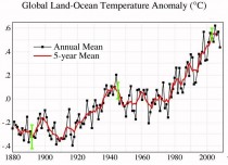
But that graph, like virtually every discussion of American temperature trends that you have seen, uses “adjusted” temperature data, not what was actually reported from weather stations. This chart reflects raw data from the U. S. Historical Climatology Network, the same data that were the basis–pre-"adjustment" - for the chart above:
Michael Hammer, who created this chart from the raw data, writes:
Clearly the shape of this graph bears no similarity at all to the graph shown in the first graph above. The graph does not even remotely correlate to the shape of the CO2 versus time graph. The warming was greatest in the 1930’s before CO2 started to rise rapidly. The rate of rise in 1920, the early 1930’s and the early 1950’s is significantly greater than anything in the last 30 years. Despite the rapid rise in CO2 since 1960, the 1970’s to early 1980’s was the time of the global cooling scare and looking at the graph in Figure 2 one can see why (almost 2F cooling over 50 years).
It would appear that the temperature rise profile claimed by the adjusted data is largely if not entirely an artifact arising from the adjustments applied, not from the experimental data record. In fact, the raw data does not in any way support the AGW theory.
So, what exactly are the adjustments that are made to the raw data by NOAA before they are published? Historically, five adjustments have been made; the only one that tended to reduce temperatures apparently has been eliminated:
It is obvious that the only adjustment which reduces the reported warming is UHI which is a linear correction of 0.1F or about 0.06C per century, Figure 2. Note also that the latest indications are that even this minimal UHI adjustment has now been removed in the latest round of revisions to the historical record. To put this in perspective, in my previous article on this site I presented bureau of meteorology data which shows that the UHI impact for Melbourne Australia was 1.5C over the last 40 years equivalent to 3.75C per century and highly non linear.
Compare the treatment of UHI with the adjustments made for measuring stations that have moved out of the city centre, typically to the airport. These show lower temperatures at their new location and the later readings have been adjusted upwards so as to match the earlier readings. The airport readings are lower because the station has moved away from the city UHI. Raising the airport readings, while not adding downwards compensation for UHI, results in an overstatement of the amount of warming. This would seem to be clear evidence of bias. It would be more accurate to lower the earlier city readings to match the airport readings rather than vice versa.
This is really a scandal. Not only does NOAA not correct for the well-recognized urban heat island effect, as I think it obviously should, it goes out of its way to re-introduce the heat island effect where better data are available!
Anthony Watts reports the discovery of more corruption of the historical record by global warming alarmists. The National Climate Data Center has been altering historical records to make past temperatures cooler than were reported at the time. This is being done so as to create an artificial warming trend over the 20th century:
Jeff Masters and [Christopher C. Burt] recently received an interesting email from Ken Towe who has been researching the NCDC historical temperature database and came across what appeared to be some startling inconsistencies. Namely that the average state temperature records used in the current trends analysis by the NCDC (National Climate Data Center) do not reflect the actual published records of such as they appeared in the Monthly Weather Reviews and Climatological Data Summaries of years past. Here is why.
Here is a typical example of what Ken uncovered. Below is a copy of the national weather data summary for February 1934. If we look at, say Arizona, for the month we see that the state average temperature for that month was 52.0F. [Ed.: This is the paper version that was published at the time.]
However, if we look at the current NCDC temperature analysis (which runs from 1895-present) we see that for Arizona in February 1934 they have a state average of 48.9F, not the 52.0F that was originally published.
So the actual temperatures reported in the 1930s are being reduced, to make it appear as though global warming has been going on since then. A reduction of more than three degrees Fahrenheit is, of course, huge.
These disclosures highlight a key fact with respect to global temperature data: the data sets are utterly lacking in integrity. Global warming alarmists confidently announce that worldwide temperatures have risen by, say .1 degree over a decade. It would be extraordinarily difficult to take measurements at many locations around the globe that would actually demonstrate that proposition. But the real situation is much worse: no one tells you what temperatures were actually measured at the world’s weather stations. Rather, they report claims of global warming based on “adjusted” temperature data–adjusted by alarmists, with the systematic purpose of manufacturing a rising temperature trend. If you subtract the “adjustments,” it may well be that there has been no net warming over the last 100 years at all.
I’ve said it before; here it is one more time: global warming hysteria is not science. It is an unholy combination of religion and politics.
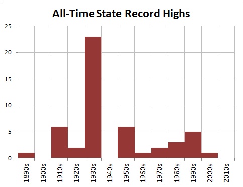
ICECAP NOTE: This shape actually fits the shape of the record highs shown in the posting on Extremes and Records in What’s New and Cool.
By Todd Starnes
A former anchor at The Weather Channel is suing the network after she said she was fired over a dispute involving her military service.
Nicole Mitchell, an Air Force Reserve Officer and a member of the “Hurricane Hunters” team, has accused The Weather Channel and NBC of discrimination and violating her rights under the Uniformed Services Employment and Reemployment Rights Act of 1994.
Mitchell said she began to experience harassment about her military service just after The Weather Channel was purchased by NBC, Bain Capital and the Blackstone Group, according to a lawsuit filed in federal court.
Court papers allege NBC bosses made explicit complaints about her military service schedule and created a “hostile working environment” for the anchor.
Mitchell, who holds the rank of captain, was an on-air meteorologist for The Weather Channel from 2004 until 2011 - when her contract was not renewed. She is a highly decorated officer who flies aboard a “Hurricane Hunter” and her military expertise was especially noted during the network’s hurricane coverage.

But after the network was purchased by NBC/Universal, Mitchell said network executives ordered her to get clearance before agreeing to any military assignments.
“I was told in an email, ‘before you agree to military duty, you need to clear it through us first,’” Mitchell told Fox News Radio. “If you don’t show up for orders, you could be court-martialed.”
The Weather Channel released a statement to Fox News Radio declining to comment on the specifics of the case.
Spokesman David Blumenthal said the network “is committed to creating a work atmosphere free of discrimination and in compliance with The Uniformed Services Employment Reemployment rights Act of 1994.”
Blumenthal said some of Mitchell’s allegations were inaccurate, but declined to provide specific examples.
“We disagree with many of the assertions in the plaintiff’s press statements and intend to vigorously defend the matter in the arbitration process,” he said.
Lance LoRusso, Mitchell’s attorney, called The Weather Channel and NBC’s behavior “deplorable.”
“It is not a matter of providing lip service and saying you support the military,” he told Fox News Radio. “You cannot interfere with their service. You cannot provide harassment or a hostile environment to them and if you do - you are subject to sanctions.”
An incident involving a missed hair appointment seems to be where Mitchell’s career at The Weather Channel faltered.
LoRusso said his client received a telephone call ordering her to appear for a Sunday hair consultation.
“They said quite clearly, ‘this is non-negotiable, no excuses,’” LoRusso said.
But Mitchell did have an excuse - she was on weekend military duty - and Mitchell had given the network advance notice of her responsibilities.
“She was told that was not a good answer,” he recounted. “They gave her a hard time, but she stuck to her guns.”
It wasn’t long before she was transferred from a Monday-Friday, 7 a.m. - 10 a.m. anchor shift on “Your Weather Today” to a Monday-Friday, 10 p.m.-2a.m. shift.
And LoRusso believes she Mitchell was removed from her star role because she’s a weekend warrior.
“Here we truly believe that the scheduling and the fact that her Reserve duty was up against a schedule of NBC and The Weather Channel - was a motivating factor in their decision,” he said. “That is illegal.”
Mitchell joined the Air National Guard when she was 17-years-old - and the network was well aware of her military commitments when she was hired, LoRusso said.
“It’s not a matter of courtesy,” he said. “It’s a matter of obligation. Our military cannot function as a volunteer force if the individual employers can control when our service members can appear and when they shouldn’t.”
LoRusso noted the irony of NBC’s sponsorship of a pro-military campaign called, ‘Got Your 6’ - vowing to support service members.
“Well, you should start in house,” he said.