


By Alan Caruba
The headlines report the way the Intergovernmental Panel on Climate Change has been lying and some, myself included, are calling for an end to this snakes’ nest of global deception.
I keep waiting for some environmental group to announce that the Earth is running out of oxygen. It’s the kind of huge lie that environmentalists of every description engage in. There’s plenty of oxygen and, despite the latest lies about carbon dioxide (CO2), the great oceans of the world are not turning into reservoirs of acidity. Together these two gases are the basis for all life on Earth.
If you remember nothing else, remember that any reference by anyone to “greenhouse gas emissions” involves the lie that they influence the weather or the world’s climate.
Since 1988, when the United Nations created the Intergovernmental Panel on Climate Change (IPCC), the vast global warming hoax existed for two purposes, the enrich those involved and to impose a one world government. The effort required mobilizing the leaders of nations to spread the word that the planet was dramatically warming and that carbon dioxide was the cause.
One has to marvel at the audacity of this scam. There were so many parties that had to be involved that it boggles the mind to consider that a mere handful of alleged “climate scientists” who created the computer models and provided the falsified data were able to corrupt so many real scientists into collaborating. The prospect of vast amounts of governmental and foundation funding made the process easier.
The scientists who spoke out against it were labeled “deniers”, but they were the truth-tellers and it took years of effort, culminating in four international conferences to debunk the global warming hoax. It was not, however, until November 2009 with the leak of the conspirator’s emails that the truth became widespread.
This evil scheme was supported and continues to be supported by many world leaders. President Obama traveled to Copenhagen in December 2009 to participate in a UN conference that was intended to impose one-world government and more recently the Secretary of State, Hillary Clinton, made mention of “climate change”, the code words that replaced global warming.
The IPCC was so successful that at its height in 2007 it shared a Nobel Peace Prize with former Vice President Al Gore. This prize is now so worthless that future recipients may not wish to be so honored.
Yes, there is climate change. There has, for 4.5 billion years of the Earth’s existence, always been climate change. There have been ice ages, magnetic reversals, volcanic activity, tsunamis, earthquakes and a host of other natural events.
To suggest, however, that climate change is influenced by too much carbon dioxide lacks all scientific merit. There simply isn’t enough CO2 in the Earth’s atmosphere to have any impact.
The single most powerful determinant of the Earth’s climate was and is the Sun.
Putting aside the United Nations’ never-ending effort to exert authority over all the nations and all the peoples of the world, global warming was about an audacious scheme to monetize carbon dioxide; to sell “carbon credits” and, by doing so, enrich those who were behind the scheme.
Recently, Patrick Hennigsen, the editor of 21st Century Wire, penned a commentary, “The Great Collapse of the Chicago Climate Exchange”, an excellent analysis of how the bottom fell out of the scheme to buy, sell, and trade “carbon credits” based on the fraudulent claim that “greenhouse gas emissions” had to be reduced worldwide to avoid global warming.
Hennigsen noted that Reuters had reported that the Intercontinental Exchange, Inc, the operating body of the Chicago Climate Exchange (CCX), “will be scaling back major operations (in August), a move that includes massive layoffs. This is likely due to the complete market free-fall of their only product…carbon emissions. “In May and June 2008, the carbon credits were trading at $5.58 and $7.78 respectively” until it finally dawned on investors that they were utterly worthless.
“Unlike most real markets,” wrote Hennigsen, “the carbon market was created by banks and governments so that new investment opportunities could seamlessly dovetail with specific government policies. It’s a fantasy casino based on a doctrine of pure science fiction.”
The U.S. has thrown billions at so-called “climate research” since 1988 and has passed laws intended to reduce CO2 emissions. There is no scientific merit, nor any justification for the many limits imposed on the American consumer. The quest, for example, of ever-cleaner automobile exhausts has resulted in more expensive cars and more dangerous ones as their weight had to be successively reduced to meet the mandates.
The current governmental craze for “clean” energy alternatives such as wind and solar power will only serve to drive up the cost of electricity without significantly adding any new sources capable of meeting the nation’s growing needs. Only government subsidies and mandates keep these projects alive as opposed to coal-fired, natural gas, and nuclear plants.
The original investors such as Al Gore have long since gotten out of the carbon credits market, having known in advance about legislation and policy before the general public. What they did not anticipate, however, was the natural cooling of the Earth since 1998 as the Sun entered one of its predictable cycles of low activity.
There is no global warming. What warming occurred was entirely natural, a response to the end of a previous period of cooling that ended around 1850.
A lot of people should be sent to jail for engaging in this fraud, but they will not. The victims remain as does the drumbeat of lies about greenhouse gas emissions or claims of ocean acidification.
Every flood, hurricane, or other natural event will continue to be blamed on “climate change” until eventually even the compliant mainstream media finally stop publishing lies. See post here.
Watts Up With That
WUWT provided a primer on cloud feedbacks on June 12th, 2009, followed by Willis Eschenbach’s “thermostat hypothesis” also recently published. This new paper by Spencer and Braswell is in the same theme as these.
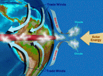
As clouds rise above the ITCZ, cloud tops create a reflective albedo, automatically limiting incoming solar radiation
On the diagnosis of radiative feedback in the presence of unknown radiative forcing
Roy W. Spencer and William D. Braswell
Received 12 October 2009; revised 29 March 2010; accepted 12 April 2010; published 24 August 2010.
Abstract: The impact of time‐varying radiative forcing on the diagnosis of radiative feedback from satellite observations of the Earth is explored. Phase space plots of variations in global average temperature versus radiative flux reveal linear striations and spiral patterns in both satellite measurements and in output from coupled climate models. A simple forcing feedback model is used to demonstrate that the linear striations represent radiative feedback upon nonradiatively forced temperature variations, while the spiral patterns are the result of time‐varying radiative forcing generated internal to the climate system. Only in the idealized special case of instantaneous and then constant radiative forcing, a situation that probably never occurs either naturally or anthropogenically, can feedback be observed in the presence of unknown radiative forcing. This is true whether the unknown radiative forcing is generated internal or external to the climate system. In the general case, a mixture of both unknown radiative and nonradiative forcings can be expected, and the challenge for feedback diagnosis is to extract the signal of feedback upon nonradiatively forced temperature change in the presence of the noise generated by unknown time‐varying radiative forcing. These results underscore the need for more accurate methods of diagnosing feedback from satellite data and for quantitatively relating those feedbacks to long‐term climate sensitivity.
Citation: Spencer, R. W., and W. D. Braswell (2010), On the diagnosis of radiative feedback in the presence of unknown radiative forcing, J. Geophys. Res., 115, D16109, doi:10.1029/2009JD013371.
Our JGR Paper on Feedbacks is Published
by Roy W. Spencer, Ph. D.
After years of re-submissions and re-writes - always to accommodate a single hostile reviewer - our latest paper on feedbacks has finally been published by Journal of Geophysical Research (JGR).
Entitled ”On the Diagnosis of Feedback in the Presence of Unknown Radiative Forcing”, this paper puts meat on the central claim of my most recent book: that climate researchers have mixed up cause and effect when observing cloud and temperature changes. As a result, the climate system has given the illusion of positive cloud feedback.
Positive cloud feedback amplifies global warming in all the climate models now used by the IPCC to forecast global warming. But if cloud feedback is sufficiently negative, then manmade global warming becomes a non-issue.
While the paper does not actually use the words “cause” or “effect”, this accurately describes the basic issue, and is how I talk about the issue in the book. I wrote the book because I found that non-specialists understood cause-versus-effect better than the climate experts did!
This paper supersedes our previous Journal of Climate paper, entitled “Potential Biases in Feedback Diagnosis from Observational Data: A Simple Model Demonstration”, which I now believe did not adequately demonstrate the existence of a problem in diagnosing feedbacks in the climate system.
The new article shows much more evidence to support the case: from satellite data, a simple climate model, and from the IPCC AR4 climate models themselves. Read more here.
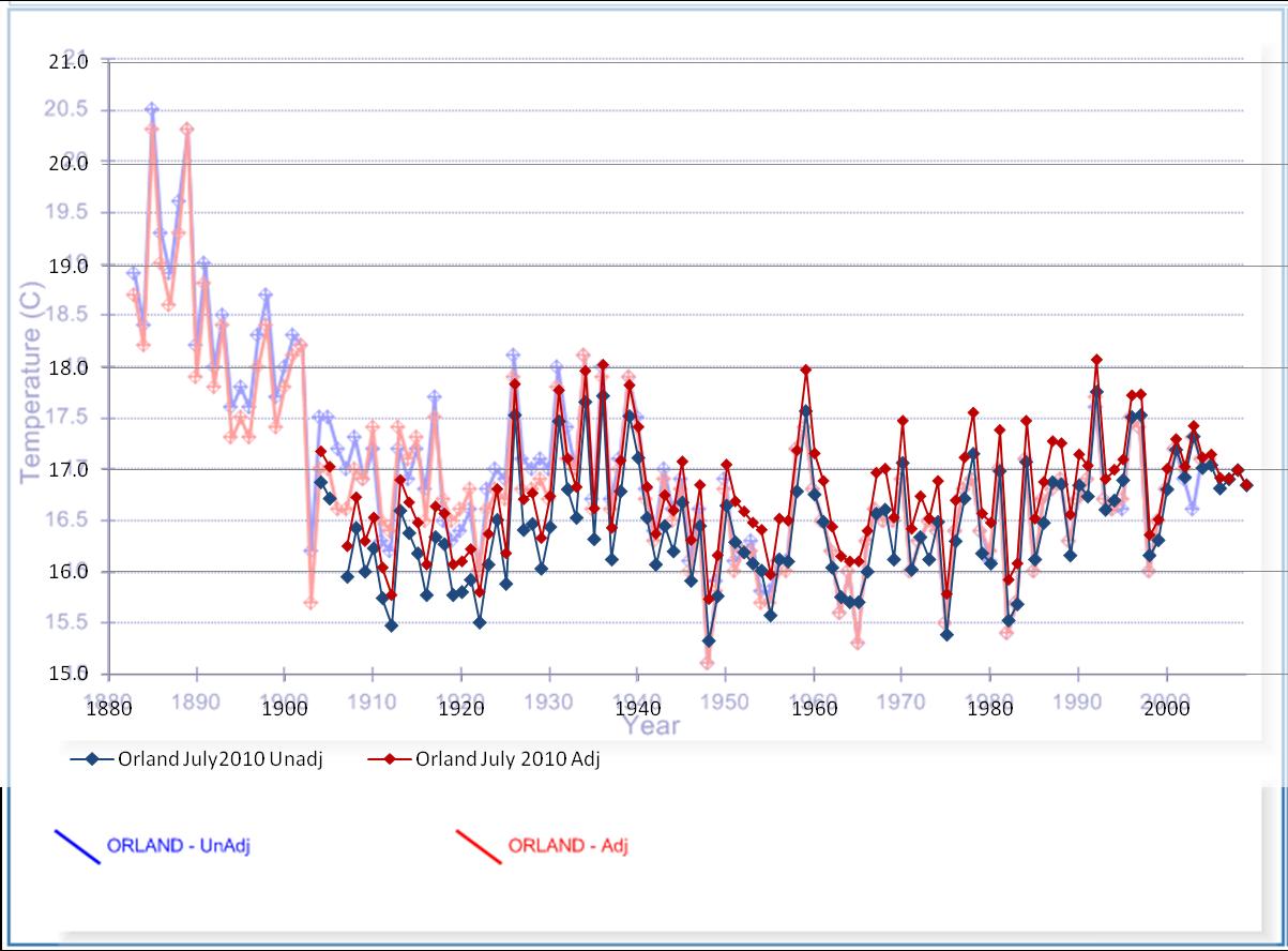
By Verity Jones
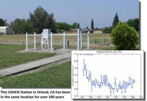
The data from the weather station at Orland, CA - ‘posterchild’ station for www.surfacestations.org (below, enlarged here) has been modified again. The modification throws away early years of data that are warmer than more recent temperatures. Is there any justification for this? (below, enlarged here).
Anthony Watts and a network of volunteers at www.surfacestations.org have so far examined 1003 of 1221 stations in the USA and rated them for their compliance with the NOAA/NCDC station quality ratings. Orland is featured as a stable rural station:
The Orland USHCN station is located behind the Orland Water Users Association off of 8th Street in Orland CA. It has the distinction of being well sited, and having been in the same location for over 100 years. It also has not been badly encroached upon by UHI as the community has not grown significantly during the period.
The version in USHCN and its modification by GIStemp were captured in the blink comparison below dated 29/12/2008 (full station data for Orland at Surfacestations.org). There is also a good history of investigating alteration of Orland data by Steve McIntyre, with his customary thoroughness, here and here.
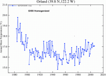
Animates here. Figure 2. Orland USHCN raw data/GISS homogenized data blink comparison. Animation courtesy of www.surfacestations.org Owner: Michael McMillan
However, the current GISS Station Data for Orland has been truncated, changing the station’s contribution to the surface record yet again. Figure 3 below shows an overlay of current data on a graph of station data prepared using Alan Cheetham’s graphing software and 2009 GHCN download (Climate Data Visualiser) at Appinsys (below, enlarged here).
With the current GISS adjustment the older data is warmed slightly, reducing the trend in line with compensation for UHI, but what the overlay shows is that the unadjusted data had been made cooler in the past anyway and even when adjusted the data in 1905-1930 is cooler than the previous GHCN version of the data. This creates a warming trend to present.
In the meantime, here’s why I have a problem with the way the data for Orland and nearby stations is now reported. If a single station shows a response for several years that is not reflected in nearby stations this can be symptomatic of some alteration of the station location, equipment or surroundings; that, I agree should, be adjusted. But when there is a very similar response in nearby stations, that tends to suggest short-term or relatively rapid alteration in the local climate (or weather). Orland’s location history (see first few comments) seems unaltered; Chico and Willows 6W show reasonable agreement with these warmer temperatures prior to 1903. Oroville also shows a similar pattern and this is kept by GISS, even after adjustment (Figure 7), although there is a ~0.5C reduction in the oldest temperatures due to the adjustment (below, enlarged here).
Read much more with comparisons to surrounding stations here.
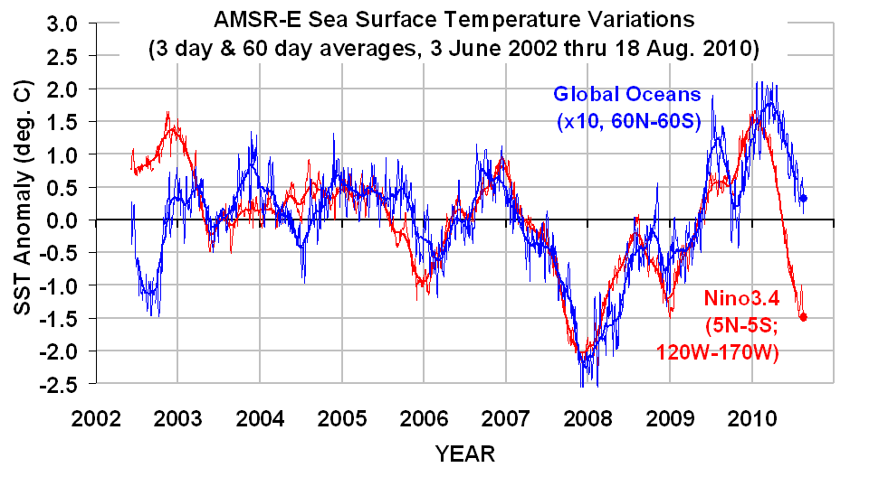
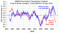
By Dr. Roy Spencer
Sea Surface Temperatures (SSTs) measured by the AMSR-E instrument on NASA’s Aqua satellite continue the fall which began several months ago. The following plot, updated through yesterday (August 18, 2010) reveals the global average SSTs continue to cool, while the Nino34 region of the tropical east Pacific remains well below normal, consistent with La Nina conditions. (click here for the large, undistorted version; note the global SST values have been multiplied by 10):
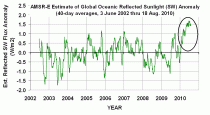
Anomalously High Oceanic Cloud Cover
The following plot shows an AMSR-E estimate of anomalies in reflected shortwave (SW, sunlight) corresponding to the blue (Global) SST curve in the previous figure. I have estimated the reflected SW anomaly from AMSR-E vertically integrated cloud water contents, based upon regressions against Aqua CERES data. The high values in recent months (shown by the circle) suggests either (1) the ocean cooling is being driven by decreased sunlight, or (2) negative feedback in response to anomalously warm conditions, or (3) some combination of (1) and (2). Note that negative low-cloud feedback would conflict with all of the IPCC climate models, which exhibit various levels of positive cloud feedback.
Read post here.
------------------
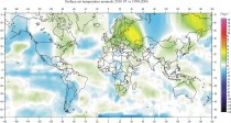
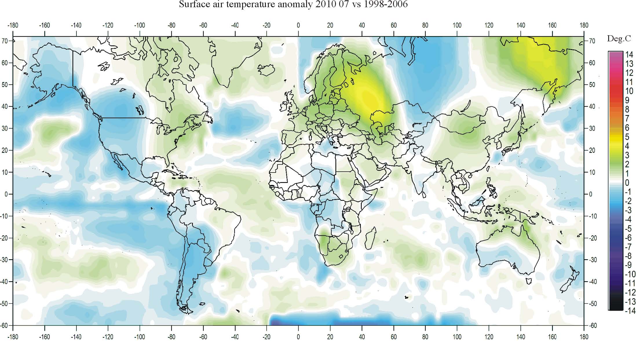
Climate4You July 2010
By Ole Humlum, University of Oslo
A newsletter with meteorological information updated to July 2010. All temperatures are shown in degrees Celsius. The newsletter itself, diagrams and supplementary material are also available for download here.
Enlarged here.
See PDF here. H/T: Joanne Nova
By Ray Evans
Climate: The Counter Consensus by Robert M. Carter (Stacey International, 2010)
Bob Carter is a member of a small group of Australian scientists (although he was born in the UK and mostly educated in New Zealand) who, having attained a distinguished position in their disciplines (he is a paleo-climatologist), were willing to put their reputations on the line by speaking out against the most extraordinary fraud in the history of Western science: the fantasy that by controlling anthropogenic emissions of carbon dioxide, mankind can control global temperatures; a miraculous global thermostat.
This fantasy is so bizarre that Jonathan Swift could, using statements from today’s Royal Society without embellishment, write them into his account of the kingdom of Laputa. The citizens of Laputa lived on a cloud and threw rocks at rebellious surface cities beneath them. Using Laputa as a satire on the Royal Society, Swift portrayed the ruin brought about by the attempts by the scientists living in the clouds to impose their will on the helpless people living below them.
Bob Carter’s book is a well written account of the deep corruption of our scientific inheritance which has been central to the spread of this fantasy. It is a fantasy which has spread throughout the intellectual, political and religious elites of the English-speaking world, and which has infected key Australian institutions, notably the CSIRO, the Australian Bureau of Meteorology, and virtually all our universities.
The foundation arguments on which this entire nonsense-structure is built are very simple. First, atmospheric concentrations of carbon dioxide control the sun’s energy flow to and from the Earth and thus control global temperatures in particular and global climate generally. Second, anthropogenic emissions of carbon dioxide are driving atmospheric concentrations of this gas inexorably higher and higher, and the consequence will be climate catastrophe.
These two arguments have no evidence to support them. None. And there is a mountain of evidence which negates them. Much of this negation is found in the Intergovernmental Panel on Climate Change’s first assessment report published in 1990. One of the graphs published in this report was a global temperature graph, originally the work of Hubert Lamb, the founder of the Climatic Research Unit at the University of East Anglia (the centre of the Climategate e-mails). His temperature curve ran from 900 AD to 2000 and showed very clearly the Medieval Warm Period (850 to 1350) and the Little Ice Age (1400 to 1850).
This graph, on its own, was enough to negate the first element of the thermo-maniacs’ foundation, and seriously undermine the second. It was argued in defence of the alleged unique quality of twentieth-century warming that although the Medieval Warm Period was admittedly an era of pre-industrial higher temperatures, the contemporary inputs of anthropogenic carbon dioxide into the atmosphere were unprecedented and a new scientific paradigm was necessary to cover this unprecedented “pollution”.
Despite this attempt to rewrite the laws of physics and chemistry which have served us well for at least two centuries, the Medieval Warm Period remained as a serious barrier to the acceptance of the doctrine of a global temperature controlled by mankind’s emissions. In a famous e-mail Jonathon Overpeck, a member of the Climategate cabal, stressed the need to “do something” about the Medieval Warm Period.
Carter carefully describes the attempts by Michael Mann and his colleagues to wipe out the Medieval Warm Period as an historical event through the invention of the “Hockey Stick”. The consequent unmasking of this fraud is an exciting story, well told here, with careful attention to the details and with references to a wide range of papers. In Australia, members of the Climategate conspiracy, notably David Karoly, kept on supporting the Hockey Stick well beyond 2007, a defence which might be seen as heroic under the circumstances, but which for the conspirators was a necessity, given the crucial role of the Hockey Stick in defence of the IPCC’s arguments about the unprecedented nature of late-twentieth-century global warming.
Following the humiliation of the EU and its supporters (including Australia) at Copenhagen last December, the whole Anthropogenic Global Warming structure is now falling down, as one key structural element collapses after another. Even the Royal Society of London, for years a rock-solid player in this fraud, has announced the establishment of a committee to inquire into the Society’s role and conduct in this debate.
Bob Carter’s book covers all the elements of this structure of fraud and deceit: the bogus computer models (used by the CSIRO as evidence of rising sea levels along the Australian coast, thus justifying the expropriation of people’s property along the coast through the negation of building permits); the temperature record going back decades, centuries, millennia, and half a million years; and the carbon dioxide record covering the same time scales. He covers the ocean acidification scam; the rising-sea-level scam; the Great Barrier Reef scam; but most interesting of all is his discussion of climate in geological time. Since paleoclimatology is his forte it is not surprising that his description of climate events going back hundreds of thousands of years is riveting. At some point in the not too distant future (two to three millennia perhaps) the Earth will undergo, quite rapidly, a shift into ice-age conditions which will make human habitation here extremely difficult. With our present state of knowledge and technology, there would be nothing we could do to prevent it.
As far as we can determine, during the period from 1943 to 1975 the Earth cooled by nearly a degree Celsius (although anthropogenic emissions of carbon dioxide were rising sharply), and this trend precipitated fear of a new ice age. However, following the switch in the Pacific Decadal Oscillation from cool to warm in 1975-76, global temperatures began to rise and the ice age scare quickly gave way to the global warming scare, and within thirty years or so to the situation where we were on the point of wreaking great harm on our nation.
Bob Carter discusses the motivating forces behind the intellectual and moral corruption which has been the central issue in this story, and here we find a scientist who is bewildered by what he has seen. He accepts Aynsley Kellow’s arguments concerning the corruption which follows from adherence to a “noble cause” - in this case “saving the planet”. In my view this is a serious misreading of the situation and it follows from a profound misunderstanding of the nature, doctrine and purposes of the environmentalist movement, which has been driving the Anthropogenic Global Warming fantasy for more than twenty-five years.
The Greens are the political face of the environmentalist movement and they have become extremely influential, not only as separate political parties, but as factions within the major parties throughout the Anglosphere and very clearly within our own Liberal and Labor parties. Because they have been able to play the political game with great skill they have not been subjected to proper scrutiny. John Howard, for example, failed to realise that the environmentalist movement is an existential threat to Western civilisation, indeed to all civilisation.
The core articles of faith of the Greens are the sanctity of “nature”, and the depravity of mankind. Their hatred of mankind is revealed time and time again in their oft-expressed desire to see new plagues wipe out the greater part of the world’s peoples. The creation of more and more “wilderness”, from which humans are barred, is a manifestation of this awful misanthropy, and the ultimate goal of this movement is an Earth which is no longer polluted by any human beings at all. It is an anti-theist movement with a deep hatred of its own kind, which it sees as depraved and incapable of redemption.
There is a growing realisation in the democracies of the Western world that they have been conned by the thermo-maniacs. In Australia the Senate saved us from the Carbon Pollution Reduction Scheme (CPRS) bill, which had it been passed, would have wreaked irretrievable damage on Australia in its economic, social and political life. Bob Carter was one of those Australian scientists who were not only able to convince many parliamentarians that the science on which the CPRS Bill was based was “absolute crap”, but also, by speaking at hundreds of meetings throughout the land, persuaded thousands of rank-and-file members and supporters of the Coalition parties that Tony Abbott’s famous declaration last September at Beaufort, Victoria, was correct. And it was the rank-and-file’s overwhelming pressure on the Coalition parliamentary parties that led to Malcolm Turnbull’s demise as Opposition Leader and to Tony Abbott’s succession.
What are the political consequences of this great change in the tide of affairs? In former times a king who persisted in ruinous policies was eventually forced to save his throne and the monarchy itself, by abandoning the adviser who was most identified with the policy, conducting a trial, and then executing the former favourite. Under such circumstances Charles I agreed to the execution of the Earl of Strafford, an act of which he repented at his own beheading.
As the federal and state parliaments begin to retreat from the ruinous policies of de-carbonisation to which they are currently still committed, such as renewable energy targets, attempts to turn coal-based power stations into gas-fired power stations, bio-char, and carbon dioxide reduction by command-and-control measures of one kind or another, there will be a need to find a scapegoat upon whom the burden of guilt can be laid. Such a scapegoat is ready at hand: the CSIRO, which has become so deeply corrupted by its thirty-year participation in this scam that its demise will be a welcome reminder that the wages of corruption are institutional disaster and disgrace.
There will be a need for a trial, in this case a Royal Commission with terms of reference which will allow it to bring to light the full story of how this once respected organisation betrayed the principles on which it was founded by Ian Clunies Ross in the 1940s and 1950s. As his book demonstrates, Bob Carter will be an invaluable witness at this Royal Commission.
See post here.
By Paul Wornham, Environmental Examiner
Wind power is high on the priority list for governments looking for ways to meet commitments to reduce CO2 emissions. As a renewable source of power, wind appears to fit the bill as a natural source of energy that can both provide power and be kind to the environment, but there is a down side to wind energy that may make the option less green than you might suspect.
Here are five reasons to rethink wind power as a green option:
Wind turbines need online back-up capacity
Wind is unpredictable, no one can know when it will blow or when it will be calm but because modern life needs reliable power, every wind turbine needs online back-up capacity. In Ontario, that backup is largely provided by gas turbines that run at 60% capacity whether or not they are generating power for the grid. In most cases, it would be more efficient to run the gas generators to generate electricity and not have the additional cost and carbon footprint of the wind farm at all.
Carbon cost of construction
Wind turbines are complex machines and require vast quantities of steel and concrete for the construction of the tower and foundation, in addition to materials like copper, aluminum and carbon composites for the blades and generating system. Concrete is said to be responsible for 5% to 10% of all human sources of CO2, emitting approximately 1.25 tons of carbon dioxide per ton of concrete. Full-size on-shore turbines need between 500 and 1000 tons for a solid foundation which comes at a high cost to the environment before the first kilowatt is generated.
Wildlife
Wind power has a high negative effect for wildlife, particularly birds. The green credentials of wind turbines are challenged especially in Altamont pass in California which is to blame for thousands of bird deaths every year, many of them protected species. Offshore wind farms can affect dolphins and seals in addition to birds.
Landscape blight
Large scale wind farms are increasingly unpopular because they spoil the natural landscape. The late Sen. Kennedy, usually an environmental cause supporter, opposed the ‘Cape Wind’ project in Nantucket Sound largely because of its potential to harm the area’s natural beauty. Planned wind farms in the UK face similar opposition where they are to be sited in or near designated protected areas of natural beauty.
Health
There are concerns that wind turbines sited near communities cause health problems for residents. Reported problems include dizziness, nausea and headaches. A common complaint is about the ‘whooshing’ noise made by turbine blades, which can interrupt sleep and affect concentration. The effects on human health are still being studied, but it is a valid factor to consider when evaluating wind power.
Wind farms are increasingly common sights no matter where in the world you live, but while the intentions of wind power advocates and generators are generally well-meaning, there are some serious problems and unintended consequences with the renewable option.

Read more here.
See more in this detailed analysis here.
By Bryan Leyland on Joanne Nova blog
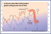
El Nino/La Nina effect (SOI) predicts global cooling by the end of 2010
A July 2009 paper by McLean, de Freitas and Carter showed that global average temperatures followed the Southern Oscillation Index (El Nino/La Nina) with a 5-8 months lag. The graph below shows that when the SOI is shifted forward by 7 months the two plots change direction together (except when volcanic eruptions caused cooling).
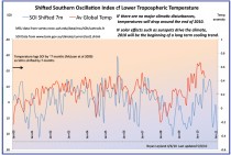
The chart above (enlarged here) shows a projection of temperatures to Feb 2011. The chances are that the present warm spell will end quite suddenly before the end of this year. Over the next few months the SOI will indicate whether or not the cooling will continue beyond Feb 2011. Evidence from studies on past climate and sunspot cycle related effects gives a strong indication that the cooling will continue.
Where can I find more information?
The paper is here and contains more graphs (see especially Figure 7)
Wasn’t this paper disputed?
Yes, but because the critics failed to understand the process ("derivative") that was used to match the peaks and valleys in the two sets of data and derive the 7 month delay. Therefore they refused to accept that the above plot is actual temperatures and SOI. (They are). The response by the authors is here.
------------
A few thoughts on the peer review process
Jo Nova
The Response by the Authors (here) tells the story of how their paper was published in the Journal of Geophysical Research (JGR). Prior to publication on July 23 2009 they received glowing referee reviews, but afterwards the usual ClimateGate Team leapt into action for speedy damage control.
Within a couple of weeks Foster et al (Grant Foster, James Annan, Phil Jones, Michael Mann, Jim Renwick, Jim Salinger, Gavin Schmidt and Kevin Trenberth) submitted their critique of it to the editor of JGR Atmospheres. At the same time as this, it was posted on the Internet - formatted in JGR style, as if it had already been accepted by JGR.
About then new editor was appointed at JGR (Editor-2).
The editor asks for suggestions (from Forster) for unbiased expert reviewers and Forster et al suggested six. But all six were well known to Phil Jones. Jones comments to friends that “All of them know the sorts of things to say - about our comment and the awful original, without any prompting.” So much for independent impartial reviewers.
Editor-2 was advised twice of the existence of these Climategate emails but was not concerned. Nor was he concerned that the paper had been published already on the internet (on August 7), and worse, with the JGR page header, in clear breach of the JGR rules.
Editor 2 invites McLean et al to reply to the critique of them (as is the norm), but then rejects the McLean reply. There are few official guidelines that a reply has to meet, and there were no obvious problems with the science, yet McLean et al was not allowed to even reply to the criticism.
Yet the three reviews of our response that we were provided with were scientifically insubstantial. Only one reviewer mentioned the time lag that we established, despite its pivotal importance to our findings. And two reviewers focussed mainly on the derivative technique that Foster et al.’s comment falsely implied was the basis of our conclusions.
So the guys who pervert the system by suggesting friends as reviewers, and who breach the rules by falsely prepublishing, are given a free pass to the printing press, and the team who ought to be entitled to defend their own work are shut out for no clear reason.
This is the state of modern peer review: A few anonymous unpaid reviewers, whose names are suggested by the reviewees themselves; this is rigorous? Who are we kidding. We have tighter controls and better standards for peer reviewing Cab Sav.
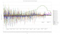
By E.M. Smith
This graph has the monthly trend lines from 1986 to date. Notice in particular how drastic some trends are. Like November, for instance. ( You can click here to get a much larger and readable version).
GHCN V2 All Data Anomalies 1800-2010 1986 Trends
I can’t help but think that this is something of a “Jumping The Shark” graph. The drastic and extreme change of trends, especially in some months, along with the divergence between months, just looks crazy. Yet that’s what is in the data. There is no adjustment, homogenizing, filling in, UHI adjustment, etc. done by me. This is the straight GHCN “Unadjusted” data set. It is converted to anomalies by having each thermometer compared only to itself, and for each month being compared only to itself. There is no seasonal averaging nor any kind of blending done. Simple, direct “self to self” comparisons for each thermometers in each month.
Compare with the graph of the data prior to 1986. In this graph there is a minor warming of winter months as we rise out of The Little Ice Age, but substantially no warming happening in Summer. A very natural state of affairs.
GHCN V2 All Data Anomalies 1800-2010 pre-86 Trends
That is just a crazy change of trend between these two graphs. Notice that I’ve stretched the vertical size of the second graph so that what little divergence there is within those trend lines would be more visible.. This change of trend between the graphs happens well after CO2 has had plenty of time for “effect”, yet could not warm the summers prior to 1986. It looks very non-physical.
I’ve chosen to make this segment break in 1986 for this graph as that is when a lot of the newer “duplicate number” or “modification history” flags first start to show in the data (the older series overlap, then exit with The Great Dying Of Thermometers that starts in 1990 in a big way.)
The nature of these graphs, and how they are made, is discussed in the posting of yesterday, here.
That posting has the graph entire from start to end, along with trend lines for the data as a composite from start to end, so you can compare the two segments with the total by using the graphs in both postings.
I suppose one could try to claim that a 24 year segment was just too short to give a valid trend, but then one would have to explain why a 30 year segment is long enough to define “climate"… and why it’s usable for defining “climate change” but not usable for showing how atypical the present segment of the data looks when presented.
IMHO, these two graphs highlight a significant “brokenness” in the GHCN data series.
Update: This Just In
From Verity Jones (Digging in the Clay), I’ve been handed an early peek at a “Pivot Chart” she has started. This is just the first 50 or so lines done, but it shows how the data suddenly change in 1986 or so with the change of the “modification history number” AKA “Duplicate Number”. 50 down, only 6800 to go…

Down the left side are the Station IDs, across is ‘years’. A colored box shows where there is data. If I understand what this says correctly, it is showing “The Splice” where one set of stations lead in, we get a different set (mostly) in the ‘cold period’ from 1951 to about 1980 ish, then a swap is made about 1986-1990 to yet another set.
“A Splice is a terrible thing to waste.”
Exactly what the change is that happens at that moment in time is yet to be determined. Read much more here.
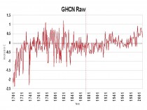
Icecap Note: Here is an average of all stations from 1701 in the raw GHCN (V2) data set. We know that the ‘anomaly’ method used doesn’t do simple averages but departures from some established averages (each data center does it differently) and they look at the geographic distribution and also that in the the early record stations were sparse. However, the simple plot does capture the rise out of the Little Ice Age into the warm 1700s, the cooling of the early 1800s and late 1800s and early 1900s, warming in the 1920s-1940s, cooling mid-century and then warmth. The raw data certainly doesn’t suggest anything extraordinary about the current time.
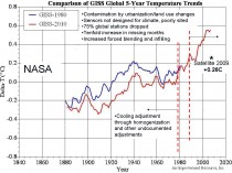
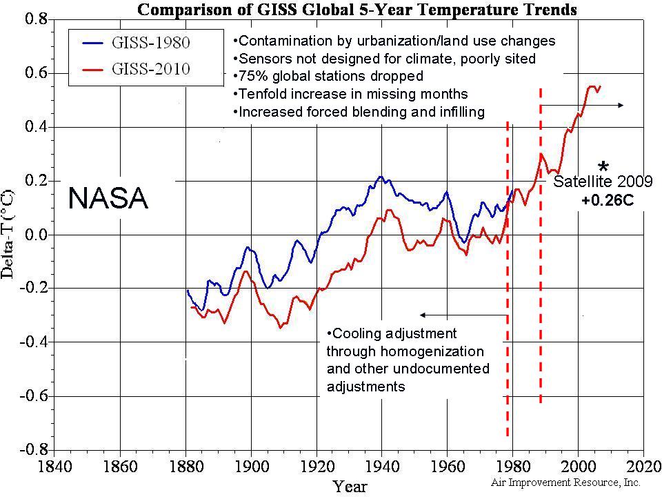
It is only after the data centers do their adjustments cooling off the early 20th century warm period (below shown 0.25C or 0.45F), and enhancing late century warmth (0.3 to 0.5C or 0.5 to 0.7F) with a host of issues we have identified - that we appear to have a problem. It is a contrived problem unrelated to greenhouse gases.
Enlarged here.