


By Anthony Watts, Watts Up With That
Every once in awhile (like once a week) I happen upon a NOAA USHCN weather station that leaves me wondering - what were they thinking? The latest example is Santa Rosa, CA. Here is what the data looks like before and after NASA GISS adjusts it. These are the USHCN “raw” and “homogenized” data plots from the GISTEMP website. The before and after is quite something to behold.
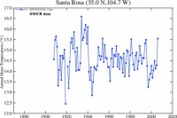
See larger image here.
And here is the data after it has been “homogenized” using the GISTEMP algorithm, I changed the color hues to help differentiate them visually:
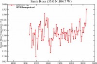
See larger image here.
Note that other than my applying labels and doing a hue shift, these are the exact graphs presented on the NASA GISTEMP website.
They also present the data used to plot these graphs on each of the above linked pages. You can download it yourself by clicking on the “Download monthly data as text” links at the bottom of the pages linked by the graphs above. I can’t provide direct links here due to the links being dynamically generated and as temporary files at GISTEMP. I downloaded and plotted both of these datasets myself, plus did polynomial fit trend lines. Note that missing data from 1920 has not been plotted on this graph, but simply skipped. The visual result of the before and after adjustments by NASA GISS speaks for itself:
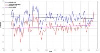
See larger image here.
What was down, is now up. Note the hinge point in the near present. The GISTEMP data stops at 2006, it will be interesting to see what this new location does for the data in 2007 and 2008. Read full post and comments here.