


The Litte Ice Age Thermometers - The study Of Climate Variability from 1600 to 2009
By Climate Reason
A clickable map with the historical station records can be found here. A discusssion of UHI factor here.
----------------------------
The Smoking Gun At Darwin Zero
By Willis Eschenbach at Watts Up With That here
So I’m still on my multi-year quest to understand the climate data. You never know where this data chase will lead. This time, it has ended me up in Australia. NASA [GHCN] only presents 3 stations covering the period 1897-1992. What kind of data is the IPCC Australia diagram based on? If any trend it is a slight cooling. However, if a shorter period (1949-2005) is used, the temperature has increased substantially. The Australians have many stations and have published more detailed maps of changes and trends.
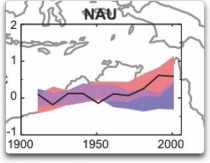
The folks at CRU told Wibjorn that he was just plain wrong. Here’s what they said is right, the record that Wibjorn was talking about, Fig. 9.12 in the UN IPCC Fourth Assessment Report, showing Northern Australia (below, enlarged here).
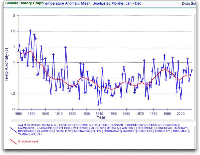
Here’s every station in the UN IPCC specified region which contains temperature records that extend up to the year 2000 no matter when they started, which is 30 stations (below, enlarged here).
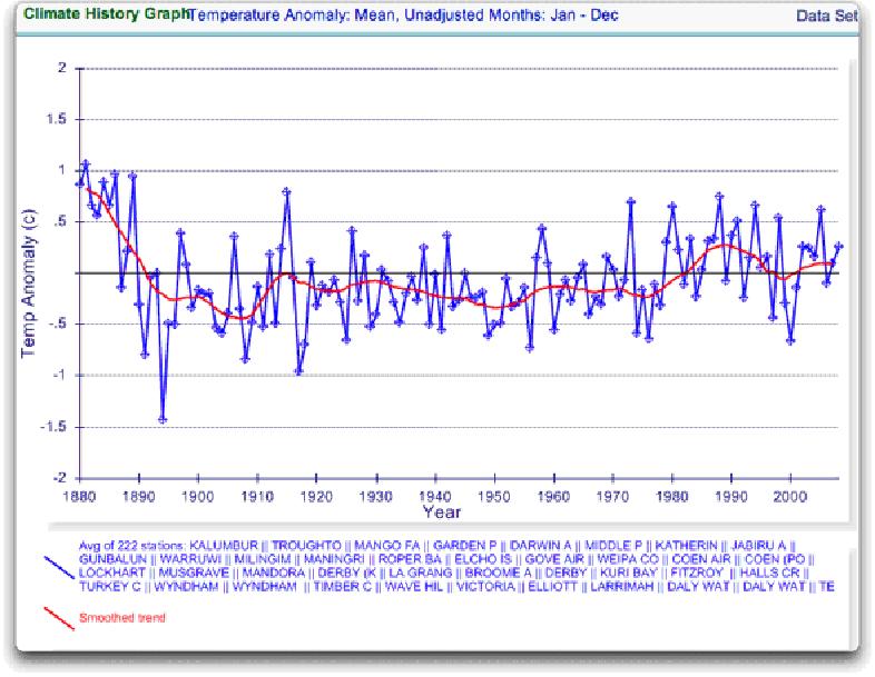
Still no similarity with IPCC. So I looked at every station in the area. That’s 222 stations. Here’s that result (below, enlarged here).
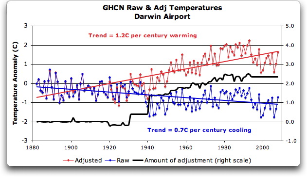
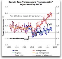
The answer is, these graphs all use the raw GHCN data. But the IPCC uses the “adjusted” data. GHCN adjusts the data to remove what it calls “inhomogeneities”. So on a whim I thought I’d take a look at the first station on the list, Darwin Airport, so I could see what an inhomogeneity might look like when it was at home.
Then I went to look at what happens when the GHCN removes the “in-homogeneities” to “adjust” the data. Of the five raw datasets, the GHCN discards two, likely because they are short and duplicate existing longer records. The three remaining records are first “homogenized” and then averaged to give the “GHCN Adjusted” temperature record for Darwin.
To my great surprise, here’s what I found. To explain the full effect, I am showing this with both datasets starting at the same point (rather than ending at the same point as they are often shown) (below, enlarged here).
YIKES! Before getting homogenized, temperatures in Darwin were falling at 0.7 Celcius per century...but after the homogenization, they were warming at 1.2 Celcius per century. And the adjustment that they made was over two degrees per century...when those guys “adjust”, they don’t mess around.
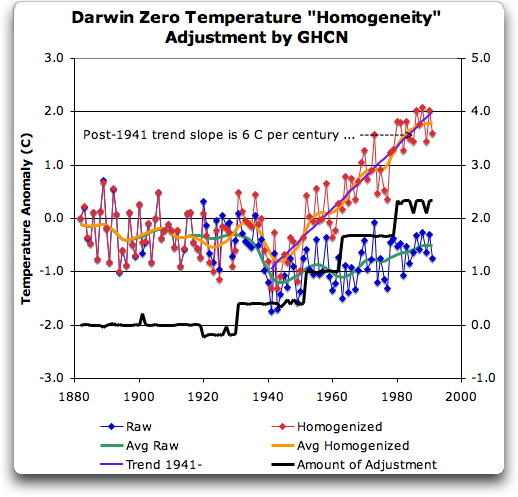
Intrigued by the curious shape of the average of the homogenized Darwin records, I then went to see how they had homogenized each of the individual station records. What made up that strange average shown in Fig. 7? I started at zero with the earliest record. Here is Station Zero at Darwin, showing the raw and the homogenized versions (below, enlarged here).
Yikes again, double yikes! What on earth justifies that adjustment? How can they do that? We have five different records covering Darwin from 1941 on. They all agree almost exactly. Why adjust them at all? They’ve just added a huge artificial totally imaginary trend to the last half of the raw data! Now it looks like the IPCC diagram in Figure 1, all right...but a six degree per century trend? And in the shape of a regular stepped pyramid climbing to heaven? What’s up with that? See full DAMNING post here.
---------------------------
Feeling Warmer Yet?
Study by New Zealand Climate Science Coalition
There have been strident claims that New Zealand is warming. The Inter-governmental Panel on Climate Change (IPCC), among other organisations and scientists, allege that, along with the rest of the world, we have been heating up for over 100 years.
But now, a simple check of publicly-available information proves these claims wrong. In fact, New Zealand’s temperature has been remarkably stable for a century and a half. So what’s going on?
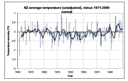
New Zealand’s National Institute of Water & Atmospheric Research (NIWA) is responsible for New Zealand’s National Climate Database. This database, available online, holds all New Zealand’s climate data, including temperature readings, since the 1850s. Anybody can go and get the data for free. That’s what we did, and we made our own graph. Before we see that, let’s look at the official temperature record. This is NIWA’s graph of temperatures covering the last 156 years: From NIWA’s web site -
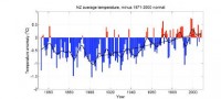
The official version enlarged here.Mean annual temperature over New Zealand, from 1853 to 2008 inclusive, based on between 2 (from 1853) and 7 (from 1908) long-term station records. The blue and red bars show annual differences from the 1971 - 2000 average, the solid black line is a smoothed time series, and the dotted [straight] line is the linear trend over 1909 to 2008 (0.92C/100 years).
This graph is the centrepiece of NIWA’s temperature claims. It contributes to global temperature statistics and the IPCC reports. It is partly why our government is insisting on introducing an ETS scheme and participating in the climate conference in Copenhagen. But it’s an illusion.
Dr Jim Salinger (who no longer works for NIWA) started this graph in the 1980s when he was at CRU (Climate Research Unit at the University of East Anglia, UK) and it has been updated with the most recent data. It’s published on NIWA’s website and in their climate-related publications.
The actual thermometer readings
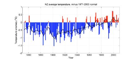
To get the original New Zealand temperature readings, you register on NIWA’s web site, download what you want and make your own graph. We did that, but the result looked nothing like the official graph. Instead, we were surprised to get this:
here.
Straight away you can see there’s no slope - either up or down. The temperatures are remarkably constant way back to the 1850s. Of course, the temperature still varies from year to year, but the trend stays level - statistically insignificant at 0.06C per century since 1850. Putting these two graphs side by side, you can see huge differences. What is going on?
Why does NIWA’s graph show strong warming, but graphing their own raw data looks completely different? Their graph shows warming, but the actual temperature readings show none whatsoever! Have the readings in the official NIWA graph been adjusted?
It is relatively easy to find out. We compared raw data for each station (from NIWA’s web site) with the adjusted official data, which we obtained from one of Dr Salinger’s colleagues. Requests for this information from Dr Salinger himself over the years, by different scientists, have long gone unanswered, but now we might discover the truth.
Proof of man-made warming? What did we find? First, the station histories are unremarkable. There are no reasons for any large corrections. But we were astonished to find that strong adjustments have indeed been made. About half the adjustments actually created a warming trend where none existed; the other half greatly exaggerated existing warming. All the adjustments increased or even created a warming trend, with only one (Dunedin) going the other way and slightly reducing the original trend.
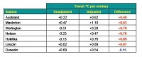
Enlarged here
The shocking truth is that the oldest readings have been cranked way down and later readings artificially lifted to give a false impression of warming, as documented below. There is nothing in the station histories to warrant these adjustments and to date Dr Salinger and NIWA have not revealed why they did this.
Enlarged here
See much more of this detailed analysis here. NIWA responds to the charges here but Anthony Watts uses instrument photo located at NIWA headquarters to cast doubt on their claims here. See also how the government is hell bent on moving foward with carbon emission schemes choosing to believe agenda driven government scientists here.
May I suggest those of you capable of extracting and doing the same kind of analysis for other regions try the same approach. Note back in 2007, an Icecap post inspired Steve McIntyre story “Central Park: Will the real Slim Shady please stand up?” on Central Park data raw versus adjusted here. Read the comments. As one poster noted could this be a ‘smoking gun’ on data manipulation”.
------------------------
No Global Warming in 351 Year British Temperature Record
By the Carbon Sense Coalition here
The Central England Temperature (CET) record, starting in 1659 and maintained by the UK Met Office, is the longest unbroken temperature record in the world. Temperature data is averaged for a number of weather stations regarded as being representative of Central England rather than measuring temperature at one arbitrary geographical point identified as the centre of England.
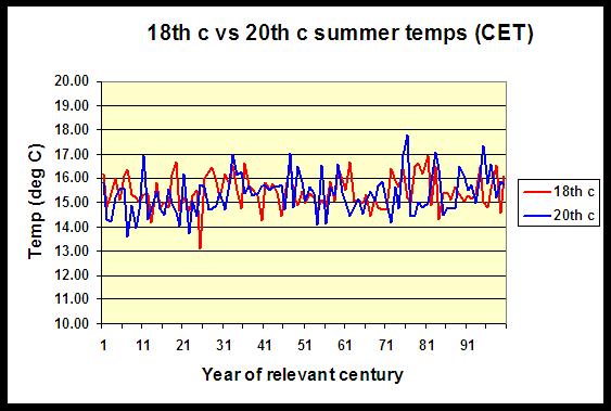
A Scottish Chemist, Wilson Flood, has collected and analysed the 351 year CET record. Here (below, enlarged here) is the comparison of the 18th Century with the 20th Century:
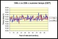
Wilson Flood comments:
“Summers in the second half of the 20th century were warmer than those in the first half and it could be argued that this was a global warming signal. However, the average CET summer temperature in the 18th century was 15.46 degC while that for the 20th century was 15.35 degC. Far from being warmer due to assumed global warming, comparison of actual temperature data shows that UK summers in the 20th century were cooler than those of two centuries previously.”
-------------------------
Karlen Emails about Inability to Replicate IPCC CRU based Nordic Data
By Willis Eschenbach on WUWT
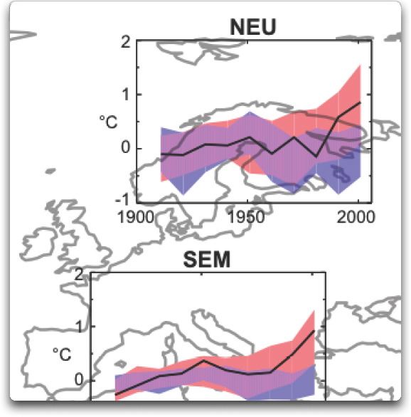
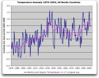
Professor Karlen in attempts to reconstruct the Nordic temperature. In his analysis, I find an increase from the early 1900s to ca 1935, a trend down until the mid 1970s and so another increase to about the same temperature level as in the late 1930s (below, enlarged here).
A distinct warming to a temperature about 0.5 deg C above the level 1940 is reported in the IPCC diagrams. I have been searching for this recent increase, which is very important for the discussion about a possible human influence on climate, but I have basically failed to find an increase above the late 1930s (below, enlarged here).
See much more here.
-------------------------
Skewed science
By Phil Green, Financial Post
A French scientist’s temperature data show results different from the official climate science. Why was he stonewalled? Climate Research Unit emails detail efforts to deny access to global temperature data.
The global average temperature is calculated by climatologists at the Climatic Research Unit (CRU) at the University of East Anglia. The temperature graph the CRU produces from its monthly averages is the main indicator of global temperature change used by the International Panel on Climate Change, and it shows a steady increase in global lower atmospheric temperature over the 20th century. Similar graphs for regions of the world, such as Europe and North America, show the same trend. This is consistent with increasing industrialization, growing use of fossil fuels, and rising atmospheric concentrations of carbon dioxide.
It took the CRU workers decades to assemble millions of temperature measurements from around the globe. The earliest measurements they gathered came from the mid 19th century, when mariners threw buckets over the side of their square riggers and hauled them up to measure water temperature. Meteorologists increasingly started recording regular temperature on land around the same time. Today they collect measurements electronically from national meteorological services and ocean-going ships.
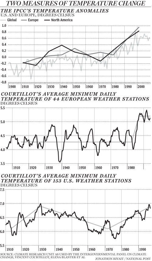
Millions of measurements, global coverage, consistently rising temperatures, case closed: The Earth is warming. Except for one problem. CRU’s average temperature data doesn’t jibe with that of Vincent Courtillot, a French geo-magneticist, director of the Institut de Physique du Globe in Paris, and a former scientific advisor to the French Cabinet. Last year he and three colleagues plotted an average temperature chart for Europe that shows a surprisingly different trend. Aside from a very cold spell in 1940, temperatures were flat for most of the 20th century, showing no warming while fossil fuel use grew. Then in 1987 they shot up by about 1 C and have not shown any warming since (below, enlarged here). This pattern cannot be explained by rising carbon dioxide concentrations, unless some critical threshold was reached in 1987; nor can it be explained by climate models.
Courtillot and Jean-Louis Le Mouel, a French geo-magneticist, and three Russian colleagues first came into climate research as outsiders four years ago. The Earth’s magnetic field responds to changes in solar output, so geomagnetic measurements are good indicators of solar activity. They thought it would be interesting to compare solar activity with climatic temperature measurements.
Their first step was to assemble a database of temperature measurements and plot temperature charts. To do that, they needed raw temperature measurements that had not been averaged or adjusted in any way. Courtillot asked Phil Jones, the scientist who runs the CRU database, for his raw data, telling him (according to one of the ‘Climategate’ emails that surfaced following the recent hacking of CRU’s computer systems) “there may be some quite important information in the daily values which is likely lost on monthly averaging.” Jones refused Courtillot’s request for data, saying that CRU had “signed agreements with national meteorological services saying they would not pass the raw data onto third parties.” (Interestingly, in another of the CRU emails, Jones said something very different: “I took a decision not to release our [meteorological] station data, mainly because of McIntyre,” referring to Canadian Steve McIntyre, who helped uncover the flaws in the hockey stick graph.)
Courtillot and his colleagues were forced to turn to other sources of temperature measurements. They found 44 European weather stations that had long series of daily minimum temperatures that covered most of the 20th century, with few or no gaps. They removed annual seasonal trends for each series with a three-year running average of daily minimum temperatures. Finally they averaged all the European series for each day of the 20th century.
CRU, in contrast, calculates average temperatures by month - rather than daily - over individual grid boxes on the Earth’s surface that are 5 degrees of latitude by 5 degrees of longitude, from 1850 to the present. First it makes hundreds of adjustments to the raw data, which sometimes require educated guesses, to try to correct for such things as changes in the type and location of thermometers. It also combines air temperatures and water temperatures from the sea. It uses fancy statistical techniques to fill in gaps of missing data in grid boxes with few or no temperature measurements. CRU then adjusts the averages to show changes in temperature since 1961-1990.
CRU calls the 1961-1990 the “normal” period and the average temperature of this period it calls the “normal.” It subtracts the normal from each monthly average and calls these the monthly “anomalies.” A positive anomaly means a temperature was warmer than CRU’s normal period. Finally CRU averages the grid box anomalies over regions such as Europe or over the entire surface of the globe for each month to get the European or global monthly average anomaly. You see the result in the IPCC graph nearby, which shows rising temperatures.
The decision to consider the 1961-1990 period as ‘normal’ was CRUs. Had CRU chosen a different period under consideration, the IPCC graph would have shown less warming, as discussed in one of the Climategate emails, from David Parker of the UK meteorological office. In it, Parker advised Jones not to select a different period, saying “anomalies will seem less positive than before if we change to newer normals, so the impression of global warming will be muted.” That’s hardly a compelling scientific justification!
In addition to calculating temperature averages for Europe, Courtillot and his colleagues calculated temperature averages for the United States. Once again, their method yielded more refined averages that were not a close match with the coarser CRU temperature averages. The warmest period was in 1930, slightly above the temperatures at the end of the 20th century. This was followed by 30 years of cooling, then another 30 years of warming.
Courtillot’s calculations show the importance of making climate data freely available to all scientists to calculate global average temperature according to the best science. Phil Jones, in response to the email hacking, said that CRU’s global temperature series show the same results as “completely independent groups of scientists.” Yet CRU would not share its data with independent scientists such as Courtillot and McIntyre, and Courtillot’s series are clearly different. Read more here.
Icecap Note: Finally see this exhaustive study by E.M. Smith on Musings from the Chiefio on NOAA’s global garbage bin GHCN which CRU and the media are using as confirmation that poor Phil Jones and Hadley did not manipulate data. See how in China, the Dragon Ate the Thermometers in this analysis by E.M. Smith here.
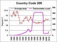
Also this animated gif shows the manipulation of the US temperatures. H/T Smokey on WUWT
------------------------
Would You Like Your Temperature Data Homogenized, or Pasteurized?
By Basil Copeland on Watts Up With That
A Smoldering Gun From Nashville, TN
The hits just keep on coming. About the same time that Willis Eschenbach revealed “The Smoking Gun at Darwin Zero,” The UK’s Met Office released a “subset” of the HadCRUT3 data set used to monitor global temperatures. I grabbed a copy of “the subset” and then began looking for a location near me (I live in central Arkansas) that had a long and generally complete station record that I could compare to a “homogenized” set of data for the same station from the GISTemp data set. I quickly, and more or less randomly, decided to take a closer look at the data for Nashville, TN. In the HadCRUT3 subset, this is “72730” in the folder “72.” A direct link to the homogenized GISTemp data used is here. After transforming the row data to column data (see the end of the post for a “bleg” about this), the first thing I did was plot the differences between the two series (below, enlarged here):
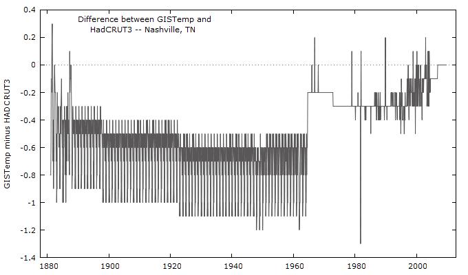
The GISTemp homogeneity adjustment looks a little hockey-stickish, and induces an upward trend by reducing older historical temperatures more than recent historical temperatures. This has the effect of turning what is a negative trend in the HadCRUT3 data into a positive trend in the GISTemp version (below, enlarged here):
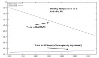
So what would appear to be a general cooling trend over the past ~130 years at this location when using the unadjusted HadCRUT3 data, becomes a warming trend when the homogeneity adjustment is supplied.
“There is nothing to see here, move along.” I do not buy that. Whether or not the homogeneity adjustment is warranted, it has an effect that calls into question just how much the earth has in fact warmed over the past 120-150 years (the period covered, roughly, by GISTemp and HadCRUT3). There has to be a better, more “robust” way of measuring temperature trends, that is not so sensitive that it turns negative trends into positive trends (which we’ve seen it do twice how, first with Darwin Zero, and now here with Nashville). I believe there is.
Temperature Data: Pasteurized versus Homogenized
In a recent series of posts, here, here, and with Anthony here, I’ve been promoting a method of analyzing temperature data that reveals the full range of natural climate variability. Metaphorically, this strikes me as trying to make a case for “pasteurizing” the data, rather than “homogenizing” it. In homogenization, the object is to “mix things up” so that it is “the same throughout.” When milk is homogenized, this prevents the cream from rising to the top, thus preventing us from seeing the “natural variability” that is in milk. But with temperature data, I want very much to see the natural variability in the data. And I cannot see that with linear trends fitted through homogenized data. It may be a hokey analogy, but I want my data pasteurized - as clean as it can be - but not homogenized so that I cannot see the true and full range of natural climate variability. See full post here.
See this post on GISS Raw Station Data Before and After Homogenization for an eye opening view into blatant data manipulation and truncation.