


By Verity Jones, Digging in the Clay
A Tamino rant aimed at Joe D’Aleo’s Arctic ice refreezing after falling short of 2007 record (also at ICECAP) has had me smiling. Tamino’s accusation against Joe of cherry picking are centred on one of the graphs originally posted here at DITC.
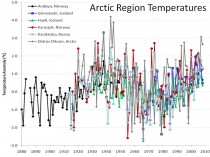
“D’Aleo tries so hard to blame Arctic climate change on ocean oscillations. Part of his dissertation includes a plot of “Arctic Region Temperatures”
“Do you suspect that these six stations were “hand-picked” to give the impression he wanted to give? Do you think maybe they were cherry-picked? If so, you’d be right.”
Well excuse me but of course they were cherry-picked, but not for the reasons Tamino suggests. If you really want to spit cherry stones, Tamino, chew on them first.
The graph was originally posted here and here’s what I said about it then:
“Tony had found many climate stations all over the world with a cooling trend in temperatures over at least the last thirty years…
We were concerned that this could be seen as ‘cherrypicking’...In many cases it was not just cherrypicking the stations, but also the start dates of each cooling trend.”
However, the story the post revealed wasn’t the one Tony wanted to tell from the original reason why the stations were chosen - the story that came out of the work was the unexpected (to us) cyclical pattern exhibited by so many of the stations across the world. The pattern matched more closely in regional stations - hence the closely grouped Arctic set in the graph above. So no, the stations in the graph weren’t meant to represent the whole of the Arctic (the original presentation of the graph is here).
But while we’re at it let’s look at a few more stations.
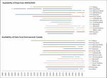
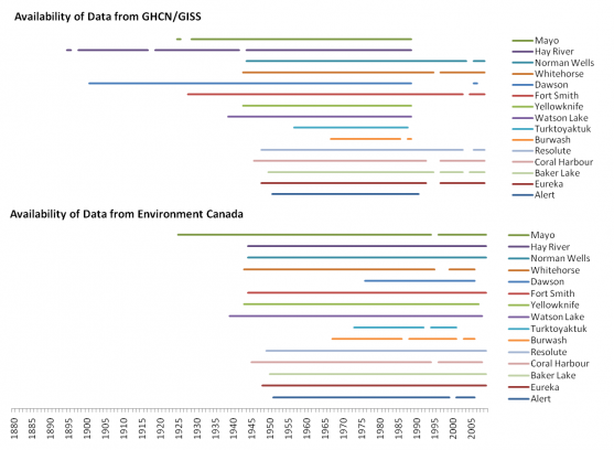
One of the reasons for choosing the stations we did in the graph above was the longevity of the record. This was something I had a look at in the Canadian Arctic too when comparing GHCN/GISS data and that of Environment Canada.
Tamino also berates Joe for not averaging/spatially weighting the data:
“He wants you to think that Arctic regional temperature was just as hot in the 1930s-1940s as it is today.”
If we want a simple comparison of the 1930s with the present we need stations that cover both time periods. In GHCN v2 for Canada, only one station (Fort Smith) has data in 2009 and also has data prior to 1943. Now Fort Smith is more than 1C warmer on average in the five years 1998-2002 than in 1938-1942, but if we look at Mayo in the Environment Canada data set, it is only 0.275C warmer in recent times when comparing averages of the two periods.
These are just two stations but such differences intrigue me. If you don’t compare like with like, how can you be sure there is no inadvertent bias? Are we comparing apples in the 1930s/40s with oranges in the 1990s and 2000s?
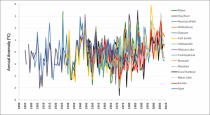
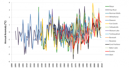
If we plot all the (GHCN/GISS) data (yes it’s another one of those ‘awful’ spaghetti graphs ;-0) - look at that big white gap under the plots from 1937-1946.
Those years look pretty warm compared to 2000-2010, but unfortunately the data for Hay River, Mayo and Dawson does not extend to recent times. To do a comparison, you need to plot GISS and Environment Canada data together, and (as I showed here) there is a bit of a mismatch that needs to be overcome. In Dawson the 1940s are warmer; Hay River shows a slow continuous upward trend.
If you want to compare the two periods in Canada, unfortunately you mostly have to rely on combining stations, and methods for this are well documented (I’ll not go into detail here). What is still debated though is the magnitude of correction (if any) for urban warming.
Much as scientists are required to be objective, there is a need for subjectivity in looking at the surface temperature records. What has changed around this station? Why is one station producing a cyclical signal while another gives a near linear trend? Like I’ve said before, I’m a fan of a parallax view.
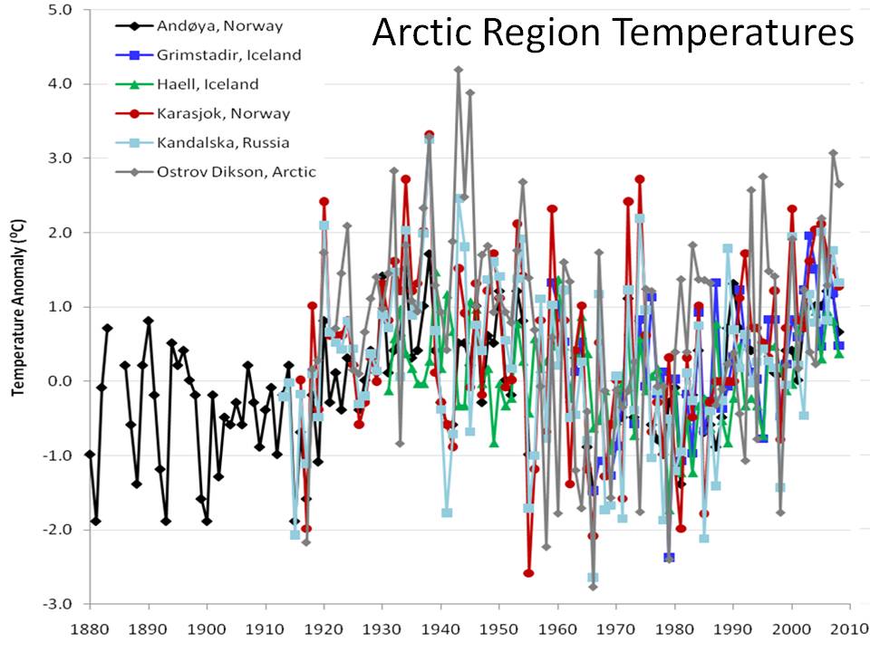
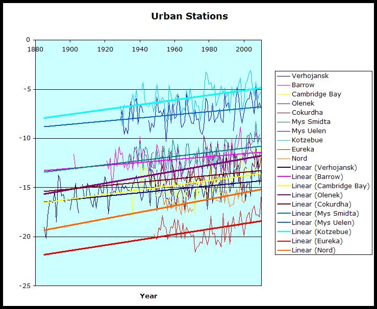
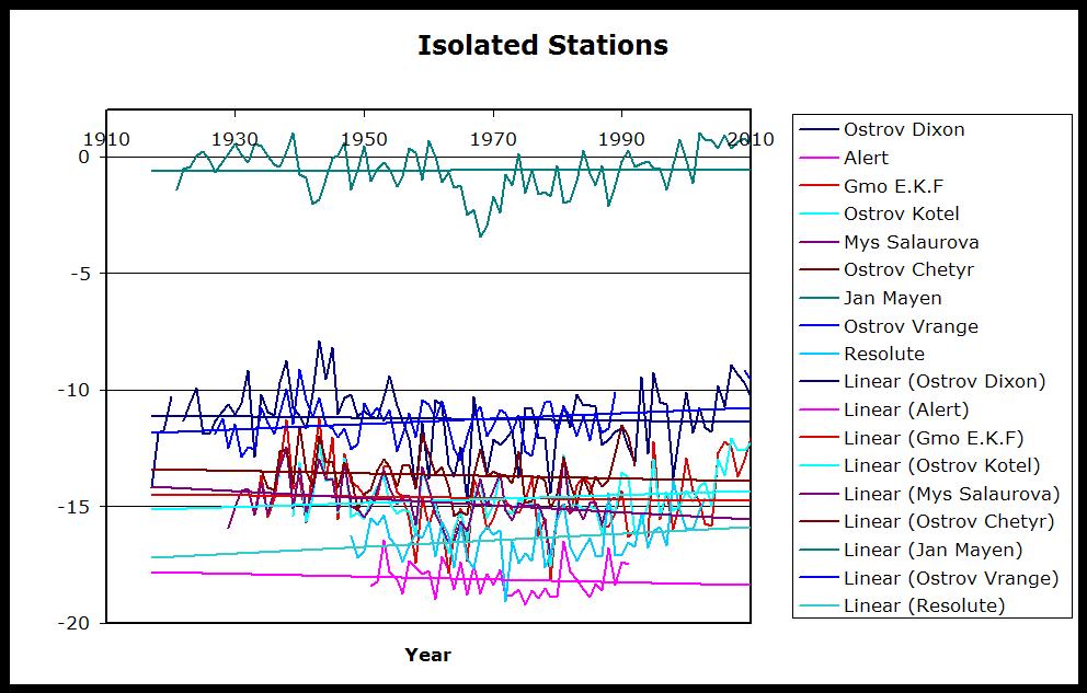
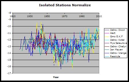
Canadian Arctic stations are mostly rural and very small settlements; they’re labelled as <10,000 population by GISS. Analysis by Roy Spencer showed the greatest warming bias associated with population density increases at low population density. Ed Caryl in A Light in Siberia compared “isolated stations” with “urban” where there was a possible influence from human activity. He found a distinct warming trend in temperatures of “urban" stations where there was increasing evidence of manmade structures or heat sources. In contrast, he found little or no trend in ”isolated stations’. Normalising the data for the isolated stations, he too produced a ‘spaghetti’ graph, which, lo and behold, also shows up that cyclical variation. Not only that, but for a lot of these stations (go ahead - call them cherry picked if you wish), the 1940s are clearly warmer than recent times.
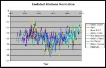
Enlarged
Graph from No Tricks Zone.
So it is very clear to me that, in comparing station data, we’re dealing with cherries, apples, oranges, and probably a whole fruit bowl. Banana anyone? The problem is that Tamino and others insist on mixing it all up to make a smoothie. Now that’s OK as long as you like bananas. See post here.
Icecap Note: I want to thank Verity for taking time to respond to Tamino. I am preparing my response (preliminary notes here) back to Tamino by examining more stations in the arctic and reiterating my claims and those from the NOAA NSIDC in 2007, JAMSTEC, IARC and Frances at Rutgers that the Pacific and Atlantic played a role in arctic temperatures and ice cover in multidecadal cyclical ways and evidence from Soon these cycles may be solar driven. Tamino focused on the one graph mentioned of the dozen presented in the original post is a frantic attempt to discredit natural variability which prompted Verity’s response. Steve Goddard has shown here that there are many anecdotal stories about declining ice and arctic warming during the prior warm period. More to come.