


By Joseph D’Aleo
Recently we shared a story in the Wall Street Pit how NASA has gradually reduced the warm middle 20th century blip and created a more continuous warming. You can see in this 1976 National Geographic graph, a rather significant warm period starting in the 1920s and peaking during the dust bowl era in the United States in the 1930s and only slowly declining heading into the 1950s. It showed more significant cooling in the 1960s and 1970s. The story questioned where to from there.
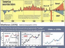
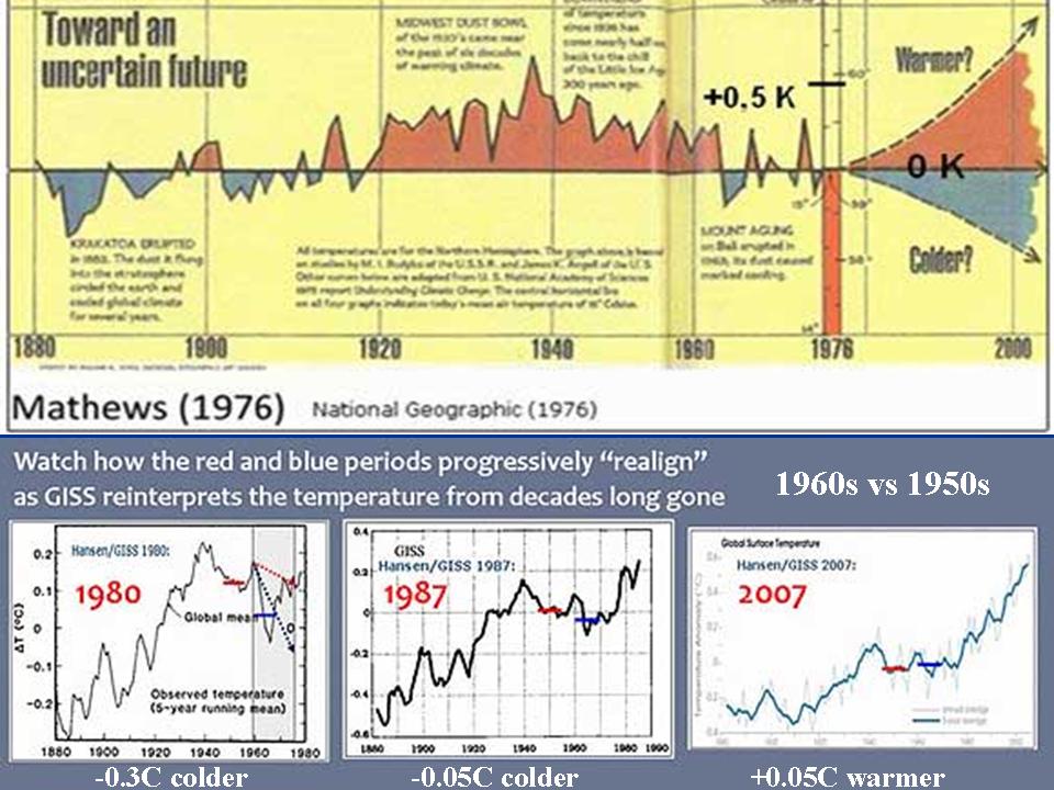
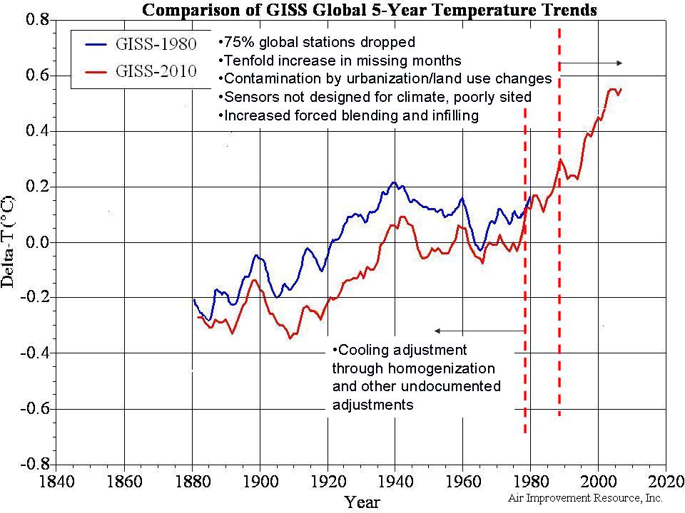
The story showed three Hansen plots of global temperatures from 1980, 1987 and 2007 (above, enlarged here). The 1960s started out 0.3C colder than the 1950s in 1980, dropped to 0.05C colder by 1987 and was actually warmer by 0.05C in 2007.
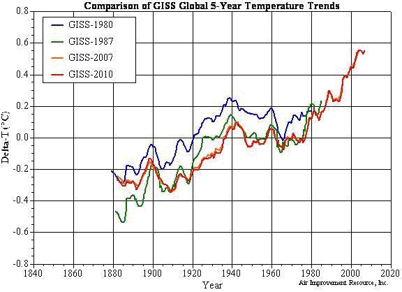
We have extracted the values from the graphs and superimposed them on the graph below (enlarged here). You can see the big 1980 to 1987 dropoff and subsequent further cooling by 2007 and 2010 (orange and red).

You can see how the picture from 1976 and 1980 changed rather dramatically in 1988 (with the record through 1987). That second graph was in time for the infamous Hansen congressional testimony where it was introduced with Tim Wirth’s (then senator and now President of the United Nation’s Foundation) orchestrated ceremony which was scheduled on what was forecast to be the hottest day of the week with air conditioning turned off and windows opened and fans blowing hot air to a perspiring Hansen and committee and media.

The result has been to cool off the early and middle part of the record to accentuate the apparent warming trend. The anomalies are also affected. The base period for NASA to compute averages is 1951 to 1980. They lowered the average by about 0.115C or 0.207F.
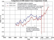
The data after 1990 (as shown above, enlarged here) has been in contrast adjusted up by station dropout (especially rural), tenfold increase in missing months both of which forced more infilling and estimation, contamination by land use changes and urbanization, use of sensors not designed for climate trend analysis. These were described in detail in Surface Temperature records: Policy Driven Deception? here.
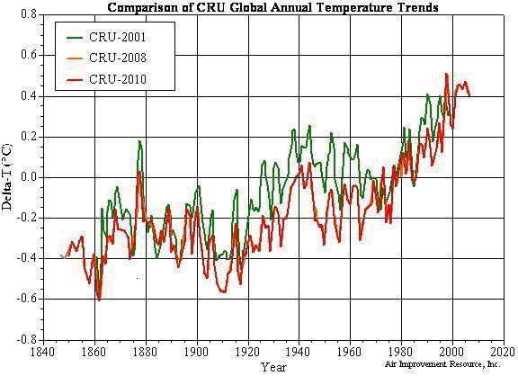
Hadley’s CRU has changed significantly just in the last decade in much the same way. The 1940 warm blip that worried Wigley and others was minimized which minimized the three decade cooling from 1940 to the late 1970s. The same issues mentioned above have exaggerated the recent warming below (enlarged here).
The cooling of the base period for CRU (1961 to 1990) was 0.092C (0.16F).
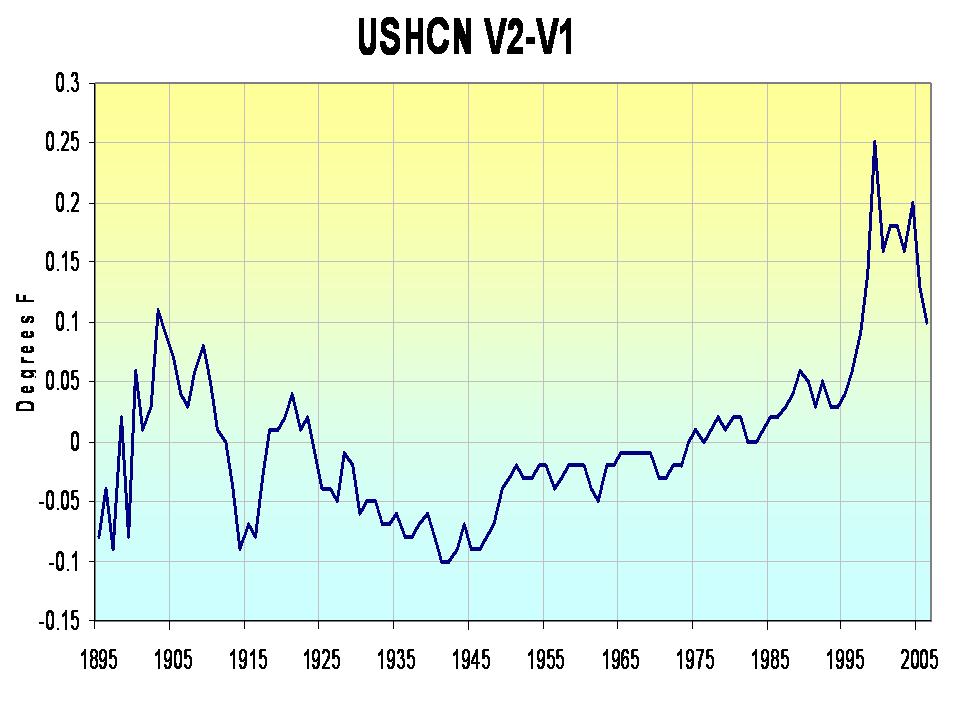
NOAA USHCN saw a change in 2007 that removed an urban adjustment and produced this annual change in US temperatures below (enlarged here). Again we see a cooling of the mid 20th century warm period and an elevation of recent years.

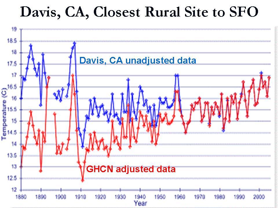
We are working on a GHCN global change analysis. Charts like this which are common across the globe (this from Alan Cheetham) tell us we will probably find the same (below, enlarged here).
Stay tuned. See PDF here.