


By Shanta Barley, New Scientist
A rise in water vapour in the atmosphere fuelled 30 per cent of the global warming that took place during the 1990s. This discovery suggests that the potent greenhouse gas plays a bigger role in climate change that we previously imagined.
Susan Solomon and colleagues at the US National Oceanic and Atmospheric Administration combined satellite measurements and weather balloon data to track changes in the concentration of water vapour 16 kilometres up in the stratosphere, between the 1980s and today.
Water vapour levels in the stratosphere increased in the 1990s but dropped by 10 per cent in 2001. After feeding their measurements into a climate model, the team suggests that vapour was to blame for almost a third of the warming that happened in the 1990s.
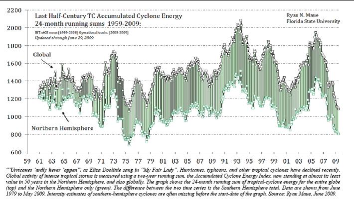
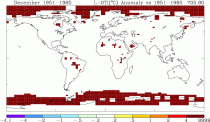
Icecap Note: that corresponded to a decline in tropical activity during the cold PDO La Ninas of 1999 to 2001 (below, enlarged here).
It likely bounced back and then declined agin afte the 2005 tropical activity spike
The model also suggests that the decline in water vapour concentrations that occurred in 2001 slowed down the rate of global warming in the last decade by 25 per cent.
“This research does not change the consensus view that human emissions drive climate change,” says Fortunat Joos, a climate modeller at the University of Bern, Germany.
Journal reference: Science DOI: 10.1126/science.1182488
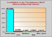
Water vapor is 20 times more abundant greenhouse gas than CO2, a bit player at best in climate change, but of course you can’t tax or control the hydrological cycle
-------------------------
Is the NULL default infinite hot?
By E.M. Smith
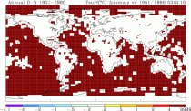
What to make of THIS bizarre anomaly map?
What Have I Done?
I was exploring another example of The Bolivia Effect where an empty area became quite “hot” when the data were missing (Panama, posting soon) and that led to another couple of changed baselines that led to more ‘interesting red’ (1980 vs 1951-1980 baseline). I’m doing these examinations with a 250 km ‘spread’ as that tells me more about where the thermometers are located. The above graph, if done instead with a 1200 km spread or smoothing, has the white spread out to sea 1200 km with smaller infinite red blobs in the middles of the oceans.
I thought it would be ‘interesting’ to step through parts of the baseline bit by bit to find out where it was “hot” and “cold”. (Thinking of breaking it into decades… still to be tried...) When I thought:
Well, you always need a baseline benchmark, even if you are ‘benchmarking the baseline’, so why not start with the “NULL” case of baseline equal to report period? It ought to be a simple all white land area with grey oceans for missing data.
Well, I was “A bit surprised” when I got a blood red ocean everywhere on the planet.
You can try it yourself at the NASA / GISS web site map making page.
In all fairness, the land does stay white (no anomaly against itself) and that’s a very good thing. But that Ocean!
ALL the ocean area with no data goes blood red and the scale shows it to be up to 9999 degrees C of anomaly.
“Houston, I think you have a problem”.
Why Don’t I Look In The Code?
Well, the code NASA GISS publishes and says is what they run, is not this code that they are running.
Yes, they are not publishing the real code. In the real code running on the GISS web page to make these anomaly maps, you can change the baseline and you can change the “spread” of each cell. (Thus the web page that lets you make these “what if” anomaly maps). In the code they publish, the “reach” of that spread is hard coded at 1200 km and the baseline period is hard coded at 1951-1980.
So I simply can not do any debugging on this issue, because the code that produces these maps is not available.
But what I can say is pretty simple:
If a map with no areas of unusual warmth (by definition with the baseline = report period) has this happen; something is wrong.
I’d further speculate that that something could easily be what causes The Bolivia Effect where areas that are lacking in current data get rosy red blobs. Just done on a spectacular scale.
Further, I’d speculate that this might go a long way toward explaining the perpetual bright red in the Arctic (where there are no thermometers so no thermometer data). This “anomaly map” includes the HadCRUT SST anomaly map for ocean temperatures. The striking thing about this one is that those two bands of red at each pole sure look a lot like the ‘persistent polar warming’ we’ve been told to be so worried about. One can only wonder if there is some “bleed through” of these hypothetical warm spots when the ‘null data’ cells are averaged in with the ‘real data cells’ when making non-edge case maps. But without the code, it can only be a wonder:
With 250 km ‘spread’ and HadCRUT SST anomalies we get bright red poles.
The default 1200 km present date map for comparison:
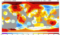
GIS Anomaly Map for November 2009
I’m surprised nobody ever tried this particular ‘limit case’ before. Then again, experienced software developers know to test the ‘limit cases’ even if they do seem bizarre, since that’s where the most bugs live. And this sure looks like a bug to me.
A very hot bug… Read more here.
Read also the Madagascar Muse here which shows despite no stations, a permanent red spot appeared over Madagascar in recent years thanks to the interpolation made. In the latest update after the post, GISS removed that hotspot.
See Surface temperature Records: Policy Driven Deception? which heavily drew on data from E.M. Smith and postings by Anthony Watts here.
----------------------
UAH MSU jumped this month with a boost from ocean temperature rises. This has been jumped on by alarmsists trying to deflect attention from the brutal Northern Hemisphere land winter. Why the satellite sensed ocean warming? Walter Starck explains:
“Sea surface temperatures in the top meter of the oceans rapidly increase in periods of extended calm weather due to the cessation of wave driven mixing. After a week or two of calm, the surface temperature may become as much as 4-5 degrees higher than the temperature 2m below the surface. This thermal stratification disappears in a few hours when normal trade winds resume. El Niño events are characterized by extended and expanded areas of calm over the tropical oceans and it is this calm, not exceptional atmospheric temperatures, which is responsible for the rise in sea surface temperatures.
Elevated sea surface temperatures would presumably result in greater transfer of thermal energy to the atmosphere via increased back radiation, conduction/convection and evaporation. After an El Nino, when the warm layer is again mixed through the normal 70-100m thickness of the surface zone above the thermocline, the total thermal content should be somewhat less than it otherwise would be due to the cessation of mixing during the period of calm and the greater loss to the atmosphere from the higher temperature shallow surface layer. The result is that the high SSTs characteristic of El Ninos is followed by a period of lower than average surface temperatures (i.e. La Nina). This seems quite evident following the 1998 El Nino.
I am aware of the high temperature shallow surface layer from a lifetime of diving in the tropics where I have experienced it directly on repeated occasions. Although this warm surface layer would show up in old fashioned measurements taken using buckets it would not appear in temperatures taken from cooling water intakes on ships since they are below it and XBT records would be problematic as the heated layer is so limited in thickness.
I suspect that the high January SSTs just experienced are a manifestation of this effect and will be followed by lower than average SSTs when normal trade winds resume. The important thing that is not being properly recognized is that the higher SSTs of El Nino events involves only a very shallow surface layer, not the entire upper mixed layer of the ocean.”