


By Anthony Watts
See update below: New comparison graph of US temperatures in 1999 to present added - quite an eye opener - Anthony
There’s been a lot of buzz and conflicting reports over what the BEST data actually says, especially about the last decade where we have dueling opinions on a “slowing down”, “leveling off”, “standstill”, or “slight rise” (depending on whose pronouncements you read) of global warming.
Here’s some media quotes that have been thrown about recently about the BEST preliminary data and preliminary results:
“‘We see no evidence of it [global warming] having slowed down,’ he told BBC Radio 4’s Today programme. There was, he added, ‘no levelling off’.” - Dr. Richard Muller
In The Sunday Mail Prof Curry said, the project’s research data show there has been no increase in world temperatures since the end of the Nineties:
- Dr. Judith Curry in The Sunday Mail“There is no scientific basis for saying that warming hasn’t stopped,’ she said. ‘To say that there is detracts from the credibility of the data, which is very unfortunate.’
Climatologist Dr. Pat Michaels in an essay at The GWPF wrote:
“The last ten years of the BEST data indeed show no statistically significant warming trend, no matter how you slice and dice them”. He adds: “Both records are in reasonable agreement about the length of time without a significant warming trend. In the CRU record it is 15.0 years. In the University of Alabama MSU it is 13.9, and in the Remote Sensing Systems version of the MSU it is 15.6 years. ”
In the middle of all those quotes being bandied about, I get an email from Burt Rutan (yes THAT Burt Rutan) with a PDF slideshow titled Winter Trends in the United States in the Last Decade citing NCDC’s “climate at a glance” data. This is using the USHCN2 data, which we are told is the “best”, no pun intended. It had this interesting map of the USA for Winter Temperatures (December-February) by climate region on the first slide:ICECAP NOTE That is an ICECAP graphic that Dr Rutan we are pleased to say used
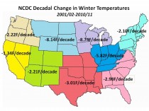
Hmmm, that’s a bit of a surprise for the steepness of those trend numbers. So I decided to expand and enhance that slide show by combining trend graphs and the map together, while also looking at other data (summer, annual). Here’s a breakdown for CONUS by region for Winter, Summer, and Annual comparisons. Click here to enlarge to full size to view the graphs.
Winter temperatures and trends F, 2001-2011. Note that every region has a negative trend:
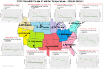
Here similarly is the summer trends 2001-2011. Note that 5 of 9 regions have a negative summertime trend.
And finally here is the Annual yearly mean temperature trend for the last decade. Since 2011 is not yet complete for annual data (though is for Winter and Summer data), I’ve plotted the last decade available, from 2000-2010.
Only 1 of 9 regions has a positive decadal trend for the Annual mean temperature, the Northeast.
This data is from USHCN2, from the National Climatic Data Center (NCDC). Note that I have not adjusted it or even self plotted it in any way. The output graphs and trend numbers are from NCDC’s publicly available ”Climate At A Glance” database interface, and these can be fully replicated by anyone easily simply by going here and choosing “regions”.
I find the fact that summer temperatures were negative in five of 9 regions interesting. But most importantly, the trend for the CONUS for the past 10 years is not flat, but cooling.
The trend line for the contiguous lower 48 states looks like this for the same period when we plot the Annual mean temperature data for 2001-2010 (we can’t plot 2011 yet since the year isn’t complete):
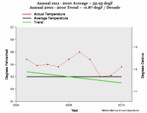
So according the the National Climatic Data Center, it seems clear that for at least the last 10 years, there has been a cooling trend in the Annual mean temperature of the contiguous United States. Pat Michaels in his GWPF essay talks about 1996 :
A significant trend since these periods began is not going to emerge anytime soon. MSU temperatures are plummeting and are now below where they were at this time of the year in the 2008 La Nina. NOAA is predicting an extreme La Nina low in 2012. If the 1976-98 warming trend is re-established in 2013, post-1996 warming would not become significant until 2021.
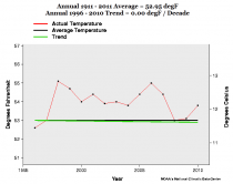
So when you run the NCDC “climate at a glance” plotter from 1996 for the USA on Annual mean temperature data for the contiguous United States for 15 years of data, you get this, flatness:
Warming, for the USA seems pretty “stalled” to me in the last 10-15 years. Bear in mind that BEST uses the same data source for the USA, the USCHN2 data. Granted, this isn’t a standard 30 year climatology period we are examining, but the question about the last 10 years is still valid. “Aerosol masking” has been the reason given by the Team. Blame China.
For the inevitable whining and claims of cherry picking that will come in comments, here’s the complete data set from NCDC plotted from 1895. I added the 1934 reference line in blue:
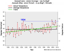
Interestingly, we’ve had only two years that exceeded 1934 for Annual mean temperature in the United States and they were El Nino related. 1998 and 2006 both had El Nino events.
While the United States is not the world, it does have some of the best weather data available, no pun intended. Given the NCDC data for CONUS, it certainly seems to me that warming has stalled for the United States in the last decade.
UPDATE: 11/06/2011 8AM PST
When I wrote the post above, I had concerns that the 1998 and 2006 peaks might not have actually exceeded 1934. I didn’t have the energy to explore the issue last night. This morning looking anew, I recalled the GISS Y2K debacle and recovered the graphs from Hansen’s 1999 press release. This was originally part of “Lights Out Upstairs” a guest post by Steve McIntyre on my old original blog. Just look at how much warmer 1934 was in 1999 than it is now. Much of this can be attributed to NCDC’s USHCN2 adjustments.
Steve wrote then:
In the NASA press release in 1999 , Hansen was very strongly for 1934. He said then:
The U.S. has warmed during the past century, but the warming hardly exceeds year-to-year variability.Indeed, in the U.S. the warmest decade was the 1930s and the warmest year was 1934.
This was illustrated with the following depiction of US temperature history, showing that 1934 was almost 0.6 deg C warmer than 1998.
From a Hansen 1999 News Release
However within only two years, this relationship had changed dramatically. In Hansen et al 2001 (referred to in the Lights On letter), 1934 and 1998 were in a virtual dead heat with 1934 in a slight lead. Hansen et al 2001 said
The U.S. annual (January-December) mean temperature is slightly warmer in 1934 than in 1998 in the GISS analysis (Plate 6)… the difference between 1934 and 1998 mean temperatures is a few hundredths of a degree.
From Hansen et al 2001 Plate 2. Note the change in relationship between 1934 and 1998.
Between 2001 and 2007, for some reason, as noted above, the ranks changed slightly with 1998 creeping into a slight lead.
The main reason for the changes were the incorporation of an additional layer of USHCN adjustments by Karl et al overlaying the time-of-observation adjustments already incorporated into Hansen et al 1999. Indeed, the validity and statistical justification of these USHCN adjustments is an important outstanding issue.
====
I’ve prepared a before and after graph using the CONUS values from GISS in 1999 and in 2011 (today).
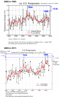
GISS writes now of the bottom figure:
Annual Mean Temperature Change in the United States
Annual and five-year running mean surface air temperature in the contiguous 48 United States (1.6% of the Earth’s surface) relative to the 1951-1980 mean. [This is an update of Figure 6 in Hansen et al. (1999).]
So clearly, the two graphs are linked, and 1998 and 1934 have swapped positions for the “warmest year”. 1934 went down by about 0.3C while 1998 went up by about 0.4C for a total of about 0.7C.
And they wonder why we don’t trust the surface temperature data.
In fairness, most of this is the fault of NCDC’s Karl, Menne, and Peterson, who have applied new adjustments in the form of USHCN2 (for US data) and GHCN3 (to global data). These adjustments are the primary source of this revisionism. As Steve McIntyre often says: “You have to watch the pea under the thimble with these guys”.