


By Dr. Anthony Lupo
In late January, an updated planting zone map was issued by the USDA for the first time since 1990. As it was during the summer of 2011 when the new 1981-2010 climate normals were issued, this should be no surprise to climate scientists [1]. The new map is a big improvement over the older one as more data were incorporated using new techniques. It is available also online incorporating geographic information system (GIS) technology allowing it to be an interactive tool for users [2].
But, even as the map was released, stories written by media organizations such as the Associated Press were then carried in publications across the nation e.g. [3]. The first line of the story stated that the map demonstrates global warming is now affecting both your home and garden. Its as if the map itself demonstrates, or is more proof for, the occurrence of human induced climate change (global warming refers to this phenomenon). The same article says this reflects the new reality that the coldest days of the year are not as cold anymore. They quote scientists as saying that you can now grow things in your locality that you could not plant before. The implication is that the warmth being experienced in recent decades is unprecedented.
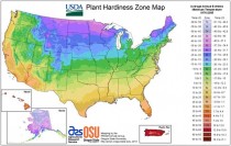
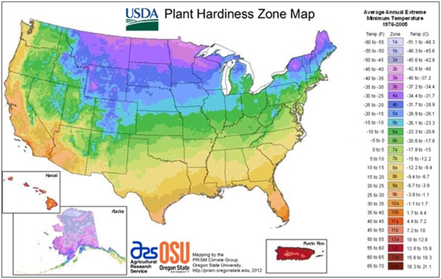
Figure 1. Adapted from the USDA website (enlarged). The plant hardiness zone map created using climate data from 1976 -2005.
However, USDA spokesperson K. Kaplan correctly points out that the map is not the best instrument for demonstrating climate change. She does not deny that climate change has taken place, but that the map is not the best indicator for demonstrating it. She is correct and presumably meant that the current map uses improved methods and more available data than the previous map, thus comparisons would be difficult to make even if climate had not changed.
Climate change has occurred in recent decades and that is easily demonstrated by comparing the 1981-2010 normals to previous periods [1]. The new USDA map included data gathered from 1976-2005 [2], which largely overlaps with the period including the new climate normals. As the article about the new normals stated[1], the new map (Fig. 1) included a period of time that was warmer than the period that was used to create the 1990 plant hardiness map. Thus, the map is going to be reflective of climatic conditions in the immediate past. On a planet where the climate is almost always warming or cooling, the map may be out-of-step with current realities. Global temperatures have been steady or cooling since about 2000 and especially since 2007.
Additionally, there is no way that one can ascribe a cause for climate change by looking at changes in the new normals or plant hardiness. Presumably, changes in the weather and climate, regardless of cause will be reflected by what kind of flora and fauna inhabit a region. As the glaciers shrank away for North America deciduous trees
such as American Beech moved northward from the Deep South and into the Great Lakes Region. Climate skeptics also recount that a thriving wine industry existed into the northern parts of England and the Vikings colonized Greenland during Medieval times, but not today.
An example closer to home and our time reveals that during the 1800s certain types of citrus grew well in Alabama, Florida, and even in South Carolina. In the colder period from about 1890 to 1920, some types of citrus were wiped out of this region (e.g., Satsuma Tangerines), and citrus production in general during this time shifted toward California [4]. In the last few decades, citrus production has increased again even as far north as South Carolina [5].
This is not to criticize the new map. It can only be based on the best available data and technology. But, the larger point is, the map is only guidance for the amateur or
experienced gardener or farmer. The map will always be changing into the future as the climate changes. For example it would be interesting to look at the same map by using comparable data gathered from the period 1921 -1960 when temperatures were still warmer than the current period used for the climate normals. But, it is flawed logic to imply that the new map is more evidence of human induced global warming.
[1] Lupo, A., 2011: Is warmer really the new normal? July 7, 2011.
[2] Kaplan, K., 2012: USDA Unveils New Plant Hardiness Zone Maps. January 25, 2012.
[3] AP Story, 2012: Plant zones get warmer in new map.
[4] Malcolm, P., 2006: History of Citrus. .
[5] ScNow.com, 2009: Citrus in South Carolina?