


By Joseph D’Aleo, CCM, AMS Fellow
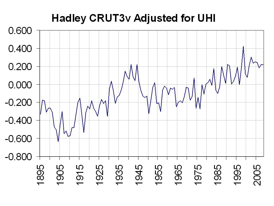
I believe this is a more accurate (though still not perfect) plot of global temperatures than those produced by Hadley, NOAA, and NASA GISS. It combines data from all three centers, using data from two (NOAA and GISS) to adjust the third (Hadley)
It is enlarged here
WHY ADJUSTMENT IS NECESSARY
As I showed in the first analysis here, the long term global temperature trends in their data bases have been shown by numerous peer review papers to be exaggerated by 30% to 50% and in some cases much more by issues such as uncorrected urbanization (urban heat island or UHI), land use changes, bad siting, bad instrumentation, and ocean measurement techniques that changed over time. NOAA made matters worse by removing the satellite ocean temperature measurement which provide more complete coverage and was not subject to the local issues except near the coastlines and islands. The result has been the absurd and bogus claims by NOAA and the alarmists that we are in the warmest decade in 100 or even a 1000 years or more and our oceans are warmest ever. See this earlier story that summarizes the issues.
No one disputes the cyclical warming from 1979 to 1998 that is shown in all the data sets including the satellite, only the cause. These 60-70 year cycles tie in lock step with the ocean temperature cycles (PDO and AMO) and Total Solar Irradiance (Hoyt/Schatten calibrated to Willson’s ACRIM data).
As for the argument by some posters or commenters that the AMO and PDO are derived differently and represent patterns not simply magnitudes, let me agree but note that the “patterns” in both oceans with the two phases of the indices are the same. In both the PDO and AMO warm modes, there is horseshoe of warmth in the north and tropical oceans surrounding coolness in the central west ocdean basin. Both warm modes are accompanied by general net global warmth. Cold modes have the opposite configurations and results. By standardizing the two sets they become more comparable in magnitude. When I add, I am not combining apples and oranges but instead apples, albeit perhaps MacIntosh and Granny Smith.
The adjusted Hadley shows greater warming in the early 1900s (long before the major industrial boom) when the sun emerged from its 100 year cycle slumber than in the El Nino laden warm PDO era from 1979 to 1998.
Unfortunately we can’t do a more elaborate evaluation because Phil Jones at Hadley has refused to provide raw data and adjustments made and claims to have lost some of the original data for want of storage capabilities. They only have for some regions the homogenized, modified data. See this post.
The data centers want to treat their information as proprietary to them but unlike public corporations, they are repositories of data for use by educational and research institutions and are obliged to properly maintain the original data, make it available to anyone who is qualified to work with it, AND document each and every adjustment made and why.
Can you imagine what would happen after an audit or investor review of an annual financial report of any public corporation if they hid key financial information and only supplied carefully processed/manipulated information that showed them in the best possible light. Do we have the ENRON(s) of weather here? All three data centers have a vested financial interest in promulgating global warming. They each have reputations and major funding at risk should a cooling take place. In other words, the foxes are in charge of the data chicken coups.
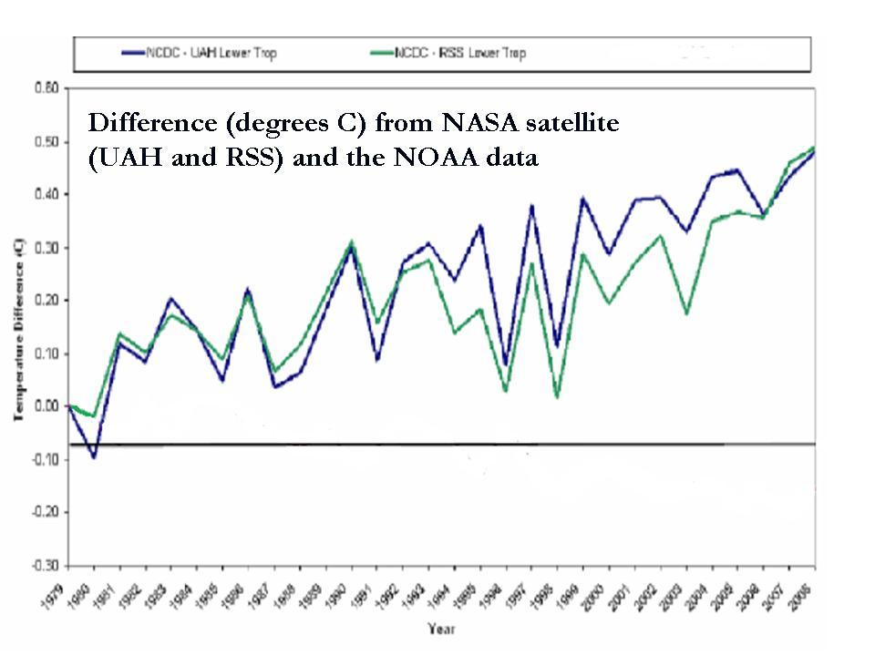
The only independent data sources are RSS and UAH with satellite analysis. Their work has confirmed the warming of the 1979-1998 period but at about half the rate of the data centers, consistent with that up to 50% contamination in the literature.

See enlarged here.
In all my talks (I and other Icecap members do dozens each year), I address all the issues with the surface data bases and the fact that numerous peer review papers estimate artificial warming contamination of 30-50% or even higher. But just stating that seems to not easily resonate with people. It is hard to visualize mentally what that means.
I do show the US data before and after UHI was removed in 2007 and that helps, but I wanted to try and find a way to adjust the IPCC’s Hadley source with a UHI adjustment to show what 30-50% means and that the warmest 10 years were not in the last 12 years, and that the changes are cyclical and minor, and importantly in the end, that EPA regulation, US congressional legislation and any Copenhagen action is unnecessary and unwarranted.