Jul 09, 2008
The Hot Water Bottle Effect
By Stephen Wilde in CO2sceptics
This article attempts to consider the combined effect of the atmospheric greenhouse effect and oceanic oscillations. As far as I know no one has previously attempted to describe both phenomena as part of a single global temperature control system. It was prompted by an answer I gave to a meteorologist about my article entitled “The Death Blow to AGW”. That meteorologist had difficulty understanding how a period of steady solar irradiance could nevertheless heat up the Earth. My reply was as follows:
“An electric bar fire with a constant level of output in a room will cumulatively raise the room temperature for as long as the heat flowing from the fire exceeds the heat outflow from the room. Thus a net warming effect from the sun, even if it is in the form of a steady flow of energy from the sun over a few decades will cumulatively warm the Earth until the radiation of heat from the Earth rises to match the excess heat being received. As a result of oceanic time lags that could take some time. There is the mechanism.”
That exchange led to this article via my attempt to find a more accurate analogy than that of the greenhouse effect. I soon realised that the oceans were more significant than the atmosphere since they hold solar heat in greater quantity and for much longer than the atmosphere. My conclusion was that we owe our existence not to an atmospheric greenhouse or blanket but instead to an oceanic hot water bottle. It is what I hope will become widely known as The Hot Water Bottle Effect (THWBE) in place of The Greenhouse Effect.
The recent global warming spell was never a result of any greenhouse effect. It was entirely a result of THWBE whereby heat already stored in the oceans and released by a positive phase of the Pacific Decadal Oscillation supplemented a historically high level of solar irradiation. With the Pacific Decadal Oscillation now in decline and solar irradiation now falling we are already in very different times.
Ideally this article should be read with certain of my previous articles (Part I - Global Warming and Cooling - the Reality, Part II - The Real Link between Solar Cycles, Oceans and Temperatures and Part III ”The Death Blow to AGW” mentioned above) with this article being regarded as part 4 of a new theory as to how global climate really works. As far as I can see the theory fits the known facts and ongoing observations of the real world as opposed to the speculations of climate modelling. Read Part IV in its entirety here.
Jul 08, 2008
South America Update: First Half of 2008 and Perito Moreno Glacier
By Alexandre Aguiar, MetSul Weather Center (Brazil)
2008 so far has been a very interesting year. All the months in the first half of the year ended with below normal temperature, a situation not observed since 1962. Our fall was very cold and performed like winter. June was really cold. The frost ruined 1.3 million tons of corn in the state of Parana, a damage not seen in 8 years. July has been very mild and the forecast models do not indicate any cold incursion in the next 10 days. It is quite unusual to not have very cold days in the first 15 days of July. Usually, the lowest temperatures of the year occur between July 5 and July 15th in our region. It seems the nature is compensating a very cold and early winter with mild temperatures in the peak of the climatic winter.
Regarding the Perito Moreno glacier in Argentina, which the BBC claimed had a huge ice dam on Argentina’s Perito Moreno glacier is about to break apart for the first time during the southern hemisphere winter, there is an interesting quote in the Argentinean press today: Victor Jorge Leis, operational director of the National Weather Service of Argentina, expressed doubt about global warming as the cause of the rupture of the glacier. “It is too difficult to establish a connection with the greenhouse effect because temperature has not been much above normal in the region in the last few months. Besides, temperature is just one factor in the ice behavior and wind and oceans tide should not be ignored”, he told. Other experts mentioned that the glacier tip is 400 years old, what justifies its fragility”.
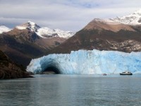
The last time it ruptured in July was in 1951 (coming off a strong La Nina). There is a news report quoting one of the most important experts in the glacier that has the following headline: “The Perito Moreno rupture is not consequence of greenhouse effect: “Ricardo Villalba, director of the Argentinean Institute of Glaciology, Snow and Enviromental Sciences (Ianigla) tells Los Andes newspaper that the position of the ice and the tides can be blamed for this unusual breakup in the winter.”
Jul 07, 2008
Alarmists Use Weather to Promote Global Warming Hoax
By Dr. Tim Ball, Canada Free Press
Claims that recent severe weather and flooding in the US are proof of human CO2 impacts on global climate are scientific nonsense. They are part of a pattern of keeping weather and climate issues in the public mind. Governments and large segments of society accepted the theory. Most bullied by use of fear but also their lack of knowledge and understanding was also exploited.
Now a combination of events are driving them to raise the threat level and make increasingly false claims. forcing a coverup. The world is cooling while CO2 levels continue to rise. In every record for any period in history temperature increases before CO2 not as assumed. Plans to implement carbon taxes to offset warming exacerbate soaring fuel prices. Effects of policies implemented to replace fossil fuels with biofuels are driving food and total living costs rapidly higher. People increasingly question the threats as a recent UK poll showed; “The majority of the British public is still not convinced that climate change is caused by humans - and many others believe scientists are exaggerating the problem, according to an exclusive poll for The Observer.” Proponents of the theory that humans are causing global warming or climate change have used fear to push their false belief. Now they’re experiencing fear as evidence shows they’re wrong and the public perceive a deception.
Robert Frost said, “There’s nothing I am afraid of like scared people.” Those who perpetrated possibly the greatest deception in human history that CO2 is causing global warming/climate change are scared. Events are driving them to extreme, unsubstantiated and even ridiculous claims and threats.
So they return to their central theme of convincing you that normal weather events are abnormal. An increase in severe weather is a persistent theme, especially in North America. Recently the U.S. Climate Change Science Program and the Subcommittee on Global Change Research issued a report with projected changes in weather and climate extremes in North America and U.S. territories. There are three major problems with what is being said. 1. The severe weather of this spring across the Northern Hemisphere was caused by cooler weather not warmer. 2. The IPCC and the NOAA positions that severe weather will increase with global warming is scientifically wrong. 3. The records show current weather extremes are well within long term natural variability.
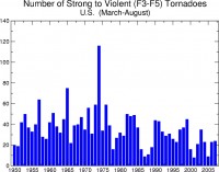
The graph from the National Oceanographic and Atmospheric Administration (NOAA) shows that severe tornadoes were higher in the period from 1950 to 1975. Global temperatures were falling during that time. Since then frequency has decreased as the world warmed to 2000. Since then the world has cooled slightly and the pattern shows a slight increase in severe tornadoes. This trend of severe weather is most likely to increase as the Earth continues to cool. Proponents of human caused climate change will claim it proves them right. They will continue their practice of claiming natural events as unnatural. Unless people understand the basic science they will continue the fraud and pressure politicians into even more damaging energy and environmental policies. Read much more here.
Jul 07, 2008
UAH: June 2008: Still Negative Anomaly
By Lubos Motl, The Reference Frame
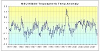
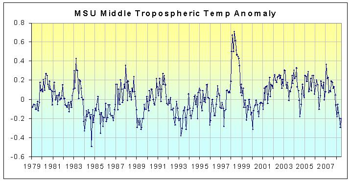
According to UAH MSU, the global temperature anomaly in June 2008 was -0.11C, up from -0.18C in May 2008. A similar warming from -0.083C in May 2008 to +0.035C in June 2008 has been reported by RSS MSU, too. But let us focus on UAH MSU. Anomaly-wise, June 2008 was the third coldest month of the 21st century so far, after May 2008 and July 2004 (that had -0.12C, almost the same temperature).
In terms of the anomaly, the land in the Southern polar lands - Antarctica - cooled by a hefty 2.35C from the previous month - from +0.82 to -1.53C. Such things happen near the poles where all changes are amplified and where the area is not too large to guarantee a constancy of temperature. The Northern polar region cooled from 1.03 to 0.49C between May and June 2008. The total sea ice anomaly is currently near zero, as a positive anomaly of the Southern Hemisphere cancels the negative anomaly of the Northern Hemisphere. A year ago, the total anomaly was around -2 million squared kilometers. Those “experts” who bet that there will be less ice in 2008 than 2007 don’t look particularly clever to me. By the way, a Dutch team just published a study that shows that the Greenland melting cycle exhibits no trend in the last 17 years. See Andrew Revkin’s blog and NYT article.
The first half of 2008 is over so we can say something about this period. According to the UAH MSU data, the average temperature anomaly for those six months was -0.03C, making the first half of 2008 the coldest half-year since first half of 1997. It’s been a half-year of a cooling U.S. job market, too. No, it is not a typo. I really mean that 2008 has been cooler than the “cold” La Nina years and half-years during the 1998-2001 La Nina episode, too. And that’s true despite the fact that the 1998-2001 La Nina episode was both longer and stronger than the recent one. To summarize, there’s no global warming in the recent 10 years of data.
This absence of warming becomes even more striking in the middle troposphere where the bulk of the greenhouse effect is being predicted while the reality shows an even slower warming trend if any. In fact, the trend since 1979 is 0.00C per decade on the Southern Hemisphere and 0.05C per decade globally, justifying the claim that there exists no satellite-observed global warming in the mid troposphere. UAH MSU sees the global June 2008 anomaly in the mid troposphere as -0.20C and the average of the first half of 2008 equals -0.18C. Since the beginning of the UAH satellite records in 1979, only a few half-years in 1984, 1985, 1989, 1993 were cooler than first half of 2008. Read more here.
See larger image here
Jul 06, 2008
Going Down: Death Rates Due to Extreme Weather Events
By Indur Glokany with introduction by Anthony Watts
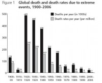
During our discussion of the preposterous news story from Pravda, claiming this headline: “Earth begins to kill people for changing its climate” a scientist dropped in to provide us some insight into his latest paper. It was highly relevant at the time since one of the repeating themes we see in the mainstream (and not so mainstream) media is the attribution of increasing death due to severe weather events to “global warming”.
But that is not supported by the real data, it is a false premise. In this paper, Indur Goklany examines the worldwide trends and makes dome surprising discoveries base of examining data from the World Health Organization, NOAA, and other sources.
Some have claimed that, all else being equal, climate change will increase the frequency or severity of weather-related extreme events (see, e.g., IPCC 2001; Patz 2004; MacMichael and Woodruff 2004). This study examines whether losses due to such events (as measured by aggregate deaths and death rates2) have increased globally and for the United States in recent decades. It will also attempt to put these deaths and death rates into perspective by comparing them with the overall mortality burden, and briefly discuss what trends in these measures imply about human adaptive capacity.
See larger image here
Despite the recent spate of deadly extreme weather events - such as the 2003 European heat wave and the 2004 and 2005 hurricane seasons in the USA - aggregate mortality and mortality rates due to extreme weather events are generally lower today than they used to be. Globally, mortality and mortality rates have declined by 95 percent or more since the 1920s. The largest improvements came from declines in mortality due to droughts and floods, which apparently were responsible for 93 percent of all deaths caused by extreme events during the 20th Century. For windstorms, which, at 6 percent, contributed most of the remaining fatalities, mortality rates are also lower today but there are no clear trends for mortality. Cumulatively, the declines more than compensated for increases due to the 2003 heat wave. Read more here.
|

