Oct 09, 2014
“Long-lost” satellite images shed new light on global sea ice…enormous holes found in the arctic
Vencore Weather
"Long-lost” satellite images shed new light on global sea i...enormous holes found in the Arctic ice back in the 1960’s...Antarctica sea ice reached record highs and lows just two years apart
Enlarged
Discussion
Overview
NASA launched the first of seven Nimbus spacecraft to study Earth from space in August 1964 and fifty years later experts at the National Snow and Ice Data Center in Boulder, Colorado are recovering long-lost images from old Nimbus data tapes and black-and-white film. The preliminary findings from long-lost images from the 1960’s have produced some big surprises with respect to global sea ice. In much the same way archeologists dig up artifacts that can rewrite history, these long-lost satellite images have to potential to rewrite our knowledge of ever-changing global sea ice cycles.
The Nimbus program
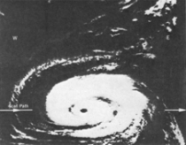
Fifty years ago NASA launched the first in a series of Earth-observing satellites that revolutionized how scientists study Earth’s weather systems, environment and atmosphere. The Nimbus satellites were a series of seven Earth-observation satellites launched over a 14-year time period from 1964 to 1978, one of which did not achieve orbit. In total, the satellites provided Earth observations for 30 years and collectively carried a total of 33 instruments, including ozone mappers, the Coastal Zone Color Scanner instrument and microwave and infrared radiometers. The Nimbus series were the first meteorological satellites to provide day and night local area coverage every 24-hours, repeated at the same time daily. This “sun-synchronous” orbit became the norm for satellites in subsequent years. Nimbus were also the first satellites to provide day and nighttime pictures of intense hurricanes as viewed from space which initiated the use of satellite technology to provide hurricane warnings (example image above).
Nimbus satellite observations were transmitted as an analog signal and then burned onto film and stored in canisters labeled only by orbit number (i.e., no indication of geography). The only way to retrieve this imagery data into useable format was to scan all of it which meant 250,000 images. Now the satellite imagery data is completely digital and can be managed and manipulated by scientists in order to get a look at the past. Preliminary work with the newly-digitized satellite data has been performed on the 1964-1969 time period and now the year 1970 is being analyzed.
Global Sea Ice
In terms of global sea ice, our current satellite data records are quite good for a little more than the past 30 years or so. Pushing it back another 15 or 20 years could be crucial in the understanding of global sea ice cycles which have been occurring throughout history. Indeed, early findings have been quite surprising with respect to both the Arctic and Antarctica sea ice extent. According to NASA scientists, while there was more ice compared to today, there have been “enormous holes” found in the Arctic ice that “we didn’t expect and can’t explain” in a decade considered to be colder-than-normal (i.e., the 1960’s). The Antarctica sea ice extent findings are perhaps even more amazing. Using these long-lost satellite images, it appears that the Antarctica sea ice extent reached record high levels in 1964 only to be followed by record low amounts just two years later in 1966, and the earliest maximum sea ice extent was seen in 1969. As is often the case with more data, it often leads to more questions than answers. The IPCC had sea ice data in the 1990 report from NOAA.
_thumb.png)
Enlarged
Video discussion on this by NASA scientists:
Steve Goddard presents more proof that the ice periodically shrinks and the arctic warms in this very long collection of media reports from scientists.
Oct 07, 2014
NASA Scientists Puzzled by Global Cooling on Land and Sea
AFP
The deep ocean may not be hiding heat after all, raising new questions about why global warming appears to have slowed in recent years, said the US space agency Monday.
Scientists have noticed that while greenhouse gases have continued to mount in the first part of the 21st century, global average surface air temperatures have stopped rising along with them, said NASA.
Some studies have suggested that heat is being absorbed temporarily by the deep seas, and that this so-called global warming hiatus is a temporary trend.
But latest data from satellite and direct ocean temperature measurements from 2005 to 2013 “found the ocean abyss below 1.24 miles (1,995 meters) has not warmed measurably,” NASA said in a statement.
The findings present a new puzzle to scientists, but co-author Josh Willis of NASA’s Jet Propulsion Laboratory (JPL) said the reality of climate change is not being thrown into doubt.
“The sea level is still rising,” said Willis. Yes Willis but at about half the rate of the 20th century - 4 inches vs 7 inches).
“We’re just trying to understand the nitty-gritty details.”
A separate study in August in the journal Science said the apparent slowdown in the Earth’s surface warming in the last 15 years could be due to that heat being trapped in the deep Atlantic and Southern Ocean.
But the NASA researchers said their approach, described in the journal Nature Climate Change, is the first to test the idea using satellite observations, as well as direct temperature measurements of the upper ocean.
“The deep parts of the ocean are harder to measure,” said researcher William Llovel of NASA JPL.
“The combination of satellite and direct temperature data gives us a glimpse of how much sea level rise is due to deep warming. The answer is—not much.”
Sep 30, 2014
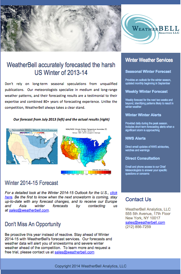
Weatherbell had last winter and spring and summer right…how about the winter
Joe D’Aleo, CCM

Enlarged
For a detailed look back at 2013/14 and ahead at the Winter 2014-15 Outlook for the U.S., click here. Come to weatherbell.com to sign up for access the the world’s best models and blogs. Be the first to know when the next snowstorm is coming, stay up-to-date with any forecast changes, and to receive our Europe and Asia winter forecasts by contacting us at sales@weatherbell.com.
Obvious failure of climate science that mainstream media ignores
Bob Tisdale
The National Science Foundation press release Cause of California drought linked to climate change found its way into the mainstream media, with science reporters around the globe adding their hype. That press release is based on the recently published study Swain et al. (2014) “The Extraordinary California Drought of 2013/2014: Character, Context and the Role of Climate Change, which can be found in the Special Supplement to the Bulletin of the American Meteorological Society (BAMS report)Vol. 95, No. 9, September 2014, Explaining Extreme Events of 2013 From A Climate Perspective.
I’ll publish a few comments about Swain et al. (2014) in a few days. But this post is not about that paper.
THE CALIFORNIA DROUGHT - WHO’S TO BLAME FOR THE LACK OF PREPAREDNESS?
As I was reading Anthony Watts excellent post about Swain et al. (2014), Claim: Cause of California drought linked to climate change - not one mention of ENSO or El Nino, a number of reoccurring thoughts replayed, thoughts that have struck me numerous times as the Western States drought unfolded last year and intensified this year.
Was California prepared for a drought?
Obviously, California was not prepared for a drought this intense, and the impacts of that lack of preparedness on California residents will grow much worse if the drought continues.
Why wasn’t California prepared for a short-term (multiyear) drought this intense?
The realistic blame should be the focus of climate science in general under the direction of the IPCC. In the opening paragraph of the IPCC’s History webpage, they state (my boldface and caps):
Today the IPCC’s role is as defined in Principles Governing IPCC Work, “...to assess on a comprehensive, objective, open and transparent basis the scientific, technical and socio-economic information relevant to understanding the scientific basis of risk of HUMAN-INDUCED climate change, its potential impacts and options for adaptation and mitigation.
The fact that the IPCC has focused all of their efforts on “understanding the scientific basis of risk of human-induced climate change” is very important. The IPCC has never realistically tried to determine if natural factors could have caused most of the warming the Earth has experienced over the past century. For decades, they’ve worn blinders that blocked their views of everything other than the possible impacts of carbon dioxide. The role of the IPCC has always been to prepare reports that support the reduction of greenhouse gas emissions caused by the burning of fossil fuels. As a result, that’s where all of the research money goes. The decision to only study human-induced global warming is a political choice, not a scientific one. In efforts to justify agendas, politicians around the world jumped on the climate change stump and funded computer model-based studies of human-induced global warming...to the tune of billions of dollars annually.
Because of that political agenda, the latest and greatest climate models still cannot simulate the basic underlying processes that govern the naturally occurring, coupled ocean-atmosphere processes like ENSO (El Ninos and La Ninas), like the Pacific Decadal Oscillation...processes that have strong influences on temperature and precipitation in west coast states. So there is no possible way climate models, as they exist today, could forecast what precipitation might be like in the future there. And that basic problem will persist until there is a redirection of climate-research funding. Yes, funding. Research follows the money.
What value do climate model-based studies provide?
None.
The paper Pierce et al. (2013) The Key Role of Heavy Precipitation Events in Climate Model Disagreements of Future Annual Precipitation Changes in California provides an overview of why the climate models have no value when it comes to forecasts like California drought. In their abstract Pierce et al. write (my boldface and caps):
Of the 25 downscaled model projections examined here, 21 agree that precipitation frequency will DECREASE by the 2060s, with a mean reduction of 6-14 days yr−1. This reduces California’s mean annual precipitation by about 5.7%. Partly offsetting this, 16 of the 25 projections agree that daily precipitation intensity will INCREASE, which accounts for a model average 5.3% increase in annual precipitation. Between these conflicting tendencies, 12 projections show drier annual conditions by the 2060s and 13 show wetter.
[Hat tip to blogger “Jimbo” on the WUWT thread Claim: Cause of California drought linked to climate change [ not one mention of ENSO or El Nino.]
So some climate models say that daily precipitation intensity will increase and others say it will decrease. In other words, the climate science community is clueless about what the future might bring for west coast precipitation.
Some might say that climatologists for the State of California and other west coast states have been hampered by climate science. It’s tough to make recommendations to state and local governments for long-term planning when the climate science community provides them with nothing to work with.
Is California prepared for a drought that lasts multiple decades or even centuries?
Anthony Watts’s post included a graph from a paleoclimatological study of West Coast drought that showed past droughts have lasted for hundreds of years. For the original graph and discussion, see Figure 10 of Cook et al. (2007) North American drought: Reconstructions, causes, and consequences. (Note: That’s not the John Cook from SkepticalScience.)
Now I hate to make you think about bad news. But if it’s happened in the past, can it happen again?
Why are mainstream media simply parroting press releases?
Climate-change news reports have become echo chambers of the press releases put out by colleges, universities and government research agencies. Individual reporters might provide a more in-depth report by asking the scientist-authors for a few extra word of wisdom.
But why aren’t the media asking the tough questions, like:
Why weren’t west-coast residents warned 10 or 15 years ago that a severe drought is just a weather anomaly away?
Why aren’t there enough desalinization plants in place to supplement rainfall deficits?
Why are the people of the west coast protesting for, and why are state governments funding, more wind farms and solar arrays when they need something more basic to maintain life there, water?
Seems to me we may very soon be seeing a reversal of Steinbeck’s The Grapes of Wrath, with vast flocks of California residents migrating back to the Midwest, which also is subject to periodic droughts.
Poor planning on the parts of a few - based on politically motivated, unsound science - may make for emergencies for millions.
Sep 29, 2014
Real Climate Debate Hasn’t Even Begun
By Larry Bell
Contrary even to former Obama administration Energy Department Undersecretary for Science Steven Koonin’s admission that the climate change debate isn’t settled, there never really was one.
Koonin, who now directs New York University’s Center for Urban Science and Progress, wrote a headlined Wall Street Journal Weekend Review story that was entirely right about thing however: “We often hear there is a ‘scientific consensus’ about climate change… But as far as computer models go, there isn’t a useful consensus at the level of detail relevant to assessing human influences.”
Dr. Koonin is also correct in noting that the issue isn’t whether or not the climate is changing because “the climate has always changed and always will” He points out that the main question remains to be about the relative importance of both natural and man-made influences which will effect energy and infrastructure policy decisions.
On this score, while he believes that humans can cause serious issues, “they are physically small in relation to the climate system as a whole”, whereas carbon dioxide emissions “directly shift the atmosphere’s natural greenhouse effect by only 1 percent to 2 percent.”
Still, there’s even very good reason to think that even this amount of human CO2 influence may be highly exaggerated.
He admits that “climate sensitivity,” an estimate of warming induced by a hypothetical doubling of atmospheric CO2 concentration, is no different, and no more certain than it was 30 years ago. Meanwhile, global sea levels rose at almost the same rate during the first half of the 20th century as today.
At the same time, Earth’s average surface temperature rise of 0.9 degree F over the last quarter of the 20th century has slowed over the past 16 years (many say longer), while human CO2 contributions have continually risen 25 percent. Koonin adds: “Yet the models famously fail to capture this slowing in the temperature rise.” He also observes that models showing Arctic ice melting over the past 20 years forget to note almost equal growth across Antarctica which is “now at a record high.”
Incidentally, global temperatures were just as warm, or even warmer, than now from about 1910 to 1945 when atmospheric CO2 levels were lower. And let’s also recognize that no respectable surveys show consensus among experts that global warming since the industrial revolution brought smoke stacks and SUVs onto the scene is either unusual or anything to lose sleep over.
So where do the famous “climate debate is settled” and “97 percent of all scientists agree about global warming” (aka climate change) statements come from? They can be traced to an endlessly reported 2009 American Geophysical Union survey consisting of an intentionally brief two question online survey sent to 10,257 Earth scientists by two researchers at the University of Illinois-Chicago, which asked two questions.
The first: “When compared with pre-1800s levels, do you think that mean global temperatures have generally risen, fallen, or remained relatively constant?”
Few would be expected to dispute this. Thee planet began thawing out of the little ice age in the middle 19th century, predating the Industrial Revolution. (That was the coldest period since the last real ice age ended roughly 10,000 years ago.)
The second question: “Do you think human activity is a significant contributing factor in changing mean global temperatures?” So what constitutes “significant”? Does “changing” include both cooling and warming...and for both “better” and “worse”?
Which contributions? Land use? Deforestation? They were also not asked whether they believed the anthropogenic (human-caused) contribution was or might become sufficient to warrant concern or the adoption of stringent government regulatory policies.
Of the 3,146 who responded (a 31 percent return rate), only a small subset of just 77 (2.5 percent) were represented in the survey statistic. These are ones who listed “climate science” as their area of expertise and had been successful in getting more than half of their papers recently accepted by peer-reviewed climate science journals.
In other words, that “97 percent all scientists” referred to a laughably puny number of 75 of those 77 who answered yes.
Get that - of the 3,146 Earth scientists who responded, 98 percent of the cherry-picked 2.5 percent who were counted in the survey agreed that humans have at least some unspecified influence on climate! That’s really a ton of consensus!
In his Wall Street Journal article Steven Koonin wisely cautions: “Uncertainty is a prime mover and motivator of science and must be faced head-on. It should not be confined to hushed sidebar conversations at academic conferences.” He concludes that “any serious discussion of the changing climate begin by acknowledging not only scientific certainties but also the uncertainties, especially in projecting the future.”
Yes. Only when that happens will the real debate begin. One where Mother Nature will have the final word.
Sep 23, 2014
Surprising PNAS paper: CO2 emissions not the cause of U.S. West Coast warming
Anthony Watts
The rise in temperatures along the U.S. West Coast during the past century is almost entirely the result of natural forces - not human emissions of greenhouse gases, according to a major new study released today in the Proceedings of the National Academy of Sciences.
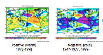
PACIFIC DECADAL OSCILLATION AND SURFACE TEMPERATURES

Enlarged

Enlarged
Northeast Pacific coastal warming since 1900 is often ascribed to anthropogenic greenhouse forcing, whereas multidecadal temperature changes are widely interpreted in the framework of the Pacific Decadal Oscillation (PDO), which responds to regional atmospheric dynamics. This study uses several independent data sources to demonstrate that century-long warming around the northeast Pacific margins, like multidecadal variability, can be primarily attributed to changes in atmospheric circulation. It presents a significant reinterpretation of the region’s recent climate change origins, showing that atmospheric conditions have changed substantially over the last century, that these changes are not likely related to historical anthropogenic and natural radiative forcing, and that dynamical mechanisms of interannual and multidecadal temperature variability can also apply to observed century-long trends.
From a Seattle Times newspaper story: (h/t Dale Hartz)
The vast majority of coastal temperature increases since 1900 are the result of changes in winds over the eastern Pacific Ocean, the authors found. But they could find no evidence that those weather patterns were themselves being influenced by the human burning of fossil fuels…
Since the ocean is the biggest driver of temperature changes along the coast, the authors tracked land and sea surface temperatures there going back 113 years. They found that virtually all of the roughly 1 degree Celsius average temperature increase could be explained by changes in air circulation.
“It’s a simple story, but the results are very surprising: We do not see a human hand in the warming of the West Coast,” said co-author Nate Mantua, with NOAA Fisheries Southwest Fisheries Science Center. “That is taking people by surprise, and may generate some blowback.”Source.
The paper:
Atmospheric controls on northeast Pacific temperature variability and change, 1900 to 2012
James A. Johnstone and Nathan J. Mantua
Abstract
Over the last century, northeast Pacific coastal sea surface temperatures (SSTs) and land-based surface air temperatures (SATs) display multidecadal variations associated with the Pacific Decadal Oscillation, in addition to a warming trend of ∼0.5-1 C. Using independent records of sea-level pressure (SLP), SST, and SAT, this study investigates northeast (NE) Pacific coupled atmosphere ocean variability from 1900 to 2012, with emphasis on the coastal areas around North America. We use a linear stochastic time series model to show that the SST evolution around the NE Pacific coast can be explained by a combination of regional atmospheric forcing and ocean persistence, accounting for 63% of nonseasonal monthly SST variance (r = 0.79) and 73% of variance in annual means (r = 0.86). We show that SLP reductions and related atmospheric forcing led to century long warming around the NE Pacific margins, with the strongest trends observed from 1910 to 1920 to 1940. NE Pacific circulation changes are estimated to account for more than 80% of the 1900 to 2012 linear warming in coastal NE Pacific SST and US Pacific northwest (Washington, Oregon, and northern California) SAT. An ensemble of climate model simulations run under the same historical radiative forcings fails to reproduce the observed regional circulation trends. These results suggest that natural internally generated changes in atmospheric circulation were the primary cause of coastal NE Pacific warming from 1900 to 2012 and demonstrate more generally that regional mechanisms of interannual and multidecadal temperature variability can also extend to century time scales.
|


.png)