
|
Jun 06, 2008
Global Whining vs. the Truth
By Brian Sussman, KSFO, San Francisco Meteorologist in the American Thinker
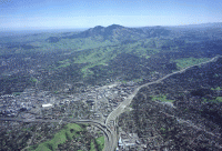
105 degrees tomorrow? We’ll be sending you out live,” the television producer informed me. Like most TV Meteorologists, I loathed the heat wave live-remotes. I would much rather work in a controlled environment, complete with air conditioning and a green Chroma-key screen. And during extreme weather events, the studio lent itself to professionalism rather than playing on emotion. “Let me guess, the bank in Walnut Creek?” I said sarcastically. I had been through this drill many times. “Perfect location. Plus, a lot of viewers with ratings meters out there.” Walnut Creek is an upscale town 30 miles east of San Francisco. It is sheltered from the cooling influences of the coast and the Bay by a modest mountain range.
As a result, in the summer that region can bake. The bank not only referenced the name of the town, but had a thermometer that was several degrees off, thanks to the heat absorbing black asphalt on the adjacent multi-lane street and the pavement of the nearby parking lot. The producer knew 105 would easily read 110. On air, I always quickly explained the reason for the soaring temperature reading for our audience, but it was not enough. The misleading visual message was absolutely clear: 110 in Walnut Creek-another sign of climate doom! No doubt about it, the climate was under assault. It had to be global warming.
No, it’s global whining. Even without the bogus bank thermometer, a heat wave-or even a hot year-does not indicate global warming. More important, such weather does not point to any warming created by mankind’s utilization of fossil fuels. But telling that to the stooges on Capital Hill who are debating energy policies like Cap and Trade is like trying to tell the TV producer not to mislead the audience by sending the weatherguy to the bank thermometer in Walnut Creek.
Cries of out of control global warming become more dubious when one looks at the hottest decade in modern history, the 1930s. One might make the argument that the incredible rise in temperatures in the 1930s coincided with the first notable increase in CO2, thus, the gas can be linked to global warming —but not honestly. While levels of carbon dioxide continued to increase during the following three decades, temperatures actually decreased. All this said, when examining the data from the most trusted sites within the Historical Network beginning in 1930 to present, there has actually been a net-decrease in temperature. This decrease is noted in all quarters of the continental United States. Read more here.
Brian Sussman is a radio talk show host on KSFO-AM in San Francisco and formerly an award-winning television meteorologist. His forthcoming book, “Global Whining, a Denier’s Handbook” is being represented by WordServe Literary Group, Ltd.
Jun 05, 2008
Painting by Numbers: NASA’s Peculiar Thermometer
By Steven Goddard, The Register
The story is that the world is heating up - fast. Prominent people at NASA warn us that unless we change our carbon producing ways, civilisation as we know it will come to an end. At the same time, there are new scientific studies showing that the earth is in a 20 year long cooling period. Which view is correct? Temperature data should be simple enough to record and analyze. We all know how to read a thermometer - it is not rocket science. Previously we looked at how US temperature data sets have been adjusted - with more recent versions of historical data sets showing a steeper rise in temperature than they used to. Here, we’ll be looking at current NASA data and why their temperature maps appear hot-red, even when others are cool-blue.
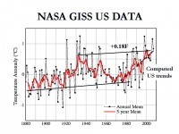
So how does NASA’s data compare with other temperature sources? As we explained in our earlier article, NASA data is derived from a grid of ground-based thermometers. During the last thirty years, we also have the benefit of more sophisticated technology - satellites which can indirectly record temperatures across most of the planet. The satellite data is from Remote Sensing Systems (RSS) and the University of Alabama at Huntsville (UAH).
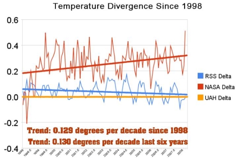
In 1998 (left side of the graph below) NASA and the satellite data sources RSS and UAH all agreed quite closely - within one-tenth of a degree. Ten years later - in March 2008 - NASA is reporting temperature anomalies more than 0.5 degrees warmer than UAH. The divergence between NASA and UAH has increased at a rate of 0.13 degrees per decade (red lines below.) In contrast, RSS has converged with UAH over the period and is now within 0.02 degrees (blue lines below.)
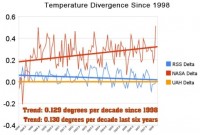
See larger graph here
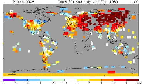
The divergence is now quite striking. Looking closer at March 2008, NASA’s data shows the month as the third warmest on record. In sharp contrast, UAH and RSS satellite data showed March as the second coldest on record in the southern hemisphere, and just barely above average for the whole planet. How could such a large discrepancy occur? Viewing the NASA 250-mile map for March below, what immediately grabs the attention is that NASA has essentially no data (gray areas) in most of Canada, most of Africa, the Greenland ice sheet, and most of Antarctica. This begs the question, how can one calculate an accurate “global temperature” while lacking any data from large contiguous regions of three continents? So what was NASA missing?
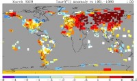
See larger map here
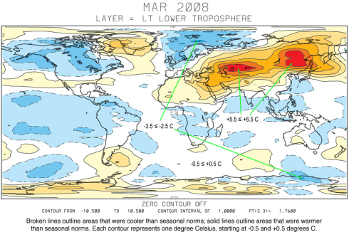
NASA Temperatures March, 2008 - 250-mile smoothing radius - looks hot. We can find NASA’s lost continents in the UAH satellite data for March below.
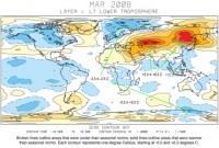
See larger map here
Not surprisingly, the missing areas in Canada and Africa were cold. The NASA data thus becomes disproportionately weighted towards warm areas - particularly in the northern hemisphere. As can be seen in the UAH satellite map above, the warm areas actually made up a relatively small percentage of the planet. The vast majority of the earth had normal temperatures or below. Given that NASA has lost track of a number of large cold regions, it is understandable that their averages are on the high side.
Cherry picking is a second important issue with NASA’s presentation is that they use the time period of 1951-1980 as their choice of baseline. This was a well known cold spell. Whatever motivations NASA had for picking the 1951-1980 baseline undoubtedly have some valid scientific basis. Yet, when the data is calibrated in lockstep with a very high-profile and public political philosophy, we should at least be willing to ask some hard questions. Dr. James Hansen at GISS is the person in charge of the NASA temperature data. He is also the world’s leading advocate of the idea of catastrophic global warming, and is Al Gore’s primary climate advisor. The discrepancies between NASA and other data sources can’t help but make us consider Einstein’s advice: “If the facts don’t fit the theory, change the facts.” Read full post here.
Jun 04, 2008
Army: Sun, Not Man, Is Causing Climate Change
By Noah Shachtman, Danger Room
The Army is weighing in on the global warming debate, claiming that climate change is not man-made. Instead, Dr. Bruce West, with the Army Research Office, argues that “changes in the earth’s average surface temperature are directly linked to the short-term statistical fluctuations in the Sun’s irradiance and the longer-term solar cycles.”
In an advisory to bloggers entitled “Global Warming: Fact of Fiction [sic],” an Army public affairs official promoted a conference call with West about “the causes of global warming, and how it may not be caused by the common indicates [sic] some scientists and the media are indicating.”
In the March, 2008 issue of Physics Today, West, the chief scientist of the Army Research Office’s mathematical and information science directorate, wrote that “the Sun’s turbulent dynamics” are linked with the Earth’s complex ecosystem. These connections are what is heating up the planet. “The Sun could account for as much as 69 percent of the increase in Earth’s average temperature,” West noted.
West acknowledges that the IPCC and other scientific groups have “conclude[d] that the contribution of solar variability to global warming is negligible.” He argues that these groups have done a poor job modeling the Sun’s impact, however, and that’s why they have “significantly over-estimated” the “anthropogenic contribution to global warming.” Read more here.
Jun 02, 2008
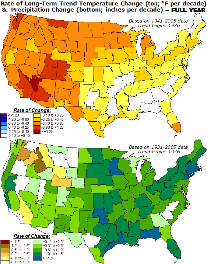
NOAA Cherry Picking on Trend Analyses
By Joseph D’Aleo, CCM
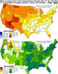
A meteorologist friend came across this CPC section on seasonal and annual trends. He quickly noted that they chose a date to start the trend that showed the maximum possible trend results.
See full image here
You will notice that the trends are for the period from 1976 to 2005. They start at the time of the Great Pacific Climate Shift to the PDO warm mode in 1976-77. Had they done the trend over the whole period of record back in the warm peak in the 1930s, they would have seen little trend (0.18F versus 1F for the 1976 to 2005 period). Max to max and min to min changes provide the real trends in cyclical patterns.
See full image here
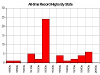
The 1930s was when most of the all-time heat records were set for the United States.
See full image here Read more here.
Jun 01, 2008
Our Spotless Sun
By Lawrence Solomon, Financial Post
You probably haven’t heard much of Solar Cycle 24, the current cycle that our sun has entered, and I hope you don’t. If Solar Cycle 24 becomes a household term, your lifestyle could be taking a dramatic turn for the worse. That of your children and their children could fare worse still, say some scientists, because Solar Cycle 24 could mark a time of profound long-term change in the climate. As put by geophysicist Philip Chapman, a former NASA astronaut-scientist and former president of the National Space Society, “It is time to put aside the global warming dogma, at least to begin contingency planning about what to do if we are moving into another little ice age.”
The sun, of late, is remarkably free of eruptions: It has lost its spots. By this point in the solar cycle, sunspots would ordinarily have been present in goodly numbers. Today’s spotlessness - what alarms Dr. Chapman and others - may be an anomaly of some kind, and the sun may soon revert to form. But if it doesn[t - and with each passing day, the speculation in the scientific community grows that it will not - we could be entering a new epoch that few would welcome.

This was the case during the Little Ice Age, a period starting in the 15th or 16th century and lasting centuries, says NASA’s Goddard Space Centre, which links the absence of sunspots to the cold that then descended on Earth. During the coldest part of the Little Ice Age, a time known as the Maunder Minimum (named after English astronomer Edward Maunder), astronomers saw only about 50 sunspots over a 30-year period, less than one half of 1% of the sunspots that would normally have been expected. Other Minimums - times of low sunspot activity - also corresponded to times of unusual cold.
During the Little Ice Age, the River Thames froze over, the Dutch developed the ice skate and the great artists of the day learned to love a new genre: the winter landscape.
Glaciers advanced rapidly in Greenland, Iceland, Scandinavia and North America, making vast tracts of land uninhabitable. The Arctic pack ice extended so far south that several reports describe Eskimos landing their kayaks in Scotland. Finland’s population fell by one-third, Iceland’s by half, the Viking colonies in Greenland were abandoned altogether, as were many Inuit communities. The cold in North America spread so far south that, in the winter of 1780, New York Harbor froze, enabling people to walk from Manhattan to Staten Island. Read more here. See also earlier blog on cycle 24 and the significance of its delay here.
|
|
|
|

